ADV @ UNDERCONSIDERATION Peek here for details
BROWSE
Client
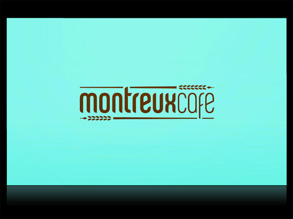
Montreux Café
Quantity Produced
3,000
Production Cost
$1,100
Production Time
1 week
Dimensions (Width × Height × Depth)
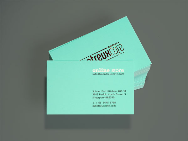
Business card: 85 mm × 55 mm (3.3 in × 2.1 in)
Page Count
–
Paper Stock
420gsm
Number of Colors
1 spot + Copper Foil
Varnishes
Matte lamination
Binding
–
Typography
Custom Chalet Comprime by House Ind
Rockwell
Frutiger
Custom Hiragino Maru Gothic Pro
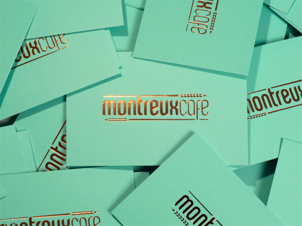
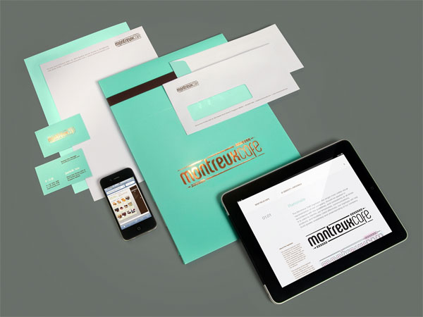
The first thing that came to mind after seeing these was Tiffany’s, and of course quick to follow, Breakfast at Tiffany’s, and then Audrey Hepburn. Like her, the turqoise and gold combination has just the right amount of class and sass. Funny how things come full circle.
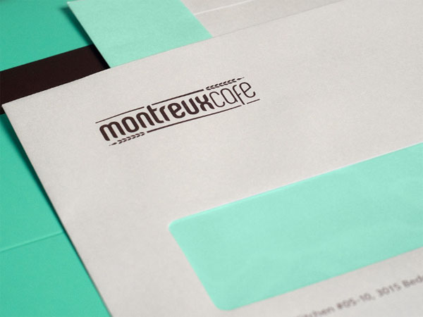
We’ve developed a full identity system for Montreux Café, with the aim of increasing its brand awareness. We have also incorporated a set of brand colours to help improve on the brand recognition of Montreux Café.
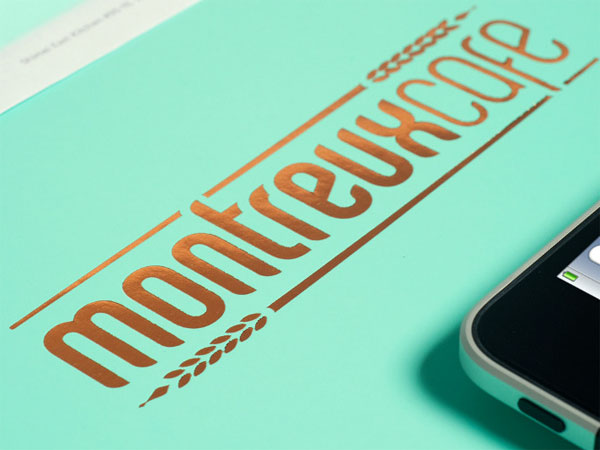
We’ve used a similar typeface to their previous design to help bridge the transition of the rebrand, as well as keeping elements like the wheat symbol (as requested by the client), that was used to subtly frame the wordmark. By varying the thickness of the condensed typeface we are able to compact the wordmark as much as possible, yet maximizing legibility.
To improve the image of Montreux Café, we’ve used a much heavier grammage stock, coupled with the Copper foil-blocking of the logo.
Initially we intend to use uncoated stock for the business cards, and use triplexing to sandwich a brown stock in between to add a little novelty. However, we took considerations into being consistent with the packaging of the cakes, which have to be varnished or laminated to improve the durability when placed into and taken out of fridges and ice boxes, and decided to forgo triplexing and use a matte lamination on the business cards. It helps to keep the cost down too.

This post was published in the original layout of FPO so all images are smaller. Project descriptions as well as production lessons are quoted in the main content area.
Post Author
Lauren Dickens

Lauren Dickens
Former intern at UnderConsideration LLC.
More: Online / On Twitter
Date Published
April 22, 2011
Filed Under
Identity Materials
Tagged with
business card
copper
foil stamp
offset
stationery


About
FPO (For Print Only), is a division of UnderConsideration, celebrating the reality that print is not dead by showcasing the most compelling printed projects.
FPO uses Fonts.com to render Siseriff and Avenir Next.
FPO is run with Six Apart’s MovableType
All comments, ideas and thoughts on FPO are property of their authors; reproduction without the author’s or FPO’s permission is strictly prohibited
Twitter @ucllc
Sign-up for Mailing List
Mailing list managed by MailChimp
Thanks to our advertisers
About UnderConsideration
UnderConsideration is a graphic design firm generating its own projects, initiatives, and content while taking on limited client work. Run by Bryony Gomez-Palacio and Armin Vit in Bloomington, IN. More…
blogs we publish
Brand New / Displaying opinions and focusing solely on corporate and brand identity work.
Art of the Menu / Cataloguing the underrated creativity of menus from around the world.
Quipsologies / Chronicling the most curious, creative, and notable projects, stories, and events of the graphic design industry on a daily basis.
products we sell
Flaunt: Designing effective, compelling and memorable portfolios of creative work.
Brand New Conference videos / Individual, downloadable videos of every presentation since 2010.
Prints / A variety of posters, the majority from our AIforGA series.
Other / Various one-off products.
events we organize
Brand New Conference / A two-day event on corporate and brand identity with some of today's most active and influential practitioners from around the world.
Brand Nieuwe Conference / Ditto but in Amsterdam.
Austin Initiative for Graphic Awesomeness / A speaker series in Austin, TX, featuring some of the graphic design industry's most awesome people.
also
Favorite Things we've Made / In our capacity as graphic designers.
Projects we've Concluded / Long- and short-lived efforts.
UCllc News / Updates on what's going at the corporate level of UnderConsideration.

Related entries
Andy Stewart Design Identity Materials
Carolina Manresa Identity Materials
Bocanegra Studio Identity Materials
2016 Brand New Conference Badges
Molly Taylor & Co. Identity Materials