ADV @ UNDERCONSIDERATION Peek here for details
BROWSE
Dimensions (Width × Height × Depth)
18 in × 24 in
Page Count
–
Paper Stock
French Muscletone Hot Fudge
Number of Colors
3
Varnishes
–
Binding
–
Typography
A Love of Thunder by S. John Ross
Aller by Dalton Maag Ltd.
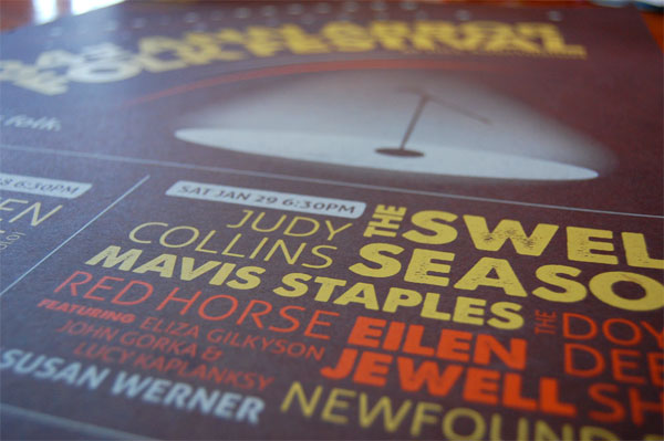
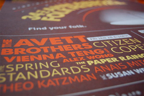
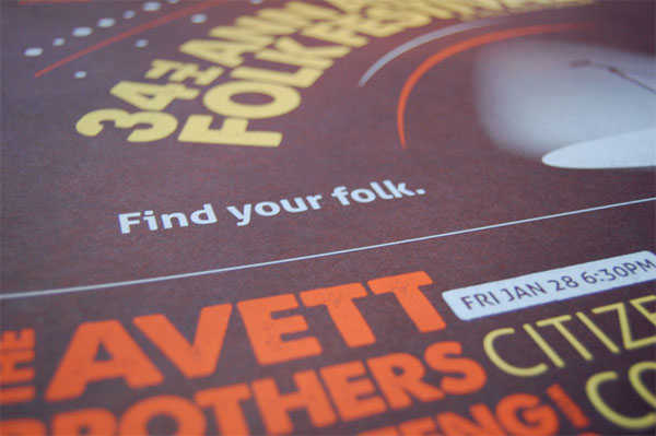
Ann Arbor is a relatively young town, has been a hub of activity and creativity but since it’s founding. Color, with the help of smart typographical choices, help to translate a certain aesthetic in this poster. The paper reminds me of a cup of black coffee and the yellow, orange, and white pop right off the page. Nice gradation on the white ink too for the microphone image.
This is a promotional piece for The Ark’s annual Ann Arbor Folk Festival, two nights of great music in Hill Auditorium, Michigan’s most historic concert hall. The concept is based on the experience one will have watching the musicians perform in this space. Pre-festival, the poster had to present a large amount of information, grab attention, and drive ticket sales. During the festival, the poster was sold so we wanted to create a piece that was unique and substantial.
In the silkscreen process, there were some transparency issues with the ink on the dark brown paper. The palette had to shift slightly to achieve the opaqueness desired.
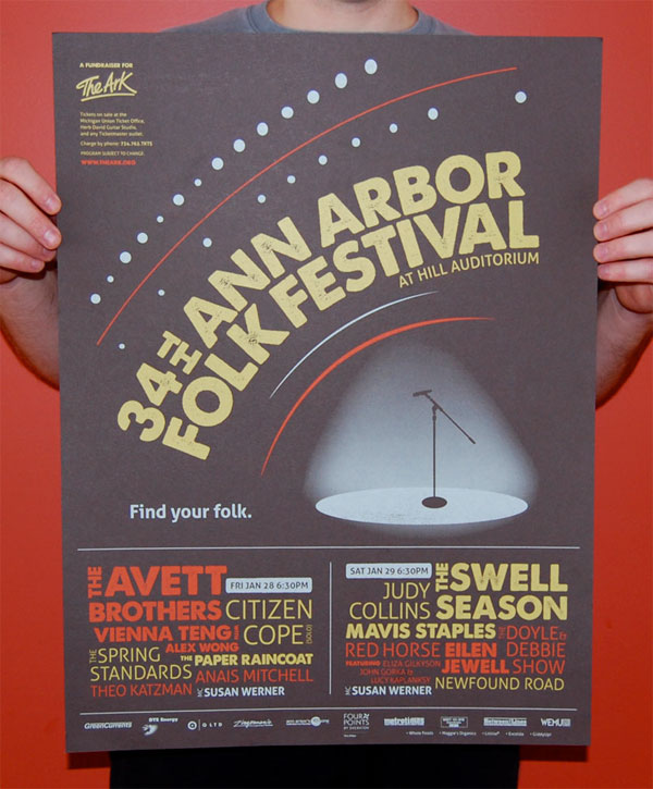


The Ark’s “Ann Arbor Folk Festival” Poster
Production Method
Design
Q LTD: Jocelyn Edin
Printing
VG Kids
This post was published in the original layout of FPO so all images are smaller. Project descriptions as well as production lessons are quoted in the main content area.
Post Author
Lauren Dickens

Lauren Dickens
Former intern at UnderConsideration LLC.
More: Online / On Twitter
Date Published
May 3, 2011
Filed Under
Posters
Tagged with
poster
silkscreen


About
FPO (For Print Only), is a division of UnderConsideration, celebrating the reality that print is not dead by showcasing the most compelling printed projects.
FPO uses Fonts.com to render Siseriff and Avenir Next.
FPO is run with Six Apart’s MovableType
All comments, ideas and thoughts on FPO are property of their authors; reproduction without the author’s or FPO’s permission is strictly prohibited
Twitter @ucllc
Sign-up for Mailing List
Mailing list managed by MailChimp
Thanks to our advertisers
About UnderConsideration
UnderConsideration is a graphic design firm generating its own projects, initiatives, and content while taking on limited client work. Run by Bryony Gomez-Palacio and Armin Vit in Bloomington, IN. More…
blogs we publish
Brand New / Displaying opinions and focusing solely on corporate and brand identity work.
Art of the Menu / Cataloguing the underrated creativity of menus from around the world.
Quipsologies / Chronicling the most curious, creative, and notable projects, stories, and events of the graphic design industry on a daily basis.
products we sell
Flaunt: Designing effective, compelling and memorable portfolios of creative work.
Brand New Conference videos / Individual, downloadable videos of every presentation since 2010.
Prints / A variety of posters, the majority from our AIforGA series.
Other / Various one-off products.
events we organize
Brand New Conference / A two-day event on corporate and brand identity with some of today's most active and influential practitioners from around the world.
Brand Nieuwe Conference / Ditto but in Amsterdam.
Austin Initiative for Graphic Awesomeness / A speaker series in Austin, TX, featuring some of the graphic design industry's most awesome people.
also
Favorite Things we've Made / In our capacity as graphic designers.
Projects we've Concluded / Long- and short-lived efforts.
UCllc News / Updates on what's going at the corporate level of UnderConsideration.

Related entries
36 Days of Type Poster
Ministry of Environment in Colombia Poster
National Parks Map
eBoy Poster
“Love Your Mother” Print