ADV @ UNDERCONSIDERATION Peek here for details
BROWSE
Client
Self-promotion
Quantity Produced
600
Production Cost
$400
Production Time
1 week
Dimensions (Width × Height × Depth)
3.5 in × 2 in
Page Count
–
Paper Stock
Reich Savoy, Brilliant White, 236lb
Number of Colors
3
Varnishes
–
Binding
–
Typography
ITC Avant Garde Gothic
Adobe Garamond Pro
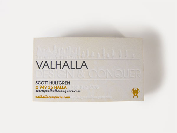
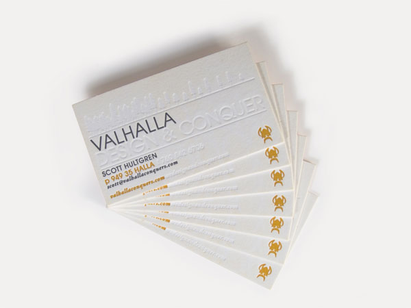
I don’t know much about Scandinavian mythology, so maybe it’s because Valhalla is also the name of one my favorite bars here in Austin, or that it’s referenced in Led Zepplin’s “Immigrant Song,” but this name just oozes cool to me. The blind hit gives these cards a textural element, and the weight is substantial enough that people will want to hold on to it, which is in fact, the point of a business card.
I always try to have memorable business cards and always try to make my new one better than the last. My theory is that if it’s a cool card the people will keep it around, rather than putting it in the circular file. I’ve always liked letterpress cards and decided to give it a shot for my newest cards. The time from “I need new business cards! What if I did a letterpress version” to completed cards, in my hands, was only about two weeks which included a trip down to meet with Tim (super-amazingly awesome to work with) and see what could be done.
I tried to keep the design really simple and utilize the letterpress capabilities a lot. I like the card and think it works good without the blind tree / line / etc hit on the front (or design and conquer on the back) but when that’s evident, it really brings the card to the next level.
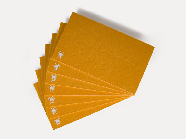
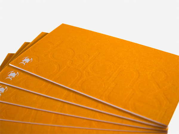
One cool, interesting thing I like is that I was able to use my original “design and conquer” as a blind hit on the backside with my viking icon in the same location as the front of the card. Theoretically, you’d be able to see the icon popping out a bit more since he’s hit on the front and left alone on the back but with such thick paper it didn’t show. Still cool to know though.
Even with the incredible deal Tim at Quality Letterpress gave me, letterpress isn’t cheap but it’s oh-so-awesome! This paper came in at about $9 per 26×40 sheet but it looks and worked amazing. For the blind hits, I wish I had done the regular Adobe Garamond Pro - Italic instead of the Semibold. I think the thinner font weight would have made it a bit more legible since there’s no ink to help set it off. All in all though, I’m very happy with the cards and the few I’ve received great feedback from handed out so far.

Valhalla Business Card
Production Method
Design
Scott Hultgren
Printing
Quality Letterpress (San Diego, CA)
This post was published in the original layout of FPO so all images are smaller. Project descriptions as well as production lessons are quoted in the main content area.
Post Author
Lauren Dickens

Lauren Dickens
Former intern at UnderConsideration LLC.
More: Online / On Twitter
Date Published
May 10, 2011
Filed Under
Business Cards
Tagged with
blind hit
business card
letterpress


About
FPO (For Print Only), is a division of UnderConsideration, celebrating the reality that print is not dead by showcasing the most compelling printed projects.
FPO uses Fonts.com to render Siseriff and Avenir Next.
FPO is run with Six Apart’s MovableType
All comments, ideas and thoughts on FPO are property of their authors; reproduction without the author’s or FPO’s permission is strictly prohibited
Twitter @ucllc
Sign-up for Mailing List
Mailing list managed by MailChimp
Thanks to our advertisers
About UnderConsideration
UnderConsideration is a graphic design firm generating its own projects, initiatives, and content while taking on limited client work. Run by Bryony Gomez-Palacio and Armin Vit in Bloomington, IN. More…
blogs we publish
Brand New / Displaying opinions and focusing solely on corporate and brand identity work.
Art of the Menu / Cataloguing the underrated creativity of menus from around the world.
Quipsologies / Chronicling the most curious, creative, and notable projects, stories, and events of the graphic design industry on a daily basis.
products we sell
Flaunt: Designing effective, compelling and memorable portfolios of creative work.
Brand New Conference videos / Individual, downloadable videos of every presentation since 2010.
Prints / A variety of posters, the majority from our AIforGA series.
Other / Various one-off products.
events we organize
Brand New Conference / A two-day event on corporate and brand identity with some of today's most active and influential practitioners from around the world.
Brand Nieuwe Conference / Ditto but in Amsterdam.
Austin Initiative for Graphic Awesomeness / A speaker series in Austin, TX, featuring some of the graphic design industry's most awesome people.
also
Favorite Things we've Made / In our capacity as graphic designers.
Projects we've Concluded / Long- and short-lived efforts.
UCllc News / Updates on what's going at the corporate level of UnderConsideration.

Related entries
KitchenAid Limited Edition Cards
Black Sheep Studio Business Cards and Promotional Items
Seegno Business Cards
Fracas Productions Business Cards
Elegante Press Business card