ADV @ UNDERCONSIDERATION Peek here for details
BROWSE
Client
Self
Quantity Produced
750 each
Production Cost
Program + Poster: Sponsored by BurdgeCooper
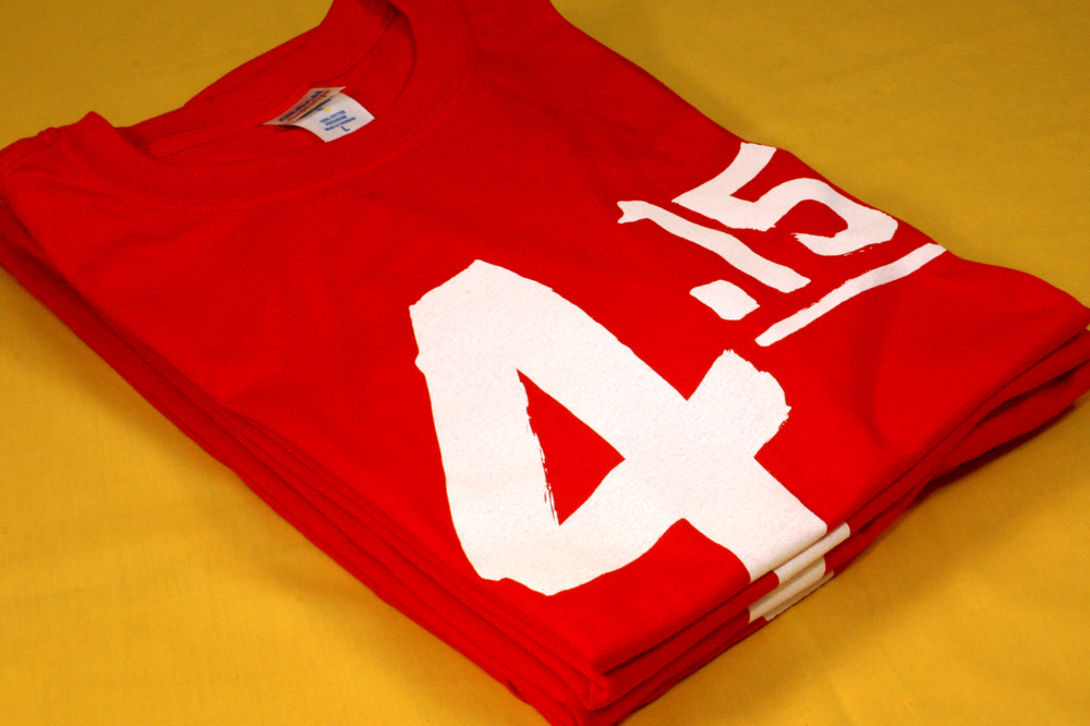
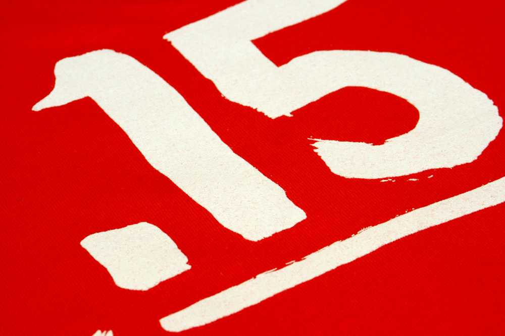
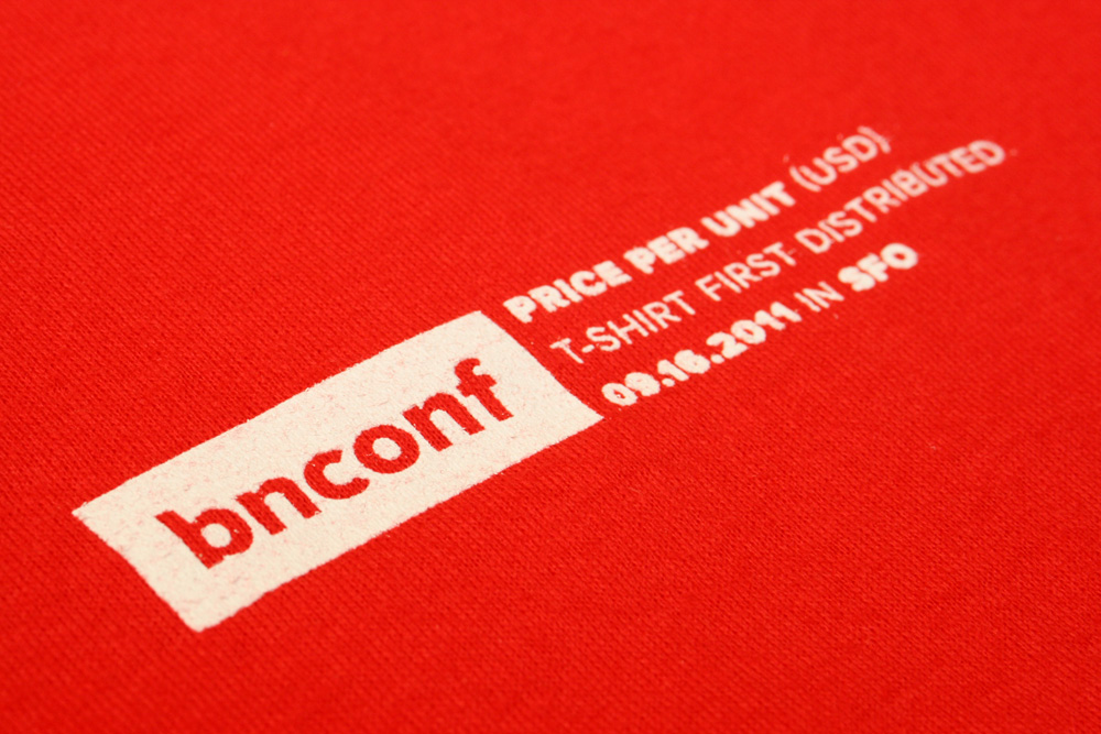
T-shirt: $4.15 per
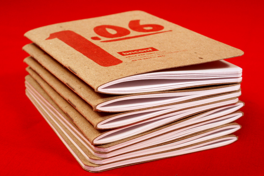
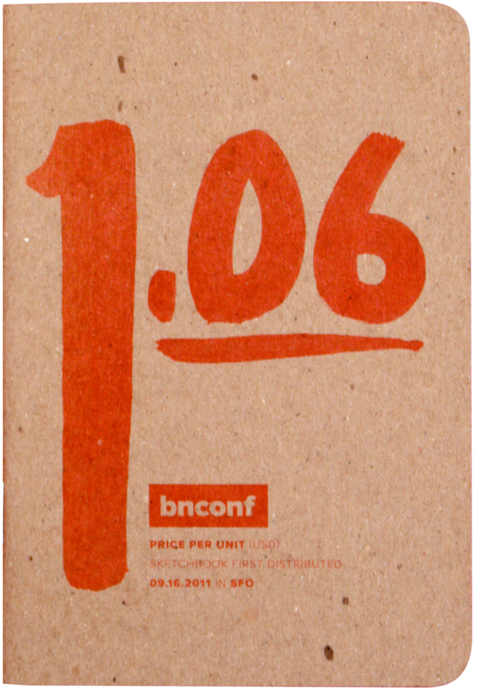
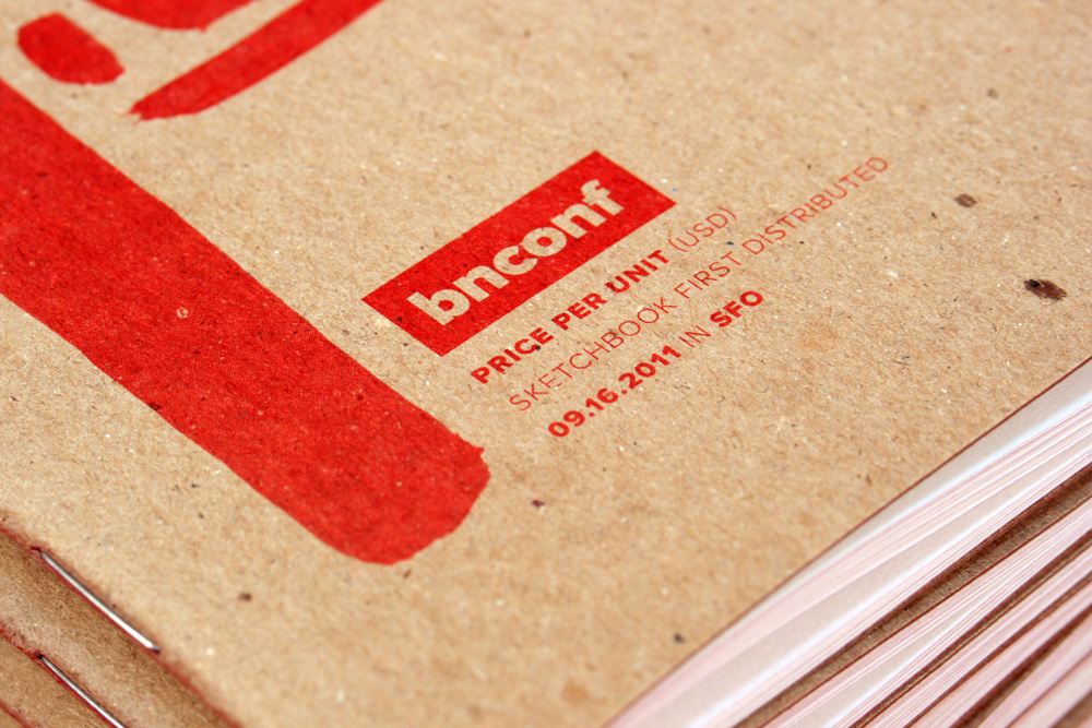
Sketchbook: $1.06 per
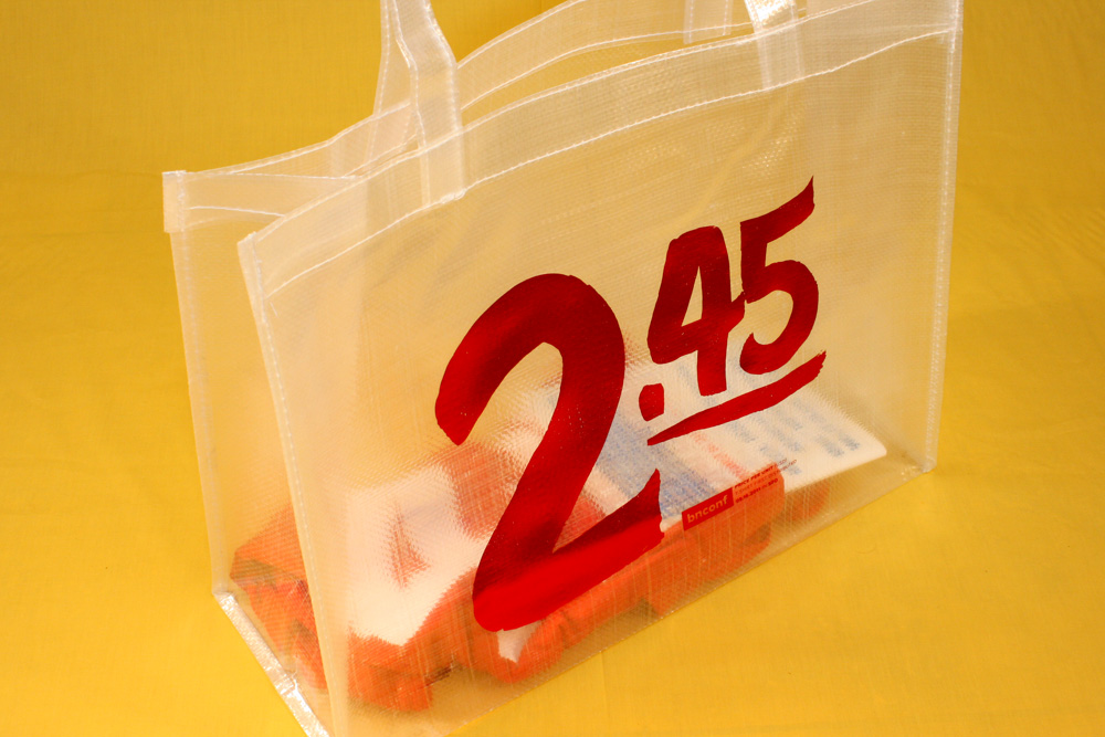
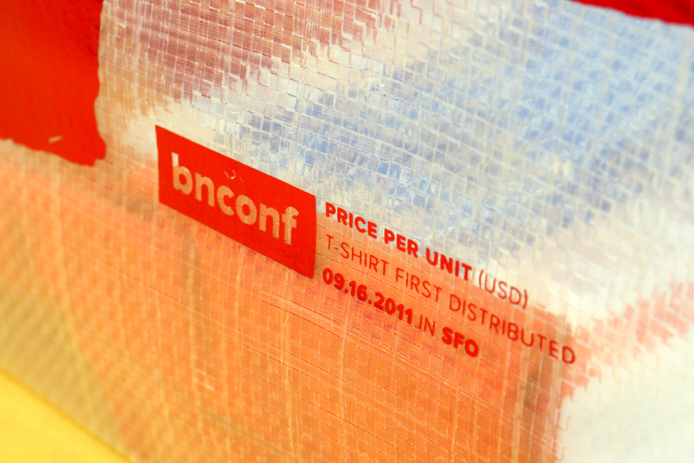
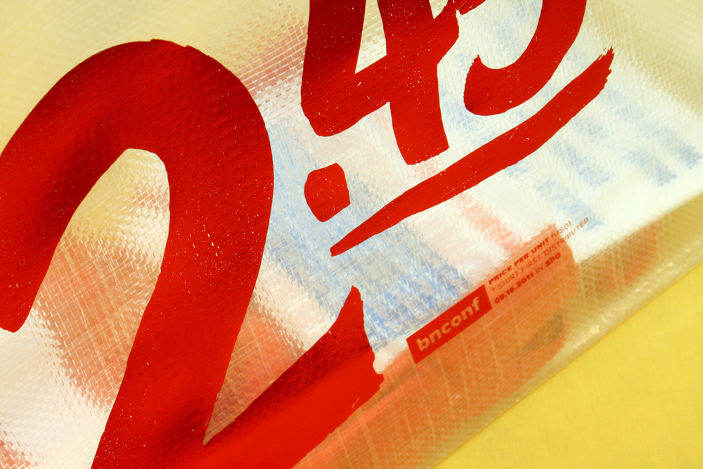
Tote: $2.45 per
Production Time
2 Weeks
Dimensions (Width × Height × Depth)
Program: 5 in × 7 in
Poster: 17 in × 23.5 in
T-shirt: S, M, L, XL, XXL
Sketchbook: 3.5 in × 5 in
Tote: 16 in × 6 × 12
Page Count
Program: 36 + Cover
Sketchbook: 32 Pages + Cover
Paper Stock
Program Cover: Neenah Translucents, Radiant White, 17 lb text
Program Body: Neenah Coronado SST, Stipple, 80 lb text
Poster: Neenah Translucents, Radiant White, 28 lb text
Sketchbook: Chipboard + Uncoated text
Tote: Clear Lumina
Number of Colors
Program Cover: 2 Spot
Program Body: CMYK
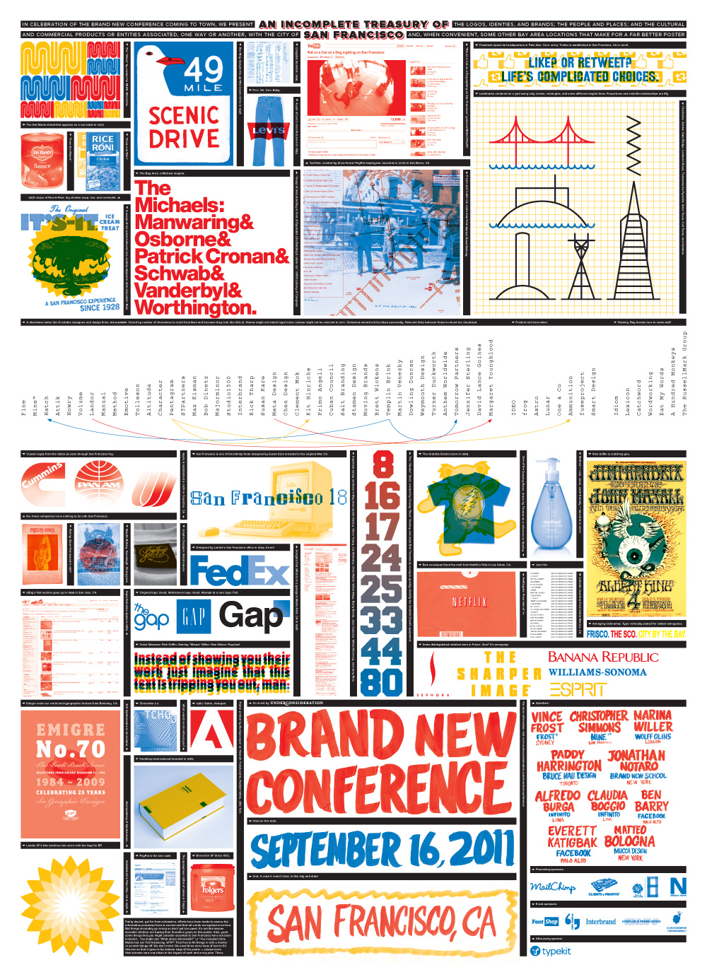
Poster: 4 Spot
T-shirts: 1 Spot (double hit)
Sketchbook: 1 Spot
Tote: 1 Spot
Varnishes
–
Binding
Program and Sketchbook: Saddle-stitch
Typography
Hand Lettering by John Hodgins
Proxima Nova by Mark Simonson
Apex Serif by Village
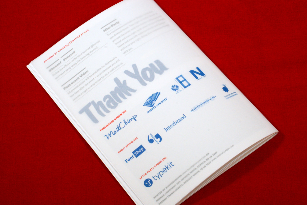
Just like last year, we thought it would be fun to do a rundown of our materials for the 2011 Brand New Conference that took place back on September 16. And, also, like last year, we have plenty of leftovers that we are offering up for purchase here. Keep scrolling to read some details about each piece. Swag is no longer available for purchase.
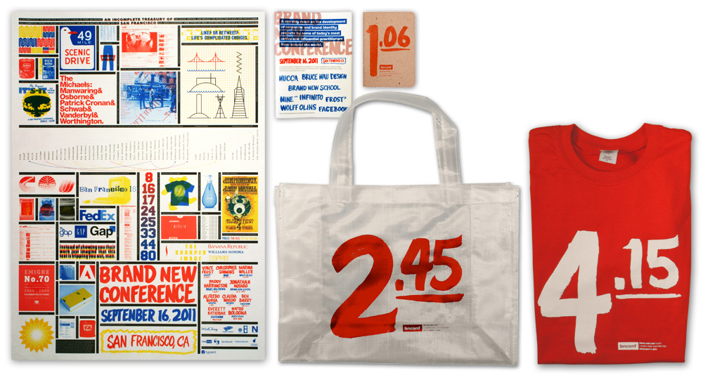
Poster + Swag.
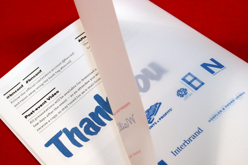
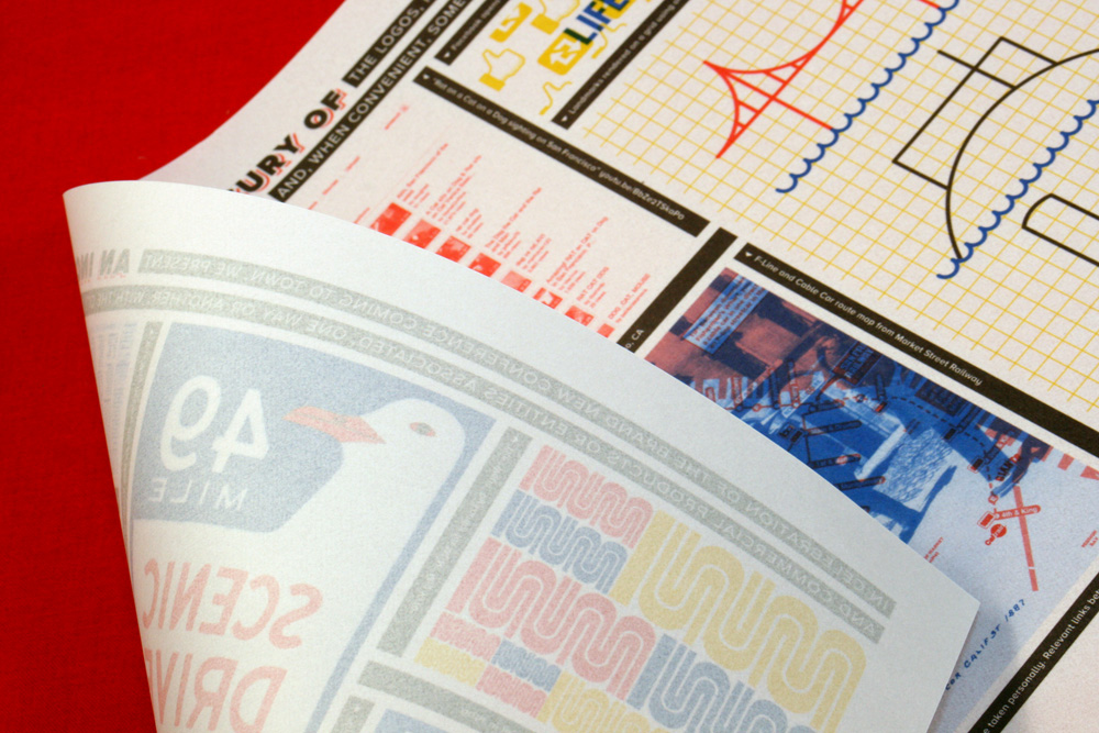
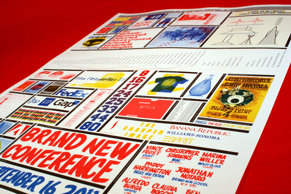
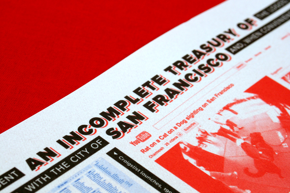
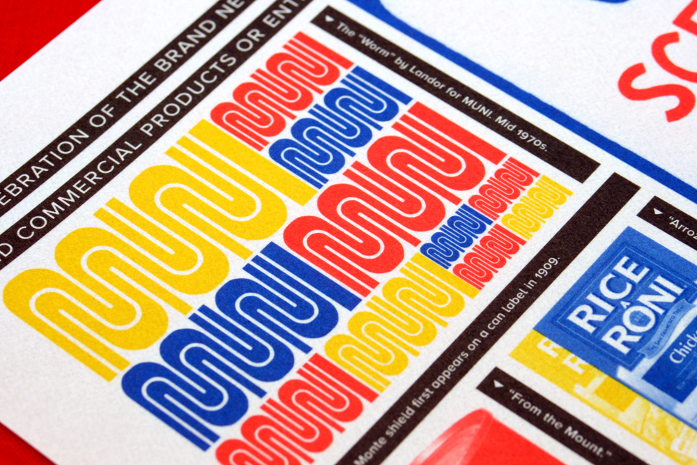
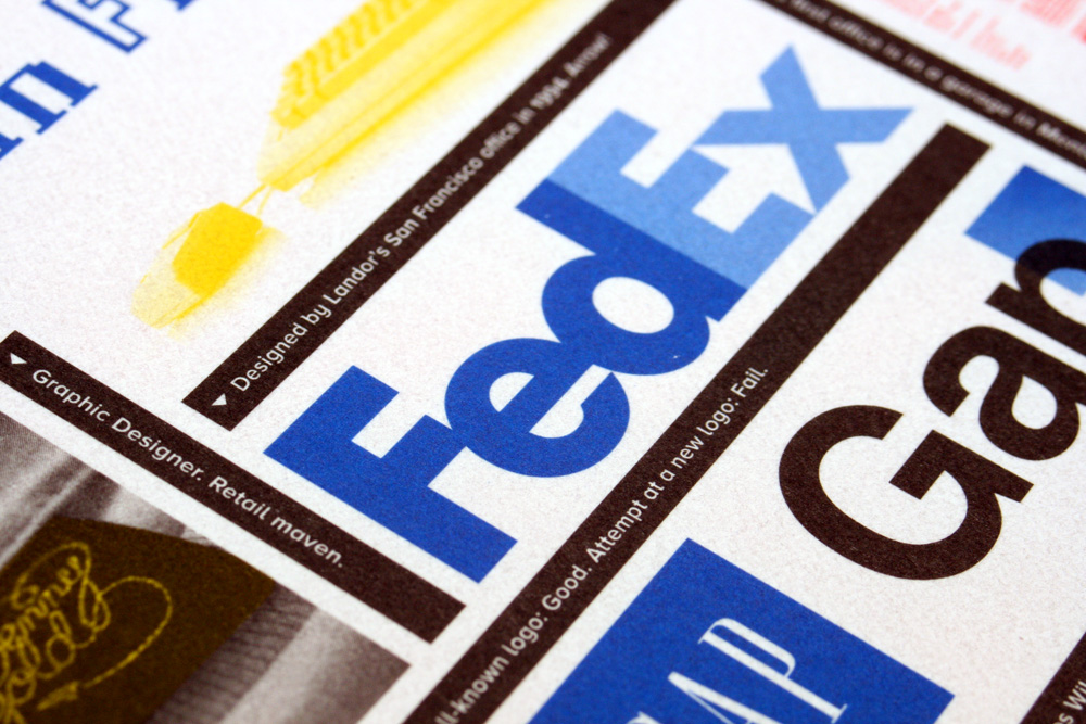
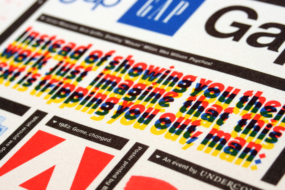
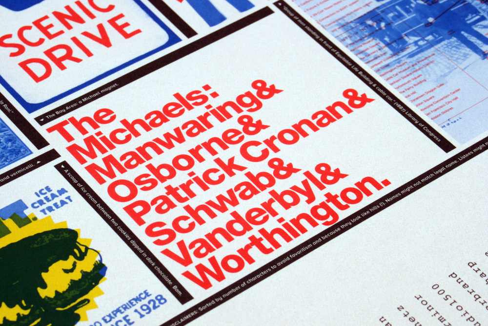
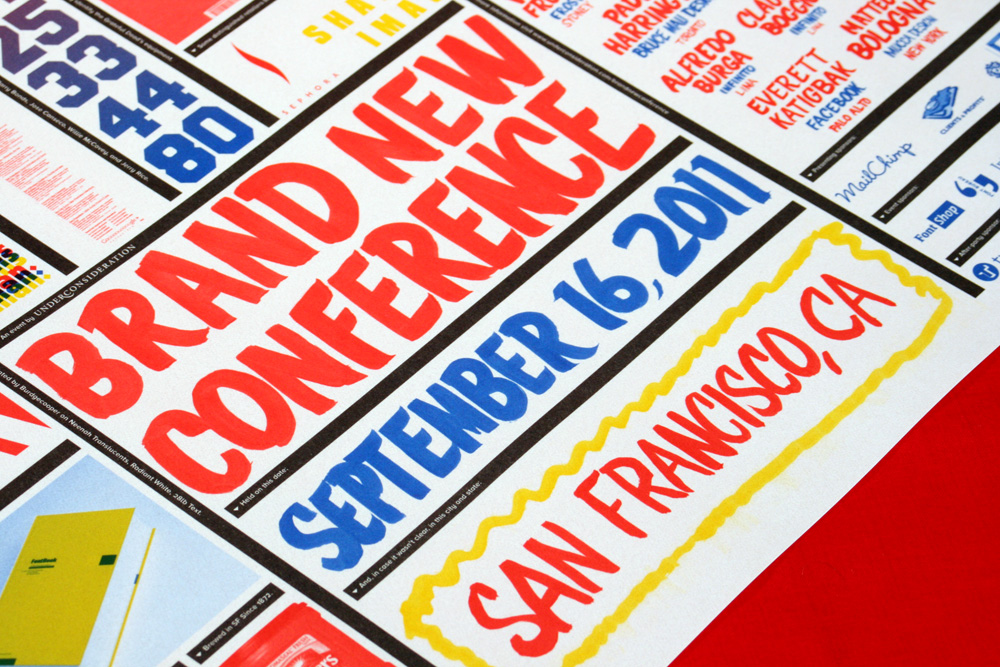
The concept of the materials stems from the hand-drawn, brush lettering that was originally inspired by small grocery stores, bodegas, and buying things on sale by the pound. So we extended the idea of blowout sale prices to the t-shirt, tote bag, and sketchbook by just listing the production price on the front. Kind of silly, but we thought it would be funny to walk around with a random money amount. The t-shirt, at $4.15, turns out to be the main phone area code for San Francisco — something we didn’t plan, but I guess it was meant to be. The idea too is that we didn’t want to just sell a t-shirt with a giant “BRAND NEW CONFERENCE” on it, so it’s less a promotion for the event and more just a general kind of t-shirt. The program, poster, and tote bag extend the grocery store metaphor by being translucent, as if you were looking at a sale sign painted on or posted through a glass window. The poster is printed offset with a lot of juicy overprinting and is full of design-ey stuff — you can download a PDF preview too.
You can click on any photo to view bigger in a pop-up.
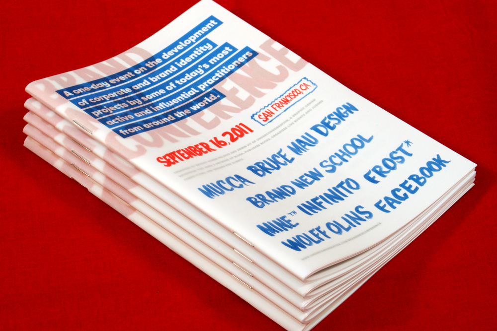
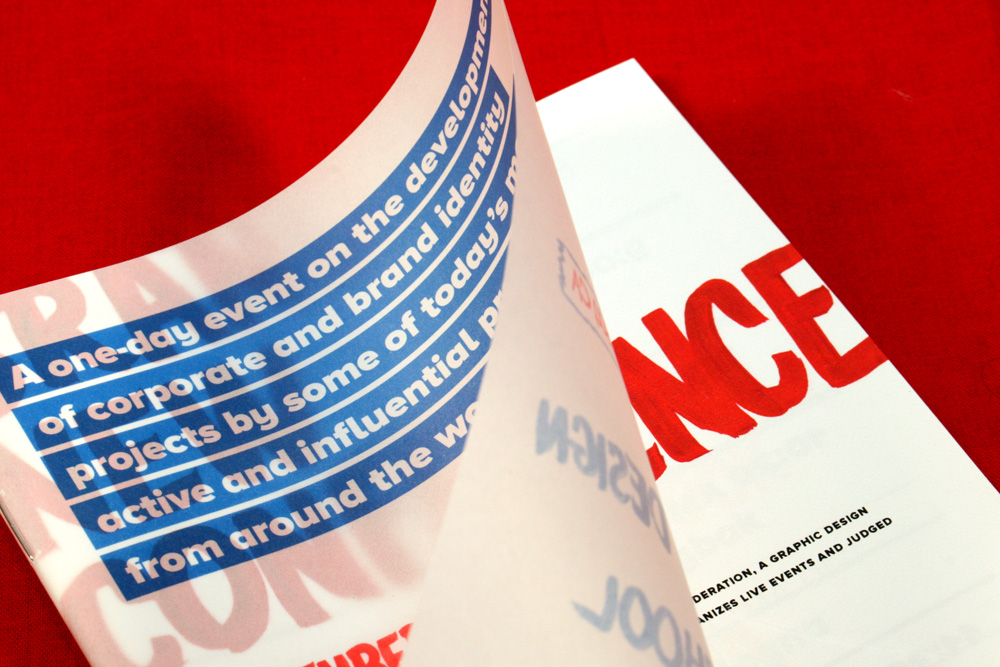
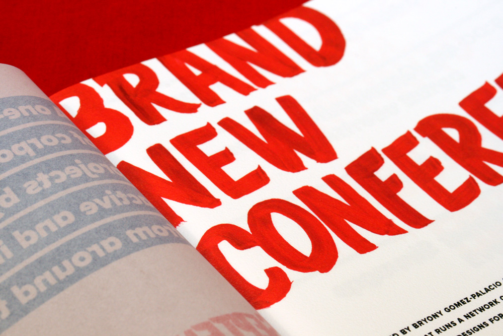
Program
For the program we chose this really funky Neenah Paper, Coronado with a Stipple finish, that feels like licking a slick wall. Not that I’ve ever licked a slick wall, but it has a lovely raised texture and a fun sheen to it that make it nice to hold in your hands. The body is printed digital, and I love how far digital printing has come that it now has a very convincing finish to it that it doesn’t look like it came out of Kinko’s anymore. The cover is a very light translucent that we used to create some type and text interaction.
T-shirt
We didn’t do American Apparel again. It’s hard to spend twice the money for it. But went back to Gildan Soft Style in a fire-engine-red color. Our main man at Standard Deluxe, Scott Peek, did a double-hit of white to make the dollar amount pretty opaque.

Sketchbook
Very straightforward: chipboard cover and blank pages. Fits in your ass pocket. Courtesy of the flawless ScoutBooks.
Tote Bag
This is one of the few clear totes out there and the moment I saw it I loved it and knew this was the direction we wanted to take the whole set of materials in. It was also a bit of a gamble because we had no idea what the printing would look like on the clear material. But the good thing is that silkscreen will adhere to anything but egg yolk and the tote came out super great. Red is a bit darker than we wanted but still pretty cool.
Poster
This year, the poster was my favorite piece to make. In part because of the concept and design challenge of filling a giant page with bits and pieces of San Francisco design history and its icons. But also because of the production challenge, knowing that BurdgeCooper was in for printing the poster in 4 spot colors. (Somehow it seems easier to design for 1- or 2-color printing). Since the colors of the conference identity were basically a version of CMYK I immediately thought that it would be fun to do lots of overprinting, because it’s not something I get to do often. There were so many different elements and different ways that the overprinting worked that I had to do the color separations myself and I prepared the InDesign file in an as old-school-as-possible way so that they would just have to output each layer to plate and all the trapping and overprinting would already be there. This was in part because I’m a control freak and I wasn’t sure if prepress was going to get all the different spots. Anyway. Turned out great!
For your perusing pleasure: Download PDF of the poster.

2011 Brand New Conference Materials
Production Method
Design
UnderConsideration
Printing
Program + Poster: BurdgeCooper
T-shirt: Standard Deluxe
Sketchbook: Scout Books
Tote: Holden Bags

This post was published in the original layout of FPO so all images are smaller. Project descriptions as well as production lessons are quoted in the main content area.
Post Author
Armin

Armin Vit
Editor of FPO and co-founder of UnderConsideration LLC.
More: Online / On Twitter
Date Published
September 27, 2011
Filed Under
Identity Materials
Tagged with
digital
offset
poster
program
spot ink
t-shirt
tote


About
FPO (For Print Only), is a division of UnderConsideration, celebrating the reality that print is not dead by showcasing the most compelling printed projects.
FPO uses Fonts.com to render Siseriff and Avenir Next.
FPO is run with Six Apart’s MovableType
All comments, ideas and thoughts on FPO are property of their authors; reproduction without the author’s or FPO’s permission is strictly prohibited
Twitter @ucllc
Sign-up for Mailing List
Mailing list managed by MailChimp
Thanks to our advertisers
About UnderConsideration
UnderConsideration is a graphic design firm generating its own projects, initiatives, and content while taking on limited client work. Run by Bryony Gomez-Palacio and Armin Vit in Bloomington, IN. More…
blogs we publish
Brand New / Displaying opinions and focusing solely on corporate and brand identity work.
Art of the Menu / Cataloguing the underrated creativity of menus from around the world.
Quipsologies / Chronicling the most curious, creative, and notable projects, stories, and events of the graphic design industry on a daily basis.
products we sell
Flaunt: Designing effective, compelling and memorable portfolios of creative work.
Brand New Conference videos / Individual, downloadable videos of every presentation since 2010.
Prints / A variety of posters, the majority from our AIforGA series.
Other / Various one-off products.
events we organize
Brand New Conference / A two-day event on corporate and brand identity with some of today's most active and influential practitioners from around the world.
Brand Nieuwe Conference / Ditto but in Amsterdam.
Austin Initiative for Graphic Awesomeness / A speaker series in Austin, TX, featuring some of the graphic design industry's most awesome people.
also
Favorite Things we've Made / In our capacity as graphic designers.
Projects we've Concluded / Long- and short-lived efforts.
UCllc News / Updates on what's going at the corporate level of UnderConsideration.

Related entries
Andy Stewart Design Identity Materials
Carolina Manresa Identity Materials
Bocanegra Studio Identity Materials
2016 Brand New Conference Badges
Molly Taylor & Co. Identity Materials