ADV @ UNDERCONSIDERATION Peek here for details
BROWSE
Dimensions (Width × Height × Depth)
16.5 × 5 × 1.375
Page Count
242
Paper Stock
Mohawk Premium Digital, Neon White 100 lb Text
Number of Colors
Digital 6-color
Varnishes
–
Binding
Hardcover
Modified Coptic stitch binding
Typography
Avenir (Adrian Frutiger, 1988)
Clarendon (Robert Besley, 1845. Besley became Mayor of London 24 years later. Top that.)
Being three times as long as it is tall, this book for Lynda.com stands out like a 2001: A Space Odyssey monolith, except without all the angry monkeys. The book is a beautiful combination of digital printing and super tactile finishing. Stefan Bucher, responsible for the design, explains in detail:
“The Art of Lynda.com” is a 242-page coffee table book featuring 100 of the best illustrations created exclusively for Lynda.com’s line of self-paced educational CD/DVD-ROMs. Using an enhanced Coptic stitch binding, the book represents the meeting of new technology and 2,000-year old craftsmanship. Measuring 16 by 4.25 inches, and weighing in at 3 pounds in its slipcase, the book can also be used to defend yourself in a tight spot.
In its original DVD incarnation the artwork runs across the top of the case as a thin strip. It was immediately clear to me that the book needed to stretch as much as possible to maintain this super-Cinemascope format. The rounded spike in the bottom right corner of each illustration also comes from the DVDs and is a large part of Lynda.com’s branding in general.
The large format made it so that we couldn’t print even 4-page signatures on the Indigo, which is limited to 13-by-19-inch prints. We didn’t want to perfect-bind the book — such floppiness — so we decided on Coptic stitch binding instead. Having stiff cover and backboards lends the book stability, and the custom slipcase protects the whole thing. Sounds easy enough. What we didn’t count on was that binding a good 2.5 lbs. of book on a 5 inch spine would make the whole affair sag in the center. If you picked up the early prototypes you’d get a big, beautiful fan of pages drooping out of the bottom of the book.
We tightened the binding. We added more holes. We tightened the binding more. We got nowhere. Finally the good people at Roswell suggested we had to perfect-bind the book and THEN add the Coptic stitch. This made me sad. One of the great joys of the Coptic stitch is that you get to see the fore-edge of the book. Which we were painting Lynda.com yellow. But it had to be done. So we quickly printed 500 matching yellow spines for the purpose. And it occurred to me that I could insert the title between the binding string. Which made the bindery hate me more. These things are not supposed to be aligned with anything. BUt as always, Roswell came through with flying colors.
After that, all the fancy embossing on the cover… it ain’t nuthin.
A nice side effect of printing digitally was that we could send finished book blocks. The design prominently features bleeding hairlines. With regular signatures, those would dance all over the place when you fan the finished pages. With this book it’s one solid line along the left fore-edges. THe same is true of the curved hook on the right edge of the book.
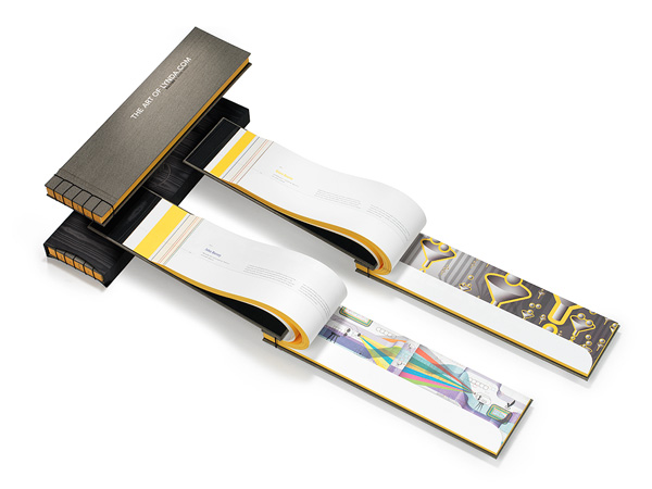
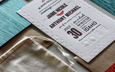
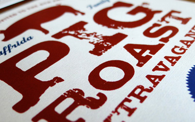
Photo above by Jason Ware. Photos below by Bruce Heavin

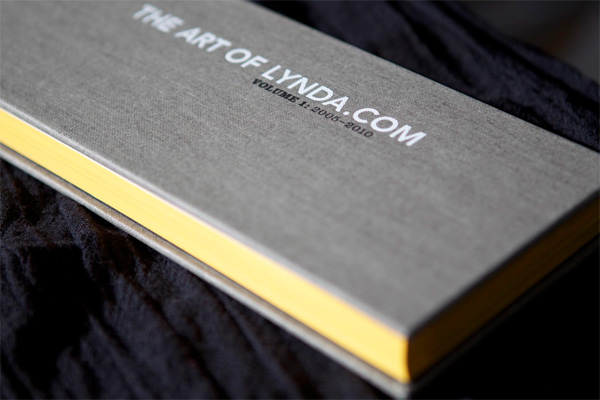
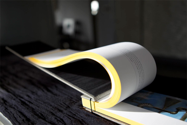
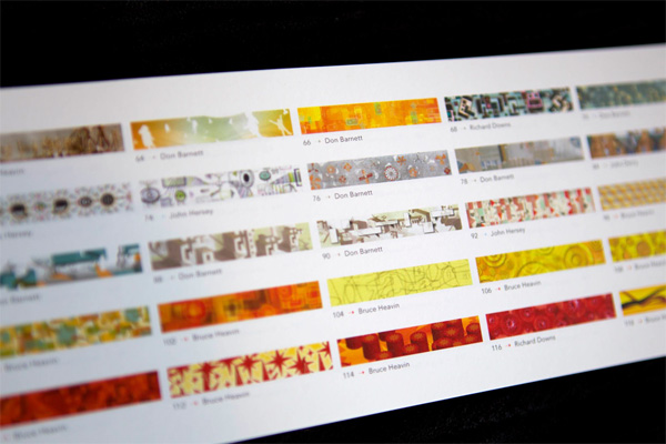
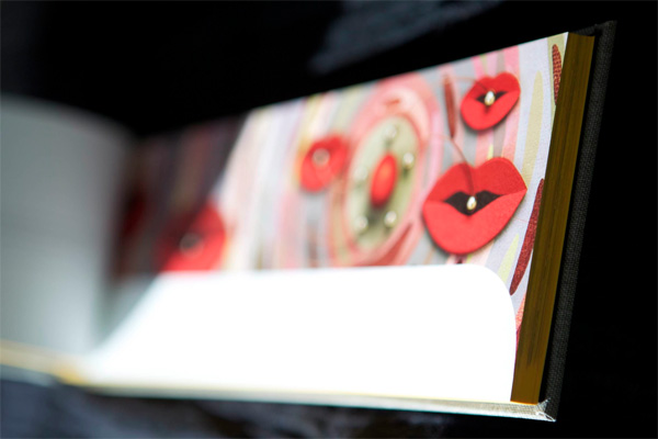
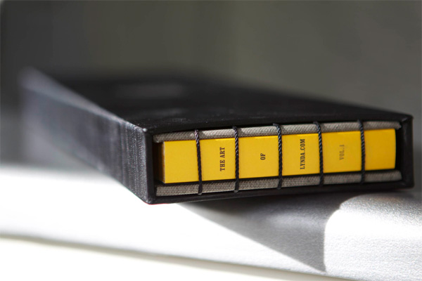
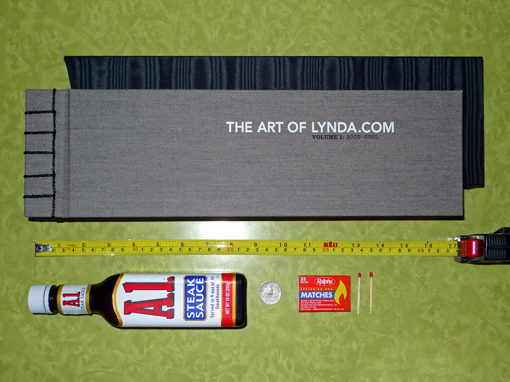
Photo to show scale, by Stefan Bucher.
“The Art of Lynda.com” Book
Production Method
Design
Design: 344 Design, LLC, Stefan Bucher
Illustrators: Don Barnett, John Derry, Richard Downs, Bruce Heavin, Maria Rendon
Creative Director: Robert Giaimo
Art Director: Heather Stallings
Client: Lynda Weinman
Printing
Printing: Typecraft Wood & Jones
Bidning: Roswell Bookbinding
This post was published in the original layout of FPO so all images are smaller. Project descriptions as well as production lessons are quoted in the main content area.
Post Author
Armin

Armin Vit
Editor of FPO and co-founder of UnderConsideration LLC.
More: Online / On Twitter
Date Published
October 25, 2011
Filed Under
Books
Tagged with
case
coptic stitch
digital
hardback
indigo


About
FPO (For Print Only), is a division of UnderConsideration, celebrating the reality that print is not dead by showcasing the most compelling printed projects.
FPO uses Fonts.com to render Siseriff and Avenir Next.
FPO is run with Six Apart’s MovableType
All comments, ideas and thoughts on FPO are property of their authors; reproduction without the author’s or FPO’s permission is strictly prohibited
Twitter @ucllc
Sign-up for Mailing List
Mailing list managed by MailChimp
Thanks to our advertisers
About UnderConsideration
UnderConsideration is a graphic design firm generating its own projects, initiatives, and content while taking on limited client work. Run by Bryony Gomez-Palacio and Armin Vit in Bloomington, IN. More…
blogs we publish
Brand New / Displaying opinions and focusing solely on corporate and brand identity work.
Art of the Menu / Cataloguing the underrated creativity of menus from around the world.
Quipsologies / Chronicling the most curious, creative, and notable projects, stories, and events of the graphic design industry on a daily basis.
products we sell
Flaunt: Designing effective, compelling and memorable portfolios of creative work.
Brand New Conference videos / Individual, downloadable videos of every presentation since 2010.
Prints / A variety of posters, the majority from our AIforGA series.
Other / Various one-off products.
events we organize
Brand New Conference / A two-day event on corporate and brand identity with some of today's most active and influential practitioners from around the world.
Brand Nieuwe Conference / Ditto but in Amsterdam.
Austin Initiative for Graphic Awesomeness / A speaker series in Austin, TX, featuring some of the graphic design industry's most awesome people.
also
Favorite Things we've Made / In our capacity as graphic designers.
Projects we've Concluded / Long- and short-lived efforts.
UCllc News / Updates on what's going at the corporate level of UnderConsideration.

Related entries
Severe(d): A Creepy Poetry Collection by Holly Riordan
BOYCO Classpack® Book
Antes de Perder la Esperanza Book
Gunnel Wåhlstrand Exhibit Book
Szép versek & Körkép Book Covers