ADV @ UNDERCONSIDERATION Peek here for details
BROWSE
Client
Dad
Quantity Produced
2
Production Cost
$200-ish
Production Time
1 week
Dimensions (Width × Height × Depth)
8.5 × 5.5 × .25 in
Page Count
52 + Cover
Paper Stock
Mohawk Superfine White
Inkjet Vellum
Kraft/Paper Bag stock
Number of Colors
CMYK
Varnishes
–
Binding
Screwposts
Typography
Filosofia
Bebas
Garamond
Engravers
Helvetica
We are big on the hand made gifts around here, and those that bring a group of people together get extra credit. Involving not only family members, but friends and colleagues spanning 38 years is daunting, but I expect truly satisfying once all the stories are cohesively packaged in a handsome book.
My brother and I wanted to make something really special for my dad’s retirement from JCPenney, which actually coincided with his 60th birthday. So two birds, one stone, right? His idea was to reach out to twenty or so of my dad’s closest colleagues from his 38 years with JCPenney. My brother contacted everybody by phone or email, transcribed them, and emailed me the copy. This went on for a couple of months until we had everybody, and then it was my turn to choose fonts, work on the layout, the cover etc.
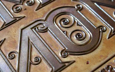
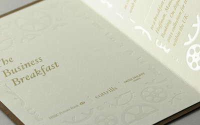
The vellum “cover” page before everybody’s story really adds a fun touch and mystery to what’s behind it, with the text faintly showing through. Red and Black were the main colors as that’s been JCPenney’s main color scheme (well, Red at least). A heavy use of rules was used that’s inspired by James Cash Penney’s (founder of the company) “Golden Rule” ideology.
This was an insane labor of love and probably one of the projects I’m most proud of. Everything was designed, printed, hand trimmed and assembled by me, in between making dinner and feeding my at-the-time 5-month-old son. Which lemme tell ya, ain’t easy.
Trimming everything by hand was probably the most time-consuming aspect of this. And numerous trips to the paper store when the printer would jam when trying to print the cover and back cover. I also hand-punched every page, using the cover as a template—I wish I would’ve had them drilled. But I like that this project was completely done by hand (aside from the printer and computer, of course).


Celebratory Book for Dad
Production Method
Design
Design: Chris Halverson
Writing/Editing: Matt Halverson
Printing
Chris Halverson
This post was published in the original layout of FPO so all images are smaller. Project descriptions as well as production lessons are quoted in the main content area.


About
FPO (For Print Only), is a division of UnderConsideration, celebrating the reality that print is not dead by showcasing the most compelling printed projects.
FPO uses Fonts.com to render Siseriff and Avenir Next.
FPO is run with Six Apart’s MovableType
All comments, ideas and thoughts on FPO are property of their authors; reproduction without the author’s or FPO’s permission is strictly prohibited
Twitter @ucllc
Sign-up for Mailing List
Mailing list managed by MailChimp
Thanks to our advertisers
About UnderConsideration
UnderConsideration is a graphic design firm generating its own projects, initiatives, and content while taking on limited client work. Run by Bryony Gomez-Palacio and Armin Vit in Bloomington, IN. More…
blogs we publish
Brand New / Displaying opinions and focusing solely on corporate and brand identity work.
Art of the Menu / Cataloguing the underrated creativity of menus from around the world.
Quipsologies / Chronicling the most curious, creative, and notable projects, stories, and events of the graphic design industry on a daily basis.
products we sell
Flaunt: Designing effective, compelling and memorable portfolios of creative work.
Brand New Conference videos / Individual, downloadable videos of every presentation since 2010.
Prints / A variety of posters, the majority from our AIforGA series.
Other / Various one-off products.
events we organize
Brand New Conference / A two-day event on corporate and brand identity with some of today's most active and influential practitioners from around the world.
Brand Nieuwe Conference / Ditto but in Amsterdam.
Austin Initiative for Graphic Awesomeness / A speaker series in Austin, TX, featuring some of the graphic design industry's most awesome people.
also
Favorite Things we've Made / In our capacity as graphic designers.
Projects we've Concluded / Long- and short-lived efforts.
UCllc News / Updates on what's going at the corporate level of UnderConsideration.

Related entries
Severe(d): A Creepy Poetry Collection by Holly Riordan
BOYCO Classpack® Book
Antes de Perder la Esperanza Book
Gunnel Wåhlstrand Exhibit Book
Szép versek & Körkép Book Covers