ADV @ UNDERCONSIDERATION Peek here for details
BROWSE
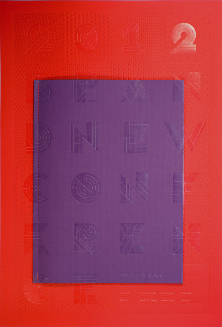
2012 Brand New Conference Program and Poster
Production Method
Foil stamp
Letterpress
Design
UnderConsideration
Printing
Henry+Co / Newspaper Club
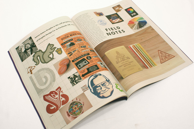
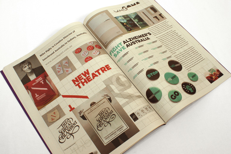
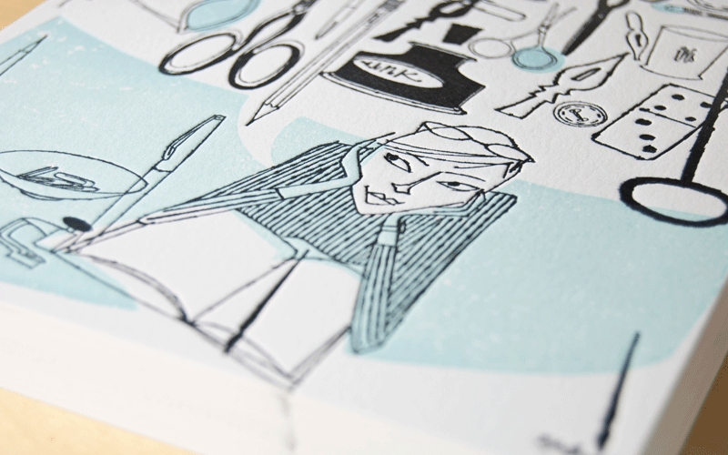
The programs for the first two Brand New Conferences were very mild affairs: 5-by-7-inch booklets, using some interesting paper, and saddle-stitched. Nothing wrong with them. But also nothing insanely great about them. The one thing we have tried to do each year is make them a brief showcase of our speakers’ work, so we always include a few images of it to make it more of a keepsake. This year we wanted to turn the volume up to 11 and do something more interesting.
Results are posted immediately after the specs and we have a few copies left, which you can purchase. (Shipping within the U.S. is included. International orders add $5.00 per item.) Then there is a lengthy explanation of the process after the images (for those masochists who enjoy reading about this kind of stuff).
Client
Self
Quantity Produced
700 each
Production Cost
N/A: Both were part of barter
Production Time
1 Month
Dimensions (Width × Height × Depth)
Program: 11.3825 in × 15 in
Poster: 16.5 in × 24 in
Page Count
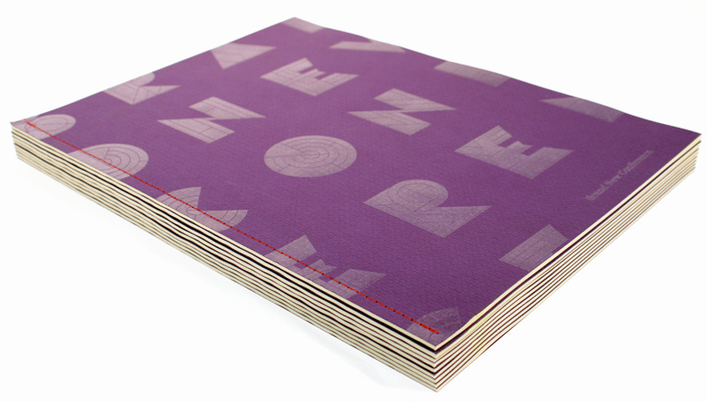
Program: 48 + cover
Paper Stock
Program Body: Newsprint
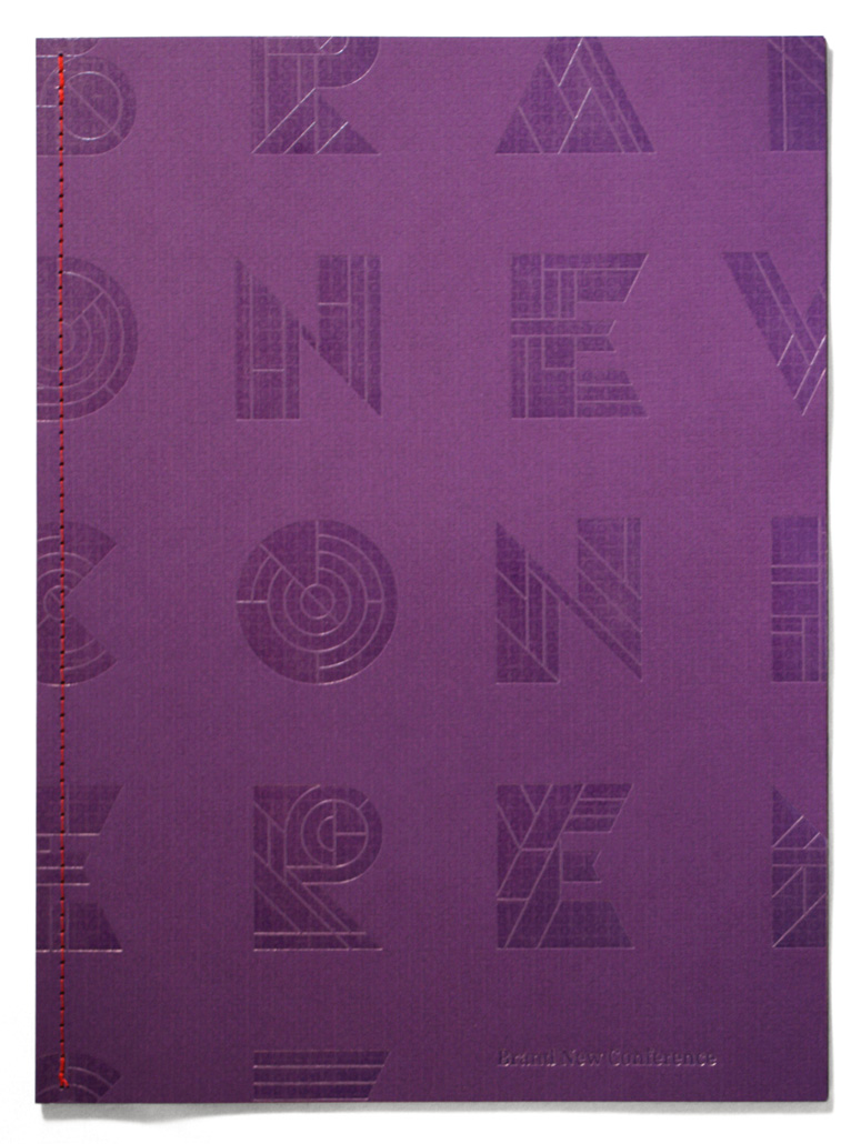
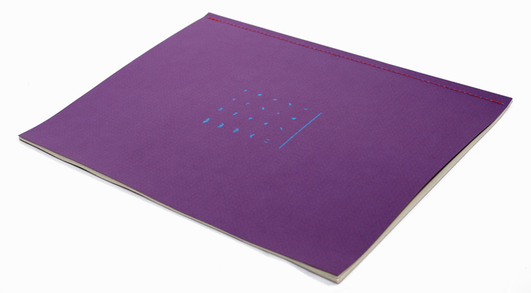
Program Cover: Neenah EAMES / Furniture / Kaleidoscope Purple / 80C
Poster: Neenah CLASSIC CREST / Eggshell / Red Pepper / 130DTC
Number of Colors
Program Body: 4/4
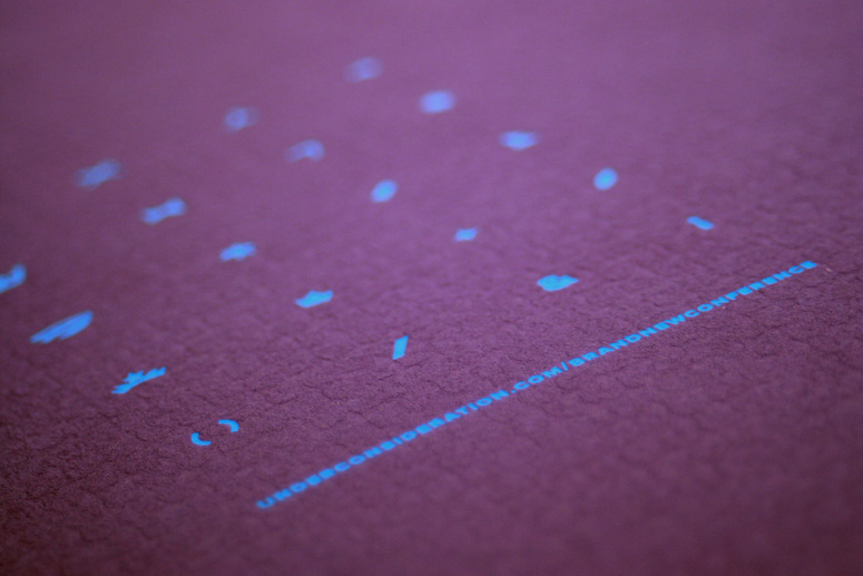
Program Cover: 2 Foil Stamp (clear foil in front, blue foil in back)
Poster: 1 hit of tinted letterpress + 1 clear foil
Varnishes
–
Binding
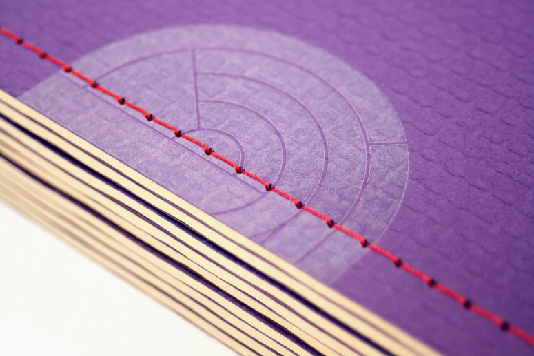
Sewn with red thread
Typography
Meta Serif
Proxima Nova
Poster |
Program |
Programs are shipped flat in a rigid mailer. Posters are shipped rolled in tubes. Orders of both items are mailed separately.
Program
Poster
Poster |
Program |
Programs are shipped flat in a rigid mailer. Posters are shipped rolled in tubes. Orders of both items are mailed separately.
I have been wanting to use the Newspaper Club for a few months now. For those who don’t know, Newspaper Club makes it extremely easy to print newspapers by ganging up multiple projects on one print run and maximizing the effort and cost it takes to get a web press running. They have a super simple method for uploading a full-proof PDF and then you get a newspaper on your doorstep a couple of weeks later. Doing it with Newspaper Club meant I could have a very large canvas and have plenty of pages without having a huge cost. You obviously sacrifice image quality but I think people are quite forgiving in that regard, and the size of it makes up for any newspaper-ey limitation.
So, Idea Number One: print the guts of the program with them. Which led to Concern Number One: the thing I don’t like about newspapers is that once you open them and flip through them they are impossible to keep together and pages start falling out of your hands and unto the floor, making the experience irksome, and imagining our attendees fumbling with the program didn’t feel right. Hello Idea Number Two: What if, once we got the newspapers, we trimmed the spine and then bound them in something more sturdy so that the pages were contained? The newspaper arrives as a giant signature anyway, so as long as I left wide enough margins on the inside we could trim off an eighth of an inch without sacrificing space.
With those ideas in place I also started thinking about a fun commemorative poster that would take advantage of the cool patterns we had made for the conference’s identity so I approached Atlanta, GA-based Henry+Co to see if they would be interested in doing it for us. Luckily we are both mutual fans of each other so agreeing to work together was a easy.
I told Jason Henry about the program too, to see if they wouldn’t mind making it part of the deal. He agreed. But I’m not a douchebag and I didn’t want to overstay my welcome so Concern Number Two came up: How can I make sure that I don’t make Henry+Co spend more money than they need to and how can I make their job easier? Idea Number Three came up: I was sure there was a way to recycle the larger plate(s) for the poster to be reused on the program cover but somehow make them feel like they were two different things altogether.
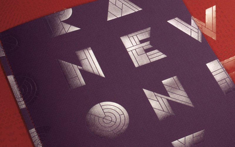
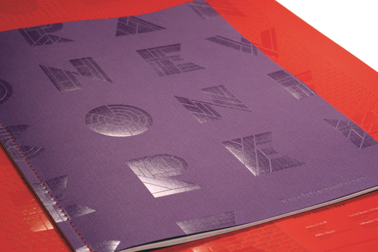
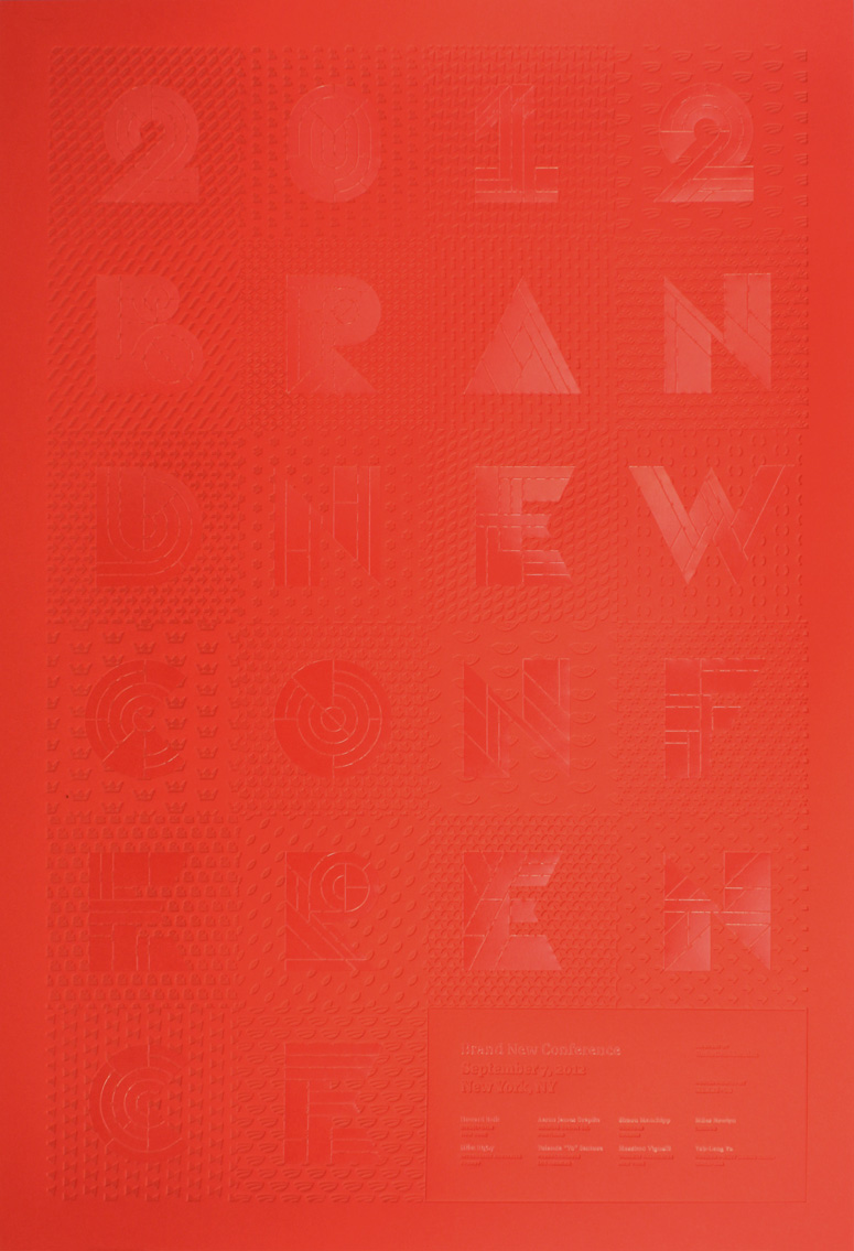
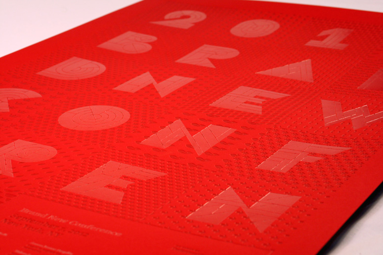
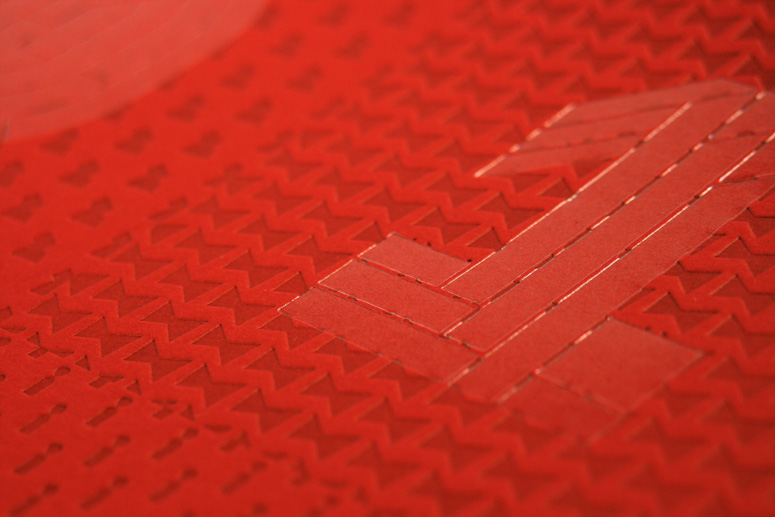
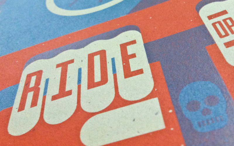
I started designing the poster and cover the program jointly to make sure than one informed the other and that somehow some of the artwork could be reused. Eventually, through enough math and positioning I came up with a design where large letters would spell out the conference name and they would be seen in full on the poster. Then that same plate could be used on another kind of paper and it would simply be a tight “crop” of that plate. Talking it through with Jason we decided to make that plate a clear foil stamp so that it would take on the flavor of the paper and make the two items feel different.
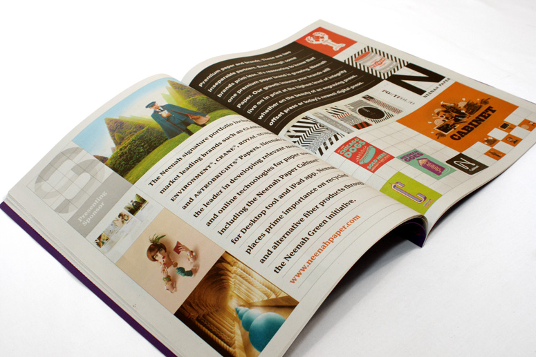
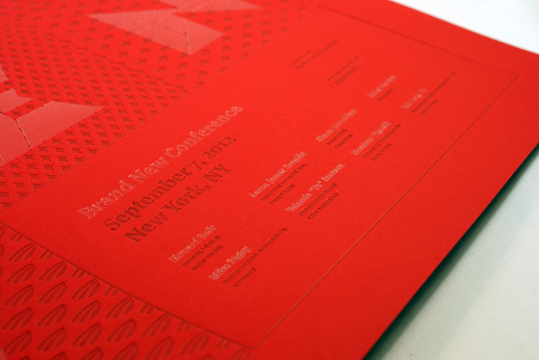
For the third year in a row, we got to pick our paper from Neenah, who have sponsored the conference three years in a row, and each year their selection seems to grow and/or get better. Based on our color palette — red, purple, navy blue, and cyan — I looked for matching papers. In their CLASSIC CREST family, Neenah has introduced a most delicious “Red Pepper” color across many finishes and weights. Jason suggested aiming for the fences and going with the grandaddy of a 130 double cover weight. There weren’t any bright blues to be had, but there was a purple in the EAMES line, which had a great texture too. The only problem was that the heaviest it came in was 80 cover which wouldn’t get much of an impression from the clear foil, but the color matched and I figured that the lighter cover would match nicely with the light newsprint. You can see the relationship below between the two papers and the large clear foil plate. I was damn proud of arriving at that layout.
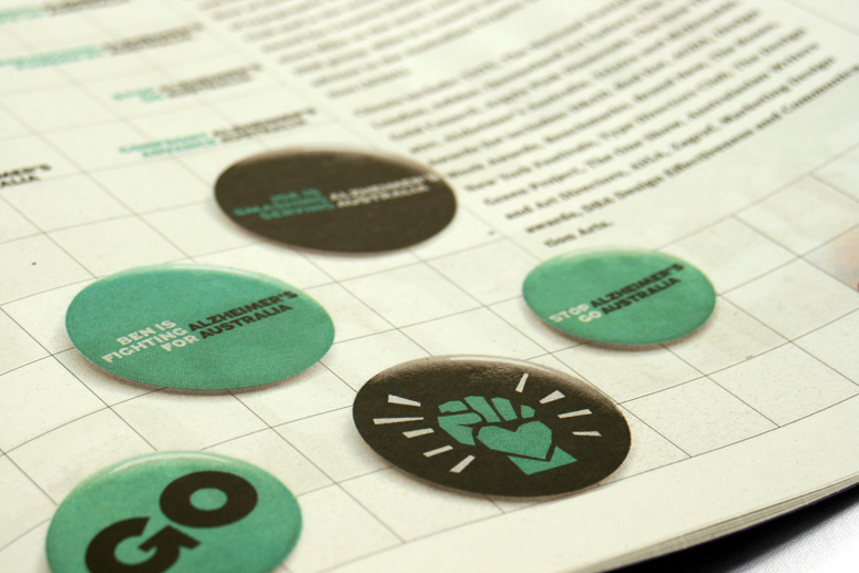
The program was finished with red thread, another of our colors and in the back it has a breakdown of the logo “debris” that we pillaged printed in a bright cyan foil, so we managed to hit three of the four colors in our palette.
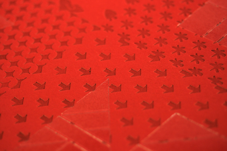
For the poster I wanted a lot of texture in the patterns of the logo debris, so I knew it had to be either letterpress or debossing. Jason suggested letterpress. I wanted a tone-on-tone effect and chose a dark red PMS to hit the red paper. I wasn’t convinced it was the right move, but I went with it. While on press, Jason wasn’t happy either and pulled the PMS. He tried a blind hit but that wasn’t too legible. He then tried a tinted hit, which darkened the paper a bit more and he was happy. He sent me photos, I saw them on my iPhone, and approved it from a taxi. The finished poster has a subtle effect of tones of red and if you touch it, I’m sorry to say, but it might give your fingers a small orgasm. That’s how good letterpress and foil stamp feel on this Red Pepper Neenah Paper.
We have a few copies left, which you can purchase. Shipping within the U.S. is included. International orders add $5.00 per item.
Poster |
Program |
Programs are shipped flat in a rigid mailer. Posters are shipped rolled in tubes. Orders of both items are mailed separately.
Project Description
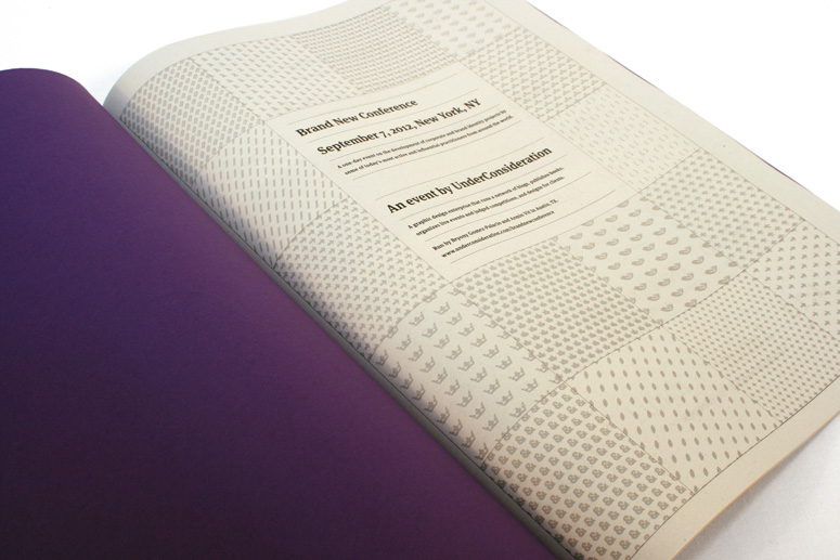
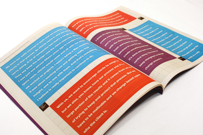
Materials for the 2012 Brand New Conference held in New York on September 7, 2012. The program is a generous showcase of the speakers' work, not just the typical bios and headshots. The large spreads allow for plenty of images, many of sizable proportions. Also featured are profiles of the event's sponsors that forego the typical ad and instead feature "brand deconstructions".The poster is a commemorative token of the event, given away to attendees.
Production Lesson(s)
Program: If you choose your colors wisely with simple CMYK breakdowns the color accuracy and registration on newsprint on a web press there is not much to worry about and as long as your expectations are set accordingly — less saturated and detailed photos and variation on colors — the results are fantastic.Poster: I had originally specified a red PMS to hit the red paper, hoping for a tone-on-tone effect, but I kind of knew it wasn't going to play out nicely; Henry+Co on the spot switched to a tinted letterpress that simply darkened the paper instead of putting a color ink on it and it achieved the exact result I wanted.

Post Author

Armin Vit
Editor of FPO and co-founder of UnderConsideration LLC.
More: Online / On Twitter
Date Published
September 19, 2012
Filed Under
Foil stamp
Letterpress
Print Method
Tagged with
foil stamp
neenah
newsprint
thread sewn
tinted letterpress


About
FPO (For Print Only), is a division of UnderConsideration, celebrating the reality that print is not dead by showcasing the most compelling printed projects.
FPO uses Fonts.com to render Siseriff and Avenir Next.
FPO is run with Six Apart’s MovableType
All comments, ideas and thoughts on FPO are property of their authors; reproduction without the author’s or FPO’s permission is strictly prohibited
Twitter @ucllc
Sign-up for Mailing List
Mailing list managed by MailChimp
Thanks to our advertisers
About UnderConsideration
UnderConsideration is a graphic design firm generating its own projects, initiatives, and content while taking on limited client work. Run by Bryony Gomez-Palacio and Armin Vit in Bloomington, IN. More…
blogs we publish
Brand New / Displaying opinions and focusing solely on corporate and brand identity work.
Art of the Menu / Cataloguing the underrated creativity of menus from around the world.
Quipsologies / Chronicling the most curious, creative, and notable projects, stories, and events of the graphic design industry on a daily basis.
products we sell
Flaunt: Designing effective, compelling and memorable portfolios of creative work.
Brand New Conference videos / Individual, downloadable videos of every presentation since 2010.
Prints / A variety of posters, the majority from our AIforGA series.
Other / Various one-off products.
events we organize
Brand New Conference / A two-day event on corporate and brand identity with some of today's most active and influential practitioners from around the world.
Brand Nieuwe Conference / Ditto but in Amsterdam.
Austin Initiative for Graphic Awesomeness / A speaker series in Austin, TX, featuring some of the graphic design industry's most awesome people.
also
Favorite Things we've Made / In our capacity as graphic designers.
Projects we've Concluded / Long- and short-lived efforts.
UCllc News / Updates on what's going at the corporate level of UnderConsideration.

Related entries
The 2011-12 FPO Awards Book
Craftor Studio Canvas Bag
The 2011 Brand New Awards Book