ADV @ UNDERCONSIDERATION Peek here for details
BROWSE
Unlike previous years, 2012 didn’t bring FPO as many posters in terms of quantity. But we can always count on the quality of our submissions and despite having a small pool of posters to celebrate the best, these twelve selections are a handsome dozen.
See also:
Part 1: Jan - Jun
Part 2: Jul - Dec
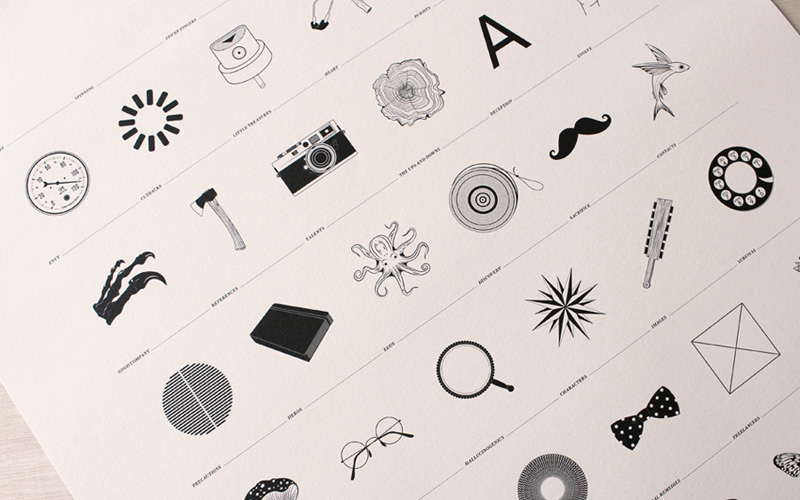
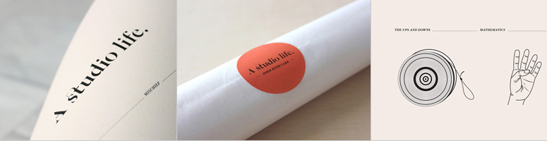
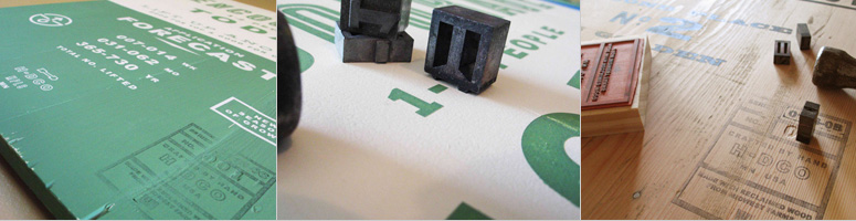
12 — A Studio Life
You gotta love visual puns, metaphors, allegories, allusions, and plain random connections that both poke fun and illuminate the aspects of our dear design profession. A simple offset print in black on a grid with small type goes a long way.
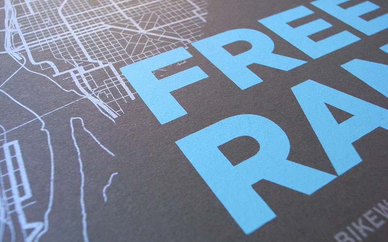
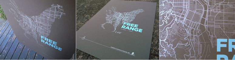
11 — ARTCRANK Free Range Poster
I wish more posters had chickens in them. If, in 2013, we showcase 12 posters with chickens on them, all of them would be included in this list at the end of the year. That this chicken is built of out of Portland’s streets and is printed on chocolate-colored paper only adds to the appeal.
I love me a good overlay and this blue and orange silkscreen poster with all its hard edges and punchy graphics sparks some great third-color magic.
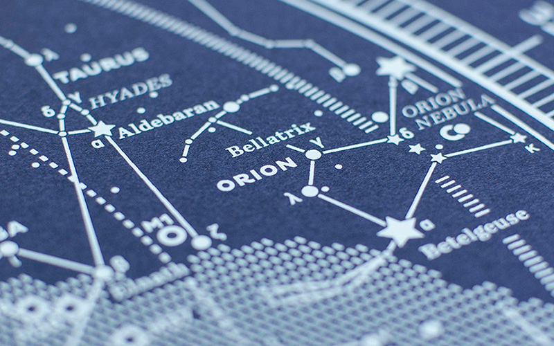
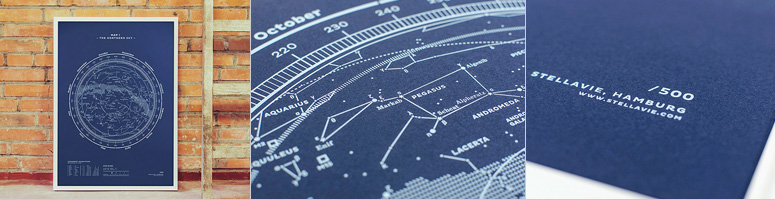
Anyone willing to typeset and vectorize a constellation gets my vote and not only is the design on this gorgeously obsessive but the print is like staring out in the sky while camping in a national park with a little fire burning by your side. Or not. Maybe it’s just an awesome print.
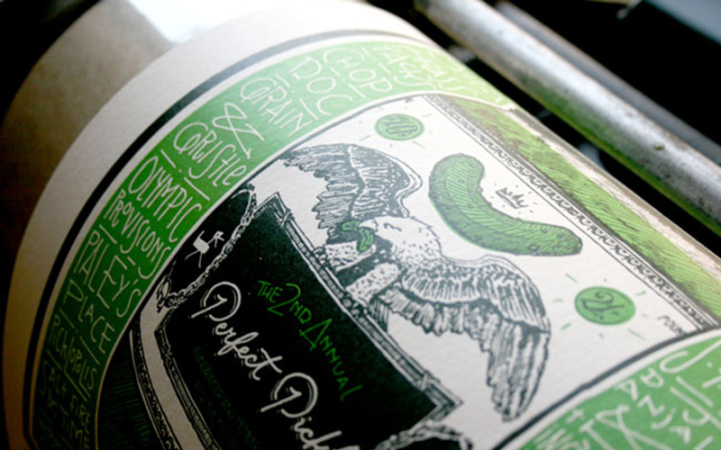
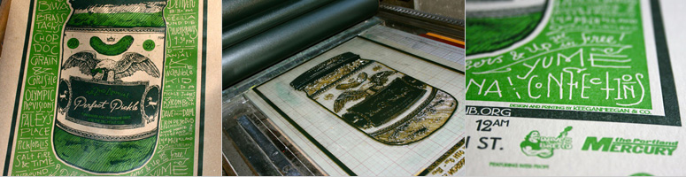
8 — Dill Pickle Club Fundraising Poster
This poster had me at “Pickle”. But also at the letterpress pounding that that paper must have endured under all that ink coverage. Plus, I think there is not enough posters with eagles holding foodstuffs in their beaks.
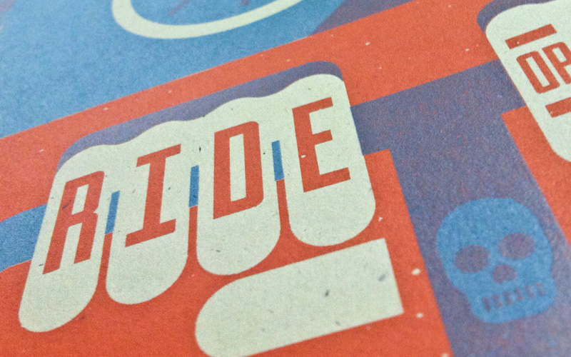
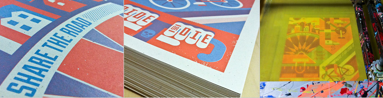
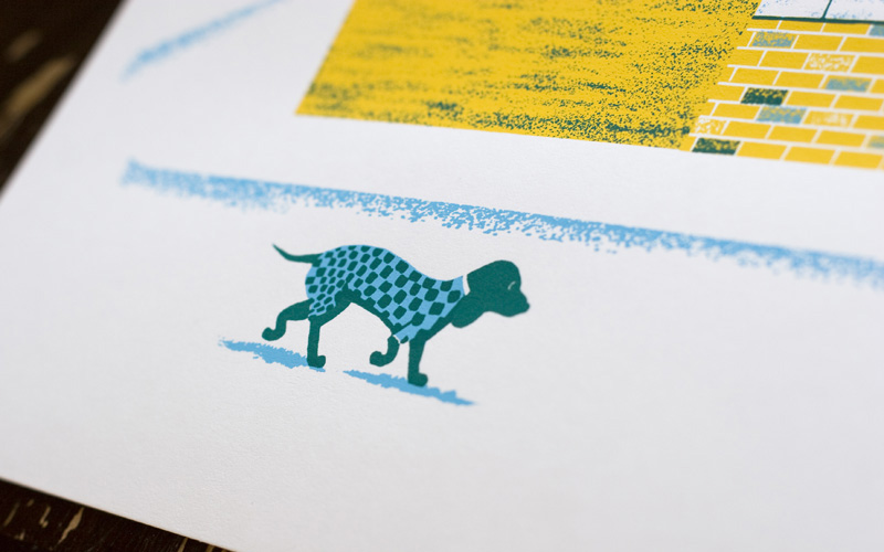
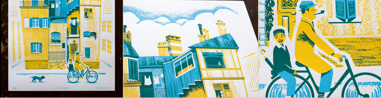
7 — “A Ride Through Town” Poster
What’s not to love in this poster? The roughish textures? The vest-wearing dog? The dapper men on the bicycle? The perfectly stacked clouds? Nope, there is nothing not to love.
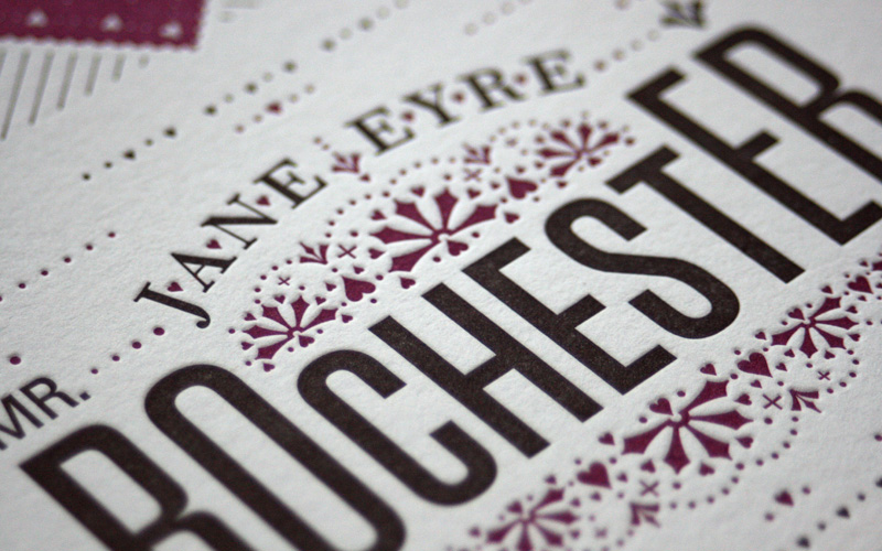
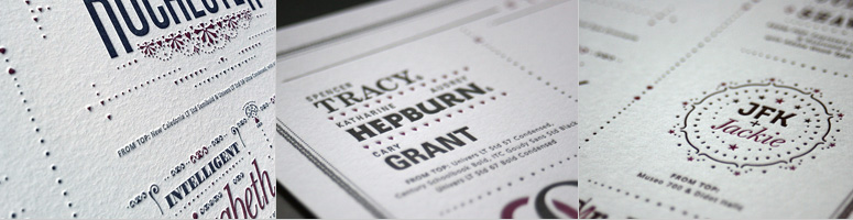
6 — Typographic Matchmaking Poster
Pairing two different typefaces together is almost an art and this letterpress poster of popular, real-life and fictitious pairs makes an artful case for it.
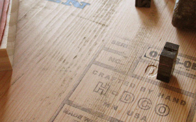
5 — Holmberg Wooden Poster Series
A lot of DIY went into these very limited edition posters, including pressing, manually, some metal type and rubber stamping and stenciling and vinyling and… yeah, just all kinds of loving.
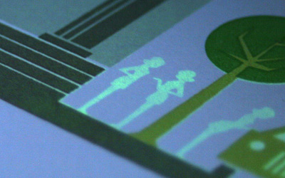
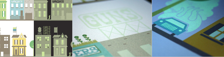
4 — Glow-In-The-Dark Poster Surprise
The phosphorescent ink in this poster turns an innocent Main Street into a seedy underworld in the dark.
Production Method
Silkscreen
Design
Illustration by Jason Dean
Printing
Printing by David Chad @ Chad's Screen Printing of Orlando.
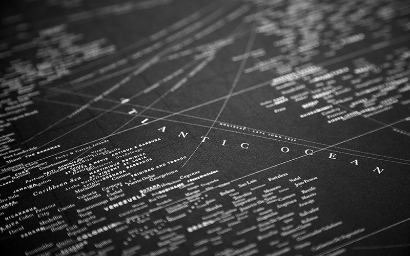
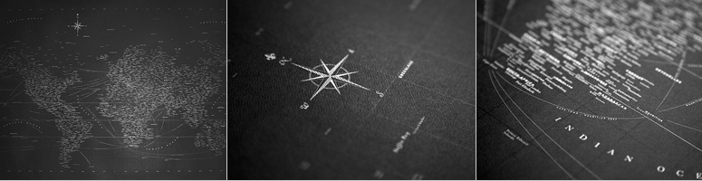
3 — Chartis Graphein
Dude! That is some serious typesetting hours that went into this and the white/silver printing on black stock elevates this world map to Must-Have status.
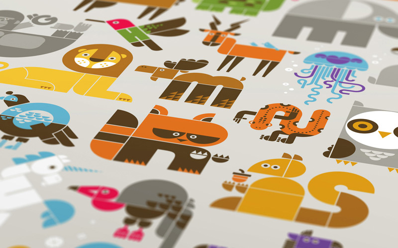
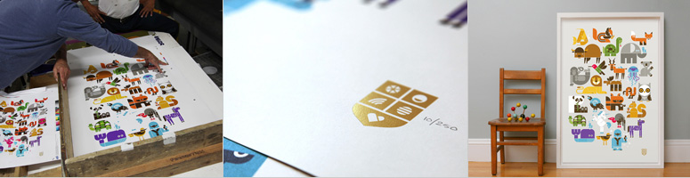
2 — Wee Alphas Limited Edition Screen Print
Dude! (Sorry). This is a 13-color silkscreen print. This is, like, Registration X-Factor. Adding to the printing feat are the clever, cheerful animal-letters created by Office.
Production Method
Foil stamp
Silkscreen
Design
Office: Jason Schulte Design
Printing
Belaire Displays
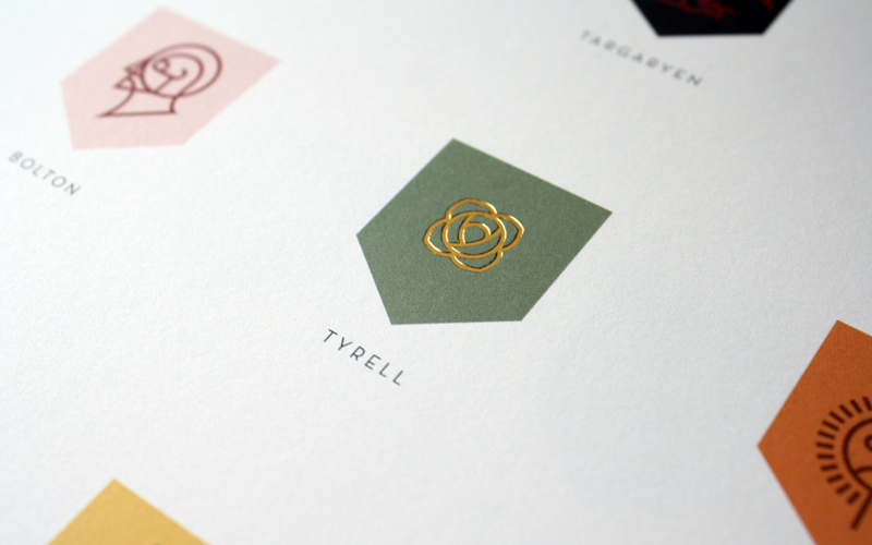
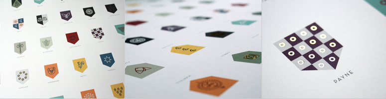
1 — Sigils of the Houses of Westeros Poster
If I had a penny for every e-mail we received asking if this sold-out poster was going into a reprint I would have, um, 50 cents. Which doesn’t sound like much, but we’ve never had this kind of feverish interest in any project we’ve published. And it deserves all the attention and lusting it’s gotten. Expertly designed and handsomely produced this Game of Thrones homage is not just the best of the posters but I would most likely take it as my favorite FPO project of all 2012.
Post Author

Armin Vit
Editor of FPO and co-founder of UnderConsideration LLC.
More: Online / On Twitter
Date Published
January 2, 2013
Filed Under
FPO News
Tagged with
Best of FPO
end of year list


About
FPO (For Print Only), is a division of UnderConsideration, celebrating the reality that print is not dead by showcasing the most compelling printed projects.
FPO uses Fonts.com to render Siseriff and Avenir Next.
FPO is run with Six Apart’s MovableType
All comments, ideas and thoughts on FPO are property of their authors; reproduction without the author’s or FPO’s permission is strictly prohibited
Twitter @ucllc
Sign-up for Mailing List
Mailing list managed by MailChimp
Thanks to our advertisers
About UnderConsideration
UnderConsideration is a graphic design firm generating its own projects, initiatives, and content while taking on limited client work. Run by Bryony Gomez-Palacio and Armin Vit in Bloomington, IN. More…
blogs we publish
Brand New / Displaying opinions and focusing solely on corporate and brand identity work.
Art of the Menu / Cataloguing the underrated creativity of menus from around the world.
Quipsologies / Chronicling the most curious, creative, and notable projects, stories, and events of the graphic design industry on a daily basis.
products we sell
Flaunt: Designing effective, compelling and memorable portfolios of creative work.
Brand New Conference videos / Individual, downloadable videos of every presentation since 2010.
Prints / A variety of posters, the majority from our AIforGA series.
Other / Various one-off products.
events we organize
Brand New Conference / A two-day event on corporate and brand identity with some of today's most active and influential practitioners from around the world.
Brand Nieuwe Conference / Ditto but in Amsterdam.
Austin Initiative for Graphic Awesomeness / A speaker series in Austin, TX, featuring some of the graphic design industry's most awesome people.
also
Favorite Things we've Made / In our capacity as graphic designers.
Projects we've Concluded / Long- and short-lived efforts.
UCllc News / Updates on what's going at the corporate level of UnderConsideration.

Related entries
The End
No Posts this Week
We are Moving! (No Posts this Week)
The Best of 2016 on FPO, Part 2: Jul - Dec
The Best of 2016 on FPO, Part 1: Jan - Jun