Announced Oct. 28, 2016 by Armin No Comments on Brand New’s 10 Year Anniversary
Today Brand New turns ten years old. I had originally planned a quick, one-paragraph post acknowledging the milestone but as soon as I started gathering some facts and figures I got carried away and delved some more into our Google Analytics, parsed all the words ever written, and then flushed out some thoughts about what it’s been like writing this blog for so long. Whether you’ve been reading for all 10 years, half that time, or have just recently become a regular reader: thank you!
Posts4,476
Comments250,000+
United States45.78%
United Kingdom7.36%
Canada5.46%
Australia3.42%
Germany2.71%
Brazil2.49%
France1.90%
China1.55%
India1.52%
Pentagram273
Wolff Olins170
Interbrand164
Landor149
Futurebrand97
Lippincott90
Moving Brands69
Great1,968
Bad1,283
Nice1,267
Sans1,046
Established929
Overall909
Color palette371
Hate304
Subtle223
Gotham170
Helvetica168
Poor155
Terrible115
Sexy100
Annoying96
Kerning67
On October 28, 2006, we published the first post of Brand New: a review of the Chicago 2016 Olympics Candidate City logo. Probably the first time anyone cared about a candidate city logo, a practice that, ten years later, is a big deal. At the time, we posted two or three posts a week and half of them were not even by me but by Dave Weinberger who wrote many of the posts from the first year. Perhaps there wouldn’t even be a Brand New if weren’t for Dave, who started a regular “column” on our first blog, Speak Up, called “Recent Rebrandings” that preceded Brand New by about a year and showed us the first glimpse of the passionate commentary that logo redesigns could ignite. At the time, many on Speak Up, did not appreciate the “this sucks” kind of commentary and thought that logo discussions had no place there, so that’s when we decided to start a new blog just for logo discussions. Here is the big announcement from when we launched Brand New on Speak Up.
Traffic
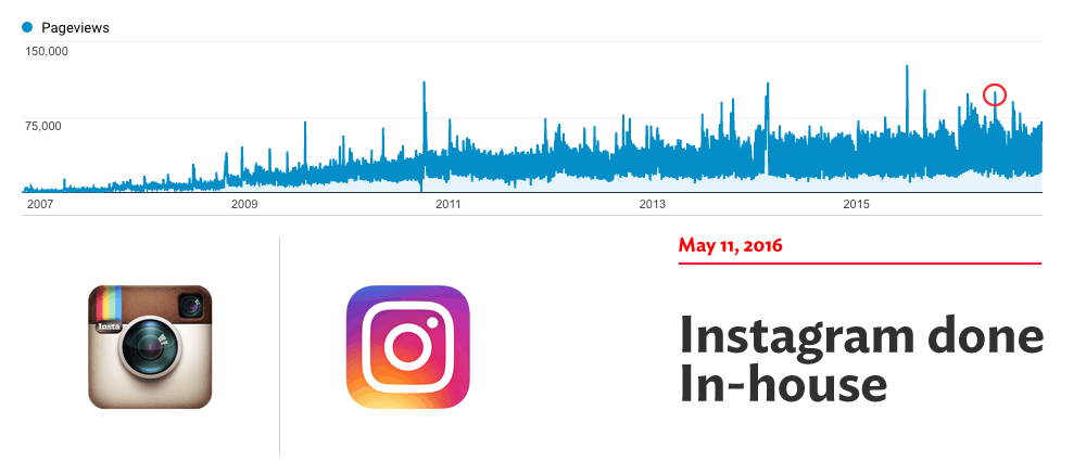
Brand New launched to 76,000 pageviews that first month in 2006. By January 2007 readership had actually dropped to 47,000 pageviews in a month but by 2008 it started a fast ascent, clocking 211,000 monthlies in 2008; 471,000 in 2009; 761,000 in 2010; and finally breaking the million-pageviews-a-month in 2011. In the past 12 months we have averaged 1.46 million pageviews and 262,000 unique visitors a month. While still a far cry from the Gizmodos and WIREDs of the world, for a blog devoted solely to logo and identity reviews, I find these numbers fascinating. Not in a bragging way — it just amazes me how much a simple, single-minded premise has grown.
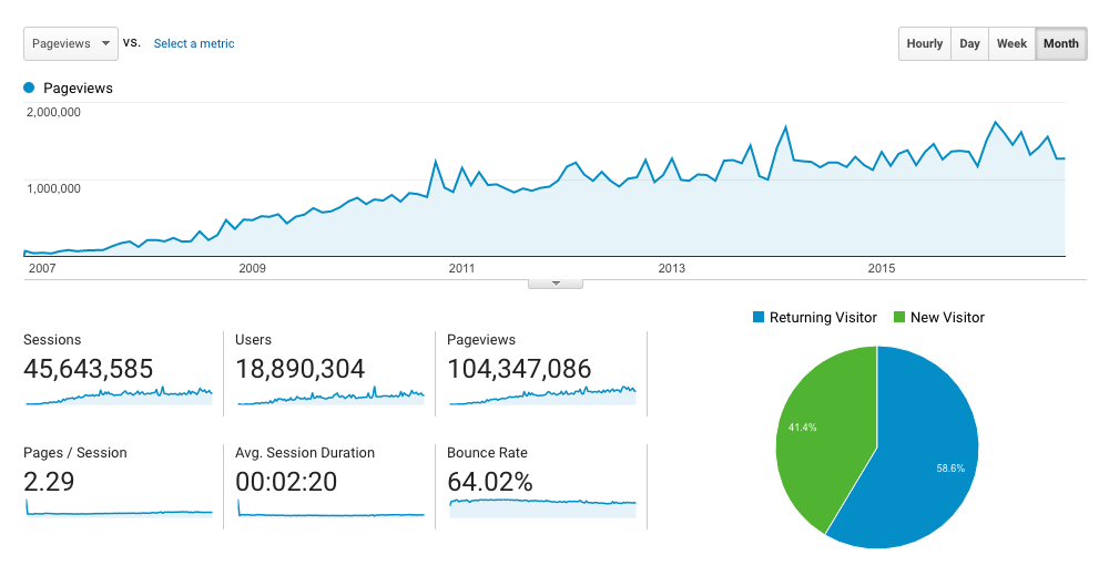
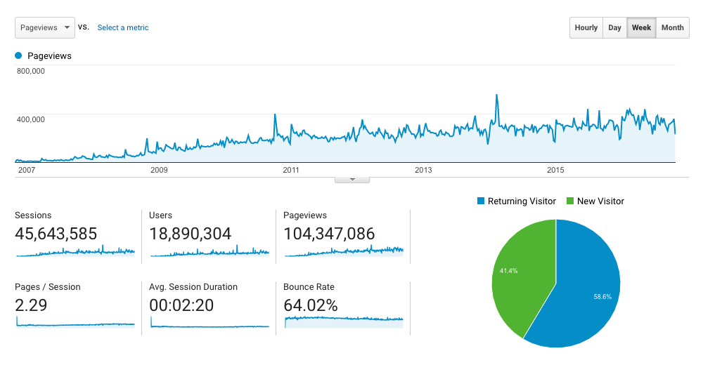
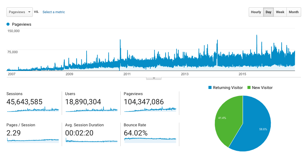
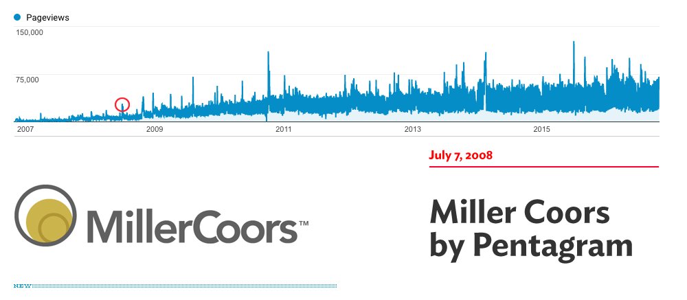
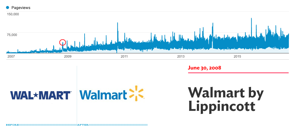
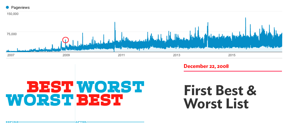
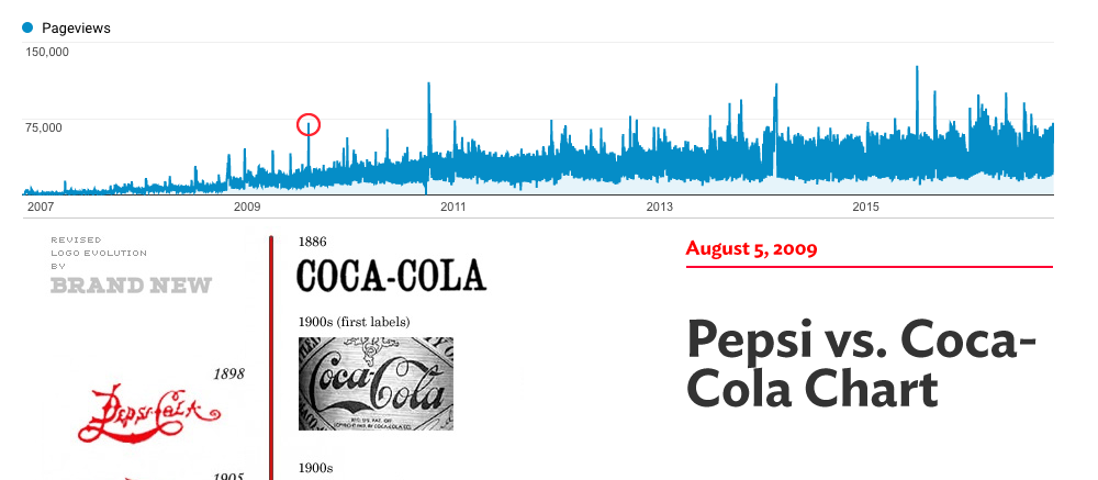
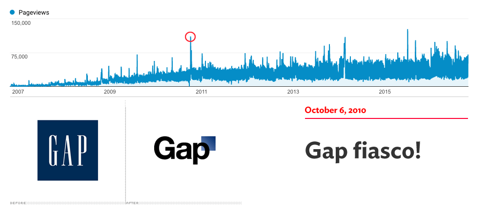
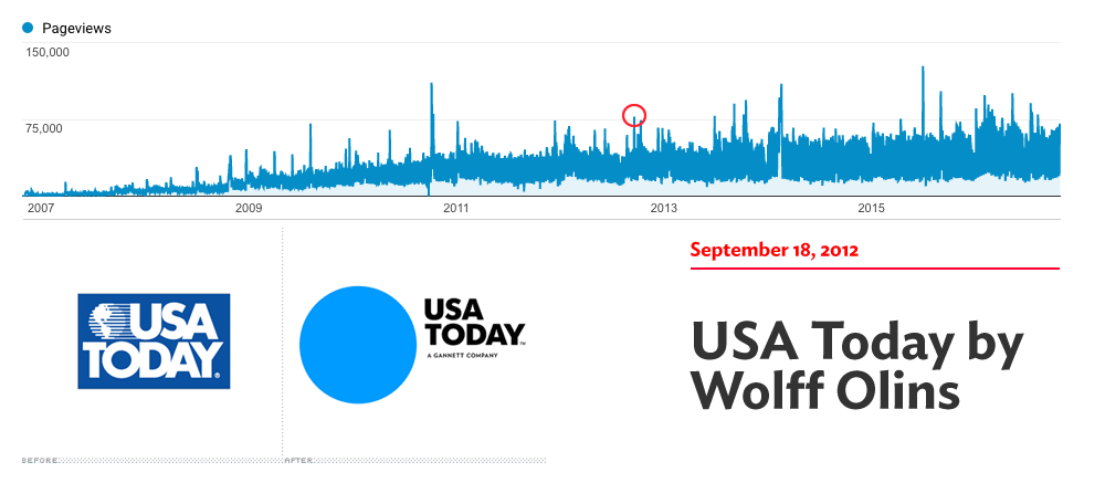
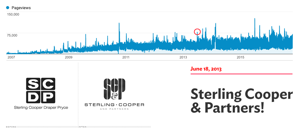
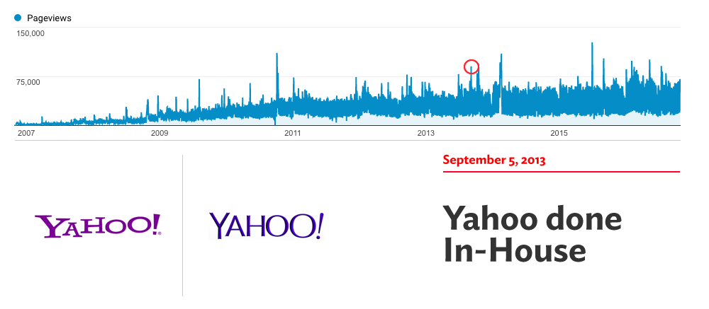
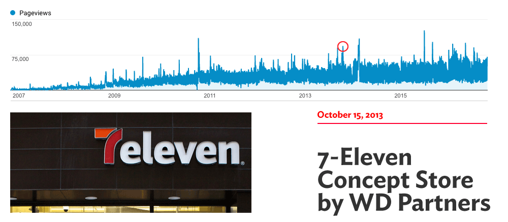
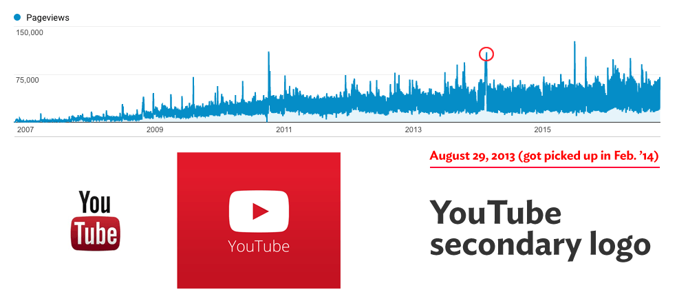
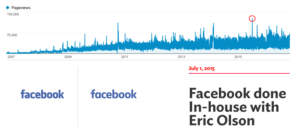
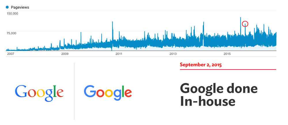
In this last chart, of growth by day, the increase isn’t as clear as the monthly but it shows some epic spikes. It’s these spikes that have been the main triggers for the growth of Brand New. After every spike, where a ton of new readers end up on Brand New, many stay as recurring readers. So, let’s look at what some of those spikes are.
Spikes

It’s funny — although very sad for them — how the Gap fiasco remains one of our biggest traffic spikes, especially relative to normal traffic. Interesting that the top three spikes in recent years are from Facebook, Google, and Instagram — the big three that dominate our world right now. Here is looking at Snapchat for the next big spike. The YouTube logo… that’s actually the most visited post ever but I don’t remember it being that popular.
April Fools
Not reflected as evidently in the spikes are our April Fools’ posts, which have always been quite popular and I usually see an uptick in readers that stay.

Writers
There are 4,476 posts in our system and I’ve written 4,228 of those posts. That’s 94.4% of the content. Maybe 10 – 15% of those are filler or announcements or even posts that are not live but that’s still a shit-ton of posts. That other 5.6% of posts have been written by a number of well-intentioned folks. As mentioned earlier, Dave Weinberger was one of the first writers on Brand New other than me. The second most prolific writer behind me was Christian Palino who wrote close to 50 posts. Sam Becker, Clinton Duncan, John Feldhouse, and Ryan Hembree all contributed in the double digits. Even Bryony tried her hand at it at some point but she did not like doing it at all. Then there was a period of time where I sought international writers to write about identities that originated in their country but this was one of the worst deviations from the norm as the writing always needed a lot of touch-up and everyone had a different style and, um, attention to detail.
The biggest detriment in having other writers was that this was not anyone else’s way of making a living so they didn’t HAVE to write on demand as I do and they didn’t feel the pressure of having to deliver content on time in relation to a press release. This is not their fault; other than a byline, they were not getting anything so I don’t blame them at all but it was no structure to be able to maintain Brand New (and my sanity). I also often didn’t agree with what they wrote and that was weird for me mostly. So in the past three or four years I have written everything and I turn down offers from anyone that wants to write for Brand New… except for Mark Kingsley, who writes great, thoughtful posts that are a complete antithesis to mine and are always a hit with readers.
Still, I thank all the people who have contributed their time.
My Writing and Formula
Being the sole writer and turning down offers from others to write for Brand New is not an indication that I think I’m the best writer. Not by a long-shot. I actually envy the way Richard Baird writes for his own BP&O site where he can articulate really what a design is doing. BUT what I do think I have nailed down that’s not easy to replicate by someone else is a formula and when you have to write one post every day for ten years you either develop one or you lose your mind and the rest of the day. You’ve probably noticed it but just in case:
1. State the facts, beginning with what year the thing was established because that creates an instant point of reference, “oh, this thing is old” or “okay, this has only been around for 10 years”. To me, that instantly gives you one way to judge the work. The rest of the facts state what the client is and does; sometimes, if I’m familiar with the client I will add an observation that establishes with you that I’m familiar with it and that my observations are now officially based (and biased!) on my own experiences.
2. Credit the designer or firm, because we all want to know if it’s time to hate on Pentagram, amiright? Kidding aside… yeah, you want to know who did what and even with the rise of interest in logo redesigns it’s still amazing how many clients DON’T credit their designers. When I don’t post a credit you might think that I’m poor at journalism — and to a degree yes because I don’t go calling around media relations people because they never reply — but unless they are credited, it’s nearly impossible to find out who designed what, even if it’s one of the big ones. So unless I started Googling “Client + Landor”, “Client + Futurebrand”, “Client + Pentagram” until I hit on a combination that matched, there is no easy way. Usually, after the post goes live, I’ll get the credit either from the designer or a friend of the designer. 95% of the time it’s “Hey, it was me, can you add our credit? yay!” and 5% of the time it’s “Hey, asshole, how come you didn’t give us credit? EVERYBODY knows we did this. Now credit us or we will sue you.” For real. Anyway… back to the formula.
3. A quote from the designer. Usually a small paragraph can explain the whole thing. I put it first thing so that you can use it as a quick way to judge the rest of the work.
4. Talk about the logo. First the old logo to establish what was wrong or right about it; then the new one to see if it improved or dis-improved on the old one.
5. Show applications where available.
6. A fairly quick review of the applications. I usually devote more time and word count to logos than applications, unless the applications are awesome. Or terrible.
7. Close with “Overall…” this or that in a single sentence that summarizes everything I said in a “yay” or “nay” manner and tries to acknowledge what good or bad the design did.
8. Publish.
Criticism vs. Opinion
Although what I’m doing on a day to day is officially a critique of the work, I don’t consider myself a “critic” in any way whatsoever. I share my opinion and I provide commentary on what I see without any intentions of changing the industry or blow people’s minds with quotes of French philosophers — no offense Mark! Perhaps by now you’ve heard me say this but I consider what I’ve been doing on Brand New to be like sports commentary: I call the plays on a sport that I have experience in, that I know enough about to claim some kind of authority, and that I deeply enjoy and I get excited and saddened by it and sometimes I’m right and sometimes I’m wrong. And I do it every single day. I have biases, preferences, and conflicts of interest but I’m proud of all of them — if not proud, I can totally live with them. A critic should be devoid of these or at least not flaunt them : )
The Comments
There is nothing more divisive in others’ opinions about Brand New than what they think of the comment section and the many characters that populate it. Some people hate it, others love it. I just can’t imagine Brand New being the same without them. Sometimes they make me happy, sometimes they make me angry but, more than anything, I love that everyone feels confident to speak their mind to different degrees of reasoning behind it. Whether any of us agree with everyone else all the time or part of the time or never, what matters is that we are able to just hit “Post” on whatever’s on our mind and as long as it’s courteous and mostly well written and thought out, everybody’s welcome. If you are an ass, then you will soon know you are being an ass.
Tips
The main fuel of Brand New is the tips. We currently get an average of 160 tips a month. In my email inbox I have slightly over 10,000 tips since 2012 which is what I have in the current Mac “user”. Without all the individual tips I really don’t know how I would find out the content from anything that’s not a huge release. So keep ’em coming for the next 10 years.
I don’t Reply to Emails
If you’ve sent a tip — either about your work or someone else’s — and I didn’t reply, please don’t take it personally. It would be impossibly time-consuming to answer everyone but please know that I read and look into every single tip that comes in, which may not make things any better that I didn’t not just not reply but not post the work as that means I didn’t think it was “worthy” to include on Brand New… Which brings us to the next point.
Criteria for Posting
One of the things I think makes Brand New successful traffic-wise is that the work shown engenders some kind of investment because the “clients” are either well-known or of a nominally large size that they have an impact on the world or that they represent something we kind of know or are familiar with and can establish some kind of connection with it. So for example, I would not post about a single hamburger joint in Austin — except for a Friday Likes — because a large portion of our readership would not care. But I would definitely write about Burger King because everyone can relate. For the clients in between — the local or regional burger chains — that depends on the quality or interesting-ness of the work and whether it gets a full Review, or is Noted, or not included. A simple formula for what gets on Brand New would be:
– Client is Big + Work is Great, Fine, or Bad: 100% chance of getting in.
– Client is Medium + Work is Great: 75% chance.
– Client is Medium + Work is Fine: 50% chance.
– Client is Medium + Work is Bad: 60% chance.
– Client is Small + Work is Great: 75% chance.
– Client is Small + Work is Fine: 5% chance. (Because then no one cares).
– Client is Small + Work is Bad: 25% chance. (Because at least we can make fun of it learn from it).
Getting that Logo File
Let me tell you something: I’m a fucking boss when it comes to getting a high-res version of a logo. You would think that in today’s age, clients would post high-res versions of their logo when issuing a press release and I would say 80% of clients now do but those that don’t, man, the hunt is on! Recently, logos deployed online as SVG have made my life much easier as I can save, open in Illustrator, and make it big or small or change the colors. Some clients get extra nifty with their coding and the logo is built into an icon font so what I do is zoom in in the browser, then hit “inspect element” and I increase the “font size” until I can take a decent screen shot. Sometimes there will be a PDF buried in the press section or an annual report with the logo as a vector that I can download and open in Illustrator; the worst is when the logo is a raster image in a PDF. Facebook profile pics are a last resort because it squeezes out all the resolution in its uploads. So, clients, please! High-res those logos in your press releases.
10 more Years!
Unlike our past blog, Speak Up, where I remember seeing its expiration date about three years before it actually happened, I don’t see Brand New stopping any time soon. As long as there are companies, products, services, sports teams, and even individuals, there will always be content. Competition has gotten tougher in the last two years with every big player from WIRED to Vanity Fair to Fast Company all getting in on the logo-redesign-action and they typically publish first — because they have teams of writers — and their readership is bigger but even if we are a day late (or a week late) and we are not reaching that many people, I’m going to be here, working my formula, and hopefully providing a point of view and a way of presenting the work that sets Brand New apart from them. I also predict the big media will eventually lose interest in logo redesigns in 2 – 3 years and we’ll all still be here, obsessing about kerning and pontificating about how much better we would have done the job if we had been given it for at least for 10 more years!

Comments