

NOTE: This is an archived version of the first incarnation of Brand New. All posts have been closed to comments. Please visit underconsideration.com/brandnew for the latest version. If you would like to see this specific post, simply delete _v1 from the URL.
![]()
I vividly remember the day I stopped watching baseball: It was the day I never started watching it. In part this makes me completely inappropriate to judge anything related to a team with one of the most ardent set of fans, but just as well, this objective detachment from the history of the Boston Red Sox or any nostalgia towards their iconography may be the best suited to pass graphic judgement. This week, the Red Sox unveiled new primary and alternate home and road uniforms plus a new(ish) logo. (Plenty more images and news if you search online for “New Red Sox Logo.”)
Replacing the old seal as the team’s official logo is the lone pair of red, hanging sox. Unless I’m wrong, there is no typography associated with it. None. No “Boston.” No “Red Sox.” If that’s the case, this is one of the best cases of visual identity and brand equity becoming so strong the icon doesn’t need explanation. They are sox. They are red. They can not be anything other than the Boston Red Sox. That’s pretty cool. Having said that, I don’t understand why the socks have to be so dopey. Sure, they are cleaned up from the original version, but I’ve never seen socks so pointed.
Now, the old logo has been cleaned up and has become the secondary logo. You will notice from the graphic below that the “Boston” lettering has been changed from a slab serif to the nostalgic tuscan lettering that defines the Red Sox. From the “Red Sox” word, we can see that the letterforms have been redrawn, gone is that wobbly R. But, again, why so dopey? The new lettering still looks as if it came from a late nineteenth century broadside. This is a twenty-first century team. The tuscan style could have easily been maintained with a more progressive update. The stitches (is that what you even call them?) of the baseball have also been changed, and I think those do look better.
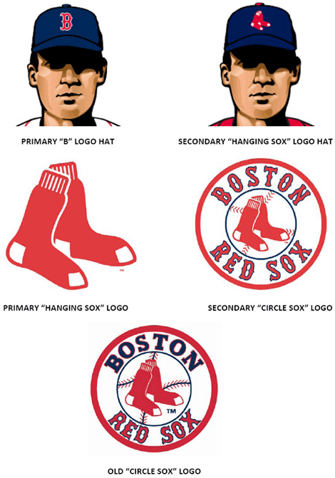
As far as hats go, the lone hanging sox logo becomes the secondary option while the single B becomes the primary hat. Sounds good, but again, streamline and modernize that B, please. Overall, I think this is an interesting evolution that builds on the tradition of the team even if it pulls too heavily on those old-timer strings. The Red Sox Insider Blog has some pictures of the new uniforms.
Thanks to all that sent in the tip.


Jump to Most Recent Comment
Ben’s comment is:
I way prefer the old one. Having just the red socks looks like Dr. Seuss is the major sponsor.
On Dec.19.2008 at 08:06 AM
Willis’s comment is:
I'm a Sox diehard of several decades. To me this is good change, but plenty of my fellow Nation'ers seem to think that it's messing with a good thing. I love the new uniforms, which you (appropriately) did not cover here. Nobody has any strong attachment to the seal, so seeing it relegated to the secondary logo is fine. With respect to the font adjustments, fine, but again the point isn't really to streamline things as much as give them a "yesteryear" sheen.
The pair of socks alone has been an informal logo for years, so again it's no out-of-leftfield change. I am a bit surprised that nobody seems to consider the "B" alone to be a logo - I consider it to be the team's actual primary logo, and the way it is most identified as a national and becoming-global brand. The pair of socks seem to compete with the B in some respects, but I guess official lines have been drawn. If they ever take the B off the hats for good (instead of just on Sundays, or what have you), you will see New England rise up like it's 1775.
On Dec.19.2008 at 08:12 AM
Prescott Perez-Fox’s comment is:
No No No, some things you just don't change. I don't mind the updated seal, but with a team that has endured so many centuries, the uniform carries with it more than just a B.
The same could be said of the Yankees, Montreal Canadiens, etc. It's like Coke; after a certain point, an outdated look simply becomes untouchable.
On Dec.19.2008 at 08:13 AM
Jacob’s comment is:
Why go with nineteenth-century iconography? Well, why not go with nineteenth-century iconography? The team originated then. Fans like links to the past. Baseball is just about the most nostalgic "industry" in America, and I really don't see a problem with that--nor do I see a problem with keeping visual links to the past. (Even if those links are kind of naive.) Again, I ask: why not?
On Dec.19.2008 at 08:45 AM
Chad K’s comment is:
Nice Christmas stockings
On Dec.19.2008 at 08:58 AM
Not Required’s comment is:
"They can not be anything other than the Boston Red Sox."
Wow. You couldn't be more off the mark if you tried. They were fine as a secondary element in the original logo, but they don't stand up well on their own (like most socks! :-). Don't make me post the Loser picture from the "Lucky Sun" entry again to prove it! You also seriously underestimate how the fans of any opposing team will use this to taunt Boston fans. The only way this could be worse is if they start losing a string of double headers.
On Dec.19.2008 at 09:02 AM
Jonathan’s comment is:
So if we updated the letterforms, why don't the "B" on the hat and the logo match? The end points on the left of the "B" on the hat come to a point, where as on the logo they look to be a bit rounded off.
Besides that, I like the new look and idea of creating iconography.
On Dec.19.2008 at 09:05 AM
Jonathan’s comment is:
Oh and I also like the update to the color red! Very fresh!
On Dec.19.2008 at 09:07 AM
Altaf ’s comment is:
Seems like the heels represent the shape of the baseball field and & toes represent bases? If so, I like the concept, but I agree the execution is dopey.
On Dec.19.2008 at 09:23 AM
Sean’s comment is:
I don't really understand why the B would need to be streamlined. What benefit does that have? It seems like a case of designers always automatically wanting to redesign everything to make it perfect (which I am definitely guilty of myself), when it's kind of losing sight of the real goal of the design/logo. It doesn't need any help. It's been around for so long and is so well known, that streamlining it doesn't add anything to what a logo accomplishes, it would only detract from that by changing (no matter how little) what everyone knows.
Same would go for the Yankees NY logo. It could be worked out better. It's not even exactly the same on the jerseys as it is on the hats. But why would you mess with it? It's so universal, you barely see the N and the Y anymore (moreso if you're from NY possibly), but that is what makes it an identity. When you've looked at it so long and so many times that you don't think about it, that you don't need to think about it. You barely even see it. Sames goes for the Socks of the Sox, to a lesser degree.
On Dec.19.2008 at 09:47 AM
Jonathan’s comment is:
The benefit, Sean, would be consistency. The changed the "Boston" text on the logo, while they were changing it, they should have thought to make the "B"s match.
On Dec.19.2008 at 10:54 AM
Sean’s comment is:
Oh, agreed Jonathan. I wasn't even getting into that. I agree they should be consistent. I was just commenting on the idea of the original B being changed. I think the new circle logo should have followed the original hat/jersey design more closely and not adjusted the B.
On Dec.19.2008 at 11:26 AM
Mr Posen’s comment is:
Hanging socks as a logo is so weird and abstract, I love it!
A bit of trivia:
In South Australia there is an Australian Rules football team named the Redlegs, and yes their logo is fugly.
![]()
Bruce’s comment is:
I don't mind the updates, though I do think the sox should have been modernized more. I think it's odd that they would wear the B cap at home. Usually, when you're at home, you wear your team name uniform, and your city name uniform when away. It would make sense, then, to wear the sox hat at home, and the B cap away. But I guess the B cap is too iconic to mess with.
On Dec.19.2008 at 12:52 PM
Sox Fan’s comment is:
You are all ridiculous! It doesn't matter either way. The red sox are timeless, and some things you just don't change or scrutinize.
On Dec.19.2008 at 12:53 PM
davebarrondesign’s comment is:
I agree with Jonathan - the Bs should match...
However, I find it funny that while living in Boston, I had a tough time finding a simple, 'primary' adjustable hat.
I had no issues finding a 'secondary' hat, or one of a million bizarre alternates with everything from a shamrock to the color pink.
I think the pointy socks come from the original Red Stockings name--not the athletic socks of today, but the 1800s-style male stockings.
On Dec.19.2008 at 12:54 PM
Bart’s comment is:
Is this for real? People really wear a hat with a picture of two red socks on it?!?
On Dec.19.2008 at 01:03 PM
magnusotis’s comment is:
I think is is more of an update than a change. Fenway Park is also going through some renovations, so I suppose it makes sense to bust out a fresh new look.
I wish they would have slapped a white outline around those sox. They should pop when they're on a navy background. Might be a little weird to see the team without the B on their hats.
GO SOX!
On Dec.19.2008 at 01:23 PM
Andrew Harrington’s comment is:
I can't stand hearing, "Some things you just don't change!" For how 'timeless' people think the Red Sox and their on-field look are, they've certainly done their fair share of fiddling with the uniforms and logos over the years.
Anything can be changed for the better, even the Red Sox.
On Dec.19.2008 at 01:28 PM
George - LogoDesign.org’s comment is:
I like it, personally. I think it's a change for the better, although I'm not gonna be wearing a hat with two red socks on it!
On Dec.19.2008 at 01:34 PM
felix sockwell’s comment is:
I'm lovin' it.
On Dec.19.2008 at 02:14 PM
Mark’s comment is:
I like the new uniforms nice clean and simple.
I'm glad they chose a logo that was different then the previous one, but still centered on the longtime logo without being trendy and generic. I like the idea of just hanging red socks, clear and to the point. It feels more open.
I disagree about that they should modernize the B if they did that so much like for example making it bold and sanserif it would become boring, that B is pretty unique to the team.Maybe a little tweaking it a little is more in order.
On Dec.19.2008 at 02:16 PM
Yeison Agudelo’s comment is:
dude that stupid its so red.... imean yea red sox but i love the old one
On Dec.19.2008 at 03:30 PM
Bart O'Dell’s comment is:
Personally... go Yankees!!
I am confused on why Boston had an update when most of their kit stayed the same?
On Dec.19.2008 at 05:11 PM
Kevin Zwirble’s comment is:
I think it's kinda smart for the Sox. They are becoming a global brand with the numerous Japanese pitchers on their squad. They need a logo that says their name in many languages.
And hey, they could do alot worse, here's an old, old logo...
http://www.redsoxconnection.com/images/oldredsox.gif
On Dec.19.2008 at 05:35 PM
John Mindiola III’s comment is:
"streamline and modernize that B"
you've got to be kidding, right? that B is worth more than all of the readers of this blog put together.
On Dec.19.2008 at 05:45 PM
Derrick’s comment is:
A lot of people are forgetting that the hanging red socks have been around longer than the circle that encased them. The Sox used just the socks from 1931-1932 and then again from 1960-1961. Not to mention that the circle-less socks have been a secondary logo for a long time.
I think this refresh is just what they needed, and there's no need to modernize the B - it has a long history.
On Dec.19.2008 at 08:45 PM
Joseph Maguire’s comment is:
The difference isn't that much it's not the primary logo that is changing its so much the secondary logos. The sox alone and the circle sox is updated and cleaner. I like the changes. GO SOX
On Dec.19.2008 at 10:07 PM
Joseph Maguire’s comment is:
sorry my post wasn't properly written, The difference isn't that much according to the media image of the B still being the primary mark. and the sox's being secondary for at least the uniform.
more about that here Maguire Design Blog
Wünderwoman’s comment is:
That's just...weird.
On Dec.20.2008 at 12:49 AM
designscene’s comment is:
looks like santa claus is coming!!
On Dec.20.2008 at 11:23 AM
Barclay D.’s comment is:
i am a graphic designer, and i am a red sox fan (not a psycho nation one).
i like the old, and they are bringing back the classic is nice. too classic might be the problem. i dont think they needed a change, but i am sure they will change back if they look like our grandfathers are playing in the 20s.
On Dec.20.2008 at 02:20 PM
mongoose’s comment is:
I think that indeed, the new simple socks- which have the proper update of simplicity, iconic nature, and reproducibility- is a great update. I hadn't realized how bad the 'Boston' font was until it was changes, and the new lettering for 'Boston' on the secondary logo is excellent.
Armin.. baseball has its roots in the 19th Century. Those traditions and styles that have held on since then, or at least can echo until then, looks so much more solid, authentic, and traditional than some modern shiny sports logos. I don't know how you can agree with the Good Housekeeping retro-change and think the Red Sox should drastically overhaul those lovely spiky letters.
I give it a.. it's headed for the fences.. it's going.. GONE! over the Green Monster! It's a home run!
--Mongoose
On Dec.20.2008 at 10:16 PM
Paul Lloyd Johnson’s comment is:
This is utterly pointless.
On Dec.21.2008 at 10:33 AM
Kodie’s comment is:
Hosiery. As a uniform element, as the primary defining element that identifies the team, names the team, it is old-fashioned. Modernizing a logo by elevating the same old red woolen stocking feet is like focusing on long underwear with the hatch in the butt as what's new in fashion. The old merchandise logo with the sock with the face and legs, holding a baseball bat... sad. Did they get rid of it? I can't find it. They put red socks on hospital patients (at least one hospital in Boston) who are likely to fall or have trouble walking, so they can be easily identified and returned to their beds. Just another bit of local history.
On Dec.21.2008 at 11:25 AM
Anonymous’s comment is:
The odd sock guy art was never an official part of the club identity, it was utilized (and likely created by) by Topps for trading cards in the mid 50s.
On to the revised identity-the "hanging sox" have been the core element of the visual culture of the ballclub since at least 1923. This represents an evolution; the round logo that this effectively replaces dates back to 1976, hardly an untouchable icon.
Additionally, a close look at the previous (round) mark reveals a bevy of inconsistent messages, if we're concerned about such things; the typography of the word "Boston" has no other presence, anywhere, in the visual heritage of the club, the "Red Sox" typography is a poor familial match to the lettering on the home jersey, which dates back to the mid 30s, with very slightly evolved letterforms.
The standalone icon needs no verbiage whatsoever. In the business world of sports, this organization is, along with the Yankees, the gold standard for MLB, Tiffany's and Cartier, internationally focused money-printing machines with vast equity the world over.
The new look represents a sensible evolution of a time-honored brand with deep regional and national roots; a smart effort by a very marketing-savvy ownership/leadership that addresses the architecture of the identity package in a tangible way too, making it more practical for the multi-platform needs of the 21st century.
The visual culture of baseball is embedded in an early 20th century aesthetic, the fiercely tribal brand loyalties that exist here require a gradual evolution as opposed to a radical branding revolution. The licensing revenue that these brands generate is staggering, another important consideration here.
On Dec.21.2008 at 12:35 PM
Von Glitschka’s comment is:
An ever so modest re-fresh but needed. I wouldn't even go so far as to call it new though. Now lets see them improve the Celtics mascot and then the Yankees logo. Now that would be drop kicking a hornets nest.
On Dec.21.2008 at 03:02 PM
steve’s comment is:
the new road uniforms look great.
the chest features navy lettering as opposed to the current red "Boston'. the new coloration is reminiscent of the mid 80s road uniforms which always struck me as really appropriate for the
visiting team - no nonsense and slightly like
prison uniforms. the new versions also feature the hanging sox on the left sleeve. a nice hit of color which save them from looking generic.
Joe Bauldoff’s comment is:
Baseball: A stocking feet game
On Dec.22.2008 at 01:46 PM
Jim MacLeod’s comment is:
This logo has been around for years. But for the first time in a very long time, the players on the field will be wearing the "hanging Sox" logo.
This logo helps to clear up the discrepancies that arose with the "B" cap logo (thanks New Era for screwing that up). The "B" is still the logo that they players will usually wear. This is more for marketing purposes. They still have four logos (the Sox, the B, the circle and the Red Sox word mark) but now they've designated which logo should be used most often. The easiest, cleanest logo; the hanging Sox.
I've actually done a lot of work with these logos, and the Red Sox are one of the better MLB teams in that they have two simple logos to work with.
Lucas’s comment is:
Losing the navy blue in the original circle logo is a mistake. The stitches fall apart without the blue as well. I can make a reference back to the new Pepsi logo ... LEAVE IT ALONE. I don't understand what circumstances have caused the logo to need a change.
Something I've learned through working in advertising is to take a step back, analyze the existing brand, and finally realize who you need to reach. This change has no audience. Its not promoting fan involvement or reaching out to new people. As far as I can tell, this is only diminishing the teams accomplishments.
There is pride in that original.
Cody M’s comment is:
If Pepsi can do it so can the Red Sox. Not a sports fan but as far as looks go this is an improvement, a minor one but an improvement none the less. Not to mention the huge mount of revenue that will be coming in thanks to everyone buying the new look in the form of car stickers, jerseys, hats, jackets, tee shirts, posters, and anything else possible. God forbid you wear something with an old logo!
On Jan.02.2009 at 11:06 AM
XK9’s comment is:
First off, I'd like to thank Anonymous for the very insightful history of the Red Sox identity elements.
Two of my greatest passions are graphic design and Boston Red Sox Baseball. I'm a New England expatriate living in LA. I'm writing this in Massachusetts where I'm visiting my Boston family. Yesterday I got a special thrill driving along the Mass Pike past Fenway Park. I noticed the 2 Sox (I've not heard them referred to as "hanging sock" before) on a northeastern exterior wall of the Park. I hadn't seen that before.
All of you who criticize these logo elements as an anachronism, please step away from your keyboards. One of the beauties of baseball is its tradition, the combination of nostalgia and modernity. The "old fashioned" 2 Sox are part of Red Sox tradition. I really like how the team is embracing it as part of the official identity. It's been respectfully updated.
This is another piece of evidence of the masterful guidance of the Henry Lucchino Werner ownership team. The have restored the luster of a legendary team, beautifully updated the oldest (and arguably best) ballpark in baseball and delivered two World Series Championships (so far).
Well done, sirs.
Now can I get Monster Seat tickets for a Sox Yankees series?
On Jan.03.2009 at 10:21 AM
Ant-LOX’s comment is:
I love those hanging red sox, glad to see it used more.
On Jan.03.2009 at 01:30 PM
Comments in Brand New, V1.0 have been closed.


