

NOTE: This is an archived version of the first incarnation of Brand New. All posts have been closed to comments. Please visit underconsideration.com/brandnew for the latest version. If you would like to see this specific post, simply delete _v1 from the URL.
![]()
Replacing Microsoft’s Live Search search engine and attempting to take Google head-on, Bing is the new frontier of search. Or at least that’s what Microsoft wants us to think. There is no need for a full explanation of what Bing is or does, you can simply start using it and see for yourself — actually, just search for yourself (you know you do it all the time anyways) and see if the results are better or worse. There are plenty of other blogs and sources critiquing the functionality and efficacy of Bing, so what truly brings us all here today is the sad, awful, unforgivable mutilation that has been done to these four poor letters of the Latin alphabet.
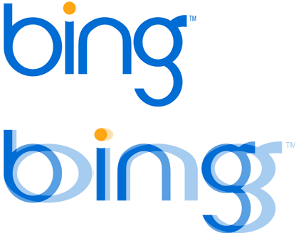
Top: The logo re-scaled horizontally to what I assume were its approximate, original proportions. Below: Overlay of scaled logos.
This is like setting the resolution of your screen to 6,000 pixels wide by 1,000 high. I can’t even imagine how someone arrives at a design solution like this. The shapes resulting from the strenuous horizontal scaling are simply too unflattering and unattractive. There is bad taste and then there is this. What was going through the designer’s mind? “I’ll scale it a little bit. Hmmm, maybe just a little more. More. More. I have so much power. I’m drunk in scaling power. More. More. Scale it more. Don’t stop. Do it. Okay, that’s enough.”
Microsoft has never been a paragon of good design, or even decent design. But this is rubbing it in design’s face.
Thanks to Robin Davis for first tip.


Jump to Most Recent Comment
Ray ’s comment is:
This saddens me.
On Jun.03.2009 at 10:24 AM
Charlie of Toronto’s comment is:
Brutal.
On Jun.03.2009 at 10:30 AM
jRod’s comment is:
do they even care any more?
On Jun.03.2009 at 10:38 AM
davidoff’s comment is:
Awfull - like all MS products. no design nowhere
On Jun.03.2009 at 10:50 AM
Michael’s comment is:
In their defense, maybe they didn't distort it. Maybe they just chose a terrible, distorted variant of that typeface to begin with. Wait, that doesn't make it better, does it? Ouch, then!
On Jun.03.2009 at 10:53 AM
Nick’s comment is:
I'm more confused than anything. Normally I try to be constructive in my criticisms on this blog. But I'm sorry, but only one word comes to mind when I see this...
Fail.
On Jun.03.2009 at 10:53 AM
colormist’s comment is:
And it was such a pretty logo without all that horizontal scaling. Actually, I thought they squished it vertically (like a big fat hamburger that you have to mash down to get to fit in your mouth), but either treatment is cruel and unusual.
Anybody know what that font is (if it is a font at all)?
On Jun.03.2009 at 10:54 AM
Keith’s comment is:
Was it designed by an engineer?
On Jun.03.2009 at 10:55 AM
Silviu Postavaru’s comment is:
The aesthetics of the service itself is also poor and gratuitous. A random image in the background. Really?
I bet that there was a huge committee involved and the poor designer just wanted to keep his job. Remember MSFT is letting a lot of people go.
On Jun.03.2009 at 10:56 AM
Aaron’s comment is:
This is truly disgusting.
On Jun.03.2009 at 10:57 AM
grubedoo’s comment is:
I just puked in my mouth a little.
On Jun.03.2009 at 10:59 AM
Dan Warner’s comment is:
Looks like a pretty fantastic logo
...for a mid-level corporate software engineer whose experience, expertise, vision and knowledge falls entirely outside the realm of design and branding.
...or, perhaps, for a large committee of such folks, after much labor, discussion, diffuse responsibility, and everyone art-directing each other to death.
Here's a GREAT article that draws a hard line in the sand over committee compromise, and what it does to the design process (and thus end results). I can't help but wonder how many logos we see here on Brand New are developed out of this kind of situation:
But back to reality, this logo is of course a wretched physical object that does their search engine project a real disservice — This mark that communicates something rooted not in speed, innovation, efficiency, elegance, of whatever they'd want to say., but it visually signals something squat, stretched, cruddy, slapdash, slightly outdated, amateur.
On Jun.03.2009 at 11:09 AM
b°b’s comment is:
As if google's logo is pretty. Maybe Microsoft is trying to beat Google in everything. "Ha, we've even beaten them in ugliness, eat that, Googles!'
On Jun.03.2009 at 11:10 AM
Martin’s comment is:
God, thank you for pointing this out, I was starting to wonder if I was the only one.
I'm surprised nobody points out how horrible even the original design was !
Microsoft and design ... guess they've really lost their mojo !
Dan’s comment is:
I believe it was designed by JWT
Who are an... advertising agency.
Correct me if I'm wrong about that.
On Jun.03.2009 at 11:17 AM
Jeffry Pilcher’s comment is:
Before you rush to condemn the designer... The more likely explanation for the severe horizontal scaling is the client. We join our frustrated designer somewhere in the middle of the presentation of Round 8:
CLIENT: "I like this typeface a lot. But I also like this really wide one too. If you make this typeface wide like this option here (points at wide font), we've got ourselves a logo."
DESIGNER: "Sure, whatever... I mean, heck yeah!!! That's an excellent suggestion! Why didn't I think of that? That's brilliant."
On Jun.03.2009 at 11:18 AM
faustosahn’s comment is:
@colormist
"Actually, I thought they squished it vertically (like a big fat hamburger that you have to mash down to get to fit in your mouth), but either treatment is cruel and unusual."
Squishing vertically is equivalent to stretching horizontally. The former will just result in a smaller version o the latter.
On Jun.03.2009 at 11:18 AM
Plamen’s comment is:
Shouldn't there be a "Before" with Windows Live Search logo?
On Jun.03.2009 at 11:23 AM
Sanjay Basavaraju’s comment is:
Murder. Absolute.
Bing is censoring content too. Apparently in countries such as Middle East nations, China, Germany, Hong Kong, Indonesia, India, Malaysia, Singapore, Taiwan, Thailand and Turkey, the search result for the keyword 'sex' fetches no results.
On Jun.03.2009 at 11:24 AM
Christopher’s comment is:
I'm not going to comment on the logo because it would seem that has been covered. What I am going to comment on is your use of the word "anyway" in your first paragraph. "Anyways"?! Really?! Uh, anyway doesn't have an S on the end of it. It's bad enough when people add an S when they say the word, but you actually took it a step further and spelled it that way. That's the real crime here.
On Jun.03.2009 at 11:26 AM
Jen’s comment is:
Tear.
WHY WOULD ANYONE DO THIS????
On Jun.03.2009 at 11:29 AM
LL’s comment is:
Looks like a store-brand yogurt mark.
On Jun.03.2009 at 11:29 AM
Brandy’s comment is:
Just plain bad…if in doubt, stretch it out!…Badda-bing.
On Jun.03.2009 at 11:31 AM
Alistair Morton’s comment is:
font mushability is the new black, get with it.
On Jun.03.2009 at 11:32 AM
Anonymous Coward’s comment is:
I thought they squished it vertically… but either treatment is cruel and unusual.
Vertical squishing and horizontal stretching are geometrically identical to one another. There is no difference whatsoever.
On Jun.03.2009 at 11:33 AM
Inside Yo’s comment is:
The logo was designed at the Razorfish Portland Oregon office.
Of course it was ultimate picked by MS out of hundreds of designs.
Not the best one in the bunch, but not the worst.
Josh’s comment is:
I'm pretty sure whoever it was makes more money than me. Sick.
On Jun.03.2009 at 11:35 AM
Greg’s comment is:
This reminds me of things I hate.
On Jun.03.2009 at 11:39 AM
Ross Parker’s comment is:
epic fail.
On Jun.03.2009 at 11:39 AM
Works Collective’s comment is:
When is a circle not a circle...when Microsoft gets their hands on it. I'm just glad they didn't try to stretch the "i" and get an even more horrid thing going on with the character weights.
On Jun.03.2009 at 11:40 AM
Armin’s comment is:
> "Anyways"?! Really?! Uh, anyway doesn't have an S on the end of it. It's bad enough when people add an S when they say the word, but you actually took it a step further and spelled it that way. That's the real crime here.
Christopher, "anyways" is a word approved by Merriam-Webster. It's not a crime. It's a matter of preference. It's like saying you don't like my Iron Maiden T-shirt. It's a t-shirt, it just may not be to your liking. Live and let live man.
On Jun.03.2009 at 11:41 AM
Mike N’s comment is:
A type crime has been committed. I think an arrest is warranted.
On Jun.03.2009 at 11:47 AM
Philippe Gauthier’s comment is:
Wow this is so shitty! The logo at first was alright, but they had to make look horrible...
On Jun.03.2009 at 11:47 AM
Proverbial Thought’s comment is:
More like boing... Or, add "or" and it can be boring...
What's even funnier is that MS feels the need to make the TM part of the official logo. Too funny, as if ANYBODY would be looking to steal this mark!
On Jun.03.2009 at 11:48 AM
Nate’s comment is:
I believe they wanted the "b" and possibly the "g" to look like an eye.
In the bing.com "favicon" you'll see a version with just the "b", but with the tittle (the dot from the "i") in the middle of the "b", making it look like an eye.
On Jun.03.2009 at 11:49 AM
Shahzad Khan’s comment is:
It's mostly not the designer, it's the retarded executives who think they know more about design than the designer, and get them to scratch their own good stuff.
On Jun.03.2009 at 11:50 AM
Dave Simon’s comment is:
Client: "No, no, make it wider so the circles in the 'b' and 'g' kinda look like eyes!"
Designer: "I give up."
On Jun.03.2009 at 12:14 PM
oscar’s comment is:
This is indeed awful, but it's not like the original is some incredible object of beauty. It looks like some crap off of dafont.com.
On Jun.03.2009 at 12:45 PM
Kevin C’s comment is:
Armin> It's not a crime. It's a matter of preference. It's like saying you don't like my Iron Maiden T-shirt. It's a t-shirt, it just may not be to your liking. Live and let live man.
Why does the above not apply equally to the use of horizontal scaling in the bing logo?
On Jun.03.2009 at 12:50 PM
D’s comment is:
This site is slowwwwww. >
Yes, the logo looks like dookie. You would think Microsoft would start to realize good design is important. Actually, I'm glad they don't. It would help their company and I'm ready for them to die.
On Jun.03.2009 at 12:53 PM
Anonymous’s comment is:
D, you are right. But it seems like it's just a server hiccup. It's never this slow.
On Jun.03.2009 at 01:01 PM
Darren’s comment is:
I think it looks adequately vanilla for another vanilla MS "solution", and, *definitely* not something to get so worked up over.
On Jun.03.2009 at 01:06 PM
fehmann’s comment is:
come on...it could be worse...at least it's spelled correctly.
I think.
Johnny Cage’s comment is:
you'd think they could at least come up with a decent name, after which they could design a tortured logo. i found this cool site that critiques the curiously named, bing: http://onthebutton.wordpress.com/2009/06/03/naming_bing/
On Jun.03.2009 at 01:17 PM
damon’s comment is:
JWT did this?
they're an ad agency, sure, but a pretty good one. Granted execution sometimes isn't the worlds best in the ad world, but as an art director and designer I know that there are TONS of design conscious ad people. obviously.
I find it hard to believe they did this,that's intensely bad.
On Jun.03.2009 at 01:21 PM
arturo Rodriguez’s comment is:
When I first saw it, I thought it was a accident. Really? A bit disappointed this came out of Razorfish.
On Jun.03.2009 at 01:30 PM
Jeremy Wa’s comment is:
It's a feature, not a bug.......
When they update it after it fails, maybe they will rename it
p u k e.
That seems about right, no?
On Jun.03.2009 at 01:49 PM
Kris Hunt’s comment is:
I thought it looked ridiculous when I first saw it, too. Glad I'm not the only one.
On Jun.03.2009 at 01:53 PM
Spiny Norman’s comment is:
The letterforms in both logos are evocative: "guano"
On Jun.03.2009 at 01:56 PM
Eric’s comment is:
I like it.
On Jun.03.2009 at 02:05 PM
Kathleen’s comment is:
why on earth? I truly do not understand design (and I use that term loosely) decisions like this...and I don't think I want to.
On Jun.03.2009 at 02:08 PM
Lee’s comment is:
Amazing. One of the first things they teach you in any sort of design training is to respect the typeface and not stretch it without good reason.
On Jun.03.2009 at 02:10 PM
frou’s comment is:
Ha ha. You said "design solution"
On Jun.03.2009 at 02:27 PM
Bob’s comment is:
Yes, Razorfish Portland did this brand. In fact, I did.
The good news is that no font was hurt or abused in the designing of this mark. All the letter forms were made from scratch.
I'm really sorry I offended you all so much. The fact that it made you puke and cry makes me feel good that it elicited such a strong reaction.
For the record, the people I worked with, at Microsoft, are really, really good people.
By the way, thank you Eric.
I am now going to peel myself off the floor.
On Jun.03.2009 at 02:27 PM
Joey V’s comment is:
Bob, Sorry you received such harsh criticism... if you can call it criticism. Everybody should keep in mind that actual people design the logos we critique. Pretend they're in the room. There are a lot of things that occur during the branding process that the designer doesn't have control over. And some people just have different taste.
I know I'm not in love with everything I design. Sometimes you gotta do what the client wants or needs, even if it isn't beautiful.
On Jun.03.2009 at 02:46 PM
Tony’s comment is:
As a designer working for a large corp, I'm pretty sure this was one of those design by committee choices that happens all too often.
Some Jr. VP thinks they're totally creative and "thinks outside of the box" to spew forth this kind of horror. Then some poor designer, smart enough to know that telling his boss's boss that his idea is stupid is a sure fire way to the unemployment line, sucks it up and makes it a reality. Sadly, that's how most design happens in the corp. world, I'm always surprised when good things manage to make it into the real world.
Steven Hoober’s comment is:
TMs are routinely, practically always, embedded as part of the logo/logotype. Look around more, and you'll see much more egregious (like, huge!) ones. I like it when no one bothers scaling, so it's less than 1px in the web, or 6 ft tall at eye level on a sign. Seen both. This is not a bad location, size or treatment.
Bob, I dread getting this sort of commentary exactly. I think we're all sad that the "original" (the squished back down one that Armin created) looks very ordered and smooth and just about as nice as a geometric face can look.
The characters you were graced with resulted in pretty good letterforms; there's some specific bits I like, but on to the bad instead: The final logotype has stretched /looking/ parts. The sides of the round spaces especially look very fat, and certain joints, like on the left of the B, look... off. Doesn't make me wanna throw up, but it doesn't feel as balanced as it seems it could.
For the record, I love making logos and logotypes. As much as I hate having to do so for actual clients. I've never sent one out into the wild that I was 100% happy with, and usually a lot less.
On Jun.03.2009 at 02:55 PM
Matthew Roosa’s comment is:

Ian Davies’s comment is:
Um, are we all supposed to recant our criticism just because the purported designer shows up? Sorry Bob, but your logo blows.
If all the letter forms were made from scratch, then you have a real talent for drawing letters that look like they were stretched by someone using Illustrator for the first time.
But that's all.
It doesn't matter that the people at Microsoft are "really, really good people". I'm sure they are. Not a puppy kicker among them. But it doesn't excuse them from picking a crappy logo that should make a 1st year graphic design student hang their head in shame.
On Jun.03.2009 at 03:13 PM
Andrew Klein’s comment is:
You take a potentially useful, marketable product, witty sounding name, and a multi-billion dollar company behind it, and apply a sloppy, lack-luster web design and a logotype
careless, obnoxious, amateur...
even the favicon sucks!
On Jun.03.2009 at 03:18 PM
Stefani’s comment is:
My initial thought was that they had coded the image tag with the wrong image dimensions.
On Jun.03.2009 at 03:20 PM
Eric Peacock’s comment is:
It'd be interesting to see a case study showing the conceptual evolution.
When I first saw the logo I didn't really like it without really knowing why. The scaling comparison in this post made me realize that I liked it better unscaled.
I'd definitely credit Bob on doing original lettering - there's way too much font dependancy in logo design sometimes.
On Jun.03.2009 at 03:21 PM
Mike Williams’s comment is:
My understanding is that it is a type crime to horizontally scale a typeface because scaling ruins the typeface designer's intended proportions.
Making your own lettering that looks horizontally scaled (like this) is not a type crime but rather just a matter of aesthetic preference.
On Jun.03.2009 at 03:22 PM
Hibryd’s comment is:
Why does the N have those quasi-straight lines at the top? Everything else is perfectly rounded or dead straight. Why is the G's top tail the only part with a varying thickness? The letterforms just aren't consistent from letter to letter.
On Jun.03.2009 at 03:23 PM
Dale Campbell’s comment is:
Having had to design my fair share of logos where the client dictated the end result - as opposed to working together and making a sound design solution and decision - I can only hope that Bob had to make certain sacrifices along the way to this creation.
That being said, overall I don't feel it's very successful. It immediately makes me feel squished and limited - something that perhaps a search engine should not make me feel. The internet is a huge place and I don't feel this portrays that.
And in Bob's defense, I would love to see many of the other ideas. I'm sure that there must be some gems in there.
Keep well,
Dale
Al’s comment is:
It works though:
http://www.bing.com/search?q=horrible+bing+logo&go=&form=QBLH
room34’s comment is:
It's horrible, there's no denying that. But honestly, I think it's better than Google's logo.
On Jun.03.2009 at 03:41 PM
koyo’s comment is:
DESIGN CRIME!
On Jun.03.2009 at 03:41 PM
David Sanchez’s comment is:
I actually like it, and is shorter and better than google.com
On Jun.03.2009 at 03:45 PM
michael’s comment is:
"OBJECTION, Leading the witness!"
I wonder if Armin skewed the critique by only writing about HIS concern of horizontal scaling. I wonder if he said something positive, the comment stream would have gone the other way? Seems a little like mob mentality here. The logo is what it is. And as my kindergarten teacher would say... Now lets all take a second to say something nice.
joecab’s comment is:
I'm with jeffry: this screams of typical client interference. Having dealt with so many clients like this, I can just hear it now ...
"That light typeface feels like it's floating in its space. Widen it to give it more heft."
On Jun.03.2009 at 03:54 PM
Jarrod’s comment is:
@Michael
No, Michael. It's bad, shockingly bad. It's a bad logo, a weak visual brand experience, and a mediocre webpage design (at best). I knew it before it was posted here.
Sadly, I think the name actually has potential in this context.
On Jun.03.2009 at 03:54 PM
Brian Libby’s comment is:
I don't get it. What's so horrible about stretching the letters out horizontally? I think there is some artistic license here. Stretching the text may conflict with standard design of letters and fonts, but logos are in part an artistic/graphic expression, and thereby they have some liberty with the proportions of the letters. Is bing really the only logo that does this?
On Jun.03.2009 at 03:57 PM
derrick’s comment is:
It's really ugly. Even de-stretched, nothing about it says approachable or friendly, which is the angle they were going for. Something like this would have been better:

Josh ’s comment is:
Not to sound completely biased against Microsoft, but this attempt at an identity is no surprise to me. Have you worked your way through their website lately? Really? Dropdown menus large enough to require scrollbars?
Microsoft has the financial power to hire any creative talent they choose. It amazes me that they can't get things like this right.
On Jun.03.2009 at 04:08 PM
moo’s comment is:
i don't think it's that bad. i think everyone is jumping on the "i hate ms" bandwagon. anything from ms these days are greeting prematurely with "i hate it" mentality.
On Jun.03.2009 at 04:11 PM
Jim’s comment is:
Maybe the designer forgot to reset the pixel aspect ratio from 1.777 to 1.0.
I'll wait for service pack 3.
foresmac’s comment is:
Reminds me of the early-90s, PageMaker-fueled design aesthetic of hardcore punk record covers and zines. When I look back at some of my stuff form that era, I wonder, "what the hell was I thinking." Most likely it was, "Oh, look at this control I can change."
:P
On Jun.03.2009 at 04:15 PM
Jason Philo’s comment is:
Would you recommend some good resources for building a strong design foundation? It's something I'm interested in getting better at.
On Jun.03.2009 at 04:22 PM
Miek N’s comment is:
I take back my type crime comment from before. Since it technically is not a typeface and was therefore technically not stretched, then technically no crime has been committed, technically speaking.
The mark is still uncomfortable to look at.
On Jun.03.2009 at 04:29 PM
Nathan’s comment is:
What's worse is that they are proud of it. They think it's hip and cutting edge.
On Jun.03.2009 at 04:30 PM
michael’s comment is:
I aggree with moo. this logo is not bad. design is completely subjective. there are some rules that need to be followed and as for as i can tell, this logo didn't break any. lots of sans serif fonts have variable stroke widths, including Helvetica, Lucida Grande and Myriad (gasp, an apple font) just to name a few. i think the only reason everyone thinks its stretched is because of the large counters in "b" and "g". so whatever. hate it if you want, but the logo is fine.
On Jun.03.2009 at 04:32 PM
Paul Lloyd Johnson’s comment is:
I can't wait for Steve Balmer to start dropping "you can Bing that" and other similar phrases into interviews. Tragic.
Steve, Google may not have the best branding, but at least their logo doesn't make me want to pull my eyes from their sockets.
On Jun.03.2009 at 04:34 PM
Joshuantaylor’s comment is:
Gonna step out on a limb here. I like the logo. Maybe not for its technical merit, for it does lack. But it is memorable and it works. Everybody I've talked to in my office LOVES the logo.
There, I said it. Now you can crucify me too. :)
Danny Hinde’s comment is:
When I first saw this I couldn't believe it was from Microsoft! The logo is ridiculous and the type is awful and just looks like its been dodgily resized.
I'm glad everyone else feels the same way about it.
On Jun.03.2009 at 04:49 PM
Joshua Davis’s comment is:
I agree that the Bing logo was a complete design failure. I wrote up a critique of the design on my blog highlighting some of the worst mistakes.
Microsoft's new Bing Logo is an Epic Fail
On Jun.03.2009 at 04:51 PM
awesomerobot’s comment is:
Even Google's considerable lack of design is better than stretching type in my opinion.
I personally wouldn't mind the logo if they squished it back to normal - it's simple and meaningless, but at least it wouldn't be terrible.
On Jun.03.2009 at 04:53 PM
Samantha’s comment is:
@ Joshuantaylor
I think everyone in your office are the type of people who think they know good design when they see it. Everyone thinks they know what looks best. The real issue here is that this search engine is going to bomb with the design/interactive community, as much as the logo already is.
On Jun.03.2009 at 04:55 PM
Anonymous’s comment is:
Armin’s comment is: Christopher, "anyways" is a word approved by Merriam-Webster. It's not a crime. It's a matter of preference. It's like saying you don't like my Iron Maiden T-shirt. It's a t-shirt, it just may not be to your liking. Live and let live man.
Armin, you couldn't be more wrong on this. It is not a preference, it is pure laziness. But nice try.
http://grammartips.homestead.com/anyway.html
On Jun.03.2009 at 04:55 PM
Paul Lloyd Johnson’s comment is:

Christopher’s comment is:
Armin’s comment is: Christopher, "anyways" is a word approved by Merriam-Webster. It's not a crime. It's a matter of preference. It's like saying you don't like my Iron Maiden T-shirt. It's a t-shirt, it just may not be to your liking. Live and let live man.
Armin, you couldn't be more wrong on this. It is not a preference, it is pure laziness. But nice try.
http://grammartips.homestead.com/anyway.html
On Jun.03.2009 at 04:56 PM
Kevin’s comment is:
I would've defended the logo even before the designer showed up -- I have no particular objection to the horizontal scaling -- but I do agree with LL that it could be a yogurt label.
On Jun.03.2009 at 04:56 PM
drewdraws2’s comment is:
I'm so sick of hearing people defending awful design with phrases like "design is subjective" and "artistic license". This is the kind of language that people who don't know any better use to justify bad decision-making. If you've studied design or typography, you'd know that horizontal stretching is one of the cardinal sins, and for a company of this size and a logo of this stature to do it inexcusable. Armin doesn't need to lead me into seeing that - it was my first thought too.
Everything is subjective, but sometimes bad design is just that. You can like it or not like it – that's subjective – but it is not good design.
On Jun.03.2009 at 05:05 PM
kash73’s comment is:
The language in some of the comments make me ashamed to be a designer. It comes off as arrogant especially when you don't know what was asked of the designer. Of course, people are entitled to their opinion, but use your words people! Provide something constructive - or maybe this is just a venue to complain like children? If it is, then it's a waste of web space.
On Jun.03.2009 at 05:20 PM
Armin’s comment is:
> Armin, you couldn't be more wrong on this. It is not a preference, it is pure laziness.
Whatevs.
; )
On Jun.03.2009 at 05:21 PM
John Muir’s comment is:
Still disappointed they didn't call it Moogle. They have the bad taste in typeface and garish colours though.
Someday, Google, please: bring in the designers. They're good people. Don't feel threatened.
On Jun.03.2009 at 05:22 PM
John Muir’s comment is:
Still disappointed they didn't call it Moogle. They have the bad taste in typeface and garish colours though.
Someday, Google, please: bring in the designers. They're good people. Don't feel threatened.
On Jun.03.2009 at 05:23 PM
Jurgen van der Pol’s comment is:
But It's Not Google...
On Jun.03.2009 at 05:37 PM
author’s comment is:
thanks for pointing it out. I thought the typeface looked strange. Perhaps it's the same agency who shamelessly ripped off existing designs for their own use in the about bing's website.
On Jun.03.2009 at 05:57 PM
Ax Mattias’s comment is:
I work for a design firm and I'm familiar with "design by committee" process. I've had many of my proposals ruined by incompetent middle–managers who don't know a single thing about typography outside of double–spacing their paragraphs inside of MS Word.
Still, I realize that something is bad when I see it, even if it is requested to fit a certain mold. It is very hard to design around a flawed idea that has a shaky foundation.
If you're given creative freedom and an abstract idea then it is your responsibility to come up with something that isn't complete garbage, as it is evident in the execution of “bing” logo.
This particular logo hurts the eye and assaults person's aesthetic sensibilities. The author mentions how this was an original logotype that was in no way derivative from another typeface. I would like to challenge that.
Pay attention to the letter N where the thick stem is overly expressed upon horizontal scale expansion. Any typographer would recognize (the equivalent of) ITC Kabel with a slightly modified letter G, and Bayer Sans letter N. You can replicate this inside most graphics apps.
What I find particularly disingenuous is Bob's insistence that he drew the logotype "from scratch", when the letter G follows Kabel's distinct descender lobe convention. If you were to remake it, why do it like something which is already part of a well-known typeface?
In sum, the logo sucks. It's hardly original. Razorfish should apologize and return the money.
On Jun.03.2009 at 06:02 PM
robert’s comment is:
This is as bad as something I did as an fine arts major to a bumper sticker that a lot of people used. I won't mention where, or what type face, just suffice it to say I learned my mistakes on the ground. A company this size should have some editorial process (cough) art direction (/cough) that avoids this rookie mistake.
On Jun.03.2009 at 06:13 PM
Not a Designer’s comment is:
Does it matter that the logo doesn't appeal to designers.
Ask your non designer wife, girlfriend, husband, boyfriend, taxi driver*, newsagent for their opinion between bing.final, bing.scaled and google.current to see if this is really the big issue you all think it is.
While I generally can't stand anything MS do, I don't mind how the letters look.
I am, however, disturbed by their relationship to each other.
The b and n look like they belong to one logo while the i and g seem to be a different scale.
The lack of a perfect curve to the inside of the n seems a bit crappy too, but fortunately it's only obvious in the distorted version at top.
Also when squishing the logo above to illustrate the point (is squishing a technical term) shouldn't someone have taken the trouble to at least make the tittle and the scoop below it round again?
Also, "Google It" has become synonymous with searching and can be confused with nothing else.
Can anyone imagine saying "hang on, let me bing it"
Sorry did you say "bin it" or "bring it"?
Bob. Keep up the good work and remember Design is Subjective and anyone can pick fault with something and post a criticism while the rest of us wonder what all the fuss is about. (at least you weren't responsible for the re-branding of Tropicana http://www.anders.com/cms/305)
BTW only a couple of years ago second post would have asked if the designer used a Mac, because that's how you tell if they really have taste ;-)
*Probably best Never to ask a Taxi Driver for their opinion on anything.
On Jun.03.2009 at 06:24 PM
Steve’s comment is:
Maybe the designer did it deliberately bad because they don't like Microsoft, and then persuaded Microsoft it was cool. In that case it would be genius. Remember that famous Coke ad from years ago with the ice cubes?
On Jun.03.2009 at 06:27 PM
David Nguyen’s comment is:
drewdraws2 nailed it. This logo shows no design competence whatsoever.
On Jun.03.2009 at 06:28 PM
João Gomes’s comment is:
@Jason: Start by reading the basics, i.e. "A Type Primer" by John Kane and "Elements of Typographic Style" by Robert Bringhurst. Then, work your way through the classics, like Jan Tschichold's "New Typography" or Josef Müller-Brockmann's "Grid Systems"...
Be also sure to investigate the history of book publishing, from the invention of the press by Gutenberg in the late fifteenth century to this day, as well as some other parallel activities such as poster and book-cover design (the names of Cassandre, Raymond Sauvignac and Alvin Lustig come to mind).
Meanwhile, if you're interested in typography, you can always practice your skills with some calligraphy exercises with different pens. Also, check out the inner workings of vector-based drawing programs like Illustrator, and a bit of FontLab (although you will really need some guidance from experienced people like, say, the folks from www.typophile.com to even begin to understand the latter).
Hope this helps. ;)
On Jun.03.2009 at 06:30 PM
Hamranhansenhansen’s comment is:
The reason this is such amateurish design is that it was probably designed by an amateur designer. Almost certainly, a Microsoft software engineer.
Microsoft has a lot of money, but no talent. The first priority for people like that is an opportunity to prove the world wrong and show they actually do have talent. Cutting a check to a professional like any other rich person is not their priority.
On Jun.03.2009 at 06:58 PM
Anonymous’s comment is:
> "Anyways"?! Really?!
Christopher, I can't believe you don't know the question mark and exclamation mark go like this: "!?" not like this: "?!" ... get a clue, man!
What is the Internet coming to!?
On Jun.03.2009 at 07:04 PM
erik spiekermann’s comment is:
Bob, the ”original“ designer, writes: All the letter forms were made from scratch.
If that is true, it is sad. Couldn’t you hire someone who can actually design type? It wouldn’t take more than an hour to do. It would still be a boring logo, but at least it wouldn't look like a free font drawn by a 15-year old in Corel Draw, in 1987. It was made from scratch and it still looks like scratch.
On Jun.03.2009 at 07:07 PM
Kit Grose’s comment is:
From the people who brought you the MSNBC logo...
The part that confuses me most is why not fix the letterforms? You only have four to worry about? You could have kept the metrics *and* made it attractive.
On Jun.03.2009 at 07:12 PM
another christopher’s comment is:
@ derrick and his "Something like this would have been better" suggestion
This clearly shows why no one should attempt to create a quick fix in order to impress the readers of this blog with their design prowess. Derrick's version actually makes me like the stretched version! And don't even get me started on that miniature "g" beside the bloated "bin".
On Jun.03.2009 at 07:34 PM
Hamranhansenhansen’s comment is:
> For the record, the people I worked with, at
> Microsoft, are really, really good people.
Doing really, really bad work.
Windows is profitable and Office is profitable. Everything else is a hobby that loses money. It's yacht racing.
I don't blame the designer only ... the producer of bing.com should get the lion's share of the blame. You can call this a problem of design or a problem of extremely low production standards. Microsoft is guilty of both again and again and again. It seems like they celebrate it.
On Jun.03.2009 at 08:06 PM
JM’s comment is:
Good taste has left the building!
On Jun.03.2009 at 08:11 PM
ola’s comment is:
Alright, you think it's ugly BUT i think it's deliberatly fugly. See, in the world of search the biggest player has subconsciously provided us with the message: Horrible design == Great engineers. If this was another default rounded web2.0 logo with gradient and/or reflection you would forget it instantly. This on the other hand either burns into your eyes so you'll never forget it while the others, let's call them the not-so-design savvy, thinks: "i can't put my finger on it but i think these guys are great at search".
On Jun.03.2009 at 08:23 PM
Arma’s comment is:

David Nguyen’s comment is:
@ ola:
I think your reasoning is a bit limited here. The Bing logo doesn't have to be a Web 2.0 logo to be good: it just has to be a good logo, period.
Also, for most people, I don't think bad design automatically means good engineering. In fact, some studies suggest that people naturally think that if something looks better, it works better. There was a recent article on A List Apart about this:
http://www.alistapart.com/articles/indefenseofeyecandy/
But this isn't to say that only aesthetics matter. The ideal is a perfect marriage between style and function, something that Apple does extremely well.
In the grand scheme of things, design is relatively inexpensive, so it's disappointing that a company as rich as Microsoft wasn't willing to throw more money at the logo. I mean, it looks like they put more effort into a Windows wallpaper.
On Jun.03.2009 at 08:54 PM
breton’s comment is:
"design is completely subjective."
Well not only is this wrong, but it seems to misunderstand what "subjective" means. It is as if you believe a subjective viewpoint is completely worthless compared to an objective viewpoint. As if there's no difference between the original "Matrix", and "Matrix Reloaded" that is particularly important. As though you live in a world where Dominos pizza can write a novel about "the Noid" that stands shoulder to shoulder with Dickens or Vonnegut. As though there's nothing in the realm of Aesthetics that is measurable, or possible to experience in the same way as everyone else.
Yes we all posess different brains, but the perceptual machinery that we all posess is taken from precisely the same genetic mold. We all percieve the elements of design in precisely the same way. The only difference between a designer, and a non-designer, is the designer's ability to register these perceptions consciously, and manipulate images to evoke certain desired mental reactions. If there wasn't some kind of commonality between all humans, this would be a completely pointless excercise, and there'd be no reason to have a profession called "designer".
I find it amazing the number of people that are able to go through life without actually bothering to really LOOK at anything. It is pitiful the amount of life you're missing out on.
as for design being "completely" subjective, this is of course wrong, and there are qualities in a design that you can measure objectively, just as you can measure a peice of music to determine whether the melody and chords are harmonious, "in tune", have a correct rythem, and others.
There are specific measurable ingredients in a logo or type design, such as proportion. Without those ingredients, the logo cannot be successful. The ingredients do not gaurantee success, but without them, there is not even the slightest chance of producing something appealing.
The Letters of this design have deeply unsatisfying proportions, both in the overall shape, but also in the places where thicks and thins occur, and the proportions between them. The qualities that make a typeface or a logo "good", are qualities which make it seem almost like the group of letters are alive. Like they have a personality. Like they could hold a conversation with you. In such logos, the proportions closely mimmick those you might find in an animal, or a plant. A logo can even look completely synthetic, but the relationships between the shapes still closely mimmick relationships you may encounter in a natural scene- It is what our brain has evolved to percieve and match, and if a scene doesn't match it, we instinctively feel that it is "wrong".
This logo is almost certainly wrong. Like a mutated bambi, with the legs of an elephant attached to the thin spidery body of a deer. A squat ugly nose, and colors that invoke diseased flesh, or possibly fumy plastic.
Do not come here and tell us that "Design is Completely subjective". You look like a blind and pitiful fool. I hope one day that you might regain your sight.
On Jun.03.2009 at 10:15 PM
breton’s comment is:
"It is what our brain has evolved to percieve and match, and if a scene doesn't match it, we instinctively feel that it is "wrong"."
The fact that our brains have this facility to tell whether a scene is "correct" or "incorrect" rather implies that it was at some point direly important to our survival. Imagine detecting that you were about to be ambushed by a neighboring tribe if you couldn't tell the difference between the work of a man, and run of the mill forest. What if you couldn't tell the difference between a poisonous plant, or an edible one with a slightly different shape of leaf? What if you couldn't tell the difference between rotting meat, and fresh meat? A person without finely tuned aesthetics would be poorly suited to survival in the wild.
On Jun.03.2009 at 10:25 PM
Andy’s comment is:
I like it. So there. :)
On Jun.03.2009 at 10:28 PM
Glenn Sakamoto’s comment is:
Microsoft sucks. And this new logo is a perfect example.
On Jun.03.2009 at 10:57 PM
Nick’s comment is:
So. I am not a fan of horizontal scaling either. BUT....

If you are going to "correct" the scaling by squeezing it back to it's proper forms...please pay attention to details.
Just saying. A squished TM is just as offensive as a stretched b-i-n-g
On Jun.03.2009 at 11:04 PM
robbert’s comment is:
The explanation is simple – it was designed and then some MS minion dropped it into Powerpoint for an internal presentation at Microsoft and (as they ALWAYS do) inadvertently distorted it, stretching it horizontally. Then the suits signed of on it in its distorted form and the rest is history.
On Jun.03.2009 at 11:58 PM
Bart’s comment is:
I wonder if this logo is bad on purpose. The Google logo is bad, but people have grown to love it and Google now emphasizes its quirkiness with Google doodles. The execution of the Subservient Chicken is "bad", but by doing it that way Crispin Porter + Bogusky were able to give it more authenticity (for Burger King) than if it was a perfectly smooth video shot inside a swanky apartment.
Either way, what are the chances that Microsoft will ever, ever ever fix it, for as long as Bing.com lives??
On Jun.04.2009 at 12:08 AM
Youssef Sarhan’s comment is:
I have started to develop the bing logo which I hope to present to Microsoft. Let them know how we feel about it. á la Tropicana packaging.
I've wrote up a short Article on it if anyone wants to take a look. I'd like to know what people think of my proposed redesign. Good or bad.
Bing: The Necessity of Mutual Response
A lot of critiquing and sometimes moaning has been done but not enough action, but that is what I am to do, take some action.

There are more bigger and better images on either of those links.
All the best, Look forward to hearing from you guys.
y.
On Jun.04.2009 at 12:17 AM
JG’s comment is:
ok.. here's the question you need to ask yourself.. does it look good? Yes.. it does.. and if it is.. then these stupid desing paradigms are flawed.. who sets these design principles.. some of these principles are over 10 years old.. peoples tastest and perceptions changes over time.. just look at the clothes you wear for example.. or the kind of music that is popular today... design prinicples are just that... look out of the box... innovate!!!.... hello!!!!!
On Jun.04.2009 at 12:30 AM
Matt’s comment is:
There is no excuse for poorly crafted work.
Until Microsoft understands that 'god is in the details' they will never become the company they wish they were.
On Jun.04.2009 at 01:13 AM
Anonymous’s comment is:
my eyes crossed, had i lost oculars control, was my retina detaching; no; maybe it was my teeth, i flossed like my dentist had never seen, but to no avail, a nettle pot with salt water from the great Salt Lake; no not yet. Then the epiphany (• a manifestation of a divine or supernatural being.
• a moment of sudden revelation or insight.) "They" were controlling the horizontal, "they were controlling the vertical, but had Rod Serling from the Twlight Zone series came to screw with my computer. It was Bill Gates, confused from retirement and not being able to solve the aids problem in africa had hacked the designers computer and left his mark. yes thats it...or maybe something more arcane or sinister...i am at a loss for adverbs or are those adjectives..where is windows 3.1 and its drawing program when we need it most?
Von Glitschka’s comment is:
Armin Vit is to "Microsoft Bing," what Jim Garrison was to the "JFK assasination." A graphic zapruder film if you will. Look for a design firm on the grassy knoll.
Nice.
On Jun.04.2009 at 02:55 AM
John Mindiola III’s comment is:
I agree with Breton. Design is NOT subjective. How could it be? It's a the visual lubrication for our consumer society! Design attempts to solve problems for business objectives. There is good, and there is crap. Bing will prove to be one or the other.
On Jun.04.2009 at 03:07 AM
Robert’s comment is:
I'm no typographer, but... ten minutes.

jordsta’s comment is:
Looks like there's a ton of hate for this logo.. How about we design a better logo for Bing?
On Jun.04.2009 at 04:47 AM
bowerbird’s comment is:
bob did it for microsoft.
he was paying them back
for what microsoft did to bob
many years ago -- remember?
good job, bob. that'll show 'em.
-bowerbird
On Jun.04.2009 at 04:49 AM
painimies’s comment is:
If they really needed to make it appear wider, why still just slant the logo, instead of redrawing it?
Like this, but using more than one minute:

Youssef Sarhan’s comment is:
Hey everyone, I've written a post on re-designing a new logo for bing, rather than criticising and in some cases moaning, I've done something about it.
For more images and info click the picture.
Bing: The Necessity of Mutual Response
Bassem B.’s comment is:
Be it as it may, I'll take this logo any day over Google's horrible, childish, ridiculously ugly logo.
On Jun.04.2009 at 05:37 AM
Chuck Spidell’s comment is:
Bing! There it went.
On Jun.04.2009 at 06:56 AM
Steve K’s comment is:
Their website is pretty shocking as well. Looks like a table design circa 1999. Looks like design was an after though on this project. Well done Microsoft.
On Jun.04.2009 at 06:56 AM
Youssef Sarhan’s comment is:
sorry for the double(triple?) post.
On Jun.04.2009 at 07:10 AM
Chuck Spidell’s comment is:
Let's Bing It Out™, shall we?
On Jun.04.2009 at 07:17 AM
Michael Kozakewich’s comment is:
Robert's version is good, and fixes up the problem with the b, though the g looks goofy. Everyone else kind of misses the mark.
Honestly, though, while it is squished, and has some clumsy parts, it's not all that bad.
Up at the top of the page, when Armin presented the un-squished logo, it's actually too tall, by just a bit, which makes the original look even more squished by comparison.
Paul Lloyd Johnson’s comment is:
I like Robert's version. Much better. However, it shows the problem they have made for themselves. They need a logo that can go on webpage buttons. The tail of the g is just too big. It wouldn't work.
No offence Yousseff, I actually think your version is worse than Microsoft's. :S
On Jun.04.2009 at 07:38 AM
Adam’s comment is:
Maybe Microsoft is aiming for some kind of proportional readability on new ultra-wide monitors?
http://www.engadget.com/2009/06/04/nec-crv43-43-inches-of-curve-on-sale-july/
Maybe not...
On Jun.04.2009 at 07:49 AM
Andrew Sabatier’s comment is:
You'd expect those at the helm of a venture of this stature to understand the benefits of high quality branding.
Microsoft has got this partly right. Bing is an infinitely superior name to Live Search. Bing works as a noun and a verb but it will have to offer something extraordinary, something that Google cannot and will not deliver to win the place Google so competently occupies.
It looks like the branding professionals were called in too late. The strategy appears Google-led. The name is a competent offering but the design stinks. The brandmark has been very poorly handled. It looks naive and amateurish. The horizontal scaling issue compounds this impression.
With good reason I might like to Bing but at the moment I prefer to Google.
A.
Richard’s comment is:
In their defense, it doesn't look terrible on the bing.com website when it's at a small enough size. I've seen it blown up to a large size on random paraphernalia and yes, it is horrendous.
On Jun.04.2009 at 08:54 AM
Cristian Loghin’s comment is:
There you go Designer Bob and Microsoft. When tracing over the official version in Illustrator, it became very clear why the logo looks the way it does. It's made out of pure geometric shapes, but the very necessary visual adjustments that must be made to turn a bunch of circles into actual expanded letters are missing. Let me know if you want the vector file, free of charge.

Marc’s comment is:
I seriously doubt this was done by Razorfish.
If you'll look at the other work has done for Microsoft, there's a distinct difference. It's actually good.
Wait a minute. What's this? Microsoft owns Razorfish?
http://tinyurl.com/ccaqsk
DOH!
On Jun.04.2009 at 09:34 AM
ola’s comment is:
@David Nguyen
I was kidding. I don't think people consider bad design equals good engineers. The logo is definitely sub par but i think people lash out a little extra because it's from Microsoft.
On Jun.04.2009 at 09:47 AM
Christopher’s comment is:
Armin’s comment is:
> Armin, you couldn't be more wrong on this. It is not a preference, it is pure laziness.
Whatevs.
; )
Touché Armin. :)
(PS: I apologize if I came across as a big ol' jerk. It was one of those days yesterday and apparently the use of "anyways" just set me off.)
On Jun.04.2009 at 09:48 AM
Youssef Sarhan’s comment is:
@Paul Lloyd Johnson
I would agree, robert's version is a nice touch-up but honestly I'm not fond of this thin circular style. I reminds me too much of projects you do when you first learn about designing type/logos. It looks like a really ill considered cheap typeface that has no intelligence behind it. The sort of typeface that ruins anything because in itself it lacks sufficient consideration.
The bing logo really oozes of basic lack of type optics. Look at how the n gets so narrow and thin at the apex. The g sits off the baseline but the loop doesn't link back up, not that it MUST, but in this case it looks too awkward. The counters are ludicrously huge and the descenders don't rise near high enough. Large x-heights are good, but with a low cap it you're shooting yourself in the foot, from a legibility point of view. Which is what type is supposed to be, legible.
What I offered was by far a better solution, I don't think it's perfect, but it's not hard to be better than the current.
On Jun.04.2009 at 10:00 AM
Dwight’s comment is:
It seems like whenever Microsoft tries to catch up with their competitor, this time google, they fail miserably to see what truly makes the competitor a better product. Google works well because it is remarkably simple and clean and a layout, and their brand is humble and unobtrusive. A giant random picture on the homepage, way to get it Microsoft.
I am guessing Microsoft is trying to be edgy with their bauhaus inspired typeface, except what does a search engine have to do with disco.
And then there is orange. Really? I love orange when I want to be excited, not as a jarring accent on my search engine.
As much corporate bs that is running through the veins of this design, I am surprised that this is not set in papyrus, that neat textured font.
On Jun.04.2009 at 10:09 AM
Marc’s comment is:
@ Youssef Sarhan
Your logo sucks. You don't know what you're talking about. Shut up and go away!
:)
On Jun.04.2009 at 10:32 AM
Youssef Sarhan’s comment is:
@Dwight
You're right bang on with what you said, it's Microsoft's whole approach to design, this isn't a new thing, it stems back to the early 80's when they completely copied Helvetica.
No papyrus is the font of choice for the design conscious photographer. I don't know why but I always think cheesy photography when I think of papyrus.
On Jun.04.2009 at 10:55 AM
Joey Falcon’s comment is:
Youssef ... your logo does suck.
You want to know why? There are too many pauses with your typeface. As if each letter was meant to be read individually and adding so much space between them makes it even worse.
Plus it just looks ugly.
So far all attempted redesigns suck except for Roberts.
On Jun.04.2009 at 11:25 AM
Jeff’s comment is:
This isn't even close to the most extreme horizontal scaling I've seen in logos so I'm not sure what the issue is. Ever read early issues of Wired? They made my eyes bleed.
The bing home page is more aesthetically pleasing than this blog, and strikes me as one of the few MSFT pages that's well put-together. It doesn't reinforce their brand, and it's not terribly distinctive, but it's uncluttered and straightforward.
I don't like Microsoft either, but this is a big improvement for them.
On Jun.04.2009 at 11:27 AM
Anonymous’s comment is:
> As though you live in a world where Dominos pizza can write a
> novel about "the Noid" that stands shoulder to shoulder with
> Dickens or Vonnegut.
Actually, a Dominos Pizza employee writing a book about "the Noid" kind of sounds like a Vonnegut novel. The Dominos employee would just have to make sure his book had really deep and profound themes like the absurdity of organized religion.
On Jun.04.2009 at 11:40 AM
Michele’s comment is:
I live in Indonesia, and can prove Sanjay's assertion. I searched for "sex" per the suggestion and got this response:
"The search sex may return sexually explicit content.
To get results, change your search terms."
derrick’s comment is:
@another christopher: Hmmm... looking at it again, you're right, but the weirdness of the "g" is due to Eric Gill (the original designer of the font). Regardless, I still think it looks better than even the scaled version.
On Jun.04.2009 at 12:07 PM
Joel’s comment is:
This logo really is not that bad. A lot of design snobs here just criticizing for the sake of criticizing. Get a life and join the real world.
On Jun.04.2009 at 12:23 PM
Joey V’s comment is:
I would like to see something like this:

Maxime’s comment is:
I couldn't agree more with all of you.
When I first saw the search engine page, everything seemed so "Microsoft". A big lack of good web design in every aspect.
This logo is maybe (probably) the beginning and the end of this search engine.
On Jun.04.2009 at 12:53 PM
Rachel’s comment is:
I like it. Certainly better than the alternates being posted. Logotypes are modified out of base typefaces every day...don't act so surprised.
On Jun.04.2009 at 01:14 PM
ruqus’s comment is:
Crime against sight
On Jun.04.2009 at 01:47 PM
Cristian Loghin’s comment is:
Some of yous are just speaking out of your arses. The logo is a mistake and there's no way to justify it, unless you are completely oblivious to the basic rules of type design. I didn't post my tracing of the logo, but if you spend a little time trying to do it yourself you can see how it was originaly drawn. It's just overlapping ellipses and rectangles with no concern about what makes type work. It's obvious the designer doesn't know typography. And why should he, after all he's working for a MS web design studio. Have a look at how Futura is drawn, you postmodern ignorants!
On Jun.04.2009 at 03:04 PM
Anonymous’s comment is:
Seriously, you people need to chill. While this logo is definitely not excellent, it's also nowhere near as bad as some of you are suggesting. Get off your high horses and quit being such snobs. And you wonder why designers are perceived as such pompous a**holes.
On Jun.04.2009 at 03:28 PM
Notanon’s comment is:
Cop-out alert, cop-out alert!
On Jun.04.2009 at 03:35 PM
moo’s comment is:
@cristian loghin: shut up. it's a logo. ms didnt attempt to create an entire typeface.
@youssef: wow, you sir have no right to criticize the original bing logo; yours is absolutely horrible. you are brave tho for putting that up not once but many times until you got feedback.
On Jun.04.2009 at 03:48 PM
gene’s comment is:
Thank you for addressing this clusterfu*k of a logo. Besides the name meaning "disease" in Chinese (4th tone), the logo is unprofessional and cheap looking. I know times are tough, but shit, hire a good designer when considering something major as this.
On Jun.04.2009 at 04:20 PM
gene’s comment is:

Scott’s comment is:
"Anyways" is slang, Armin.
It was co-oped by M-W because of its widespread (mis)use. Though, it was not part of the English language prior to say, 1990 or so. (I don't know exactly when.)
It may be your preference, but it's typically held in poor taste for those who adhere to "proper" English language.
Then again, this is the country that makes up words like "conversate." Anyways is a minor blip when compared to this type of abysmal English.
On Jun.04.2009 at 04:36 PM
Youssef Sarhan’s comment is:
This post is getting a huge influx of ignorance, it must have been on the front page of digg or something. About 10% of the comments here are informed and educated.
There are a lot of people saying things but doing nothing about it, absolutely nothing, not bringing anything to the front.
So many of you really are under considering design.
On Jun.04.2009 at 05:32 PM
Wünderwoman’s comment is:
So sad....so bad. Ho Hummmmmm.
Will somebody out there hire a real freaking designer for a change? It matters!
On Jun.04.2009 at 06:35 PM
Adam’s comment is:
I was going to write a blog article just like this ... it's crazy they'd spend that much dough only to slap a $2 logo onto it. Ugh.
On Jun.04.2009 at 06:36 PM
Jannis Gundermann’s comment is:
I know this might be a little extreme to say but I really hope their Bing service fails miserably.
Not only is there nothing better about its search engine (compared to google) nor is the design enticing in any way whatsoever.
And in regards to the logo.
I wonder what went through the designers head designing it.
I mean even the unscaled logo looks like crap but then scaling it to this extreme.. I just don't know what he was thinking.
Every 1st year design student at any given college could have done a better job.
Thanks for the article!
On Jun.04.2009 at 06:42 PM
jack’s comment is:
face it guys, bing is better then google. you guys are just being narrow minded about the whole thing. One track mind (the typical human)
On Jun.04.2009 at 08:35 PM
Dwight’s comment is:
I really wish Microsoft would stop stealing sheep.
On Jun.04.2009 at 08:37 PM
Panasit’s comment is:
So much for the basic typography rule of not squeezing the text but instead use "condensed" font.
My typography teacher will go nuts over this.
On Jun.04.2009 at 10:13 PM
Panasit’s comment is:
oops, I meant extended. sorry.
On Jun.04.2009 at 10:14 PM
Forty2’s comment is:
Yeah, ugh, it sucks, but aside from typography dicks, nobody cares, and that's why my entire career as a printer/designer/typesetter has gone completely to hell because nobody gives a fuck about quality as long as some starving bastard in India can do what buyers think is OK work for 10¢ an hour.
I don't begrudge that starving bastard in India that wage, but... oh well, I knew at some point the gravy train would screech to a halt.
On Jun.04.2009 at 11:26 PM
jim Roelofs’s comment is:
The point in all this is that these unfortunate morons are very much interested in establishing a respectful toehold in the design community's software requirements.
Who are they kidding?
On Jun.05.2009 at 01:50 AM
Jan-Willem’s comment is:
Sorry people, but all the "better suggestions" are not better at all in my opinion (except for the black one of Cristian Loghin’s, the above one, not better, but ok).
Keep in mind that adding effects, shines, etc don't automatically make a logo better. It won't make it stronger. The Bing logo is a good sample of simplicity, combined with design.
On Jun.05.2009 at 06:17 AM
Jongseong’s comment is:
![]()
Cristian Loghin above probably did a better job than me to clean up the logo, but I've produced an image of the original on top and a quick version I did on the bottom. I kept all the original shapes; all I did was tweak the curves and slightly thicken the horizontals. I hope this comparison will help explain why the logo is so ugly.
This is not a matter of taste or design philosophies. The logo is objectively flawed. Quite apart from the matter of overall shapes and proportions (which are subjective design decisions and you're entitled to your own opinions on them), the fact that no adjustments were made whatsoever to make the curves look good after putting together the geometric components is what dooms the logo.
Because of the way visual perception works, even a perfect geometric circle looks something less than perfectly round. When it comes to geometric ellipses, they look too pointy at the ends as they are elongated. You have to make the ends rounder to make it look pleasing to the eye.
That's why horizontal scaling is frowned upon. Using expanded or condensed letters is a matter of taste, but using letters that were optimized for one width and stretching them introduces ugly shapes.
Looking at the 'n', you can see that the designer of the logo simply didn't put in the effort to make the curve seem natural. This becomes so painfully obvious because the forms of the letters are so geometric and simple, and the wonky curve at the top of the 'n' sticks out like a sore thumb.
There is no excuse at all for a professional graphic designer to produce such low-quality work. I'm not a design professional, never have studied design formally, and it took me more time to figure out how to match the colour and size of my version to the original (still not perfect, by the way) than to tweak the shapes as necessary.
On Jun.05.2009 at 08:06 AM
toqueboy’s comment is:
stretching or not stretching the logo doesn't really matter. it's a horrible brand.
my first thought was "maybe they're trying to look as lo-fi as google"
On Jun.05.2009 at 09:24 AM
Rahman’s comment is:
Nice logo
On Jun.05.2009 at 10:09 AM
colormist’s comment is:
John Muir’s comment is:
Still disappointed they didn't call it Moogle.

But then they'd have to buy the Final Fantasy franchise, use this as their logo, and I'd insist that it say "Kupo" every time you'd click on it. But then again, I don't want to live in a world where Microsoft owns Final Fantasy.
John Muir’s comment is: Someday, Google, please: bring in the designers. They're good people. Don't feel threatened.
Seconded. I got really excited when I heard Google was coming to Ann Arbor--that was, until I realized they didn't hire designers. :(
On Jun.05.2009 at 10:46 AM
Anonymous’s comment is:
On Jun.05.2009 at 11:05 AM
Meagan’s comment is:
"There are a lot of people saying things but doing nothing about it, absolutely nothing, not bringing anything to the front. So many of you really are under considering design."-Youssef Sarhan’s Comment
Youssef, the reason we are not doing anything about it is because we were not hired by Microsoft to create a logo for them. No one should waste their time redesigning their Bing logo without first going through the creative identity process with Microsoft and receiving compensation for time and effort. How can you design a logo without even receiving a creative brief from the client or sitting down to discuss what their direction is? Let us give our comments, and when we are hired by Microsoft to fix this mistake then we will do something about it.
On Jun.05.2009 at 12:19 PM
Homol’s comment is:
I have to say, I'm a little surprised at the breadth of the negative feedback here. I would even propose that it at times borders on snooty. I should add that I am NOT a designer but rather a developer within a marketing firm. I guess I could agree that it's a logo that cetainly doesn't call attention to itself, but part of me wonders if that is the point. Similar to a few posts above me, I was prompted to review Google's, after reading some of this feedback, just as a frame-of-reference. It seems to me that the point of Bing, or Google, or any search engine is to call more attention to the functionality, which has been pretty impressive, in my limited testing thusfar.
On Jun.05.2009 at 03:11 PM
Dear Gordy’s comment is:
This is fun and useless commentary. Sounds like everyone is still mad their man lost the election in 2008. Wait, maybe it's more fun to say 2oo8!
On Jun.05.2009 at 03:32 PM
Bendy’s comment is:
Thank you Robert... it's amazing how easy it is to improve some/most of Microsoft's properties. Vast improvement in 10 minutes.
This logo is absolutely beyond me... I showed up to the live launch event not 5 minutes after they turned the big light on in Seattle (I live in the neighborhood, and had to find out what was up), was aware that Bing was launching, and couldn't believe what I saw when I got there.
Cool idea for a product/site launch, but the logo is grotesque. Bad letterforms, ugly contours, unbelievably awkward 'g'... and that's before it even gets scaled.
I can't believe that for something MS considers a 'game-changer', this would be their presentation to the world. It's beyond disappointing... I truly don't understand how something like this could be approved. At any level of the design process. Even at Microsoft.
On Jun.05.2009 at 03:40 PM
Logoblink.com’s comment is:
I actually find it nice.
It's not the best logo, but a decent one.
This logo is not made for designers, it's made for the people who will use the page.
Many years I was irritated with the google logo. Then I've just get used to it. It's far more ugly but you all love it now, right :D
Go design a nice logo, instead of trying to prove how bad was someone's else attempt.
Or read my post:
:)
On Jun.06.2009 at 06:23 AM
Bert Vanderveen’s comment is:
I have been barfing for hours after seeing this.
(Sorry… couldn’t help it!)
OT: Why is everyone using the verb design (designed, designing, designer, etc.) in their comments? Anyone can see that this logo wasn’t designed, but just ‘made’. Like Porsches are designed and Oldsmobiles are slammed together.
On Jun.06.2009 at 09:17 AM
Tom Devine’s comment is:
Was stretching the type done for legal reasons: to make it copyrightable by making it unusual?
This possible reason doesn't make the final result admirable or acceptable. However, regardless of the reason, analysis like "I can’t even imagine how someone arrives at a design solution like this" and the majority of reader comments are misguided—I’m inclined to feel they only perpetuate the idea that designers are solely concerned with how things look.
On Jun.06.2009 at 09:51 AM
breton’s comment is:
"Was stretching the type done for legal reasons: to make it copyrightable by making it unusual?"
You don't copyright logos, you trademark them. Note the TM.
"This possible reason doesn't make the final result admirable or acceptable. However, regardless of the reason, analysis like "I can’t even imagine how someone arrives at a design solution like this" and the majority of reader comments are misguided—I’m inclined to feel they only perpetuate the idea that designers are solely concerned with how things look."
To continue with an earlier comment of mine, if you ever take a music class, singing or otherwise, one of the most important things you can learn is to stay in tune. If you take a writing class, you learn to write with correct grammar, and spelling. You learn stylistic things like not overusing certain words, avoid the passive voice and you learn to be very deliberate with your punctuation. If you're learning to program, you may learn to avoid global variables like the plague, follow K&R style conventions, and always keep good comments.
If you take a design class, one of the first things you learn is to never stretch or distort a letterform. There aren't really any exceptions to that rule. Even if you're a master designer- especially if you're a master designer, it's just a rule you don't break. Just like a journalist would never try to write a reasoned argument in lolspeak, and a musician would never sing in a different key to the other instruments, this is just one of those rules.
I'm sorry you see it as designers being snobby. Is a writer being snobby if they cringe at someone using "your" in the wrong context? Maybe the academy awards is being snobby if they don't nominate "The Love Guru" for best picture.
If we're going to set the bar so low that the bing logo, with its obvious violation of the unbreakable rule of typography, is "Quite Good", then I don't mind being a snob. It's not an obsession with how things look. It's just anti-anti-intellectualism.
On Jun.06.2009 at 10:18 PM
Isaac’s comment is:
Props to Bob on the b i n g logo. Muuuuuucccch better than that freakin' ugle, POS Google logo. And the worst part about it is that after 10 years, Google has still got the ugliest go' damn logo of ANYONE their size and civilization-altering capacity.
Unfortunately, a ($100 million) re-branding of a search engine is not what makes it successful.
Having genius dudes (many of which used to work at MS) IS.
I have a hard time believing that if you were to put the Google and bing logos in front of a group of design folks in 1998 (pre-Google) and ask them which one was worse, that they would choose Google's. I have a hard time believing this isn't just band-wagon MS-bashing. They're too easy to hate. You guys are lookin' at this thing through some seriously distorted glasses, I'm afraid.
The Google logo looks like something my 11-year old did in MS word. Each letter a different bright obnoxious primary color.
On Jun.07.2009 at 03:06 AM
Jongseong’s comment is:
I tried to illustrate the problem with the logo in my previous comment, but still people don't seem to get it. So let me re-state my point.
The curves in the logo are bad. This has nothing to do with the areas of design governed by taste. To borrow some of breton's analogies, it's like having a literary work full of typos or a musical performance that is off-key and full of wrong notes. The average reader or listener may not even catch these deficiencies. But the failure to get the basics right jumps out to anyone attuned to these genres.
The stylistic choices of an author or a musical performer can be judged subjectively, and there is plenty of room for disagreement on the merits of the work. However, something like the bad curves of this logo does not belong in the realm of stylistic choice. It is simply poor craftsmanship, or a lack of one.
You can call the Google logo ugly all you want (many of the criticisms raised are quite valid, and I can probably add many more), but you cannot accuse it of poor craftsmanship. This doesn't say much about the designers of the Google logo except that they owe the faultless curves to the original designer of the typeface they used, Catull. I'm not saying they would have done better than the Bing logo if they had decided to put together letters from scratch, but since they didn't go that route they at least avoided those gross mistakes.
On Jun.07.2009 at 04:21 PM
Michel webdesign’s comment is:
But the funny part is, that eventually everybody is talking about it and somehow will accept it. It's like turning the whole thing 180 degrees.
On Jun.08.2009 at 09:12 AM
Goffredo Puccetti’s comment is:
I disagree with the post.
I don't think it is particularly bad. I mean, I did not immediately like it or find it interesting but surely it is not an insult to design or below decency! Those definitions, in my book, applies to the likes of Spanair 'choose-your-logo' policies and to the mooning logos that result out of them.
This Bing logo probably will never win the Kerning of the Year contest, ok! And let's concede that the curve of the 'n' might need some adjustments. But if I check it on www.bing.com it seems it does its job just fine. Yes, it is strechted, so what?
Sorry but I just don't understand the tone of the post especially considering how often contributors are asked to be moderate in their commentaries. I am ok with irony and even sarcasm but I think it was a little bit off mark to suggest the designers were out of their mind when designing this logo.
On Jun.08.2009 at 10:10 AM
josev’s comment is:
The NYTs homepage has the logo in an ad in the masthead, and in an associated ad below the includes a search bar. The logo is presented twice with what appears to be different two different widths/character stretching.
On Jun.08.2009 at 11:32 AM
MS’s comment is:
Is it named after Chandler of Friends? Chandler Bing!
On Jun.08.2009 at 12:55 PM
David’s comment is:
the bing saga continues over at onthebutton: http://onthebutton.wordpress.com/2009/06/08/naming_bing_continued/
has anyone seen the most recent ads? what do you think?
On Jun.08.2009 at 04:15 PM
dg3’s comment is:
Not a fan.
On Jun.08.2009 at 09:38 PM
Matthew Richmond’s comment is:
So sad, so true... Well said Armin, thanks Robin.
I sent you a link, tacked on a personal tale of MSFT frustration:
MICROSOFT BIFFS THE BING LOGOTYPE
dg3’s comment is:
Yet another example of Microsoft swinging for the home run, trying to be relevant, only to hit another foul ball.
On Jun.09.2009 at 03:58 AM
Rory Fitzpatrick’s comment is:
Scale My Logo Cream
On Jun.09.2009 at 05:29 AM
dancer’s comment is:
JG’s: does it look good? yes..
no, it does not, period.
and please dont post "your" versions of this logo as noone of you could spend so much time developing it, and you only make fool of yourselves
dancer’s comment is:
breton: thank you for your educative and great comments.. you are right sir!
by the way.. i hate the new avid logo:)
back to bing:
i think (and hope) this project dies very quickly so it does not matter how the logo looks like:)
Livia Labate’s comment is:
This unusually, poorly designed logo was the first thing I noticed when I saw MS's new search product. It just seemed so distasteful to me. More importantly, it made me wonder if it was for real or if someone forwarded me a hoax or some joke about MS coming out with a new search product.
While the outcome of this logo design is poor, I really pity everyone at Microsoft that has to use this logo. Can you imagine the brand and logo guidelines for this? "Don't stretch horizontally, we've reached the limit"
On Jun.09.2009 at 03:10 PM
Johnny’s comment is:
I'm not a designer (just a regular "Brand New" reader), but I do use search engines frequently.
My first impression of the "bing" logo when it was unveiled? "Kinda cute". The brand as a whole is so-so, but it's better than the predecessor ("Windows Live Search"), which many of you probably didn't even realize WAS a brand.
So, that's the impression of a consumer. Notice how there was nothing in there about the logo causing mass cases of dysentery or the collapse of democracy.
I have always been enlightened and entertained by the comments in this blog, but this time you people are coming off as WAY shrill. No, really, listen to me: Way shrill. I don't think you all quite realize the stupendous, fingers-on-a-chalkboard level of shrillness to which you have descended.
Oh, and it IS a better logo than Google, but what isn't...
On Jun.09.2009 at 07:07 PM
neil’s comment is:
hurts. head. must not look. arrrrgggggh.
On Jun.10.2009 at 02:45 PM
Jeff’s comment is:
You people are pathetic. With all the dire things of real value happening in the world and you're coming down on a 4 letter logo like it's the end of the world. I'm a nerd, but you people need to get a life. Go volunteer and help some people in your local community and get over yourselves.
On Jun.10.2009 at 04:53 PM
Alex Gilks’s comment is:
Yeah maybe ... but that 'never stretch' type rule has to be broken sometimes
What I despise is this colouring or other bullshit with the dot over the i all the time. What is so special about the i?
On Jun.11.2009 at 04:26 AM
tinabeans’s comment is:
Wow. So much hate in these comments! I don't actually know that I hate it. Is it perfect? No. But that could be what it's going for. I sometimes like it when things are a little off. So much of the design community is focused on getting it JUST SO. But sometimes, when things are "off" they can have a charming dynamism of their own.
I doubt the designer didn't break the "no scaling fonts" rule without knowing what he was doing. This kind of "rule" gets drilled into everyone's brains from the start...
Sometimes you gotta see design for what it is, instead of what you want it to be.
On Jun.11.2009 at 12:56 PM
tinabeans’s comment is:
im sorry.. attack of the triple negatives. What I meant was: "I doubt the designer broke the "no scaling fonts" rule without knowing what he was doing."
On Jun.11.2009 at 12:58 PM
kyl3’s comment is:
what did you expect from MS paint?
On Jun.11.2009 at 02:55 PM
Breton’s comment is:
"I doubt the designer broke the "no scaling fonts" rule without knowing what he was doing."
It's true, there is one exception to the horizontal scaling rule, where if you're copyfitting 12 or 10 pt. type, and you only scale like 101% or 102% as a very last resort, and hope nobody notices. There is no reason to ever do it in a logo, and the designer clearly *didn't* know what they were doing. Why on earth should we have faith in his skill and expertise, when our own eyes tell the story?
"You people are pathetic. With all the dire things of real value happening in the world and you're coming down on a 4 letter logo like it's the end of the world. I'm a nerd, but you people need to get a life. Go volunteer and help some people in your local community and get over yourselves."
Yeah how pathetic that we should comment reasonably on an open forum about prissy stuff like design. All us fruitcake designers should be ashamed .. of... knowing the first thing about design?
"Yes, it is strechted, so what?"
It's true that most people probably won't notice or care. But we're designers because we're obsessed with making the world less ugly. Seeing something like this we can't help but cringe. End of the world? no, probably not. Lost opportunity? definitely. A lot of designers like to have the faith that design has such an influence that a bad logo will almost assure the service's failure. But there's this little tickle in the back of our minds that says "maybe bing *will* succeed, and take over from google. Then we'll be forced to look at that awful logo ALL THE TIME"
and as awful as google's logo is, at least they didn't stretch the font. At least, as an earlier poster commented, they left the professionally designed letter forms in tact.
On Jun.11.2009 at 06:08 PM
Joachim’s comment is:
The issue with this wordmark, despite being constructed from scratch, is that it appears stretched rather than extended. By high design standards, and based on the comments here, we can agree that this wordmark appears unfinished and amateurish.
As Christian pointed out, the counters in 'b' and 'g' appears to be Illustrator ovals. Any good type designer or a lettering designer would never do this. If I was Bob, I'd feel lucky to get such an opportunity, but seriously, why take up such a task without strong understanding, research and training of typography, calligraphy, and type design? This looks like a first attempt. Poorly crafted and executed, lacking the quality and integrity of craftsmanship.
Robert, and especially Cristian Loghin, did a very good job of making optical improvements. The result is a well executed wordmark.
On Jun.12.2009 at 02:09 PM
elfindetodo’s comment is:
this makes jesus cry
On Jun.12.2009 at 07:16 PM
andy ’s comment is:
I like Bing, it's a cool feature. Let's see how it compet with Google.
On Jun.13.2009 at 02:28 AM
Joie’s comment is:
I don't get it.
The whole intense hatred of horizontal scaling (or "horizontal squishing") makes no sense to me. Never has, hopefully never will. It seems to be some kind of secret handshake for "real designers". The "cool" ones are "in the know". Only "amateurs" would commit such a horrifying "design crime".
Get over it. Seriously.
Some people (or most people, apparently) get way too hung up on what you "should" and "should not" do.
I don't see "ugly shapes" here. I like that the lines are narrower at the tops and bottoms. It looks dynamic and interesting to me. I like the ovals in the 'g' and 'b'. I like that the base of the G is higher than the other letters. In short, I like it.
The "corrected" versions where the line widths have been "fixed" or where it's been "de-squeezed" don't look "better". They look "different". And I prefer MS's version to any of the proposed "improvements". I also hate MS just like all the other drones so I'd love to join the group and chastize them with wild abandon, but I can't.
So I guess I don't get to be part of the "secret club" now. Oh well. It works out, because I'd take a *gasp* *shudder* horizontally-scaled logo over a bunch of stuck-up, conformistic "real designers" any way of the week.
On Jun.13.2009 at 08:16 AM
Rafal S.’s comment is:
Dear Joie.
I can understand that you are unable to see any ugly shapes in here. However, please, believe me—most of us can see them and it is an unpleasant view.
I can also understand your concern about designers acting like somehow superior beings, bashing all type-stretching. Some of them are probably unaware, that slight type-stretching takes place in advanced typesetting engines, like the ones incorporated in InDesign, or TeX.
However, there are rules in design that are being followed not because all designers are sheep. The have a lot to do with the way we perceive world around us. Specific shapes, distortions, compositions create a feeling that something just isn’t right.
The fact you did not have such a feeling with bing logo can be explained in two ways: 1. It is actually not that bad. 2. You, dear sir, simply lack visual sensitivity, just as someone may lack sensitivity to harmonies in music. I suppose that, as in most cases, the truth lies somewhere in the middle.
I seriously don’t think that this logo is better than Google’s. But I strongly disagree with remarks that it’s ugliness is a matter of pure taste.
It is not ugly, because the type is stretched. It is ugly, because the stretching was not modified in order to create shapes more pleasant to the eye.
On Jun.13.2009 at 01:04 PM
Marc Rapp’s comment is:
Power Point has always been the program I use when designing logos, too!
It's so commercialized and inundated with research that it looks like a mistake. A bad typo.
On Jun.13.2009 at 10:18 PM
Andrew’s comment is:
To people who think designers are just snobs, what if you bought a brand new car and it wouldn't start, would it be snobby to say a mistake was made. Look at what happened recently with the redesign of Tropicana packaging. Bad design matters to more people than just designers and this design is VERY BAD. When design fails, a lot more will fail. This design is a complete failure; the name, colors and typeface all do not work. The typeface especially is very bad.
On Jun.14.2009 at 05:12 PM
JR Salazar’s comment is:
Ugh. That bites, huge and thick.
On Jun.15.2009 at 07:23 AM
Avi’s comment is:
bing, bingo, stretchlimo...
On Jun.16.2009 at 09:19 AM
tom’s comment is:
wow do you people need lives. how insipid and trite can you be? it's a font. how banal must be your existences. good luck, movers and shakers of the future.
On Jun.17.2009 at 02:24 AM
Tom’s comment is:
I'm a different Tom, but firmly endorse what my namesake just said.
Reading through these comments made me think of whining high school losers hoping to sound cool.
You're not being objective at all. Google is horrible logo made by an engineer. But you don't care. PayPal, same again. Thing is, ungainly, Bing is distinctive. And that's what matters.
On Jun.18.2009 at 02:56 AM
delizade’s comment is:
haha greate critique. I can just say when I was first met the bing site, i saw the logo and closed the page immediately. because i thought that i got a trogan or like that stupid add on my browser or I entered stupid amateur-developed new search engine.
After for a while, i learned that bing belongs to MS. I exactly shocked!
frankly awful.
On Jun.18.2009 at 09:11 AM
allianz’s comment is:

Brian’s comment is:
Here is a clear case of a Microsoft manager with a "creative streak." The type is distorted (and just plain ugly). The idea of super-rounded type isn't a bad concept, but here it's executed poorly. Also, the use of a ™ is ridiculous. The majority of smart, big brands know enough to leave it out. The "g" is just butt-ugly. The "b" and "g" seem to be battling out who's circle is larger. The "n" looks like a magnet for no reason at all. The different color dot on the "i" isn't a bad idea (albeit, simple distinction), but the cut on the top of the "i" is without reason.
So, overall, I would say it fits in pretty well with Microsoft's misguided and thoughtless attempts at branding.
Maybe this would be better?

Amy’s comment is:
Actually, "the majority of smart, big brands" do legibly display their trademark or registered trademark symbols, always. I believe it's one of the requirements of protecting your mark.
While the appearance of this "bing" logotype is unfortunate, every logo eventually undergoes evolutionary redesigns. I'm sure when bing is reimagined it will improve.
One of the most important, and difficult, parts of the design business is tactfully educating clients and steering them towards solutions that both satisfy the client's needs and wants while at the same time serving the client's brand well through good aesthetics.
For instance, in this case, I wouldn't be surprised if Microsoft had expressed a desire for a rounded, wide, geometric, open look. Our responsibility as designers is then to ask, "Why that?" Then the client may clarify: "We want it to be modern and friendly," at which point the designer can gently steer the client away from the scaled-looking type and into more balanced solutions that still satisfy their needs.
In fact, that is what we are here for. When painting a room in a house, a complete novice might choose a full gloss paint, thinking because they want the wall to be washable, it's best to go all out gloss. A paint expert, when consulted, will advise the client that an eggshell will still provide washability without an overbearing glare. In the same way, it's our responsibility to provide good advice to our clients.
On Jun.21.2009 at 01:35 PM
Lynn’s comment is:
FORGET all the C--P about the 'bing' logo itself (it IS juvenile) The SITE is almost pure garbage. Can't speak for anyone else BUT - when I punch into a particular site for further info --- I want that info NOW; I'm NOT looking for the option of going to 100's of OTHER sites that I'm not particularly interested in. WHO CAME UP WITH THIS IDIOTIC IDEA??? fire them - Yesterday~~~
How about the rest of you re this thought?? Thank you~
On Jun.21.2009 at 02:26 PM
Monte Del Monte-Cruz’s comment is:
Why are non-designers coming here and getting "very" "sarcastic" and upset that we have opinions on design? This "secret club" that we cluelessly join in order to fit in somewhere is also known as "learning things about your chosen field, which is probably an intelligent decision".
On Jun.25.2009 at 11:41 AM
Elisa’s comment is:
One of the first "rules" I ever learned was not to stretch text and it's a rule that I always choose to stick with.
On Jun.29.2009 at 06:37 PM
shane’s comment is:
"Bing" has been all over Hulu for a while now and at first I had know idea what it was, I assumed by the terrible logo and color scheme that it was some sort of diet drink, or something having to do with a terrible exercise contraption.
Why don't big companies like MS open up the process and let people vote on different logos, the people would save them from making bad choices like this.
On Jun.30.2009 at 02:55 PM
Donna’s comment is:
Just lost my 20min comment here to ether-world I truly hate it.
Just summing up, then. Artists stop being so critical and often mean. How 'bout we give constructive ideas and get into some real learning. The hubris runs wild with some of you.
The Microsoft emp. with the nice friends I don't feel is at all relavent here WHOOPIE! I;m glad for you,just nota real strong argument.
Roy Hodges’s comment is:
Hey I actually like the logo in the "unstretched" format. The stretched one calls out to a trained series of mouse movements to tell Photoshop or Illustrator to fix the stretched format -- and the worst part is -- I can't! No matter how hard I try, I can't get that Bing logo fixed!
If the logo was not stretched, it wouldn't remind us that our wallets are due to the economy. :)
On Jul.06.2009 at 08:17 PM
Joe’s comment is:
Well, maybe not, who knows, but jesus this looks like the logo for store-brand q tips or something.
On Jul.07.2009 at 04:28 AM
PeePee’s comment is:
At first I thought it was carefully thought out for everything to look more like ovals than circles, but I guess some executive did stretch the entire thing out accidently and they all decided to stick to it.
On Jul.08.2009 at 01:45 PM
Comments in Brand New, V1.0 have been closed.


