


![]()
The background on this will be brief as I lack in German fluency. Namics is a web design and development, and information technology company based in Frankfurt, Germany and from what our generous tipster informs us it is one of the biggest in Europe. They recently launched a new identity, designed by Zurich based firm Heads, that replaces their ambiguous icon for an ever-changing wordmark.
Continue reading this entry![]()
Mozilla’s Firefox seems to hold a place dear in web designers’ and developers’ hearts as a bastion of open sourceness; to be honest, I’m not the most well versed in these matters so I don’t know if there are better open source browser options that have more street cred than Firefox — I’m sure there is some browser in beta called Cucumber (or whatever) that is more hardcore. But I digress. Point is that with Firefox there are no secrets, no here-is-the-latest-thing-and-you-will-like-it, it’s all about involving others. And their process to upgrade their huggable, foxy icon to coincide with the release of Firefox 3.5 was no different. Perhaps to an excruciating degree.
Continue reading this entry![]()
Quicktime, Apple’s prevalent media technology, is seeing its latest incarnation within a den of Snow Leopards, announced this last Monday at Apple’s Worldwide Developers Conference 2009. As with almost every updated release of the Quicktime, a new icon emerges — in this case it is also accompanied by the addition of an X at the end of the name, probably acknowledging that it will be some time before the blue Q is completely superseded by the new one. In a way, this iteration of the Q-clock is the one that was always meant to be. Finally the count will reach 20 seconds and the arm will tick its way into formal harmony with the Q descender. I’m sure many of us have always wondered why this hadn’t happened at the outset. One can imagine that this current design may have been a predecessor to the first Q release, a version that perhaps wasn’t approved for abstracting “Time” too much, an approval committee saying “What if the second hand was separated from the tail of the Q?” and a designer saying “D’oh!” But let us not dwell on our past experiences, this logomark is finally living up to its potential. While the plastic, gradient-happy rendering complicates an elegant solution, for all of us inclined to do so, we can sit back and imagine the two-dimensional, one-color version and breathe a sigh of relief.
Continue reading this entry![]()
Replacing Microsoft’s Live Search search engine and attempting to take Google head-on, Bing is the new frontier of search. Or at least that’s what Microsoft wants us to think. There is no need for a full explanation of what Bing is or does, you can simply start using it and see for yourself — actually, just search for yourself (you know you do it all the time anyways) and see if the results are better or worse. There are plenty of other blogs and sources critiquing the functionality and efficacy of Bing, so what truly brings us all here today is the sad, awful, unforgivable mutilation that has been done to these four poor letters of the Latin alphabet.
Continue reading this entry![]()
Without going too deep into the history of this Dutch company, Getronics’ first order of business, in 1887, was to establish “a technical installation company for public utilities and the ship-building industry.” 122 years later and it seems only the technology and the scope of its projects have changed as Getronics has grown into the largest provider of information and communication technologies (ICT) in the Benelux (the economic union between Belgium, the Netherlands, and Luxembourg). And since becoming part of KPN, the main provider of telecommunication services in The Netherlands, Getronics has grown even more, with more than 14,000 employees and operations in more than a dozen countries. Certainly, the old logo (despite the Global Swoosh) didn’t quite stand up to its company.
Continue reading this entry![]()
From the little I know about video editing and production it’s safe to say that Avid — specifically its Media Composer software originally designed and programmed for the Macintosh back in the late 1980s — is the industry standard, having been adopted as the editing tool of choice for movies and television. Over the years, Avid Technology has developed hardware and software for audio and video editing, launching products like Digidesign, M-Audio, Pinnacle, and Sibelius with their own brand equities. Now they have all been united under one brand, recently unveiled at the National Association of Broadcasters (NAB) Show in Las Vegas.
Continue reading this entry![]()
I think I can get this right, but please excuse my lack of acquaintance with the world of open source software for mobile devices. Originally developed in 1998 by Symbian Ltd., the Symbian Operating System has (I think) powered much of the software in phones for Nokia, Ericsson and Docomo and has remained largely unknown to users. Last year, Nokia purchased the Symbian Ltd. and its OS in order to contribute it to the newly formed Symbian Foundation, which aims to provide the software platform as open source to all of its members. So, more or less, that’s the story. In other words, Symbian Foundation is attempting to feel highly approachable and transparent doing it in a back-to-basics, can’t-we-all-just-get-along, no-fuss way.
Continue reading this entry![]()
Preemptively, I will say that this redesign relatively old, maybe as early as September of 2008 and I have been sitting on these files since at least July, but the change wasn’t public yet so I just filed them. Recently I was driving through somewhere and saw a building for CSC (Computer Science Corporation) and remembered these materials, so here they are. CSC is one of the world’s largest enablers of outsourcing and staffing for IT needs, as well as providing consulting and systems integration on such matters. Founded in 1949, CSC has not had a large public persona and it’s only been in this last year that it has launched an international advertising campaign. Along with the new identity, this is part of CSC’s Project Accelerate (yeah, awesome code name!) of intended growth. The rebranding was done by Interbrand, and while there is plenty of mumbo-jumbo-eye-rolling-reasoning to accompany the identity design, I think in this case the work speaks for itself.
Continue reading this entry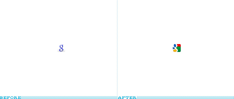
Back in June of 2008, Google changed its Favicon after what seemed like years of use of the original uppercase G, and given Google’s sparse branding, this small change was remarkably big, as if it had changed its logo. So it’s quite surprising to see Google change the Favicon once again, less than a year, which in branding time is like one week of building brand equity. It’s also surprising that, well, it’s terrible. The “g” is barely readable, the aliasing (jaggedy eges) on the rounded corners is crude and the overall feel is pretty pedestrian. This is perhaps too harsh a criticism for something as small as 16×16 pixels, but when it comes to Google every detail counts. The new Favicon is also the result of a weird call for entries encouraged by Google to create a new one, and the design is based on one specific submission (which is better than the final one) and inspired by a few others (which are also better than the final one). All in all, a strange, unnecessary change.
Thanks to all that, nearly at the same time, sent the tip.
![]()
In 2001, Ben Chestnut, co-founder of the e-mail marketing service MailChimp, designed their application’s logo in a bit of a rush… and in Macromedia Fireworks. The result is actually quite commendable for having been done in a web image-editing application, but unless this was a weird version of design Fear Factor I would never ever venture to design a logo in Fireworks — as Ben explains in this really great brandtrospecive (branding + introspective), his file was anything but expandable, nor fit to print. Working with HicksDesign, designers of the Firefox logo, MailChimp is about to deploy a new monkey on its application and web site.
Continue reading this entryNext Page
(Total Number of Pages in Technology: 3)


