

NOTE: This is an archived version of the first incarnation of Brand New. All posts have been closed to comments. Please visit underconsideration.com/brandnew for the latest version. If you would like to see this specific post, simply delete _v1 from the URL.
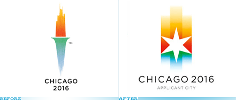
Almost a year ago, the city of Chicago unveiled its Olypmic applicant city identity and was welcomed with rare fanfare from the design community. Smart, surprising and sophisticated were all regular compliments — and these are only the ones that start with an s. Then in May of 2007, the International Olympic Committee (IOC) changed the rules of the bidding process for cities, with one clause stating that city logos “shall not contain the Olympic symbol, the Olympic motto, the Olympic flag, any other Olympic-related imagery [such as] flame, torch, medal, etc.” Chicago 2016’s skyline torch was now breaking the law.
Besides designers, the city’s residents rallied behind the logo and it was adamantly endorsed by Chicago’s biggest icon, Mayor Daley. Finding a replacement for the torch would be no easy task for VSA Partners, who had designed the identity pro-bono originally, and would do it again for version 2.0. And it must surely have been the least enviable position to be in for the venerable design firm: Finding a logo that felt the same, conveyed the same ides, and captured the same elements of the previous one. As a designer, it’s one of the worst positions to be in, because the expectations than had been set were already succesfuly met, and repeating the task with the same energy is nearly impossible. Yet, from the resulting logo, unveiled this week, SVA proved that the hat trick could be done twice.
The new logo retains the basic construct of the old icon — a blue-to-green gradient on the bottom, representing the lakes and the parks, and a red-to-yellow gradient on the top, representing the skyline of the city — and integrates one of the few victory- and hope-related elements that the IOC has not deemed inappropriate or off-limits, a star. Which on first impression looks like, well, a rather ugly star. Yet, it’s deliciously not gratuitous, as it is the shape of the stars that adorn the official flag of the city of Chicago. The resulting logo is a striking, highly visible and recognizable identifier for Chicago’s bid efforts and, despite its mushy rationalization, it may even be better — as a mark not an idea, mind you — than its predecessor.
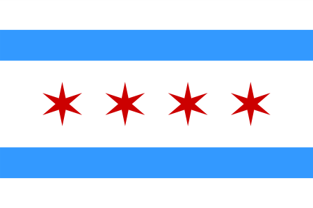
City of Chicago flag.


Jump to Most Recent Comment
Samantha Warren’s comment is:
Bravo! Proof that facing some of the most difficult challenges can result in a fantastic product. While the torch is elegant I find the star to be exquisite. VSA too a fresh approach to a common graphic all the while making a direct reference to Chicago's established visual language. This is a logo I would buy on a T-Shirt.
On Sep.21.2007 at 11:36 PM
JonSel’s comment is:
I never embraced the original. I thought it was way too gradient heavy and the proportions were too vertical. I suppose I can still complain about the gradients, but I think this mark is clearly superior. It's stronger and bolder and should prove more flexible in application. It could just be the jpegs were seeing above, but the new mark seems to have richer colors as well. Bravo to VSA for sucking it up and coming through in the clutch.
On Sep.22.2007 at 12:05 AM
Alfonso’s comment is:
I disagree. The previous logotype showcases the city as the flame that gives purpose to the torch. And this was expressed with shapes that were easily recognizable and balanced (if a bit too vertical). You could do without the mushy color rhetoric and still have an icon that communicated on an almost visceral level, purely by the power of familiar shapes.
The new one, on the other hand, seems to have lost this almost completely. Unless you know that this six-point star is featured on the city flag, it bears no basic, recognizable value. You need to be informed of what the star means or where it comes from to understand its symbolic value.
Then there's the gradients. On the torch-version, as I mentioned before, one could do without an explanation for the colors because they were housed inside shapes that clearly referenced commonly known things (a torch, a flame, a city). On this new version, the gradients/colors aren't really a part of anything. They are their own shape, and thus an explanation seems necessary.
FInally, the star makes reference to the flag, yes. But then you see the flag and it has four stars. I immediately thought, "well, surely there's a reason for each and every one of those stars in the flag, so which one is this logo refering to?" Upon further investigation concerning the meaning assigned to each star, I discover that each one has a value assigned to each point in the star. This, at least helps me understand why so much explanation is needed to describe the values of each point in the promotional videos showcasing the logo. And I must admit there's something genuinely beautiful about giving the city a new star; and even going through with the tradition applied to the stars found in the flag. Although I find this to be a very strong idea, I believe it doesn't really hold everything together in the final execution.
In the end, I think I like the torch version better simply because it is more concrete, relying less on the very sentimental explanations that accompany it. The second one seems to need the explanation to give it value, to show its meaning. Thus, it fails to catch me on a visceral level.
On Sep.22.2007 at 12:50 AM
Ty Halasz’s comment is:
Hopefully the IOC will have the first one in the back of its head when it views this one. That way, it's like having two for the price of one!
On Sep.22.2007 at 12:54 AM
Unit B’s comment is:
Well done! Lightning strikes twice, after all.
On Sep.22.2007 at 01:16 AM
Von Glitschka’s comment is:
Wow! Nice and clean just like the city itself. Really well done and the animation of it is a thing of beauty. Three thumbs up!
On Sep.22.2007 at 04:55 AM
Splashman’s comment is:
!@#$% IOC.
Well, I liked the original better, mostly because it's less generic, but the new one is just fine. As Armin noted, VSA had an almost impossible task, and taking that into account, we really couldn't ask for more. Bravo!
On Sep.22.2007 at 06:22 AM
stock_illustration’s comment is:
Considering the original was beautifully done, the new one is pretty great as well. Nice work.
On Sep.22.2007 at 11:09 AM
John’s comment is:
Great job VSA.
On Sep.22.2007 at 11:35 AM
Jason Warth’s comment is:
BRILLIANT! I dare say I like it even better than the original (which I loved as well)! "...it may even be better — as a mark not an idea, mind you — than its predecessor."
As a Chicagoan, I've always loved the Chicago flag (pictured above). It's perhaps my favorite color combo and I love seeing it around the city.
On Sep.22.2007 at 01:43 PM
JT’s comment is:
I think they really used this opportunity to their advantage perfectly. Now that I see both logos side by side, the first really looks like a logo suitable for competing within the country (would most countries outside of the US even recognize the shape of the Sears tower?), and now that Chicago won the US bid, the new logo looks like it's ready to take on the world. The star, though it's kind of a generic symbol, I think it is generally universally understood as a symbol for victory, accomplishment, wonder. Every human looks up to see stars.
I think it sums up the Olympics wonderfully.
On Sep.22.2007 at 08:49 PM
jon’s comment is:
zzzzzzzzz. thank God applicant logos are never used for the real games. Could this be more boring, stale and corporate? It actually makes me long for the London Olympics logo. I seem to be the only person on Earth who didn't love the old logo, and I fear the hate mail coming my way now. That said, I did like the use of the Sears Tower reference, and losing that seems unnecessary. To me, this is just completely generic. A star with warm and cool gradients. Couldn't this be used for any city, or any event, or any corporation? Minneapolis 2016? Los Angeles 2016? TelStar Logistics? Star Energy? WinStar Heating and Cooling? Maybe its okay after all, because if they get the Games, they can then add some Olympic reference back in, and then it'll be perfectly fine... but still, it just seems Chicago deserves better.
On Sep.22.2007 at 11:31 PM
zedzedeye’s comment is:
Shame on VSA for not following a creative brief to begin with!
On Sep.23.2007 at 01:38 AM
Frank’s comment is:
The first logo made sense.The second only makes sense if you know the first one and know about the star's background history.
On Sep.23.2007 at 01:41 AM
Armin’s comment is:
For all the complaints about the star not being immediately recognizable: This is a logo for the city of Chicago, for its residents and supporters – who will undoubtedly recognize the star as their own. Other bid cities use landmarks, or the city flower, or the city bird, or whatever. Taking the star from the flag is as perfectly sensible as any of these, and I would add, even more meaningful.
On Sep.23.2007 at 08:42 AM
Armin’s comment is:
> Shame on VSA for not following a creative brief to begin with!
Z, the rules of no torches. etc. was instituted after the original logo was designed and approved. It wasn't an oversight from VSA.
On Sep.23.2007 at 11:28 AM
Splashman’s comment is:
And Armin made that very clear in his post. Read before writing, please.
On Sep.23.2007 at 05:25 PM
Bart O'Dell’s comment is:
This will serve as a beautiful replacement until Chicago wins the bid. After that I am sure we will see the torch version return. VSA did amazing work on both.
On Sep.23.2007 at 10:24 PM
Kevin M. Scarbrough’s comment is:
I do prefer the original logo, but I must say "hat's off" to VSA for them to reconstruct from the ashes a beautiful mark. Congratulations to all involved, a job splendidly done.
On Sep.23.2007 at 10:26 PM
Jeff’s comment is:
I don't dislike this re-worked version, but it doesn't represent the city at the original work did. It WAS clever, now it is merely generic and forced - though well done for being in a pinch.
Shame on the IOC not having set proper rules before work started.
On Sep.24.2007 at 05:34 AM
Leo Klein’s comment is:
This is a logo for the city of Chicago, for its residents and supporters – who will undoubtedly recognize the star as their own.
The star really isn't that distinct. I don't think anyone around here, looking at it, would see anything particularly "chicagoan" about it.
Also, traditionally, the stars were 6 point:
http://www.chipublib.org/004chicago/chiflag.html
andrew miller’s comment is:
Considering the tough situation, the result is pretty good, but I definitely feel that the original had more meaning to it. And Armin's point that the logo is used locally only gives more reason to use the skyline.
All of their symbolism is built into this star that in my opinion is distinct but not visually attractive. Whether Chicagoans recognize their own star is something I cannot comment on, but either way, I feel the skyline is a stronger visual point to build on.
Granted the gradients look somewhat better in this version, I feel that a gradient has little to do with symbolizing parks, lakes, and a skyline.
And this definitely limits the usage of the logo. I'd like to see a black and white version, or a reversed version. Two things I think the original would have excelled at while maintaining its meaning.
On Sep.24.2007 at 08:14 AM
Armin’s comment is:
> Also, traditionally, the stars were 6 point
And this logo is…? 6 point!
On Sep.24.2007 at 08:20 AM
Blake’s comment is:
I fell in love with SVA's first attempt, simply because I thought they nailed it, dead on. I had recently visited the city for the first time, so I was already in love with the skyline. The first attempt felt like a completely classy attempt at fusing the Olympic brand (torch) with the city.
The second attempt, feels just like that-- a second attempt. I think it looks great. Feels great. Solid. I'm a fan. However, the first felt so perfect, I just can't bring myself to love the second just as much.
It's a shame what rules and politics can do to good design. Can somebody just claim it's not a torch, but... something else?
On Sep.24.2007 at 08:35 AM
agrayspace’s comment is:
Yeah but can you fax it!
Ha. No seriously. I err on the side that this is too generic. The star is a loaded symbol that carries infinitely more connotations than to the cities logo.
And Armin, aren't city application logos more for the selection committees than the citizens of the city. The purpose is to package and express how the cities energy will successfully market the games. On that note I think this falls short. When I see this I think Texas.
Still, it had to be a nightmare nut to crack.
On Sep.24.2007 at 09:42 AM
Aaron’s comment is:
I'd like to see competitor logos to see if the new Chicago identity stands on its own.
Obviously without the city skyline in the flame of the torch you really loose the Chicago-ness.
Does this new identity at least stand out as a unique and memorable look in comparison to competitor cities?
On Sep.24.2007 at 10:01 AM
5000!’s comment is:
I'm surprised they didn't keep the city skyline, or some interpretation of it. Given that the blue/green gradient is supposed to represent the lake and parks, it still would've worked in the foreground of a revised cityscape. Maybe it was just too much.
On Sep.24.2007 at 03:14 PM
felix’s comment is:
Who knew Chicago had a flag?
This is more of a look whodunnit than a look howgooditis.
Its clean and nice.. but without any emotion.
Wheres all that fabulous wind I keep hearin about?
Andrew J Klein’s comment is:
I know there have been advances in printing...but...
What would the 2-color version look like?
On Sep.24.2007 at 03:38 PM
zedzedeye’s comment is:
Armin, I believe that the rules were already in place, "IOC said its rules don't allow logos that contain the Olympic symbol, motto, flag or other imagery including a flame, torch or medal."
From what I have read, The IOC came back with a late ruling...or just in time to change it.
Either Chicago didnt know the rules (unlikely), they didnt care, or it served a different purpose (winning the US bid)
Who really knows these thing?
On Sep.24.2007 at 08:29 PM
Gavan’s comment is:
Hey Jon, in regards to bid logos being poor in comparison to the "real thing", so to speak.
I know what you're getting at, but you're seriously overlooking an incredibly sleek exception to the rule. The Sydney 2000 bid logo, designed by the great Michael Bryce, (seen at the Minale Bryce website here) is absolutely brilliant.
It puts the pathetically kitschy Boomerang Man that the games ended up with in its place, and the simple and reduced form of the bid logo has actually hung around as the memorable graphic device of the Sydney games (and you can see how it directly informed the boomerang man itself in the first place).
I too am surprised by the what I perceive as sheer amateurism of alot of the bid logos I've seen in recent times, but I'm sure there are numerous exceptions.
On Sep.25.2007 at 05:53 AM
Leo Klein’s comment is:
Armin’s comment is:
And this logo is…? 6 point!
Sorry, blanked out on this one. The _shape_ of the star is decidedly different from the more "traditional" one:
http://www.chipublib.org/004chicago/chiflag.html
Frankly, if you held up either star to an average Chicagoan, they wouldn't be able to identify it.
It has no real (local) distinction.
On Sep.25.2007 at 09:05 AM
Chad K’s comment is:
Agreed. Hardly anyone, even locals know a cities flag. Many people don't even know state flags. I recently did a project for a Community development project in Philadelphia where I have lived for almost 6 years now. To get inspiration for color schemes I looked at different material including the city's flag. I had no idea that it was light blue and yellow. It is very innocent looking and can sometimes be seen with the city's seal on it.

The Philadelphia Eagles just played a game using their throwback inaugural jerseys. See below:

I bet most of the fans in the stadium, true Philadelphians, knew that the colors, hardly intimidating to an apposing team, came from the Philadelphia flag
On Sep.25.2007 at 09:58 AM
Armin’s comment is:
As a former Chicagoan (for 3.5 years) I can attest to the visibility of the city flag. It was much more visible than in another place I have lived or visited. For instance, I don't know what the Atlanta or New York flags look like off the top of my head, but Chicago's I can immediately recognize.
But as a general rule, I would rarely encourage design firms to limit their design executions based on people's knowledge. Or lack thereof.
On Sep.25.2007 at 10:02 AM
Shelby’s comment is:
I can say that the Chicago flag is instantly recognizable to me. It's a frequent sight when you live in Chicago. Heck ,I just bought a Tosser's shirt that has the flag on it with the stars replaced with their logo. I see it all the time.
On Sep.25.2007 at 12:39 PM
yourmom’s comment is:
Ohhhhh, sad day... Stars, with any number of points, are such a cliche..
On Sep.25.2007 at 02:02 PM
C-Lo’s comment is:
Nice how they reworked it. I would have kept the "skyline in the fire" however. It'll be more workable in print.
On Sep.25.2007 at 03:43 PM
Leo Klein’s comment is:
Who said that Chicago's city flag isn't recognizeable?
All you need is to line up four red stars in between two blue strips and most people in Chicago will know what you're getting at. The thing is practically flapping from every street-lamp.
It's only when you isolate the star and expect people to recognize what that resembles, when denuded from all other context, that most people in the city of Chicago will scratch their heads.
Hence, the generic nature of the logo.
On Sep.25.2007 at 11:45 PM
Jeff’s comment is:
Stars are cliche?
Are there a lot of sars in logos? Absolutely. But I think it's kind of an excuse for a designer to take any geometric shape that used in a logo and say it's cliche. There are only a finite amount of shapes in the world, and chances are most of them have been used by someone before.
On Sep.26.2007 at 04:28 AM
Alfonso’s comment is:
Oh, no. There's a finite number of shapes in the world? We're doomed...
On Sep.26.2007 at 10:12 AM
darrel’s comment is:
The new one is a compromise, but an acceptable one.
On Sep.26.2007 at 10:35 AM
Stefan’s comment is:
"This is a logo for the city of Chicago, for its residents and supporters – who will undoubtedly recognize the star as their own."
I've lived in Chicago for almost 30 years now and didn't recognize the star as the same star from the city's flag. I agree that Chicago's flag is one of the more visually recognizable city flags, but I think it's power lies more in the repetition of the stars rather than any of the stars themselves.
"would most countries outside of the US even recognize the shape of the Sears tower?"
If people wouldn't recognize the Sears Tower, they sure aren't going to recognize the star as the star from Chicagoan flag. I think that without a detailed explanation, the new looses it's meaning. The old logo was bursting with symbols of the city. For those who know nothing of Chicago, it still beautifully referenced the spirit and excitement of the games. I feel like you need a manual to understand what the new logo is trying to portray.
On Sep.26.2007 at 02:37 PM
Fraz’s comment is:
I was initially enamored with the new design, but then I thought that it looks like a vertical, colorized version of the Los Angeles Olympic logo:

Maybe it's just me...
On Sep.27.2007 at 09:54 AM
Jw’s comment is:
I've lived in Chicago since 2002 and instantly recognized the star. Only the most myopic of citizens would miss the reference in this design.
The new logo is second only to the original. Having seen the disaster of the London 2012 logo, it's clear that they've knocked this one out of the park. I can't remember ever being as happy with an Olypmic logo.
Almost makes me hope we win the bid. Then again, the EL is already crowded and slow enough as it is...
On Sep.27.2007 at 03:46 PM
Leo Klein’s comment is:
Jw’s comment is:
I've lived in Chicago since 2002 and instantly recognized the star. Only the most myopic of citizens would miss the reference in this design.
The new logo is second only to the original. Having seen the disaster of the London 2012 logo, it's clear that they've knocked this one out of the park. I can't remember ever being as happy with an Olypmic logo.
I go back a little earlier.
I'd say they "knocked this out of the park" but only in relation to the London "Tremor" Logo.
On Sep.27.2007 at 04:18 PM
Jenny’s comment is:
I think the second logo has more meaning as a logo for the city of Chicago itself, rather than anything with an Olympic association.
Does anyone know why the IOC made this rule?
Kevin’s comment is:
the designer is kyle poff: http://www.flickr.com/photos/kylepoff/
On Sep.29.2007 at 08:07 PM
Elena’s comment is:
First off, I'd like to thank Armin for responding to my request for a discussion of the logo change. I thought the original logo was really strong, in part because Chicago is an extremely vertical city. I think the current one is ok, but not great - the sunset-y colors at the top made more sense when paired with the skyline. However, I'm wondering how anybody who has spend a significant amount of time in Chicago would not recognize that star - it's on every police car, public school & government building in the city.
On Oct.01.2007 at 02:21 PM
Mark’s comment is:
I love it, I love it.
I can see the representation of the iconic Sears Tower, I can see how the star relates to the city,I can connect the city to the logo and vice versa.
Simply Chicago, good design! :-)
On Oct.01.2007 at 09:01 PM
Leo Klein’s comment is:
CHICAGO TALKS BACK
Here are reactions from some of the kids at the school where the new logo was unveiled:
Cadeashia Ellis:
I wanted to let you know I agree with you. People are saying you were pretty harsh, but I don't think you were harsh enough. Everyone at the unveiling was excited, but once the new logo was revealed, it was just like "we waited all that time for this?" Same idea and same colors as the torch logo, but the only thing that differed was the symbol.
Dayana Mina:
I agreed with your article when you said the new star logo was nothing compared to the torch from last year. Our new Olympic logo looks as if only a little effort was put into it. It was too simple and boring.
Here you can read the the rest...
On Oct.01.2007 at 09:48 PM
rickyaustin’s comment is:
I'm not even from Chicago and I knew that was the star from the flag.
There are MANY marks out there that are praised with more muddled references than this star.
I was waiting on this mark, and I wasn't disappointed. Well done VSA.
On Oct.01.2007 at 11:46 PM
Leo Klein’s comment is:
rickyaustin:
I'm not even from Chicago and I knew that was the star from the flag.
Amazing. The people not from Chicago or who've been in the city the least amount of time, recognize the star whereas people like Stefan (30 years in Chi-town), me (47 years in Chi-town) -- or children going to public school in Chicago -- totally missed it.
May wonders never cease.
Here by the way is Sun-times Columnist, Lewis Lazare's verdict on the thing:The new logo that Chicagoans and the rest of the world will have to live with for at least the next couple of years isn't an utter disaster. It's just a hopelessly homely attempt to replace the glorious torch. What's worse, the new image has a cut-rate, slapdash feeling about it.
Ryan and Daley laid out a ridiculously elaborate back story to justify the star: The star was inspired by the six-pointed star in our city's flag -- a flag, we hasten to point out, that maybe six people beyond Chicago could recognize if it were flashed in front them.On Oct.02.2007 at 01:02 AM
Big Little’s comment is:
If you live in Chicago and don't recognize that star as one from the flag...you are either blind, or stare at your feet whenever you are in the city.
The Chicago flag is everywhere.
And it's not some unrecognizable seal, like most cities and states. It's simple, bold and memorable...unless you have no eye for detail, I don't see how you could miss it.
On Oct.18.2007 at 11:23 PM
Neil White’s comment is:
As to what Alfonso was saying, I disagree. My first impression of the new logo was of a stylized skyline, even prior to seeing the original. Also, the star works well- even if you don't catch the city flag reference, it's still a powerful symbol that everyone understands.
My big issue is the choice to use gradients. Although it's stunning on a static, white background, it might be difficult to reproduce on fabrics or against certain colors. I wouldn't be surprised if they ditched the gradient should they win the bid, spectacular as it is...
Overall, it's a beautiful design, before and after- much unlike some we've seen. ;)
On Jun.28.2008 at 04:28 AM
rich’s comment is:
great job VSA!
regarding the original... what a great historical reference they incorporated. check out this old poster

Comments in Brand New, V1.0 have been closed.


