

NOTE: This is an archived version of the first incarnation of Brand New. All posts have been closed to comments. Please visit underconsideration.com/brandnew for the latest version. If you would like to see this specific post, simply delete _v1 from the URL.
![]()
Earlier this morning I set out to write a one-paragraph review of this logo. It’s 10:15 p.m., I’m missing the Oscars, I have nearly 20 tabs open in Safari, and I’m just now finishing to unravel the epic evolution that involved one reputable sports logo firm, a few hundred designers (and non-designers surely), a contest, and, of course, a committee. In 18 months. Ready? The story starts when South Dakota State University (SDSU) started to transition into the Division I of athletic competition in 2004, but it only starts to really unspool in October of 2005 when the athletic director noticed how bad its logo was in comparison to the other slick logos of DI schools. So they enlisted New York-based Phoenix Design Works (PDW) to tackle the challenge — but not before asking another firm to do “some preliminary designs”, whatever that means — with the goal to unveil a new design in February of 2007. From what I gather PDW started working on the logo somewhere in late 2006. In October of that year, PDW showed up to SDSU to present 30 design options, and as a response, the committee “took the representatives north of campus to watch jackrabbits running” hoping that this experience “would help them design a jackrabbit that fits SDSU better,” because, “their previous exposure to jackrabbits was online photos.” This should tell you enough about the process.
The committee is never quite revealed, but there are members from the Student Association, as well as a Relations Director, and I’m guessing members of the athletic program, but as the story continues, they sound like a designer’s worst nightmare. In January of 2007, PDW shows up with a proposed solution, which is only seen in a little sidebar on this page, that involves a more realistic rabbit. From what I can see it does seem odd for a DI school, it looked like more of a Velveteen rabbit. The committee was not happy, specially as they garnered responses from people in the university. Including, god knows why, Derek Peterson the university’s bookstore manager, who “[had] been somewhat frustrated because he asked to see the logo in different colors and sizes, but the design committee failed to meet those requests”. So, no logo yet, and back to the drawing board.
In February, when the logo was supposed to be released, a turning point came when Ross Hettinger, a junior art education major, who “spent six hours coming up with his own versions of the logo with his idea of true jackrabbit characteristics” and posted it on Facebook to share his work with students. The group grew to 400 members, with some suggesting logos themselves, giving the committee a glimpse at the power of crowdsourcing. Do you have shivers yet? Hold on, it gets better.
This page you should really read as it spells the beginning of the end, and shows some of the alternate, alternate logos presented. Here are some choice sentences — don’t try to follow any of the names, it’s the underlying message that really matters — for the faint of heart:
During the Feb. 7 meeting, Brandtjen said she showed committee members student designs that were given to her, as well as designs that were posted on a group on Facebook, a social networking Web site.
“I was amazed at how responsive they were to new ideas,” she said. “We discussed those and discussed what was emphasized in those (designs) that students were in tune to. I like student submissions because I have feedback to what students think.”
“At this point, anything submitted will be treated as an indication of the direction some students are interested in going with the rabbit design.”
“Once we have several designs, the committee will get feedback from students and alumni through focus groups and an online survey.”
In this Stephen King-worthy article, the fee paid to PDW is also revealed: A whopping $6,000. Six. Thousand. Dollars. For a Division I athletic logo? That’s low. Specially for a process like this. Sometime in April, the logo unveiling is moved to Fall of 2007, while PDW is subjected to whatever feedback may have spawned from the committee as well as the looming potential of more logo submissions from yahoos around the country.
By the end of Spring of 2007, after PDW submitted three more designs, to mixed reactions, SDSU decided to offer a less-than-whopping $1,000 as reward to anyone that came up with the winning design of a contest ending June 30 — and by “anyone” they really meant it, as “those who submitted designs ranged from a 14-year-old to an 89-year-old alumnus.” After a reported 250-plus submissions, the committee selected around five logos and asked their designers for revisions less than a month later.
After focus groups and online surveys a logo was submitted to the university’s administration in December of 2007 for approval. The winning design was unveiled this past February 19.

Alternate logos.
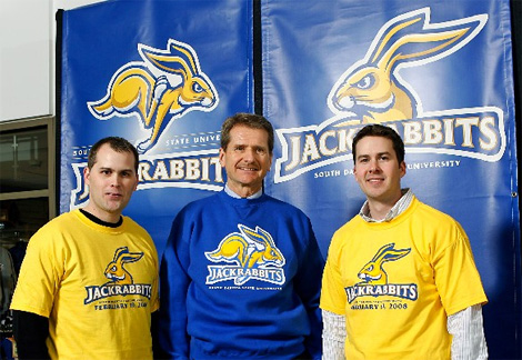
Craig (left) and Cory Whitlock (right) of Mongoose Graphics in Denver, winners of the contest.
The new design is exactly what you expect a sports logo to look like nowadays: Fierce. It is actually quite handsome when you judge it within the context of sports logos. The winning design came from brothers Craig and Cory Whitlock of Mongoose Graphics in Denver, who designed the two logos shown above. However, if I understand correctly, the “jacks” typography with ears and fluffy tail shown at the top of this post, was designed by someone else, a Tony Horning of Minneapolis. You can see some flashier pictures here, if you don’t mind a little watermarking. So, there you have it kids, that’s how you design a logo in 2008. It’s not too late to change careers. Send a bucket of roses to Phoenix Design Works if you like, they surely deserve it.
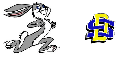
The old Jackrabbit was created in 1971 by Larry Westall of University Relations. Its resemblance to Bugs Bunny may also have played a role in their need for change.
Thanks to Rusty Mitchell for the tip.


Jump to Most Recent Comment
tim’s comment is:
Ugh, that made me nervous / enraged / suicidal just reading about it. *shudders*, *skulls gin*
i like the logo on the bottom left, the top 'jacks' one not so much. Are they both official variations? seems a bit weird to have two logos AND names...
On Feb.24.2008 at 10:51 PM
Gary’s comment is:
Gawd, and I thought I was having a bad day.
On Feb.24.2008 at 11:04 PM
JonSel’s comment is:
They've got some very angry jackrabbits running around north of campus, don't they?
On Feb.24.2008 at 11:05 PM
Zach’s comment is:
Hmm...do I want to change careers yet? I'm not even out of undergrad.
This post actually made me 'giggle'
On Feb.24.2008 at 11:11 PM
Willis’s comment is:
They ended up in a good place, especially the "proud rabbit" design on the bottom left. The "j-ears" logo is weird, though.
On Feb.24.2008 at 11:31 PM
StevieD’s comment is:
The original firm was paid $6,000 to get yanked around for so long? You, dear author, should get paid $6,000 for your writing efforts on this post, and we, faithful readers another $6,000 for enduring the drama. Crowdsourcing is a cool web 2.0 concept. But for logo design? Oy vey.
On Feb.25.2008 at 12:00 AM
SpaceMonkeyX’s comment is:
That's quite an ordeal to say the least.
I wonder if my hometown high school should adopt something similar for our mascot - The Fisher Bunnies.
No, really. Here's our website with one of the many fierce bunnies we've seen over the years:
http://www.fisher.k12.il.us/webpage/welcome.html
Blue Buddha’s comment is:
Wow! This seems rather horribly handled and spun out of control. I thought design by committee was bad where I worked!
I will admit however, that the jackrabbit presented in the link of the 2007 proposed solution does not look like a jackrabbit. Perhaps being from the west, I am more familiar with this animal.
I quite like all final solutions of the logo, including the Jacks logo at top. It is everything a current sports logo looks like and while not being remarkably trend-setting, it works.
On Feb.25.2008 at 12:26 AM
Gary’s comment is:
> This post actually made me 'giggle'
Give it another 10, 15 years and tell us if you're still laughing.
On Feb.25.2008 at 12:29 AM
Prescott Perez-Fox’s comment is:
I too don't understand why the "Jacks" wordmark doesn't match the contest winners in typo or overall style. It's a totally new version and yet, there it is. Who's in charge over there? Oh ... right ... everyone.
$6000 might be a lot of money in South Dakota, otherwise, I can't explain it. The weirdness of the process aside, I guess PDK decided how many billable hours to spend on it for the price — they must have known that SDSU isn't exactly world-class exposure. Right?
On Feb.25.2008 at 01:00 AM
Unit B’s comment is:
What was that old line, that a zebra was just a horse designed by committee? Armin, excellent job piecing the horror show together for us. Man, that is one angry bunny rabbit.
On Feb.25.2008 at 02:33 AM
kristoff’s comment is:
I think I will be adopting the phrase 'took me to watch the jackrabbits running' when a job gets that critical.
Good story. Thanks Armin.
On Feb.25.2008 at 03:33 AM
DG3’s comment is:
Love it!
On Feb.25.2008 at 03:55 AM
DG3’s comment is:
There's nothing menacing about the overly happy bunny of the original. The new one's not 'angry', he's fierce.
On Feb.25.2008 at 04:01 AM
Luke Andrews’s comment is:
Nightmarish indeed, but why didn't PDW fire their unruly client? This story is more about a design firm unwilling or unable to make a decision that would have saved them a lot of grief and — judging from how long the whole affair lasted — money.
On Feb.25.2008 at 05:49 AM
john’s comment is:
That fee of $6000 is what makes me cringe the most. For all of the sports market design concerns out there, are any of them making a living on $6000 D-I identity packages? $6000? For DIVISION ONE? That is absolutely insane.
On Feb.25.2008 at 08:29 AM
john’s comment is:
Not to go on a rant, but, can anyone else comment on that fee? PDW has done work for much bigger schools, for MLB, for any number of properties that aren't SDSU. I cannot believe that LSU, the Colorado Rockies or the Florida Marlins paid under $10K for their identity work. I would think those identity packages would be in the neighborhood of $50K, minimum.
Or is it a case of too many service providers in the market space? SME, PDW, Studio Simon, Plan B, Todd Radom, Adrenalin, Rickabaugh, Old Hat...and now Mongoose? Has sports work been devalued to the point where experienced firms are freaking giving away work for $6,000? I'd think that $6K wouldn't even cover those initial 30 initial designs! Are sports design firms having to undercut each other into irrelevance?
On Feb.25.2008 at 09:00 AM
john’s comment is:
No, really, this will be my last comment on the subject (hopefully).
Anybody at PDW who happens to read this, please know I'm not dogging on you. While this situation is an extreme, it touches a nerve for me about the valuation of design work in general, across all markets, not sports in particular.
I know all of us struggle with how to appropriately estimate the monetary value of our work. More often than not, clients are completely clueless and some even take offense at the fees we propose. It makes for what I see as a maddening downward spiral of value as we struggle to win business. Frankly, it points to a dangerous commoditization of what we do for a living, pushing us as designers closer and closer to what has happened to the illustration market over the past 50 years. Are there too many of us doing the same thing? Are we our own worst enemy? Are we kidding ourselves? The nature of markets is to seek the lowest price possible. I fear this story illustrates just how low we can go.
I may be completely off base, but when I do some "back-of-the-envelope" math concerning the value of this SDSU project, I start with trying to determine how I can evaluate concrete value. For a university athletics program, as with any sports property, I figure merchandise sales is as good an indicator as any to quantify value. I pull a number out of the air that sounds reasonable, let's say $250K per year for SDSU athletics merchandise. Take that as an average over five years and you have $1.5MM in merch sales. What's a reasonable percentage that represents the value of the creative work? 5%? 5% of $1.5MM is $75K. $250K too much per year? Okay, let's say $150K, over five years is $750K, 5% is $37.5K. Point is, back to my original point, $6K is insane. In no way, shape or form does $6K represent fair value for that work.
If I'm wrong, please, somebody tell me. I may very well be one out of his mind. But I just can't help but feel that this story, while in the extreme, reveals an ugly truth about our business. A truth I really, really, really don't like.
On Feb.25.2008 at 10:07 AM
Ty’s comment is:
PDW is worth WAY more than 6K. Gosh.
Does anyone think that much of this might be explained by the fact that this is South Dakota?
On Feb.25.2008 at 10:24 AM
nicelogo.com’s comment is:
Agree with you John and the others too. What is happening to pricing these day's? You may get a piece of the pie in your book but you're completely screwing our industry and your career. Say no to spec! And a contests too - shame on you! It goes to show them, you get what you pay for!
On Feb.25.2008 at 10:37 AM
Prescott Perez-Fox’s comment is:
btw, a CAMEL is a horse designed by committee. Or as JFK once said, "a committee is twelve people doing the work of one."
On Feb.25.2008 at 10:42 AM
Jared’s comment is:
I don't know what the 30 initial logos looked like (30? Really? Doesn't that just scream insecurity?), but that 'velveteen rabbit' was just horrid. Seems to me that both parties were completely off their rockers.
On Feb.25.2008 at 11:05 AM
Mark’s comment is:
I know a guy who coaches sports at a Division 3 university with a similarly "fierce" looking animal. We both find it to be incredibly stupid, and joke about how much money the school wasted on the design, which is described in exhaustive detail in a 30 page style guide. BTW aside from the ridiculous fierce/angry mascot phenomenon that's pervaded athletic logos, these overwrought designs look terrible when they have to be rendered in black-and-white. Simple is better folks, and if you're not going to go realistic with a mascot representation there's nothing wrong with cartoony. At least then everyone's in on the joke. Fierce jackrabbit? Are you kidding me?
Finally, to the people who liked the "bugs bunny" looking jackrabbit logo at the bottom of the entry: that's the old logo, the one the school thought needed to be replaced. Sorry you like it (I like it too), because you won't see the school using it anymore. They've gone "fierce."
On Feb.25.2008 at 11:11 AM
C-Lo’s comment is:
For a sports logo, I think it works very well. More so with the lettering and the rabbit. Not their offspring that is on top. Although I guess they have to do some sort of letter-mark for playing jerseys and such. Good color control if not on the obnoxiously atomic-bright side.
My only, ONLY little gripe is in the "jackrabbits" wording over the running rabbit. It's too thick to show the contour of the lettering, and too thin to be one shape / still shows some form of letters ( the A-C in jack for example). I would have went with a thicker or thinner (thicker if I had a preference) stroke just to clean it up more. But maybe they wanted it to have the same property as the outlined rabbit, which has a few random spikes for fur.
On Feb.25.2008 at 11:33 AM
Adam’s comment is:
Other than the $6K, what's everyone outraged about? That they asked people what they thought of the design?
That they asked a bookstore manager what he thought? (does the author realize that the bookstore will probably sell more merchandise with that logo than any other store?)
The only outrage I can muster is that for the author's apparent disdain for customers in general.
On Feb.25.2008 at 12:12 PM
Dave’s comment is:
They will ditch it in a few years to go with something that emphasizes the letters "SD" - It's how these things tend to work with colleges lately.
On Feb.25.2008 at 12:24 PM
Leland Witter’s comment is:
I seriously doubt that either party could "fire" the other. The fact that it is a state contract is referenced in the supporting links, so I'm sure that PDW was committed to a fixed price to produce X for Y dollars. Anyone really interested could probably find the details from the state databases somewhere.
This could even have been an binding RFP situation and they "won".
On Feb.25.2008 at 12:41 PM
Darrin Crescenzi’s comment is:
I was able to gain an insider's perspective on the recent rebranding of my alma mater's athletic program, a much larger Division I school with an even more ridiculous mascot (go Beavs), and the parallels between that story and this one are uncanny.
Besides the committees and the student involvement and the low pay, college athletics are so emotionally-charged that pain and frustration on behalf of the designer is the only possible outcome. With the rampant slashing of federal and state funding for post-secondary education, these public schools have become dependent on private donations to survive and expand, so they are obsessed with not offending their donor-alums. One angry letter from a rich 80-year-old former student can derail the entire design process…
I feel bad for the crew at Phoenix Design Works, though admittedly accepting the job for $6,000 and then showing up with 30 options probably set them up for disaster from the beginning.
That said, I kinda like the angry bunny.
On Feb.25.2008 at 12:42 PM
Darrel’s comment is:
They got a good logo in the end. I guess they got what they paid for given the amount of time they had to put into it themselves.
And now Mongoose Graphics can start offering a $1000 College Logo package.
*sigh*
As for the type not matching, what makes you think that a university (or anyone) that sponsors a contest to design a logo has any care in the world about being faithful to the actual winner's submission.
I was fortunate to get screwed back in college. We designed a logo for the local city's agriculture festival. We won, and then spent some time making revisions for them.
Went to pick up some sample pieces and found out the logo was completely changed. They had paid the embroidery company to completely rearrange the logo.
When we asked "why didn't you pay us to do it for you, since we had done all that work for free already?"
They just stared blankly at us not really 'getting it'.
So, good to learn that lesson early on. ;o)
Perhaps the most ironic part of all of this is that The university has their own Graphic Design Program:
http://www3.sdstate.edu/Academics/CollegeOfArtsAndSciences/VisualArts/
*if* you must have a contest, why not grant it to your own internal in-house group? (I'm guessing the Art School is probably smart enough to not bother dealing with the politics of university logo design by committee, though ;o)
On a more serious note, my hunch is that in most 'public sector' type gigs, this type of issue is more prevalent simply due to the more 'democratic' nature of the politics. It's a lot harder to find a volunteer to be the decision maker in these types of situations and you will likely always find committee involvement in the world of .edu and .gov, unfortunately.
On Feb.25.2008 at 01:11 PM
Armin’s comment is:
> Other than the $6K, what's everyone outraged about? That they asked people what they thought of the design?
The author is outraged, Adam, not because they asked people what they thought, or whether a bookstore manager has any clue how to direct design feedback, but the ultimate disregard of a design process. When as a design firm, you are made to compete, agreeingly or not, with 14- and 84-year olds answering a competition, and when the committee drags you on an 18-month long process on a shoestring budget, it's outrageous.
> The only outrage I can muster is that for the author's apparent disdain for customers in general.
Not in general. Just these. If my customers you mean clients.
Please note a previous article I wrote about designing by and with a committee. I understand how they work. And this is the worst case scenario of working with a committee.
Regards,
The Author.
On Feb.25.2008 at 01:13 PM
david gouch’s comment is:
Adam: That the bookstore manager sells merchandise with logos does not make him knowledgeable about logo design at all. Should his opinion also be sought when a publisher is revising its physics textbook?
The outrage isn't because the committee is asking opinions, it's because they are doing it in a way that so openly disrespects the design firm.
The school is basically saying that the hours and hours PDW put into concepts and research and revisions is equivalent to some random person's Illustrator sketch – in fact, that it's a better use of their time spending weeks sorting through hundreds of random Illustrator sketches than working with the firm they've hired.
I would hate to be treated like that, so I hate seeing PDW treated like that.
On Feb.25.2008 at 01:14 PM
Darrel’s comment is:
"Other than the $6K, what's everyone outraged about? That they asked people what they thought of the design?"
Not sure anyone here is OUTRAGED. If anything, they just commenting on the process that the school had to endure to get to this point.
On Feb.25.2008 at 01:15 PM
jay’s comment is:
I used to work at a university as an in-house graphic designer, and it really is this bad.
On Feb.25.2008 at 01:31 PM
Adam’s comment is:
Surely the process could have been handled more professionally. I'm not a professional designer so you can take my comments as you wish. My interest in design comes from my need for designers for a technology startup. In my experience working with two sets of professional designers, we got work that was either unprofessional (showed little thought, unoriginal, etc - which is a reflection on that group of designers, not designers in general) OR we got work back that "just didn't work".
I have consulted with my business partner, friends/family, and some designer friends on these logos. I listen to what they have to say, sometimes they agree, sometimes they offer critical advice, BUT it is ultimately up to me what works or does not work.
Designers oftentimes have the luxury to stand back and create a piece of art. The buyers, be they a startup, a bookstore, a university, have to live with the identity that a designer has given them (in this case, through a logo). This is a highly personal decision.
My "outrage" comes from your inference that the rest of us can't have opinions - and that we shouldn't even be consulted.
"Just take our word for it - we're the experts."
On Feb.25.2008 at 01:44 PM
Armin’s comment is:
> My "outrage" comes from your inference that the rest of us can't have opinions - and that we shouldn't even be consulted.
Adam, I'm sorry if that's the way my post comes through. It's simply that this specific case requires these kind of conclusions. The end users of the logo should always be consulted, and their opinions heard. It is then the responsibility of the client or committee to clearly establish, from those opinions, what is the best course of action for them and to provide feedback to the designers. In this case, the frustration of the bookstore manager and the 400 Facebook members led to very poor decision-making on the part of SDSU -- holding a contest is the ultimate indicator of a failed process.
Having said all of this, I can tell you that I have not done a single logo where I have forced my views upon a client. It is always through their feedback and based on their comfort level with any given solution. I make strong recommendations, but that's about it. I don't consider what I do as a "piece of art". Design is a service enabled a by a process between designer and client, each with important responsibilities, and both are equally responsible for the positive or negative outcome of any given project.
I only take a position of "trust me, I'm the expert" when it comes to technical issues about identity implementation or printing, because that is experience based on fact. Designing logos is a too loose a job to take that position. It's too bad if this has been your experience. We don't all work that way.
On Feb.25.2008 at 01:59 PM
Darrel’s comment is:
Adam...like anything, the person making the decisions should have some understanding of what they are deciding.
You, as the business owner, being the decision maker for your own business's graphic design needs makes perfect sense for both you and your graphic designer.
On Feb.25.2008 at 02:01 PM
Moriarty’s comment is:
God, you got to feel for the guys at PDW.
No idea what the state of play is regarding contracts in the States, but you got to think it would have been better for them to just walk away from it, even if they didn't get paid a penny (sorry, cent) for the work they'd done to date.
$6K is peanuts and the amount of time spent on the project must have made this one of the biggest loss accounts they've ever had (the trip alone to see the bunnies, how many designers? each costed at a full day rate?) - whilst at the same time no doubt completely destroying the moral in the studio.
I suspect they thought they'd be doing a quick 'down and dirty' job for the $6K for SDSU (as, I'm guessing from what others have written, they're a small university in the middle of nowhere) not an 18 month slog involving them being slapped in the face repeatedly at every turn by their clients, other people the client brought on board to 'help out', students (past, present and future), other companies trying to poach the work, etc…
Oh, and does anyone else see a Watership Down influence here in the final designs?
;-)
On Feb.25.2008 at 02:05 PM
felix sockwell’s comment is:
love it.
great reporting Armin. I actually started reading some of those links and just had to stop. But let me say this, no one is immune to this sort of client behavior. PDW could have just walked away. Its sad they let this crap school (Division 1 or not) walk all over them. My gut tells me they got paid alot more than 6k and the school was simply trying to quell any storm by stating what amount to an incredibly low fee.
In a recent "Holocaust showdown" with Pentagram's Paula Scher, I've learned to just motor through the paperwork, do the work, and get it over with. If they kill it, blame Canada (or Germany)
On Feb.25.2008 at 02:14 PM
Ty’s comment is:
I'm not seeing how the two logos relate together within the identity. Under what circumstances would you employ the "Jacks" logo or either of the "Jackrabbits" logo.
Plus, they don't even seem to relate visually. Look at the ear in the "Jacks" logo, and how the blue shading from the other logos is noticeably absent.
On Feb.25.2008 at 02:37 PM
Ty’s comment is:
And look at the different sizing of the "South Dakota State University" text in the two "Jackrabbits" logos. It seems that brand consistency is really suffering in this identity already.
On Feb.25.2008 at 02:39 PM
Gary’s comment is:
Ah, reminds me of this debacle at the University of Hawaii. They spent over $140,000 and got nothing. I feel for the folks involved with the SDSU cluster-design, but sounds like it was nothing compared with the UH project. Got to the point where even the local TV stations were sponsoring their own draw-your-own-logo contests...
On Feb.25.2008 at 02:46 PM
Hibryd’s comment is:
I will admit however, that the jackrabbit presented in the link of the 2007 proposed solution does not look like a jackrabbit. Perhaps being from the west, I am more familiar with this animal.
After 30 first-round logos, the designers should have been familiar with it too. If the first round were all as bad as that sketch, I can understand why the client would want the designers to actually see what they were supposed to be representing.
On Feb.25.2008 at 03:10 PM
Charles Forster’s comment is:
I really feel for the Phoenix Design Works. It's truly a shame when you have clients present pieces that their 'friend who has nothing to do with design decided to throw together' and make you feel totally useless.
When projects get to that point, the amount of money never really makes up for the amount of time and effort you put into to something that won't be used.
On Feb.25.2008 at 03:48 PM
Andrew’s comment is:
I DEMAND TO SEE ANY OF THE 30 INITIAL DPW DESIGNS!
Someone, PLEASE help us all.
PDW: Exonerate yourselves! Let's see what you proposed. Is SDSU off their rocker or were the initial designs really that bad?
When we see these we can all make a better judgement.
The only design I've seen thus far from PDW is the 'Rabidog' The black and white design of a rabbit in stride that looks like a rabbit head on the body of a dog.
On Feb.25.2008 at 04:10 PM
Greg Hinzmann’s comment is:
It's often surprising to me how organizations will treat "creative" work in contrast to "professional" work. You never hear of organizations "crowdsourcing" their taxes or their legal strategies. Nor do committees ask for a range of tax preparations or legal defenses and decide for themselves which one to pursue.
Unfortunately, design is an unregulated industry. No equivalent of the Bar exam is required in order to practice. Until there is some form of certification required in order to practice design, this sort of thing will continue.
However, my response anytime I am confronted with such a situation is to ask the client if they would take the same approach with anything else that they do. In this case, is this how the university would like to run it's operations? Or create its curriculums? Maybe every class should crowdsource its objectives and materials.
Bottom line is that this behavior shows a disrespect for the profession and its practitioners. Professionals should simply walk away from such clients if their efforts to educate them fail.
Designers of all sorts (graphics, product, etc.) need to band together and completely boycott all speculative work and contests.
On Feb.25.2008 at 05:02 PM
hettinger_rl’s comment is:
I'm Ross Hettinger, the SDSU student that started the Facebook group. I did this because I believed that the logo should have been updated (Warner Bros asked the school to stop using the old one or change it). I also believed that the school should've looked to the students, faculty, and alums to design a new logo in the first place. SDSU is advertised to incoming graphic design students as one of the top schools in the region in that field.
I was excited when it was announced that PDW would be the firm of choice. I had seen some of there work and loved it, but the "Rabidog" that they came up with quickly changed my mind. One look at a real Jackrabbit can show where they went wrong.
The designs that I posted in my group were-to say the least- rough. I created them by drawing them out, scanning them into my computer and using "Photoimpression" to touch them up. I stated from the begining that I did't care one way or the other if they chose my design- I just did't want the committee to choose the "Rabidog."
The old logo was created by a student back in 1973. So it seemed only natural for the new one to at least be open to the students. We're a small school, but also a proud one. I think the new designs will help bring us into the 21st century-all be it 8 years late.....lol.
Whaleroot’s comment is:
This is a hilariously sad post. Good job, Armin.
I'm surprised PDW put up with this shit. I don't have even 1% the reputation they do and surely could use the money more but, I wouldn't have hesitated for a second to drop this client. At least try and get a kill fee out of it. Sheesh!
Yay for committees! Yay for 14 year-old designers! Yay for brain aneurisms!
On Feb.25.2008 at 06:14 PM
Hibryd’s comment is:
You never hear of organizations "crowdsourcing" their taxes or their legal strategies.... Designers of all sorts (graphics, product, etc.) need to band together and completely boycott all speculative work and contests.
That's because professions like accounting have verifiable correct answers to given problems. There is usually one right answer and a professional should know what it is.
Let's face it. Design work is ethereal, unmeasurable, and often leaves equally skilled people arguing completely different points while looking at the same piece. The side effect of this is that, yes, it's open to amateurs and voting because design is often about catching lightning in a bottle. I've seen incredibly talented art directors struggle on something for days and produce crap. I've seen high school students nail something on the first try and then never get back to that level again.
Crowdsourcing may be messy and may threaten those of us trying to do it for a living, but Threadless produces some damn fine shirts, and that finished Jackrabbit logo doesn't look half bad.
On Feb.25.2008 at 06:17 PM
brandy’s comment is:
I wasn't gonna say Jack but…
I just can't help but think of this "angry rabbit" as a reflection of the violence and anger that has taken over some of our universities these days. The innocent carrot-munching, puffy-tailed "wabbit" of yesteryear is being replaced with a steroid-pumped, meat-eating, RRRRRabit that'll head-butt you or worse if you startle it.
Scaweeeeee!
On Feb.25.2008 at 06:53 PM
hettinger_rl’s comment is:
Enough with saying SDSU should've kept the old logo. Warner Brothers said they had to lose it or face a lawsuit. There was NO keeping it. And if they had to get a new logo, then why not rev it up some?
On Feb.25.2008 at 07:10 PM
Andrew’s comment is:
ROSS, Can you post any of the 30 ORIGINAL DESIGNS by PDW or any of your own suggestions from your facebook page? or at least give us a link to them? Thanks for chiming in.
On Feb.25.2008 at 07:28 PM
hettinger_rl’s comment is:
There was actually ony one design that set everyone off. There's a link with that pick in the story. Only the committee saw the other designs.
My designs are in the Facebook group "The SDSU Rabbit Should Look More Like This!" There you can see all the designs submitted to the group, some of which were submitted to the contest.
Prescott Perez-Fox’s comment is:

Sorry, I couldn't resist.
On Feb.25.2008 at 08:31 PM
Armin’s comment is:
> Enough with saying SDSU should've kept the old logo.
Ross, other than expressing minimal endearment for the old bunny, I don't think anyone is arguing that you should have kept it-- it's about HOW it was replaced and WHAT it was replaced with.
On Feb.25.2008 at 08:39 PM
erica frye’s comment is:
I'm with Andrew on wanting to see those initial designs! (Even though there is likely no chance of that.) 30 designs and not only did they not hit the mark, but they were so far off they weren't even rendering the animal correctly? Yikes. Or, maybe the client is crazy. Would be nice to know.
This is my nightmare scenario, start to finish. In my contracts I have a clause that states if we don't have a solid creative direction after the 2nd presentation, either one of us can walk away. If you don't get what they want by then, you aren't likely to figure it. And even if you do, they don't trust you anymore. The well is poisoned.
On Feb.25.2008 at 09:12 PM
Nic Eldridge’s comment is:
My take is this: 30 concepts = no brief
If SDSU had taken the time to consult with the stakeholders and develop a strategic brief prior to engaging a design team, professional or otherwise, then this process would have been over with in less than a third of the time.
Those who support the notion of the students being experienced enough to do the work should may want to consider where the students intend to work when they finish their studies. If the value of design is reduced to amounts like these, there's going to be a lot of hungry ex-design-students with great portfolios.
On Feb.26.2008 at 03:38 AM
zz’s comment is:
>There was actually ony one design that set everyone off. There's a link with that pick in the story. Only the committee saw the other designs.
It could be possible that because that's the only concept seen by eyes outside of the committee, that it could have been the worse out of all 30 that the committee purposely left out to get the students heated.
On Feb.26.2008 at 10:18 AM
nick’s comment is:
wow....those facebook submissions are just awful. no offence, but contrary to the group description, none of these would "work better." not even close.
the logo you got in the end is worth far more than 6k.
On Feb.26.2008 at 11:55 AM
Gerad’s comment is:
What is the point of this post, Seriously the end product is awesome. When PDW submitted the 1st designs I about fell out of my chair, if they were going to pick the lame stuff then I was going to quit school at SDSU and move to Canada, wait that was if Hillary got elected. I was prepared to be dissapointed when the new logo was unvailed however I was delighted.
On Feb.26.2008 at 01:19 PM
Armin’s comment is:
> What is the point of this post, Seriously the end product is awesome.
Because the end does not justify the means, Gerad.
On Feb.26.2008 at 02:03 PM
JENNIFER’s comment is:
Why would we not be picky about our logo? It is what will represent our school. Obviously you are not the most intelligent person to think that the university isn't going to look into more than one option. How we got our final logo is of no importance. Why should we have to pay thousands and thousands of dollars to a design firm that obviously did little to no research about what our school is about. I agree that it took a ridiculous amount of time to come up with a logo, but why are you wasting so much time researching how our logo came about. Spend more of your time focusing on more important things in life.
On Feb.26.2008 at 02:13 PM
Armin’s comment is:
Jennifer: Chill.
Calling someone "not the most intelligent person" is not cordial. But, then again, when you diminish the design profession by holding a contest and offering a $1,000 reward I guess cordiality is the last thing I should expect.
On Feb.26.2008 at 02:23 PM
Darrel’s comment is:
"How we got our final logo is of no importance."
This is a blog about the design of logos. The process is what we talk about here. Your school came up with a great end product through a truly awful process.
On Feb.26.2008 at 02:41 PM
Shane Guymon’s comment is:
So are they REALLY using 3 different logos then?
Poor PDW, something similar happened to our company on a MUCH lower scale of course because we mainly are working designing marketing materials for Dentists, but none the less I can imagine the headaches that came from this.
On Feb.26.2008 at 03:48 PM
Jak’s comment is:
"why are you wasting so much time researching how our logo came about"
Because thats kind of the whole point of this blog. "Obviously you are not the most intelligent person"
On Feb.26.2008 at 04:05 PM
freelancemom’s comment is:
As an alum of the SDSU design program, I'll attest to the fact that the process they went by to get this logo was terrible. There wasn't one part of it that was done well.
Obviously I question why they didn't go to their own design department; it is an excellent program and some very talented individuals have come from it.
The amount paid to PDW was ridiculous, however, they are the ones who accepted it. The logos they proposed WERE hideous. It is some of the worst work I've seen. Out of curiosity I began to research where they may have gotten their image of a jackrabbit. My search led me to a website with some very familiar images that made me question the integrity of PDW's designers.
My conclusion is that perhaps they stuck some inexperienced junior designers on the SDSU project, and that's why their ideas were awful and the price agreed upon was so low.
The contest idea was also an unprofessional idea, and the $1000 prize was ridiculous. The winning group was right to donate it back to the university. Heaven knows they need it.
That being said, the new logo is pretty decent. I was prepared to be horrified when they released it, but was pleasantly surprised.
On Feb.26.2008 at 04:43 PM
Jackrabbit’s comment is:
It seems like there's a lot of griping about SDSU's process and then when somone criticizes you, you take great umbrage.
Don't dish it if you can't take it.
On Feb.26.2008 at 04:44 PM
Armin’s comment is:
Jackrabbit, I never called anyone a "not the most intelligent person". Believe me, I can take it, as long as its dished in a civil manner.
On Feb.26.2008 at 04:53 PM
Jackrabbit’s comment is:
Well it seems from the attitude on this board that the designer is always right and the public (i.e. clients) are idiots. Besides, whatever happened to the first rule of customer service, "The Customer is Always Right?"
I seriously doubt you're going to find people more passionate about branding that college/university alumni. A poorly-designed logo or one that fails to inspire is about as bad as a team with a losing season.
You have students, alumni, future students, fans that will have a say in this re-design. To simply not include them or their thoughts (after all, they buy the merchandise, make the donations, and buy the tickets) is simply arrogance. Especially when you have folks who are passionate about their school like at South Dakota State. I doubt you find many products out on the market that can inspire that kind of loyalty.
Could things have been better handled? Of course. Frankly, I would have bypassed a business that has no inkling of who and what we are in the midwest (and those of you who think there isn't any arrogance on the coasts need to get a clue) and opened it to public submissions. And then if you wanted to bring in a firm to "clean things up" in terms of tweaking design, go right ahead.
But for most of us who are dyed-in-the-fur Jackrabbits, the process was something short of a cluster-flop. A big waste of 6-thousand dollars.
On Feb.26.2008 at 05:08 PM
Rabidrabbit’s comment is:
SDSU hired an outside design firm to produce an acceptable Jackrabbit logo. THEY FAILED, BIG TIME. Only when they opened up to ANYONE who wanted to try did SDSU succeed in getting a decent design.
As an active alumnus of SDSU, I participated in the public reviews, and shared that all the 4 "best" choices were not acceptable. I am very comfortable with the final designs. Based on this experience, I would probably NEVER hire a "graphic design firm", because I never saw a product that showed that they understood the end product. PDW did lousy work, and should not be rewarded for bad effort.
On Feb.26.2008 at 05:24 PM
Andrew’s comment is:
WooooHoooooo!
This is a very charge and fun read.
Great discussion and comments everyone. I would love to hear from more individuals who saw the initial 30 designs.
Thanks!
On Feb.26.2008 at 06:28 PM
gitamba ’s comment is:
wow this was just nightmarish. I don't know how PDW held compsure through all this. I can't imagine 6000$ is enough for their trials and tribulations.
On Feb.26.2008 at 06:43 PM
Gary’s comment is:
Thanks, Freelancemom, for one of the most balanced responses we've seen so far.
On Feb.26.2008 at 08:33 PM
ZedZedEye’s comment is:
Easy, take the VW Rabbit logo, add dimension with 2 colors and a hue of one, add angry look, a few pointed lines, and bam! rabbit college logo.
MAtter of fact I love the logo and will be the first cool kid on my block to get a hat.
On Feb.26.2008 at 09:56 PM
Jackrabbit Insider’s comment is:
[Comment removed on request of the comment's original author]
On Feb.26.2008 at 10:25 PM
JimmieTuba’s comment is:
I am guessing the 6k is a contract ending fee. If it was for the entire contract PDW screwed them selves on that one. I am imagine the payout would have been better if SDSU has selected a design of theirs. I also imagine that they had some hourly rate in there.
Being an SDSU alumnus, I was disappointed they didn't look inward first. They have a design department that could have produced it. They could have opened it up to the students at the school. The school opened up voting to the 'public' twice. I received 2 separate emails. The first was to vote on the PDW designs. They were cottontail rabbits/common hares. They are what you think of when someone says rabbit. If you have ever seen a jackrabbit you wouldn't confuse the two. The second vote was on the ones submitted by the public. These were alumni and people familiar with the university. They were a lot better IMHO. I saved the 'best' of both. I do not want to get in trouble for posting these. If someone can advise me if I am able to without repercussions, I will be happy to.
There was a comment about the school going to a letter logo. If you look up on logoserver.com or just for the football helmet you will see what we refer to the intertwined SD. Unfortunately the instate rivals of USD use the same logo (or they use to). So the school has 4 logos. Someone commented on the use of 3 logos. Most of the schools I can think of have at least 3 logos.
I hope this didn't ramble too much for everyone. Overall this has been an enjoyable discussion to read.
On Feb.26.2008 at 10:45 PM
JimmieTuba’s comment is:
Sorry for the double post but I forgot that the intertwined SD is posted next to the running rabbit. That logo is sticking around.
On Feb.26.2008 at 11:01 PM
Ty’s comment is:
We're losing sight of the final product... let's critique!
The "Jacks" logo and the two "Jackrabbits" logos are NOT cohesive and do not mesh as any brand identity should.
Isn't this alarming to anyone who thinks this identity is great?
On Feb.26.2008 at 11:18 PM
Jeffrey’s comment is:
Maybe it's just late, but I'm still not sure why this is considered to be such a "nightmare" for the designers.
First, PDW agreed to the $6k pricetag, so the blame falls on them if that's under market value.
Two, they had up to, what is it, 7 or 8 months of design time? And provided almost 3 dozen design ideas in that time, none of which anyone was happy with? Couldn't it be that all the designs were really off the mark? That PDW dropped the ball? How is that the committee's fault?
They didn't like the work PDW was doing, they gave them ample time, and basically fired them to pursue other artists. How can you place blame solely on the client for this failure?
On Feb.27.2008 at 02:01 AM
Andrew’s comment is:
Jackrabbit Insider, JimmyTuba:
Thanks for the great posts!
Jimmy: You can email them to me and I'll post'em.
And if you don't want them posted that's fine too. Email them to me anyway. I'm curious to see the fuzzy bunnies that started all this ruckus.
What makes this discussion so enthralling for all of us designers is that it illustrates what we constantly try to teach our clients: DON'T UNDERE$TIMATE the amazing power and emotional impact of something as 'simple' as a 'silly' little logo.
On Feb.27.2008 at 02:12 AM
zz’s comment is:
I find it kind of funny that there have been a few accusations that it looked like PDW's initial concepts were made by "inexperienced junior designers" and that the school should have first looked at their own program for a solution. Well in my mind, graphic design students are even farther down the food chain. I just graduated myself, so I'm not far from that. There is no way a student would be, or should be able to create something as big as a university logo. There is still a lot for them to learn outside of their curriculum. That's a project that should be left to the professional world.
On Feb.27.2008 at 09:57 AM
Darrel’s comment is:
"Isn't this alarming to anyone who thinks this identity is great?"
I'll play devil's advocate here. I'm no sports expert by any means, but it seems that college (and pro, for that matter) sports branding is really about selling product. T-shirts, caps, blankets, coolers, bumperstickers, banners, mugs, buttons, decals, etc, etc.
And, to do that, why not appeal to the broadest market by making logos that appeal to various people and applications. It seems that most sports teams don't have one logo and not only will have variations on one theme, but will have completely different logos.
Ultimately, the 'brand' of a sports organization is MUCH more than the logo, so having an arsenal of a few options isn't necessarily bad, IMHO.
Jackrabbit...I'm not entirely clear on what you are arguing about. I think we're more in agreement with you than you realized.
Jackrabbit Insider...thanks for that post. Nice to have that insight!
"There is no way a student would be, or should be able to create something as big as a university logo."
True. But a design 'department' might be up for that. That said, knowing and having experienced the internal politics of higher education, there's plenty of arguments for an internal design school to *not* take on the project. ;o)
On Feb.27.2008 at 11:30 AM
eighthave’s comment is:
This has been a very interesting post, with many plot twists just in the comments.
While the mean was brutal, the ends aren't awful. I like the Jacks logo, though it seems like they could have had some fun with the swash of the S to make it somehow resemble the hind leg. But I'm with others that thing the design problem here is that the Jacks and the two Jackrabbit logos be more similar. The jackrabbit should have the Jacks ears or vice-versa, but not be so different. My preference lies with the Jacks logotype treatment, though the length of the word Jackrabbits and the angle probably wreaked havoc there.
The bunny logo in the photo looked pretty off-base, if that was the kind of thing PDW was offering, I could see why people were upset.
While I'm not sure about whether they put junior designers on the project, if you look at their portfolio of collegiate designs, you probably get an idea of what they would have offered. Maybe the "Let's Grapple" bunny similar to their Brown, NC A&T and West Carolina marks, or the cartoonish animal on ill-fitting plinth approach in the CCNY **SHIVER**, Lafayette, Plymouth State and Scranton logos or the about-to or just-landed-from a jump approach in the LSU, Charleston and West Carolina logos. (Completely unrelated - poor Kutztown and their Golden Bear Zombies)
I'm not saying PDW doesn't do good work, because they do - but if they relied on their stock approach, it probably didn't work with jackrabbits, especially if it was more of a bunny. But since we haven't seen the options, it's hard to say. I think maybe they should have gone with a little more of a baseball approach to the graphics and not worried so much about making the rabbit look tough. I'm probably over-analyzing, but it is awkward to make an animal of prey look tough, it's fast because it's running for it's life!
Dave
On Feb.27.2008 at 12:46 PM
freelancemom’s comment is:
ZZ - I agree with you. Designing this logo would not have been a job for 1 student in the design program. But it would have made a good 'real life' project for the seniors or something, and the university wouldn't have been out anything. The students would have gotten experience, and if they came up with something decent, a professional could have tweaked it if needed. And if they didn't come up with anything decent at all, no big deal, just hire a pro.
It just would have been a nice gesture. But, it seems obvious that the committee was just really lacking in motivation and direction and quite honestly, I wouldn't be surprised if some or all of those individuals didn't even know the school had a design program.
Back to critiquing the logo, I agree that the inconsistency between the marks is a disconcerting. And I think it was odd they went with designs from two completely different groups. Seems like they should have collaborated to make them a little more cohesive. And honestly, I'm not just thrilled with the main one either...I think the spacing between the full body jackrabbit image and the text is awkward. I do like the 'head only' logo. None seem like they'd work well rendered in black and white (except maybe J-ears, which I hear is the women's logo (?)). But I'm probably biased, having seen and voted on the PDW's designs....I'll take this one over those any day! Even if it's not exactly perfect....
On Feb.27.2008 at 05:09 PM
Zinni’s comment is:
Jackrabbit’s comment is:
Well it seems from the attitude on this board that the designer is always right and the public (i.e. clients) are idiots. Besides, whatever happened to the first rule of customer service, "The Customer is Always Right?"
I love this statement... First off clients are not customers, this is not a product that is blindly handed off and then forgotten. Clients are partners and team members. Designers do not serve clients, they work along side them.
Also as an example, walk into a room full of people and ask them to decide on one topping for some pizzas you are going to order. Chances are you will get cheese... Bland and boring, because you can't please everyone. The designers don't think you are dumb, or that they are always right. They have done research into what your school needed to obtain a successful mark. I am sure that was all thrown into the wind after they were asked for numerous revisions with no distinct direction.
--Committees, gotta love em'
On Feb.27.2008 at 08:34 PM
Sherlock Holmes’s comment is:
See a few of the top secret designs that PDW proposed to the committee here:
http://www.facebook.com/group.php?gid=2236442589
The name of the facebook group is:
The New SDSU Rabbit Should Look More Like This!
Judging from the logo designs I have seen both on PDW's website and of the 5 or so of their designs for SDSU that have been posted on facebook, I can confidently conclude that the committee was correct. The designs did not accurately portray a jackrabbit (besides being lame and ugly and anemic).
Although the City Bold text treatment from PDW was better than the final Fritz Quadrata text used in the winning design. (Not the 'JACKS' wordmark with the ears)
Outsourcing to the masses, aka crowdsourcing while not always the best choice worked out just fine here. The contest was the right thing to do and the end result was a much better logo that the majority are happy with.
Props to the SDSU committee for not accepting sub-par cookie-cutter solutions from the big city agency that'd never seen a jackrabbit and taking the long way around and getting it right.
While design by committee is almost always a failure in the business of design, sometimes –as in this case– it brought about a much better result.
This has been a great post. Thanks everyone!
CASE CLOSED.
Go Jacks!
On Feb.28.2008 at 12:38 AM
Jenna’s comment is:
Actually, the turning point in Jan. 2006's rabbit did not come SDSU student who drew his own rabbit. In Jan, the committee had actually finalized a rabbit choice and was planning on unveiling it in February. The Collegian, the student newspaper, ran a photo of what it was supposed to look like and the SDSU community freaked out. That's when the other rabbits originated.
On Feb.28.2008 at 12:48 AM
Armin’s comment is:
Can someone with a Facebook account grab the image and send it my way so that I can add it to the post?
On Feb.28.2008 at 08:00 AM
EnergonCube’s comment is:
When you price it like Sh*# you get treated like Sh*#.
Hopefully, PDW has learned a valuable lesson here.
On Feb.28.2008 at 11:01 AM
SDSU Student’s comment is:
How about some perspective from an SDSU student who actually saw all this happen, seems as though some facts could really liven this article up. First, Phoenix Design Works was a terrible choice from the beginning and one that angered many students, alum and faculty. Why would a land-grant university in rural South Dakota which bares the nickname “Jackrabbits” go to a New York based firm that employees an assortment of individuals who had never laid eyes on a cotton tail, let alone an actual jackrabbit? It was a stupid decision from the get-go but at least we now know why PDW was chosen, I believe the phrase is “lowest bidder” and goes well with this situation. Clearly PDW’s contract was based on them actually submitting a successful design that was chosen by the committee and the contract had low fixed costs and was almost entirely incentive based. That’s great if you’re an NFL running back who goes for 1,200 yards your rookie season, but not so great if you’re a design firm in NY that doesn’t know the ass-end of a cow from the head of a horse. PDW probably spent their first three weeks looking at pictures of Jackalopes before realizing their error.
The design they submitted, that “Jackrabbit” with a cat’s head, terrier’s body and a cotton tail’s tail, wasn’t a preliminary design as the author of this article claimed, that was supposed to be the final design minus about six weeks of polishing. PDW did a horrendous job, they weren’t helpful, didn’t want to work with the University and didn’t believe the committee when they said they would look elsewhere for a design. Adios PDW, hello SDSU fans, alums, students and faculty.
Now if you look at the winning design versus the design on that facebook group (which I have been a member of since it had only seven submissions, including that god-awful PDW design) one will notice that the winning design incorporated elements from several of those designs, the eyes are probably the most obvious, the running rabbit was borrowed from another design, and the shape of the head from a third. And do the original artists care that their designs were “stolen”? Absolutely not, we ended up with a pretty nice mascot in the end. The new “Jacks” with the bunny ears isn’t a fav of mine, but it’s probably better than what PDW would have come up with.
Furthermore, the idea that we changed because of “how bad its logo was in comparison to the other slick logos of DI schools.” is ridiculous at best. We changed it because we were in danger of facing copy write infringement because our rabbit was way too similar to Bugs Bunny, as noted by a little tiny sentence at the end of this article. My guess is the author put that sentence at the end because it changes the tone of the article, when we’re forced to change our logo it looks (more accurately) like we had to settle for the best of what was out there in choosing PDW rather than choosing to change the logo and looking like a bunch of picky plains folks who can’t make up their minds and then screwing over the big bid design firm. The University of South Dakota had to do the same when Warner Bros. said they would sue if USD didn’t get rid of their coyote that looks way too much like Wiley E. Coyote.
But kudos to the author for even noticing our little school on the prairie. The last time I remember reading an article about South Dakota on a website not based in SD was about our attempted abortion ban, sadly this author was no less biased and possibly more erroneous than that BBC report in 2006.
On Feb.28.2008 at 09:13 PM
Megan’s comment is:
but not so great if you’re a design firm in NY that doesn’t know the ass-end of a cow from the head of a horse.
Yet they did a nice job on logos for the Charleston Cougars, Arkansas Razorbacks, Bridgewater Bears, Florida Marlins, etc. I guess these creatures are native to New York City?
Why would a land-grant university in rural South Dakota which bares the nickname “Jackrabbits” go to a New York based firm that employees an assortment of individuals who had never laid eyes on a cotton tail, let alone an actual jackrabbit?
I'm growing tired of the trash-talk and generalizations being posted here. These comments are absurd and I'm more apt to believe that what happened to this logo design process was more truthfully described in Jackrabbit Insider's post, which unfortunately was removed. The committee ruined this process.
Btw, I work at an agency in Boston and grew up in Ohio. I'm no stranger to wildlife. I lived in a small rural town and raised goats when I was younger. Not everyone who works on the East Coast from the "big city".
On Feb.28.2008 at 10:08 PM
freelancemom’s comment is:
Personally I don't think it matters where a designer is from. A good designer will do the needed research to come up with a successful product. Granted some firms/designers have more experience in certain areas, but a professional should be willing to do the background work or else not take the job.
On Feb.28.2008 at 10:51 PM
SDSU Student’s comment is:
Yet they did a nice job on logos for the Charleston Cougars, Arkansas Razorbacks, Bridgewater Bears, Florida Marlins, etc. I guess these creatures are native to New York City?
Those are big names with more commonly known mascots, probably a couple schools in every state with a nickname of Cougars or Bears. A Jackrabbit is an entirely different story, it's not so well known and apparently you can't learn much about the appearance of a Jackrabbit from a Google search.
I do have to ask though, if you're sick of trash-talk and generalizations, why are you even reading this article in the first place? The whole thing was bashing SDSU for the process and hailing PDW as the innocent victim. They took a task and did a shitty job, we paid their minimum fee and went elsewhere. If I promise a Monet and deliver two stick people pointing at each other are you going to pay the full price? I wouldn't. The choice to use the NY-firm was an unpopular one from the start and their supposedly final design, after five months of work, was horrendous and they did a terrible job trying to sell it (bringing one picture as linked above that was black and white). For the amount of work they did and time wasted $6,000 is a fair price, they didn't even spring for color copies. Kinko's charges like fourteen cents a page for color prints.
On Feb.28.2008 at 11:43 PM
zz’s comment is:
apparently you can't learn much about the appearance of a Jackrabbit from a Google search.

First google image hit for "jackrabbit." Pwned. (Sorry, I just had to check.)
Correct me if I'm wrong, but from I understand, the 30 person committee were the only ones to have seen the PDW designs minus that one that was left out in the open, right? I'm surprised at how many of the SDSU folk that commented on this post seem to have been part of the committee.
On Feb.29.2008 at 09:26 AM
Ty’s comment is:
Razorbacks and Marlins...
Those are so common.
On Feb.29.2008 at 09:40 AM
Megan’s comment is:
It sounds like the initial input meeting went like this... one committee person said "oh, we want it to be a jackrabbit", then the remaining committee members silently nodded their heads up and down. The creative team then closed their notebooks, high-tailed back to NY and went to work based on that one statement.
The client must have provided no pictures of the elusive jackrabbit, a creature that only people in the hinterlands have seen.
On Feb.29.2008 at 10:05 AM
Anonymous’s comment is:
Correct me if I'm wrong, but from I understand, the 30 person committee were the only ones to have seen the PDW designs minus that one that was left out in the open, right? I'm surprised at how many of the SDSU folk that commented on this post seem to have been part of the committee.
Those 30 designs were rough drafts shown to the committee shortly after PDW was chosen, the black and white picture that they brought five months later was not one of those pictures and was supposed what the final draft would look like, minus a couple final polishes and some color.
Razorbacks and Marlins...
Those are so common.
If only people would read the whole post. I believe the Arkansas Razorbacks and Florida Marlins qualify under the "big name" clause that I mentioned. They're both programs known on a national level, SDSU isn't too well known outside of the northern plains states unless we're talking women's basketball, but that's a pretty small crowd there.
On Feb.29.2008 at 10:16 AM
SDSU Student’s comment is:
Sorry, the above was me, forgot to put in the information.
First google image hit for "jackrabbit." Pwned. (Sorry, I just had to check.)
Yes, you did just pwn PDW, it would seem you put more effort into designing our new mascot than they did. Hence why they only received $6,000 for their "efforts".
On Feb.29.2008 at 10:21 AM
freelancemom’s comment is:
Correct me if I'm wrong, but from I understand, the 30 person committee were the only ones to have seen the PDW designs minus that one that was left out in the open, right? I'm surprised at how many of the SDSU folk that commented on this post seem to have been part of the committee.
Actually, the public voted on 3 of the PDW's finalized designs on the SDSU website. Each design included 3 different variations/uses for the same logo (9 marks total). At the end, we were to add comments. Many, many people, myself included, commented that the designs all stunk. It was shortly after that that the contest was opened...
On Feb.29.2008 at 11:17 AM
Ty’s comment is:
If only people would read the whole post.
Just because Razorbacks and Marlins are big names doesn't mean they are any less obscure than a jackrabbit. Can you draw a razorback hog? Or a marlin? If not, can you even summon a good idea of what one looks like in your head?
Look, something doesn't add up here. PDW is a great firm that produces great work, and they're not just going to half-ass it for no reason. If they mailed the initial designs in, I would wager to say there was something that caused them to do that, whether it be some dealing with the committee or anything else.
On Feb.29.2008 at 12:24 PM
Megan’s comment is:
Actually, the public voted on 3 of the PDW's finalized designs on the SDSU website. Each design included 3 different variations/uses for the same logo (9 marks total). At the end, we were to add comments. Many, many people, myself included, commented that the designs all stunk. It was shortly after that that the contest was opened
See, here's the thing. The public voted on three designs that were the result of working with this committee. It's hard for me to be critical of PDW without knowing what happened prior to these three presented options. I also have no idea what initial input was given. For all I know the input may have been "make the bunny friendly like the old one, but more realistic".
I'm currently working with a committee/group on a packaging project so I know how these things can go wrong. This client, the company's owner, assembled and internal group to manage the creative team. There was no consensus within the group about the visual approach. We were pointed to a series of competing products that have childish cartoon character mascots. We worked in that similar tone and at the presentation were taken to task by the client for producing something that was too childish. Nobody on the committee spoke up. Our mistake was that we knew there were anticipated this potential problem yet continued to work on the project. The real stakeholder should have been more involved (or represented) in the creative process.
I've worked with many public institutions and know that they're often difficult to deal with when it comes to managing the creative process. It's too easy to attack to attack the design firm without knowing all of the details.
On Feb.29.2008 at 12:36 PM
Megan’s comment is:
ugh, I shouldn't be posting while rushing between meetings. Sorry for the poorly written post. ^
On Feb.29.2008 at 12:39 PM
david gouch’s comment is:
I found the PDW logos!
Three of them are shown in this newsletter (PDF).
That newsletter mentions the logos being posted on the website for public voting until May 25. That page is gone now, but I found a cached copy.

Click the logos in the cached copy to see larger versions.
EnergonCube’s comment is:
Um. Yeah. Those suck.
On Feb.29.2008 at 01:34 PM
Sherlock Holmes’s comment is:
See? I told you they were awful.
They look like jr. high or high school work. (My apologies to any Jr. High and high-schoolers)
Megan, PDW's SPECIALTY is sports logos. That's what they do all day. That's why they got the gig. If they need a committee or any client to tell them how to do their job or what a jackrabbit looks like, they shouldn't be doing the job at all.
Many clients try to tell me how to do my job. I smile and nod and then give them what they asked for and ALSO give them what they really need. 90% of the time they choose the design they really need.
I once told my mechanic what was wrong with my car and what needed to be replaced. He did exactly what he was told to do and charged me for replacing some worn but perfectly fine parts. It didn't fix the problem. It was my fault for believing that they don't know how to diagnose and fix cars. I'll just stick with driving them.
On Feb.29.2008 at 01:48 PM
Prescott Perez-Fox’s comment is:
You can see the PDW concepts and give your feedback here:
">http://web.archive.org/web/20070512114733/www3.sdstate.edu/Athletics/MascotDesigns/Index.cfm>
I should probably let this go ...
On Feb.29.2008 at 04:51 PM
zz’s comment is:
Thanks for clearing that up, freelancemom. I either forgot there was a public vote or entirely missed that part.
I believe the Arkansas Razorbacks and Florida Marlins qualify under the "big name" clause that I mentioned.
Fun fact: the Florida Marlins were a MLB expansion team in 1993 and have had only one logo. Ever. The one designed by PDW.
Also, I agree with Ty. There's something missing somewhere as to why PDW, who have had more than a handful of successful sports logos, would all of a sudden produce not one but three sub-par concepts. Maybe a jackrabbit was too tall of an order for them.
On Feb.29.2008 at 09:46 PM
freelancemom’s comment is:
Wow, my memory served me incorrectly. Thanks Prescott Perez-Fox. There were 13 marks total. I had forgotten about those horrible ones with that terrible swooshy thing behind the rabbit. Arrgghhh...that thing is AWFUL! I hate hate hate it. It looks like some defective tail or something. Funny thing is, I talked to a lot of people about those designs (after all, it was a big deal in our little town of 20,000), and EVERY SINGLE PERSON, young, old, design savvy or completely naive, hated that swooshy thing. I just can't figure out what made them think that looked good...
On Mar.01.2008 at 12:01 AM
Disgruntled Fan’s comment is:
you think this was bad? check out Iowa State's athletic logo turmoil and the resulting logo. because the previous logo system (that cost around $50,000) was one of the three colleges that had their mascot on their helmet, in order to be "memorable" the logo is now an ambiguous "I" with the word "state" thrown across it. http://en.wikipedia.org/wiki/Iowa_State_Cyclones
http://www.savecy.com/
Panasit.Ch’s comment is:
I think American graphic designer are quite comfortable with clients respecting their ideas. In Asia (where I am), annoying clients always ask for stupid things and are very reasonable and ask for opinion from the people who know nothing about designs. I worked both in the USA and Thailand, I know they do it in the US too, but Thailand even more so. As the matter of fact, Graphic Designers are very much like any other office clerks. Do what we want or we will find someone with the skill to do what we want.
I'm surprised these all comes as a shock to you, especially in the age of Illustrator and Photoshop.
Anyway, they have to face facts: PDW's logos just don't work. I am probably preaching to the vatican here, but every designers know you don't design for yourself, or you don't design for graphic designers' eyes. You design for regular people's eyes.
Yes, sometime the people are not trained to know what works. But come on, at least they know what looks good and what doesn't.
You may know the typographic rules, you may know all about grids and swiss style and read every single Paul Rand / Pentagram / Sagmeister book ever written. But you can't just go "They don't get it. Stupid them. I am smarter. Those fools."
It's your job to make them get it. It's visual communication. If they don't like it, it's your fault.
I would have liked it if they give PDW more time, but the truth of the matters is, I don't think more time will make it better judging from all their sketches of the logo PDW did.
The final ones aren't too good but aren't too bad either and they will work.
This doesn't change anything. The world want good design, not bad design by good designers. Anybody can come up with good design. You don't get a free pass at forcing bad design down people's throat just because you graduate from design school and somehow you think your opinion matters more than the people. Those kids did better design than the professional. Live with it.
On Mar.02.2008 at 10:04 AM
SDSU Student’s comment is:
I had forgotten about that poll done by the University, I do remember that I voted 0 on all three options (not actually an option) and in every single comment I cited the facebook group as having some designs done by amateurs that were much better than what the pros delivered. Thanks for bring that up freelancemom and gouch, and I guess anyone else who I missed that offered images and links. If you'll look at the dates you'll notice that the voting took place three months after the PDW people showed up with that crappy black and white copy of their proposal, three months after that proposal was shot down and they bring back the same thing but with color. That was a total of six months work and that's the best PDW came up with. I think we've pretty much laid this story to rest now. As I said before, PDW was a bad choice from the get-go, the University made the mistake of choosing them, the company made the mistake of not submitting a decent design.
On Mar.02.2008 at 05:27 PM
adam’s comment is:
wow. these students need to realize they are posting on a board of professionals here and not communicating with a bunch of other college kids. hopefully they learn to communicate a bit more professionally by the time they reach the real world themsleves...
anyways, i just wanted to mention its ridiculous to expect a designer to be an expert in the random subject matter of a clients business/logo/brand/mascot/etc.
i mean, its silly to expect a designer to already be an expert in jackrabbits, and then that will be the only designer who can create a successful, intriguing mark for this client. a designer will find out what the subject is, then go stud said subject until they can create a successful, intriguing mark.
On Mar.03.2008 at 12:58 PM
Darrel’s comment is:
After seeing the PDW initial work, I wonder if this was a case of the firm presenting sketches, the client expecting final polished logos, and then derailing the process in panic?
On Mar.03.2008 at 01:51 PM
Andrew’s comment is:
Adam - I'm not sure what you were trying to communicate but your last sentence makes perfect sense:
A designer will find out what the subject is, then go study said subject until they can create a successful, intriguing mark. PDW didn't do this.
Darrel - PDW is clueless.
On Mar.03.2008 at 05:15 PM
Darrel’s comment is:
Andrew...that's kind of my point. Given that we don't know what the actual presentation was supposed to be, it's hard to say. If these were supposed to be polished, final concepts and executions, sure, fair game. But I have a hunch they maybe were meant as 'first round ideations'.
Could the initial logos been more 'jack rabbity'? Probably. Could the process and expectations have been managed better? Probably.
On Mar.03.2008 at 05:34 PM
Darrel’s comment is:
I just noticed the link to the web archive page of the logos is actually one of the U's own pages where they were soliciting public feedback on the logo.
To be fair, once one decides to open the decision making process to the masses, all hell is sure to break out. It's really not fair to the design firm, nor the university. Democracy is hard enough to manage when it comes to abstract political platitudes...but REALLY hard when it comes to delivery a specific product.
On Mar.03.2008 at 05:37 PM
Adam’s comment is:
Blimey, what a lot of fuss. I feel very sorry for PDW, regardless of the work they did, it seems like an impossible client to work for.
Things are summed up by SDSU Student
"I had forgotten about that poll done by the University, I do remember that I voted 0 on all three options (not actually an option)"
Yes, thanks for that positive input, and thanks for helping the process along. In a YES/NO questionnaire you'd put MAYBE, wouldn't you?
Lessons learnt? American college sports teams should learn to be far less professional and ambitious. Aim low, keep it simple. I went to Brunel University and played for Brunel University Football team. There you go. (Though there was a rabbit on our rugby team shirt. Maybe I should find that out).
Students will always be annoying won't they? I know I was.
On Mar.04.2008 at 10:07 AM
MADPHILL’s comment is:
The sad part is that the chumps that made the very attractive "winning" logo, screwed themselves and the design industry.
All in all, the times they are a changin' and a lack of business ethics and education is going to drive the design industry down at an uncomfortable pace.
There is an enormous lack of understanding on the general publics part of what design is and what it does.
On Mar.04.2008 at 10:52 AM
SDSU Student’s comment is:
That poll done by the University was to choose one of those three designs as the new logo. They were all shit so I voted according, like writing in a name for President when Option A sucks and Option B is even worse. And Adam, I wouldn't vote maybe on a yes or no, that doesn't follow the patter I established with my earlier post. I would vote hell yeah or fuck no.
wow. these students need to realize they are posting on a board of professionals here and not communicating with a bunch of other college kids. hopefully they learn to communicate a bit more professionally by the time they reach the real world themsleves...
anyways, i just wanted to mention its ridiculous to expect a designer to be an expert in the random subject matter of a clients business/logo/brand/mascot/etc.
i mean, its silly to expect a designer to already be an expert in jackrabbits, and then that will be the only designer who can create a successful, intriguing mark for this client. a designer will find out what the subject is, then go stud said subject until they can create a successful, intriguing mark.
And your excellent grammar, punctuation and capitalization in your post really helps you argument too. Ivory towers man, ivory towers.
The sad part is that the chumps that made the very attractive "winning" logo, screwed themselves and the design industry.
Sometimes people are voted by something other than money, alumni always feel very strongly connected to the school they graduated from, these guys at Mongoose were more interested in making a good design for their alma mater than the money. Seeing the designs put forth by the ones who did it for the money compared to the designs presented by the ones who actually care about our school, I'll take motivation over money any day of the week.
But yeah, my heart aches for PDW, eight months of work and the best they could come up with was a rat terrier that was kicked around by its owners for a couple years. If this board is for "professionals" it would certainly help to explain why everyone jumped on SDSU and defended PDW so whole heartedly even after seeing how poor a product PDW offered. Protecting your own, it's understandable, you're all probably putting yourselves in PDW's position, just want your money, I get it. I can also understand why you want to keep the public out of the loop on this whole process, I imagine it would really suck to spend five months working on something (or in this case 15 minutes of work and five months just sitting on your hands) only to have it brutally shot down by the public who just doesn't understand that a good design takes years to develop and it's not as simple as just putting pen to paper, even though that's what the winning design did here. I think part of the problem here is that programs like photoshop allow us mere simpletons with no proper training to make designs that can compete with your professional designs, I imagine the brakeman felt the same way when automatic brakes replaced them on trains.
On Mar.04.2008 at 12:31 PM
Darrel’s comment is:
"it would certainly help to explain why everyone jumped on SDSU and defended PDW so whole heartedly even after seeing how poor a product PDW offered."
The confusion is that you think SDSU was purchasing a product. It was purchasing a process, which should lead to a product. Something messed up the process. Be it PDW, SDSU, the students, the committee, who knows?
"I can also understand why you want to keep the public out of the loop on this whole process"
Not sure how you think things are normally designed (be it product, graphic, architecture, etc.)
"in this case 15 minutes of work and five months just sitting on your hands"
If that's the case, then you need to ask both the client (your University) and the firm what caused the 'five months of sitting on your hands'. Not knowing any details, one has to assume 'a committee' was part of the problem. ;0)
On Mar.04.2008 at 01:55 PM
Ty’s comment is:
Dear SDSU Student,
One of the cardinal rules of calling out someone's grammar, spelling or punctuation is not being guilty yourself. Your posts, however, contain spelling errors. I find it's best just to avoid comments like that altogether.
As a former college student, you remind me of myself. I was testy and narcissistic, as are you. Your overt sarcasm and patent disregard for the profession of most everyone on this board is extremely disrespectful. Granted, you have engaged in intelligent discourse in previous posts. And I know not everyone else here has shown you respect, or your school. But the hallmark of maturity is being able to look past that and still maintain an intelligent discourse even in the face of those who ridicule you.
I implore you to consider the manner in which you discuss issues, whether they be issues that mean nothing or issues that ignite a deep passion for you. You have much to learn.
Your characterization of designers being replaced by amateurs with Photoshop is sad. This is not indicative of a good societal change, it simply means that design in general is suffering. Same with photography. With the advent of digital photography, everyone thinks they are a photographer, when, in fact, they are not. They are average, and they flood the market with their mediocrity. It's sad, not a point of pride to stick it to the designers on this board.
To everyone else,
We have managed to attract the interest of so many people in some way related to SDSU. Where are the people from PDW? I'd love to hear their side of things.
On Mar.04.2008 at 04:33 PM
Andrew’s comment is:
Believe me, If I was PDW, I'd take a long vacation until everyone forgot about my hideous 'jackrabbits' that I tried to pass for a college logo. (Not gonna happen)
The PDW designs were UGLY. BAD. UNPROFESSIONAL. LAME. UNREPRESENTATIVE. END OF STORY.
This post is OVER unless Phoenix Design Works themselves want to break their silence and explain themselves. I'm sure they don't/won't. I wish they would. I'd love to hear heir excuses.
On Mar.04.2008 at 08:39 PM
Nick’s comment is:
I personally like how when clicking on the Mongoose website that you've linked to, they say on there that their site was last updated in 2003. Talk about keeping current..
On Mar.05.2008 at 01:54 AM
Ty’s comment is:
So I just noticed this:
Observe the "Jackrabbits" logo with the FULL rabbit on it, not just the head. See how the logotype overlaps with the rabbit and the text "South Dakota State University" is below it?
Now look at the photo with the three men in t-shirts, and look at the banner on the left. Now, any identity should be versatile enough to allow you to play with the icon and logotype, but when you are unveiling a new identity, shouldn't you present the official logo for a bit so you drive home its usage to your audience? And if nothing else, at least show the official logo at the freaking news conference??
This shows me how seriously SDSU takes their brand identity, and comes as no surprise in light of all of this.
On Mar.05.2008 at 10:13 AM
Darrel’s comment is:
Look! I can make the rabbit run!
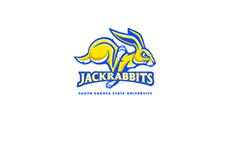
If you look at PDW's existing work, the logos posted on the SDSU site sure seem like 'first draft sketches' to me.
On Mar.05.2008 at 10:25 AM
SDSU-er’s comment is:
Suffice it to say I'd consider myself as deep inside the SDSU/PDW process as any.
Bottom line: It was the commmittee's fault. It was poorly-run to say the least, with no true leader.
PDW was instructed to bring back a "more realistic jackrabbit" as opposed to the cartoonish one. They brought back some initial drawings with an angry rabbit, and were given a firm "no." That was about the best consensus position PDW could get. Assuming East Coast elitism, the committee took PDW out to a field to show them a jackrabbit, as if images of the animal couldn't be found online. There's some good Midwest elitism for you.
After it hit the newspaper, the university beefed up its presence on the design committee, adding some higher-ups in the administration. Sadly, it wasn't until then that the university best in-house designer was included on the team. The bookstore manager's expertise on apppropriate brand marks were muted and ignored.
By that time, any chance of a constructive relationship with a designer was toast. The committee wasn't focused, so PDW wasn't given anything but "boos" when their initial marks were produced.
A sad, sad tale.
On Mar.05.2008 at 01:33 PM
Darrel’s comment is:
Well, there you go! Thanks for that insight!
On Mar.05.2008 at 02:48 PM
MADPHILL’s comment is:
SDSU Student:
I'll take motivation over money any day of the week.
-Well, I've got a sweet deal for you! Mail me the paycheck from your job every week and in exchange, I will call you with a motivational quote from my Dilbert calendar.
SDSU-er's
That sounds about right. Thanks for the insight as to what happened. I think as designers, we all know that a bad client can turn your best work into poo poo any day of the week. It's like the others said though, PDW failed to step up and take a leadership role in this situation by letting the committee monopolize their time, skill, and ultimately their bottom line.
Rich Jensen’s comment is:
SDSU-er: "Bottom line: It was the commmittee's fault. It was poorly-run to say the least, with no true leader."
This could not have possibly been the first time that PDW had worked with such a committee, nor will it be the last.
Blame, IMO, can be equally assigned here, to the committee for having no further direction than "something different", and the clearly conflicting desire for an "aggressive" design that was more "realistic" (as though you could make an herbivore look 'aggressive' and 'realistic' at the same time).
However, the PDW logos were atrocious. "Bad committee" is no excuse for the rabbit with flippers or the rabbit with biceps. Nor is it an excuse for their decision to relegate the second color (yellow) to use as a highlight color for the type.
IMO, PDW had no idea what to do with a rabbit and the committee was such that it could not be of any possible assistance to them.
On Mar.10.2008 at 04:03 PM
Luc Doucedame’s comment is:
Watership Down
On Mar.19.2008 at 02:19 PM
Luc Doucedame’s comment is:
Watership Down
On Mar.19.2008 at 02:20 PM
Luc Doucedame’s comment is:
Watership Down
On Mar.19.2008 at 02:21 PM
scott’s comment is:
Are these really college students posting this tripe? I expect this kind of response from high school children, being a college student myself, yet...
Regardless, it's obvious that a dysfunctional design relationship was fostered between client and PDW at some point in this. The onus on PDW was to create a polished and successful sports logo based upon their experience in the industry, and failed to do so, at which point the school sought other methods.
At the same time students need to realize that designers are professionals that do not take kindly to the denigration of our profession, through both underpayment and disrespect to process. Simply put, a design team will endeavor to produce what their client asks of them, if the client doesn't know what they're looking for then it's likely that they won't get what they want. This is the problem with working by committee, and by waiting until the eleventh hour to add someone with actual design knowledge to the process.
Those accusing us of being "biased" against their school and then claiming regional differences in the US as the cause, grow up. PDW was chosen for a reason, their successful record in the industry so far, and the onus is as much on the client to let the creative team know what is expected and wanted as much as it is on the team to create something spectacular. If both fail, is it fair to only blame one?
Even better if a school committee attributes an obscenely low value to a design job, expects an exceptional product, and then jumps the gun and disregards the design process before getting a finished product do the professionals not have a reason to be angry regardless of the ends or process? SDSU students don't care about the process (though apparently still feel the need to talk about it here), but what happened in that school is the stuff of nightmares for this profession.
On Mar.27.2008 at 11:16 AM
DBL’s comment is:
Jesus, you designers are all a bunch of prima donnas, and the way you all look down your nose at 'crowdsourcing' despite the obvious fact in front of your noses that worked out beautifully, reveals how very threatened you feel about the intersection of your industry with the future. Get with the times. Crowds when harnessed well are a lot smarter than you think.
Adapt or die.
Or, go tastefully design a logo for grey poupon.
On Dec.24.2008 at 12:57 AM
SDSU Reporter’s comment is:
As the person who wrote the newspaper article which the author of this article takes lines from, I find it funny that someone decided to poat the url from this web site in a comment on the SDSU Collegian's Web site. However, if someone does want a true insider's opinion - as someone who was covering this for almost the entire duration - talk to me.
I'm a little disappointed with the tone of the article in the first place, as are many, from glancing through the posts above. You had to be there to really know how frustrating the entire thing was, from anyone's standpoint, when a redesign everyone was told would take 6 months tops ended up taking over two years.
Everyone was looking forward to an awesome design from the reputable Phoenix Design Works, though some thought the job should have been given to someone closer to home. (That's just how we think out here - give the work to and support people from here.) Whether it was the committee's fault - which was made up of Student's Association members, faculty, athletic department reps, administration and University Relations Dept people (one of whom was the Director) - or PDW, I can't say. I think there was miscommunication between both parties.
From what I know, there is an innaccuracy in the article above - PDW reps came out before they started working on a design to see a Jackrabbit in real life. I believe committee members invited them out, but so what? I thought it was good of them to at least try to see what Jackrabbit looks like, because let's face it, unless you're from around Brookings, SD (which is where SDSU is located), when you hear Jackrabbit, you hear "rabbit" and think of Peter Cottontail or something similar.
What PDW came back with were laughingstocks to people out here. I don't see how anyone could be proud of what they came up with or actually think that any school would want them as a mascot. As designs go, they obviously were planned out and neat, but they weren't what we asked for, and we did give them a fair shot, I think. When they didn't deliver, we went elsewhere. Is that not how business goes?
Any questions, ask. I'll check back later.
On Dec.31.2008 at 02:08 AM
Another Hack’s comment is:
The idea, expressed endlessly here by nearly everyone who isn't a professional, seems to be that since PDW didn't deliver a logo around which consensus could be built, the anything goes/every opinion counts comedy that followed was justified.
In the simplest of terms, this is a failure of leadership and communication. Good design doesn't just come out of good designers -- it requires good clients. To clarify, a "good client" doesn't mean one who says yes to whatever a designer presents, but rather communicates what is right and wrong in clear, concise terms. A good client gathers feedback methodically and knows which opinions are relevant and which are, well, just opinions. A good client collaborates with a creative director and, to use an appropriate sports metaphor, acts as an referee rather than the captain of the other team.
As much as I think team logos have fallen in to a dreadful visual stereotype (I'm proud to say that my own alma mater has successfully stuck with their simple, powerful "M" rather than succumbing to slapping a goofy wolverine sporting a comic growl on their unifoms), PDW is among the best in the field and I can't help but think that with proper, professional leadership they most likely would have delivered a world-class result in the end. That SD was only willing to pay 6K for the image that would define them as they entered in to the top tier of college athletics, not to mention generate untold amounts of money in merchandise sales, is a clear indication that they didn't have a great deal of respect for the process. PDW should have taken that as a sign, though I do understand the appeal of taking on the job given the prestige of having another Division I identity in their portfolio.
Every move made by the SD committee after the initial (admittedly mediocre) submissions by PDW smacks of amateurish management and lack of any clear direction or vision on the school's part. I've seen some of the most talented designers' names attached to some of the most generic work out there and what they all shared was a client who either couldn't communicate what they wanted or never knew in the first place.
As any design professional (key word) can attest, the phrase that precedes every disastrous project is a client saying "I'll know it when I see it." If you don't know what you want, hire a psychiatrist first, and a designer second...
SDSU Reporter’s comment is:
Just so everyone knows, there was some mix-up with people trying to identify the person who wrote my comment. The author of my comment was not Heather Mangan. There was also an innacuracy in my comment: the quotes taken above were not from my newspaper article, but an earlier article written by Heather Mangan. I did not read them clearly enough and thought they were quotes from an article I wrote. I apologize for the innacuracy and the mix up.
On Jan.02.2009 at 07:54 PM
Jonny’s comment is:
Wow.
On Jan.06.2009 at 03:46 PM
Sara’s comment is:
This makes me want to drink.
On Feb.04.2009 at 03:52 PM
yOuZlZztyDMUT’s comment is:
mUPVzn
On Feb.19.2009 at 07:10 PM
Jonah’s comment is:
Looks like South Dakota State's logo might be getting some air time as their women's basketball team made the NCAA tournament. Though maybe not as ESPN is still using the old text lockup;
http://sports.espn.go.com/ncw/clubhouse?teamId=2571
ceQZGGyTbqEOHg’s comment is:
VYkNAh
On Apr.13.2009 at 04:43 PM
BLTN (better late than never)’s comment is:
Forgive my late late post. This is the first I've seen of this discussion. I was on the committee and much of the above assumptions are true.
First and foremost, the committee was headed up by one of the laziest, just-get-by people on campus who, consequently, is in charge of licensing and marketing for the university. Therefore, the approach was doing it because we've been told to, not because we think it's relevant. Consequently, no set of rules has been published for the use of this or any other university logo to date.
Secondly, that person's boss, the VP of Administration, had the final say. The committee was there only to make a recommendation.
I think the $6,000 may have been for additional changes and must have been the only figure disclosed to the public, but the contract with PDW was for $20,000.
PDW was chosen specifically because of their portfolio and success in athletic designs. They presented 30 very similar renditions of a "stuffed bunny" look. Despite requests to start from scratch with new rabbits, they continued to make minimal changes to the original designs. It seemed like the requests of the committee never reached the ears of the designer. The committee's changes were noted by the committee head, conveyed to a PDW representative, who passed them along to the owner, who passed them along to the designer. On more than one occasion, I recall someone saying "they didn't really do what we asked of them."
The VP made the decision to continue with PDW and keep trying to get what we wanted, despite the time it was taking, because we were under contract with them and "they were the only option."
Only after a rendition from PDW was photographed through a window and published in the paper did the committee head and the VP concede to the contest idea to appease the community. And the rest is history.
The integrity of the logo seems to be a continual problem, as it is seen altered and printed on almost any item available, without apparent regulation. It is a sad and expensive tale of failed leadership and missed opportunity.
On Jun.25.2009 at 03:32 PM
Comments in Brand New, V1.0 have been closed.


