ADV @ UNDERCONSIDERATION Peek here for details
BROWSE
Client
Self-Promotion
Quantity Produced
1,500
Production Cost
$500
Production Time
1-2 weeks
Dimensions (Width × Height × Depth)
3.5 in × 2 in
Page Count
–
Paper Stock
Crane's Crest Kid Finish, 134 lb. fluorescent white
Number of Colors
2
Varnishes
–
Binding
–
Typography
Knockout by Hoefler & Frere-Jones
Almost as spectacular as the cards themselves is Jonathan’s backstory below. I can relate because falling in love with letterpress is so easy to do. It’s meditative, deliberate, and yields beautiful compositions with unmatched character. Keeps you coming back for more and more and more.
I’ve been obsessed with letterpress for years, even going back as far as when I was 12 at summer camp and printing personal stationery on a small hand-press. As my design career progressed, I realized I wanted to make a bigger commitment to this beautiful craft and open up my own printing shop. In thinking about how people make decisions, in the way they purchase products and how they vote in politics, these are often based not on logic, but on passion and emotion. When it comes down to it, this is my passion, and I’m making a large commitment to it (including buying two presses and renting a large studio for my sizeable and ever-growing collection of wood type). So, I’ve voted to make letterpress part of my life. Maybe you should too.
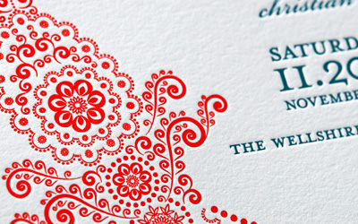
In designing the cards, I wanted to make it contemporary but also reference old political broadsides. And, because I can’t ever turn down a bad pun, I used three different taglines: “It Just Feels Right”; “For All Pressing Matters”; “On Issues of Pressing Importance”.
I’m always a fan of thicker cards, so I printed it on 134 lb. stock. I may only be able to carry 5 at a time in my wallet, but it feels damn good when you put it in someone’s hand.
I wanted a bit of a challenge for myself, hence ridiculously tight 2-color registration printed on a hand-cranked Vandercook SP-15.
The biggest lesson learned is not to run multi-color business cards 6-up on a proof press. The pressure of a cylinder press can cause the paper to stretch a little, just enough to cause registration problems. I could get the top row of cards in perfect register, but the bottom wouldn’t even be close. My solution was to cut the bottom 3 cards off the plate, and just run 3 up at a time. Sometimes less is more.
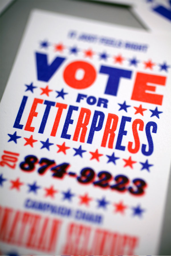

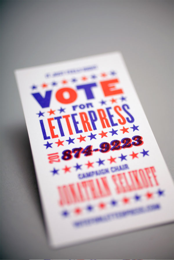
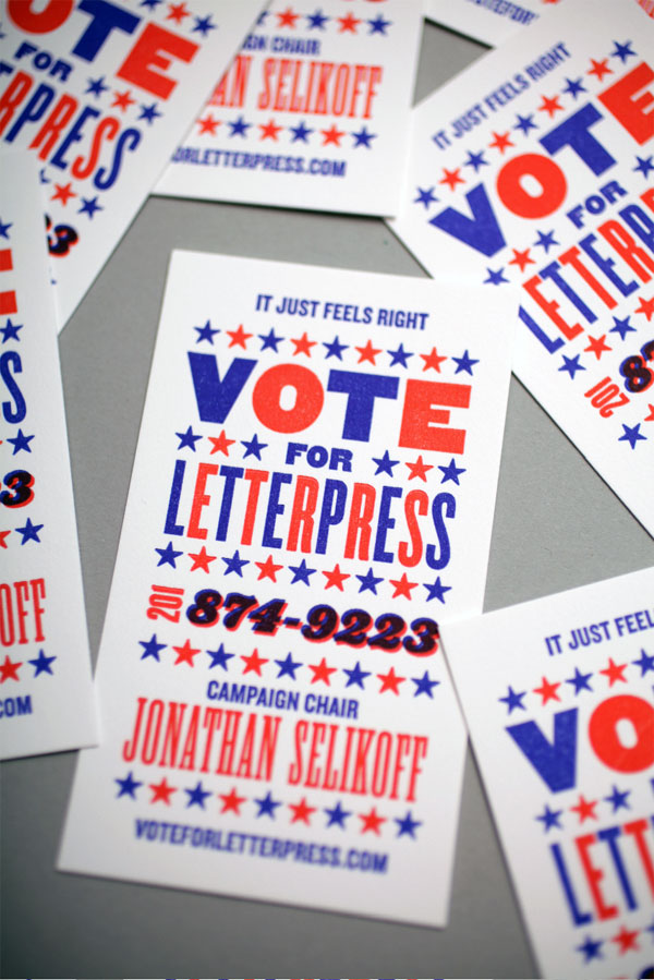
Vote For Letterpress Business Card
Production Method
Design
Vote for Letterpress: Jonathan Selikoff
Printing
–
This post was published in the original layout of FPO so all images are smaller. Project descriptions as well as production lessons are quoted in the main content area.
Post Author
Lauren Dickens

Lauren Dickens
Former intern at UnderConsideration LLC.
More: Online / On Twitter
Date Published
April 28, 2011
Filed Under
Business Cards
Tagged with
blue
business card
letterpress
red
white


About
FPO (For Print Only), is a division of UnderConsideration, celebrating the reality that print is not dead by showcasing the most compelling printed projects.
FPO uses Fonts.com to render Siseriff and Avenir Next.
FPO is run with Six Apart’s MovableType
All comments, ideas and thoughts on FPO are property of their authors; reproduction without the author’s or FPO’s permission is strictly prohibited
Twitter @ucllc
Sign-up for Mailing List
Mailing list managed by MailChimp
Thanks to our advertisers
About UnderConsideration
UnderConsideration is a graphic design firm generating its own projects, initiatives, and content while taking on limited client work. Run by Bryony Gomez-Palacio and Armin Vit in Bloomington, IN. More…
blogs we publish
Brand New / Displaying opinions and focusing solely on corporate and brand identity work.
Art of the Menu / Cataloguing the underrated creativity of menus from around the world.
Quipsologies / Chronicling the most curious, creative, and notable projects, stories, and events of the graphic design industry on a daily basis.
products we sell
Flaunt: Designing effective, compelling and memorable portfolios of creative work.
Brand New Conference videos / Individual, downloadable videos of every presentation since 2010.
Prints / A variety of posters, the majority from our AIforGA series.
Other / Various one-off products.
events we organize
Brand New Conference / A two-day event on corporate and brand identity with some of today's most active and influential practitioners from around the world.
Brand Nieuwe Conference / Ditto but in Amsterdam.
Austin Initiative for Graphic Awesomeness / A speaker series in Austin, TX, featuring some of the graphic design industry's most awesome people.
also
Favorite Things we've Made / In our capacity as graphic designers.
Projects we've Concluded / Long- and short-lived efforts.
UCllc News / Updates on what's going at the corporate level of UnderConsideration.

Related entries
KitchenAid Limited Edition Cards
Black Sheep Studio Business Cards and Promotional Items
Seegno Business Cards
Fracas Productions Business Cards
Elegante Press Business card