ADV @ UNDERCONSIDERATION Peek here for details
BROWSE

Not to pat too much myself on the back, but this year’s “Best Of” posts are looking stunning on the new FPO. Big images, big type, nice grid. Yeah! It obviously helps that the images are so great. This is the first of three “Best Of” posts, covering work published here between January and June. The second will cover July through December and the third will cover posters. These will be posted in these next two weeks. No other posts will be published. We will be back with our regular programming on January 7, 2013
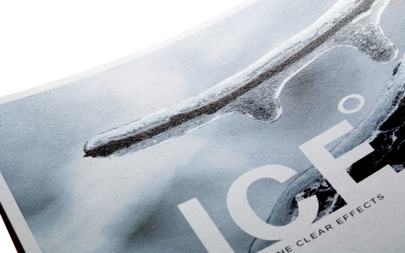
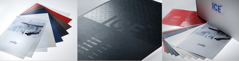
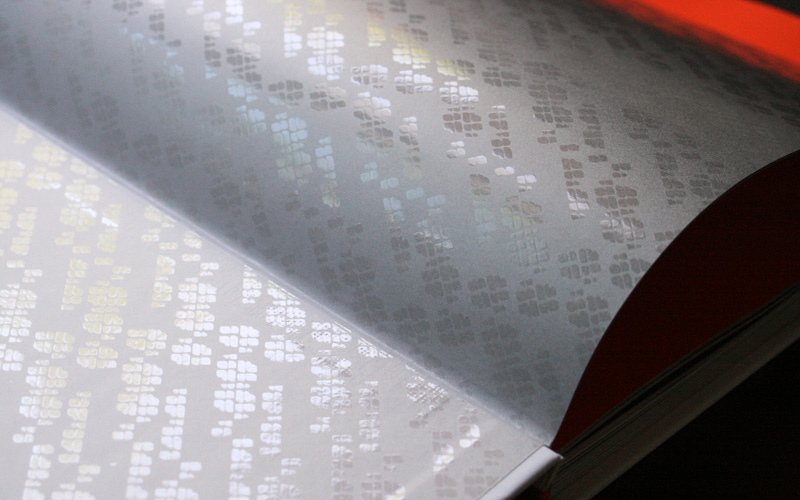
12 — Yorke Printe Self-Promotion
Digital printing keeps making a strong case for itself as evidenced by this promo showing off the inline clear effects possible on a digital press on all kinds of stock.
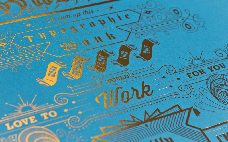
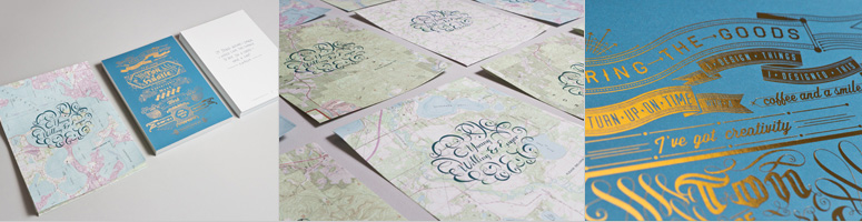
11 — Typographic Wank
Gold foil is great. Gold foil used on obsessive typography and ornamentation printed on bright blue stock is downright awesome.
10 — TOMJ Stationery
Who needs fifty shades of grey to get turned on when six shades on a stationery system will do?
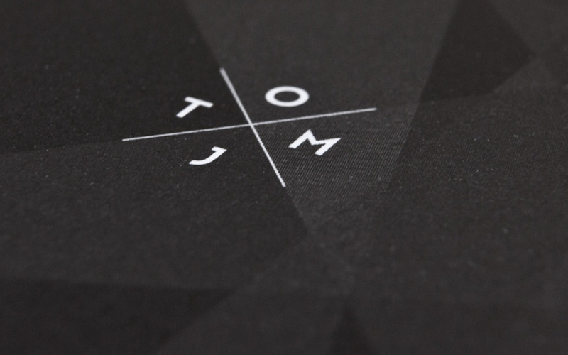
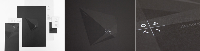
This is one of the nicest type specimens you’ll ever see. Only two spot colors, one great seal emboss, and a pretty ribbon literally tie it all together.
Production Method
Offset
Design
Dan Gneiding, Art Direction and Design
Printing
Printing: Kalnin Graphics
Embossing: Dan Gneiding with a desk top embosser
Embosser: Stamp Connection
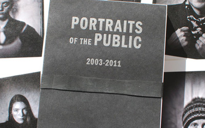
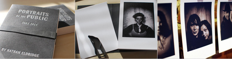
8 — Portraits of the Public Book
Loose, rich black photographs printed digitally are given additional gravitas by black letterpress printing on black stock bound with a husky black rubber band.
Production Method
Digital
Letterpress
Design
Sean Wilkinson, Might & Main
Printing
Cover: Dunstan Press
Body: Edison Press
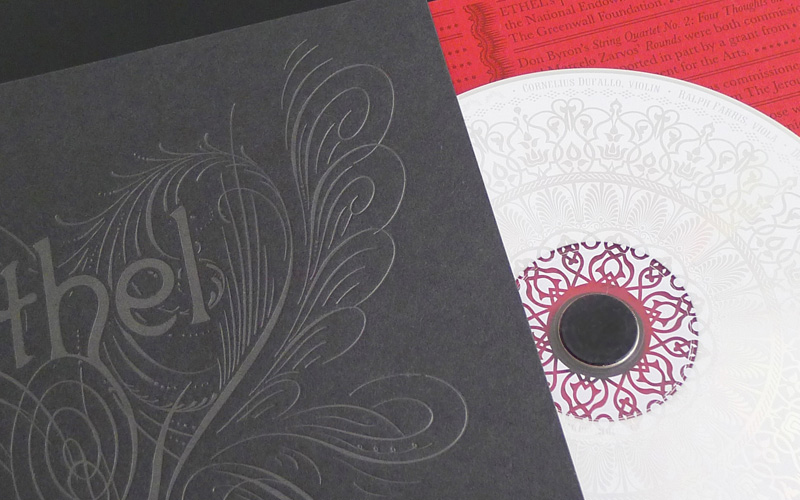
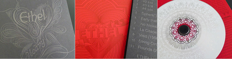
7 — Ethel’s “Heavy” CD Packaging
As you can tell, a few trends of what I enjoyed in print this year are starting to emerge: black on black printing and polished ornamentation and typography get me going. Add to this album package some red-on-red of the same lusciousness and I’m all set.
Production Method
Letterpress
Design
Mark Kingsley
Printing
Paper: Aardvark Letterpress
Disc production and printing: Ross Ellis
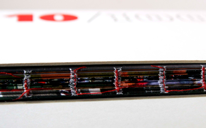
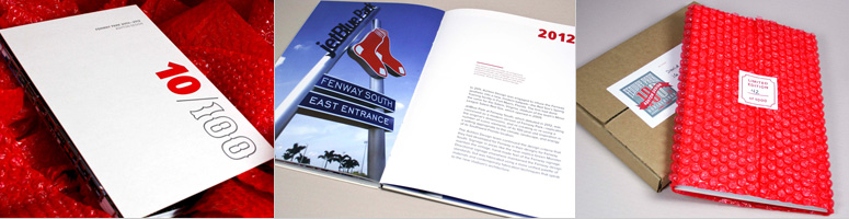
6 — 10/100 Fenway Park Commemorative Book
Exposed binding is nothing new yet it never ceases to amaze and that’s only half the story on this gorgeous book for the baseball-ish inclined.
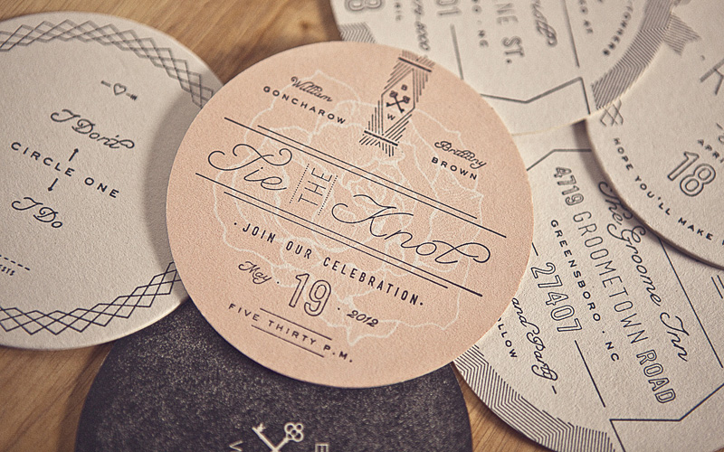
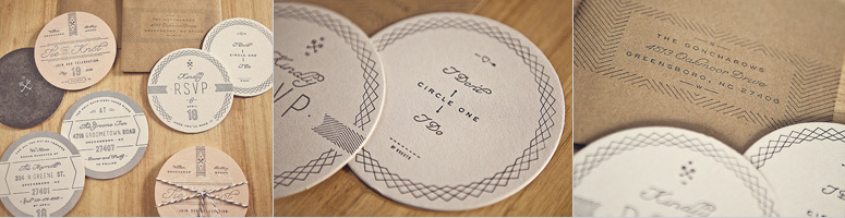
5 — Goncharow’s Coaster Wedding Invites
Letterpress on coaster stock is as sure-fire win as fudge on vanilla ice cream but these coasters’ varied typography and layout give them an edge over the rest.
Production Method
Letterpress
Rubber stamp
Design
Ross Clodfelter
Printing
Letterpress: Device Printshop
Stamping: by hand
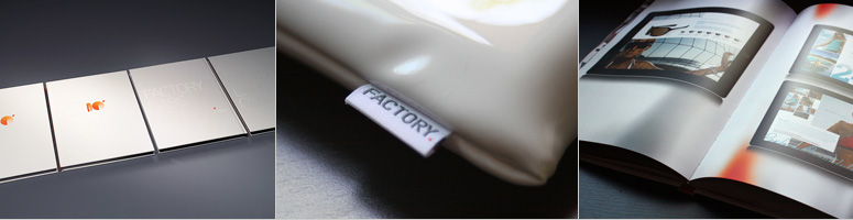
4 — Factory Design Labs Portfolio Book Volume 10
Glossy paper books seem easy to pull off and perhaps feel too traditional, but a good, solid, gloriously colored printing is no easy feat as is the case with this oversize, double-spread-filled, self-promo.
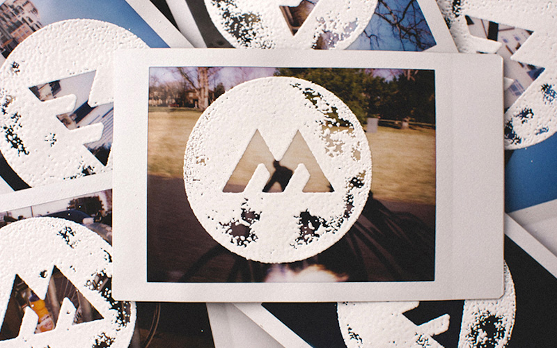
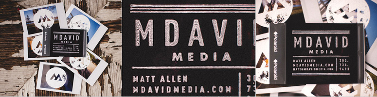
3 — M David Media Business Card
Note to self: try embossing powder in 2013. The effect is stunningly tactile as demonstrated in these cards, each one different from the next, thanks to both the unpredictable nature of the embossing and the fact that they were printed on individual Polaroids.
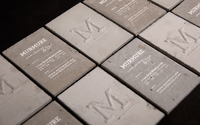
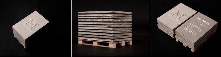
Note to self: DON’T try to set a business card in concrete. Not because it doesn’t look awesome — I mean, just look at these bad-asses — but because you can probably only fit one at a time in your wallet. Not good for networking.
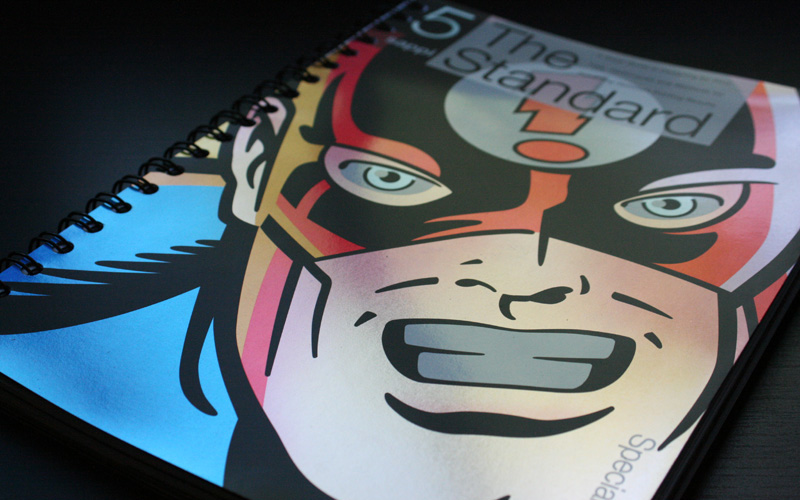
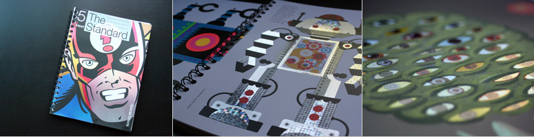
1 — Sappi Fine Paper’s The Standard Issue #5
Doing a printer promo may sound like the greatest print job on earth but when you can do anything, where do you even start? The fifth in Sappi’s great series of “The Standard” with a special effects theme spares no expense and takes you through every possible option through a superhero narrative. As they say: With great printing powers comes great responsibility.
Post Author

Armin Vit
Editor of FPO and co-founder of UnderConsideration LLC.
More: Online / On Twitter
Date Published
December 24, 2012
Filed Under
FPO News
Tagged with
Best of FPO
end of year list


About
FPO (For Print Only), is a division of UnderConsideration, celebrating the reality that print is not dead by showcasing the most compelling printed projects.
FPO uses Fonts.com to render Siseriff and Avenir Next.
FPO is run with Six Apart’s MovableType
All comments, ideas and thoughts on FPO are property of their authors; reproduction without the author’s or FPO’s permission is strictly prohibited
Twitter @ucllc
Sign-up for Mailing List
Mailing list managed by MailChimp
Thanks to our advertisers
About UnderConsideration
UnderConsideration is a graphic design firm generating its own projects, initiatives, and content while taking on limited client work. Run by Bryony Gomez-Palacio and Armin Vit in Bloomington, IN. More…
blogs we publish
Brand New / Displaying opinions and focusing solely on corporate and brand identity work.
Art of the Menu / Cataloguing the underrated creativity of menus from around the world.
Quipsologies / Chronicling the most curious, creative, and notable projects, stories, and events of the graphic design industry on a daily basis.
products we sell
Flaunt: Designing effective, compelling and memorable portfolios of creative work.
Brand New Conference videos / Individual, downloadable videos of every presentation since 2010.
Prints / A variety of posters, the majority from our AIforGA series.
Other / Various one-off products.
events we organize
Brand New Conference / A two-day event on corporate and brand identity with some of today's most active and influential practitioners from around the world.
Brand Nieuwe Conference / Ditto but in Amsterdam.
Austin Initiative for Graphic Awesomeness / A speaker series in Austin, TX, featuring some of the graphic design industry's most awesome people.
also
Favorite Things we've Made / In our capacity as graphic designers.
Projects we've Concluded / Long- and short-lived efforts.
UCllc News / Updates on what's going at the corporate level of UnderConsideration.

Related entries
The End
No Posts this Week
We are Moving! (No Posts this Week)
The Best of 2016 on FPO, Part 2: Jul - Dec
The Best of 2016 on FPO, Part 1: Jan - Jun