ADV @ UNDERCONSIDERATION Peek here for details
BROWSE
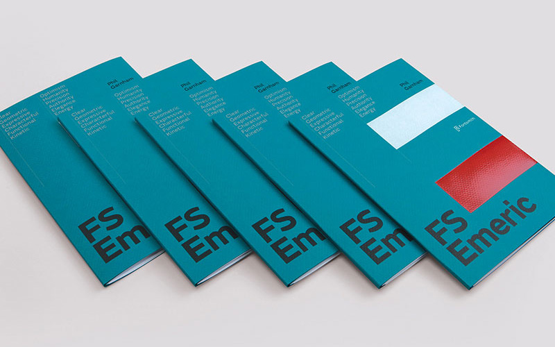
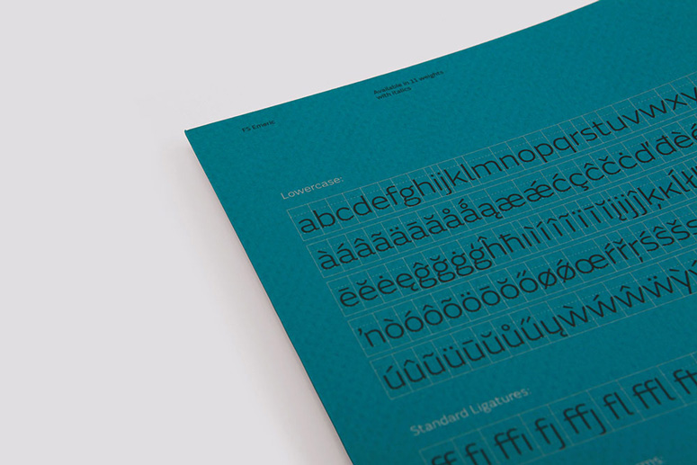
FS Emeric - Type Specimen Booklet
Production Method
Offset
Design
Believe in
Printing
Identity Print
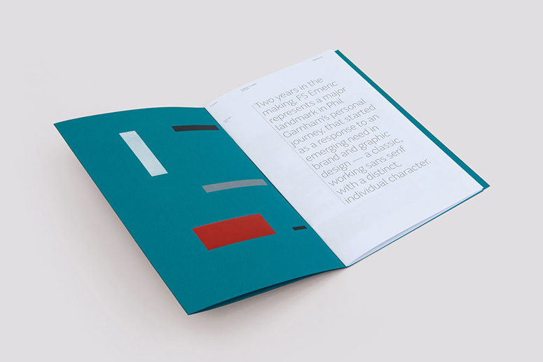
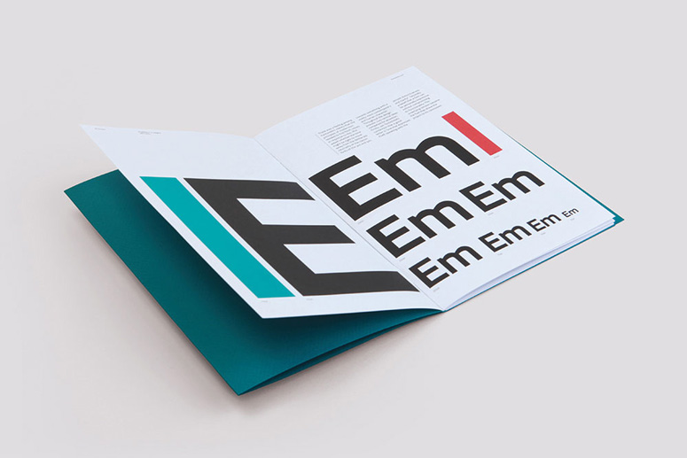
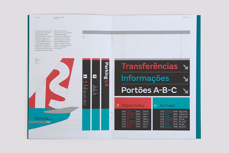
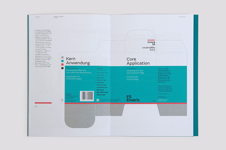
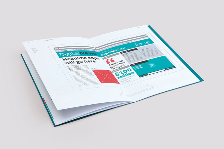
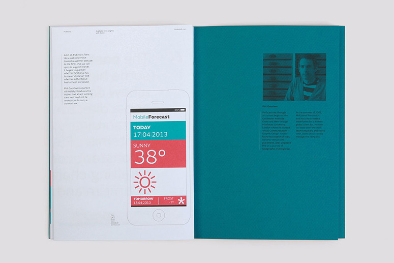
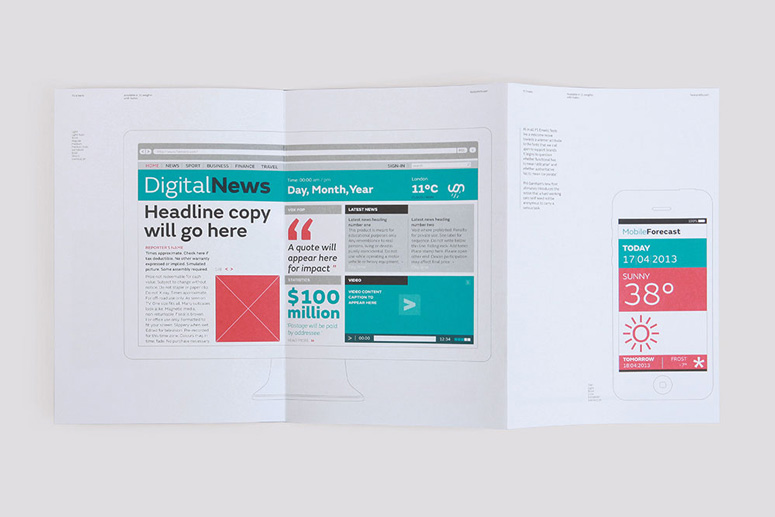
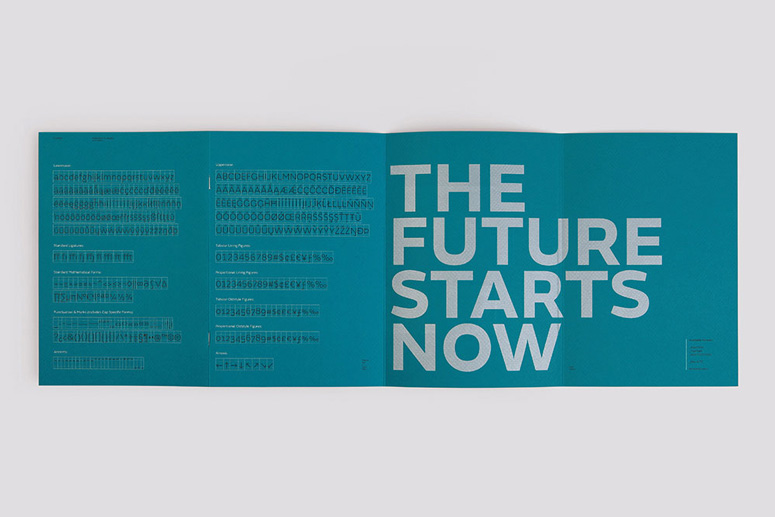
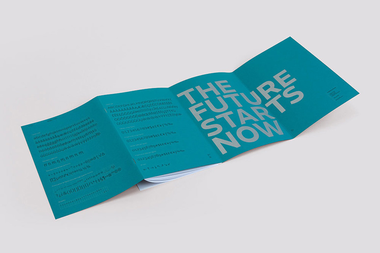
FS Emeric is a versatile type super-family rooted in modernist principles with eleven weights and italics for each weight. This thorough specimen book acknowledges the typeface’s dynamic nature through a range of hypothetical applications from packaging to livery to signage and digital layouts. The layout of the book channels the family’s modernist essence and allows the content to speak for itself.
Dimensions (Width × Height × Depth)
6.4 × 10.4 × 0.2 in
Page Count
14pp text + 8pp cover
Paper Stock
GF Smith / Strathmore Grandee / Marina Teal / 216gsm
GF Smith / Colorplan / White Frost / 135gsm
Number of Colors
Cover - 2 spot colours plus 2 coloured foils.
Text - 4 spot colours
Varnishes
–
Binding
Wraparound cover
Typography
FS Emeric
Project Description
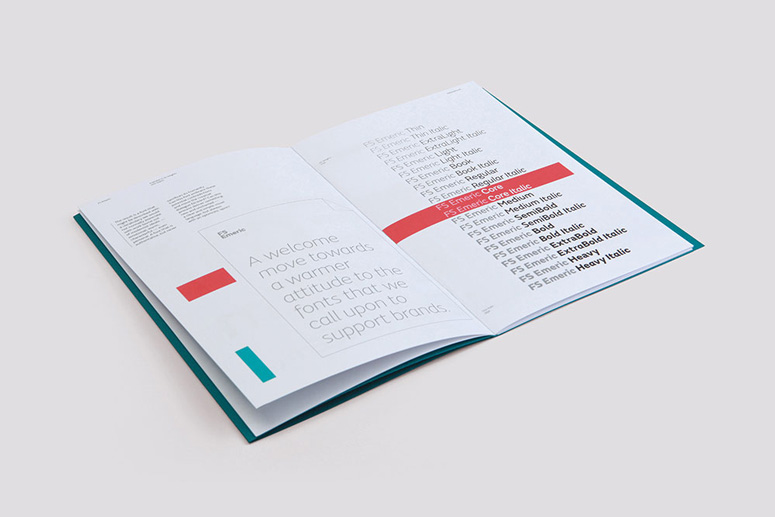
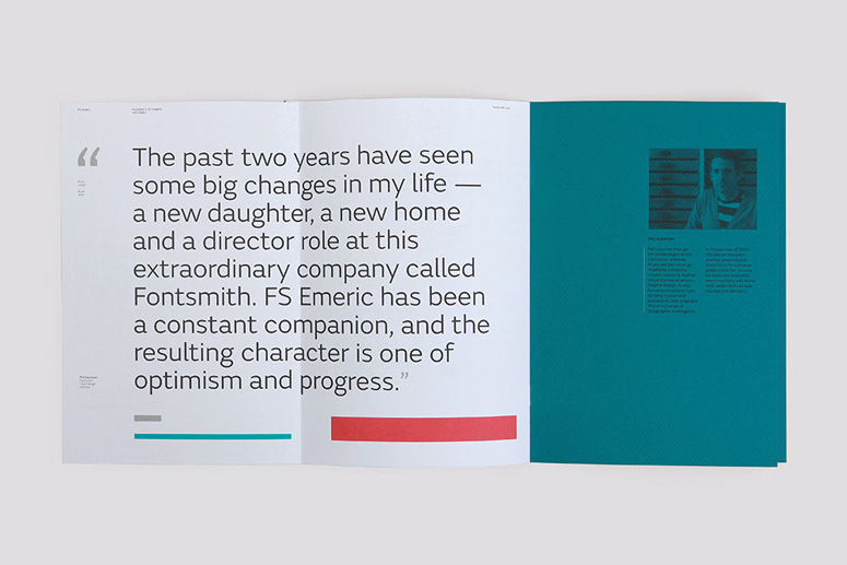
The type specimen booklet for FS Emeric is Fontsmith’s most ambitious to date, and follows the enormous success of their 2011 promotional campaign, ‘10 Years in Type’. In June 2012, Fontsmith’s type design director Phil Garnham approached Believe in®, the Exeter-based brand design studio. He had been aware of the studio’s work for some time, and was keen to work with them on the launch of FS Emeric.Phil said: “Having spent over 2 years designing FS Emeric, to call me protective would be an understatement. I needed a creative team who would challenge me and reward my faith in them with something remarkable. Believe in have delivered on every front. A successful specimen booklet reveals the personality of a typeface in all its variants. There are 11 weights with italics in the FS Emeric Superfamily, conveying many different facets and characteristics, creating a challenging brief.”
The booklet tells the story of FS Emeric via the language of brands—incorporating design for print, product, digital and architectural environments. A range of hypothetical applications are used to demonstrate FS Emeric’s versatility, with the intention of inspiring both designers and clients of its potential. Elements of the typeface are used throughout the booklet to add illustrative elements, graphic details and define the visual language of the piece. By using a typographic approach founded on the same modernist principles of the typeface, the booklet evokes a timeless sense that connects the past, present and future. The design is kept intentionally pure, focusing on the personality and strengths of FS Emeric and allowing designers to visualize how it may exist through their own work.
Believe in’s founder and creative director Blair Thomson said: “We wanted readers to gain a greater understanding of FS Emeric’s abilities, and to experience it in a more contextual way. The result builds on Fontsmith’s legacy of considered and crafted design, while remaining faithful to the spirit of the typeface.”
Production Lesson(s)
The red foil is actually 2 different red foils, one on top of the other, which was required to ensure sufficient strength on the cover stock.
Post Author

Duncan Robertson
Former intern at UnderConsideration LLC.
More: Online / On Twitter
Date Published
September 30, 2013
Filed Under
Offset
Type Specimen
Tagged with
foil stamp
FS Emeric
modern
type specimen


About
FPO (For Print Only), is a division of UnderConsideration, celebrating the reality that print is not dead by showcasing the most compelling printed projects.
FPO uses Fonts.com to render Siseriff and Avenir Next.
FPO is run with Six Apart’s MovableType
All comments, ideas and thoughts on FPO are property of their authors; reproduction without the author’s or FPO’s permission is strictly prohibited
Twitter @ucllc
Sign-up for Mailing List
Mailing list managed by MailChimp
Thanks to our advertisers
About UnderConsideration
UnderConsideration is a graphic design firm generating its own projects, initiatives, and content while taking on limited client work. Run by Bryony Gomez-Palacio and Armin Vit in Bloomington, IN. More…
blogs we publish
Brand New / Displaying opinions and focusing solely on corporate and brand identity work.
Art of the Menu / Cataloguing the underrated creativity of menus from around the world.
Quipsologies / Chronicling the most curious, creative, and notable projects, stories, and events of the graphic design industry on a daily basis.
products we sell
Flaunt: Designing effective, compelling and memorable portfolios of creative work.
Brand New Conference videos / Individual, downloadable videos of every presentation since 2010.
Prints / A variety of posters, the majority from our AIforGA series.
Other / Various one-off products.
events we organize
Brand New Conference / A two-day event on corporate and brand identity with some of today's most active and influential practitioners from around the world.
Brand Nieuwe Conference / Ditto but in Amsterdam.
Austin Initiative for Graphic Awesomeness / A speaker series in Austin, TX, featuring some of the graphic design industry's most awesome people.
also
Favorite Things we've Made / In our capacity as graphic designers.
Projects we've Concluded / Long- and short-lived efforts.
UCllc News / Updates on what's going at the corporate level of UnderConsideration.

Related entries
2017 Brand New Conference Program
Severe(d): A Creepy Poetry Collection by Holly Riordan
Um Caminho para Santiago CD Package and Diary
BOYCO Classpack® Book
Antes de Perder la Esperanza Book