ADV @ UNDERCONSIDERATION Peek here for details
BROWSE
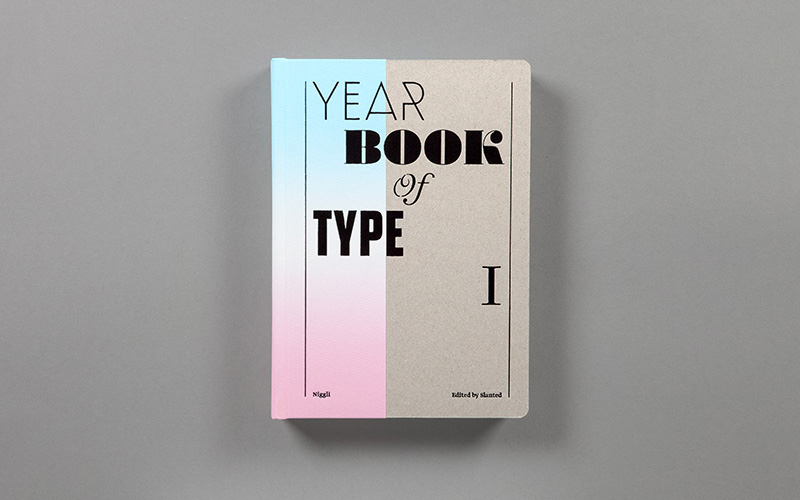
Yearbook of Type I Book
Production Method
Offset
Design
MAGMA Brand Design
Art Direction: Flo Gaertner, Lars Harmsen
Graphic Design: Léon Howahr, Matthias, Kantereit, Jan Kiesswetter
Managing Editor: Léon Howahr
Assistant Editor: Julia Kahl
Printing
Stober GmbH
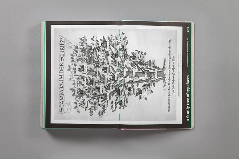
Yearbook of Type I is exactly what it sounds like: a comprehensive survey of new digital typefaces. The idea is to provide an independent print publication with an overview of new fonts and foundries, and a presentation of new developments in the field of typography. It looks like a great, informative reference for anyone interested in the latest happenings in the world of type design.
Dimensions (Width × Height × Depth)
6.5 × 9.5 × 1.4 in
Page Count
464
Paper Stock
Linen: Duchesse offset white / peyer graphic gmbh
Endpaper: SURBALIN seda, pistazie / peyer graphic gmbh / 115 g/mò
ZANDERS medley pure / Reflex Premiun Papier GmbH / 110 g/mò
Number of Colors
Black + 6 special colors (Pantone)
Varnishes
Hot foil stamping
Binding
thread stitching
Typography
Greta Sans
Greta Text (Typotheque)

Project Description
The idea behind the first edition of Yearbook of Type I is quite simple: to offer a high quality selection of the numerous new publications in the field of digital typefaces in the form of a clear, comprehensive compendium.In the past two decades the publication of typefaces has changed radically. The popularity of desktop publishing and typeface designing programs has provided a great many designers with the means to design and use their own types, in great contrast to wood, lead and photo typesetting. What's more, the internet offers a means of distribution that can be used by individuals and established typeface publishers alike.
The abundance of new and quite interesting typeface designs is certainly a welcome development, especially when one considers the essential role that typefaces play in generating an identity and creating a visual impression. At the same time designers and others working in the field are faced with a chaotic situation with a great number of type designs and publishers.
A variety of blogs and internet portals provide regular information about new fonts and foundries, but there still is no high-quality, independent print publication (typography still looks best on paper!) that provides an overview of the field. That is the goal of this volume — the Yearbook of Type is intended as a series in which the best contemporary new developments in the field of typography are presented. Typefaces created in the last two to three years from all over the world will be featured, from larger typeface publishers to small, independent typographers and foundries.
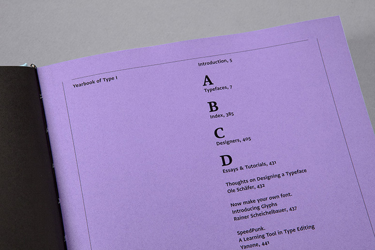
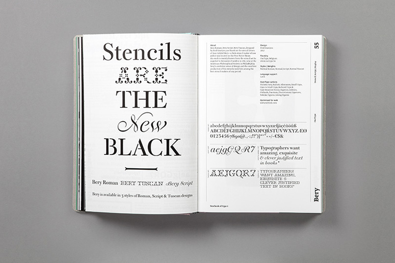
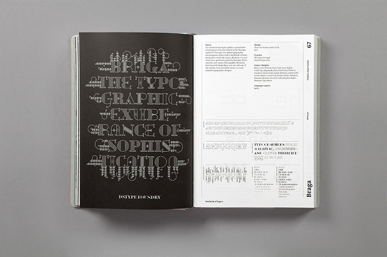
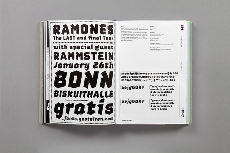
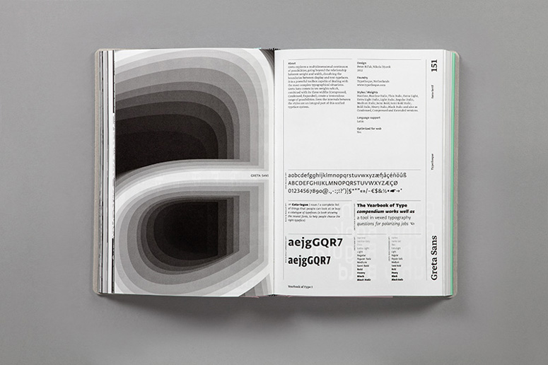
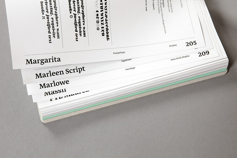
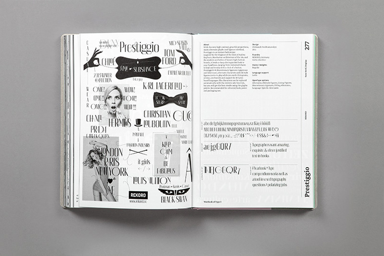
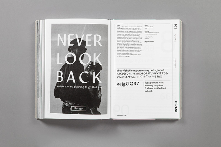
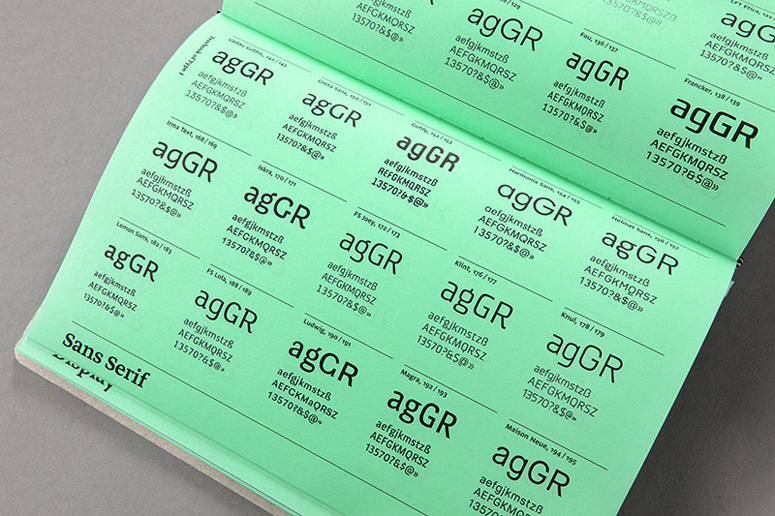
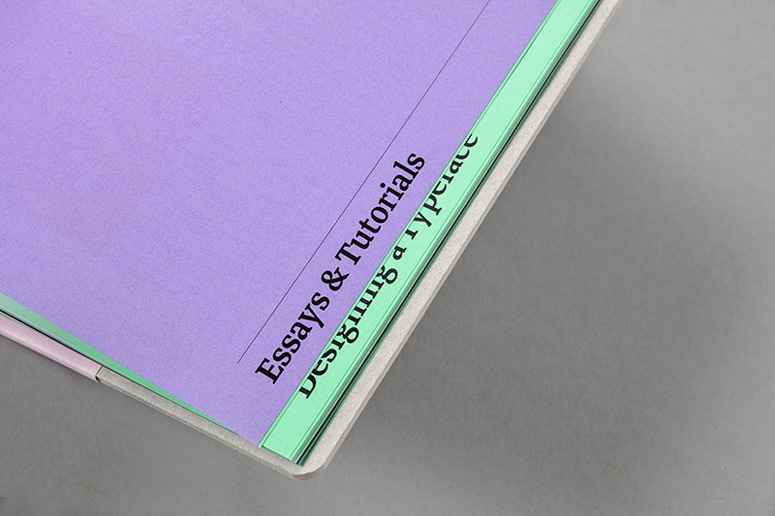
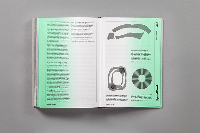
In the Yearbook of Type each individual typeface or typeface family is presented on a double-page spread. On the left side appears a visual created by the respective type designer or label with a detailed view of the type and an initial optical impression. On the right side more detailed background information is provided as well as an overview of the typeface's different features. The catalogue is followed by an index of all the typefaces arranged by category. Short texts provide information on individual type designers and an essay section offers sketches, background knowledge, technical information, instructions and descriptions from the world of typography.
We are certain that the Yearbook of Type will be of great practical value. The emotional and informative presentation of the typefaces will serve designers and agencies as a source of inspiration and will help others select the right typeface. As a catalogue and reference work it will also be of interest to all those who are interested in the contemporary world of typesetting and the latest in typeface design.
Yearbook of Type I
Editor: Slanted
Publisher: Niggli
Visual concept and realization: MAGMA Brand Design
Release: June 2013
Volume: 464 pages
Format:165 x 240 mm
Language: English
Specials: Hardcover edition with half linen
ISBN: 978-3-7212-0861-0
Price: 49,80 Euro
http://www.slanted.de/shop/yearbook-type-1
Production Lesson(s)
Good material and good content is everything!
Post Author

Duncan Robertson
Former intern at UnderConsideration LLC.
More: Online / On Twitter
Date Published
October 22, 2013
Filed Under
Books
Offset
Tagged with
annual
compilation
ombre
typography


About
FPO (For Print Only), is a division of UnderConsideration, celebrating the reality that print is not dead by showcasing the most compelling printed projects.
FPO uses Fonts.com to render Siseriff and Avenir Next.
FPO is run with Six Apart’s MovableType
All comments, ideas and thoughts on FPO are property of their authors; reproduction without the author’s or FPO’s permission is strictly prohibited
Twitter @ucllc
Sign-up for Mailing List
Mailing list managed by MailChimp
Thanks to our advertisers
About UnderConsideration
UnderConsideration is a graphic design firm generating its own projects, initiatives, and content while taking on limited client work. Run by Bryony Gomez-Palacio and Armin Vit in Bloomington, IN. More…
blogs we publish
Brand New / Displaying opinions and focusing solely on corporate and brand identity work.
Art of the Menu / Cataloguing the underrated creativity of menus from around the world.
Quipsologies / Chronicling the most curious, creative, and notable projects, stories, and events of the graphic design industry on a daily basis.
products we sell
Flaunt: Designing effective, compelling and memorable portfolios of creative work.
Brand New Conference videos / Individual, downloadable videos of every presentation since 2010.
Prints / A variety of posters, the majority from our AIforGA series.
Other / Various one-off products.
events we organize
Brand New Conference / A two-day event on corporate and brand identity with some of today's most active and influential practitioners from around the world.
Brand Nieuwe Conference / Ditto but in Amsterdam.
Austin Initiative for Graphic Awesomeness / A speaker series in Austin, TX, featuring some of the graphic design industry's most awesome people.
also
Favorite Things we've Made / In our capacity as graphic designers.
Projects we've Concluded / Long- and short-lived efforts.
UCllc News / Updates on what's going at the corporate level of UnderConsideration.

Related entries
2017 Brand New Conference Program
Severe(d): A Creepy Poetry Collection by Holly Riordan
Um Caminho para Santiago CD Package and Diary
BOYCO Classpack® Book
Antes de Perder la Esperanza Book