ADV @ UNDERCONSIDERATION Peek here for details
BROWSE
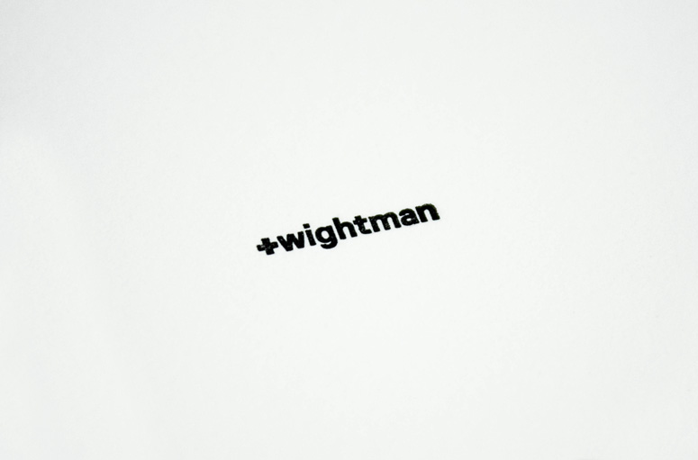
+wightman: Personal Branding
Production Method
Deboss
Letterpress
Design
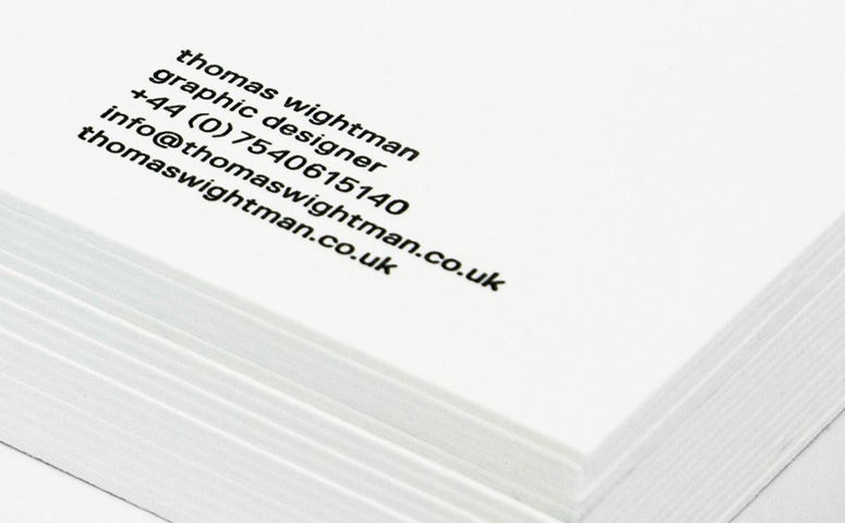
Thomas Wightman
Printer: Glasgow Press
Printing
Glasgow Press
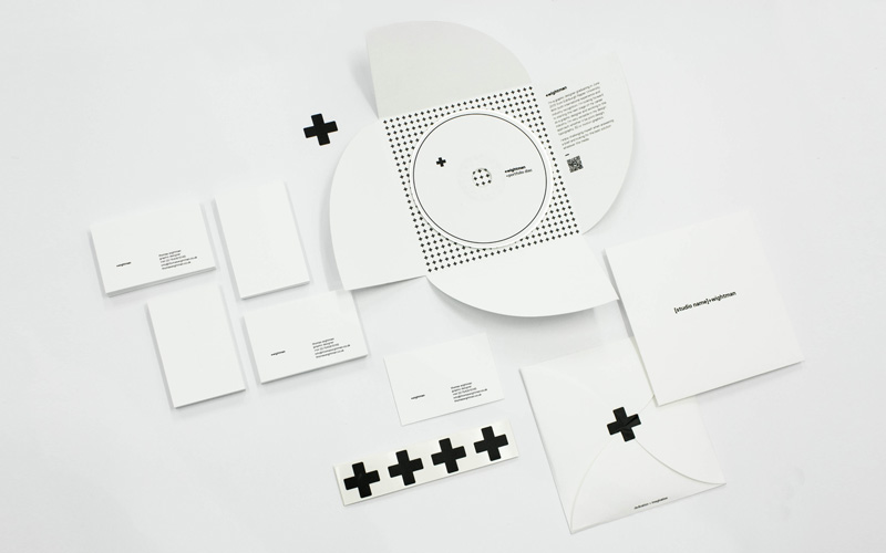
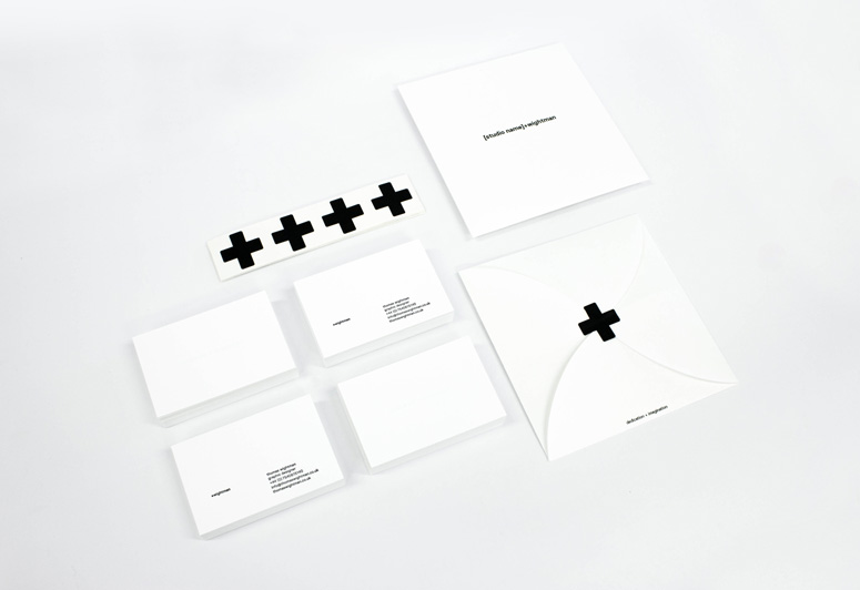
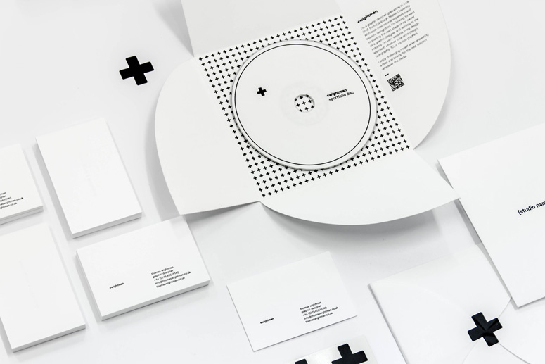
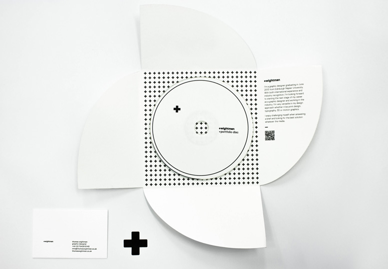
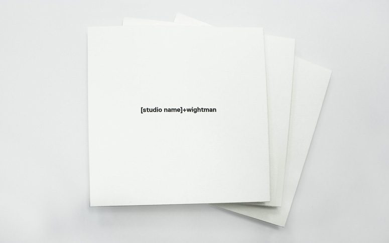
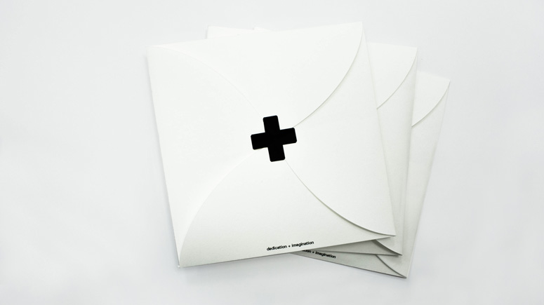
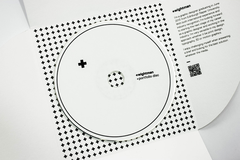
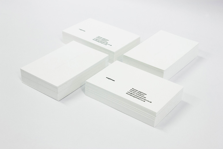
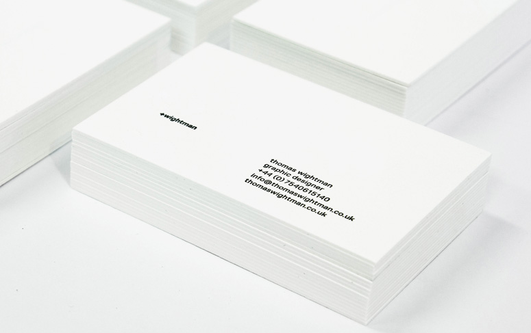
Thomas Wightman created this identity system to portray his personal design style. The + symbol logo is a derivative of the designer’s first initial. The device serves as a clever code for adding the his name to potential employer’s names when he sends out his portfolio. The simple tactile identity was then applied across promotional materials, including business cards, portfolio discs, and envelopes.
Dimensions (Width × Height × Depth)
Business Cards: 7.28 × 2.17 in
Page Count
–
Paper Stock
GFSmith / Cranes Lettra / Fluorecent White / 600GSM
Number of Colors
1
Varnishes
–
Binding
–
Typography
Replica

Project Description
+wightman: personal identityThe idea was to create a personal identity, portfolio and promotional material that would portray my characteristic design style. The logo was developed from the initial from my first name where the lowercase t would become an addition symbol +
The result when combined with my last name would create a simple addition formula. +wightman The intention was that + theme could be used in various ways to add all my characteristics together that form me.
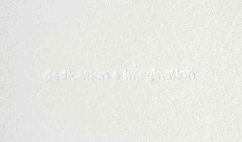
The mail-out portfolio also follows this theme where on the front reads [design studio] +wightman to suggest I'm the suitable addition to their agency. For example If I were to send my portfolio to Pentagram it would become pentagram +wightman. The shape of the mail-out envelope was also to reinforce the + brand style. The white palette and blind debossing was chosen as a clever way to again convey my last name (wightman)
Specification
—
Business Cards:
Side A: Black Ink / Heavy impression
Side B: Blind Debossing
GFSmith Cranes Lettra 600GSM w/ Fluorecent White
Printed and finishing:
Glasgow Press
—
Mini Portfolio:
+ Enveolope: 300GSM Matte Cartridge Paper
Inkjet Printed
—
+ Stickers:
Black Die Cut +wightman logo sticker
Black Vinyl
Production Lesson(s)
It was always a worry when never trying blind debossing previously by taking the chances it turned out rather effective.
Post Author

Duncan Robertson
Former intern at UnderConsideration LLC.
More: Online / On Twitter
Date Published
March 20, 2014
Filed Under
Business Cards
Deboss
Letterpress
Self promotion
Tagged with
black and white
minimal
one ink
portfolio


About
FPO (For Print Only), is a division of UnderConsideration, celebrating the reality that print is not dead by showcasing the most compelling printed projects.
FPO uses Fonts.com to render Siseriff and Avenir Next.
FPO is run with Six Apart’s MovableType
All comments, ideas and thoughts on FPO are property of their authors; reproduction without the author’s or FPO’s permission is strictly prohibited
Twitter @ucllc
Sign-up for Mailing List
Mailing list managed by MailChimp
Thanks to our advertisers
About UnderConsideration
UnderConsideration is a graphic design firm generating its own projects, initiatives, and content while taking on limited client work. Run by Bryony Gomez-Palacio and Armin Vit in Bloomington, IN. More…
blogs we publish
Brand New / Displaying opinions and focusing solely on corporate and brand identity work.
Art of the Menu / Cataloguing the underrated creativity of menus from around the world.
Quipsologies / Chronicling the most curious, creative, and notable projects, stories, and events of the graphic design industry on a daily basis.
products we sell
Flaunt: Designing effective, compelling and memorable portfolios of creative work.
Brand New Conference videos / Individual, downloadable videos of every presentation since 2010.
Prints / A variety of posters, the majority from our AIforGA series.
Other / Various one-off products.
events we organize
Brand New Conference / A two-day event on corporate and brand identity with some of today's most active and influential practitioners from around the world.
Brand Nieuwe Conference / Ditto but in Amsterdam.
Austin Initiative for Graphic Awesomeness / A speaker series in Austin, TX, featuring some of the graphic design industry's most awesome people.
also
Favorite Things we've Made / In our capacity as graphic designers.
Projects we've Concluded / Long- and short-lived efforts.
UCllc News / Updates on what's going at the corporate level of UnderConsideration.

Related entries
Black Sheep Studio Business Cards and Promotional Items
Herbst & Spungen Wedding Invitation Suite
Cranky Bucks Promotion
Seegno Business Cards
“Miniature Views” Promotion