ADV @ UNDERCONSIDERATION Peek here for details
BROWSE
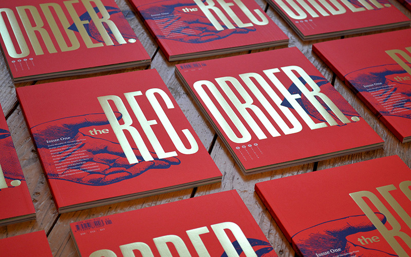
The Recorder Magazine
Production Method
Foil stamp
Lithography
Offset
Design
Luke Tonge
Luke Tonge, Art-direction & design
Emma Tucker, Editor, and writer
James Fooks-Bale, Creative direction
Printing
Leycol
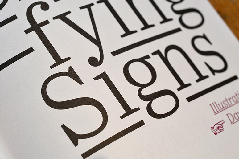
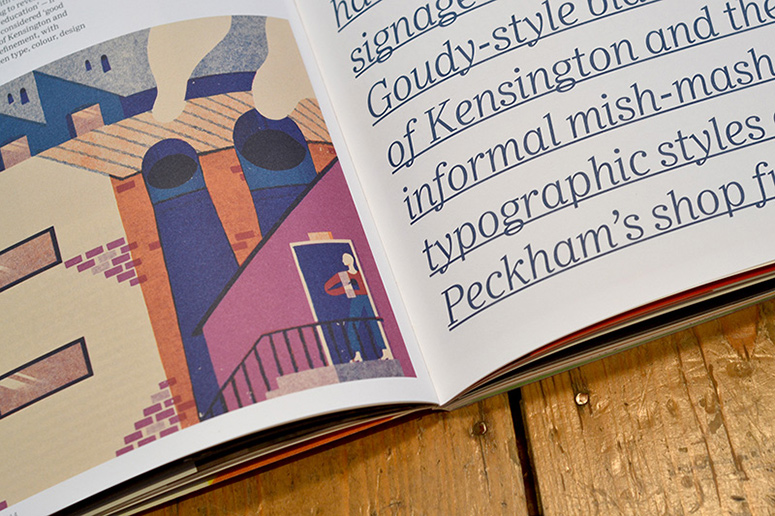
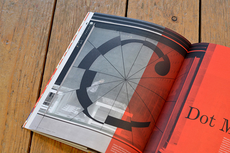
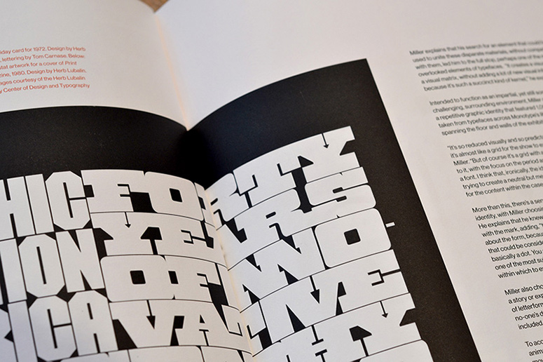
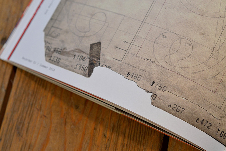
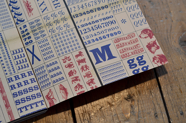
Created after business hours as a labor of love, designer Luke Tonge and team re-imagine Monotype’s magazine The Recorder (first printed in 1902) with a new focus on the role typography plays in contemporary culture.
Dimensions (Width × Height × Depth)
9 × 12 in.
Page Count
120
Paper Stock
Mohawk / Superfine / Eggshell / Ultrawhite
Number of Colors
6
Varnishes
–
Binding
Stitched
Typography
Quire Sans
Ysobel
Century Expanded
Typewriter Elite
Plak
Burlingame
Neuzeit
Neue Haas Grotesk
Balega
Iwan Stencil
Project Description
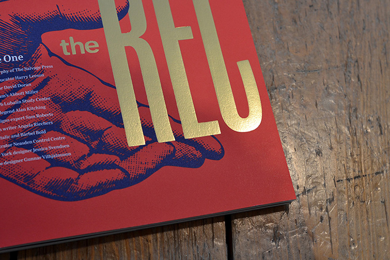
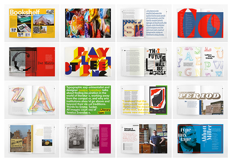
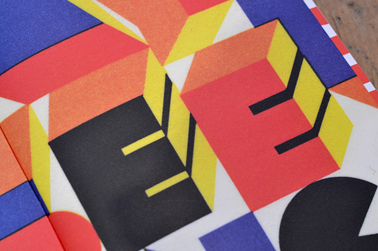
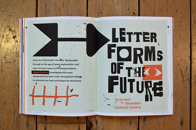
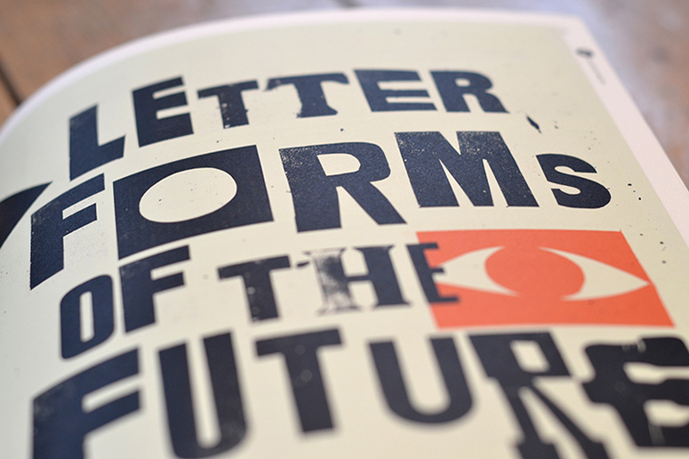
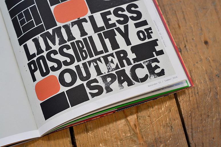
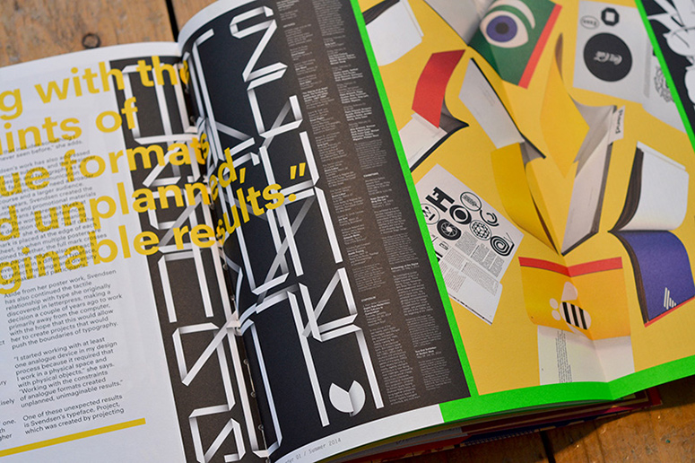
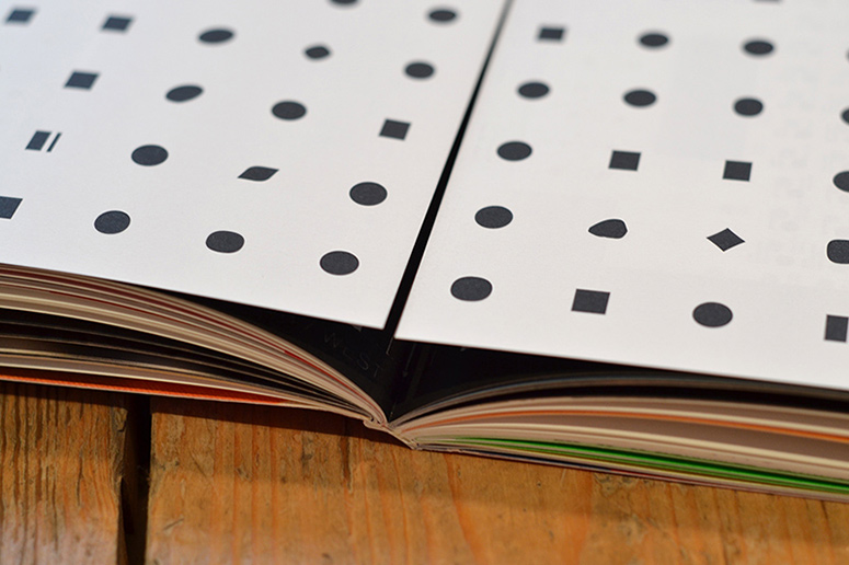
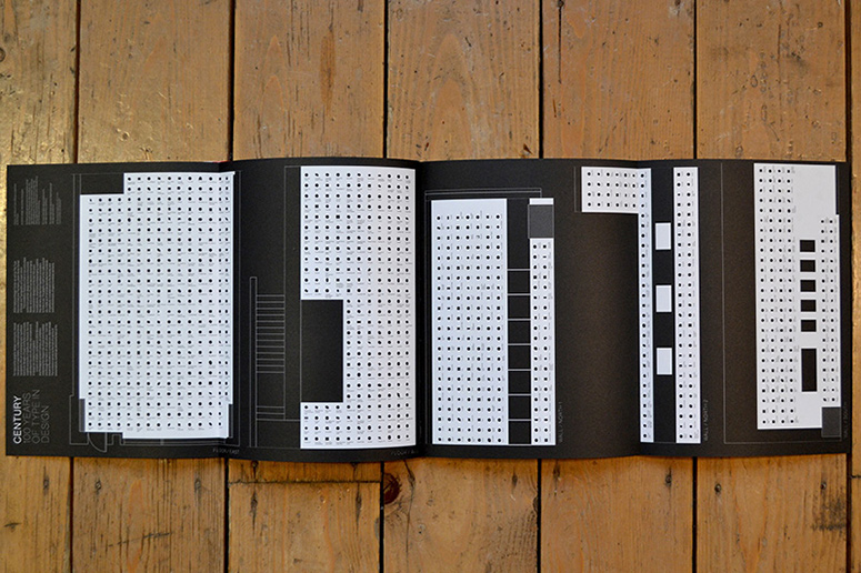
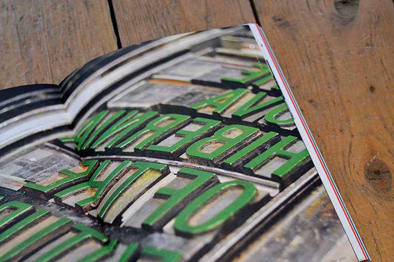
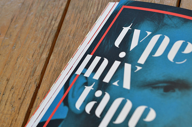
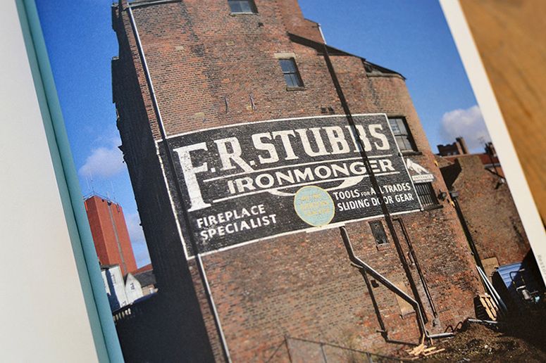
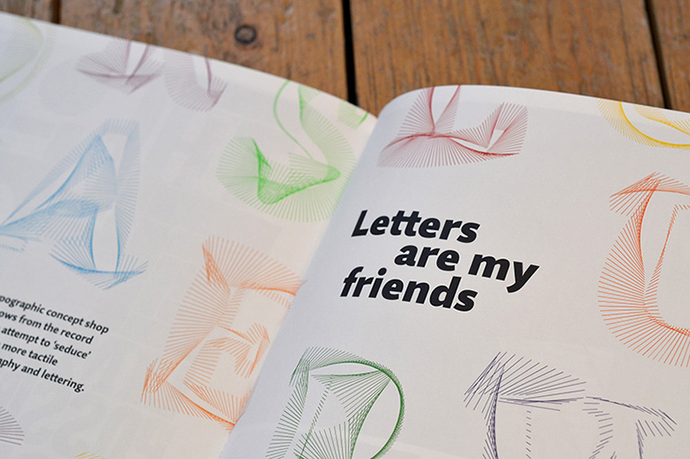
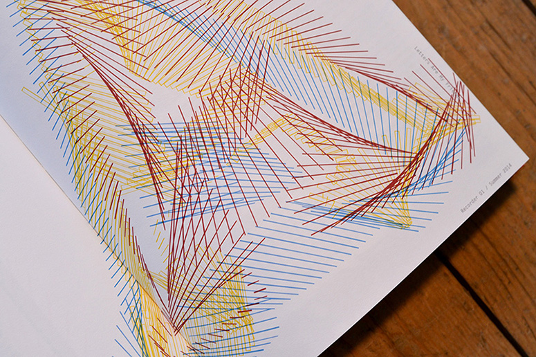
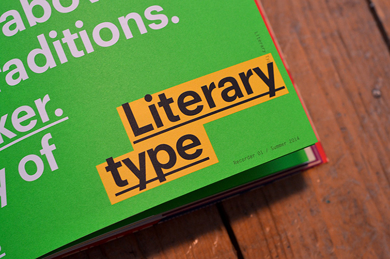
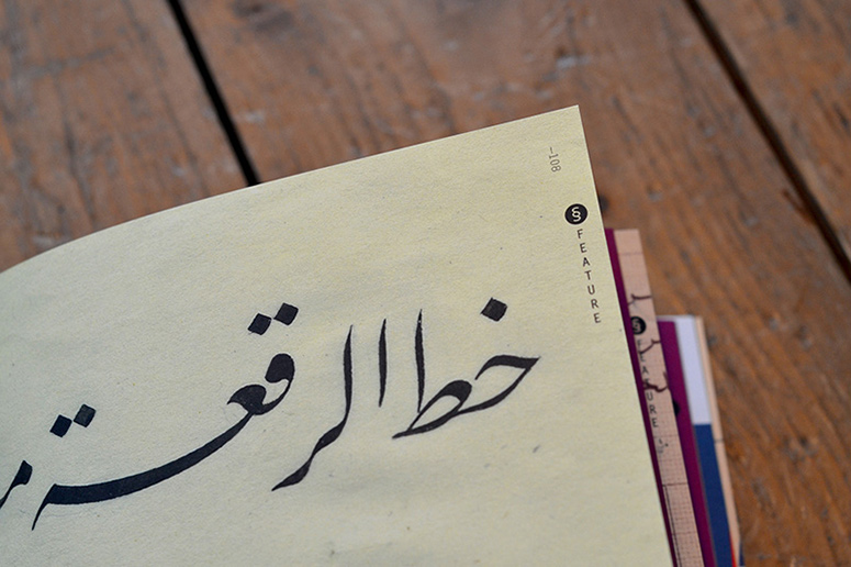
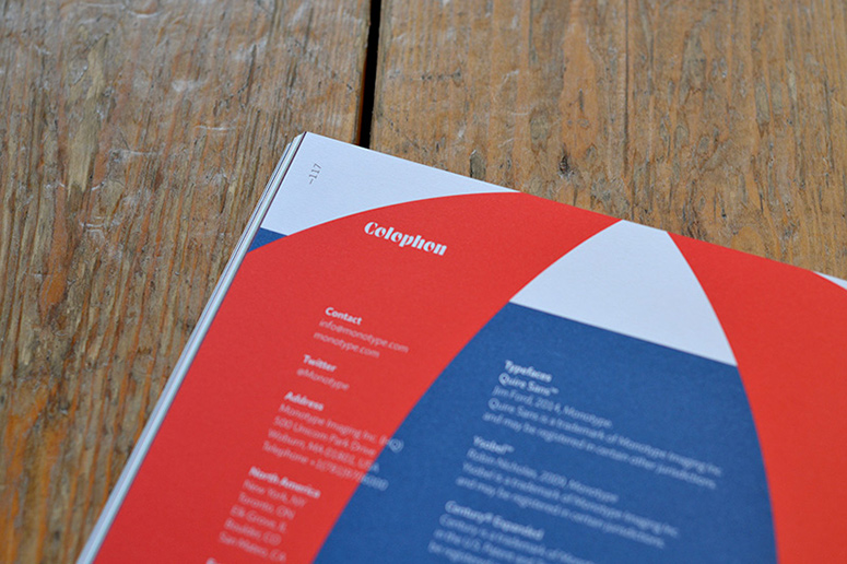
First published in 1902, Monotype's magazine The Recorder has been relaunched with a completely new look, and a new focus: the wider role that typography and type design play in contemporary visual culture. It features a range of bold typographic layouts and illustrations and showcases a variety of Monotype fonts across 4 sections: Features, Essays, Profiles & Opinions. It was created by a team of 2 people, outside of work hours.Type of course engages us all daily on many levels, yet is also a complex and nuanced subject, so the aim was to draw people in with a very accessible style and format, and then keep them engaged through original high quality and varied content.
Production Lesson(s)
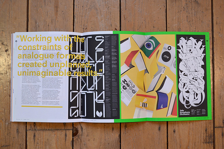
The cover has a huge gold foil masthead which wraps around to the back cover providing opportunity for tessellation and huge shelf presence. We decided to foil the Monotype 'M' icon which sits at the base of the spine, and this proved tricky to produce well. We also had some teething problems with the throw-out pages, getting the right tolerances and trims.The spot green we used was particularly successful, so we'll be repeating vibrant spot colours in future issues, as well as interesting finishes to the masthead, and throw-out pages to provide intrigue and extra width for relevant articles.

Post Author

Kelly Cree
Writer for UnderConsideration LLC.
More: Online / On Twitter
Date Published
February 23, 2015
Filed Under
Foil stamp
Lithography
Magazines
Offset
Tagged with
mohawk superfine
monotype
spot ink
typography
About
FPO (For Print Only), is a division of UnderConsideration, celebrating the reality that print is not dead by showcasing the most compelling printed projects.
FPO uses Fonts.com to render Siseriff and Avenir Next.
FPO is run with Six Apart’s MovableType
All comments, ideas and thoughts on FPO are property of their authors; reproduction without the author’s or FPO’s permission is strictly prohibited
Twitter @ucllc
Sign-up for Mailing List
Mailing list managed by MailChimp
Thanks to our advertisers
About UnderConsideration
UnderConsideration is a graphic design firm generating its own projects, initiatives, and content while taking on limited client work. Run by Bryony Gomez-Palacio and Armin Vit in Bloomington, IN. More…
blogs we publish
Brand New / Displaying opinions and focusing solely on corporate and brand identity work.
Art of the Menu / Cataloguing the underrated creativity of menus from around the world.
Quipsologies / Chronicling the most curious, creative, and notable projects, stories, and events of the graphic design industry on a daily basis.
products we sell
Flaunt: Designing effective, compelling and memorable portfolios of creative work.
Brand New Conference videos / Individual, downloadable videos of every presentation since 2010.
Prints / A variety of posters, the majority from our AIforGA series.
Other / Various one-off products.
events we organize
Brand New Conference / A two-day event on corporate and brand identity with some of today's most active and influential practitioners from around the world.
Brand Nieuwe Conference / Ditto but in Amsterdam.
Austin Initiative for Graphic Awesomeness / A speaker series in Austin, TX, featuring some of the graphic design industry's most awesome people.
also
Favorite Things we've Made / In our capacity as graphic designers.
Projects we've Concluded / Long- and short-lived efforts.
UCllc News / Updates on what's going at the corporate level of UnderConsideration.




Related entries
KitchenAid Limited Edition Cards
BOYCO Classpack® Book
Herbst & Spungen Wedding Invitation Suite
Fracas Productions Business Cards
Gunnel Wåhlstrand Exhibit Book