ADV @ UNDERCONSIDERATION Peek here for details
BROWSE
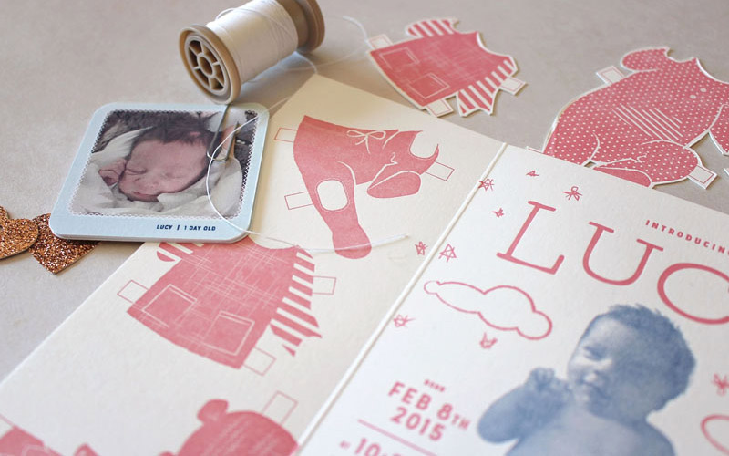
Kate Koeppel Custom Packing Tape
Production Method
Flexography
Design
Kate Koeppel
Tape Production Team: Stephen Halonen & Nick Fodor
Product photography: Cera Hensley
Printing
Adhesive Products Inc
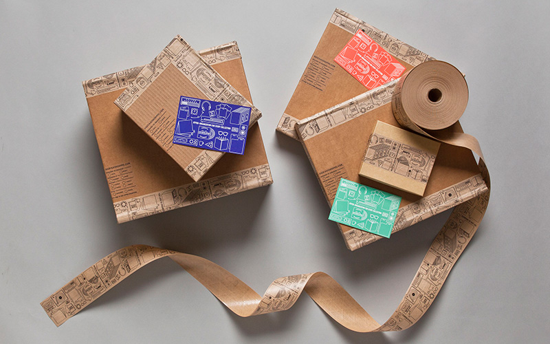
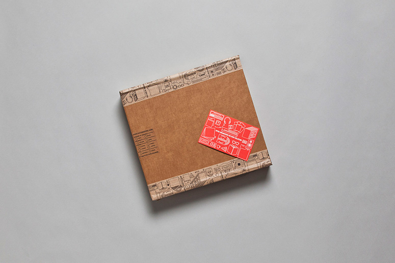
With the help of adhesive experts API, organizer-extraordinaire Kate Koeppel printed five miles of adorably-illustrated packing tape to upgrade her customers’ unboxing experience.
Client
Self-promotion
Quantity Produced
60 rolls of tape
Production Cost
–
Production Time
1 month total (5 hours to print)
Dimensions (Width × Height × Depth)
–
Page Count
–
Paper Stock
–
Number of Colors
1
Varnishes
–
Binding
–
Typography
Landon
Caps
Project Description
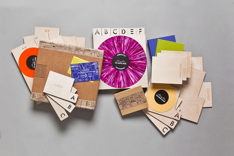
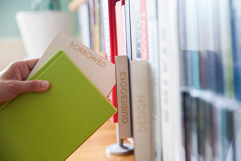
We make typographic laser engraved wood panels for organizing books, vinyl and other media.After launching the first collection two years ago, it was time to reconsider our initial letterpress and silk screen packaging. I was really attached to it all, but it wasn't realistic to maintain with the volume of products we were shipping, and it wasn't very flexible. The collection has grown from 4 products to 23, and we needed to create packaging that would very flexible, and could adapt to different products across our line. I decided to design custom paper tape that would work on all of our packaging, and all of our products.
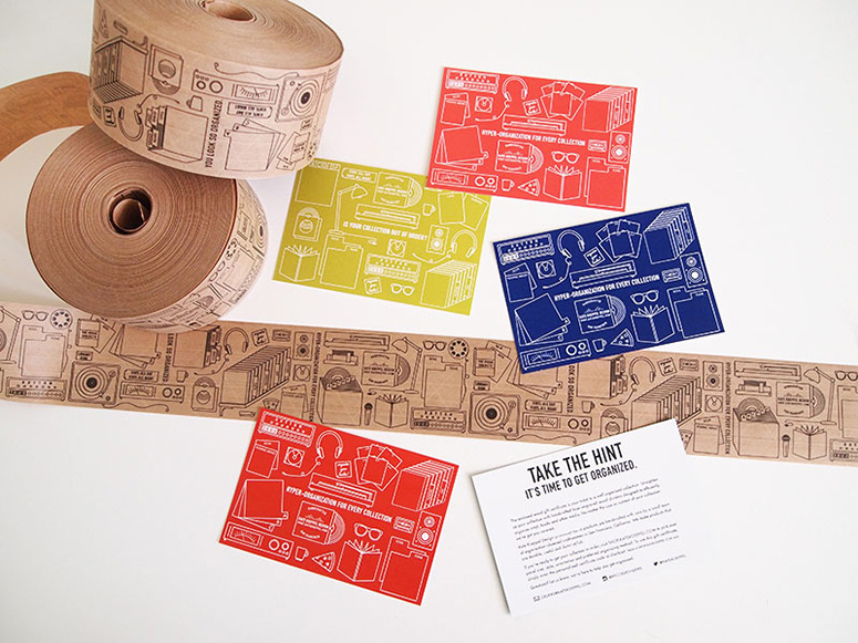
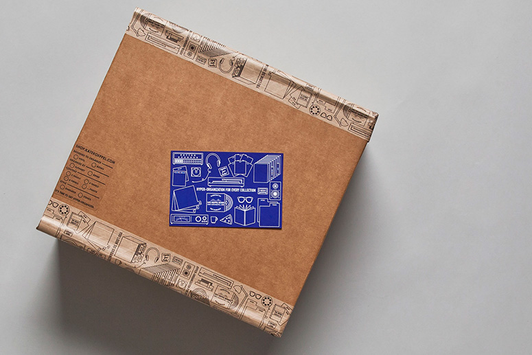
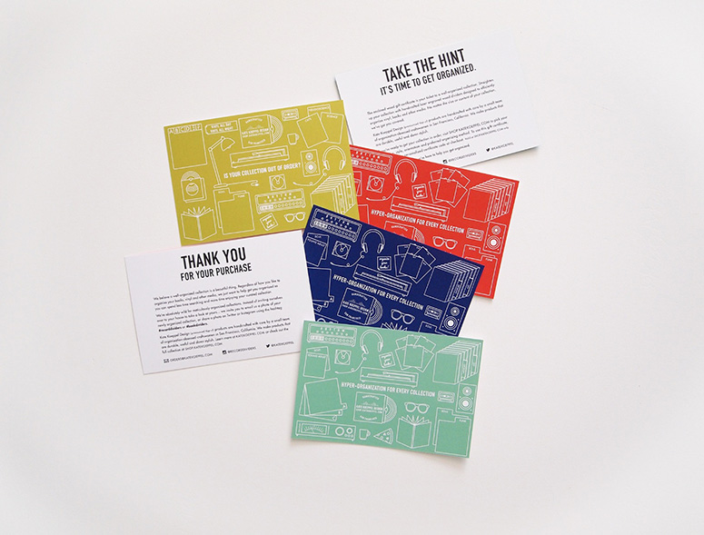
We worked with three California-based companies for our new packaging. The packaging consists of heavy duty custom cardboard boxes, illustrative printed Natural Flexgrip (reinforced paper tape) and brightly colored digitally printed postcards for each product.
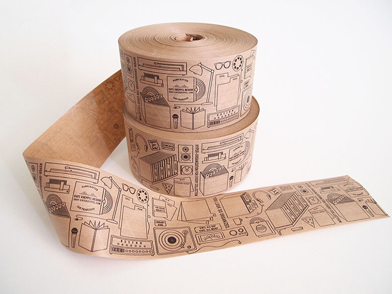
It was really hard to commit to the final tape layout of illustrations, mainly because I was committing to such a large quantity of printed tape-- (5 miles of tape, I did the math). I knew I was going to be looking at and using this product almost daily for the next year or more of my life. What if 6 months down the road I hated that little pizza slice icon?!! I created nearly 70 illustrations before narrowing the selection down to 50, then reworking them all over and over again until I was satisfied. Ultimately, I realized I had to just pull the trigger and submit it to my printer so we could test it out. The tape is a 3" by 12" repeat, and we worked very hard to make the repeat pattern look seamless. I was lucky to work with a great production team who worked hard to achieve really great printing results, considering the fairly thin line weight and volume of tape.
I am really happy with how it turned out, though I have to keep reminding myself, no one is going to see this tape as much as me and my assistants, and every customer is going to have to rip that tape open to get their products. Thinking about the unboxing helps keep it all in perspective. 2 months in, I still love that damn pizza slice.
Production Lesson(s)
(From API printer Stephen) I reduced the original art 1.5% horizontally. In making the plates I have to err on the side of caution in regards to the stretch variable. In print run set up, the plates did not have a significant stretch factor, possibly around .7%, not much at all, so the seam was noticeable. To combat the visible seam Nick did a reset of the plates, to the cylinder he added 3 layers of a .015” double sided plate binding tape atop the initial .020” tape that we use, to get the job to look as much like the original art as possible. I randomly had a small roll of this thinner caliper tape sitting around in house, sampled to us from a vendor. So we basically had to build up the thickness of the complete cylinder (plate, tape and all) until we got the seam to be as invisible as allowed. Once the seam was to our liking, Nick then ran the job at about 75% of our normal press speed to make sure we could get as consistent of an ink coverage as possible. So the job was quite fine tuned in the end. Semi jerry-rigged to be honest, but we were quite pleased with the end product.
Post Author

Jessica Mullen
Writer for UnderConsideration LLC.
More: Online / On Twitter
Date Published
June 8, 2015
Filed Under
Flexography
Packaging
Tagged with
adhesive
flexo print
flexography
tape


About
FPO (For Print Only), is a division of UnderConsideration, celebrating the reality that print is not dead by showcasing the most compelling printed projects.
FPO uses Fonts.com to render Siseriff and Avenir Next.
FPO is run with Six Apart’s MovableType
All comments, ideas and thoughts on FPO are property of their authors; reproduction without the author’s or FPO’s permission is strictly prohibited
Twitter @ucllc
Sign-up for Mailing List
Mailing list managed by MailChimp
Thanks to our advertisers
About UnderConsideration
UnderConsideration is a graphic design firm generating its own projects, initiatives, and content while taking on limited client work. Run by Bryony Gomez-Palacio and Armin Vit in Bloomington, IN. More…
blogs we publish
Brand New / Displaying opinions and focusing solely on corporate and brand identity work.
Art of the Menu / Cataloguing the underrated creativity of menus from around the world.
Quipsologies / Chronicling the most curious, creative, and notable projects, stories, and events of the graphic design industry on a daily basis.
products we sell
Flaunt: Designing effective, compelling and memorable portfolios of creative work.
Brand New Conference videos / Individual, downloadable videos of every presentation since 2010.
Prints / A variety of posters, the majority from our AIforGA series.
Other / Various one-off products.
events we organize
Brand New Conference / A two-day event on corporate and brand identity with some of today's most active and influential practitioners from around the world.
Brand Nieuwe Conference / Ditto but in Amsterdam.
Austin Initiative for Graphic Awesomeness / A speaker series in Austin, TX, featuring some of the graphic design industry's most awesome people.
also
Favorite Things we've Made / In our capacity as graphic designers.
Projects we've Concluded / Long- and short-lived efforts.
UCllc News / Updates on what's going at the corporate level of UnderConsideration.

Related entries
Dutch Harvest Hemp Tea Packaging
Shrub & Co Packaging
120WaterAudit Water Testing Kit
Crafted Taste Packaging