ADV @ UNDERCONSIDERATION Peek here for details
BROWSE
United States Department of State, Bureau of Diplomatic Security Book
Production Method
Offset
Design
In-house
Stephanie Archuleta, Sr. Graphic Designer
Vincent Crawley, writer
Printing
Goetz Printing
A historical review with quality printing and a few production surprises along the way lead you through years of images and information.
Client
United States Department of State, Bureau of Diplomatic Security
Quantity Produced
5,000
Production Cost
–
Production Time
3 weeks
Dimensions (Width × Height × Depth)
–
Page Count
92
Paper Stock
–
Number of Colors
PMS 199 + CMYK
Varnishes
Soft touch laminate
Binding
Perfect Bind
Typography
Whitney
Mercury Text
Tungsten
Project Description
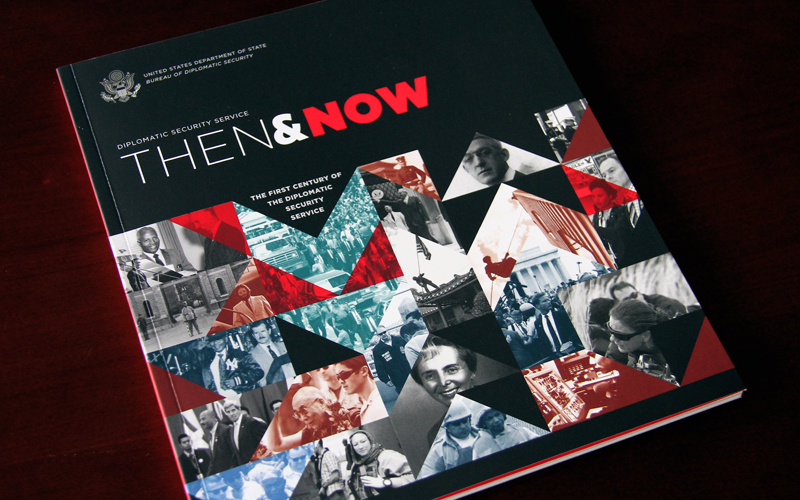
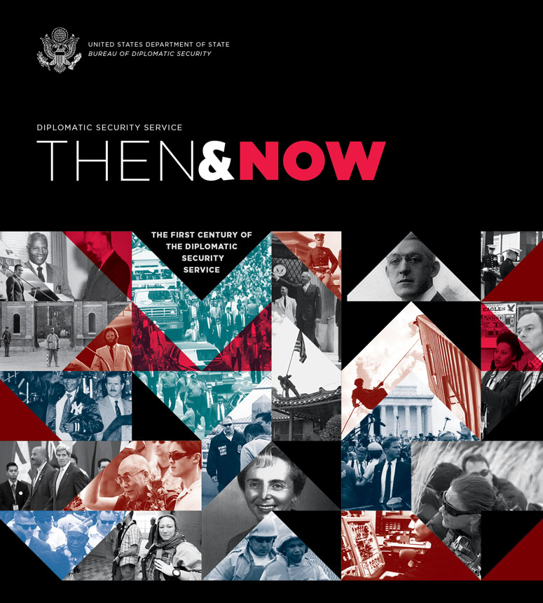
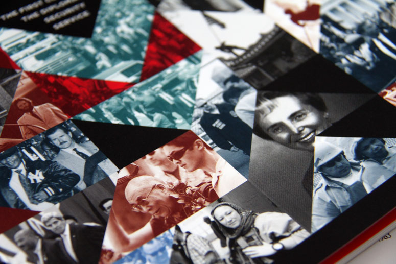
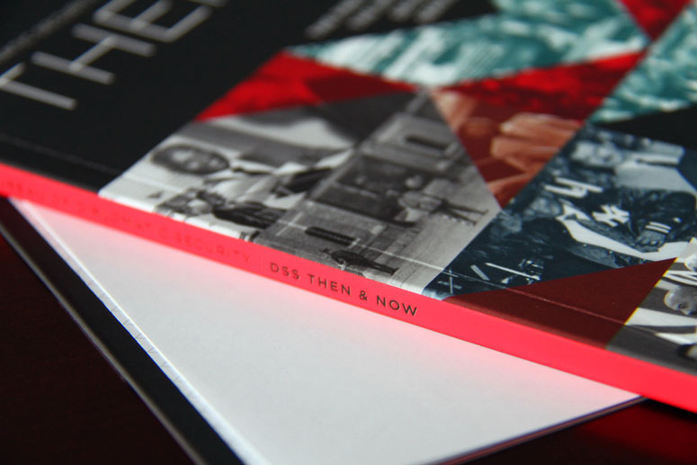
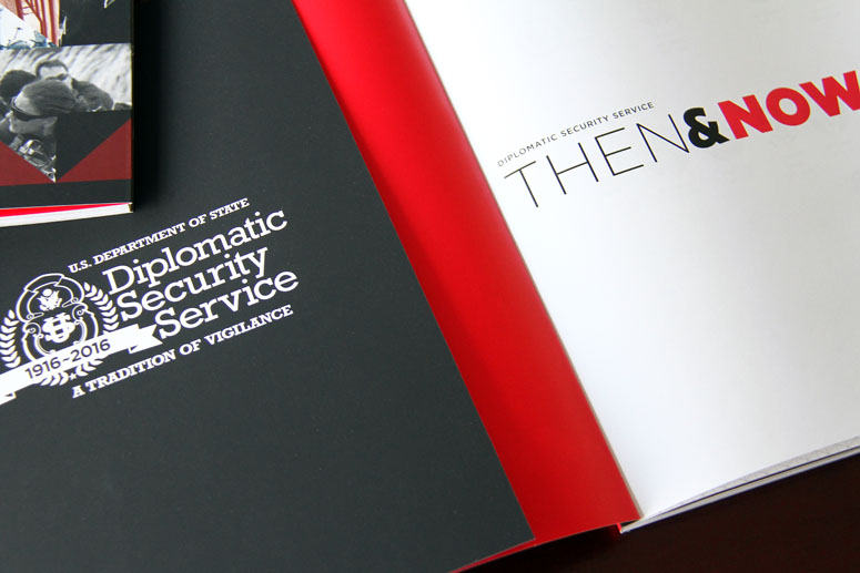
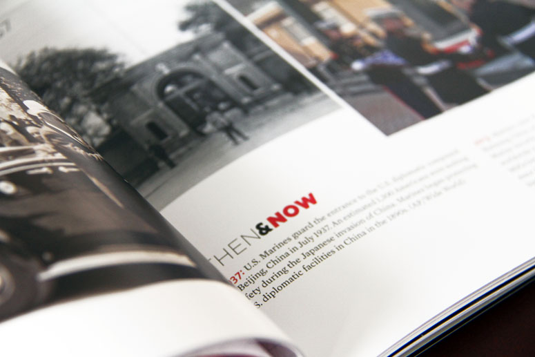
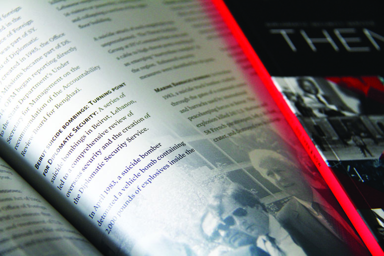
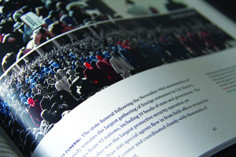
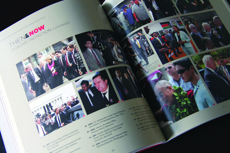
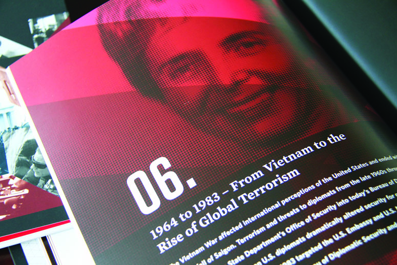
The Diplomatic Security Service (DSS) Then and Now book is a comprehensive historical chronology of the DSS from the early 1900s to the present. As 2016 is also the 100 year anniversary of the DSS, this book was meant to be a memento for all Bureau of Diplomatic Security employees. Thus, I wanted to ensure that the layout, type, colors, and production materials were refined, elegant, clean; and a product worthy for employees to keep, long after they retire. Therefore, I designed a geometric theme for the cover, which allowed us to showcase some of our historical images in a clever way. For the earlier historical images, I found it uninteresting to keep all imagery in black and white. So for certain images, I added a subtle color overlay.I also wanted to highlight the brilliance of Pantone 199, and decided that the cover was a great way to fully feature this hue. Through its use, I wanted to “catch the eye”, without the color being too overwhelming. That is also why I used the color on the cover interior, under the fold-over flap. In efforts to engage the senses, I also selected a soft touch laminate for the cover, which allowed for a soft velvety feel, while also deepening the saturation of the rich black. I'm extremely proud of this piece, and humbled that this book will be part of the historical collection of publications within the Bureau of Diplomatic Security and U.S. embassies overseas. I think it’s also a great reflection of how designers are elevating federal government design, which, in our industry, so often has a reputation for being overly wordy, drab, and colorless.
Production Lesson(s)
With such a large flood of rich black on the cover, I wanted to ensure that we could prevent any excessive cracking at the score near the spine. Our printer suggested we use Invercote paper for the cover, which would also compliment the soft touch laminate. This turned out to be the perfect paper stock solution for our cover. When in doubt, trust your printer!
Post Author

Bryony Gomez-Palacio
Editor of FPO and co-founder of UnderConsideration LLC.
More: Online / On Twitter
Date Published
July 22, 2016
Filed Under
Books
Offset
Tagged with
book
cmyk
Mercury Text
offset
perfect bound
pms
Soft touch laminate
Tungsten
Whitney


About
FPO (For Print Only), is a division of UnderConsideration, celebrating the reality that print is not dead by showcasing the most compelling printed projects.
FPO uses Fonts.com to render Siseriff and Avenir Next.
FPO is run with Six Apart’s MovableType
All comments, ideas and thoughts on FPO are property of their authors; reproduction without the author’s or FPO’s permission is strictly prohibited
Twitter @ucllc
Sign-up for Mailing List
Mailing list managed by MailChimp
Thanks to our advertisers
About UnderConsideration
UnderConsideration is a graphic design firm generating its own projects, initiatives, and content while taking on limited client work. Run by Bryony Gomez-Palacio and Armin Vit in Bloomington, IN. More…
blogs we publish
Brand New / Displaying opinions and focusing solely on corporate and brand identity work.
Art of the Menu / Cataloguing the underrated creativity of menus from around the world.
Quipsologies / Chronicling the most curious, creative, and notable projects, stories, and events of the graphic design industry on a daily basis.
products we sell
Flaunt: Designing effective, compelling and memorable portfolios of creative work.
Brand New Conference videos / Individual, downloadable videos of every presentation since 2010.
Prints / A variety of posters, the majority from our AIforGA series.
Other / Various one-off products.
events we organize
Brand New Conference / A two-day event on corporate and brand identity with some of today's most active and influential practitioners from around the world.
Brand Nieuwe Conference / Ditto but in Amsterdam.
Austin Initiative for Graphic Awesomeness / A speaker series in Austin, TX, featuring some of the graphic design industry's most awesome people.
also
Favorite Things we've Made / In our capacity as graphic designers.
Projects we've Concluded / Long- and short-lived efforts.
UCllc News / Updates on what's going at the corporate level of UnderConsideration.

Related entries
2017 Brand New Conference Program
Severe(d): A Creepy Poetry Collection by Holly Riordan
Um Caminho para Santiago CD Package and Diary
BOYCO Classpack® Book
Antes de Perder la Esperanza Book