

NOTE: This is an archived version of the first incarnation of Brand New. All posts have been closed to comments. Please visit underconsideration.com/brandnew for the latest version. If you would like to see this specific post, simply delete _v1 from the URL.
![]()
Last season’s ridiculous record of zero wins against sixteen losses for the NFL’s Detroit Lions makes its glory days of four NFL championships, the latest more than fifty years ago in 1957, a very distant past. Truth be told, the woes of its football team should be the least of the city of Detroit’s worries, but few things can bring the citizens together as an exciting sports franchise and the Lions are doing whatever they can to bring a little bit of hope to Detroit, and a new identity for the Lions may not be the salvation but at least it’s a diversion. Yesterday’s media announcement of the new logo would have been more climactic had the logo not been leaked by the NFL itself nearly a month ago when the store posted a toy 18-wheeler featuring the new logo.
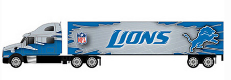
Toy truck at NFL.com with leaked Lions logo; news broke here.
Certainly, we could have posted the story back then, but there was absolutely no supporting images and just a crappy low resolution rendering of the actual logo. Plus, a disappearing image of a toy truck wasn’t much of a certain lead to go on, so I decided to sit on the story and wait for the official announcement. If only to get a better look at the lion.
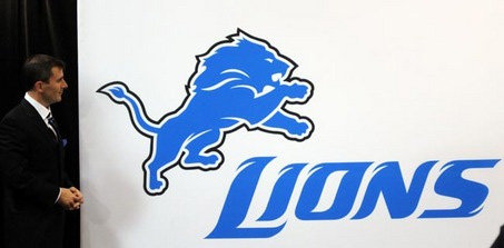
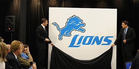
As part of the new comprehensive brand, the Lions also introduced a new logotype and a new proprietary font, “NFL Lions.” The new logotype is additional imagery that presents the Lions brand and will be featured in such prominent places as the endzone marking at Ford Field. […] The new identity retains many important aspects of our history in terms of our primary mark and our colors. However, the evolution allows us to present our Lions brand and visual identity in new, versatile and distinctive ways.
— Press Release
![]()
![]()
Click on image for bigger view.
![]()
A few sample words set in the “NFL Lions” typeface. Don’t pay attention to the resolution, it’s the best we could do from a PDF with the type as an embedded image.
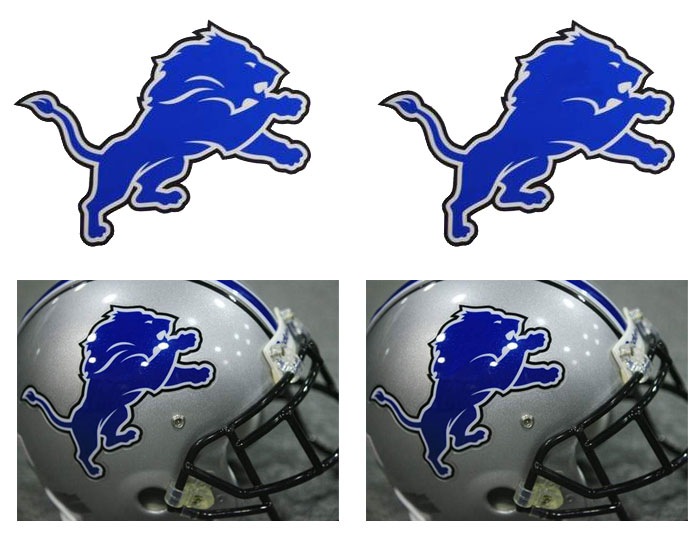
So, there you have it, the new identity for the Detroit Lions. I have to admit that I deeply enjoyed how strict the new lion remains to the original and presents a simple evolution without resorting to the animal pyrotechnic drawings that plagues most professional sports team identities. You can’t help but appreciate how big a difference a few white lines can do for Bubbles, as the lion is nicknamed. You can argue whether it’s the right drawing for a lion, but whoever designed this new mark did a good job in working with the cards they were dealt.
The furry typeface is fine, I guess, they did need some extravagant display of design and the “NFL Lions” typeface is pretty restrained for what it wants to do. Plus if you compare it to some of the Tuscan-style typography the Lions have used in the past, this is no more or less silly or inappropriate, so might as well have something proprietary. To be honest, there isn’t anything very interesting about this whole identity, it’s pretty competent and is inoffensive, but the two dozen or so e-mails I have in my inbox prove that — not unlike a certain X-Men movie that also got leaked — a little media buzz on the subject of identity design goes a long way.
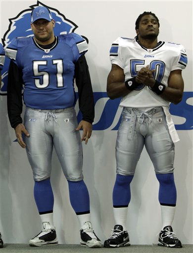
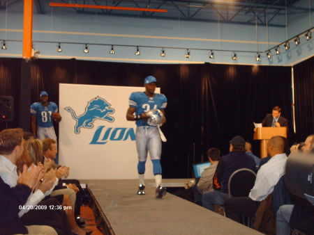
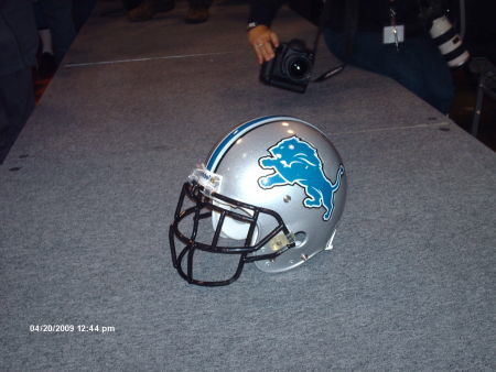
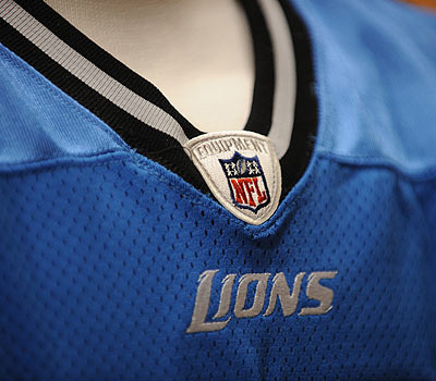
Below are some images from yesterday’s announcement.


Jump to Most Recent Comment
JeanC’s comment is:
Nice custom typeface!
On Apr.21.2009 at 10:29 AM
Dale Campbell’s comment is:
My first impression was "yuck"
I like the font itself, but next to the bold-ness of the logo, it wimps out.
On Apr.21.2009 at 10:29 AM
felix sockwell’s comment is:
what a fantastic redesign... props to whoever designed it.
On Apr.21.2009 at 10:32 AM
Proverbial Thought’s comment is:
I most appreciate the addition of the fangs to the Lion and the flowing hair. The old mark looks like the Lion has Axe gel in its hair. I think it is a good upgrade. Were I given the oopportunity to make a suggestion, I would only suggest losing the old-school, high school paralell stripes from the helmet, and decrease the size of the logo on the helmet. Other than that, I like the new logo mark, but don't too particularly care for the fonts.
On Apr.21.2009 at 10:39 AM
Adam F.’s comment is:
I think it looks great. It's a subtle change, but I certainly appreciate the extra detail that they have added. Too bad it won't make the Lions a better team!
On Apr.21.2009 at 10:41 AM
Jonathan’s comment is:
The logo redesign shows some nice signs of restraint, and is a nice improvement.
The new typeface is, well, not the greatest... While its better than than anything they've used in the past, it still has issues. The biggest problem I have is with the D and O. They are nearly identical, and when you have a D and an O in the name of your city, that's a problem.
Also, I have a problem with the new numbers on the uniform.
1. They aren't consistent with the NFL Lions typeface, which doesn't appear to have come with numbers.
2. The number are far too narrow. We had the same problem here in Jacksonville years ago, and let's just say, the narrow numbers won't last.
Sorry for the long rant, but you posted about football! Thanks Armin!
On Apr.21.2009 at 10:41 AM
Tommy’s comment is:
I was a Lions fan for 16 years before I decided I could no longer stand losing every Sunday. But one thing I always loved about this team's image was the lion, which I first fell for while watching Beverly Hills Cop where Axel Foley wears a Lions jacket with pride (no pun intended, okay maybe just a little, pride get it get it).
Anyhow, I'm a little torn. While a purist, it seems like they just didn't take this far enough. The type seems pretty uninspired, same with the lion. The pairing of the two seems a little awkward as well. I do like that they kept the new lion in the same realm as the old one and as you say they resisted the urge for, 'animal pyrotechnic drawings.' But if you're going to mark a new beginning for a team that just went 0-16 then maybe some minor pyrotechnics were in order?
Btw, that toy truck looks awful. The drop shadow on the NFL logo is trying to visually propose that it's about 23 feet (give or take) away from the side of the trailer.
On Apr.21.2009 at 10:44 AM
Fish’s comment is:
I like the type for "Lions." Can't say I'm a fan of the nontraditional numbering in that same typeface on the jerseys. The lion and the typography however feel more fierce, which is a nice update. Hopefully, one day, we may be able to say the same for the team itself.
On Apr.21.2009 at 10:52 AM
Erik at Logo Critiques’s comment is:
I appreciate the fact that the designer(s) took the old logo and really brought some personality to it with few areas of white. The addition of some teeth add fierceness.
On Apr.21.2009 at 11:03 AM
Josh’s comment is:
The uniforms still look like the same old Lions uniforms, but I have to admit that I love that lion and the subtle changes made to it. All around, a good update despite not traveling far from home.
On Apr.21.2009 at 11:09 AM
chuck’s comment is:
Was this done internally or externally?
On Apr.21.2009 at 11:17 AM
John Leschinski’s comment is:
got a link to the guide PDF?
On Apr.21.2009 at 11:19 AM
Armin’s comment is:
John, here you go.
http://www.detroitlions.com/pdfs/04202009_NewBrandAnnouncement.pdf
Digs’s comment is:
I like pretty much everything about this. The Lion tweak was nice and subtle, yet big enough to warrant the update.
On Apr.21.2009 at 11:32 AM
Matthew Smith’s comment is:
The lion is magnificent. The equity of Detroit's history has not only been retained, but also enhanced. Whoever designed this deserves an enthusiastic high five.
On Apr.21.2009 at 11:33 AM
Emily Brackett’s comment is:
I like it. I particularly like how the little bit of white redefines that lion and makes it so much more readable & energetic. Of course, those same marks make the typeface less readable. But in this context I think it works.
On Apr.21.2009 at 11:38 AM
Simon Bremen’s comment is:
Not my taste, but an excellent job all round. Restrained power is not an easy quality to pull off.
My only nit pick it the outline around the lion, I think it makes the symbol look like a sticker.
The custom font is well resolved, and totally appropriate given the world it has to live in.
Congratulations to the design team.
On Apr.21.2009 at 11:39 AM
Jose’s comment is:
Good logo. The designer did a good job. My only questions is why didn't they use the typeset on the numbers. The numbers look too generic.
On Apr.21.2009 at 11:44 AM
Xav’s comment is:
I never liked the old logo for some reason, too plain and boring. The new one looks very similar yet completely fresh and modern and more aggressive. I like it a lot.
Way to keep in with the club traditions (although considering how crap the franchise has been for the last 50 years maybe traditions could have been damned...) and still manage to come up with a modern identity.
Really good job, well done.
On Apr.21.2009 at 11:48 AM
Dan’s comment is:
Love the lion, hate the typeface. The lion redesign is exactly the way to update a decades-old logo without losing one iota of the logo itself. The typeface? Velveeta cheese. Also, does it bother anyone else that the lion is outlined but not the letters? Not saying that would look good, it just looks jarring.
On Apr.21.2009 at 11:51 AM
Matt’s comment is:
The lion update is great, much fiercer and stronger looking than the past, something the team needs to adapt as well.
On PTI yesterday, they announced this update as well, saying it doesn't look different and is not worth the 6 figures it cost. I cannot confirm or deny that, but it definitely looks different, in a better stronger way. I was a bit disappointed when i heard that on the show, pay attention people...
The biggest problem I have with this, which I'm surprised no one mentioned yet, is the actual name of the Lion, Bubbles? Are you serious? Bubbles is a strong lion? please, how could no one want to change the name, or even suggest a name change? Bubbles, seriously?
On Apr.21.2009 at 11:52 AM
ck’s comment is:
Very nicely done. The original logo was overly simple, and this takes it to where it should've been the whole time. Respectful of the past, while bringing it a new roar.
The custom typeface logo is nice, I think. Maybe not as wild as it could've been, but it feels appropriate to the team name, which can't be said for a whole lot of sports teams.
Kudos to whoever did the redesign.
On Apr.21.2009 at 11:57 AM
jRod’s comment is:
I think the incorporation of white accent lines in the existing logo was brilliant. Seriously, its exactly what I would have done. It really adds a lot more aggressiveness to the brand... exactly what it needed.
I could go on about other things that I am not so charmed about, but nevermind that... i really think the logo does the trick.
On Apr.21.2009 at 12:24 PM
CM’s comment is:
I believe the Lions’ logo would look much better without the superfluous white streaks (I guess it’s supposed to be sort of like a mane?) in the middle of the logo.
Here’s what it would look like without it:
http://farm4.static.flickr.com/3594/3461951669_14da9a9f8c_o.jpg
Much Better.
On Apr.21.2009 at 12:45 PM
AW’s comment is:
I like it overall, but the 'S' feels a little too wide.
On Apr.21.2009 at 12:47 PM
Darrin Crescenzi’s comment is:
Most likely done in-house by the folks at Reebok's team-sports licensing. They always seem to do extremely competent subtle updates.
I think one thing that always gets overlooked in these discussions is the uniform numbers. They're the biggest thing on the uniform, the only discernible piece of branding when viewed on TV or in a stadium, and are second only to color in branding hierarchy.
From what I can tell from the photo, it looks like they did a nice job incorporating the look and feel of typography into the number system, without resorting to oblique numbers (which always seems to look trashy).
Bravo!
On Apr.21.2009 at 12:51 PM
taylor’s comment is:
As a lifetime Bears fan, I hate to show any love for the Lions, but you gotta feel bad for the guys. And this is truly a great redesign. The additional strokes on the new lion make it look more defined and stronger, and the custom typeface mirrors those strokes perfectly. Great job.
On Apr.21.2009 at 01:06 PM
doug’s comment is:
I like it. It's a nice update and a decent refreshing without UPS/Xerox-ing to death. Like the application too. On a sidenote, Paul Lukas, et al. over at Uniwatchblog *haa-aates* this.
http://www.uniwatchblog.com/2009/04/21/hasnt-this-poor-city-suffered-enough/
On Apr.21.2009 at 01:07 PM
Scott’s comment is:
Like the logo. Dislike the font.
HATE the uniforms. As a proud uniwatch fanatic ... the use of black throughout the uniform is abysmal.
The best Lions uniform ever was its "throwback" that was Honolulu Blue and Silver. Or, perhaps the Barry Saunders era ... neither of which sniffed black.
http://en.wikipedia.org/wiki/Detroit_Lions
http://www.detroitlions.com/document_display.cfm?document_id=378757
They should've started here. The use of black is trite. Methinks they could've even replaced the black in the logo with a silver outline.
Missed the mark, big-time.
On Apr.21.2009 at 01:11 PM
Andy’s comment is:
I would have gone a simpler route with the logotype, but I still like this one. I don't like the clunky double outline on the lion, though, even if the lion itself looks great. In fact, I would have completely eliminated the black and put the new lion on the helmet of those beautiful blue and silver throwback uniforms.
On Apr.21.2009 at 01:18 PM
Andy’s comment is:
I also never liked the way the tail stuck straight out like that. I've always wanted it to be a backwards S shape curving back toward the body then away.
On Apr.21.2009 at 01:20 PM
Lee’s comment is:
I don't mind the updated logo, although I would have left out the white swooshes within the body.
I HAAAATE the black though. The Detroit Lions do not have black as one of their colors. Dumb, and whoever decided it should stay should be shot. Twice.
On Apr.21.2009 at 01:49 PM
Efren’s comment is:
I like it! It really looks like a lion. I also like the typeface with its "mane" characteristic.
good job.
On Apr.21.2009 at 02:10 PM
CJ’s comment is:
I like it.... Great evolution. I was always amazed that this logo was able to sit still for so long. The old lion always looked to me like something that was photocopied once too often. NIce to see the detail and aggressive look to the lion added in. Typeface goes well will the mark also, having a forward/flowing mane feel to it. Nice job as far as sports logos go. Being from Detroit, I never bought any merchandise because I personally did not like the blue/silver. I was hopeful when they trotted out black uniforms over the last few seasons and disappointed when the black wasn't used more here... but again, thats just my personal taste.
On Apr.21.2009 at 02:16 PM
Matt Fouty’s comment is:
Great to see this on here as a life long Lions fan. I hope you found my e-mails helpful. This is a great write up!
On Apr.21.2009 at 02:46 PM
Bart O'Dell’s comment is:
I think I just vomited a little.
This is horrible. Black should be replaced with a dark navy blue. Why in professional sports there is a need or a want for the inclusion of black is beyond me!?!
On Apr.21.2009 at 03:46 PM
Von Glitschka’s comment is:
Why is the paw fused to the Lions chin? That looks lame, they should have separated that. A definite improvement none the less.
On Apr.21.2009 at 04:09 PM
Bill Dawson (XK9)’s comment is:
Well done. The person who redesigned the lion symbol is a flippin genius. The type fits nicely and as previously mentioned, kudos on the original letterforms. I'd hate to see them use the typeface on anything other than the logo.
The runway show looks scary. From the photo it doesn't appear to be ironic in any way. And that's why it's scary.
On Apr.21.2009 at 04:36 PM
The Zed Word’s comment is:
@Chuck: To my knowledge the NFL designs everything in-house. As a league they control everything down to the tiniest detail, for better and (often) for worse. I'm sure the team and possibly Reebok had some input into the process but I bet we'd all be surprised at how little say they had in reality.
I may be wrong, of course, but this is always what I've heard.
On Apr.21.2009 at 04:42 PM
Bill Dawson (XK9)’s comment is:
@CM I respectfully disagree on the "mane" lines within the lion symbol being "superfluous." I saw those more as rippling sinew than wispy mane. I believe it adds to the dynamic of the lion shape.
On Apr.21.2009 at 04:51 PM
Rodrigo Müller’s comment is:
amazing improvement, BUT I think they could've left that black outline behind, it steals all the attention from the great typographic work they did.
On Apr.21.2009 at 05:25 PM
Anonymous’s comment is:
didn't they show us this awhile ago?
On Apr.21.2009 at 05:52 PM
Lindsay’s comment is:
Like many have said black outline is too much and too heavy. Also I feel the Lion is a bit too muscular in the upper body and arms, a lion on 'roids? Maybe it's apt then.
Armin, do I get credit for the find? Suppose everyone knew about it though.
On Apr.21.2009 at 05:55 PM
Nisio’s comment is:
I like the wordmark, as a wordmark, there was no need to turn it into an entire font, that's just overworking it methinks
On Apr.21.2009 at 06:04 PM
The_Lurker’s comment is:
i like the typeface and that they tried i guess.
the best i've seen since Von's KFC/OKC Thunder hybrid. they should've gotten the folks that revamped the KFC logo and created a Ron Perlman lion logo. detroit's going through tough times so maybe he can be their sponsor.
imagine Ron Perlman's Detroit Lions taking the field with ron's logo on the side of their helmet. from a psychological standpoint they'd already have three quarters of the game dominated.
On Apr.21.2009 at 06:16 PM
Mike’s comment is:
Seeing the two together, I wonder why the designer of the old logo just stopped there... I feel like he/she could've added what's there now, but somehow abruptly stopped at the silhouette shape. Anyway, nice next step, and the type is great (maybe not so much for reading anything other than the word "LIONS").
On Apr.21.2009 at 06:24 PM
John Mindiola III’s comment is:
The new lion is great. Yall may be excited about the white lines inside the body, but for me, it's the execution with the hind feet. They look like feet now!
As for the custom typeface, meh. I wish the folks designing for sports teams would stop trying to make everything so ACTIVE, and instead, make them more CLASSIC and STRONG. Have we learned noting from the Yankees?
On Apr.21.2009 at 06:30 PM
Mark’s comment is:
yes yes YES!
about TIME!!!!!
now it looks more intimating without losing the spirit of the original.
It's nice to see things done RIGHT for a change!
On Apr.21.2009 at 06:41 PM
sloane’s comment is:
Interesting to think that they might trying to build a better team through a new look? (I found this article through a link from Nate Hanson's design blog Small Instrument - check it out -).
I think we have to ask ourselves: does the new look get to the heart of the team's core characteristics? Will it help the team's fans to better understand the team? Or is it just "window-dressing?"
Brand expert John Tantillo writes a weekly brand winner/loesr post on his marketing and branding blog. Each week, he has a "takeaway."
This past week, the takeway was "Window dressing you brand almost always comes back to bite you, because your Target Market is not going to be in the dark forever."
(Takeaway was inspired by Obama's proposal for a "high-speed" train. Check out his full post: Full post: John Tantillo's Brand Winner... And Loser: The U.S. Navy and the Train To Nowhere.
On Apr.21.2009 at 06:57 PM
ZariaZ’s comment is:
Nice logo improvements and really good typeface.
What I don't like is the space between 'N' and 'S' - it's too much.
Well done again!
CM’s comment is:
@XK9 I don't know, maybe I'm alone here, but I think it's just overcomplicating it. I think it portrays the same amount of ferociousness without the streaks while giving it a cleaner and less cluttered look. They just seem unnecessary.
But hey, to each his own.
On Apr.21.2009 at 07:06 PM
Anonymous’s comment is:
The "N" and "S" could totally be a little closer...but overall this redesign is a breath of fresh air to the "animal-pyrotechnics" filter Armin mentioned.
I do feel like both the animal and type should be outlined or not....maybe that is just me though.
On Apr.21.2009 at 10:33 PM
Paul Cooley’s comment is:
oops...that was me.
On Apr.21.2009 at 10:33 PM
dg3’s comment is:
A clever redesign. It leaves what was already there, and just enhances it. Perfect.
Now if only they could redesign their players.
On Apr.22.2009 at 02:08 AM
Robin’s comment is:
Certainly an improvement. The old lion looks like its brain was exploding. Also, I LOVE that they made their players walk the catwalk to model their new uniforms. Cute, guys.
On Apr.22.2009 at 02:33 AM
Skythe’s comment is:
Great stuff. The lion went from 30% to 90% with this redesign.
On Apr.22.2009 at 06:58 AM
Julie’s comment is:
I love the updates to the lion. As a kid, I always equated the white dot representing space between the neck and foreleg as the lion's eye, and was completely stumped as to how (what I later discovered was a paw) was supposed to be a lion's nose. The addition of the white highlights not only clears that up for kids like me, it also creates a super-pleasing animal form.
On Apr.22.2009 at 09:50 AM
Jen’s comment is:
The NFL in-house creative team designed and art directed the mark and logotype with the help of an outside illustrator. Reebok had no say in any
part of the design.
In terms of the truck design, outside vendors will take marks, logotypes and style guides and design their own product. The NFL in-house creative team took no part in the design of the truck (or most consumer product material) at all.
On Apr.22.2009 at 10:29 AM
Anonymous’s comment is:
I love it. Its a nice update for sure!
www.carrihan.com
Christopher Hanley’s comment is:
Very nice update, subtle and smart. You designed it, anyone know?
On Apr.22.2009 at 10:39 AM
Angela’s comment is:
Thanks for posting, glad to see changes being made in Detroit :) There are a lot of good things happening here, but few are being talked about. It's nice to see bubbles with some personality too!
Does anyone know who designed this? I really, really hope that this was designed by someone in Michigan...we need the business! haha
On Apr.22.2009 at 11:32 AM
Cam’s comment is:
I like it. Definite progress...but it's very NFL Europe for some reason.
On Apr.22.2009 at 11:41 AM
john’s comment is:
Yes, but, what would Andrew Sabatier do?
On Apr.22.2009 at 01:41 PM
Eric’s comment is:
Personally, I find this to be a well intentioned but poorly executed update. The internal white line meant to outline the main look bloody awful. The stand out way too much and look like complete afterthoughts. The previous 0-16 season was the perfect opportunity for the team to reinvent themselves, but instead they make present us with a shoddy rushed-looking logo. Speaks volumes about the franchise as a whole over the last 10+ years.
On Apr.22.2009 at 03:49 PM
aonach’s comment is:
Hahaha. Think it will help them win a game or two?
On Apr.22.2009 at 04:23 PM
Andy’s comment is:
With all due respect, Mr. O'Dell, adding dark navy blue to the Lions' color scheme would have been just as bad as adding black. Using navy blue and medium blue together has become so overdone, ahem, in vogue (Dallas Mavericks, Memphis Grizzlies, Tennessee Titans, San Diego Chargers, Denver Nuggets, et al) that the Lions would then have looked like they were hopping on THAT bandwagon instead of the black bandwagon, which had its heydey in the early 2000s. In my opinion, black and navy blue are the same evil here, and would play identical roles from a formal standpoint, which is this identity's biggest weakness.
On Apr.22.2009 at 04:25 PM
Austin’s comment is:
At least it's not as bad as the new Jaguars uniforms released today
On Apr.22.2009 at 05:57 PM
MADPHILL’s comment is:
Definitely safe, but I agree that it's well done. I've never been a fan of the black outline around the mark, but that's not new.
Glad to see the update at any rate.
I wonder if they kept is simple and budget-conscious on purpose given the economic situation in Detroit??
On Apr.23.2009 at 11:55 AM
Matt Fouty’s comment is:
I've made a blog post with my thoughts on the change.

Chris’s comment is:
Really like it. Thank god they didn't go in the direction most other sports teams have. This is still classic and timeless.
Not going overboard and simply refining an already good logo was definitely a good move.
Camm’s comment is:
Finally. All the way back to grade school in MI, that old logo drove me crazy because of the negative space trapped between the raised front leg and the jaw! That whitespace is shaped like an eyeball, which made the 2 legs look like the jaws of any angry alligator with a mow hawk. Now maybe we can win some games! =)
On Apr.24.2009 at 09:19 PM
Doug Bartow’s comment is:
An interesting take on this from ESPN
On Apr.29.2009 at 09:37 AM
Adrian Rodriguez’s comment is:
I honestly think this was a good idea. More detail for the lion made it more realistic. Awesome work for whoever re-designed this logo.
On Apr.30.2009 at 10:05 AM
James’s comment is:
Ug i hate that S
On Apr.30.2009 at 11:37 AM
steve’s comment is:
I really think this one is a decent redesign. Keeps the integrity of the original intention, but really adds a more modern flare and the typeface adds a bit of ferocity that they no-doubt needed.
On Apr.30.2009 at 12:34 PM
biff henderson’s comment is:
The PDF 2009 schedule
http://www.detroitlions.com/pdfs/2009_Det_Schedule.pdf
will allow you to extract the new logo and logotype of "Lions" if you open it in Corel X3
There is such a lack of variation in the font that you can create the whole alphabet quite easity and have fun with it.
http://farm4.static.flickr.com/3598/3488123198_d16c7528c8_b.jpg
On May.01.2009 at 01:28 AM
StellaW’s comment is:
great redesign on an old logo, making the old frazzled looking into a much more fierce and sophisticated look.
don't love the type but i can envision how it works onto many apparels and products standalone.
great job to the designer!!
Cazart’s comment is:
It's funny - a mark is supposed to affect a brand, but in this case, it's the other way 'round.
I would like the mark pretty well if it existed in a vacuum...but I like it less just because I know how badly the actual Detroit Lions suck.
Think of it - a football team so bad it affects the graphic design. That's bad. Maybe the lion could wear a little paper bag on its head until they win a game?
On May.06.2009 at 05:15 PM
barry hoffmeyer ’s comment is:
the new lion symbol is great teath claws and a eye. the reason why the lions didnot make the playoffs is becuse the could not see therewat in to the playoffs
On May.18.2009 at 01:53 PM
Dave Klonke’s comment is:
I think the logo is great...the biggest reason why it so resembles the old icon is that they surely didn't want to take jackhammers to Ford Field. The long-time Lions logo is built into the architecture of the new stadium. By keeping the outline, they don't have to do anything more than add some white. I wrote about this here and here.
On Jun.09.2009 at 12:01 PM
Brady’s comment is:
I have to say, just as a personal aside - it's interesting how much my life has changed when the only NFL news I get is from a design website.
On Jun.15.2009 at 12:31 AM
JR Salazar’s comment is:
I think it's gonna amount for nothing if they get a consecutive donut season.
On Jun.15.2009 at 07:47 AM
Comments in Brand New, V1.0 have been closed.


