

NOTE: This is an archived version of the first incarnation of Brand New. All posts have been closed to comments. Please visit underconsideration.com/brandnew for the latest version. If you would like to see this specific post, simply delete _v1 from the URL.
While attending the International Balloon Race at the Indianapolis Speedway in 1921, as the story goes, Vice President of the Taggart Baking Company, Elmer Cline, came up with the name — which subsequently inspired the logo — of their soon-to-be-introduced loaf of bread as he was struck in wonder by the sight of the balloons in the sky. And for more than eighty years, Wonder Bread has been an icon of all things American, and, more yummily, of all things sandwich. Few things are as delicious as a peanut butter and jelly sandwich in classic white wonder bread as it sticks to the top of your mouth. Just don’t count the calories. But back on track: With an increasing number of products and SKUs that were growing inconsistent in their design, Wonder has just redesigned the complete line of packaging and has modified its logo. In charge of the redesign was Kansas City-based Willoughby Design, who was been working with Wonder since the late 1990s.
In 2008, after working through the needs of a changing market place, it was time for Wonder to evolve again for an older and more nutrition-conscious audience. Needing to recapture a #1 position in the market, Willoughby and Wonder Bread took a new look at the red, yellow and blue balloons, explored a more grown-up typeface, and dialed up the sophistication of the design system overall in order to broaden the brand’s reach to meet the growing demands of this older demographic.
— Willoughby Design
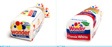
Contrast of old (above) and new (below) packaging.
New packaging.
With over sixty varieties of bread, buns and dinner roll products the redesign of the packaging certainly feels like it was much needed, and the result is undeniably pleasing and functional. Maybe a little too wavy, but what I have learned from mass consumer packaging is that straight lines or typography that isn’t on a curve or at an angle does not sell, so given the context it’s all well suited.
![]()
Changing the logo, however, seems completely unnecessary and the new logo is, unlike the packaging, neither pleasing nor functional. The flying balloons in the sky are harder to see, and have been weirdly relegated to the background, behind the crude, white stroke of the new Wonder typography, which is so awkward as well. It has too many quirks and peculiarities not worth introducing into the brand. The old typography was simple and had a great rhythm, while the new creates very irregular counterspaces. The old logo had also just been on the market for less than five years, having been designed by Willoughby as well, so it’s quite strange to see it change so soon and with little provocation.
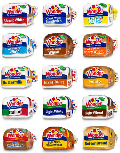
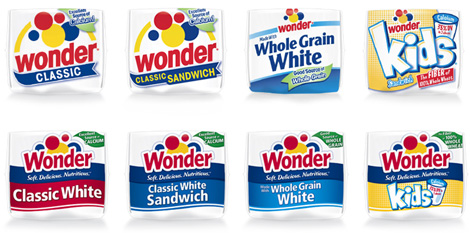
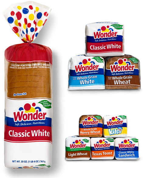
Varieties of Wonder bread.
The new packaging may be nicer and easier to replicate among different styles of bread but, when coupled with the modernization of the logo, the whole brand feels decades away from its iconic visual status.


Jump to Most Recent Comment
mane’s comment is:
I'm not familiar with Wonder, because I live in Holland, but the first thought that crossed my mind was washing-powder. That's what this identity make me think of, and I don't think that's a good thing...
On Apr.06.2009 at 07:15 AM
sander’s comment is:
@mane
That's exactly what i thought it was!
On Apr.06.2009 at 07:40 AM
Frank’s comment is:
I instantly thought "washing powder" as well.As for the logo - i agree with Armin, it really is
awkward.The type looks strange with all these inconsistent stems and yeah, the white stroke is waay too fat; makes the balloons look like disappearing behind the type.Not good at all.
Would someone please explain to me why we lately see so many strange makeovers that wouldn't pass a test if presented in design school ?
On Apr.06.2009 at 08:15 AM
Kevin Zwirble’s comment is:
I feel like they went from a brand that would stand out on the shelves to one that blends in. By significantly shrinking the logo size and adding the other elements they've merely given the consumer more to see in less time. I think it waters down any strong pacakging.
Looking at the before and after is like looking at the retro Wheaties packaging that was released earlier this year and the new one.
On Apr.06.2009 at 08:40 AM
awesomerobot’s comment is:
Wonder is really only a brand that would be recognized in the US - it does bear resemblance to something you'd see in laundry detergent, but it's such a staple of classic American branding that it's nearly instantly recognizable as bread here.
I think the redesign eliminates some trapped white space, but doesn't achieve much beyond that (If anything it was only done to fit more copy on the end of the packaging). While I know it isn't a great redesign at all, I'm almost glad it didn't change that much because it's just so classic.
I've been growing really tired of the current trend of complete redesigns that eliminate already well-established and instantly recognizable branding.
On Apr.06.2009 at 08:43 AM
Mrs. M’s comment is:
The yellow "balloon" now resembles a rising sun; the poor blue spheres have been mutated into uncouth shapes that seem to struggle to peek over that goofy type. I don't care for it. It's distracting and uncomfortable.
I'm not a fan of the before or after packaging.
I was and have always been a "brown bread" woman. Wonder Bread was always like eating a sugar sponge. Ew.
On Apr.06.2009 at 09:20 AM
Erik at Logo Critiques’s comment is:
Wow, the new logo feels sorta awkward. It doesn't feel refined to me. The white space between the 'o' & 'n' in particular bother me. Sorry but I like the old better.
On Apr.06.2009 at 09:23 AM
Marshal’s comment is:
When I see the new logo, I instantly read cleaning solution. Which isn't good when you're selling products for eating.
On Apr.06.2009 at 09:24 AM
Marshal’s comment is:
To add to my previous comment, I'm from America and have Wonder Bread on countless occasions, though I don't eat it at home. It's like Mrs. M said, sugar sponge.
On Apr.06.2009 at 09:26 AM
Jonathan’s comment is:
That blue "circle" behind the d looks like the sun has arms now or something.. While its nice to give all 60 different bags some consistency, the logo change is unnecessary and really a step backward in my mind. Armin put it perfectly when he said the previous mark had nice rhythm. It truly did.
I will add that I do like the tops of the bags, from the twist-tie, north. That looks really fun.. its too bad that will be facing the walls on all the shelves.
On Apr.06.2009 at 09:34 AM
Brandon’s comment is:
Can anyone figure out why the packaging for some bread is clear and transparent, but other breads have opaque white packaging? It seems inconsistent.
On Apr.06.2009 at 09:55 AM
DonKelly’s comment is:
I don't mind it that much. It is too bad for space reasons that they hid the iconic balloons behind the text but the thick white outline works when the entire logo is surrounded by it as on the clear plastic bags.
I don't think the rising sun effect is that bad as it conjures thoughts of toast in the morning. As for it being mistaken for a washing powder ..well.. all alone any logo can be mistaken for something else to those who aren't familiar with it. But the logo along with the packaging pretty much get the point across.
Nathan McKinney’s comment is:
Aside from the balloon cresting over the d... I like this redesign... however, the full package has one thing that I'm not fond of... that huge swipe of red on the packaging. The old design was very white and the balloons popped on it as a result. For some reason, the red swipe makes me think, this is yet another "diet" bread like all those whole wheat option out there. The basic wonder White bread is the "twinkie" of bread products. Shamelessly white and yummy. The red swipe makes it look like it's stepping away from that.
On Apr.06.2009 at 10:07 AM
PopD’s comment is:
The logo designed 5 years ago felt very old and wasn't very far away from the original logo. The yellow arches did very little and the baloons are even the same size and arrangement.
The new one isn't anything spectacular, but it definitely feels more current. I wonder too how much they were allowed to move away from the old logo.
On Apr.06.2009 at 10:29 AM
Josh’s comment is:
The type has definitely lost something, it's a lot... bouncier? Whatever the case may be, it's not as tight nor distinct as the original. Overall the brand looks like it's more consistent, and reigning back the balloons is probably a good move.
On Apr.06.2009 at 10:30 AM
jRod’s comment is:
hey, i love Wonder's White Wheat (its my favorite), and i went to look for it on the shelves the other day, i had no trouble finding it despite the new logo and packaging. that’s because i know the brand by its colors and not so much from the font.
even though this is a slight upgrade in identities, I'd recognize that packaging from a mile off. now where's my smucker's and jif?
On Apr.06.2009 at 10:46 AM
Des’s comment is:
I think the new logo merits a closer look, as I find it to be pleasing and highly functional, integrating effectively with the redesign of the packaging.
The old logo took up too much real estate; the newer, tighter version allows more messaging to appear without sacrificing prominence. The logo is now implemented consistently among all the different products, reinforcing the brand.
The “flying ballons” which previously floated over the logotype, now interact with the logo for more cohesion.
The “crude white stroke” is a functional device that enhances the logo’s visibility when knocking out of the colored bands and when used on clear plastic.
The “irregular counterspaces” and looser kerning of the new logotype provide more white space and contrast to increase legibility.
All in all, I nice update to the brand and credit due to the designers who worked on it.
On Apr.06.2009 at 10:46 AM
damon’s comment is:
blargh, I really dislike the white knockout keyline.
it takes away so much of some of the bubbles that they look like stroked lines now instead of bubbles.
the type is weaker as well. Wonder is disgusting though, so if this somehow keeps people from eating that crap we're all better off.
On Apr.06.2009 at 10:51 AM
sra’s comment is:
Do they not have the silvery bags in the states? That's what generally makes them 'pop' on the shelves up here.
Something about bringing the bubbles down onto the type isn't working for me. Maybe too much whitespace between them, feels disconnected.
On Apr.06.2009 at 10:56 AM
Tim W’s comment is:
I don't believe I share your sentiments on the type, Armin. Sure, when you zoom in and analyze it with a microscope, the serif-ish(?) tails on a few of the letters, as well as some of the angles, seem a bit odd, but from a distance adds a sense of movement that the old type simply did not have.
On Apr.06.2009 at 10:59 AM
Rick’s comment is:
While the package design is questionable, and appears muddled, overwhelming, and too complicated, I believe the brand itself and the logo redesign is a smashing success.
It gives the brand a fresh modern feel, and avoids the pitfalls we've all witnessed recently with pepsi, that come with completely reinventing a logo. If it ain't broke, don't fix it. But there's no harm in updating and modernizing it.
My one complaint is the rough line that appears at the bottom of the main yellow dot/sun. It's imperfections draw far too much attention.
On Apr.06.2009 at 11:12 AM
Gary’s comment is:
Agree with damon about the keyline. The scattered balloons were what made the whole identity so...er, wonder-ful. On a side note, is the bread aisle not the most over-merchandised section of the grocery? 15 varieties of Wonder loaf breads alone? It's almost worse than the toothpaste aisle. Or is it?
On Apr.06.2009 at 11:25 AM
Joshua Levi’s comment is:
As a child, I remember driving by the old wonder bread factory in Detroit (now the the MotorCity Casino Hotel). When you're six years old there is something strangely magical and timeless about peanut butter and jelly sandwiches–a sense which Wonder Bread epitomized.

Wonder Bread always seemed about childhood, curiosity, and lunchbox goodness. Check out this and this. Maybe its just nostalgia speaking, but it was an American icon, and I don't know if I could ever really see Wonder "evolving again for an older and more nutrition-conscious audience." I had a surprisingly memorable and unexpected reaction in 2004 when the mark was changed...
From this:
![]()
To this:
![]()
And now to where we find ourselves today...
I can understand the motivation for vertically condensing the mark. This allows it to be placed above different skew names and create an consistent system. However, these new balloons look more like paint splashes, sunsets, blue arches and red balls, and in the end, they begin to loose their sense of wonder.
On Apr.06.2009 at 11:43 AM
Amanda B’s comment is:
The way that fat white stroke is cutting into the balloons in the new logo is SO awkward. The shapes it ends up creating are really lumpy and uneven. I think the old logo is much cleaner.
As for the packaging, I think it's great that they are consolidating their brand and making it more recognizable, but I've always perceived wonder bread as cheap and unhealthy and this new packaging does nothing to change that perception.
On Apr.06.2009 at 11:46 AM
Mongoose’s comment is:
The packaging shift seems to be good indeed, and I agree, it's probably helpful for cross-brand boosting. then again. I'm not sure you want your potato and stoneground wheat breads to be as equally Wondered-up as your basic puffy sandwich loaves. (That said there's whole wheat Wonder Bread in my fridge right now, and it's good).
The lower-case 'wonder' on the old logo I can't say I like much, and the capital W is a positive step back towards the classic all-caps logo. http://assets.dynamicgraphics.com/dgmfigures/15004.jpg Keeping nostalgia is important for Wonder Bread, especially their core puffy bland white.
Agreeing with most of the commenters about the white-stroke on the letters taking over too much of the balloons; I think it's a good thickness, but there ought be less overlap to them. A little more air in the balloons and they'd rise higher.
And I like the bolder, slightly more magenta, red.
I give it a C+: A better font and better overall packaging, even though there's a familiarity/nostalgia loss and balloons being hidden poorly.
--Mongoose
On Apr.06.2009 at 11:56 AM
Lauren ’s comment is:
IT'S A MONSTER! Quick, run inside!

NYDesign’s comment is:
There is a growing trend to take successful logos and tweak everything that is good out of them and once again, we see it here. The balloons floating above the logo WAS the wonder. Now theyve anchored them to the name and completely lost the excitement/fun that the name suggests. Now its crowded, jumbled harder to read.
On the plus side, by wrapping the logo in a white bubble, they've produced a logo that fits peerfectly with the Fisher-Price/Mattel crowd. Maybe theyre trying to ride some coattails and-- considering the age demo--not a bad idea really.
Jonathan’s comment is:
I liked everything about the old design better: the logo reads better and the logo now fights with the product name on the new packaging. BOO to this redesign.
On Apr.06.2009 at 12:53 PM
Matt Gavenda’s comment is:
I like that in general it got cleaner. But I wouldn't have sentence capped it and I would have tried to keep it playful. Looks too grown up.
On Apr.06.2009 at 12:56 PM
Estel’s comment is:
I agree with Tim W, the type, at least for me, is not that bad. It does produce odd counterspaces, but as Tim said "the serif-ish(?) tails" add movement and make the type less cold.. like a bit more friendly, tt least to me; and since we're talking about wonder, emotions and stuff like that, i think it does suits.
About the balloons I do agree they could be less hidden.
On Apr.06.2009 at 12:58 PM
moeed’s comment is:
I'm familiar with Wonderbread and its usually the first one I see whenever I go to the supermarket. The colorful circles have been used with Wonderbread forever, but the new treatment is just too messy and lazy.
It seems as if brands now are making really bad decisions when it comes to how their products look (Pepsi, Tropicana, and now Wonder) and it really is sad.
I'd be happier if they stuck with the old type treatment, and just kept the yellow sun peeking out of the Wonder, less busy and more clear.
As for the packaging, it would look really stylish if they made the entire thing white, and just plastered it with colorful circles.
On Apr.06.2009 at 01:30 PM
Alvin’s comment is:
"Needing to recapture a #1 position in the market, Willoughby and Wonder Bread took a new look at the red, yellow and blue balloons, explored a more grown-up typeface, and dialed up the sophistication of the design system"
I'm laughing out loud and saying "WUT?"
Typically asinine press release aside, what irks me most about this redesign is just how utterly unnecessary.
To quote Mr Rand: "In our business there is this insidious thing called 'making a living.' There are a lot of studios that have a lot of people who have nothing to do, so they [make up projects] to keep them busy. They try to convince them to change their design."
On Apr.06.2009 at 01:49 PM
Kellie Schroeder’s comment is:
I like it. I have a feeling that the logo was reworked in an effort to save space. The brand has equity, so it can take a close second to the SKU. I think the redesign does what it should: quickly identify the difference between the offerings.
It's clean, well executed and will do it's job much better. Function...the most important element of design.
On Apr.06.2009 at 04:57 PM
Serviceburo’s comment is:
For me this thing lost when the white outline was applied to the text. I see this used quite frequently to solve issues of identical color between graphical and text elements, but it seems to me that this is a solution to a problem that doesn't need to happen in the first place.
Fortunately it remains identifiable enough that I won't mistakenly grab a loaf of this preservative laden "bread" that doesn't grow mold even after months of being left out.
On Apr.06.2009 at 04:58 PM
steve’s comment is:
the function of the pack is now dictating the design aesthetic. expanding to a cohesive portfolio look with an extended sku list is always challenging. in this case, they've really copped out with the defacto wave device. the segmentation is what an really make these types of projects sing. this one just falls flat.
and within the segmentation, individual skus such as italian and texas toast are seriously lacking an infusion of taste appeal and quality.
in terms of the logo articulation - the merging of the type and the dots really take away from the playfullness of the graphic shapes. i always envisioned the dots as the balls in a fisher price lawn mower or vacuum toy. they had a gravity-defying quality.
big brand design can be and must be better than this.
On Apr.06.2009 at 05:01 PM
Mark’s comment is:
Nicely done.
I can barely tell the difference between them.
I'm glad the ditched the yellow arch it was distracting. Plus it had no meaning.
On Apr.06.2009 at 05:50 PM
Mark’s comment is:
Okay I do have a problem with the outline on the letters it really screws with the shape of the dots, they look misshapen.
that's the only problem I have.
On Apr.06.2009 at 05:58 PM
brandsinger’s comment is:
Another case of change for the sake of change. I can't imagine that, in this age of informed consumers, anyone actually eats this stuff. Can't help but LOVE the name and playful balloon motif. Can't help but know that what's inside the package is the world's most processed, artificial bread-like product. Here's what's in "Wonder 100% whole wheat" -- !!!!
INGREDIENTS:
Whole wheat flour, water, wheat gluten, high fructose corn syrup, contains 2% of less of: soybean oil, salt, molasses, yeast, mono and diglycerides, exthoxylated mono and diglycerides, dough conditioners (sodium stearoyl lactylate, calcium iodate, calcium dioxide), datem, calcium sulfate, vinegar, yeast nutrient (ammonium sulfate), extracts of malted barley and corn, dicalcium phosphate, diammonium phosphate, calcium propionate (to retain freshness).
Savor that logo!
On Apr.06.2009 at 06:08 PM
Joseph Cotten’s comment is:
I agree with your analysis of the new logo. However, I believe Wonder is focusing on the wrong demographic. This is like Disneyworld trying to market itself to middle aged single women instead of kids. Or it's like Charles Schwab trying to market itself to pre-teen girls instead of middle aged adults. Wonder bread fills a niche of kids and parents of kids who want to eat something fun, but not junk food.
If the packaging needed an overhaul, then do an overhaul, but leaving the old identity and branding initiative was, I believe, another example of an ill-informed boardroom meeting.
On Apr.06.2009 at 06:12 PM
BJN’s comment is:
The reworked logo is from a mindset that likes borders, boundaries, and control — the antithesis of wonder and a sure way to let the air out of a balloon.
That said, no amount of branding will turn adult palates back to buying the "food-like substance" that comes in the colorful bag. The whole package could easily be used for dryer sheets, plastic bags, or disinfectant. Nothing about the package suggests and edible bread product.
On Apr.06.2009 at 07:01 PM
jrmm’s comment is:
Here in Mexico we have a different logo... although I wish it would be like the new american one...
![]()
Anonymous’s comment is:
I like it. It's stayed true to the original.
On Apr.07.2009 at 12:15 AM
Jessica’s comment is:
The Australian "Wonder" bread has a VERY different logo! i don't even know if it's the same company...but here tis
![]()
dg3’s comment is:
Peanut butter on fresh Wonder bread, along with plenty of milk. Now *that's* heaven!
=]
On Apr.07.2009 at 12:50 AM
Mongoose’s comment is:
Lauren: Your "Monster" graphic made me chuckle. Good stuff. :)
JRMM: oooh. I like that logo, that looks more like Wonder Bread to me. ...maybe it's just closer to how it was when I was 6, but..
--Mongoose
On Apr.07.2009 at 01:31 AM
Chris’s comment is:
The new Wonder is a blunder. The redesign for this bread is a dread. I should be elated, but sadly the balloons now look deflated.
On Apr.07.2009 at 02:29 AM
stache’s comment is:
I grew up looking at Wonderbread in the grocery isle. I don't really see anything wrong with how they executed the consistent look across all SKUs.
The "Wonder" brand is so well-established in the states that, even if it does look like washing powder to external eyes, it will always be "the bread company" to most Americans.
I wish they could make the white stroke a little smaller and keep the lowercase "w", but there is nothing here that makes me think "pepsi logo".
~stache
On Apr.07.2009 at 10:06 AM
Avi’s comment is:
I like the old one. The new branding somehow looks like that of diapers…
~Avi
On Apr.07.2009 at 10:30 AM
DeSoleta’s comment is:
why balloons at all - and the brand name Wonder makes me wonder what's in that bread - the new design is horrible the old is what I'm used to, is cleaner and the white for me represents the pureness of white bread
On Apr.07.2009 at 11:03 AM
Anonymous’s comment is:
I completely disagree with everyone. As a system it is far more practical and makes the buying experience simpler and clearer. I also think the consistency in packaging adds to shelf impact. The logo on it's own is a little less appealing but in context on the package I think it works well.
On Apr.07.2009 at 01:09 PM
Sean Williams’s comment is:
I agree with the majority of opinion here... the old design was better. The balloons over the logo definitely worked.
So keep your "healthy brown bread" that tastes like a corrugated box, I still love my Wonder bread (even with its reworked identity) with Ham, Swiss cheese and lotsa mayo.
Emily Lozano’s comment is:
I like the new logo. I think it's an improvement getting rid of the awkward negative space of the previous one, tightening up the whole thing visually and allowing for easier, neater sub-branding which, like it or not, is necessary (until the bread aisle gets simplified altogether.) The Wonder logo retains it's equity and is fresh. Those are good things.
I think it's become very popular among designers to hate new designs. It's easy to criticize something we did not design ourselves. But I think we need to be careful of too much criticism.
1. It's not always warranted - this seems like a knee-jerk reaction riding on the wave of power created by the Tropicana "victory."
2. Unwarranted criticism scares off big companies from rebranding thus limiting creativity and trust in their creative partners. Let's not shoot ourselves in the foot.
Designers are people too and we can be just as nervous about change as any other consumer. Let's take that into account when bashing new designs.
On Apr.07.2009 at 02:18 PM
Andy’s comment is:
I like that the varieties now conform to an easy to shop system, but the old logotype was so much better and more befitting of the brand. I would have taken out the arch and called it a day on the logo.
On Apr.07.2009 at 04:00 PM
b.r.o.o.d.y.’s comment is:
I'm not too keen on what goes on in groceries' packaging design, but still, I find this new packaging much of an improvement. Even the logo looks passable on it. Still, they sort of butchered that old logo by mashing the circles into the wordmark. It looks awkward and it becomes hard to tell apart both what the wordmark says and what the graphic stands for.
On Apr.07.2009 at 04:56 PM
Kevin’s comment is:
I actually don't mind the new logo - it's just the way that it is used with the packaging that makes it look...pardon the pun...stale.
On Apr.07.2009 at 05:42 PM
BJMRamage’s comment is:
Overall I like it. Packaging makes this an easy brand and product within the brand to spot and choose. The new logo, albeit the large white stroke and thus smashed balloons, works well. The type is a bit lighter and wispy feeling. The vertical lines almost have a string feel to them as a balloon holder.
Good job. This redesign is successful and keeps the overall look and feel intact.
On Apr.08.2009 at 10:55 AM
Bob van Ooik’s comment is:
Not being from the US, I was not familiar with this brand. I had to scroll down quite some to see it was about bread. The logo and the packaging made me think it was about washing powder. It will probably stand out on the shelves but this was one strange experience...
On Apr.08.2009 at 11:44 AM
Skylar’s comment is:
That's interesting people are mentioning how the logo looks like washing powder or detergent. I grew up with the stuff so I never really thought about it, but now if I take a step back I can really see what you mean!
On Apr.08.2009 at 01:46 PM
D Gallek’s comment is:
I like the new logo and I think it integrates into their packaging needs very well.
As a consumer, I would never buy Wonder but the packaging looks fresh without so much of the white space of the old.
As a designer, I think the overall design is very effective.
My only quibble, the two blue arms that the two outside balloons have become.
On Apr.08.2009 at 03:34 PM
Hofer’s comment is:
Obviously something is working. IBC, the parent brand for Wonder recently emerged from Chapter 11. Let THAT be testament to the design work Willoughby has done for this brand over the last 10 years.
http://www.allbusiness.com/labor-employment/labor-relations-labor/11807671-1.html
It's easy to make "observations" on a screen browser which is no substitute for real evaluations from real context. Sensitive design critiques consider the wider context.
(And for those without context of American daily pop culture, this brand is second only to apple pie.)
On Apr.08.2009 at 04:35 PM
Kate’s comment is:
I too grew up with Wonder bread. It seems to me that the logo has been sacrificed so that the tagline 'safe, delicious, nutritous' could fit into the design system for the new packaging. I feel that's a lazy compromise. The new mark is awful for all the reasons mentioned above. There surely could have been a visual solution for all the packs without doing that to the logo. Shame.
On Apr.09.2009 at 05:09 AM
Smab’s comment is:
Maybe it's because I never ate wonder bread but I was never particularly fond of the old logo, especially the yellow circle/rainbow-esque thing they had. The circles being behind the name kindof makes it look more like ballons emerging from behind something rather than circles randomly placed and then left as a logo.
Maybe the white outline should have been thinner but otherwise I like the change.
And as for the packaging as a whole they seem ot have more colors if anything so I think they have a bit more wonder. However quite frankly I don't really want my bread to be wondering.
Guilherme’s comment is:
This identity is very similar to the brand Panco
On Apr.09.2009 at 03:32 PM
Rob’s comment is:
I personally prefer the new packaging. It is more consistant and modern and both of those are good these days. As well, it is a refined logo and is more simple-looking, but does not lose any of the 'Wonder' of the logo. This is due to the fact that it retains the balloons but adds bolder colours. It also changes the packaging so you know it is certainly Wonder bread but not inconsistant other bread types. Overall, a solid redesign in my opinion.
On Apr.14.2009 at 05:10 PM
Steve’s comment is:
As soon as I saw the two logos, I felt the before was better than the after version. I agree with Kevin Zwirble's comments wholeheartly. Both on the bag-end faces and stricly as graphic images seen below, I think the older version is stronger and little, if any, was done to improve the design.
FYI, I don't see 'soap' regarding the colored circles, but then I'm very familiar with the brand.
On Apr.17.2009 at 02:31 PM
tq’s comment is:
I'll admit I haven't had wonder bread in years- mostly because I stopped eating bread but I really wanted PB&J sandwiches so I gave into the craving.
I stood in the bread aisle for about ten minutes looking wonder bread.... eventually I went with a store brand.
I wasn't reading the labels I was looking for a white bag with Red, Blue and Yellow dots... Pretty stupid idea, changing the label, if you want my honest opinion....
On Jun.11.2009 at 10:09 AM
Comments in Brand New, V1.0 have been closed.


