

NOTE: This is an archived version of the first incarnation of Brand New. All posts have been closed to comments. Please visit underconsideration.com/brandnew for the latest version. If you would like to see this specific post, simply delete _v1 from the URL.
![]()
Established in 1984 in the state of Washington as Hart Brewing, the small microbrewery has grown quite a bit in the last quarter century — I could have said 25 years, but “quarter of a century” adds so much more drama, but anyway… — gathering awards for their specialty flavored and uniquely concocted beers as well as running three full-production breweries in Seattle, Berkeley and Portland and four, probably delicious, alehouses. Hart Brewing changed its name to Pyramid Breweries in 1996. This month, they will start selling their beer in newly designed bottles and boxes and introducing a new logo.
The previous logo was strangely enough too specific to Egyptian pyramids, and I can’t tell if it was done ironically or not, there just doesn’t seem to be any strong reason for such an American-like beer and company to go after that look. So while the old logo looked more like a cover of Ali Baba and the Forty Thieves the new logo is unabashedly more American, even more Northwestern-ish and even Midwestern-ish, a working man’s and woman’s beer. The lines are cleaner, the type is bolder and the colors are more interesting. There is a slight disconnect in the style and line-width between the pyramids and the ribbon but overall it works well together. As the bottles below show, the logo looks better on a dark background, where the rays behind the pyramids, shine a little brighter.
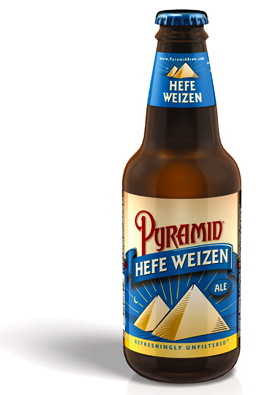
Old bottle design, and previous name, Pyramid Hefe Weizen, for the flagship beer now named Pyramid Haywire.
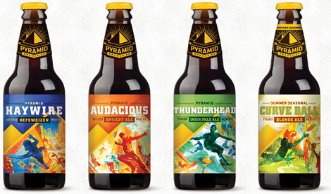
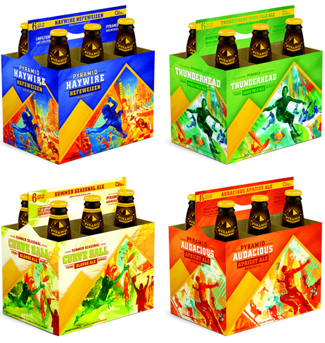
There is also a new bottle and six-pack designs that use some hyper-stylized illustrations that introduce a completely different feeling from the logo. It may be someone else’s idea of good beer packaging, but it’s not mine and it feels like beginner’s beer, as opposed to beer from a 25-year-old brewery. Too much X-Games, not enough blue ribbon award winning.


Jump to Most Recent Comment
Ben’s comment is:
It looks like beer is going to the x-games.
On Apr.20.2009 at 07:35 AM
Nick’s comment is:
no real need for the change...looks too sports team-ish, doesnt mean I wont drink the beer I'm just going to have to be a little more over analytical about the label design now
On Apr.20.2009 at 08:02 AM
Corby’s comment is:
Well I sure feel less likely to grab one of these off the shelf now.
I'm very disappointed with the redesign. Pyramid Hefeweizen is probably my favorite beer. I just bought some a few nights ago, in fact.
The old branding was nice. Something about it all just made me think this looks like a tasty beer to try.
Now I'm going to be drinking something called... ummm... "Haywire"?
Call me crazy, but I am turned off by names like that and designs like these. Something about it seems amateurish... it's the same reason why I never feel like buying "Wicked Ale" (bad packaging) or "Moose Drool" (bad name). The old logo seemed like an established brand and identity.
I don't even know why they feel the need to rebrand. From what I can tell they sell very well. It's one of the more common brands. Every Fresh&Easy carries it.
And I hope the green on the IPA packaging isn't as blindingly bright as it appears on the web.
On Apr.20.2009 at 08:19 AM
Erik at Logo Critiques’s comment is:
I like the new logo but maybe not the packaging so much. It looks like an energy drink...
On Apr.20.2009 at 08:32 AM
obse.’s comment is:
Yaaaay! Beer for children!
On Apr.20.2009 at 08:37 AM
Joshua Crain’s comment is:
Too much X-Games... Thank you!
On Apr.20.2009 at 08:39 AM
Andy’s comment is:
The logo is a plus. Very solid for the most part, but I don't like changing/adding of names of the established varieties. What was so wrong with 'Apricot Ale' that it needed to be called 'Audacious?' The packaging, as well, is too loud for me.
On Apr.20.2009 at 08:40 AM
DanR’s comment is:
The beer is good. The new logo actually is quite nice. The packaging blows chunks.
On Apr.20.2009 at 08:50 AM
Gustav’s comment is:
I like the ident.
But the main issue is not the colorful X-games illustrations (though I'm not a fan) but the fact that they havn't really succeeded in integrating the logo.
I think that the illustration style could work but for now it just feels like two seperate brands put together.
On Apr.20.2009 at 08:55 AM
Mrs. M’s comment is:
Let me preface this by saying I'm a teetotaler, so I'm bringing in the opinion of an outsider, as it were.
The mark is lovely in its stark simplicity. Far better than that faux-Victorian face with the under-swoosh that hinted at the Eye of Horus. It's bold, geometric, and serves as a handy pointer.
I actually like the packaging because it looks so non-traditional. It's a bit messy, very chaotic, but there's some clever use of the pyramidal angles being used on the cartons. The colors are saturated and lively. I also like the names, but maybe that's just my "design student" hubris coming through. ;)
I will concede that it doesn't match the logo very well, and in that it fails. The basic line and concept of the packaging is solid, though. I think if they'd tone down the busy images, it would have been even stronger. It's the images holding this back. Perhaps only one stylized sports fanatic per label?
On Apr.20.2009 at 09:15 AM
Jonathan’s comment is:
I wonder if the logo and the packaging were done by two different designers/companies - they just don't work well together, two totally different messages and feels.
On Apr.20.2009 at 09:26 AM
Nathan McKinney’s comment is:
To me, beer is one of those odd industries where an import has more cache. I like the old logo much better. It actually looks like a beer logo. Who cares if it looks like it comes from another country. What's the matter with a little mystique and nostalgia? The new logo looks more like a design for a tractor company.
While I'm not wild about the old label, the new one isn't an improvement. Neither look much like a beer label to me. The old came a bit closer, but it looks less like a house brew and more like a budget selection ala Busch beer. The new look seems to be attempting an artsy wine label look, but actually comes across more like a bad gatorade design. The new label designs don't even come close to matching the new logo on the neck of the bottle. So what was the point of all this anyways.
I'll stick with Newcastle, thanks.
On Apr.20.2009 at 09:28 AM
Ryan Adair’s comment is:
I think the 'new' logo is...umm...just ok.
The packaging is WAY to intense. Every time you get done skydiving on a motorcycle, reach for a frosty Pyramid Ale.
Those colors are gonna send somebody into epileptic shock.
On Apr.20.2009 at 09:35 AM
Andrew Klein’s comment is:
Logo: GOOD
The rest: Looks like Capri Sun from the mid-nineties
On Apr.20.2009 at 09:41 AM
dollface’s comment is:
looks promotional......which is not a good it is already outdated!! but i do like the logo, i wish they made better use of it.
On Apr.20.2009 at 10:07 AM
Scott’s comment is:
Blah.
While the logo update is pleasant, it is not an improvement. The pyramids, maybe.
Why is it that some designers must replicate the ubiquity of the era? This design looks suspiciously 00s. And that packaging is atrocious.
What has these marketers thinking that sub-branding every line of drink with its own overly creative brand name will improve recognition and/or sales?
A) this will create confusion so waitresses and bartenders will be constantly forced to "describe" Haywire.
B) Do you really think that this gaudy packaging will distinguish itself on the shelves? Yeah, sure, just like what happens now on wine shelves.
At least this stuff uses moderate color tones to distinguish: http://www.bigbossbrewing.com/home.php
On Apr.20.2009 at 10:07 AM
M.’s comment is:
The logo / identity redesign would be good for many other industries, but beer design (like cigarettes) succeeds by looking common, nostalgic, traditional, a little dated (in a good way) and generally un-polished. There is also room for exoticism - I assume a Camel cigarette would go hand in hand with a bottle of (old) Pyramid. Very all-American, even with the seeming detachment from domestic themes. The old Pyramid logo and bottle had some High-Life / PBR cache, which is difficult to manufacture - not that this redesign tried. Instead, the direction seems to be "Stand Back: Professional Designer at Work" which is usually a good thing... maybe just not here.
The packaging is ridiculous as stated above, but perhaps Pyramid is knowingly transitioning from salt of the earth drinkers to an upscale, Frasier Crane-style "Ooh! Apricot!" market.
On Apr.20.2009 at 10:12 AM
Paul Cooley’s comment is:
Oh my god...Mountain Dew...I mean MTN Dew packaging is really not working for me here. Who knew these great beers felt such a defined connection with the X-games set.
Logo is nice though.
On Apr.20.2009 at 10:14 AM
C Dub’s comment is:
The new logo (which I like) and the packaging (which I don't) seem very disconnected. Most of this is not only in the weird (bad) illustrations, but the total disregard of brand colors. Where is the yellow and black on the logo and bottle cap? Good start bad finish.
On Apr.20.2009 at 10:34 AM
Von K’s comment is:
I agree the bright, active lifestyle illustrations aren't doing it for me. They're nice as illustrations, don't get me wrong, but in this context they just make me think about mountain biking with a headache.
Quirky names aren't nice, either (I hate asking my server/barkeep things like "what's the 'hot turducken' taste like?"). There's more than enough of that kind of thing in the beer world ATM.
The logo is nice, IMO. That kind of direct, restrained approach would be more to my liking.
On Apr.20.2009 at 10:45 AM
Cam’s comment is:
Looks like a beer energy drink, Sparks or Rev...Thumbs down...logo redesign is nice, packaging misses the mentioned northwesterny (Aaron Draplin) blue collar feel.
On Apr.20.2009 at 10:49 AM
jRod’s comment is:
The logo is a bit of an improvement, but really the packaging is a step backward. i really liked the cleanliness of the first version better.
On Apr.20.2009 at 11:01 AM
Micah’s comment is:
I'm definitely dissapointed with the illustration style. To me Pyramid had a defined identity that was different from all the other northwest microbrews. This feels a little too similar to what Red Hook has going on, but the content of the illustrations don't match up.
This type of beer is meant to be enjoyed while relaxing, not surfing. The same content could have been treated differently, instead of dramatic perspective action shots it could have been a little more subdued.
Maybe it'll grow on me, it seems whenever a company rebrands everyone gets mad at first but then relaxes about it. Oh well, until I get used to looking at it i'll probably start drinking Widmer.
On Apr.20.2009 at 11:11 AM
Lane Meadowcroft’s comment is:
Logo is ok, but I would have omitted the little pyramid in the background if they wanted to get away from the Egyptian reference. Packaging is one big disconnect.
On Apr.20.2009 at 11:14 AM
Matt’s comment is:
I also think the logo update works well in the sense that it is much bolder than the previous version.
that being said, Gustav seem's to nail it right on the head, sorry for the pun, but where is the new logo on the packaging? They have everything and the kitchen sink on there, but no new logo? is this like a where's waldo of the logo, cuz i don't see it yet?
On Apr.20.2009 at 11:23 AM
Amanda B’s comment is:
The new logo is really nice! I like the simplicity and the colours, it is quite strong now.
When I first read this I only saw the tops of the beer bottles and thought "nice, the logo colours work well with the brown bottle and the yellow cap plays off the logo really well..." then I scrolled down. AAH! Mayhem! The illustration style and mish mash of colours looks completely off! The labels need to be toned waaaay down to work with this logo as a cohesive brand. They were heading in the right direction with the logo redesign but went way off course with the label graphics. What a shame.
On Apr.20.2009 at 11:34 AM
Lauren ’s comment is:
I really like it!
Any why not X-game-styled beer? I mean yes, they did just narrow their audience, but it is an audience who like to party nonetheless. Illustrations are well executed.
Then again this is my age bracket, so of course I'm receptive. But I don't drink, so I have no affinity towards any of the beer brands.
They'll sell to the kind of person who goes for a fun and fancy package. (Though it sounds like that wasn't their intended audience).
On Apr.20.2009 at 12:02 PM
Tim’s comment is:
Seems to me they're going for the youth market with this packaging. Which has a couple of drawbacks: 1) the youth are too young to legally drink, and 2) the ones that can drink are stuck on Bud Light as a "good" beer. Kind of barking up the wrong tree with this re-design, in my opinion.
On Apr.20.2009 at 12:09 PM
Eli’s comment is:
The treatment of the pyramids in the new logo is good - though it looks like they were already halfway there on the old bottle. In all the new logo is pleasant and restrained as was the old. No great improvement, potential to be a nice update.
But what the hell is going on with the packaging? Utterly unconnected from anything that I would ever want in a Microbrew. Unconnected from the logo. Unconnected to the (horrible) new names (I think they're playing ultimate frisbee in the Curveball illustration).
This screams "I'm cheap, likely to be an unnatural color, and probably taste like grape Bubble Yum." Seems to me that regular Pyramid drinkers would pass this by out of sheer embarrassment, and that any new consumers it draws in will be 10 years shy of being able to purchase it.
Way to kill a brand.
On Apr.20.2009 at 12:10 PM
Chris’s comment is:
The "A" in "PYRAMID" feels somewhat unresolved being in the fold of the banner. Either it needs to "bend" like the banner or it needs a peak like the top of the pyramids.
On Apr.20.2009 at 12:10 PM
Leland Witter’s comment is:
I was at the Magic Hat brewery on Saturday in Vermont and heard that they acquired Pyramid - apparently last year, but I hadn't heard of it before.
Magic Hat is an odd, but fun brand and I'm guessing that the change is related to their influence. If you think this packaging is "out there" you need to look at Magic Hat's!
On Apr.20.2009 at 12:22 PM
damondidit’s comment is:
Hmm, looks no different than the beer rack in any Whole Foods or Trader Joes, where craft beers rule the day. To me, I'll buy Pyramid because I know what I am getting.
The disconnect between logo and packaging makes it look like there were 6 Pyramid singles and an empty sleeve of "XBeer" in the cooler.
On Apr.20.2009 at 12:28 PM
John McCollum’s comment is:
I'm really concerned about the naming aspect of this project. Yes, there are some darn big pyramids on the packaging, but with all the junk they've thrown in them, they don't really work to reinforce the brewery name.
I'd contend that, in most cases, the best long-term branding solution for breweries is the one that emphasizes the identity of the brewery itself. From my experience, the individual beers and their names will change often. The name of the brewery, never.
I'd argue that if people perceive Pyramid as a fantastic brewery, they'll buy anything they put out there.
Haywire? Curve Ball? Yich. Is Pyramid's key selling distinction that their beers are CRRRAZZZY and OFF THE HOOK!!!?
If not, why choose juvenile names that don't tell the consumer anything about the brewery or the beers themselves?
Perhaps they're not trying to communicate that their beers are made from high quality ingredients or represent a specific brewing heritage. If that's the case, however, I guess I don't see why I as a beer lover should buy their product.
On Apr.20.2009 at 12:30 PM
Johnny Holeva’s comment is:
April fool's???
(You're a little late with this one Armin)
On Apr.20.2009 at 12:40 PM
gabriel amadeus’s comment is:
Nice work on the logo, but I have to agree with the gatorade-esque illustrations.
On Apr.20.2009 at 12:54 PM
Geoff Thibeau’s comment is:
Yeah, I read something in the news awhile back that Pyramid Breweries were concocting performance-enhancing beer. They're just being honest.
/end lie
On Apr.20.2009 at 01:25 PM
Darrin Crescenzi’s comment is:
Hmmmm… the new logo is really quite nice (the A is a little weird), but boy is there a disconnect between it and the packaging. Beyond my personal distaste for the typeface SquareSlab-Serif, that packaging looks like somebody ralphed a package of Skittles.
Being a staple here in the craft-beer capital of the world, this new Pyramid will really throw us Portlanders off. Maybe that's a good thing, it certainly eschews the old-timey look most of our craft brews go for.
I always thought Great Divide Brewing from Denver did the "X-Games" look quite well. Link.
On Apr.20.2009 at 01:39 PM
Darrin Crescenzi’s comment is:
Also, on the renaming of their signature beer, "Hefe Weizen" to "Haywire."
I imagine they're getting crushed in most markets by Widmer Bros. Hefeweizen, which is definitely the standard wheat beer in the Pacific Northwest. Probably an attempt at differentiating their Hef from that "other" Hef.
On Apr.20.2009 at 01:44 PM
lucid’s comment is:
Visuals look like they are influenced by a Pee Chee folder.
Incredibly lame packaging for a micro-brew... I can not make the connection between sports and brew, besides this is from Washington... what, like a total of 20 people surf in that state.
C/C-
On Apr.20.2009 at 01:46 PM
Mark’s comment is:
It is an improvement, definately it is. But it's lost it's personality a bit. Now it looks hard and rigid.
On Apr.20.2009 at 02:25 PM
Mark’s comment is:
logo is okay but I agree the packaging is a MESS!!!!!
I guess it's a very BAD attempt to get at the youth demographic,geez they think that we the 18-24 year olds (I'm 22) are all thrill junkies,and watch the X-games every damn year! TALK ABOUT STEREOTYPES!!!
big miss there.
On Apr.20.2009 at 02:45 PM
NicKLAUS’s comment is:
It feels as if they're taking an "Energy Drink" approach with ridiculous names and wild colours. The packaging also looks like I'd be getting coolers instead of beer. I can't imagine there's going to be a lot of men buying this beer without wanting to sing "Copa, copa cabanna". On another note, I love the logo, but it feels so distant from the packaging. It feels as if the logo and packaging were designed by two entirely separate designers / firms.
On Apr.20.2009 at 02:46 PM
Blaise’s comment is:
Who did the design?
On Apr.20.2009 at 03:02 PM
Steve’s comment is:
I'm a fan of Pyramid already, so I'll continue to drink it, but I really have to agree with others here that it feels very "sports drink" to me. The new logo, itself, seems okay, but the graphics otherwise are way more energetic than I usually am when drinking beer. ;)
On Apr.20.2009 at 03:14 PM
Glenn Sakamoto’s comment is:
The original packaging and identity worked better than the redesign.
The Pyramid logo on the new package is lost in contrast to the busy label graphics.
I know beer. Beer is a friend of mine. You sir, are no beer.
On Apr.20.2009 at 03:33 PM
Anonymous’s comment is:
@ Leland Witter: Magic Hat did indeed buy Pyramid Brewing, so I suppose that would explain the packaging. Dang hippies.
On Apr.20.2009 at 03:46 PM
SirRon’s comment is:
Haywire Hefeweizen!?! Really? Are they going to change the brewery name to Pyralamadingdong too?
I looked up "haywire" in Webster's just in case there is some alternate definition that I wasn't aware of... nope:
1 : being out of order or having gone wrong 2 : emotionally or mentally upset or out of control
"having gone wrong"... nice decision Pyramid, signed...
- Nova and New Coke
Nathaniel’s comment is:
Snapple makes beer now?
On Apr.20.2009 at 04:40 PM
heather van de mark’s comment is:
It seems as though the real problem might not be the xtreme packaging, but rather the company not having a full understanding of who their audience is. Maybe they thought they had a "young," uber-athletic, sporty consumer and thus wanted the package to reflect that more. Or maybe that's the next market they want to go after (although, why they would choose to completely alienate their old audience is unknown). I just be trying to give them the benefit of the doubt by considering context.
And I do like the new logo in comparison to the old one.
On Apr.20.2009 at 05:44 PM
Serviceburo’s comment is:
This is one of those re-brands that I just don't get. I start looking at the new mark, thinking to myself that it's quite nice, I like the way they play the geometry to create depth and symmetry and then throw it off just enough to be interesting by putting the off-center second pyramid in. It's a good job of tuning an existing logo into something even nicer.
And then I see the six pack graphics.
What went wrong here? I can tell you from experience in beer merchandising that changing your packaging this dramatically can really blow up in your face. In parts of the country such as the Northwest, beer coolers in convenience and grocery stores are stocked with 50-100 different brands. Consumers rely on packaging to remain familiar in order to spot their favorite brand without having to search too hard. I've seen people practically throw themselves on the floor in tears when the brand they drink is moved to a different shelf and they can't find it.
That's not to mention that the graphics themselves are horrible, dated, and quite honestly some of the worst color schemes I've seen in a long time. And as part of their target demo, I can tell you that this packaging is not going to make me buy their beer.
On Apr.20.2009 at 06:07 PM
Jason’s comment is:
Weird. Just really weird. I was at Safeco Field for Opening Day and saw the taps at the concession stand labeled as "Haywire."
"Polish sausage and a large Hefeweizen," I said.
People in the real world (at least here in Seattle) order "garlic fries and a hef." Darrin is right that they're likely trying to get a foothold away from Widmer Bros, but it seems like a mis-step to expect dudes at a football or baseball game to order "a couple of Haywires."
On Apr.20.2009 at 07:11 PM
artisan54’s comment is:
i agree with DanR. how could they go so solid with the new logo, and then so outlandish with the packaging. its like 2 different companies did it and didnt communicate at all.
On Apr.20.2009 at 07:13 PM
Paul’s comment is:
Logos goes alright.
Packaging is just (as has been said) ... weird.
On Apr.20.2009 at 07:13 PM
Chuck Spidell’s comment is:
The dimensionality of the new logo is striking and has a very NW style. The die line on the bottle neck label is pretty cool. However, the sports theme rebranding / repositioning is too cliche for my tastes. Not everyone in the world is an athlete or aspires to be like one. Here's some rational from their website: The new brand position is an expression of the proud tradition of brewing great beer combined with the energy, activity and the community that is the essence of the cities where Pyramid brews and serves its collection of award winning offerings.
On Apr.20.2009 at 07:43 PM
Chuck Spidell’s comment is:
Darrin nailed it: that packaging looks like somebody ralphed a package of Skittles. Too funny!
On Apr.20.2009 at 08:02 PM
Chuck Spidell’s comment is:
For the record ... this article explains everything.
On Apr.20.2009 at 08:06 PM
bobco85’s comment is:
The logo and packaging designs look completely separate from each other, and it's hard to tell how they're related. I do like the simplicity of the logo, especially since you get the idea of pyramids without needing the whole desert scene.
On the packaging, I don't see pyramids (which would refer to their name, very important) but instead see mountains. Especially if they're in the Northwest, how are they going to help people remember pyramids when it just looks like another mountain background?
On Apr.20.2009 at 10:52 PM
Anonymous’s comment is:
Serious disconnect between packaging and identity. They should have kept the clean lines and simplicity of the logo in the packaging design.
On Apr.20.2009 at 11:01 PM
Felix’s comment is:
One of a few cases of overdesigning for the packaging design...
"Keep it simple, Stupid!" Now where have I read that before...?
On Apr.21.2009 at 02:05 AM
designscene’s comment is:
At first glance it reminded me a lot of Camel cigarettes. The two pyramids, and the colours, and the 'Ali baba and the 40 thieves' look as someone put it, are similar in some way.
On Apr.21.2009 at 02:14 AM
Tim Gengler’s comment is:
The old logo is fantastic.
Design-wise, I do like the new one. In context, though, it looks more like an office supply company rather than a brewery.
The packaging itself seems all wrong, though. I don't see any connection between the designs and the logo, or between the designs and the product. They belong on a trendy iced tea, perhaps a carbonated energy drink. Or, if you're going to go that route in your packaging, why not make the new logo follow in style?
It's a daring mix of a paper company's logo and a Trapper Keeper cover design.
On Apr.21.2009 at 02:36 AM
plamen’s comment is:
Ehrrmm... this is beer?
On Apr.21.2009 at 04:39 AM
Koodoz Design’s comment is:
Worst rebranding everrrr!
Old logo was far more interesting and quite frankly... the new packaging suggests a poor man's sports drink (in a brown bottle).
This is not what a beer product should look like.
On Apr.21.2009 at 06:55 AM
Matt Clarke’s comment is:
Love the new logo and the way it appears on the beers but the rest of the packaging does not work as hard. Saying that, beverages are always a difficult design challenge. So still top marks. Matt.
PS have a wine bottle for you to look at if you are interested.
Link: http://www.design-intellect.co.uk/graphic_designer_portfolio.html
Jem’s comment is:
All the bright happy colors make me sad.
Blaise’s comment is:
Was this rebrand even necessary? The previous look had a uniqueness that made it distinct. While the new logo is nice the old Pyramid typography was incredible.
I don't know who is responsible for the new design, although it would not surprise me if it was a committee of too many exec types, but here is a link to some 2006 Pyramid work that is unquestionably appropriate for their market.
http://www.the-m-line.com/work_default.htm
On Apr.21.2009 at 12:25 PM
Beerfreak’s comment is:
I can dig the new logo. The bright colors remind me of the Kona Brewing Company (Good or bad?). And while I do not like the packaging, I can see the relation to the different illustrations and the varying lifestyles that go along with living in the NW U.S.
I will say that the work from The M-Line link that Blaise provides is not very accurate in their market research.
First of all, Blue Moon started in the mid 90's, and was not a Coors product until much later. This can be easily read on the Blue Moon website.
Second—yes I am going to play this card—Blue Moon is a Belgian Witbier, not a Hefeweizen.
Which bring me to my third point, back to Pyramid and the materials that The M-Line created:
Design wise I love the coasters and spreads. However, if Pryamid Hefeweizen is selling itself as a true Hefe M-Line would have found in their research that lemons are not supposed to be used with Hefeweizen, only with Witbeirs. The two beers have completey different flavor components and origins. Go to germany, ask for a lemon in you Hefeweizen and you will most likely stick out like a sore thumb and be seen as the obnoxious American, since the U.S. is the only culture to pair the two.
Granted, in the end this comes down to personal taste, which is fine. But I think it is worth saying, since the overall feedback on here for the packaging is that it sucks...If M-Line did it, then to me that isn't showing much competence.
On Apr.21.2009 at 01:17 PM
rico’s comment is:
As a fan and more-than-occasional drinker of Pyramid Apricot Ale, I find this really disappointing. Yes, the packaging was a little stodgy and in need of a slight refresh (emphasis on slight), but this is ridiculous. I don't want to drink "extreme" beer, and I will never call Apricot Ale (one of the better beers out there in my opinion) "Audacious". This is way off the mark. Whoever signed off on this at Pyramid should be given an early retirement.
On Apr.21.2009 at 01:32 PM
damon’s comment is:
the logo is great, but you lost me at the packaging. it's too insane.
there is a world that beer lives in, and this isn't it for so many reasons.
I quite liked the old bottle, and even like the new design outside of the photography. too busy
On Apr.21.2009 at 10:18 PM
Natr’s comment is:
From a regulatory standpoint, I'm surprised that Pyramid choose to incorporate images of people engaging in outdoor activity, exercise, etc.
Since the product could potentially be construed as a sports-oriented or "healthier" beer, I would dare to guess that the Alcohol and Tobacco Tax and Trade Bureau (TTB) gave this the third-degree.
Personally, I don't think it's a path worth pursuing.
On Apr.21.2009 at 11:53 PM
Ross Patton’s comment is:
Sorry. As a Seattle-ite who drinks Pyramid on a regular basis, this whole thing just feels wrong. I'm pretty ambivalent on the logo, although there was nothing wrong with the old one, but the packaging is just horrible. It doesn't feel like Pyramid at all. The old packaging said local NW craft beer (we are big on our small breweries here) and the new stuff looks like general energy drink packaging... just horrible. Really dissapointing. I guarantee you that no matter how much 'market research' they did most people who are familiar with Pyramid are going to feel the same way.
On Apr.22.2009 at 02:18 AM
Matt’s comment is:
C DUB was bang on.
The logo, I liked a lot. Had a heritage feel without being twee, bit of a Chris Ware thing going on, and then... oh dear... the bottles. It's like a day-glo nightmare. Is there not a risk the colours are going to make you hurl after you've had a few?
A mis-marriage made in hell... I'm all for multi-dis agencies but maybe this is an example of identity designers doing identity and packaging designers doing packaging...
On Apr.22.2009 at 09:23 AM
Dave Selden’s comment is:
Looks like they hired Peter Max to do the packaging.
On Apr.22.2009 at 04:41 PM
Daniel’s comment is:
FIrst, I enjoy a Pyramid Hefe Weizen anytime of the day as long as it is after 10:30 am. We all must have rules.
Now for the logo, redesign works very well. It is smooth and reflects the brand and its history.
Now for the package design, what where they thinking? Did Seattle get the Olympic games in 2012? Did the London Olympic design team get the redesign bid? I am not sure I will want to pick it up at the store now. Someone might see it in my shopping cart. I will have to stick to drinking on tap at the bars now.
decksnap’s comment is:
These bottles now look like a rip-off of Redhook, particularly with the type, which, last I checked, had a strong presence in the Seattle area.
Seems lame to me, I remember loving the pyramid stuff last time I was there.
On Apr.22.2009 at 07:17 PM
Goffredo Puccetti’s comment is:
Ok, Let's make a full confession:
I am from Europe where a brewery younger than 100 years is considered new... As opposed to properly established brands!
As a designer I do like the redesign of the logo. As a European beer drinker I cannot even contemplate the idea of looking at that packaging and imagine that there is beer in it. So, I assume my opinion is very biased and maybe that will work in other markets but I really dislike that packaging. Seems also kind of unethical to openely address young targets for alcoholic beverages.
Anyway, that's what I think about, when thinking about perfect beer branding: http://www.pilsner-urquell.com/
Mokokoma Mokhonoana’s comment is:
The logo looks good, the packaging? cheap, blinding and childish.
On Apr.23.2009 at 11:56 AM
Daniel’s comment is:
Like the new logo.
HATE the new bottle wrappers & six packs.
Overall I think this will be damaging to the brand.
On Apr.23.2009 at 01:44 PM
nola’s comment is:
Voicebox Creative in sf worked on this I think...but they do really beautiful work so this seems like a case where the client steered them down a very wrong path. Too bad.
On Apr.27.2009 at 07:38 PM
Stephen’s comment is:
I think the before and after pictures are mixed up... these could be so much better. No need for a re-branding in my opinion. But then again, how would we ever have heard of "Pyramid Breweries"?
On Apr.28.2009 at 05:57 PM
J. Woodward’s comment is:
Logo is awesome, the other stuff... not so much.
On Apr.30.2009 at 01:10 AM
Cam Hoff’s comment is:
They both look uber-masonic. Top selling brand amongst freemasons!
On Apr.30.2009 at 05:17 PM
Aardvark’s comment is:
I like the new logo better, but the label designs are hella tacky. The other one was much more reminiscent of actual pyramids and Egypt; an effect I actually like.
On May.02.2009 at 05:33 PM
krys’s comment is:
As I was reading about the new logo, I was excited to see how the new packaging would carry the brand. What a disappointment.
On May.11.2009 at 01:47 AM
buster’s comment is:
they could have gone with just a spruce up to make the old type less flowery and feminine. This just looks too much like red hook, and with a distracting sports motif to boot. I don't like it.
On May.11.2009 at 06:07 AM
Drew’s comment is:
I'm going to have a hard time carrying the beer given that I'll have to set fire to the packaging before I leave the store. It looks like nachos on mushrooms made war on the box.
On May.16.2009 at 12:14 AM
rachel’s comment is:
i like new logo.
On May.20.2009 at 01:01 PM
Anonymous’s comment is:
It looks more like a design for Gatorade than Beer. There is a "look" for Beer, and this isn't it!! I think they're targeting a particular age bracket, but in doing so, they're eliminating several other age brackets (including mine!). At age 48, if I were to serve Beer at a party or meeting, I wouldn't serve beer in koolaid/gatorade/energy drink bottles!!
On May.24.2009 at 02:10 PM
Esteban’s comment is:
Love the logo. Hate the bottles.
On May.25.2009 at 07:08 PM
Comments in Brand New, V1.0 have been closed.


