

NOTE: This is an archived version of the first incarnation of Brand New. All posts have been closed to comments. Please visit underconsideration.com/brandnew for the latest version. If you would like to see this specific post, simply delete _v1 from the URL.
![]()
Hosted by the Asian Football Confederation, Asia’s governing body of soccer, the annual AFC Champions League features the best clubs from each country competing for Asian soccer supremacy. This past December they unveiled a new identity aimed towards the new and growing generation of soccer enthusiasts.
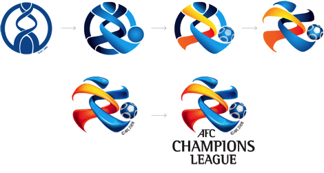
Showing the transition from old to new logo.
I am not at all familiar with Asian soccer so I am not exactly clear what the old logo meant, other than it was also the design of the trophy and that it is somewhat not pleasing to the eye. The new logo, for some reason, repels and attracts me at the same time. I hate the way the three-dimensionalization is done, I hate the Rotis Semi Serif typeface, and I can’t stand that the “AFC” text is not centered with the other two lines. But, only my psyche would know why, I find it oddly appealing and liberating. Perhaps it’s because of the logo evolution image above that the static trophy figure broke out of its shell and went running to kick the ball… who knows. The image below also shows some nice rationalization. At the end of the day, though, the logo is pretty garish. There is a PDF with the identity guidelines if you are interested.
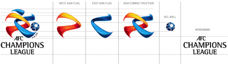
The components of the new logo.
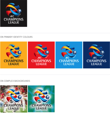
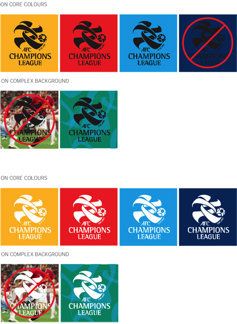
Color options for the logo.
Thanks to Design Tagebuch, where I spotted this logo.


Jump to Most Recent Comment
JeanC’s comment is:
I like it on core colors. Makes mors like an asian writing. But the ball should be thrown away!!
On Feb.02.2009 at 09:58 AM
Paul Lloyd Johnson’s comment is:
I think this would be more successful if they had stopped on the 4th stage of that transition drawing.
I like it though.
Makes more sense than the old logo, that looks like a restaurant sign.
twoeightnine’s comment is:
The final version is too much but damn, I have to applaud the effort. To go from a trophy to a person is impressive.
On Feb.02.2009 at 10:32 AM
Serviceburo’s comment is:
Okay, I was about to freak out, but then I saw the single color print versions of this thing, and I think it actually works for me.
Kill the shaded, rendered version, but the single color is actually pretty strong. It says "soccer" a hell of a lot more than the previous logo, has a nice sense of motion to it, and honestly (and a bit cheesily) has a bit of a sense of being a Chinese character, which certainly gives it an Asian context. The rare improvement in a redesign that I have seen recently.
On Feb.02.2009 at 10:38 AM
felix sockwell’s comment is:
wild. that things hand drawn! (or airbrushed?)
its better, you have to admit. but what kills me is the newer, huger "©2008 AFC" under the logo. Multi Nat'l Soccer logos: they ALL do this. World Cup too. Why? It's clunky.
Jeffry Pilcher’s comment is:
I like what you don't and vice versa. And for different reasons. Strange.
On Feb.02.2009 at 10:45 AM
M.’s comment is:
I agree - the shading / CGI-ishness is way overdone. The ball is also placed a bit awkwardly, and is too detailed (does it really need its own design? It could just be a round blob and work perfectly and more simply).
The things they got right though - additional dimension (soccer player emerges from static form), connected to the previous logo (evolution of shape), says "soccer", says Asia (pseudo-character form), more dynamic (implied motion) - I think carry the weight here. Not a perfect job but surely progress.
On Feb.02.2009 at 10:59 AM
brd’s comment is:
I like it. It's like a people's logo. Maybe it's not a designer's logo, but it works I think for the common player.
On Feb.02.2009 at 11:01 AM
Jonathan Carnehl’s comment is:
I suppose that may be true, brd, but it's still ugly. It's just too round, too shiny, and too cgi'y. I don't care much for the flat version either, so maybe it's the shape I'm not responding too.
On Feb.02.2009 at 11:27 AM
Bystander’s comment is:
Maybe you like it because the character's got pluck. Look at that stride.
On Feb.02.2009 at 11:39 AM
jRod’s comment is:
The original one looks like a strand of DNA, so i would think that "AFC" had something to do with championship genetics or whatever. so the updated version is a step (or kick) in the right direction, IMO.
the new version is good, and i like it's kid-like nature. but, it does have a lot of gradients and generally, we don't like that around here, right?
On Feb.02.2009 at 11:40 AM
designscene’s comment is:
I like it, its fun and captures the spirit of the sport. Its lively and vibrant and makes you feel like going to watch the game.
On Feb.02.2009 at 11:52 AM
Anonymous’s comment is:
Man, you couldn't be more right. It's just so garish... but I don't hate it.
I look at it, and my brain feels pain. I want to hate it... but I just can't! This logo is dividing by zero.
On Feb.02.2009 at 12:13 PM
Impossibly Stupid’s comment is:
That shows a lot of creativity in going from the old logo to the new one. The only thing that seems really off is that the player that emerges from the swooshes looks a bit chubby. It might work as a stuffed animal or some other children's logo, but they really should have pulled in the midsection a bit to give a more athletic appearance.
On Feb.02.2009 at 01:19 PM
orangetiki’s comment is:
Very clever and eye catching. Nice tie in with the old design, and I also like how they sorted the logo out for different mediums. You rarely see that anymore, and yet it is such a core ideal of the work of a designer. I would be very hard pressed to come up with anything better / improve. Kudos
On Feb.02.2009 at 01:38 PM
heather van de mark’s comment is:
I haven't seen many logos that I feel instantly work for me, but this does. I knew it was a sport's logo because obviously the ball, and the movement in the shapes. It looks like a little person kicking a ball. And it certainly feels Asian. The bright, contrasting colors (which offers it energy) create a nice "Asian" esque character. I think it's not the most remarkable, beautiful thing I've ever seen, but I think it definitely serves its purpose, and serves it well.
On Feb.02.2009 at 02:23 PM
rickyaustin’s comment is:
Barf @ Rotis Semi Serif
On Feb.02.2009 at 02:53 PM
Filipe’s comment is:
as Serviceburo said, the one color version looks really nice, and so much better than the old version... but the full color version... it's like throwing the Firefox logo against a ceiling fan, and then rendering it on Cinema 4D
On Feb.02.2009 at 02:54 PM
Kellie Schroeder’s comment is:
I agree with you on the typography...but the mark is really cool! Thanks for sending the detailed breakdown of it's evolution and the ID standards. It really helps tell the story.
On Feb.02.2009 at 03:20 PM
Lauren ’s comment is:
What a cool character! I can't get past him/her to even have an opinion on the type or appropriateness. Clever their drawing is.
On Feb.02.2009 at 03:25 PM
David H’s comment is:
I like that the text serif and the head have the same swoop look to them. The character in the logo looks great 3D and flat. At least to me, the swirls look like a soccer ball by themselves, but having it work as a character is even better.
The only thing that bothers me is "AFC" being out of alignment with everything else, but it's still not that bad.
On Feb.02.2009 at 03:34 PM
Jamie’s comment is:
I agree with Serviceburo's comment that the logo actually works quite nicely in flat, 1-color.
I guess my biggest issue with the logo is that the character does not look like a soccer player AT ALL....looks like a speed-walker!!
On Feb.02.2009 at 04:12 PM
DG3’s comment is:
At least it looks a LITTLE less like a DNA strand now.
On Feb.02.2009 at 05:47 PM
Mark’s comment is:
eh....
I can't hate it or like it. It's just.....okay.
It doesn't really strike me as much.
Is it better than the old logo? yes, but is it absolutely great?, no. It's improvement but it doesn't impress me that much, I like the flat color version though.
Maybe because result seems predictable.
On Feb.02.2009 at 05:49 PM
Craig’s comment is:
It may not be the best logo design ever but you need to think about this in context of its intended market. I just spent some time in Thailand and there is a massive culture difference in logo design.
I think this logo fits with the Asian logo design culture quite well. Good work.
On Feb.02.2009 at 07:46 PM
Neil’s comment is:
http://www.underconsideration.com/brandnew/archives/barclaycard_ball.gif
Quite similar!
But, I do like this. It's a great improvement on the original logo and I think it works perfectly for what it's intended for, including the 3D-ishness of it! I think you have to consider the fact that this logo is for football fans. Bright stadium lights, colourful team shirts, mini parties in the stands etc. The logo fits right in with that ethos.
On Feb.02.2009 at 08:24 PM
Neil’s comment is:

Daniel The Red’s comment is:
The solution for a bad logo should never be to awkwardly transform its elements into another bad logo. They should have abandoned the DNA trophy entirely and started from scratch. This is forced and garish indeed.
On Feb.02.2009 at 08:27 PM
Paul Cooley’s comment is:
That uncentered "AFC" totally punched me in the face. I agree entirely with Armins stance, there is a simultaneous love/hate situation going on for me. The character seems to be a bit hefty for a soccer player...but i do find the process and the 2 color versions to be close to saving graces for this logo at least from a designer's perspective.
I do feel that those who aren't as nit-picky as us will find it to be quite an improvement.
On Feb.02.2009 at 09:32 PM
Matheus’s comment is:
fail
On Feb.02.2009 at 11:39 PM
Glenn Sakamoto’s comment is:
But is it beautiful?
On Feb.03.2009 at 03:03 AM
Joel Smith’s comment is:
The more I look at this, the more my "human" side responds. There is something very approachable about this mark. It holds a unique energy and commands my attention. Is it bad that I want to hug the logo? lol
From a technical aspect: That AFC being off balance is just bugging the crap out of me. And as someone else put it, the "clunky" copyright near the foot is distracting.
On Feb.03.2009 at 08:41 AM
Nick Irwin’s comment is:
little over the top "bubbly shading" but not a horrible icon by any means...I have a personal vendetta against the Rotis semi-sans typeface, seems really dated next to the more modern icon...
The icon seems a little hefty, you think with all that running around it wouldn't be so wide
On Feb.03.2009 at 08:43 AM
Nico’s comment is:
The old logo was pretty plain. The new one is vibrant, bold and conveys the idea of football being a fun game. I would have not liked it as much if the color version was the only one, but the single color versions works very well.
A great redesing on my book.
On Feb.03.2009 at 09:52 AM
g-sppud’s comment is:
I applaud the process and the creativity here, and I think the outcome was not too bad. I prefer the flat version to the airbrushed, and the ball is distracting with too much detail. Also, I agree that this mark is very approachable. All things considered - nicely done.
On Feb.03.2009 at 10:29 AM
Joseph Maguire’s comment is:
Love it, no seriously this is different and unique.. Not in love with the type but that mark is pretty sweet.
On Feb.03.2009 at 11:07 AM
Jacob’s comment is:
The fightin' DNA!
On Feb.03.2009 at 11:56 AM
David Sanchez’s comment is:
Simply beautiful.
On Feb.03.2009 at 01:56 PM
Kevin Zwirble’s comment is:
I agree about the logo looking to "garish". Not gonna lie, that typeface just plain sucks.
Although the fluidity and, oddly enough, the 3d-look (which I usually hate) really draws me in.
I'm not a fan of the flat, one-color versions. It shows shows that when you really design a logo you have to take into account every conceived way it will be used. I don't think they did that, and rely on the 3d look to much.
On Feb.03.2009 at 02:36 PM
Jason’s comment is:
I give it 3 years.
On Feb.03.2009 at 05:19 PM
Grant’s comment is:
I like the concept of the two peices coming togather, but all the 3d web 2.0 supergraphic b.s. makes me say no. It also makes it hard to reproduce on other media and sizes.
On Feb.03.2009 at 05:30 PM
Char’s comment is:
ummm Black on Navy Blue?
are they being serious about offering that as an option? You can't even see the logo. There is no contrast. It looks even worse on a photo. As a logo, there is an awful lot going on, geez.
Bryan Veloso’s comment is:
Char, that's why there's a red X through it.
On Feb.03.2009 at 06:43 PM
Kyle Caird’s comment is:
It has similar colors/treatment as the Firefox logo:

HOLY MATRIMONY!’s comment is:
If they did it:
Alien + Gumby
On Feb.04.2009 at 07:26 PM
Nate’s comment is:
If ever there were a laboratory that specialized in genetically engineering soccer players, this would be it.
On Feb.05.2009 at 08:53 PM
Nate ’s comment is:
the logo that is.
On Feb.05.2009 at 08:54 PM
John Mindiola III’s comment is:
Rotis? Ugh. The rest is pretty hot though.
On Feb.05.2009 at 11:36 PM
Marcin’s comment is:
Ball - badly placed;
I don't like ,,plastic-fantastic'' colours :) Bettter way to use it in one or two basic colours. All this fountain fills makes me think, that author wants to hide something behind it.
On Feb.06.2009 at 03:06 AM
Fabian ’s comment is:
It is a great transition from the old logo to the new. Breaking free from the old restraints, nice move. The ball is not needed as the overall logo shape is of a soccerball.
On Feb.12.2009 at 07:30 AM
JR’s comment is:
This logo has a lot of design possibilities as a desktop wallpaper accent. Pretty versatile. Could even make for a personalization a la OS-tan. ACL-tan or something.
Approved.
On Feb.15.2009 at 02:28 AM
Randy Hill’s comment is:
The first logo looked like it belonged in a Chiropractor's office. I hate the multicolored new version, however, I do like the single color version much better.
On Feb.20.2009 at 03:33 PM
Fonto’s comment is:
At least this mark is having more fun than the old one. It has an Olympics meets Pokemon kind of feel. I wonder, is that old mark a kimono wearing, headless player holding a ball? If it isn't, then that old mark really sucks.
On Feb.20.2009 at 06:04 PM
Sergio Almeida’s comment is:
WELL DONE!
On Mar.04.2009 at 12:54 PM
ashley’s comment is:
I think this was inspired by the Futurist painting 'Dynamism of a Soccer Player (Dinamismo di un footballer)' by Umberto Boccioni,
See: http://jama.ama-assn.org/cgi/content/extract/290/11/1422

Comments in Brand New, V1.0 have been closed.


