

NOTE: This is an archived version of the first incarnation of Brand New. All posts have been closed to comments. Please visit underconsideration.com/brandnew for the latest version. If you would like to see this specific post, simply delete _v1 from the URL.
![]()
From the little I know about video editing and production it’s safe to say that Avid — specifically its Media Composer software originally designed and programmed for the Macintosh back in the late 1980s — is the industry standard, having been adopted as the editing tool of choice for movies and television. Over the years, Avid Technology has developed hardware and software for audio and video editing, launching products like Digidesign, M-Audio, Pinnacle, and Sibelius with their own brand equities. Now they have all been united under one brand, recently unveiled at the National Association of Broadcasters (NAB) Show in Las Vegas.
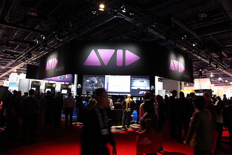
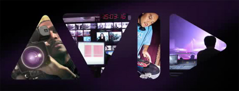
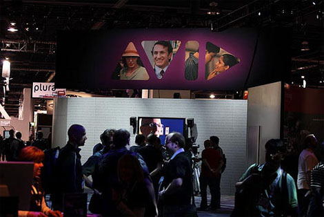
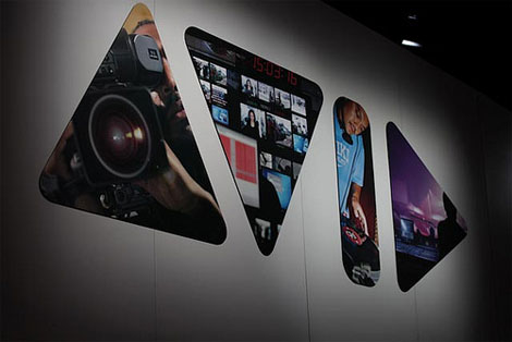
At the center of Avid’s brand identity is a new logo composed of simple geometric shapes derived from the buttons, icons and markers that consumers and professionals recognize as fundamental to the digital audio and video solutions they use every day to enable their creativity. The new logo forms a visual connection to iconic shapes that represent “volume up, volume down, play, pause, record and forward,” signaling a unification of the company’s core audio and video offerings. The distinctive mark also spells out the company’s name in abstract letterforms.
— Press Release
The old logo was memorable with its italic quirkiness but the new one is both memorable and relevant. At first glance it might feel like a cliche to use the play buttons as a logo, but as truly universal icons for a range of products that are accepted industry-wide, it’s the perfect use. The result is simple and bold. I could definitely do without the shading, specially being so subtle it feels unnecessary. But this will surely look great on screen and some glossy packaging. I also like the idea of filling in the shapes with images and, while it’s one of the oldest tricks in the book, Avid pulls it off nicely.
Thanks to Josh McDowell for first tip.
Update: The redesign was done by Wally Krantz (Executive Creative Director), Dennis Thomas (Design Director), and Sam Becker (Senior Designer) at The Brand Union.


Jump to Most Recent Comment
Jonathan’s comment is:
I'm liking this. Its contemporary, relevant, and the shapes are well established in the industry. If they can apply this on some streamlined, minimalist pieces/products, I think it will be a winner.
On Apr.28.2009 at 09:38 AM
Chris Austin’s comment is:
Very appropriate use of symbols as type. Without even reading the synopsis I could identify the industry.
On Apr.28.2009 at 09:46 AM
Dale Campbell’s comment is:
I think it's great. Perfect application. Easy to read. Easy to recognize.
Very well done Avid!
Keep well,
Dale
Neil’s comment is:
I think this logo ticks all the right boxes. I even think that the shading has been perfectly pulled off. Nice work.
On Apr.28.2009 at 09:51 AM
dod’s comment is:
there was or is a music-tv-channel in germany called VIVA: http://www.viva.tv/
On Apr.28.2009 at 09:52 AM
conkyfilms’s comment is:
Sorry, but this is absolutely horrible. Even without seeing dod's comment my first thought was "music video channel (from the early 80s)". Completely un-contemporary and a really clumsy execution of a rather obvious concept. The way the logo components occupy the nether-regions between symbols and letters makes it quite hard to "read".
On Apr.28.2009 at 09:59 AM
Ricky Salsberry’s comment is:
Obvious? Sure.
Obvious doesn't mean bad. Sometimes things just fit, and it takes as much courage to say "even though this is obvious, it's the best solution" as it does to jump off the creative cliff.
Stylistically I'd lose the gradient as mentioned, and I'd probably 'kern' the symbols a bit more like typography, the V-I space is gaping, but overall I think this rocks.
This will work well on most applications, at any size. Well done Avid.
On Apr.28.2009 at 10:10 AM
Dan’s comment is:
I'm not a stickler for readability, but this one's definitely on the line. Also, I immediately thought of the omni group logo. I know it's a bit different as the shapes of the Omni logo are knocked out, but the geometric elements wind up looking quite similar.
On Apr.28.2009 at 10:12 AM
John’s comment is:
I think it might be a bit too clever. I don't read "AVID", I just see a row of buttons from a media device.
On Apr.28.2009 at 10:15 AM
Glenn Sakamoto’s comment is:
Bravo! The logotype works really well with inset photos.
Definitely lose the gradient, though.
On Apr.28.2009 at 10:17 AM
sr’s comment is:
This is no BS...but I was branding a pseudo-ipod in-house before and I came up with "AVID EDGE" and had an identical solution! Crazy. I had to kill the idea when I researched USPTO and found similar trademarks (perhaps this one?)
This AVID logo feels a bit generic, given my experience with it. But the overall implementation works better than the previous. It feels slightly outdated to me, but not so much.
On Apr.28.2009 at 10:22 AM
Luke Andrews’s comment is:
The purple gradient really feels like a bad dream from the 1980s, but the rest of the concept just works. The old logo looked generic and corporate. The new logo is immediately memorable and specific. Big improvement. If only they didn't make fading purple the main treatment...
On Apr.28.2009 at 10:23 AM
Von K’s comment is:
Whether you see buttons or letters, this works either way. It doesn't matter if you don't read it. It's a solid concept.
The execution seems like it could have been made a little less clumsy (the space between the "V" and "I") but this works.
That said, I hate the purple. I know, equity, but the shaded purple just feels very early 90s. They could've used a less-gross purple and ditch the cheap-looking gradients for a much nicer overall effect. The way it looks now reminds me of those Vuarnet t-shirts. Anyone?
On Apr.28.2009 at 10:26 AM
rvr’s comment is:
definitely not sold on this. obvious is not bad, inherently, but this is bad, i think. it immediately reminded me of stuff i would come up with in junior high when doodling logos for imaginary companies. and believe me, those were not good logos.
the already mentioned problems of kerning and readability i think undermine the concept, as well as what looks like lazy execution. i just don't see how this concept was pushed and honed to a point where it had maximum impact.
the only place where i kind of like it is in the last image, on a white background, with a little sharp shadow. it sort of works there, but the other applications are quite weak.
i personally like abstracted, conceptual logos along these lines, but i think to create a really strong mark in this vein you have to work very hard and hone it until it's absolutely razor sharp. avid, as a major brand in the media production industry, deserves better.
On Apr.28.2009 at 10:26 AM
Nate’s comment is:
With all due respect, I believe that readability in this instance is irrelevant. The Avid brand is completely saturated within their target market. The new logo should be viewed more as a symbol, not as a wordmark.
I do not believe this could have been executed any more perfectly. And the shapes will lend themselves to be used as patterns a la the Bahamas branding.
On Apr.28.2009 at 10:28 AM
M.’s comment is:
This is flat-out great. It's the first instant home run on BN in a little while.
This is so simple and strong - a clever but instantly understandable visual play, symbols that represent the core values of the brand (editing and media), thoroughly modern and not tacky. Throw in the fact that the previous Avid logo screamed "ask your doctor if Avid is right for you" and they couldn't have come off better.
Bravo.
On Apr.28.2009 at 10:32 AM
Andrew’s comment is:
I think it's great, but that the "V" in the logo needs to be aligned better with the rest of the letters. It looks to be too high, it's definitely not optically aligned with the rest of the letters.
On Apr.28.2009 at 10:38 AM
Andrew Sabatier’s comment is:
This is contemporary brand identity design at it's finest. The medium and the message have been played together masterfully.
A container brandmark makes sense as a medium for further messages about the type of media space this brand lives in. The messages interact on many levels through an archetypically simple and thoroughly modern device, the play symbol.
From the name I get Audio Visual ID, without knowing anything more about this brand. Avid works as more than the sum of these components. The name transcends it's function and now has all the latent richness of the sector embedded in the new identity.
I think Avid could afford to be more benefits and lifestyle-oriented even though its market appears to be primarily business-to-business. This would lift the photography out of the literal terms and tools of their trade. The messaging is so strong they can afford to treat secondary messaging less directly. This would build more emotional resonance into the brand and propel an excellent identity into a truly inspired identity.
Marshall McLuhan would be an avid fan. This identity is primed for greatness.
A.
Andrey Horsev’s comment is:
Looks similar to Audiko.
On Apr.28.2009 at 10:54 AM
Andrew Klein’s comment is:
unapologetically simple, appropriate, neat and clean
The readability doesn't bother me from a formal standpoint, but I could imagine advertising and promotional applications where it might fall short.
On Apr.28.2009 at 11:14 AM
jRod’s comment is:
i totally get what they are doing, and generally i am all for it. but in this case, the only thing that i would make an adjustment to would be the play button "D". its just not working. I feel like rounding out the D would do wonders for it, but I do get the general idea.
On Apr.28.2009 at 11:16 AM
Jordi’s comment is:
Yeah nice try. You could do better, Avid guys. The result is a good concept but horrible execution. Umbalanced readability, too generic, pink "dildo"... ugly.
On Apr.28.2009 at 11:23 AM
Kozzmox’s comment is:
This is an.... inspiration??
http://3.bp.blogspot.com/_b0cNMrjsWZk/SeJtW6qT-5I/AAAAAAAAAWE/qYbPepkwhOQ/s400/Audiko-logo.png
On Apr.28.2009 at 11:35 AM
Carlo’s comment is:
I respect the inspiration a lot - it's wonderfully mysterious and iconic. But in the context of the name "AVID" it seems a little crude; especially using a triangle to represent the letter "D" (especially one as pointed as this) seems forced, overly glyphic, almost ugly. It changes the name from "Avid" to "AVID"
On Apr.28.2009 at 11:44 AM
Michael’s comment is:
I saw the Avid booth at the NAB Show this year and have spent some time navigating their site. The Avid rebrand is one of the most successful efforts of the year ... hands down. You'll understand that, the more you know of the company's current market and products, seen against their previous visual presence. This is one of those situations where it's OK to scrap almost everything in the old identity system. The logo could use a consistent registered mark to help quicken the read of the head-scratchers, but this is a near-10 execution of a solid concept.
On Apr.28.2009 at 11:45 AM
koyo’s comment is:
I think the design is good. Which I don't like is the gradient.
On Apr.28.2009 at 12:01 PM
Avi’s comment is:
This is great. They can't get a better logo for that name.
On Apr.28.2009 at 12:12 PM
efrencast’s comment is:
I like it. Its modern ad ppl involved in the community will get it I guess.
How show I read it? Up, Down, Pause. Nice job.
On Apr.28.2009 at 12:16 PM
MADPHILL’s comment is:
Standing ovation. I love it.
On Apr.28.2009 at 12:19 PM
Rodrigo Müller’s comment is:
amazingly well done and applied.
On Apr.28.2009 at 12:47 PM
Bakai’s comment is:
I love it, the symbols work perfectly as letters. Aside from the purple, this is a winner.
On Apr.28.2009 at 12:48 PM
CB’s comment is:
I get the feeling if a less-respected company had tried this people would be yawning or laughing.
On Apr.28.2009 at 12:57 PM
Kristi’s comment is:
Its not my personal cup of tea, but I at least understand what Im looking at now. There old logo looked like one of those "new" perscription drugs. I do agree with some people that the purple gradient makes it look a little 80's. But all in all it screams techie and I guess thats there target market.
On Apr.28.2009 at 12:58 PM
Cam Hoff’s comment is:
I love this. Brilliant in it's simplicity and relevance.
On Apr.28.2009 at 01:21 PM
Mark’s comment is:
It's okay, it's different, but I can't find anything wrong with the old logo, it looked fine and up to date. Why resort to shapes? Isn't it kind of hard to read now? especially if you've never heard of the company?
On Apr.28.2009 at 01:34 PM
Proverbial Thought’s comment is:
Except for the gradient I love this logo! It is clever, relevant, and memorable. It is a tad bit cliche, but not in an overly redundant way. Although it may be a tad difficult to see that it is a word; I think that makes the mark far more memorable once you make the connection.
I also love how it is being applied, and think that they will easily build captivating campaigns around the new logo. Bravo to the designer(s).
On Apr.28.2009 at 01:37 PM
BJN’s comment is:
I don't like the design. It doesn't resolve well as a name - I see it persistently as control glyphs. The glyphs are too generic. The purple/black scheme has a juvenile vibe.
I think inserting photos in the glyph shapes is a very poor use for the mark, at least as executed in the examples. The glyph shapes get lost with dark-on-dark or light-on-light images and backgrounds and the image samples shown are throwaway stock shots that contribute little.
On Apr.28.2009 at 01:52 PM
Ryan K’s comment is:
What's going on? Have I been transported back to 1988?
The whole thing scream old, dated and 80's to me. I think they could have done better, more "modern", streamlined and "techy".
And the photos/videos in the shapes, what's going on there? Those are the worst part, they all look like they are from 25+ years ago.
The previous logo wasn't great, but they went from 'Microsoft' to 'triangle, triangle, bar, triangle'...??
On Apr.28.2009 at 01:53 PM
sanjay basavaraju’s comment is:
Any idea who is done it?
Conceptually it is bang on. Lacks in execution though.
It communicates. It is simple. It uses associations in our minds. I agree with Andrew, V is too high and is begging for optical correction.
The strategy, according to the press release in the Avid site, is to adopt 5 separate technologies of theirs to make one family. They work extensively on both audio and video technologies. At first it seems generic, but it also seems appropriate.
In future, there is a chance that the current icons of playback usability may cease to exist. Indications, such as play rewind stop on buttons are already endangered, so it will soon get extinct. When that happens, the association may seem like a company belonging to the past.
On Apr.28.2009 at 02:01 PM
CM’s comment is:
I don't like it. I know it's trying to be clever and target the industry it's in, but it's just not english. It's shapes.
And the sick side of me sees a phallic looking object.
On Apr.28.2009 at 02:13 PM
don’s comment is:
I know I will sound like a bit of a broken record here, but I don't think this logo is quite there. A good idea, certainly. However, there are technical problems such as the kerning and the readability. I feel like with a touch more work, this logo could be more than just mediocre, which is what it is now.
Good concept, poor execution.
On Apr.28.2009 at 02:18 PM
Victoria’s comment is:
I work with Avid editors. Unanimous reaction to this new logo: hysterical laughter. They ALL thought it was a joke at first.
It's especially interesting to see the difference in opinion between designers and the people who use Avid products on a daily basis. They're both very visual jobs, but designers seem to love the new look and I've yet to hear a single kind word for it from the editors.
On Apr.28.2009 at 02:28 PM
Proverbial Thought’s comment is:
Everybody should stop and listen to Victoria. Too often WE decide what WE like and don't like; which would be fine if all consumers had advanced degrees in Graphic Design. But, since they don't, I think the USERS voice should be the loudest sound in the room.
On Apr.28.2009 at 03:23 PM
Chuck Spidell’s comment is:
Super clever in concept but there's going to be legibility problems as the brand moves forward. Even on their website, the Flash intro states "welcome to Avid," which is obvious that there's an internal struggle with the new wordmark - as noted by Victoria. By the way Victoria, the Careers page needs a .
On Apr.28.2009 at 03:37 PM
Chuck Spidell’s comment is:
title.
On Apr.28.2009 at 03:38 PM
Wünderwoman’s comment is:
Brilliant!
On Apr.28.2009 at 03:43 PM
kirk’s comment is:

Proverbial Thought’s comment is:
TOO FUNNY KIRK!!! but you forgot to finish it with "select", "start". Sorry; WAY OFF TOPIC.
On Apr.28.2009 at 03:50 PM
e|v|l’s comment is:
I think it is really appropriate especially for the category it is in. Very clean, modern and simple. I think it works without trying too hard.
I don't really like the execution of using the images in the logo though. It is over done and predictable to me. The idea just doesn't feel completely formulated, like half a concept.
Just my thoughts. Overall really nice redo on the logo!
On Apr.28.2009 at 04:03 PM
Fish’s comment is:
Techy, cool, somewhat contemporary. Not a huge fan of the color or the gradient though. While the color is retaining some brand equity, the gradient feels totally unnecessary. I really do not like how the images are being used within the shapes, it feels WAY 80's to me. I wish they were cropped in there differently, maybe more abstract.
On Apr.28.2009 at 04:10 PM
V as in Victor’s comment is:
I really like the feel ofthis. I'm impressed that they went as techy as they did, without feeling like Avid needed to dumb the look or the lettering down. I always like it when a logo and a word mark are about to become one. Kudos on this one.
On Apr.28.2009 at 04:31 PM
dg3’s comment is:
I'm in the video biz, and this is a very clever design.
On Apr.28.2009 at 04:35 PM
Warren’s comment is:
This is a genuinely brilliant rebranding. The only question left is why Avid didn't use it in the first place, 20 years ago.
On Apr.28.2009 at 04:42 PM
Christian’s comment is:
I was in the video biz, and I don't like it. Feels like an attempt to get ready for the consumer market. The old AVID was indeed more corporate but that's what avid did - b2b.
On Apr.28.2009 at 04:55 PM
John Mindiola III’s comment is:
I want to say this is a winner, but I just don't know. I fear it getting lost in ads, poster, etc. It might be one of those logos that you always see with a tagline underneath. Also, I think one thing NOT helping it's readability is that they're using its shapes as windows to other imagery. I think this taking the logo even further (farther?) from A-V-I-D. I think even it's "see-ability" is hindered by this treatment. We're all so used to seeing these buttons on all our devices, that this logo seems to just get lost in a sea of ubiquity.
On Apr.28.2009 at 05:20 PM
Kyle’s comment is:
I am really digging the new look • Clean • simple • memorable • and it just speaks to the brand.
On Apr.28.2009 at 05:24 PM
Violet’s comment is:
For all of those who do not like this logo
Please redo it your way and show how you would do it... it's amazing how it is impossible to make everyone happy. But this is not a horrible logo.
So I'd like to see how YOU can do better. All bark and no bite, let's see what you got if you're going to run your mouth.
On Apr.28.2009 at 05:29 PM
EnergonCube’s comment is:
Wow! Great job with this one. Perfectly suited for the company and industry.
On Apr.28.2009 at 05:35 PM
Stephen’s comment is:
Let's remember, this is a RE-branding. I believe that this mark is much stronger than the previous one where you can't tell if its a pharmaceutical or a travel agency.
Transformation from ho-hum mark to practical, personal, well executed idea = completed.
Liamm’s comment is:
Altough I feel it works theres something about the kerning between the V and I, altought I know nothing could have been done to counteract it, All in all however I believe it is a much more dominant logomark as opposed to their previous identity!
On Apr.28.2009 at 07:31 PM
Kit Grose’s comment is:
I really strongly dislike this logo.
The original Avid logo had very strong brand equity and had built itself up in my head as being up there with Adobe etc. This logo throws it all away (which is occasionally—though rarely—necessary) for a logo that I can't read and whose letterforms sit alongside eachother very awkwardly.
The illegible wordmark is not creative or clever (anyone could have thought of the Play symbol). It's not even recognisable to me when it's used with the photos inside.
The logo appears to me to be a first draft craving for some finesse; those "I" and "D" letterforms look so awkward and choked up compared to the "AV" pair. It's though they decided to use the play symbol for the D and worked backwards, instead of designing around the entire word.
So with all the issues involved in the new logo, I just don't see any improvement over the old logo that both looked strong/authoritative and was recognisable.
On Apr.28.2009 at 07:40 PM
tez’s comment is:
As stated earlier, it ticks all the right boxes and works in a functional and application sense. for me it looks just a tad dated verging on late 70's early 80's tech. That said it may just be me needing to get used to it. Don't get me wrong I think its one of those logos that need to have time to grow on you properly.
On Apr.28.2009 at 08:20 PM
Joao Peres’s comment is:
I thinks it's great.
On Apr.28.2009 at 08:48 PM
Stuart McCoy’s comment is:
I worked at a multimedia company in my first job as a designer. We had an Avid Media Composer in our own editing quite. One of the designers there taught me just about everything I know about motion graphic design and After Effects. Anyway, one of the things I liked about the previous Avid logo was how versatile it was. Their branding was clean and even now not dated at all. This logo is going to have a lifespan of about 2 years before it will look like a very bad idea and they will be looking to rebrand. I get the media controls, by the way, I just think this logo has short stumpy legs that won't take it very far.
On Apr.28.2009 at 10:07 PM
matt’s comment is:
I approve - it was striking at first, in sort of a taken aback way, but after a few seconds of trying to connect AVID to 'triange triangle bar triangle' I realized that I really liked it. It's quite appealingly clever.
On Apr.29.2009 at 12:13 AM
bobco85’s comment is:
The logo is a good example of communicating your industry to a viewer (unless you're into hieroglyphics, especially of an extraterrestrial sort), but I get this sense that anytime anyone sees the logo, there's going to have to be some sort of "AVID" written in a lower corner next to it so the average joe will get it. It's a logo that only industry workers will actually get.
Funny, my right thumb actually twitched when I first saw the logo (remote-control syndrome?).
On Apr.29.2009 at 12:46 AM
Von Glitschka’s comment is:
Nice! Good example of appropriate design for it's target audience.
On Apr.29.2009 at 01:07 AM
mog’s comment is:
I love it - it's a total home run. Even the purple (I'm always a bit partial to purple ^_^).
For the people complaining about "readability": How readable is Coke's logo? As has been said (here?) before, you only have to "read" it once - it's more of a symbol. This is the same. It will make instant, perfect sense to anyone within Avid's target markets.
I'm actually hoping that my next M-Audio keyboard will have this logo on it. That's about the best endorsement for a logo there is.
On Apr.29.2009 at 01:36 AM
Johny Coo’s comment is:
Brilliant in it's simplicity and relevance. Oe!

gooliver’s comment is:
The logo of the German Music-TV named VIVA:
http://de.wikipedia.org/wiki/VIVA
On Apr.29.2009 at 02:57 AM
Gary Wales’s comment is:
Having spoken to some editors and Avid (!) users about the new logo, most felt it was difficult to read. I don't really think it matters myself - the letterforms will become synonymous with the Avid brand anyway. The market is relatively niche and very loyal.
Nice, though I agree the shading is a step too far.
On Apr.29.2009 at 07:45 AM
Paulo’s comment is:
Really great work!
On Apr.29.2009 at 07:48 AM
john colucci’s comment is:
yeah, agreeing with some of the others, it's very 1980. great play-on and application to industry, but they could do better
On Apr.29.2009 at 09:33 AM
AL’s comment is:
I think it's perfect given the industry and it's more a symbol than wordmark but lack of attention to detail (horizontal spacing & vertical alignment) bothers me.
On Apr.29.2009 at 10:26 AM
DonKelly’s comment is:
I like it. Maybe not as much as some but I do like it.
Will it take a few applications for people to get used to it? yup.
Could it use some tweaks... maybe from a designers POV most likely. For the industry it is a part of it works. I can almost hear the naysayers of the NIKE swoosh.. "a swoosh" so out dated..etc etc" NOW it's one of the most recognized symbols on the planet. A new re-branding takes time to be absorbed in to the public conscious. PLUS I agree with Violet.. let's see some ideas for a new version from those that don't like it.
Victoria made a point. BUT if we as designers went by the public poll for logos..every logo would be bland just out of trying to please everyone with legibility, dated design, etc etc.
WE make stuff because not everyone out there can.
Fabian ’s comment is:
Great solid concept!
On Apr.29.2009 at 11:15 AM
Anonymous’s comment is:
Enough with the VIVA comments, never liked this logo, nor it's properly executed - how do you see the I in VIVA? Sorry, far better execution in AVID new identity... if only we're not into showing off how smart we are, this thread will be less polluted with meaningless points.
On Apr.29.2009 at 11:30 AM
Mongoose’s comment is:
Amazing. Wow. Wow.
The old logo wan't too shabby: clean, legible, and charismatic 'i' and 'd'. But this new one is a 50-year logo. The letter forms work; I read it as 'Avid' without any trouble. The echoing of what they make with the control button forms is a thing of beauty.
The Kerning issue I'm sure derives from getting the 'ID' to work as a sideway eject button; it means keeping the spaces rather on the tight side. And V look maybe a little tight.
The purple I like, and I don't understand the hate for it. The subtle shading is subtle, but the logo will work well enough in one-color and B&W applications.
A+ . Simple, bold, and says what they're A/V. My hats off to the designers.
--Mongoose
On Apr.29.2009 at 11:30 AM
Mongoose’s comment is:
@sanjay basavaraju: These sort of symbols aren't going away anytime soon. I see Play, Pause, Fast-forward buttons on my Blu-Ray remote. On my tiVo. On my iPod. In my computer music software. These are widely known, well-respected symbols, because these are the sort of actions that A/V, in both professional and consumer space, needs. I can't forsee these symbols, which have been solidly in place the past 30 years, not lasting another 30.
On Apr.29.2009 at 11:36 AM
Sam’s comment is:
I agree that this logo is awful. Even when the old and new were side-by-side I had to try and figure out what the deal was (it took me probably five seconds to figure out it was supposed to be Avid and I knew what the article was about!).
A good logo should also tell you what the company is. This just looks like traiangles and lines. Show this to the general public and I would guess 98% would have no idea what the company name was or what industry they are in.
On Apr.29.2009 at 12:02 PM
tnt’s comment is:
GD! spot on. smart, clever, unique & appropriate.
On Apr.29.2009 at 12:03 PM
Tim’s comment is:
We will never see an ad for an Avid product with only this logo. They will still have to put the word 'Avid' somewhere in the ad in normal letters. Seems pointless to me to have the logo and still *HAVE* to spell out the word somewhere else in the ad.
On Apr.29.2009 at 12:08 PM
Morning Toast’s comment is:
I don't like this at all. It's a little cliche in my book and reminds too much of 80s VH1 and similar treatments during that time.
I mean, I get it. I get the symbols and all, but it doesn't hit you quickly out of context.
I don't mind the use as part of an image or campaign, but as the logo it just ends up being fleeting. I'm not saying their logo didn't need an update (the old logo was easy and simple) but I expected more, I guess.
On Apr.29.2009 at 12:08 PM
otto’s comment is:
I think this is a fairly solid solution, speaks well to what Avid do, though agree it could benefit from some finessing.
My only criticism is, the 'image inside the logo' approach is getting a little over-played.
![]()
JM’s comment is:
The 'D' looks too small.
It's good, but needs more 'love crafting'.
On Apr.29.2009 at 01:11 PM
Andy’s comment is:
@Sam
The new logotype is clear in telling us what industry this company serves by using video control symbols to form abstract letterforms. The old one is as vague and vanilla as it gets if you ask me.
On Apr.29.2009 at 01:49 PM
Matt’s comment is:
Good concept, but needs some work
The spacing, as said before, is terrible. The designer has to figure someway to make that space between the 'V' & 'I' appear less than it really is, cuz it looks like a giant hole now. And the "D" is too small, as also stated before.
but I'll say again, nice concept and better than the before version.
Nice Contra reference Kirk, I'm ready to play my 30 lives now.
And what the hell is Violet's problem, wrong side of the bed or is it that time... oh nevermind. We'll get right on it, put aside the paying clients for Violet everyone... What the ?????
On Apr.29.2009 at 02:11 PM
Dan’s comment is:
I like the concept, but I've never seen a video device with purple backlit buttons. I really don't think their brand color is appropriate, and wish they would have ditched it as well. Common chroma-keying colors seem like a no-brainer here, especially given the photo inlays that seem to be such a large part of their implementation strategy.
On Apr.29.2009 at 02:34 PM
SeeingI’s comment is:
AVID for the win. Great new logo.
On Apr.29.2009 at 02:47 PM
David Sanchez’s comment is:
Interesting. Feels like work from The Brand Union, who worked on this?
On Apr.29.2009 at 03:07 PM
Chris’s comment is:
Dig it. I understood it completely the second I saw it and it looks current (it reminds me of this, which is definately a good thing). Success!
Agree with Otto about the photos in the logo Avid need some higher quality photos to pull it off (ala the MAD example).
On Apr.29.2009 at 03:31 PM
Anonymous’s comment is:
nice!
On Apr.29.2009 at 03:31 PM
Jamie’s comment is:
Am I the only one who saw a purple crayon when looking at this logo? :(
On Apr.29.2009 at 05:26 PM
(____"____)’s comment is:
I like the abstract, code like qualities, but technically it falls short.
The end of the V is too high, it is not optically aligned.
The space between the V and I breaks the flow of the letters. The spacing should have been opened up overall to compensate. (AV-ID)
The weight of the D appears too small, again, not optically aligned with baseline or cap height.
With a bit of additional refinement it could have been, great.
On Apr.29.2009 at 06:51 PM
Nigel Thompson’s comment is:
For my generation, 80's is king and imparts a vibe of "uniqueness"and breaks the mold of the stale attitudes of the 90's. For older folks , maybe the 80's vibe of this is a bad throwback, but this new logo is intended to represent the NEW company Avid is becoming, and I give it an A+ for attitude. Yes... Avid does make those mega-buck boxes and servers for the big corporate networks, but with the engineering talents of M-Audio and Digidesign in their camp, don't be suprised if you start seeing some VERY affordable Media Composer break out box widgets for monitoring HD--and beyond!
The style of the new logo is questionable to some, but what it really says to me is that 5 world-class companies just came together as one. Simply brilliant. I can't wait to see what they come out with products-wise now!
On Apr.29.2009 at 09:56 PM
Dan’s comment is:
I think this is quite clever, but the shapes don't read as letterforms to my eyes. If I saw this on the street, I would glance at it without ever reading the brand name.
On Apr.29.2009 at 10:00 PM
Paul’s comment is:
I have to say I prefer the old one ... and it still doesn't make it a good product.
On Apr.30.2009 at 10:47 PM
chris’s comment is:
This is one of those, oh so obvious yet so very perfect solutions. It functions on many levels. Nice.
One thing: is it just me, or does the D look optically out of balance? It seems it could be bumped up a bit, even extending below the baseline and above the cap height without disturbing the geometry. It looks like the designers attempted mathematical alignment, but could use should have spent more time on the optical.
Someone call the Hoefler guys!!
Other than that, a great idea.
On May.01.2009 at 02:12 PM
Robert Davis’s comment is:
Chris...those were my initial thoughts as well. The letters should be optically adjusted just a bit.
On May.01.2009 at 02:27 PM
JC’s comment is:
no sold on this, it isn't produced tight enough to pull off symbol = letter.. the idea is again "muddied" by the use of gfx inside of the logo fills, this is trouble when presenting new ideas to clients, imho they have boxed themselves in... or at least until they go to print... that european "magic box" works, but not for this... overall I think it was the easy solution and I totally agree with those that see the value of that old personable font. ugh on this... unfortunately.
On May.02.2009 at 01:27 AM
Kevin’s comment is:
I really like the logo, but I can't be the only one bothered by the fact that the press release says, "The new logo forms a visual connection to iconic shapes that represent 'volume up, volume down, play, pause, record and forward,'" yet pause and record are clearly absent.
On May.02.2009 at 06:35 AM
la_meute’s comment is:
It looks like VERY OLD... Back in the 80s.
On May.02.2009 at 06:40 AM
Joe Maguire’s comment is:
Fantastic new creative by Avid! I love it simply put if it was any other company this would be lame but it's perfect and simple for this particular brand.
On May.02.2009 at 02:36 PM
o’s comment is:
![]()
Gareth Coxon - Dot Design’s comment is:
Works very, well but I'd worry that it will soon become dated, but like the idea behind and readability is fine for me.
On May.04.2009 at 05:27 AM
orangetiki’s comment is:
The logo with the people in it looks great for a background on a wall or a one time use. As a logo for a company, No. Just plain ol' NO. It falls way too flat when it is used as a single color on black.
On May.04.2009 at 01:25 PM
Mo’s comment is:
The look is lumpy. I want to fix it and maybe that's the charm. Like seeing a bad movie that I'll discuss for hours afterwards... always on my mind.
The company has tremendous loyalty from its customers that edit with their gear. I think all they needed for them was a bright purple smudge or checkmark and they would "get it".
I don't hate it- I just want them to improve their
core software which has truly great functions wrapped in a dowdy, dated PC-looking gui.
The folks who make Logos here have plenty of good critique and I enjoy this nook very much.
On May.06.2009 at 08:38 AM
Adrien’s comment is:
The new logo doesn't allow new users to learn the name Avid, and doesn't allow existing casual users to see the relationship between the logo and the name.
It's pure insanity. It's branding suicide.
On May.06.2009 at 09:13 AM
Adrien’s comment is:
In addition, if the new logo suggests the letters A, V, I, and D, then the letters A and V are too close to each other. The kerning is terrible.
On May.06.2009 at 11:00 AM
mario's pants’s comment is:
Color me unimpressed. It's possibly because - knowing the kind of company Avid is - that I find this logo is less ironic or iconic than it is a stab in the dark approved by people who literally are flying by the seat of their pants. The purple color and gradient is surefire evidence of that assertion. Avid has never been a "cool" brand and the fact that this design is so derivative and of grade school caliber should not be attributed to some kind of higher school of thought but rather the opposite.
On May.06.2009 at 01:56 PM
Goffredo Puccetti’s comment is:
Love it.
One of the best thing seen this year.
And as soon as they realise that nobody really needs a gradient,or pictures in a logo, this identity will become even more neat and memorable.
Top marks. Near perfect. Bravo!
G.
On May.07.2009 at 10:28 AM
Anonymous’s comment is:
First impression: Brilliant mark. But then the rest of the execution falls flat on the face. Huge potential, lost. Hopefully they develop it further into something more contemporary. But yes, brilliant mark stand-alone.
On May.08.2009 at 05:18 PM
Mitch Anthony’s comment is:
Well, we (Titanium) did the mark that was replaced, and I really like what Brand Union did. Simple? Yes. Obvious? Yes. Derivative? I bet Brand Union had no idea their idea was similar to another. This kind of coincidence happens all the time. My hat is off to both client and firm. The mark feels just right for an industry leader.
My blog post about the change can be found here:
http://www.element22.com/site/post.php?id=425&cat=2
Mitch Anthony
Titanium. Brand design and development
(We called ourselves DeWitt Anthony in the 90s.)
JR Salazar’s comment is:
Approved.
On Jun.15.2009 at 07:44 AM
Karthik’s comment is:
avid is great / very cachy logo ever i saw.
On Jun.25.2009 at 02:00 PM
Comments in Brand New, V1.0 have been closed.


