

NOTE: This is an archived version of the first incarnation of Brand New. All posts have been closed to comments. Please visit underconsideration.com/brandnew for the latest version. If you would like to see this specific post, simply delete _v1 from the URL.
![]()
Originally established as a butter producer in 1905, Valio has grown to produce numerous dairy products in its more than hundred-year-old history and in February it introduced a new identity that will begin to roll out across their product line this month and into 2011. Hopefully our Finnish readers can contribute any thoughts about the presence of this brand in Finland.
The new identity communicates the Valio brand promise: Valio promotes a balanced life by creating good feelings, happiness and enjoyable sensations. The blue and white colour and the shape of the leaf communicate Finnishness, untarnished nature and Valio’s roots in the countryside. Softer than the present version, the new logo and logotype conveys good feelings and enjoyment. The shape is also reminiscent of Valio’s older logo which represents a milk separator lid.
— Press Release
![]()
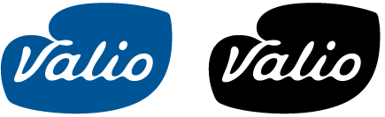
I love the bluntness of the press release, how the logo “communicates Finnishness.” Wording aside, I really like this new logo. I don’t care at all for the needlessly Photoshoped logo they are using as their main identifier, but the actual forms once you strip that away are very pleasing and, for lack of a better term, extra milky. It’s nice to see an asymmetric shape and custom lettering come together so nicely.
Old packaging samples.

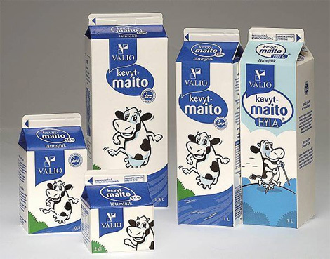
New packaging samples. Click on image for bigger view.
The packaging and the adorning cow have also seen a pretty nice redesign. Overall, a very energetic and refreshed improvement.
Thanks to Aarni Koskela for the tip.


Jump to Most Recent Comment
fabrika’s comment is:
Milky, nice work.
On Mar.24.2009 at 08:45 AM
Sandeep Kaul’s comment is:
Refreshing!
On Mar.24.2009 at 08:51 AM
Josh’s comment is:
The logo definitely has a retro feel on the cartons, and they are much clearner. The only thing about them I don't dig is the cow/crocodile hybrid animal on the front. I even dig the logo with gradients, they've been well done.
On Mar.24.2009 at 08:54 AM
kris’s comment is:
Ah nice, the logo feels like dairy without trying too hard - I'm completely unaware of the brand and before reading the article it was obvious that it was for a dairy product. Well done.
On Mar.24.2009 at 09:04 AM
Visa Kopu’s comment is:
Valio had this logo from the 1950s to the early 1990s. I always preferred it to the one you have pictured as Valio's "Before" logo.
On Mar.24.2009 at 09:09 AM
Mokokoma Mokhonoana’s comment is:
I was not sure of the new logo at first but after I seeing it in action, I think it is a good (re)design - which reminded that it's only 'fair' to judge a logo only after you see how it works when applied(stationery, packaging, marketing collaterals etc.)
On Mar.24.2009 at 09:12 AM
damon’s comment is:
I find it kind of odd that it didn't really change the feel of the packaging at all. I'm not sure if that's a good thing, sometimes it is, sometimes it's nice to see the whole brand refreshed a bit.
all in all I like the logo though, the typography is very milky without being a joke.
On Mar.24.2009 at 09:13 AM
Andrew O. Ellis’s comment is:
I love it! It's such an odd yet appealing shape. it feels somewhat organic and even liquid.
One thing that strikes me though- I had no idea the milk label colors indicating fat content were universal. But now that I see it in this rebrand I assume from past experience that Red = Vitamin D, Dark Blue = 2% and so on.
I feel slow.
On Mar.24.2009 at 09:20 AM
Ryan Adair’s comment is:
Beautiful redesign. Looks buttery and milky and delicious! I love the weird, amoebic shape and the round liquid corners of the type. Good job!
On Mar.24.2009 at 09:24 AM
Maya’s comment is:
Valio. Now with 30% more Finnishness.
I think the logo is a fast improvement and nicely drawn. The packaging seems to have a lot going on and the logo is competing with whatever the larger bubble says.
On Mar.24.2009 at 09:27 AM
Plamen’s comment is:
Sweet!
I've identified the business of the company in a glimpse of the logo before reading at all.
On Mar.24.2009 at 09:30 AM
Joseph K’s comment is:
I like that it also reads as “Valis” without blurring your eyes that much. It’d get my purchase just for that.
Not too sure of the new cows, though. She appears to be looking sidelong at the consumer, unsure of their intentions, and her new nose reminds me more of a crocodile.
On Mar.24.2009 at 09:33 AM
Swifty’s comment is:
I dunno - it looks UnFinnished.
(Kidding! I couldn't resist).
While I appreciate the new logo, and have an overall positive impression of it, I do feel the new implementation is more of a sideways step from the previous incarnation.
The black and white cow is a bit more striking than the blue and white ones on the new packaging.
But as others have said, I totally dig the asymmetry of the logo itself.
On Mar.24.2009 at 09:36 AM
theoxygenthief’s comment is:
I really like the logo, communicates clearly and fits the product amazingly.
The Crococow really needs to go though IMHO....
On Mar.24.2009 at 09:41 AM
Anonymous’s comment is:
The definitely got better. But the package designs yet to take the advantage of the new logo.
On Mar.24.2009 at 09:45 AM
Impossibly Stupid’s comment is:
While I'll agree that it is a better, softer version than the old one, it really isn't that distinctive. I mean, it seems to be a bit of a stretch to say it looks like a leaf, or anything more natural than spilt milk. Worse, though, is that it looks much more like a Viagra pill, and it doesn't help at all that the company name is so similar to that brand. Maybe that's not a factor in Finland, but I can see the Pfizer people having problems with it.
On Mar.24.2009 at 09:50 AM
Andy’s comment is:
Why does the carton in the middle open the other way?
On Mar.24.2009 at 09:51 AM
lost’s comment is:
the logo on the milk cartoon blends in too much with the title/type of the milk.
On Mar.24.2009 at 09:58 AM
Cam’s comment is:
Love it.
On Mar.24.2009 at 10:15 AM
Adam’s comment is:
Mmmmm Milky! I like the redesign...even the gradients, which surprised me. I guess I forget sometimes that gradients can be tasteful in the right context...in moderation. The letterforms remind me of curd rising to the top of the whey...but I may be reading into it too much. Overall, well done.
On Mar.24.2009 at 10:35 AM
Erik at Logo Critiques’s comment is:
Like it! Smooth transition from old to new. Kind of a "gentle rebrand" if you will.
I like the use of the space much better on the redesign also, it's clean and has nice whitespace. I felt the old packaging was a little cluttered.
On Mar.24.2009 at 10:52 AM
Mane’s comment is:
This logo immediately makes me think of milk! And it's fresh, and well executed. But... it kinda reminds me of the Dutch Optimel logo - which, of course, is not a bad thing...

Anonymous’s comment is:
I really like this, it has a smooth appearance and makes me think of milky things, the old one was too sharp for a dairy provider.
On Mar.24.2009 at 11:00 AM
Rodrigo Müller’s comment is:
I like the new logo, a lot. love the way the outer shape blends with the typography. I'm not such a big fan of the new cow charachter, they all look sad when compared to the old ones, maybe that's something to improve.
On Mar.24.2009 at 11:01 AM
Dennis’s comment is:
I like that the communicating elements from the packaging pretty much remain the same, but the logo is far more appealing to the crowd :). it's more friendly and approachable.
@Mane, yeah it reminds me of Optimel as well. But I don't think that's much of a problem considering they will never meet each other in the supermarket :)
On Mar.24.2009 at 11:22 AM
Dennis’s comment is:
edit. It remains recognizable as a brand, yet it's more friendly and approachable through the logo. That's what I wanted to add ;)
On Mar.24.2009 at 11:25 AM
jRod’s comment is:
i have to disagree with the "needlessly Photoshoped" statement... that version of the logo looks "extra milky" to me. it wasn’t over the top and glossy. i think it was well executed.
i could go on and on about how well this logo was built, but really i think I would rather just go get a glass of milk.
On Mar.24.2009 at 11:33 AM
Amanda B’s comment is:
I like it! It looks really good on the packaging, and it's a very strong stand-alone mark. I especially like the black version, it reminds me of a cow's spot.
I think the new packaging is a big improvement, the use of colour is much smoother and I think the new cow has more personality. It's pretty funny that all the cows are super active, and the Whole Milk cow is lounging around fishing...
On Mar.24.2009 at 12:13 PM
Brad McCall’s comment is:
One of the things I really like about this logo is that even though the logo seems vastly different when placed side-by-side the old one, on the shelf their packaging seems very much the same. I always like to see a company make a smooth transition like this. Very clean, updated and yet they kept the essence of the initial brand. I'd say bravo!
On Mar.24.2009 at 12:25 PM
JBIII’s comment is:
The V and how it ties in to the white negative shape is very awkward for me and think it does not work as well as it could. Maybe if they made the drip off the i it would have worked better?
The illustration and line extensions are very playful, nicely done and carries over any equity in the previous design.
On Mar.24.2009 at 12:25 PM
timf’s comment is:
I like how it almost looks like a kiss/lip-imprint in perspective.
On Mar.24.2009 at 12:33 PM
Evgeny’s comment is:
Love this! Most up to date and fresh logo with good recognizable look.
On Mar.24.2009 at 12:34 PM
Carlo’s comment is:
Even though I like everything about the new logo on its own, in the context of the rectangular-box packaging there's something relevant and smart about the previous flag/tag logo that the new logo is missing.
On Mar.24.2009 at 12:41 PM
Lauren ’s comment is:
I wish the new cows looked a little happier though... they seem to run a gamut of strange emotions. But at least they don't have three legs.
On Mar.24.2009 at 12:46 PM
soully’s comment is:
Lovely, the logo looks great, the packaging could maybe have been taken a few more steps forward from the previous cartons in my opinion but regardless it works.
On Mar.24.2009 at 12:52 PM
Calvin Buchanan’s comment is:
Does anyone know who did rebrand?
On Mar.24.2009 at 12:59 PM
Stephanie’s comment is:
The new logo looks great, I agree the "digitized" version looks forced. I'm glad they use the flat version on their packaging.
However, I don't know about the blue cows...I prefer the black and white ones better. The blue ones remind me of alien cows...if there are cows in outer space.
On Mar.24.2009 at 01:59 PM
Sean Farrell’s comment is:
perfection.
On Mar.24.2009 at 02:43 PM
Sew’s comment is:
I love the new logo. It speaks for the dairy category. However I think the the placement of the logo and the over-use of shapes on the packaging killed the simplicity of the logo.
On Mar.24.2009 at 02:43 PM
joanna’s comment is:
The new logo works much better, and actually relates to the dairy category unlike the old pharma looking logo. The new packaging is in the right direction, however the number of callouts is just an overkill, taking away from the logo and killing the simplicity.
On Mar.24.2009 at 03:11 PM
Alec’s comment is:
I like the overall execution to the brand enhancement.
The linked up lower cases at the new logo subtly deliver the milky message. The leave shape logo background may not be the best choice for the logo but it is a handy graphic element in brand association at all applications.
A touch of 3D shading is nice, I agreed the solid color version is better for packaging (easy control in color matching and more appropriate to the package design) but I believe the shaded version will be better for website (they did).
The new packaging didn't moved far from the original so it could easily capture the previous customers. Beside the cow character, all other graphic elements have been improved including the side panels. The only down side is customers have to study the new color code (or activities of the cow) a bit for these new packages since the milk fat label is relatively small.
I also prefer a black and white milk cow but a blue version may best fit to their color scheme while reduce cost in printing.
I like the shape of the cow's nose at old packages but after further comparison, I found that the "Crocodile" style nose could make the “cow character” looks more like a female in my eyes, not sure if this is the reason to modify the better looking cow.
Valio did a good move to stay away from the out dated logo and the new logo identity now well cooperate with their brand images, especially for those milky photographs at their website.
On Mar.24.2009 at 03:27 PM
Bruce’s comment is:
I like it. The script is very fluid, like milk itself.
On Mar.24.2009 at 04:06 PM
lucid’s comment is:
LOVE IT, much more refreshing than the old version. Less "Intel Inside"
B+/A-
On Mar.24.2009 at 05:27 PM
Marc Katsambis’s comment is:
Nice upgrade, but that left corner bugs the hell out of me. It looks like a mistake and should be smoother/rounder. Where's the pen tool? Let me fix it!
On Mar.24.2009 at 06:18 PM
t-bone’s comment is:
that cow is pretty whacked out, but the flat logo is nice n creamy.
On Mar.24.2009 at 07:04 PM
Mike’s comment is:
Reminded me of this:
![]()
Mmm, I loved Magnolia ice cream.
As for the logo, I like the change. Milky, as has been said, and the V is my favorite.
Frank’s comment is:
"..the new logo and logotype conveys good feelings and enjoyment."
That's so absolutely what i thought before reading the press release and the feeling i got just from looking at the two logo versions.
Very nicely done.
The only downside i see is that the packaging doesn't quite fit the milky, friendly elegance that the new logo definately has.Maybe they should have made the logo the main visual on the packaging and just write "milk" or "butter" or whatever the product is underneath ?
Anyway, both thumbs up for the logo.
On Mar.24.2009 at 09:17 PM
Anonymous’s comment is:
Excellent! Perfect combination between wordmark and symbol.
On Mar.24.2009 at 10:29 PM
birdman’s comment is:
Having never been exposed to this brand or product before, I saw the new logo and immediately thought "butter," then "dairy." I was very glad to see that was indeed the intent!
I don't think the gradient-style logo is overdone; in fact, I think that's part of what led me to think "dairy": reminds me of the soft sheen that melted butter or a glass of milk gets. Somehow, it feels more "edible" that way... if that makes any sense. :)
The old-old logo (with the green Futura-looking font) made me think of gasoline: a mix of the Hess and Valero logos. Not exactly appetizing. But of course, I'm speaking as an American, not as a Finn.
I agree with others that the milk container itself is almost too busy for the simplicity of the logo, and the crisp, boxy folds of the container don't help matters. Probably my biggest beef is with the badge immediately under the logo (what I assume is the Finnish word for milk).
But I also agree with others that the redesign is clearly an improvement yet also hearkens back to the previous, allowing the customer to recognize and find it easily (which was one of my biggest gripes with the Tropicana fiasco). On the whole, a lot of win going on here.
On Mar.24.2009 at 10:30 PM
daniel’s comment is:
the cow is just too adorable
On Mar.25.2009 at 12:39 AM
Visa Kopu’s comment is:
Calvin Buchanan: According to this article (in Finnish), the rebranding was made by Tango International.
On Mar.25.2009 at 03:14 AM
Glenn Sakamoto’s comment is:
A vast improvement over the original. But for some reason it feels too pharmaceutical, like Pfizer. And the shape reminds me of an internal organ.
On Mar.25.2009 at 10:46 AM
b.r.o.o.d.y.’s comment is:
Good logo, and better execution on the packaging. I think if you look at the softer shapes objectively you can't help but admit that they do much to make the brand even livelier.
As for the logo, I had my doubts when I saw the glossy bumpy version sitting there on its own. But it looks excellent in all the presentations.
On Mar.25.2009 at 12:09 PM
Neil’s comment is:
This is an excellent redesign. It's nice to see that all hope is not lost this year for logo design, considering some that have been featured on Brand New previously.
On Mar.26.2009 at 04:29 AM
Mongoose’s comment is:
Man, I'm digging on this, for the reasons everyone else is. It feels dairy and milky, especially with the drippy links on the lower-case letters. As for being 'Finnish', well, it's blue and white.
So was the old logo, of course, and I don't think they've made it any more Finnish. The enclosing shape wasn't bad on the old logo, but the weird half-a-V and boxes just wasn't impressive nor a good occupier of space. The new one much better fills the space.
I disagree with Armin about the photoshopping and gradients; I think it makes for a nicely three-dimensional logo. Mind, it's good in simplified outline, too. I don't know if it's quite so 'leafy' a enclosing shape as they claim it is, but it's oddly pleasing and distinctive.
I give it an unabashed A+; this is my favorite rebrand of the year so far. It hits all the right notes, and none of the sour ones.
--Mongoose
On Mar.26.2009 at 02:58 PM
Mike Kennedy’s comment is:
I agree with timf’s response. It looks like Lips/Kiss to me.
On Mar.26.2009 at 04:35 PM
Jason A. Tselentis’s comment is:
A moooovingly good mark to help milk the product.
On Mar.26.2009 at 05:07 PM
Stephanie Newcomb’s comment is:
What an improvement. So much cleaner and much more modern.
On Mar.26.2009 at 07:22 PM
Mark’s comment is:
Well done.
The logo reminds me of a cow's spot, A big improvement in the logo. The previous logo was a mishmash of unrelated elements. I don't get what the previous logo was supposed to stand for.
On Mar.26.2009 at 07:43 PM
Dan O’s comment is:
Nicely crafted. Good to see something which has clearly had some time spent on it by someone who knows what they're doing; it hasn't been left to the designer to make the final tweaks.
Reminds me a bit of the Boots logo (huge UK-based pharmacy chain), but it's not too distracting. Nice job.
On Mar.26.2009 at 09:03 PM
binoygopal’s comment is:
good one;good concept
On Mar.27.2009 at 02:53 AM
arcticmagnolia’s comment is:
Hopefully the new cow is changed for a bit better one.
Here is a set of pictures of Valio's art themed cartons with old logo from Oct-Nov 2005 (Valio's 100th Birthday). I like how Valio plays with its cows every now and then.


ryan’s comment is:
The Finns are very proud, confident and blunt. the press release language was spot on for the way a Finn would talk about a logo.
On Mar.28.2009 at 12:34 AM
Mark’s comment is:
oh it's supposed to represent a leaf? darn
I was wrong.
On Mar.28.2009 at 05:17 PM
Viceroy Diceroll’s comment is:
This is a great redesign! It looks very contemporary next to other European product design. The ambiguous liquid shape is great, and it just looks fresh all together. The old logo was awkward and didn't remind me of milk at all.
On Mar.30.2009 at 08:34 PM
Jack G.’s comment is:
As long as most of the applications will be without the gradient, I think it's snappy and attractive. But wherever the gradient goes... Not so pretty.
On Apr.03.2009 at 12:15 PM
J’s comment is:
@Andrew O. Ellis: in Finland, all milk is fortified with vitamin D. The amount was recently increased as many Finns suffer from vitamin D deficiency. Short winter days, lack of exposure to sunlight, etc.
So, the red carton means whole milk (3,5 % fat), the dark blue = semi-skimmed (1,5 %), the light blue & yellow = 1 %, and the lightest blue = skimmed (fat free). So it's partly universal.
As a Finn, I must say I like both the new logo and the straightforwardness of the press release. Hate the cows though.
On Apr.06.2009 at 03:29 PM
Kellie Schroeder’s comment is:
BRILLIANT!
Nice system.
On Apr.06.2009 at 04:58 PM
Finnish cow girl’s comment is:
I don't see there a leaf but a well formed cow udder full of milk, which is brilliant! The change is really so smooth that I had to check my refrigerator while reading this, and yes: cartoon has renewed.
You asked thoughts about the brand: I come from a farm that produces milk to Valio in Ostrobothnia, and my brother and his family do the job these days. I know the milk I buy in Helsinki is not coming from my home farm, but it's still a homey brand to me when I pour it to my morning coffee.
After Valio sold their ice cream brand Valiojäätelö to Nestlé some years ago I begun more deliberately to use foreign food products. I felt that Valio had sold something fundamental and I too could give up to globalization.
These days Valio milk is slightly more expensive than other brands, but I buy it to keep our countryside alive and hope that reasonable sized family farms can survive a bit longer. I wouldn't want anonymous milk from big factorylike farms, where workers don't know their cows by name and character.
On Apr.07.2009 at 04:39 AM
buster’s comment is:
beautiful. Milky, classic, and just enough retro to reflect the companies long history.
The old one looked like it sold copiers or paper.
On Apr.08.2009 at 01:32 PM
Comments in Brand New, V1.0 have been closed.


