

NOTE: This is an archived version of the first incarnation of Brand New. All posts have been closed to comments. Please visit underconsideration.com/brandnew for the latest version. If you would like to see this specific post, simply delete _v1 from the URL.
![]()
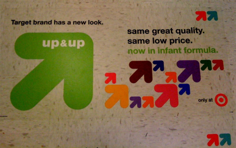
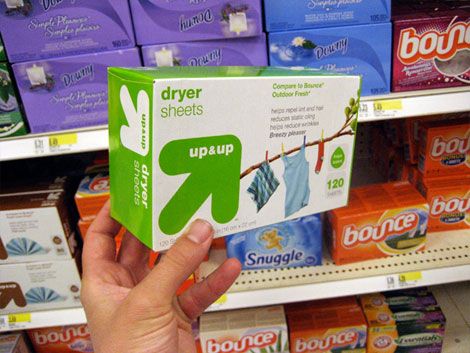
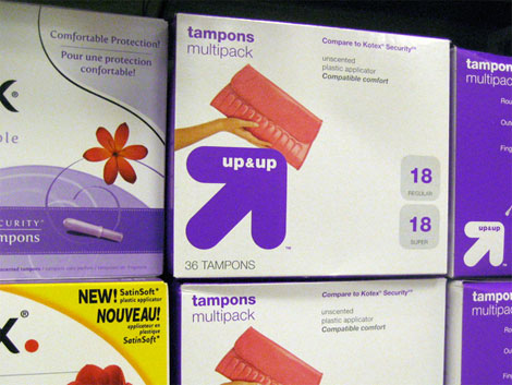
As if we needed any more proof that the venerable patron saint of mass consumer design, Target, attracts designers, my inbox has been jumping with designer e-mails about the new look and name of its private label brand: Up & Up. The chunky arrow logo is replacing Target’s red bulls eye in all the products in the health and beauty care category, from diapers to sunscreen lotions. As CNNMoney, one of the first to pick up the story, reports, the new design is just beginning to be rolled out and by the end of the year there will be 800 Up & Up products, which are typically priced 30% below brand names. And in this rough economic times, 30% less to pay for anything is, well, right on target. One of our undisclosed tipsters says the design has been done by Wolff Olins, who has Target listed in their clients page, so it may just be right — of course, a hundred other design firms have Target listed in their client page, but still.
Floor graphics. Image Source
The blog, My Private Brand, has a nice selection of images with the new look, and he also reports of a comment he received from a sales floor team member:
I work for Target as a sales floor team member, and I am happy to hear you’ve discovered our Up & Up brand. Up & Up is the new look we’ve given to our target brand products. Previously where you would have found bottles with similar packaging and coloring to that of their brand-name competitors, Up & Up products will feature witty designs and will slowly transition in as our store’s leading self-owned brand. Other products that you may see flying up on our shelves include our Target home brand, now named reDesign. reDesign is marked by its innovative turquoise packaging. Archer Farms is still our self-owned consumables brand, and TruTech is our self-owned brand for electronics. Be sure to stop into your local Target store to pickup these great finds!
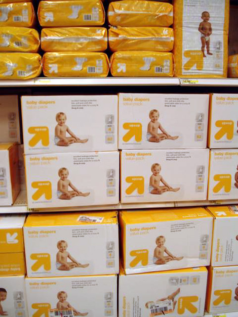
Walls of diapers. Photo: Bryony.
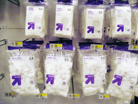
Designing private label identities and packaging has to be tough business. You can’t over-design because then it looks more expensive than the brand packaging, but you also can’t make it too spare where it looks like what the old Target brand used to look like, which is lame and cheap. Up until now I had never bought a Target branded item because I literally thought I was getting an item 30% more inferior than others. Of course, economic times have changed, and I’m more willing to buy baby wipes that are cheaper, but my confidence in the product may be enhanced by the new look, which is simple and vibrant. The product images are a little bland and generic, but they seem to work well against the stark white backgrounds and the bright colors. The use of solid rectangles, rather than the numerous waves and curves it used to, gives the Up & Up brand a very contemporary and designy feel.
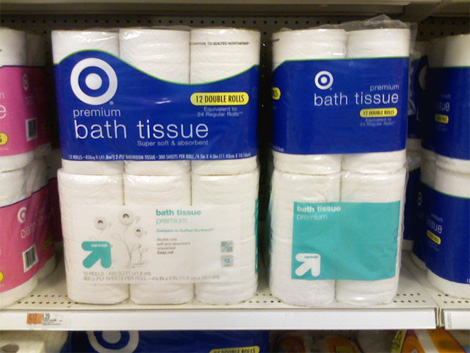
Toilet paper Bath tissue, before and after. Photo: Aaron Bouvier.
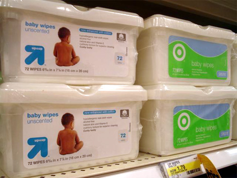
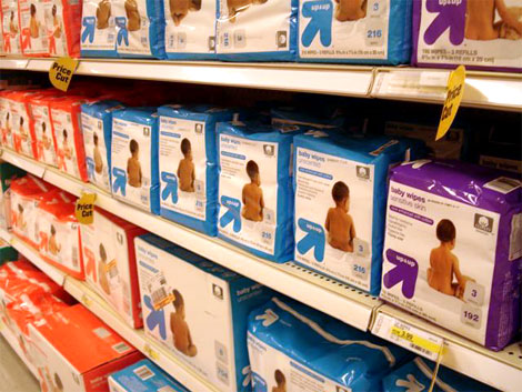
Wipes, before and after. Photo: Bryony.
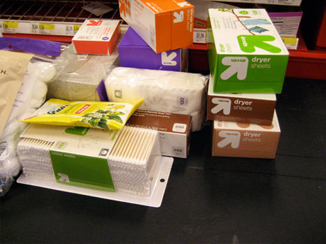
And here are some new images sent in by a good brand samaritan.
Thanks to Josh Renaud for first tip.
Update JUN.03.09: New images of the packaging have been added.


Jump to Most Recent Comment
Matthew Roosa’s comment is:
I have been really surprised with a long of the store brand designs lately. The old stuff is usually bland and chock full of dated stock photography and generic labels, but a lot of the newer stuff seems so fresh and well thought out and surprisingly attractive.
On May.29.2009 at 08:11 AM
Matthew Roosa’s comment is:
*that is "a lot of the store brand designs..."
On May.29.2009 at 08:12 AM
hofn’s comment is:
I value neat and effective (no flash/pizazz?!?!) design but this just seems really lazy.
If this was in fact handled by Wolff Ollins, then it looks like unintentional self-parody.
On May.29.2009 at 08:30 AM
Dan Warner’s comment is:
Every time is see vag rounded, gotham rounded, etc. I think of babies and baby products — so it's nice to see a solid application of the "soft n' squishy" rounded typeface genre...
On May.29.2009 at 08:47 AM
Dale Campbell’s comment is:
I don't mind it.
I think it's recognizable but awfully close to what Publix down here in the southeast does with their products.
The white space/cleanliness is very nice to see. I will never badmouth whitespace! : )
Keep well,
Dale
Alex’s comment is:
Great stuff, really fits with the rest of the target brand. An arrow and a target. Nice.
On May.29.2009 at 09:06 AM
Emily Brackett’s comment is:
Funny you should report on this because I was just at Target yesterday and was looking for the Target brand diapers. As a Mom, I've tried the name brands and tried the Target brand and had previously decided that the 30% cheaper Target ones were just fine. However, I had never heard of the Up & Up brand and was a bit disconcerting to see no Target diapers and this new brand that was not even identified as the house brand. I did figure it out, but I think a bit of educational signage might have helped, as I was hesitant (I didn't see any of those floor signs).
On to the design... I think it's OK, but not great. I would have loved to see the hip side of Target's own brand be used on these products. I would not classify this as "witty design". The logo is memorable, although not that unique and the rest of the packaging is not very memorable at all. Rather than being minimal it's a bit boring.
But the diapers themselves do have fun polka dots on them, which I love!
On May.29.2009 at 09:09 AM
LB’s comment is:
I don't know. There's something about this that I'm missing. Maybe it's the wit in those images. What's so witty about a baby on a diaper package?
On May.29.2009 at 09:19 AM
Hooper’s comment is:
Yeah, I get a really really strong Publix vibe from these - white base with one color accent, fun/kooky images on certain products, simple type, etc. etc. etc.
That's not to harsh on Target, because I like Publix's packaging a lot, but it is strangely familiar. The arrow/bullseye angle is nice, too.
On May.29.2009 at 09:23 AM
Proverbial Thought’s comment is:
Ther emust be some new focus group data floating around corporate circles regarding white backgrounds because this is similar (to me) to Walmart's rebrand of its food products recently. May also be a cost-cutting issue as there is no in cheaper to print than white ink...
On May.29.2009 at 09:25 AM
Chad Kaufman’s comment is:
I can't remember the project that I saw, but it was a design that used these arrows around stairs (Pentagram maybe, Armin does this ring a bell?). Anyway...
I think the brand is great, very bold in the style of everything else target, but I think there may be an underlying motivation for a separate Target brand. Many companies create sub-brands to distance themselves a bit from the products they sell. For liability reasons, if something goes awry with a product, the parent company's brand is not tainted. Many car companies create sub-brands (ie - Scion for Toyota, Mini for BMW, etc.) so that they can handle their sub-brands as separate entity. Especially in the car industry with crash test results, recalls, and other consumer driven reviews there are a lot of situations where having a separate brand can be benificial. Any bad PR can be bounced off the underlying brand.
In the same sense, if this mark will be applied to "health and beauty care category, from diapers to sunscreen lotions" there can be a lot of health and safety PR that can be directed towards Up & Up without involving Target. If something happens to an Up & Up product, Target can pull it or change it with minimal damage to the Target brand. Sure, it will be known that it is ultimately Target's brand, but consciously it will be perceived slightly different by consumers.
On May.29.2009 at 09:37 AM
Jonathan’s comment is:
Looks like a backwards R.
On May.29.2009 at 09:52 AM
gak’s comment is:
I know that this is probably just because I am a single girl looking for dates, but this design looks like a phallus pointing at 7 o'clock with its testicles splayed outward.
Now that I think about it, perhaps this arrow design is the male counterpart to the "bullseye" if you know what I mean.
On May.29.2009 at 09:59 AM
Erik at Logo Critiques’s comment is:
@Dale Campbell I was thinking the same thing about Publix

The new target stuff is alright, it seems a little boring and bland, but I guess that's pretty standard for a lot of private label brands.
On May.29.2009 at 10:03 AM
Impossibly Stupid’s comment is:
"Up until now I had never bought a Target branded item because I literally thought I was getting an item 30% more inferior than others."
Wow. Talk about the power of brands over brains. In these days of mass production, the odds are pretty good that store brands and national brands are both produced by the same machines, with the only difference being the packaging and corresponding advertising. Is it really so much to expect consumers to pick up a product and read the label? It doesn't take a lot of time to hold two boxes side by side and compare the ingredients and/or location of manufacture.
On May.29.2009 at 10:16 AM
Chris Herron’s comment is:
The type is small, but this is a memorable design with a strong name. Could become iconic with time and exposure. Would love to read the strategy behind the decision to spin off this product category from the parent brand.
On May.29.2009 at 10:27 AM
Bruce’s comment is:
I wonder if it will affect the Archer Farms brand, which is already upmarket, and quite nice.
On May.29.2009 at 10:31 AM
James Re’s comment is:
I like it allot from concept to execution. So many brands are created and mean nothing especially store brands. The usually rest on the laurels of their parent store, an ambiguous link at best especially with a department store like target whose products are so very varied (excuse the word play). But this has a concept apart from all that and can stand on its own.
All in All well done.
On May.29.2009 at 10:41 AM
Nate’s comment is:
I had the same problem as Emily. I stopped into Target one day looking for baby wipes and diapers and was completely thrown off by the whole Up & Up switcharoo.
I figured it the whole debacle on my own, but yes, a "heads-up" would've been nice. Then when I brought said products home, my wife says, "What's up with the Up & Up brand? We always get Target brand?"
Argh.
And oh, nice design, poor warning, you friggin dicks.
On May.29.2009 at 10:50 AM
drewdraws2’s comment is:
It seems a little dangerous to stray from the bullseye, but this rebrand looks good in the photos. Haven't been to a Target recently to check it out in person though.
On a side note, Target brand paper towels are the best on the market.
On May.29.2009 at 11:13 AM
AP’s comment is:
I work for Target and I had no idea what up & up was when they first started to appear on shelves... none of us had a warning either! Then i'd get angry questions every day from mothers who loved the Target brand diapers and baby wipes and were upset that we didn't carry it anymore... A MONTH LATER we got the floor signs, signs for shelving and a memo about the transition in my e-mail. Good job, Target!
On May.29.2009 at 11:19 AM
honkhonk’s comment is:
no one mentioned TDR yet ? weak...
On May.29.2009 at 11:34 AM
Armin’s comment is:
> Wow. Talk about the power of brands over brains. In these days of mass production, the odds are pretty good that store brands and national brands are both produced by the same machines, with the only difference being the packaging and corresponding advertising. [...] It doesn't take a lot of time to hold two boxes side by side and compare the ingredients and/or location of manufacture
Wow! But, no. It's fun to think that way, but even if you believe that ingredients and place of manufacture tell the whole story, it's just not true. Take baby wipes: Seventh Generation, which are probably 30% more expensive than Target baby wipes feel better, last longer and, heck, they smell better. The quality and experience of the product is better. Simple as that.
On May.29.2009 at 11:52 AM
Ryan Adair’s comment is:
Another unnecessary project.
Why?
Was it really crucial that Target redesign their beauty product line? Were they not selling? First of all it's not that much better (and on it's own it's pretty dang boring), secondly, there is not an obvious distinction that what's inside has changed at all. I mean, what is the difference? Is the product different?
So many posts on this blog can be filed in the "Why?" folder...The "If it ain't broke..." folder.
Is it just me?
On May.29.2009 at 12:49 PM
Stephanie’s comment is:
I think it's brilliant. Not in the best re-design kind of way, but the strategy intended. I'm sure it could be better in many ways depending on what aspect of the product line they want to push, but I think they reached a good median. Not too flashy to make people think it's an amateur brand that's trying too hard to be chic, and not too boring to be a lame house brand. Kind of reminds me of Method line of products.
Looking at the photos, I am loving the graphic they used for the toilet papers. Growing toilet paper plant, adorable! I wouldn't be able to resist.
On May.29.2009 at 01:54 PM
chris’s comment is:
Arrows? This has been used time and again, and again, and again.
Now, if you are looking at this another way, it is phallic. Look for a moment. From another perspective it is not "up & up" but get me the Viagra.
I am just sayin'…
On May.29.2009 at 02:02 PM
Proverbial Thought’s comment is:
@Impossibly Stupid:
I don't know about the food items and whatnot, but I can definately tell you that there is a HUGE difference in Quality between Huggies and Target-brand pampers. I know because I'm cheap and still won't opt for the cheaper pampers b/c my baby goes through them at about a 3:1 ratio. Other items, not so much; and I won't pay for anything that I know is being marked up for the brand name. I know... Off topic.
On May.29.2009 at 02:20 PM
Impossibly Stupid’s comment is:
"The quality and experience of the product is better."
Such is the danger of using a single data point. I never made the claim that *all* products in a certain category are identical, just that there is a significant overlap in manufacturing such that it makes no sense to simply assume that paying significantly more means getting significantly more. I myself have had the experience of buying store brands and finding some inferior to a name brand, but it makes no sense to assume that all of them are, or to *never* purchase the store brand to find out for yourself.
On May.29.2009 at 02:26 PM
Impossibly Stupid’s comment is:
"there is a HUGE difference in Quality between Huggies and Target-brand pampers"
Again, singling out individual brands and noting a difference is less than useful. You could just as easily make the same preferential claim between two big name brands. What you'd have to show to disprove my point is that *no* other (national) brand uses the same manufacturing process that another (store) brand uses.
"I know... Off topic."
I disagree. I think it is extremely important in discussions of branding to look at what the underlying product is. That's especially true when the topic at hand is a store brand or other generic, unadvertised product. It's all about consumer expectations, and whether or not paying more for a name brand is going to meet those expectations.
On May.29.2009 at 02:37 PM
Aaron’s comment is:
I'm not digging this. It's another "square arrow". The square arrow is becoming the equivalent of the horseshoe shaped swoosh (and here) that was popular years ago on way too many logos or the ever present "speech bubbles" of the past four or five years.
Someone commented above that this seems lazy and I completely agree. It may look a little more "designy" than the old stuff, but it is more generic in comparison and quite frankly I am somewhat surprised that Target, which has spent millions over the past ten to fifteen years, would feel a need to move away from their bulls-eye logo. Some could say that a bulls-eye is not the most inventive mark in the world, but it is theirs.
This trend towards anti-identity (think Tropicana) erases all the idiosyncrasies of the organization, its' history, and its' humanity. It's all white space and clean, left justified type in bright colors. It has become a look unto itself: organic-modernism. The problem is that it doesn't work for everything and it is becoming a lazy, prescripted approach for designers.
On May.29.2009 at 03:01 PM
Johnny’s comment is:
Impossibly:
Comparing ingredients or place-of-manufacture between two products (which I do) is NOT always a reliable indicator as to the similarities in quality or user experience.
One example is Cetaphil skin cleanser, which my wife uses. Store brand versions (including Safeway, Rite-Aid and Target) have the exact same ingredients listed in the same order. But my wife says that the less expensive brands all have slightly thinner consistency, and she prefers the experience of using the more expensive name brand.
I can think of many similar examples from personal experience. You seem to be a consumer who values monetary savings first and foremost, which is great. But sometimes you simply DO get more from the higher-end products in the same category.
On May.29.2009 at 03:24 PM
cBraunDesign’s comment is:
While I agree this is slightly boring, and possibly unnecessary, I think it's a huge improvement. Mostly because the old branding was so horrible. I often found myself wondering how such a great store (compared to the Wal) had such bad in-house branding. It was Helvetica Thin with a white bulls-eye (way to throw out the color equity), and a nasty looking swoop/wave above it. I always hated it so much.
This Up&Up brand is a big improvement, and I noticed it immediately when my wife brought home a tube of what she called, "Target brand suntan lotion."
Good work.
On May.29.2009 at 03:39 PM
angela’s comment is:
"there is a HUGE difference in Quality between Huggies and Target-brand pampers"
In a discussion about brands, I found this comment interesting just for using the Pampers name to be a general word for diaper. What does that say about THEIR branding?
On May.29.2009 at 04:09 PM
Proverbial Thought’s comment is:
@Impossibly Stupid:
Your response is slightly irrelevant because in my statement I already acknowledged that the difference I was speaking of was limited to that particular product. I think it went a little something like this:
"Other items, not so much; and I won't pay for anything that I know is being marked up for the brand name.
Would have been nice for you to add some sort of disclaimer to your original comments that would have notified me, th reader, that you were not painting with a broad brush. But hey, reading & writing comprehension isn't for all. As for being argumentative here on Armin's blog... Can't, won't do it. It's just a logo that nether of us have been paid for.
On May.29.2009 at 04:40 PM
Josh ’s comment is:
This isn't so bad, but it's not really that great either.
I wonder if I'd like it more if I wasn't trying to understand the visual relationship between the bulls eye and this arrow. It's not a bad mark, but offering it as an alternative to the bulls eye just isn't working for me.
On May.29.2009 at 04:49 PM
Proverbial Thought’s comment is:
@Josh:
Think of it this way... What do archers shoot at the bullseyes of their targets? Yup... Not that I am suggesting that is it or anything; just a thought to put your mind at ease.
On May.29.2009 at 05:12 PM
Chris Johnson’s comment is:
@ Armin:
Your summary of the Seventh Generation product quality is not in line with some available data. Based on Consumer Reports objective testing of five different Seventh Generation products, the effectiveness of those products is WORSE than the top performing products in a range of 19% to 33% .
Branding and package design support the PERCEPTION that a product is better. Good branding can serve to stop a consumer from seeking out objective data or it can cause the consumer to choose a product despite the availability of contrary data. There is nothing wrong with this, it is fair play.
Frankly, arguing about the quality of a product based on the packaging is a fool's errand because there is no reliable relationship. If you want to find out which product performs best, base your decision on objective data from an impartial source. Contrary to what most people believe, there is typically no relationship between brand reputation and quality/effectiveness. Toyota and Apple represent the exceptions, not the rule.
On May.29.2009 at 05:28 PM
Impossibly Stupid’s comment is:
Well, I kinda am painting with a broad brush. :-) What I was originally addressing was the original assumption that *only* way a store brand could be 30% cheaper is if it were 30% worse. I think we all can name products were that is indeed the case, but I've seen many more cases where the bulk of the price difference really is from the costs of advertising, packaging, and other promotion of the brand.
Believe me, I buy plenty of brand name items, but its always an informed decision based on actually comparing the merits of the product, exactly the same way I decide between the major name brands themselves. It just seems silly to shut off your brain because you recognize something as a store brand.
On May.29.2009 at 06:46 PM
My private brand’s comment is:
Thanks for the link, I enjoy your blog
On May.29.2009 at 09:28 PM
Panasit’s comment is:
I feel like I'm at a train station and this is its official brand of toilet paper. Actually the packaging looks like it's the official brand of normal A4 paper with a naked baby sitting on it.
I mean there's simple and there is lazy. Arrow is one of those established communication symbol, to use it.. and then hide the name of the brand (in small letters too) IN IT, that violates so many logo design laws it's not even funny.
Strange, I always thought my opinion has always been pretty similar to the critics, especially when it comes to design. But then I find myself on the reverse side with both Pepto-Bismol (I like, people hate) and this one (I hate, people like).
Not to mention the fact that I really like Terminator Salvation. May be I'm in my "off" season.
On May.30.2009 at 12:37 AM
ege’s comment is:
I like the simplicity of the design. The goal of a logo is to boil down a company to a simple recognizable mark, is it not? I quite enjoy the simple strait forward approach.
On May.30.2009 at 01:14 PM
John Mindiola III’s comment is:
I think Target should play Relient K's "Up and Up" for promoting this re-branded product line.
On May.30.2009 at 01:24 PM
Quality is a luxury’s comment is:
There's one more thing that plays a role in decision making between a store brand and a branded product -- Cost. For some, that's is the only differentiator they care about at this time.
On May.30.2009 at 06:12 PM
JAC’s comment is:
No me gusta...es una imagen que da para muchas weás...
On May.31.2009 at 12:37 AM
yael’s comment is:
Hey, it attracted me (as a mother of kids looking for well-priced diapers). I'm not afraid of store brands, but have had good and bad experiences in that department. This looked like a Seventh-Generation-esque brand. I didn't realize it was Target's house brand until I was home and using them. They're a great product and I'd buy them again. I liked the look, like I said. So, for me this works. The bullseye doesn't work.
I think Target has successfully elevated the quality perception by using a different brand identity for different product categories. You can't sell food the same way as diaper rash cream.
On May.31.2009 at 10:18 PM
Tim’s comment is:
Just picked up some "up & up" diapers and wipes yesterday. When I first saw the packaging upside down in my wife's cart, I thought the logo was reading "dn & dn" until I noticed the ampersand. Too bad they didn't go with a + sign. Would've given them a whole new visual to represent prices going "dn".
On Jun.01.2009 at 09:30 AM
Armando’s comment is:
Very nice and clean.
@JAC:
¿Qué cosa son? weas'?
Darlene Chevalier’s comment is:
UGH! I don't like it! The "target" logo is so strong, recognizable, and clean, why did they take it off the packaging? Surely, it could be incorporated into a newer, fresh design...
On Jun.01.2009 at 12:17 PM
Matt’s comment is:
The logo looks rather generic. The arrow seems to be just a bit to large making it awkward. I also found the older packaging more appealing.
Negative space is great and all but I don't think trying to save ink by only using white is a great idea.
On Jun.01.2009 at 12:51 PM
V as in Victor’s comment is:
It's nice to see that Target is taking a chance and opening themselves up to a new look. Branching off the main logo is a risk, but if it pays off, they're able to create a new niche in the consumer arena with the new look and feel. I like the use of white space and not being hit over the head with the Target logo. I do feel that a small use of the target might have been a good idea for a transition period based on concerns above, but overall, I feel a good job was done. Kudos.
On Jun.01.2009 at 01:06 PM
NicKLAUS’s comment is:
When I first saw this post I originally thought it was for the new Pixar movie UP.
I personally think it'd look a whole lot better if they took this new package design but kept the target logo instead of the new Up & Up Arrow. This way people looking for this Target Brand should be able to make the connections. The packaging looks good, I'm always a fan of the objects isolated on white. I love white space. LOVE IT.
With all of the confusion, it sounds to me like the transition was a little off Target... see what I did there. Alll right..
On Jun.01.2009 at 03:21 PM
Bianca’s comment is:
That logo remembers me this one ![]() Well, at least the arrow does.
Well, at least the arrow does.
petbottle’s comment is:
The quoted comment supposedly from a Target "sales floor team member" reads suspiciously like a press release.
On Jun.01.2009 at 03:54 PM
Glenn Sakamoto’s comment is:
Really cool stuff!
On Jun.01.2009 at 04:53 PM
Mondayne’s comment is:
@Nate: The comment was going so well until:
"And oh, nice design, poor warning, you friggin dicks."
I laughed so hard I starting to cough and go blue in the face. Such unnecessary anger. It's awesome.
On Jun.01.2009 at 11:11 PM
Joshua Emrich’s comment is:
My wife just bought a box of UP & UP diapers. As a designer, it's tempting to make a clean design without all the gradients and photoshopy depth, but those elements help hide the dirt, scratches, and dents that are picked up as the box is shipped and stocked on store shelves. When the box is in your hands it looks kind of blah...
Great name but it's seems difficult to make an arrow memorable.
On Jun.02.2009 at 10:49 AM
David’s comment is:
Will there be comparable outrage to Tropicana from Target shoppers with the disappearance of the iconic bullseye from store shelves?
On Jun.02.2009 at 04:00 PM
Benigno’s comment is:
I really like the redesign.
And although arrows and bull eyes can came together, I also consider there was not an introduction of the brand campaign. Maybe the arrows pointing targets or something to help it just create an identity, before leaving up&up by itself.
And, strangely but no one mentioned, GREAT VALUE? Any resemblance?
Who came up with the concept first, Wallmart of Target?
I think in this Wallmart-Target battle, although really closed, Great Value comes to a clean win for the used of much more rich photographs.
On Jun.02.2009 at 06:20 PM
Brandy’s comment is:
Ok, so who did it. Can we get confirmation?
On Jun.02.2009 at 10:45 PM
Brandy’s comment is:
There's no way this is Wolff Olins.
On Jun.02.2009 at 10:50 PM
Armin’s comment is:
I've added some new images of the packaging that were sent in by a good brand samaritan.
On Jun.03.2009 at 07:04 AM
arch’s comment is:
Strategy - The redesign/rebrand of Target's line was very well-timed. More consumers are buying private label goods. It was time for Target to give its own brand a proper name rather than just saying "im target, im cheaper, so buy me."
Design - This looks like Wolff Olins work to me as well. I dont think this was an in-house job. They could have incorporated the bullseye design, but I guess Target wanted something completely new. Overall, I like it. I'm a big fan of white space and less clutter. It allows the packaging to breathe. People are likely to be more attracted to this sort of look. Change is never easy and there are likely to be some who will complain. On a whole, the rebrand should be well received and it will encourage those who havent bought Target's goods before to give it a try - sounds like mission accomplished to me.
On Jun.03.2009 at 10:19 PM
Anonymous’s comment is:
Looks pretty nice and fits the purpose.
On Jun.04.2009 at 11:19 AM
Shane’s comment is:
Saw this on my last visit to Target and was wondering when I would see it on here. I LOVE the new look! Target is continually doing a swell job in regards to design.
On Jun.04.2009 at 05:51 PM
Julie’s comment is:
I am very disappointed that Target has changed "house" brands. What a rip!! I am an avid Target shopper, I get everything but my fruits,veggies and beef. I was so unhappy to see that not only did they change the way they are making the products but they also changed the quantity and RAISED the prices!!!!! For example, Target brand Size 4 value case of diapers was 13.69 for 96 avg. out to .14/diaper, Up and UP brand Size 4 value case of diapers is 13.79 for 82 avg. out to .17/diaper. Also, they should have kept mothers in mind when going for the "new" look, I found it VERY disturbing to go in and find not only the diapers, wipes, kiddie foods are different, but so is the Target brand formula. As a mother, I want to keep my child with the familiar brand, and Target has let me down in a HUGE way!!!! I avoid all the other "one stop shops" and go to Target because of cleanliness and product availability. Don't know how I feel about them now.
On Jun.05.2009 at 06:20 PM
Jordan Foutz’s comment is:
I actually read all of the comments because they were overwhelmingly positive. Most comments are sadly just a execution-style barrage of complaints and "woulda been better ifs". Guess Target is sending the right message based on public opinion.
On Jun.06.2009 at 12:08 AM
Anonymous’s comment is:
I like the packaging but the actul diapers have big polka dots all over them instead of just at the waistband. I have a boy and they look very "girly" to me. Unless they make the actual diapers a little more plain, I will not be buying them for my 2 year old. (I have been using Target diapers since he was born).
On Jun.06.2009 at 09:41 AM
rmc’s comment is:
Overall I like the up&up arrow design, but I feel as though the photography lacks unity across the brand.
Some of the photos show the product's user. Some of the photos show the product being used. Still others have artistic arrangements of the product. While all of the applications are creative, I'd like to see more consistency throughout the series.
I realize not all products are suitable for illustration on the package, but seeing different image types on packages throughout the store could make for a disjointed shopping experience.
On Jun.10.2009 at 11:37 PM
mp’s comment is:
At first glance I thought, "cool design, I like the logo," but after scrolling through the examples I couldn't help but think that the logo resembles a phallic symbol. :/
(Apologies for the crudeness.)
On Jun.17.2009 at 11:02 AM
Keith’s comment is:
Down and down - no matter how you look at it.
On Jun.22.2009 at 02:17 PM
Patricks’s comment is:
I miss the bullseye logo already. Up & Up sounded good for a Baby brand, but not for everything in store...
Seeing all these arrows on the shelves will mess up the store's aesthetic.
On Jun.24.2009 at 09:59 PM
Comments in Brand New, V1.0 have been closed.


