

NOTE: This is an archived version of the first incarnation of Brand New. All posts have been closed to comments. Please visit underconsideration.com/brandnew for the latest version. If you would like to see this specific post, simply delete _v1 from the URL.
![]()
There are a few magazines that I read/peruse irregularly, usually at airports or doctors’ waiting rooms. For the most part I can remember what these look or feel like, even if I only see them intermittently. Whether it’s National Geographic, or Us Weekly, or Fast Company I can picture the layouts and the typography, no matter how high or low it leans. As news broke out of the recent redesign of BusinessWeek, and as I picked it up at the newsstand (in Denver’s airport) I was unable (perhaps unwilling) to remember what the old BusinessWeek used to look like — my best bet at this point is “generic” with a dash of “boring” as I simply could not picture anything other than the condensed serif on the cover. So as I flipped through the new BusinessWeek I was happy to find a cohesive visual tone that, even if not particularly groundbreaking in the general design sense (as every single visual styling has been done before, from the thick-underlined-text to the text-in-a-ragged-box mannerisms, which I have done myself I must admit), creates a memorable and impactful, in that businessy-type-A way, viewing experience — starting with the new logo on the cover, all the way through to the last page.
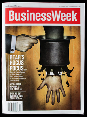
The redesign of the magazine and identity was done by Modernista! (exclamation point theirs), a Boston-based agency that has worked with BusinessWeek in the past, specifically in designing the magazine’s quarterly complement, IN (or INside Innovation for extended purposes), which you may or may not know was somewhat controversial in its disparaging of the design process before launching in Spring of 2006. Despite my contempt for a company named with an exclamation point (are they really that excited about themselves?) I am quite appreciative of the complete visual overhauling of the magazine as a signifier of the effort that BusinessWeek itself did in rethinking their magazine who, according to their story, spent 18 months in the process. And, as an ephemeral reader, I believe the effort shows.
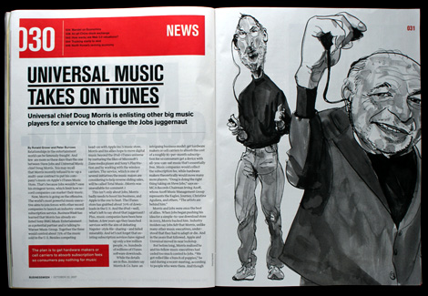
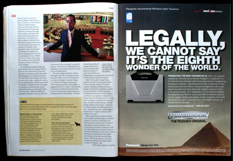
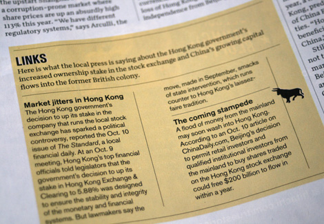
The logo, in this case, is not the most important aspect of the redesign — although the 180-degree shift from serif to sans serif acts as the perfect statement to signify change, shoving the old, stodgy logo out of the way for a new, bold, no bullshit logo in a surprisingly well kerned sans serif typeface that looks to be a customized version of, my best guess at the moment, Univers, but I wouldn’t bet my mortgage on it. It’s inside that the magazine feels more relevant with a clean design and consistent typographic treatments that sway you from beginning to end. Simple size shifts from front of the book to feature stories to back of the book are enough indicators that you are changing sections without resorting to extra fancy opening spreads for the feature stories. I mention this in light of, and as a personal response to, Wired magazine’s opposite approach where each section is all fireworks all the time and the back of the book stories are usually painfully disjointed from the feature stories. But I digress. With its redesign, BusinessWeek has poised itself to play in the same field, in terms of shelf presence as Time, something it couldn’t quite accomplish before. In terms of content, BusinessWeek is going to great lengths in convincing us that this is the best magazine ever and Bruce Nussbaum (devoted contributor to the magazine) claims it’s “a new kind of print medium that will be the model for magazines to copy in the years ahead.” While this may be a happy exaggeration, I am pleased to agree that this redesign feels like a great step forward for BusinessWeek, and I’m almost certain that, when the next redesign happens, I will remember what it’s previous incarnation felt and looked like.
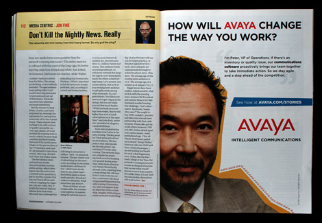
Some images from my crumpled copy for your perusing pleasure.


Jump to Most Recent Comment
damon’s comment is:
I like the magazine redesign, although I too can't really recall what it looked like before. "generic" with a dash of "boring" is probably pretty apt.
it's clean, and basic, but it works.
the modernista! website however, hurts my brain.
On Oct.16.2007 at 11:25 AM
Ryan’s comment is:
I can't say my mind has been blown by this revamp, but at the very least it looks good and I like it better than the previous one. I have a feeling most businessmen and women who read the magazine won't even notice the font change, though.
On Oct.16.2007 at 11:26 AM
Josh Emerson’s comment is:
This is a good update, however, with the heavy use of horizontal lines, the vertical lines look really bad. Especially on the page with the little bull.
On Oct.16.2007 at 11:32 AM
Ty’s comment is:
So many lines! But at least it's not as complicated as Modernista!'s web site...
On Oct.16.2007 at 12:10 PM
Joe’s comment is:
Isn't this black-on-white condensed grotesk channeling GOOD magazine?
On Oct.16.2007 at 12:18 PM
felix’s comment is:
Joe, you hit it on the nose, at least in my mind's eye. Charty. Clean. Underliney.
I smell Bruce Nosebrown. And it stinks.
On Oct.16.2007 at 12:38 PM
Someone’s comment is:
ITS NOT VERY SUBTLE AT ALL
On Oct.16.2007 at 01:46 PM
jody’s comment is:
Speaking of web sites that hurt...Try accessing a second-level navigation item by rolling-over a main-level navigation item on businessweek.com and they all disappear.
On Oct.16.2007 at 01:46 PM
Geof Harries’s comment is:
I think the re-design looks fantastic. My concern is with the website experience. I've already sent a note to BusinessWeek.
1) Why do comments need to be reviewed before they're posted? Don't they have a staff member who can keep up with the community and thus eliminate this type of moderation?
2) In order to view more than a few comments, a new window pops open, away from the story. Then, within that new window, you click a link that opens another window to comment on the story, which is not even accessible. What's up with the labyrinth?
On Oct.16.2007 at 01:58 PM
Greg Scraper’s comment is:
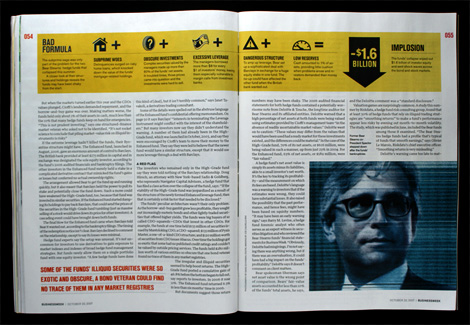
A nice, simple, clean redesign. My only complaint, albeit a small one, is that there's really no need for the vertical lines in between columns that are part of the same story. I think the eye can follow lines of text, and instinctively know to jump to the next line without being forced into a wall. The white space is enough. The rest of the redesign is great though. I love the fact that the style is implicit throughout, but individual stories can have a slightly different look using column formats, picture placement, headline size, etc. Without a steadying hand at the helm, it could get a little overboard, but with the examples I've seen they haven't let it stray too far. And, I love the page number placement, in red no less. Nice.
On Oct.16.2007 at 03:20 PM
C-Lo’s comment is:
At least there conscience of design.
On Oct.16.2007 at 04:10 PM
C-Lo’s comment is:
Ugh wrong conscious. My bad
On Oct.16.2007 at 04:12 PM
ps’s comment is:
i don't mind it i guess, but i wonder if this get's old soon. everything seem very large and bold ...
On Oct.16.2007 at 05:05 PM
Kyle Hildebrant’s comment is:
One thing I will say, that hasn't been said, is that the anti-aliasing on the type of the NAV menu is superb. I'm curious if this was done manually, or it just happened that Photoshop gets along well with the face.
On Oct.16.2007 at 05:13 PM
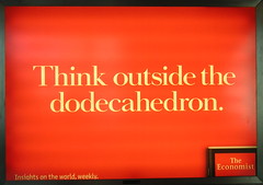
Patrick Wang’s comment is:
I think removing the blue bar was shortsighted. The white type on red background with nothing else is the same logo design as its main competitor, The Economist. At least the blue bar maintained some visual distinction from The Economist's logo.
On Oct.16.2007 at 07:05 PM
Mark’s comment is:
@Jody, you're not sliding your mouse down fast enough!
On Oct.16.2007 at 09:07 PM
Gavan M’s comment is:
Wow. Gorgeous. I like it.
I totally agree with Greg about the vertical rules between columns. Fairly clumsy.
On Oct.17.2007 at 05:35 AM
Chad K’s comment is:
PS - "i don't mind it i guess, but i wonder if this get's old soon. everything seem very large and bold ..."
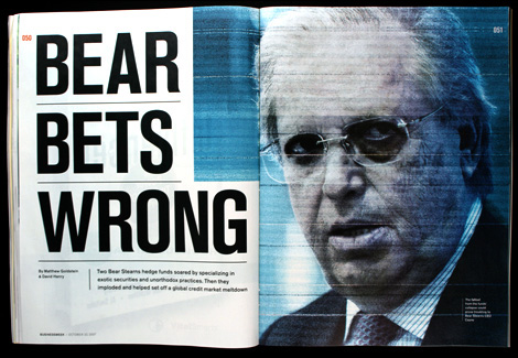
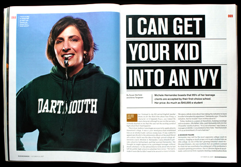
I agree. While the design of the one we see is a nice change–bold and clean. It doesn't leave a lot of room for variations to get creative with articles (but then again, that may be appropriate for a magazine like BusinessWeek). While the bold headlines make for bold and obvious section openers, there isn't much difference between the ominous looking article that opens with, "BEAR BETS WRONG" and the article that opens "I CAN GET YOUR KID INTO AN IVY". While I believe these two articles probably read very different, the bold headings make them seem similar.
Of course this is a periodical an consistency is a great thing. And it's not like if you pick up a Wall Street Journal newspaper there will be any difference between a headline about a stock that has doubled and a person charged with fraud. But it is a magazine that is presented with less limitations that a paper and should allow itself some flexibility.
In all, I think it was a great redesign, and too early to tell if they will stick with this layout exactly (and if so if it will become stale).
On Oct.17.2007 at 08:07 AM
BWJ’s comment is:
I agree with Patrick...first thought was that someone changed the name of The Economist.
Seems like a big oversight...especially in lieu of the recent Economist campaign that has been splashing their red box all over the place.
Consin’s comment is:
"Seems like a big oversight...especially in lieu of the recent Economist campaign that has been splashing their red box all over the place."
Oh rubbish.
The Economist don't own red, Coca Cola does, or is that Virgin, or is that Time magazine, no wait, Levis? no vodafone?, the communist party?
BWJ’s comment is:
When speaking in the realm of weekly news publications...The Economist has a lot of equity in the use of white type in a red box.
If you think wanting to differentiate a brand from competition in the same industry is rubbish...I'll remember to never consult you for sound advice.
On Oct.17.2007 at 11:10 AM
Ty’s comment is:
I agree, BWJ. Consin has it wrong. This would be the equivalent of Pepsi rebranding to red. It's not just the same industry, it's the same focus, field and genre.
On Oct.17.2007 at 12:48 PM
Josh Emerson’s comment is:
@Ty - I completely agree with you guys. However, its somewhat irrelevant since red was already included in the original branding elements. They got rid of the blue bar. It seem that they could have done something to make the blue bar fresh and that would help differentiate themselves from The Economist. I think they missed that opportunity.
On Oct.17.2007 at 01:15 PM
Kyle Hildebrant’s comment is:
I agree with Josh.
The blue bar was a point of equity that could have been easily ported to this news masthead/identity.
Other than that, I really think this was a step in the right direction.
BWJ’s comment is:
However, its somewhat irrelevant since red was already included in the original branding elements.
I don't think it's irrelevant at all.
The Pepsi logo is red and blue..and if they got rid of the blue...they would be found to look a lot like Coke on the shelf.
I would hope that an established firm like Modernista! would understand the aspects of brand enough to not have made this mistake. Sure, aesthetically, it may be a step in the right direction, but if the problem is to reinvigorate, differentiate and help better compete in the market of weekly news periodicals—this solution fails aesthetically and strategically.
On Oct.17.2007 at 06:35 PM
Demetrius’s comment is:
I wonder if they dropped the blue to make it seem less USA business magazine. As well, the redesign feels very "New Euro" I find - speaking with a lots more hipness, authority and of the moment. Will be curious to see if the redesign lasts 5-8 years or longer.
I hear the bits about the Economist. However, I find new article layouts 2nd & after pages remind me more of some other (U.S.) competitor I've not touched in awhile. Too, I feel a certain dryness I've seen in political 'journals' with a dense sense of text. (In general, the Economist's text breathes better - well, easier - than this does).
On Oct.17.2007 at 10:29 PM
Dale’s comment is:
Some important context is missing from this discussion. Inevitably, one of the reasons BusinessWeek redesigned is to shore up their positioning vis a vis Conde Nast's new, extravagantly funded business magazine, Portfolio, which recently launched with much fanfare after poaching major talents from other business titles.
Portfolio's design is heavily invested in serifs, and the self-consciously italic "f" in the logo has been much mocked in media circles. The entire art direction is traditional and a bit precious--if v. well executed.
With this redesign, it looks like BusinessWeek, one of the big three establishment bizmags (with Fortune and Forbes) is trying to assert that it's more vital, more modern, more direct and hard-hitting than the comparatively pauncey Portfolio.
I think this is where the new very sans-serif logo is coming from--I find it bland and feel like the two words have lost differentiation. This is the kind of stark treatment that works much better with a short strong word like "GOOD" (magazine). Inside treatments seem fresh, however, and will help with the positioning.
On Oct.18.2007 at 12:09 AM
Von Glitschka’s comment is:

Seems a little boring. Maybe spice it up a bit?
On Oct.18.2007 at 03:55 AM
Josh Emerson’s comment is:
The Pepsi logo is red and blue..and if they got rid of the blue...they would be found to look a lot like Coke on the shelf.
Looks like the good folks at the Economist are now using blue in their design. Sorry seems pretty irrelevant now.

Brian Bush’s comment is:
Feels ham-fisted, inelegant.
Not impressed at all.
On Oct.18.2007 at 01:53 PM
John Chennavasin’s comment is:
This reminds me of the recent Car and Driver magazine redesign. Also, the typeface used in the redesign is Akzidenz Grotesk.
On Oct.18.2007 at 02:01 PM
Cc’s comment is:
Given the context and the intended audience, it is definately a step in the right direction. I would not expect it to be ground breaking stylistically. Why reduce the value of design to how "pretty" it looks? If everything was groundbreaking, then nothing would be.
I think it is utilitarian and more functional than before. I think the intended audience will find that a welcome change.
Who knows exactly who their direct competition is?? Unless you were part of the design or strategy team, you'll be speculating forever. Why not celebrate the fact that they realized they needed a change?
On Oct.18.2007 at 02:54 PM
Dave Barnes’s comment is:
As a reader/subscriber since 1969, I hate it.
I immediately thought "low rent Economist ripoff".
TheRG’s comment is:
The logo is not unique and I do not think it's a ripoff of The Economist. There have been many other white-type-on-red-rectangle logos:
Life
OK!
Q
etc.
I do like the new design though.
On Oct.18.2007 at 11:21 PM
Enrico Limcaco’s comment is:
I like it. But I also miss the look of Fast Company's glory days.
On Oct.19.2007 at 12:11 AM
Ty’s comment is:
Yes, let's model the BusinessWeek design off of the standard for excellent journalism: OK!
On Oct.19.2007 at 08:05 AM
Armin’s comment is:
I'm a little surprised by the concern of BusinessWeek looking like The Economist, OK!, Life, etc. I'm on the camp of "it's no big deal". NO ONE owns white type inside a red field, much like no one owns white type inside a blue square. The point of differentiation comes in its use: BusinessWeek uses its logo from edge to edge in their magazine, The Economist (which is a serif AND breaks the name into two lines) uses its logo not even half the width of the magazine, and even LIFE had a peculiar use to it it that no other magazine can mimic.
I agree the blue line could have been kept, but as differentiator from the Economist I don't think it's a matter of life and death. Both magazines feel VERY different from each other, and it's the overall design, implementation and attitude that creates the distinction, not just the logo.
On Oct.19.2007 at 08:35 AM
zia’s comment is:
I very much like the masthead type treatment. It's clean and distinct and will draw the right kind of attention on a crowded magazine stand.
On Oct.19.2007 at 05:50 PM
Michael’s comment is:
I beleive that the new logo was a complete mistake. The redesign of the magazine is very good but the logo should remain unchanged! The old logo is much more powerful and recognizable. The first time I saw the new logo on the BusinessWeek website I though that I was on the wrong webite. Why change your logo if is perfect?
On Oct.25.2007 at 05:04 PM
Ivan Philipov’s comment is:
Re: the Business Week site, I thought I was looking at the new CNN site at first glance.
On Oct.27.2007 at 06:10 AM
Ethan’s comment is:
I like the visual redesign. I like the content redesign even better.
I've read the magazine for several years, and it feels like the editors asked themselves, "Well, the internet is kicking our ass in news. But what can print still do better?" I'd say 3 things: in-depth, context, and density (a la Tufte's 'data density' concept). And it seems they're doing just those things.
The redesign is a helluva lot better than the recent (and painful) Business 2.0 redesign, which claimed to bring the best aspects of the web into print--an impossible task which that magazine's demise partly proves.
On Nov.02.2007 at 12:03 AM
Jacob’s comment is:
Quite honestly, I don't care for the new design ... or the old one. The content's greater than before, and though it's a bit upsetting going through change, I think most of us will get used to it pretty quickly.
On Nov.08.2007 at 10:33 AM
Julius May’s comment is:
New format is terriable makes the magazine seem skimpper in pages. Table of contents is worthless and numbering the pages as 007 and so.
Terriable bring back the old one easier to read and follow stuff this one is horrrrrrrrriable.
On Nov.28.2007 at 04:47 AM
james’s comment is:
as a reader, i noticed the change immediately.
while i'm certainly not a fan of anything as gaudy and erratic as Wired's logo ~ the logo change was bland and I felt rudimentary in its execution (i immediately thought - "looks like it was designed 40 years ago" ~ maybe a miss placed sentiment, but my gut reaction was displeasure.)
it still rubs me the wrong way - almost as if I paid the $$$$$ to have it redesigned, only to get this overlooked placeholder of a banner ~ like the design guys ran out of time to come up with something more refined & distinguished in order to meet my deadline.
the internals, however, I think it looks like a nice improvement.
gary radnovich’s comment is:
Need more pages magazine is so skimpy these days!!
Poor design and content should get rid of wine reviews who cares about this its a magazine covering News not wine
Gary "mr good or bad knowledge" radnovichi
gary@knbr.com
On Dec.02.2007 at 03:10 AM
David ’s comment is:
I hate the redesign.It seems totally gratuitous to me.I had to cancel my subscription because the reading experience became too unpleasant.I say fire all involved.
On Jan.28.2008 at 06:03 PM
Kyle’s comment is:
What is the new font that BW now uses anyway? Looks sexy..
On Mar.08.2008 at 03:20 PM
Comments in Brand New, V1.0 have been closed.


