


This is why I love our readers: David, aka “Logo Fiend” has dug around United States Patent and Trademark Office’s Trademark Electronic Search System (TESS) and found the registered work for the new Pepsi, Mtn Dew and Gatorade work. Now, this doesn’t mean it will all be used or that this will be its ultimate form, but if it’s been registered or trademarked it sure won’t be too different. I alluded to a scoop in the previous post, but this is not it, this is a bonus! So, thanks David, and enjoy everyone.
Continue reading this entry
![]()
(Apologies for the delay on this one, I have been sitting on it since Wednesday, because there was, still is, a possibility for a bigger scoop. So if it happens I’ll just post it separately). This is possibly one of the biggest rebrandings that will take place over the next months/years as was announced this week that Pepsi will be revamping the design and identities of their key brands, in light of the decrease in sales with drops between 2% and 5% in different beverage categories. No visuals, other than the logo above, have been released so this is definitely a preemptive review of the work done by New York-based Arnell Group. There is plenty of quotables from the only two sources that have reported on the imminent change, so let’s get to those.
Continue reading this entry![]()
Before I did the obligatory Googling if you had asked me what Memorex does I would have said recordable CDs and DVDs, period. I would have never guessed that they also sell TVs, DVD players, and all sorts of other audio equipment. This is perhaps as much my fault for not staying on top of my consumer electronic brands but also a reflection of the saturation point that Memorex achieved with their ubiquitous packs of CD-Rs and DVD-Rs. This past September, Memorex — self described as “one of the most trusted and recognized consumer brands in modern marketing history.” — unveiled a new identity that, apart from signaling change it shifts its focus and attention to a female consumer.The S
Continue reading this entry![]()
I will preempt this post by saying that this may or may not be an official long-term change for HP. There has been no press release and no change on their main web site, but the use of this reworked logo has been making enough appearances to consider it a low-key rollout. I first saw the logo on a TV ad for HP’s Touchscreen PC — and I would recommend watching the ad as it is pretty awesome — and then it has been popping up in print ads in a variety of mainstream magazines, including Wired, where the logo shown above comes from. The evolution looks interesting, I definitely like the removal of the holding shape which has always, to me at least, made it look more like the logo for a dishwasher. I also like how the circle now “masks” the italic hp letters, it gives the sense of there being more beyond what you are looking at. The shading doesn’t look great in the image above, but it’s a nice subtle execution, as opposed to the clunker two posts down. A nice, punchy evolution.
Update: A clean version of the new logo has kindly found its way into my inbox. Refresh your browser to see it.
![]()
Quick Note: The opening image above is not exactly a before/after of logos, more of a visual language before/after.
I have always had a soft spot for orange sodas, there is something about the combination of magic syrup, orange and bubbles that is just fun. In Mexico the undisputed taste champion (at least in my personal tests) was Orange Crush and I guess the funky glass bottle it came in had something to do with the experience. A close second was Fanta. So, yes, that was an odd segue to bring us to the subject at hand, but I really wanted to link to the Orange Crush bottle. With more than 70 flavors (including mind-benders like Banana Fermented Milk, Mellon Vanilla and Mint Raspberry) in 180 markets around the world, Fanta, from the Coca-Cola family of products, will be implementing a new identity designed by San Francisco-based Office.
Continue reading this entry![]()
A leader in the production and distribution of gas-based domestic appliances, Emegé (pronounced, roughly, eh-meh-heh) is a 75-year-old, family-owned corporation based in Argentina, slowly growing into the international market. With six logos logos since its inception and the latest update in 2003, Emegé has released a contemporary new identity designed by Buenos Aires-based Brea, García Barra y asoc..
Continue reading this entry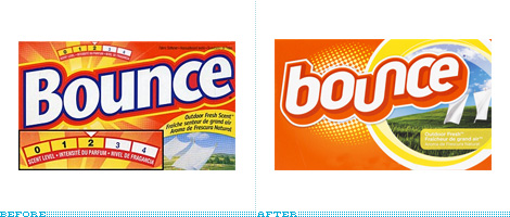
It is significantly difficult to get excited about dryer sheets — those scented thingies you put in the dryer to make your clothes smell better and cling less to your underwear — but this redesign is relatively exciting. Bounce, a product from the infinite P&G empire, recently launched a complete redesign of their full line of dryer sheets, which come in a variety of scents and styles. A large variety.
Continue reading this entry![]()
Of all the industries or products to discuss logos about I never thought that ceiling fans would be one of them. While not a tremendously exciting rebranding, I think it’s important to highlight products and organizations that may be less glamorous or sexy — because fried chicken is so sexy. Hunter Fan Company, established in 1886 by a father-son team of John and James Hunter that started by making ceiling fans and now purveys other kinds of spinning blade mechanisms and air-influencing machinery, recently changed their logo in what they are calling “the biggest brand overhaul” for the company. I sure hope so. The old logo, if you can even begin to ignore the shameful volumizing, was a charming wordmark — perhaps even with a dash of cool a la Von Dutch — but it was definitely dated. With that name and that execution, and not being familiar with the brand, it felt like a logo moe in place on the side of a rifle. The new logo, which may not have the personality or exuberance of the old one, is at least more elegant, softer and like it would exude more confidence in hanging one of their products over your bed. My favorite part is the color combination, there is something very pleasant and contemporary about it — in combination with the script typeface it reminds me a lot of Harrods, which is a good thing. As opposed to the old logo, the new one looks to be a typeface out of the box instead of a more personable custom script. Even so, anything that rids us of bubblified logos is a win.
Thanks to Jason Williams for the tip.
![]()
On June 30th, SABMiller plc and Molson Coors announced their joint venture Miller Coors to consolidate resources and compete with greater combined force in the U.S. market. From their first press release Chief Executive Leo Kiely states “MillerCoors will be entrepreneurial, with the ability to operate with speed and agility in the marketplace, backed by the powerful combined resources of two exceptionally successful companies. We will drive profitable growth and bring new energy to the U.S. beer industry. Our focus now is to deliver on the $500 million in identified annualized cost synergies by improving sourcing across our eight major breweries, building a streamlined organization and leveraging the scale of the new company. Our talented people are experienced and passionate about this business and — importantly — are determined to win.” For the face of this new company, Pentagram’s partner Michael Bierut, and designers Katie Repine and Ben King developed a logo based upon the view of a glass of beer from above.
Continue reading this entry![]()
Grupo Bimbo, one of the largest food corporations in the world based in Mexico City with a strong presence in Latin America, and famous for its delicious snacks and ubiquitous bread, has been making headway into the baked goods market in the South American country of Uruguay by purchasing El Maestro Cubano (“The Cuban Craftsman” could be a proper translation in meaning), a leader in that category. The new, revitalized logo has been executed by Uruguay-based Kabala, who had previously done packaging for Bimbo and are now heading the design of the packaging. The brief was as simple as it gets: Make the logo fresh and relevant, stick with the same elements. With the complicated discussions around vaguely disclosed strategies we read on press releases, it is rather nice to just be able to look at a no nonsense graphic execution. The old logo was charming and the typography most likely the result of an original sign painting outside of the first store — I’m just romanticizing here, I don’t know the story of the logo — while the new one fits perfectly in today’s world of consumer good packaging and icons. The typography — set in Myriad Pro Black Italic (I never would have guessed) — is clean and friendly, and pretty much the same can be said about the baker. The elements are well integrated and the colors more in tune with the flagship brand of Bimbo. A very hearty update for this purveyor of (what I’m sure are) delicious treats.
Continue reading this entryPrevious Page | Next Page
(Total Number of Pages in Consumer products: 4)


