

NOTE: This is an archived version of the first incarnation of Brand New. All posts have been closed to comments. Please visit underconsideration.com/brandnew for the latest version. If you would like to see this specific post, simply delete _v1 from the URL.

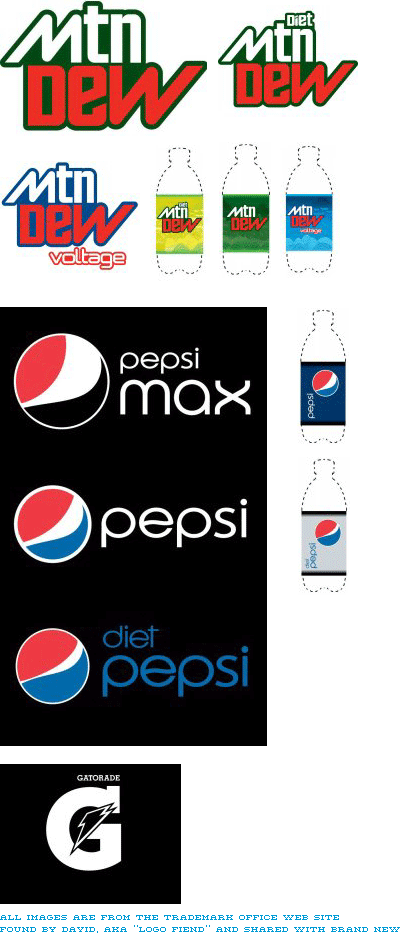
This is why I love our readers: David, aka “Logo Fiend” has dug around United States Patent and Trademark Office’s Trademark Electronic Search System (TESS) and found the registered work for the new Pepsi, Mtn Dew and Gatorade work. Now, this doesn’t mean it will all be used or that this will be its ultimate form, but if it’s been registered or trademarked it sure won’t be too different. I alluded to a scoop in the previous post, but this is not it, this is a bonus! So, thanks David, and enjoy everyone.


Jump to Most Recent Comment
James’s comment is:
That Gatorade is horrible. What's with the double stroke around the bolt? Maybe the color version is better, though the MtnDew logos do not fill me with confidence. Pepsi type is nice, but the E needs a bit more wiggle, no?
On Oct.22.2008 at 10:20 AM
reyarts.com’s comment is:
Pepsi has lost its spirit guide and sense many years ago...
So sad.
Chaac’s comment is:
Please say it isn't so! The new Pepsi identity would be awful. I hope the brand managers read this post as the critics grow more negative (that I think they will) for them to rethink it.
I really dislike it. It looks unbalanced, asymmetric, un-thought and soooo unnecessary from my point of view. Yuck!
And please don't get me started with the Typography. What the hell is wrong with that wiggling letter "e"? is it sick? BAAAAAD DECISION.
On Oct.22.2008 at 10:22 AM
helloMuller’s comment is:
MTN DEW? SRLSY?!
On Oct.22.2008 at 10:27 AM
dan’s comment is:
why on earth would you change gatorade (which is starting to own the lightning bolt, nike swoosh style) to a cap G which means nothing and is not ownable. this is awful. looks like bad 1st year design student work.
On Oct.22.2008 at 10:29 AM
tom selleck’s comment is:
What a giant soapy douche of a new brand. WTF??
On Oct.22.2008 at 10:32 AM
plamen’s comment is:
This is a joke, right? Like the Ford April Fools post?
I pray this will never reach Europe!
On Oct.22.2008 at 10:34 AM
mm’s comment is:
The 'new generation' of the 80's has grown up and now works for an array of soulless multinational corporations with swishy orb logos.
It makes sense that Pepsi would update their identity to match.
On Oct.22.2008 at 10:35 AM
Rob’s comment is:
The concept I get, but c'mon that is not even visually balanced.
On Oct.22.2008 at 10:37 AM
mm’s comment is:
I hate to admit it, but the mtn dew logo patch works for me. It fits in the extreme sports branding landscape. I could see that patch pasted next to array of skate and snow logos on the back of a beat up van next to a skate park.
On Oct.22.2008 at 10:38 AM
Andrew’s comment is:
Something about these logos has lost the longevity that the originals seemed to have. They're pretty much starting fresh, but that doesn't seem to be a good thing. These logos don't fill me with excitement, especially for a brand that seems to try and be more exciting than the product it sells.
On Oct.22.2008 at 10:42 AM
thehappyhuskie’s comment is:
I think the "e" sums up my feelings exactly on this...sick to my stomach.
The Mtn Dew voltage logo is esp. terrible, since the solution is only half way there.
I gotta agree with dan's comment that Gatorade's Lightining Bolt was as recognizable as Nike's Swoosh, and it does look like a first year design student's work!
My question, why, why, why, the complete redesign? What happened to us just saying no as designers? Why do we try to improve everything? I guess thats prolly why I am where I am.
On Oct.22.2008 at 10:45 AM
jenny’s comment is:
I like the new Pepsi ones (reminds me of the '80s Diet Pepsi branding), but the S looks weird. It needs to be more Bauhausy, I think.
The Mtn Dew ones. I wouldn't have rounded off the M and the W, because, like, mountains are pointy. Also, what exactly IS Mitten Dew, anyway?
On Oct.22.2008 at 10:46 AM
Craig’s comment is:
HAHAHAHAHAHAHAHAHAHAHAHAHAHAHAHA! This is such a joke that its not even worth any serious discussion.
On Oct.22.2008 at 10:47 AM
Louis W’s comment is:
This HAS to be a joke. That MTN DEW is disgusting. Can anyone say first year college design class project?
PS: I did a search on the site linked above and it returned nothing matching the icons above. Not to mention the quality of all the images in their library are 2bit, not full color.
On Oct.22.2008 at 10:52 AM
ckck’s comment is:
Oh my, this is shaping up to be a train wreck. One big gloriously spectacular train wreck.
I mean, what's with the snarling 'e' in pepsi? I know it's supposed to be the wave of their old logo, but really, it only looks like a snarling mouth.
On Oct.22.2008 at 10:57 AM
Oak’s comment is:
Is it just me, or is does the "e" in pepsi appear to be belching? (Hint: think "Homer Simpson: Season 1.")
On Oct.22.2008 at 10:58 AM
Jonathan’s comment is:
The weird "e" would actually be a nice allusion to the old logo. If only they'd keep it!
On Oct.22.2008 at 10:59 AM
Roiby Gonzalez’s comment is:
That Gatorade has to be a joke.
On Oct.22.2008 at 11:03 AM
Jeff’s comment is:
L O L
On Oct.22.2008 at 11:05 AM
Ryan’s comment is:
Wow... one thing I loved about Pepsi and its products were its branding decisions. What's left? :-( I would reconsider.
On Oct.22.2008 at 11:05 AM
Ethan Gardner’s comment is:
That Mountain Dew logo is terrible.
On Oct.22.2008 at 11:10 AM
Renee’s comment is:
These are possibly the worst logos I've ever seen in my life. Were they done by a designer in their first year of college?!
On Oct.22.2008 at 11:12 AM
john.q’s comment is:
this has to be a joke. it's horrible beyond belief.
On Oct.22.2008 at 11:14 AM
Jw’s comment is:
I can take or leave the new Pepsi mark... I like it a bit better when it's not MAXed out or slimmed down... I've never been a fan of Pepsi's typography in any iteration.
The Mountain Dew logo, however, I find appealing. Feels playfully 70s to me.
On Oct.22.2008 at 11:25 AM
marnie’s comment is:
I was thinking of this change this morning while standing on a corner waiting for the light to change. A Pepsi truck rolled by, blue with the logo and the name prominent and simple. And it made me wonder what the new trucks would look like and how they would handle a whole array of logos. It seems like having so many variations weakens rather than strengthens the brand identity.
mtn dew amuses me. It doesn't work for me at all but I am not their target demographic and I suspect that group already call it that in text and chat anyway.
On Oct.22.2008 at 11:28 AM
Paul’s comment is:
Where's the logic in the Pepsi marks? I get the Diet Pepsi/Pepsi relationship and the Pepsi/Pepsi Max relationship, but when you apply either of those to the overall Pepsi brand, which of the following is true? Does Diet Pepsi have less caffeine than Pepsi, or does Pepsi Max (a sugar free product) have more sugar than Pepsi?
Also, if it's supposed to be a smile, shouldn't it be rotated clockwise about 90 degrees?
On Oct.22.2008 at 11:29 AM
Rodrigo Müller’s comment is:
oh my good Lord... forgive the responsibles for these lame changes...
On Oct.22.2008 at 11:30 AM
Brian’s comment is:
Atrocious.
On Oct.22.2008 at 11:35 AM
ArnoldP’s comment is:
CTRL Z!!!! CTRL Z!!!!
On Oct.22.2008 at 11:40 AM
Nancy Pelosi’s comment is:
OMG! What a train wreck.
On Oct.22.2008 at 11:54 AM
Clint!’s comment is:
Wow, seriously dissapointing.
On Oct.22.2008 at 11:55 AM
damon’s comment is:
sucks
On Oct.22.2008 at 11:55 AM
Swifty’s comment is:
None of the logos read as a smile to me.
The problem I have is that the 'e' in the wordmark and the new 'smile' logo don't look intentional.
On Oct.22.2008 at 12:00 PM
John McCollum’s comment is:
I like the idea of making the logo smile.
I hate the idea of making a smile the logo.
On Oct.22.2008 at 12:03 PM
Leslie’s comment is:
Louis W, no offense, but it seems you didn't search that hard... New Pepsi logo
On Oct.22.2008 at 12:05 PM
John Mindiola III’s comment is:
This is, by far, the most disgusting thing I've ever seen in my life. I'm not exaggerating. This is the reason why other people think graphic design isn't a real job. Please tell me this is some sick joke. Please.
On Oct.22.2008 at 12:09 PM
Dale’s comment is:
yuck.
I just don't understand. I don't care how many times someone tries to explain it, there simply wasn't anything wrong with the iconic logo they had (have?).
It's just plain trash to me, now. I think I might have to switch to Coca-Cola.
nail’s comment is:
The Gatorade logo can't be real so i'll pretend i didn't see it.
As for the Pepsi logos, I appreciated the idea of carrying a concept through each product logo, but the execution and the type leave much to be desired. The "smile" just feels very awkward and unrefined.
As for the mountain dew logo..I'm left scratching my head. It feels like a Ski Resort logo from the 80's.
While I like the simpler and more minimalist approach to the packaging, the logos don't hold their weight on their own.
On Oct.22.2008 at 12:12 PM
John Mindiola III’s comment is:
damn, it's not a joke. i saw those images on the site. is this part of the 80s ugly design movement? this makes me sick. i will stop buying pepsi products if this is the garbage they are going to put out. absolutely atrocious.
On Oct.22.2008 at 12:15 PM
Fubiz’s comment is:
Ugly !
On Oct.22.2008 at 12:22 PM
Diane’s comment is:
And I thought the new Animal Planet logo was the worst redesign I'd ever seen.
While I actually could of understood them redoing how the Pepsi Logotype worked I cannot not express enough distaste for that "smiling" circle. It's so horrible I can't believe someone is getting paid millions of dollars to do this. Just think they could of gotten any college student to do it for free Pepsi for life. Anyone who thinks these are examples of an amazing redesign should be shot in the face.
On Oct.22.2008 at 12:24 PM
JonE.’s comment is:
Wow, seems like nobody likes this redesign...and neither do I.
The mnt. dew looks like a horrible design from the 70's and 80's. Usually, when done today, would have a flare of contemporary design, this does not. Its even kinda disgusting me.
I can understand the pepsi re brand a little better now, but its still hard for me to understand the direction. Visual people will not get the 'smiley' concept immediately, so the least they could do is rotate it to 90 degrees. I agree with someone who said the 's' in pepsi needs to be more buahausy, it looks like comcast's new S. And the 'e'...if you are going for that swirl, do it all they way.
As for gatorade...what can I say that hasn't been said? Sad.
On Oct.22.2008 at 12:26 PM
Rob’s comment is:
This is seriously weak. Pepsi must have went into some first year visual communication students to save money!
On Oct.22.2008 at 12:34 PM
Evan’s comment is:
The first thing I thought of on seeing the proposed Pepsi logo type was it was for some sort of antacid relief medicine. The "smiles" concept needs some work.
As for Gatorade, the main recognizable image with that brand is the lightning bolt. The new big G, little bolt looks like a bad sweatshirt logo for some junior high team.
Please hit the reset button Pepsi!!!!
On Oct.22.2008 at 12:42 PM
Prescott Perez-Fox’s comment is:
I like the new mtn dew logo, but I don't understand the need to abbreviate. Is the word "mountain" out of style?
IMHO, that Pepsi stuff = FAIL.
On Oct.22.2008 at 01:18 PM
Anonymous’s comment is:
I'm still not going to have a strong opinion either way yet until I see finals – but I don't particularly like the direction shown here.
I *almost* like the Mtn Dew mark, and the standard Pepsi isn't bad – but the rest feel slapped together, which they very well may be just for trademark purposes.
On Oct.22.2008 at 01:26 PM
lol’s comment is:
Mtn Dew lol
On Oct.22.2008 at 01:29 PM
matt’s comment is:
I agree with most here that the new identities suck ass. The 'MTN DEW' is especially horrible. It looks as flat and as static as possible. The old logo and can design had life, full of energy, about to fly off the can. I'd be suprised if this one can even move without a walker. And they couldn't line the 'N' and 'W' up any better than that, gimme a break.
At least this Mountain Dew logo showed me I was gonna be on it and bouncing around after I finished the drink

Michael’s comment is:
1.2 billion over three years. I guess when you're tired of playing second fiddle, you've got to play louder to get noticed -- and sometimes jab yourself in the eye with your bow in the process.
If I'm Coke, I'm leaving my look alone, donating 1.2 billion in aid to developing countries, and running comparison ads to show how Pepsi spent their 1.2 billion on (what is looking like) a crummy face lift.
On Oct.22.2008 at 01:43 PM
jakeBang’s comment is:
GOD! NOOOOO... xD
On Oct.22.2008 at 01:59 PM
Doug’s comment is:
UGH. This is some of the most atrocious redesign work I've ever laid eyes on. Is Mountain Dew now falling prey to text message grammar? Some suit at PepsiCo must 'love' the symmetry of the M and W.
The new Pepsi logotype looks more appropriate for a lipstick brand. I'll give the Pepsi line three years before a return to the more traditional approach. Bad, bad, bad.
On Oct.22.2008 at 02:13 PM
dave’s comment is:
What has happened at Pepsi??? These logos really suck! They can't be serious about this.
On Oct.22.2008 at 02:15 PM
Jimmy Marks’s comment is:
The term "fart in church" comes to mind.
Also: mtn dew...

colormist’s comment is:
"I feel this has the potential to be quite good and groundbreaking — specially when you consider the masiveness of Pepsi — but just as well it can easily be trite, corny and lame." - By Armin on Oct.20.2008
I admit, I also had high hopes for the slight shift in the logo design. I guess we gave them too much credit. These are clearly trite, corny, and really lame.
I don't see a smile in the pepsi logos. My brain keeps trying to equate their sizes to the ingredients, but it doesn't work that way, then my head hurts and I go buy Coke instead. Pepsi's branding team has always disappointed me. Why do they constantly feel the need to change their brand??
On Oct.22.2008 at 02:23 PM
nick’s comment is:
Smile or not these are executed really porly. When i look at it i see pepsi is "normal", diet pepsi is thin, and pepsi max is "fat"? For a low calorie drink this is very misleading. Dosn't seem like the message you want to send.
On Oct.22.2008 at 02:27 PM
eric’s comment is:
Wow, these are really bad. The smiley icon doesn't even make since when it's rotated so much and the type is horrible. What's the deal with the "e"? I get the reference to the old logo but why? I can't say I ever really liked pepsi's type much so nothing has changed there.
The wider white smiley face just makes me think about how much more fat my gut will get if I drink the Max instead of the diet. (if that makes since at all)
I actually don't mind the new Mtn Dew. I think it fit's there target market and it could work much better on small cans. The colors are horrible though so I hope those get adjusted.
On Oct.22.2008 at 02:28 PM
John McCain’s comment is:
¡I think this is a great logo! It will eventually win the hearts of the american people, just like my great campaign. I endorse it!
On Oct.22.2008 at 02:39 PM
three’s comment is:
i'm not sure how i feel about this. the old logo is pretty iconic..
On Oct.22.2008 at 02:45 PM
Katie’s comment is:
Because the cafeteria where I work only sells Pepsi brand products, I drink Tropicana and Dole Juices and MUG root beer (I refuse to drink Pepsi Cola, though. That stuff is gross).
However, after this crap-tastic (and unnecessary) redeisgn, not to mention that Pepsi's products are too sweet and just generally nasty-tasting, I'll have to start hiding a case of Coke under my desk and stashing some Honest Ade, which is owned by Honest Tea, a subsidiary of Coca Cola, in the department fridge for myself.
I agree with a few other commenters that the Mtn Dew badge looks like a dated 70's patch, and not in a good way. I never really cared for the old logo, but after seeing this, I have found a new appreciation for it.
The Gatorade logo is horrible. I really liked the lone bolt. It stood on its own and didn't slap you in the face with the obvious. It was quiet, reserved, but powerful and edgy. The lone bolt was classy, on a level with Apple and Nike, which, I think is the apotheosis of logo design. Now, as Evan pointed out, it looks like a junior high school's sweatshirt logo.
SMILE!!! Like, omigod. The new Pepsi logo is, sooo awesome! Its, like, a smile, only its not. See? Its still just like the old Pepsi logo, but tilted and smiley!!!! It is soo cute. You don't even have to work that hard to find the "surprise" in it. Like, the FedEx logo? Its got that lame aarow in the middle of the E and X. Not everyone knows its there, cause its like, sooo hard to find. Right? So what Pepsi did here is like, take all the guesswork out of it and just give you what is basically a smiley face!!! GOD, how 70's!! Isn't that when that yellow smiley face came into fashion or whatever? I guess. NE WAY... Some ppl would say that the logo is all convoluted and dumbed down, but WHATEVER. The typography is awesomely off balance with the symbol. I mean, who wants everything all balanced and stuff NE WAY? Whatever... I *heart* that the different symbols for the different Pepsi products are different kinds of smiles. It doens't look like a mistake AT ALL. And I can totally tell that Pepsi Max is a grin or whatever.
Pease out, ppl.
On Oct.22.2008 at 02:48 PM
Wes’s comment is:
I like it. It's bringing back retro. Hopefully, though, it won't be continued throughout branding.
On Oct.22.2008 at 03:05 PM
Ronlewhorn’s comment is:
Pepsi looks like a blue sticker being peeled off a red sticker. It is currently such a balanced and recognized icon! It also screams "Airline" for some reason.
Mt. Dew Looks like a generic rip off version. Like BigK Mountain Mist. So cheap.
Why would you take away such a killer icon of the lightening for gatorade. If anything simplify and clean up the look with JUST A LIGHTNING BOLT ! that'd be stellar!
Ronlewhorn’s comment is:
I think this is a joke. Seriously. Someone is leaking false info. Dan was probably right with it being a 1st year design student's work. No respectable company like Pepsi would desaturate their brand like this.
On Oct.22.2008 at 03:26 PM
Manolis Gerasidis’s comment is:
"MtnDew" looks like some student's work!!! "Gatorade" seems like it was done in 2 minutes and has many problems. The idea of an "organic-modular" logo that changes on each product is good but i think the execution sucks. And that shaky "e".... as someone mentioned before, if you are going for that swirl, do it all they way.
The whole redesign of all these brands seems like a joke!
Matt’s comment is:
seriously, this looks like student work. why would they rebrand these three product lines and not the others (Tropicana, Sierra Mist, Quaker, etc)? looks like crap and doesn't make sense.
On Oct.22.2008 at 03:54 PM
moeed’s comment is:
Hideous. All of it. Everything.
On Oct.22.2008 at 03:56 PM
Pedro Rocha’s comment is:
And people are already spoofing the new Pepsi brand identity...
Pepsi's smile is turning into an embarrassing grin... http://willitbrand.blogspot.com/2008/10/pepsis-embarrassing-grin.html
On Oct.22.2008 at 04:03 PM
Jeremy’s comment is:
AWFUL AWFUL AWFUL. What an enormous step in the wrong direction. The Pepsi brand used to be so iconic...now it's a joke.
On Oct.22.2008 at 04:08 PM
tom selicks'moustache’s comment is:
BOOO.....What are they trying to do...Un Brand it. Gatorade is rookie style, Mountain Dew Blows....Pepsi is ok, but not much different. How many millions of dollars went into this crap?
On Oct.22.2008 at 04:12 PM
phoebz23’s comment is:
BOOOO!!!!!!!!!!
it is bad, very very bad. Why would you change something
that has worked for so many years!
BOOOO I say BOOOOOOOOOOOOOOOO!!!
I hope they read all of the feedback here and realize what
a travesty this would be!!
rickyaustin’s comment is:
I did think skiiing when i saw the Mtn Dew logo.
It's nothing to write home about, but the old mountain dew identity isn't exactly the Nike logo. I wouldn't miss it if it changed. It could definitely use a cleanup.
On Oct.22.2008 at 04:28 PM
Wünderwoman’s comment is:
Come on...quit your bellyaching...this stuff is fresh.
I asked all the designers at my studio and we agreed. It's nice. I like the application...and I'm starting to warm up to the new icon.
I think it's a good thing for Pepsi.
Well done.
Matheus’s comment is:
What can I say?
LOL
On Oct.22.2008 at 04:41 PM
gwer’s comment is:
If they want to hav a retro identity, it's a strong redesign, but i think it's a little outdated. It's a bit late for retro..
It's like start to use lime from now on, or only create vintage/worn-off images....
On Oct.22.2008 at 04:52 PM
Jordan’s comment is:
I think, or at least, I hope the Gatorade and "Mtn" Dew logos are experimental. Maybe they are just for the public to decide. The pepsi logos arent bad, I like them, but there just not pepsi. The look like the new tropicana logos. or xerox
On Oct.22.2008 at 04:53 PM
Wil’s comment is:
What has always bothered me about mountain dew, besides its new logo treatment, is the fact that it's named mountain dew. With all the gradients, swooshes, and angles in the current logo, I never took notice in the name; however, the new logo, it just makes me think of magical trees seeping special dew owned by gnomes high up in the mountains. Shady business.
I think the logo went from mountain dew to mountain douche.
On Oct.22.2008 at 04:58 PM
matt’s comment is:
I was unaware that the gatorade logo was now just the lightning bolt until reading some people's posts and checking out the website. It doesn't even say Gatorade on it, just the bolt. How cool is that when your logo doesn't even need the type anymore, That's as good as it gets, like the nike swoosh,
SO WHY GO AND CHANGE IT??? fkn retards...
On Oct.22.2008 at 05:11 PM
JR’s comment is:
I guess I get the pepsi logo, but I really just want to smack the sneer off that e's face.
I don't mind the Mt Dew logotype, since a) it reads as young and sporty and b) the 13-25 year old guys who do drink it probably won't care that it got a makeover.
That Gatorade logo is so sad. No energy at all.
On Oct.22.2008 at 05:20 PM
Nic Taylor’s comment is:
oh my... this is depressing... so much so that I hope the people who gave pepsi a face-lift (or more like a punch in the face) don't re-do the prozac logo cuz I'm gonna need enough of it just to get over the pepsi design...
yucky...
I feel like I need to go take a shower after looking at this dirty stuff...
On Oct.22.2008 at 05:34 PM
AK’s comment is:
I noticed the width of the "smile" changes from Max (most) to Diet Pepsi (least). Clever, but the logo still is too "Web 2.0" for me.
On Oct.22.2008 at 05:45 PM
blerb’s comment is:
this is the product of an ill-informed marketing team and a design agency that's willing to bullsh*t its way into logo reasoning.
Flowery descriptions and marketing research aside this = amazingly average.
Too bad Pepsi Co.
On Oct.22.2008 at 05:57 PM
mm’s comment is:
Can I have their old logo now that they aren't using it?
On Oct.22.2008 at 05:57 PM
koyo’s comment is:
HORRIBLE!
On Oct.22.2008 at 06:14 PM
mm’s comment is:
> "I noticed the width of the 'smile' changes from Max (most) to Diet Pepsi (least). Clever, but the logo still is too "Web 2.0" for me."
I think that's a representation of weight loss. The logo's jeans fit better as you move toward diet.
On Oct.22.2008 at 06:20 PM
marky’s comment is:
ok, i'm a long time reader, but i've never commented here before. until now. this stuff is just so heart wrenchingly awful that i have no recourse but to voice my distaste. here goes.
please pepsi, listen to the people upon whom you are forcing this so called "branding". we implore you to stop and stop now. go spend a couple bucks and try again. please, before anyone else gets hurt. thanks.
On Oct.22.2008 at 06:43 PM
JAson’s comment is:
Is it just me or do these two look alike?
![]()
Hans Forckmann’s comment is:
On the whole the general sense of the comments I find on Brand New tends towards the negative. Its no surprise that you guys have jumped all over this work with the same degree of typical egotistical, pretentious, shitheel commentary.
It would be refreshing to just once read commentary from designers who lives in the real world, rather than the ivory tower of pretentious design you all seem to hail from.
On Oct.22.2008 at 07:04 PM
durkadan’s comment is:
Oh my GOD! The Gatorade logo... I was doing better than that when I was applying for art college... back when everything was done by HAND. My Metallica logo drawing on my school bag had more artistic integrity. The Mtn Dew logo - well, I know why they shortened it - so they could have the type sitting horizontally on cans and bottles... but it is a very poor execution. Colours are god-awful, typography sucks... this is just the worst, honestly. Anyone know who did these?
On Oct.22.2008 at 07:34 PM
Derrick’s comment is:
Um, we're just stating our opinion on the design. Sorry our opinions aren't the same as yours.
Anyway, my thoughts:
-Good lord, that type is just AWFUL! Modified Century Gothic? For shame...
-The "MTN Dew" logo is only slightly better than its predecessor.
-The bottle designs are better than the actual logos themselves. However, Coke already did the over-simplified look.
-The Gatorade logo is the weakest of the lot. It's terrible, especially the slab serif and the tiny font size of the "GATORADE" text.
Pepsi, I expected more.
On Oct.22.2008 at 07:35 PM
marko savic’s comment is:
Pepsi: less like smiles, more like bowling balls. The typography is wretched.
mtn dew had potential and was an epic fail, regardless of vowels.
gatorade is just jaw droppingly stupid.
This is a heaping pile of failed potential.
On Oct.22.2008 at 08:22 PM
Robin’s comment is:
This is probably the worst re-branding that I have ever seen. YUCK!
On Oct.22.2008 at 08:43 PM
Grant’s comment is:
bye bye pepsi! I'll miss you!
On Oct.22.2008 at 08:48 PM
Jordan’s comment is:
If you want to contact Pepsi and see if this is the real thing (i did) here's the link.
http://cr.pepsi.com/usen/pepsiusen.cfm?time=541054
that doesn't take you through "Lisa"
On Oct.22.2008 at 08:54 PM
Dale’s comment is:
i could deal with the circle 'smile' but the typography is just ridiculous.
it looks like a bad college assignment - in line with logos that use Eurostile (in the bad way) or copperplate.
can pepsi do nothing original? just because coke decided to go simple (which works for them by the way as they didn't change the coca-cola wordmark, they just took away the bubbles, wavy lines, etc).
This looks like a bad reincarnation of said coke strategy but about a year too late.
Don't get me started on Mtn Dew - the W looks all out of proportion.
The smiling circles - the middle on is best. I would have like to seen different colours like max, rather then different widths of white - makes the original pepsi circle too diluted.
summary = horrible.
On Oct.22.2008 at 08:55 PM
Jordan’s comment is:
The diet pepsi one looks like the diet pepsi cans from 1980

david Downing’s comment is:
"e" = homer simpson belching … genius.
And i think there is an apology due to any first year design students … your work isn't as bad as this :)
Otherwise, i agree with most commenters, this would be a great start to a concept, but hopefully nowhere near final.
the mtn dew seems the closest, but the W is so terribly awkward.
Lucky for me, i prefer Coke!
On Oct.22.2008 at 09:21 PM
karl b’s comment is:
I think I finally have the motivation I need to give up my Dew addiction. I'll boycott, that's several thousand Dews a year in lost sales they will get. It's the stupidest name and logo change? Why? Lame.
On Oct.22.2008 at 09:42 PM
Blue’s comment is:
I like the new Pepsi type but the asymmetry of the logo doesn't work for me.
On Oct.22.2008 at 10:53 PM
SP’s comment is:
Awful. Just awful. Pepsi seems to have been going through an identity crisis since the late '90s, turning their cans/bottles blue (which I like), updating in 2003, rearranging the text in 2007, and pulling this blunder now. Please don't do this, Pepsi.
On Oct.22.2008 at 11:08 PM
Rob’s comment is:
This isnt what I pictured when you said there would be variations on the white "smile".
On Oct.22.2008 at 11:57 PM
Kakairo’s comment is:
I can't help but thinking that the wavy "e" would work really well if paired with the old logo, mirroring the more colorful ball. But pair it with the smile/buttcrack, it just looks out of place, like whoever was writing it sneezed while finishing the "e".
On Oct.23.2008 at 12:07 AM
Andrew’s comment is:
Um. wow, I'm a little late to the party. but with the pepsi, pepsi max and diet it really does feel a lot more like an asscrack in different sizes
On Oct.23.2008 at 12:36 AM
mint-in.com’s comment is:
If this is for real :), I like the behaviour of the new pepsi logo sign in case of different drinks. Te typeface of the logotype is really nice.
Although, In my opinion other two logos (MTN, G), aren't that good.
On Oct.23.2008 at 02:18 AM
Paul Walker’s comment is:
the new pepsi logo looks far better on black with the white stroke. The icon doesn’t amaze me, but I would retract any bad sentiment I had about it from the original posting. Its a whole lot more cohesive than it is on white, and if they keep it flat, I’ll prefer it to their currently standard logo treatment. The new typography is a little on the “meh” side, but the old was closer to “oh god no”.
MtnDew looks awful, and I don’t what to think about it anymore.
The new Gatorade branding confuses me.
On Oct.23.2008 at 04:39 AM
reyarts.com’s comment is:
BACK TO THE FUTURE 2 - 2015 Pepsi Labels
Alexander Fjelldal’s comment is:
>enjoy everyone.
hardly.
On Oct.23.2008 at 06:31 AM
mao’s comment is:
i think there's something on the "e" that could go a bit further.
the new clean type-face is nice and sleek but is it just too contemporary? and how long would it last with the whole retro-80's trend?
the sphere feels a bit disconnected.
MTN Dew i think reaches it's market nicely (young-extreme sports fans)
Gatorade..pfff i have no words..wtf are they thinking here?
timf’s comment is:
So...
Pepsi Max (big smile) = I taste really good!
Pepsi (smallish smile) = I taste boring, go get some Pepsi Max!
Pepsi Diet (grimace) = I taste aweful, not nearly as much fun as Pepsi or Pepsi Max...
On Oct.23.2008 at 08:52 AM
sra’s comment is:
Man, I just want to grab that smile logo and turn it clockwise a bit. The right side of the smile is too high up.
That said, the mtn dew thing is working a lot better than I thought it would. It's very... mountainous. I can see that appealing to current mountain dew drinkers. Especially younger guys and gamers.
There is absolutely nothing redeemable about the gatorade logo though. It's looks like a how-not-to example, enough so that I'm halfway ready to call shenanigans on the whole thing.
On Oct.23.2008 at 09:08 AM
Goffredo Puccetti’s comment is:
Oh, not again!!!!
I think we are living through the most depressing age of western graphic design.
I rank this effort... well.. somewhere between xeroxian and barclaycardesque.
Ronlewhorn’s comment is:
i think the "e" is cringing.
On Oct.23.2008 at 09:36 AM
Ronlewhorn’s comment is:
Or maybe pulling an elvis lip
On Oct.23.2008 at 09:36 AM
M. Hulot’s comment is:
These look like they were made by kids using shareware fonts.
I'm thinking Pepsi must have held a "Design Our New Logos" competition at a local high school in order to save money. Either that, or the entire project was outsourced to an offshore design company in Laos.
I really had to look for the so-called "smile", which is in itself a disaster. I can't think of any other case where a company has strengthened their brand by altering their mark/symbol on a per-product basis.
On Oct.23.2008 at 09:50 AM
Dave’s comment is:
Wow, I'm amazed. This a horrible rebrand.
On Oct.23.2008 at 09:57 AM
Xander’s comment is:
OMG those are awful! I hope for Pepsi's sake that they filed these patents as a joke/by mistake.
On Oct.23.2008 at 10:04 AM
damon’s comment is:
this can't be final art though
the strokes on the pepsi glyphs aren't the same, and why does the pepsi max not have blue in it like the other two?
the pepsi font is ridiculous.
that gatorade logo looks like you dropped things in a pile and that's just how they landed.
this makes no sense, I can't buy this as a professional job for a huge company. there's no way they're on board with this.
has to be a lie.
Paulo’s comment is:
Who grow up with the brand will sure hate this new image.
Younger ones will get used to it - and they are, in fact, the Pepsi consumers. And that's all that matters.
Hate the typography, by the way.
On Oct.23.2008 at 11:21 AM
matt’s comment is:
"It would be refreshing to just once read commentary from designers who lives in the real world, rather than the ivory tower of pretentious design you all seem to hail from." —HANS F.
Why don't you go check out the 826 posts, I don't remember any being negative at all. That work is awesome.
And if the work sucks, negative comments will follow, and if its great, positive ones come. It's not rocket science... genius
On Oct.23.2008 at 11:22 AM
Monkey Bingo’s comment is:
I dig the MTN Dew logo. Fresh and retro. But perhaps I understand the sentiment....I hated when Reebok went RBK. Mixed feelings about the Pepsi logo. The 'E' is atrocious, but perhaps with time it will feel natural, and the tweak definitely makes me take a second look. The Mark is funky, but could work. Clearly the bottles here are not final artwork so we have to wait and see. Impossible to judge Gatorade without seeing the final.
These aren't released yet so I feel it is premature to lambast them.
On Oct.23.2008 at 11:24 AM
Carl Jonard’s comment is:
My God, the new Pepsi logos are horrible. I don't care about the typography, but those new curves are so inelegant.
They scream, "I'm halfway through the Adobe Illustrator Visual Quickstart Guide, but I just can't get the hang of these bezier curves. This looks close enough to 3-D, right?"
Pepsi's had a consistent, universally-recognized logo for 60+ years now. Hell, if they just wanted to follow Coke's lead and make simple cans using their 1950 logo, I think it would look great. I just don't know what the hell this is.
EPIC FAIL.
On Oct.23.2008 at 11:32 AM
Jessica’s comment is:
...some of us are first-year design school students. Go easy, yeah?
That being said, I don't care for the "smile" system. I don't think most people are going to pick up on it.
Diet Pepsi looks especially anemic. At best, that's a polite-I-really-don't-wanna-drink-this half-grin.
The new Gatorade mark looks like the designer stopped two minutes into an Illustrator brainstorming session.
The Mountain Dew (oh sorry, Mtn Dew) is the least offensive, but it needs a lot of refinement. I think the child-to-adolescent crowd might like it, and that's probably who they're targeting, no?
Doesn't bother me. I've never liked Pepsi products anyway.
On Oct.23.2008 at 11:49 AM
Brad’s comment is:
Im not bothered by the Gatorade logo as much as I am bothered by the shitty pepsi logos. The lack of uniform disgusts me. It looks like a 3rd grader tried to draw the original pepsi logo.
Why can they go back to the can design they had when they had the peel open cans? before the pop top.

Do you realize how cool it would be to go that far back and recreate the vintage brand?
this rebrand just looks awful. It resembles a SafeWay brand or some grocery store knockoff brand rather than a massive, world-leading company brand.
Grow up.
On Oct.23.2008 at 12:52 PM
Lank Thompson’s comment is:
This is quite possibly some of the smartest and greatest design work I have seen. Pure genius. Go get em' Pepsi! Oh and Thank you.
Sincerely,
Neville Isdell
Chairman, Board of Directors
The Coca-Cola Company
BJN’s comment is:
Hans Forckmann’s comment is:
>>It would be refreshing to just once read commentary from designers who lives in the real world, rather than the ivory tower of pretentious design you all seem to hail from.
Excuse me Mr. Forckmann, but this is exactly the kind of design excercise that comes from an outfit that has no regard for brand equity and who come up with fluffy, pretentions crap like the "smile" concept of a logo that happily morphs depending on the whim of the packaging du jour. The Pepsi logo is as close to iconic as any brand on earth, yet you think it's pretentious to suggest that this redesign is weak crap. In the real world, Pepsi will spend a vast sum on these new designs and end up weaker for it. If that's pretentious, count me in.
On Oct.23.2008 at 01:39 PM
Mark’s comment is:
*looks at the updated pictures*
What freaking year do they think it is? 1984?
GAG!
On Oct.23.2008 at 01:45 PM
Diane’s comment is:
Obviously, Pepsi is troubled. There is a brief history of their logo that I found here. Pepsi has a history of changing their logo and unfortunately, we just have to put up with this new look until the next one. I guess when you're number two you shouldn't aspire to look like number one. Sad.
Coke is their competitor and if you look at their logo history, not much has changed. And that's a good thing in this instance!
On Oct.23.2008 at 02:04 PM
BFG’s comment is:
Looks like it is outdated even before it hits the market.
Maybe they should start on the re-rebrand now.
Morning Toast’s comment is:
It is sad to witness Pepsi slowly swirl down the tubes. Especially that Gatorade logo - ack!
Well, Coke is just sitting back and laughing too...
On Oct.23.2008 at 02:20 PM
Mark’s comment is:
BTW as far as graphic design experience goes, I've attended Graphic Design 1 and Graphic Design 2, so I've got the basics down, and what graphic design strives for. My teacher was very impressed with my work, I caught on pretty quickly.
That being said I tell crap, from good stuff, and this stinks of a bad attempt, my graphic design teacher would probably rate this a C or a D maybe a B-.
It's unsymmetrical, it has overlapping, and the way it's arranged in some parts doesn't create enough interesting white space, especially the Gatorade logo, it doesn't give enough room to breathe it's all squished together. The Pepsi logo itself is horrible, my teacher would probably react with "WTF did you do to the logo?", she'd definately take points off for it being unsymmetrical, and off balance, more so for the Pepsi Max (she'd take points off for the colors not being consistent with the rest of the package, why the black?) and the Diet Pepsi ones. At the very least the Mtn (cringe) Dew logo creates interesting shapes, so that looks successful, but the rest of the package falls short.
On Oct.23.2008 at 02:22 PM
Mark’s comment is:
one more thing I wonder if the Pespsi logo is a symbol for a plumbers stages in life from how much crack is seen from skinny to fat or from young to old.
XD
On Oct.23.2008 at 02:25 PM
Mark’s comment is:
one more thing I wonder if the Pepsi logo is a symbol for a plumbers stages in life from how much crack is seen from skinny to fat or from young to old.
XD
On Oct.23.2008 at 02:27 PM
damon’s comment is:
I also hate that the E in pepsi is basically the OLD PEPSI LOGO
On Oct.23.2008 at 02:51 PM
Arron Lock’s comment is:
Really? I was pretty excited to hear that Pepsi was changing all the branding for their products but I am not amused at these. The Pepsi (Original, Diet and Max) are OK, the MtnDew will work for their target market of extreme sports, but the Gatorade logo is horrid. Someone above me commented that maybe the color version will be better but the truth is if the logo sucks in black it will suck in color.
C'mon Pepsi. As much money as my family spends per year on your products, you can afford better.
On Oct.23.2008 at 03:54 PM
Anon’s comment is:
To be honest I really don't mind the black. It's everything on top of it that looks like shit. This is what happens when you hire old time hacks at big over rated ad agency to rebrand your company in hopes to get in touch with today's youth. The Pepsi logo looks like a big sail mast. Is this a logo for Americas Cup? And the Gatorade logo looks a big ugly G with a lighting bolt. Oh wait that's all it is. Looks like you guys solved it then. Check please.
On Oct.23.2008 at 04:56 PM
Nic Taylor’s comment is:
does anyone think the could have a done worse job even if you were trying to make it look like crap?
On Oct.23.2008 at 05:39 PM
king slod’s comment is:
Can people please stop posting completely irrelevant logos and saying, "Hey, it looks just like this... anybody else agree?" Jeez...
And, these logos really seem like a joke!
On Oct.23.2008 at 11:36 PM
Barack Obama’s comment is:
This is not the kind of change I had in mind.
On Oct.24.2008 at 12:00 AM
George’s comment is:
R.I.P. Pepsi...
On Oct.24.2008 at 04:30 AM
Tim Allan’s comment is:
Who cares, its a drink that makes people fat. There are far more important things in design to worry about rather than the 'earth shattering' consequences of Pepsi's redesign.
On Oct.24.2008 at 07:27 AM
Ben’s comment is:
I do respect the guts it takes to throw away just about everything and start over. This is the brand of the youth. Taking risks, not following rules, and being brave. It is exciting to think what else are they willing to spend on. Most massive corporations are to safe and should be more willing to change.
On Oct.24.2008 at 11:37 AM
Anonymous’s comment is:
Wuakala eso apesta!! no me gusta ninguno de los dos logos
On Oct.24.2008 at 11:40 AM
Ben’s comment is:
This looks like a college-level typography exercise.
On Oct.24.2008 at 12:51 PM
Jen’s comment is:
Why would they change something that did not need to be changed? There was no real good reason to change these logos, they are bad and look like there from another time.
Very plain and amateur looking. I feel bad for the designer that did the previous logos when they see these! Why Pepsi? WHY????
On Oct.24.2008 at 02:45 PM
milo’s comment is:
the pepsi "e" gave me an immediate queasy sensation; I then realized it subconsciously reminded me of Dick Cheney's sneer.
"Homer Simpson belching" add some motion arcs and it's perfect!
and the new slogan: "Belch Like Homer"
so, basically: a whole lotta fail goin' on.
On Oct.24.2008 at 02:45 PM
debbie’s comment is:
that e reminds me of a lower eyelid twitch like in a cartoon when someone goes crazy and there's just that little marker showing it.
On Oct.24.2008 at 10:54 PM
Zapprabbit’s comment is:
Very clumsy looking design, Are they saying that Pepsi Max is fatter than Pepsi light, or not as thin as Pepsi....... This could be the old Coke trick of making a complete mess of the brand, so they can relaunch to Pepsi classic when the PR time is right!
Still a shit idea!
On Oct.27.2008 at 12:00 AM
Arthur’s comment is:
Sea Monkey anyone?

Dale’s comment is:
Tragic!
Mark my word, they will be redesigning this, without the Arnell Group, before we know it. I can't believe this got past consumers in qualls and quant testing. Unreal. Oh, unless Peter simply told Pepsi that they shouldn't listen to consumers. Ha.
This redesign is trite, and there is no emotional connection for the consumer to react to. It may as well be a store brand.
On Oct.27.2008 at 10:22 PM
Dale’s comment is:
Oh, and they were late to the table with the "G" for Gatorade, Gillette beat them to the punch.
http://www.gillette.com/en-US/#/home/
To be clear, I don't think the Gillette redesign is anything to write home about.
On Oct.27.2008 at 10:25 PM
Mr. One-Hundred’s comment is:
I think the reason Pepsi is number 2 has absolutely nothing to do with branding, marketing, advertising or anything like that. Pepsi is number 2 and will always be number 2 because most people think Coke tastes better. Why can’t they be happy being number 2? Is that such a bad thing? They wouldn’t have to go this ridiculous re-branding process every couple of years only to find out “Geez, we’re still not number 1”.
Get over it Pepsi!
On Oct.27.2008 at 11:03 PM
Josh’s comment is:
Student design project? Seriously, someone is being paid millions of dollars for this.
Dear Pepsi,
I will do it for $1000 dollars if it means you won't make this stuff ever happen.
I'm pretty sure that Joel Templin is crying in a corner somewhere. I love his work so much and i know he has worked with Pepsi and he just must be a ball of tears and cursing WTFs.
Let Joel do it, Pepsi
On Oct.28.2008 at 12:51 AM
andyRespire’s comment is:
I may get flogged for saying this...
But I don't hate (& even kinda like) all these designs. It does seem premature and poor timing to redesign all-things-Pepsi - but I like the designs themselves. It seems a forward progression, and I'm a sucker for the simple, round euro-look. Their brand has been all about 'new' things for decades, so unlike Coke, they're not trying to maintain the equity of a traditional look.
MtnDew:
I don't mind shortening name to txt style (texting tweens/teens/20s ARE their target market) This will look good in all 'X-treme!' sports settings - but logo does seem unfinished & unbalanced.
Sierra Mist:
I think the new brand look FINALLY competes w/ Sprite (but doesn't beat it.) SMist has been visually jipped since its inception a few yrs ago. It was redesigned a yr or 2 later - and not much better. I'm mostly glad to see Brush Script typeface finally gone (was that a student competition or something?). And no, I don't mind that they dropped the dots from the 'i's so don't whine about it...
Gatorade:
strange & weak direction turn from just the bold-sweaty-beveled-lightning-bolt. (maybe AC DC sued them...?)
I'm a Coke guy, but I'll stoop to buying a few Pepsis when they hit the shelves, just to check them out in person.
On Oct.28.2008 at 01:33 AM
alejandro’s comment is:
somehow mtn dew reminds me raymond loewy’s new man logo.
http://www.goodlogo.com/extended.info/2389
On Oct.29.2008 at 01:26 PM
Sarah Palin’s comment is:
Looks like a Socialist who hates America threw that together to confuse and insult Joe Six Pack.
On Oct.30.2008 at 12:40 PM
Anonymous’s comment is:
"Today’s target demographic is radically different. The drink is mainly marketed to people in the 12-30 year old demographic group, creating a connection to activities like extreme sports and to the video game culture." - wikipedia, mtn dew

WTF?’s comment is:
This is what happens when you try and be more than just a drink. "Crossing the boundaries of multicultural blah, blah, blah." The marketing mafia is really going out of their way to make themselves sound important -- when will Pepsi get on line for their bailout? jeezus.
On Oct.31.2008 at 10:20 AM
Bruce’s comment is:
Muttin Dew! What an Ass-Ugly new logo. I thought maybe this was some kind of a Halloween prank. A large company like Pepsico can't afford to pay people to come up with anything better? Shasta has cooler looking cans than this. somebody please help them!
On Nov.01.2008 at 01:07 AM
John B.’s comment is:
Coke must be rolling with laughter seeing that their rivals are killing the brand with their own hands.
That said, mountain dew's logo is something that i can get accustomed to or even like, though it will take some time. Couldn't they have integrated "voltage" better like they did with "diet" dew?
On Nov.06.2008 at 05:52 PM
SpongeBob SquarePants’s comment is:
Oh, tartar sauce!
On Nov.07.2008 at 04:50 AM
Mitch’s comment is:
What chode came up w/ this? These logos suck. I'm grab'n my pitchfork - let the revolution begin!
On Nov.11.2008 at 12:56 PM
film izle’s comment is:
tahnk youu
On Nov.11.2008 at 01:36 PM
Noah’s comment is:
Makes me really like these ones...

Kristian ’s comment is:
Does anyone know what the cans are going to look like
On Nov.14.2008 at 07:03 AM
Jaime’s comment is:
The Gatorade bottle just showed up on dieline. I don't know about you all, but it looks good to me!

Mark’s comment is:
Woah, that Gatorade bottle is NICCCCEEE!!!
the big G doesn't look so bad after all,nice job whoever did it.
I want one.
The other bottles look pathetic in comparison to that.
On Nov.25.2008 at 08:00 AM
Joan’s comment is:
WOW! That Gatorade bottle looks soooo much better that I originally thought. I really really like it. The G is nice too... I get it, you have G2, and now the main Gatorade is G!
G-enious.
On Nov.25.2008 at 12:40 PM
Mrs. M’s comment is:
I know the lightning bolt is essential to the Gatorade brand, but on this new bottle, I want to pluck it off and flick it aside.
I don't know why, it just drives me batty, resting as it is in the passive cage of that G.
Sure, it leaps out, but it disorients me too. Feels like it wants to stab, not symbolize. Could just be me. I wonder how it would've looked embossed, as the logo is at the top. Too dimensional?
Perhaps it simply needed to lose the extra stroke and shading.
On Nov.25.2008 at 12:53 PM
lindsey shore’s comment is:
I don't see what's wrong with them, they look nice to me. You guys just get so worked up over such miniscule things. Chill out a little, a'ight? It's just a logo, it's not like they're changing the ingredients to pepsi into like Cow Blood or anything. When they do that, then you can get upset. Until then, relax a little, you'll just give yourself a heart attack.
On Dec.05.2008 at 06:18 PM
edwin cruz’s comment is:
both 2003 can(pepsi yin yang globe) and 2008 can(pepsi smiling globe) tastes the same. as well as 1980's can, 1991 can and 1998 can.
On Dec.06.2008 at 06:19 PM
edwin cruz’s comment is:
both 2003 can(pepsi yin yang globe) and 2008 can(pepsi smiling globe) tastes the same. as well as 1980's can, 1991 can and 1998 can.
On Dec.06.2008 at 06:19 PM
Mark’s comment is:
Shrink that thunderbolt on the "G" until it's no longer overlapping the the "G" and then it would be perfect.
maybe dump the thunderbolt altogether.
On Dec.07.2008 at 03:04 PM
Jack ’s comment is:
CM Punk's gonna be annoyed at the change. and 'mtn' Dew, how gay.
On Dec.09.2008 at 10:43 AM
Mitch VanDenBerghe’s comment is:
They should really consider going back to the original retro logos.
On Dec.11.2008 at 03:15 PM
Lou’s comment is:
Wow, saw this train wreck in the store today for the first time. I was not even aware that they were changing the packaging. I immediately thought "Wow, that is UGLY!" and then I had to come to the internet to check the stuff out. I am stunned. Absolutely the worst logo I've ever seen, not just for Pepsi, but Mt Dew and Sierra Mist too.
On Dec.13.2008 at 08:38 PM
Bob B.’s comment is:
I for one think it’s brilliant.
It is communicating right to your intuition and your color/shape recall. I think it is fresh, ‘lighter’, minimal and very ownable. It takes their swoosh and challenges Coke’s trade dress, while being individualistic. Awesome job.
The shape now communicates something about the product, rather than consumers having to figure out “what’s new in the drink category this week”. It’s doing something FOR the consumer… not just TO the consumer.
Great courage and design leadership. It is inspiring.
Wow. Coke looks dated now.
On Dec.19.2008 at 04:02 PM
Justin Hill’s comment is:
The new logo looks like a rubber ball you could play jacks with.
On Dec.20.2008 at 10:32 AM
Anonymous’s comment is:
i like it but it's not what i had in mined
On Dec.26.2008 at 09:40 PM
odin’s comment is:
this new logo makes me sick.
On Dec.27.2008 at 02:05 AM
Jeffrey’s comment is:
I have an old Pepsi ad (ca. 1961) framed on the wall...of the "be sociable, Have a pepsi"........The bottle cap (no twist offs then) had a clearly delineated red swirl on top, blue swirl on bottom......and Pepsi Cola written in coca-cola ese cursive script in red over a huge swath of white across the middle.
better yet, the "new 12 oz can" had a zebra stripe pattern all over the can, with that same Pepsi brand mark square in the center...
THAT WAS GOOD DESIGN....I did a double take when i saw the new logo 'burping out of the corner of its mouth"
People notice change in labeling...for better or worse.
On Dec.27.2008 at 03:06 AM
Dave’s comment is:
Simply amazing the arrogance of a 100 year old beverage company thinking that changing its logo will influence enough purchasing decisions to reverse a negative sales trend. What person over the age of 10 in the civilized world does not know what Pepsi is. The sad thing is there is a complete team of internal and external marketing "experts" that believe consumers are so impressionable that they can influence them by changing a logo. The multi billions Pepsi will spend to make this change would be better suited to providing seed money to entreprenuers to develop the next beverage concept that doesn't exist but would capture the interest of the consuming public (think Red Bull). Talk about the misuse of resources. As a shareholder of Pepsi I would be outraged at the hubris of the key executive team that actually believes this is the best way to reverse negative growth trends for the Pepsi brand. How many people were laid off this year at various Pepsi companies so some "executive" could spend over a billion dollars to change a logo.
On Dec.31.2008 at 10:04 AM
Bob B.’s comment is:
Branding is all about building equity....over time it creates value. I honestly do not believe for one second that the marketing "experts" (as you call them) thought that this would, by itself, reverse a sales trend. It is only one piece of a very big puzzle. I am anxious to see what associations (visual or intangible) they apply to this new look. Logos can't do it all.... and aren't designed to do so. You are only seeing the tree, not the forest.
On Dec.31.2008 at 10:39 AM
Alessandro’s comment is:
I'm surprised by the negative reaction, especially by some graphic designers.
Yeah, the "MTN DEW" is pretty crappy, but Pepsi and Sierra Mist are very attractive and eye-catching. Better than the old designs, and as good or better than the retro designs.
Now, I'm no graphic designer, but as an architecture student it's my business to design presentation boards, materials, and models in addition to buildings, interiors, furniture, and other things. While Pepsi's style may not be "my style" I do think it is far better than the crap they were making previously.
On Jan.01.2009 at 03:44 AM
Justin Hill’s comment is:
Jacks, anyone?
Justin Hill’s comment is:
Jacks, anyone?
Doug W. Benson’s comment is:
I'm sad to see the complete bastardization of my favorite beverage logo of all time. Bring sexy back!
On Jan.04.2009 at 04:54 AM
CW’s comment is:
Looks a little like the Obama logo. If this Pepsi logo change is to jump on-board with the Obama mania I'm done with them. I hate band-wagoners. I will drink Coke.
On Feb.04.2009 at 12:01 AM
Hohen’s comment is:
I like the new Pepsi icon.
But to the font.. I have to say sorry, especially the ugly e!
WebGuyTV’s comment is:
Not sure what all the fuss is about. Pepsi has ALWAYS sucked. Now their logo sucks as bad as the beverage.
Seems like a perfect fit to me.
On Feb.10.2009 at 11:31 AM
Anonymous’s comment is:
helper
On Feb.15.2009 at 05:59 AM
deepak.d.wayal’s comment is:
helper
On Feb.15.2009 at 06:00 AM
mak’s comment is:
you know... skimming thru all the comments on this page i can't help but notice how divorced this "community of designers" is from the real world... YOU JUST DON'T GET IT... THE MAN ON THE STREET DOESNT GIVE A SHIT ABOUT DOUBLE STROKES, FONT WIGGLES, RELIEFS, AND BLEEDS... HE OR SHE COULDNT CARE LESS IF THE LOGO IS LOOSELY WARHOL INSPIRED OR OBAMA INDUCED... YOU GUYS ARE A BUNCH OF LUNATICS THAT JUST FEED ONE ANOTHER'S NEED FOR ATTENTION... JUST LOOK AT HOW THE FIRST COMMENT SPARKED A WAVE OF CONCURRING COMMENTS... NOT ONE PERSON HAD THE BALLS TO STAND UP AND SAY THEY ACTUALLY LIKED THE NEW LOGO...
On Feb.16.2009 at 02:13 AM
CriticalTool’s comment is:
Shucks. I kinda like the new Gatorade logo.
On Feb.24.2009 at 04:14 PM
Brad’s comment is:
They truely are grotesque. They have made their way to my overseas location and I could not be more disheartened. The most shameful part of it all is they are selling the Mnt Dew cans in the original 12 pack paper carton. I first had to check to see if they really were bottled in a Pepsico bottling plant and to my dismay they were.
On Mar.02.2009 at 01:23 PM
Jake’s comment is:
Can anyone say "new coke"?
On Mar.14.2009 at 08:52 PM
Vrawk’s comment is:
They can't change the Voltage bottle, can they?
I mean, they have to keep it, as per contest agreement, right?
If not, all that 'By the people, for the people' crap was a waste of time.
On Mar.18.2009 at 05:39 PM
Caroline’s comment is:
OMG... why is every brand in the world changing their logos and making them look sooooo generic??? It is starting to annoy me.
On Mar.19.2009 at 04:22 AM
sex hikayeleri’s comment is:
Shucks. I kinda like the new Gatorade logo
On Apr.05.2009 at 04:39 PM
sex hikayeleri’s comment is:
The concept I get, but c'mon that is not even visually balanced
On Apr.05.2009 at 04:42 PM
gizli cekim’s comment is:
That Mountain Dew logo is terrible
On Apr.05.2009 at 05:34 PM
film seyret’s comment is:
thanks man
On Apr.14.2009 at 05:41 PM
spunky’s comment is:
The Mtn Dew logo is so bad it looks like it's the generic store brand. Maybe they're trying to cater to young, stupid children who can't spell because of all the texting they do.
On Apr.15.2009 at 03:56 PM
Rob’s comment is:
I think all this boils down to is poor execution. The idea is great, however it looks almost disproportionate. They simply could have taken the current logo and spun it sideways, but now it looks as if the white band is sticking out like a tongue form a cartoon logo. A shame if you ask me, good idea, poor executiion.
On Apr.15.2009 at 05:22 PM
Almost Hectic’s comment is:
These marks blow!
I cant decide if I would love to meet the account guy who sold them on the redesign, or if I would be afraid to meet him because he would be able to persuade me to believe anything.
Either way he must be an absolute genius and very wealthy!
On Apr.28.2009 at 05:28 PM
beyaz eşya servisi’s comment is:
this site very good..themplate is nice
On May.05.2009 at 03:49 AM
seikon servis’s comment is:
thanxxx admin..
On May.21.2009 at 02:00 AM
esco servis’s comment is:
thanxxx admins
On May.21.2009 at 02:02 AM
Comments in Brand New, V1.0 have been closed.


