

In Brief: Tropicana Hits Command-Z

“I’m incredibly surprised by the reaction,” added [Peter Arnell], referring to the complaints about his agency’s design work, but “I’m glad Tropicana is getting this kind of attention.” Um, yeah, it’s the wrong kind of attention, the kind you would never want your client to get because of your work. Way to work the press. In terms of design justice coming down upon crappy design, this day is as big as it gets. Every year from here henceforth, on February 23rd, corporations should be allowed to take back a design mistake and repent… a branding Yom Kippur if you will.
Apologies for the late start this morning, major server issues. Photo by Flickr user justinlai.

In Brief: MoMA Reboot
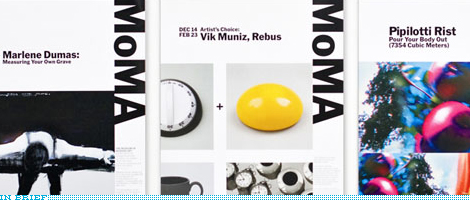
One of the hardest challenges is reinvigorating a brand and visual identity without changing the logo, it’s as if you were trying to do a fashion makeover with a pair of jeans that have been in the closet for years. To continue the lame jeans analogy: A good pair of jeans goes well with everything, so MoMA’s simple, iconic logo is prime material for building around it. Pentagram partner Paula Scher established a new identity system in collaboration with Julia Hoffmann, MoMA’s Creative Director for Graphics and Advertising, who produced all of the examples on Pentagram’s web site.
In Brief: The Wrong Kind of Breathtaking
“You know if we roll, we roll big.” Those were the words in 2006 that sent Agency.com’s viral video of pitching for the Subway account to internet infamy and advertising douchebaggery. Well, brand identity has found its equivalent. Yesterday, at the massively trafficked reddit.com, a new user posted a PDF to the presentation — humbly titled “Breathtaking” — accompanying the redesign of the Pepsi logo by Arnell Group. The contents are at once hilarious, pretentious and delirious as they try to establish Pepsi as the center of the universe. Some select pages are posted here and the PDF should still be publicly available somewhere on the internets. Long live the internet as a tool for exposing lameness.
Continue reading this entry
In Brief: Logo as Plot of Land
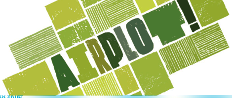
London-based design agency Airside has posted two great entries on their blog about the design of the identity for Airplot, Greenpeace’s initiative to stop the proposed construction of a third runway at Heathrow airport. The first post to highlight is the one that shows Airside’s process and how they arrived at the solution and the second (although they posted this one first) shows the different applications. Worth a look and a read.
In Brief: The Arabic Brand Experience
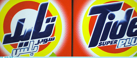
If you’ve ever wondered what everyday logos, brands and packaging look like on the other side of the world — depending on where you are we might be the other side of the world, so consider this a rhetoric opening — J. Jason Smith of Graphicology has captured some great photos of Western logos and their Arabic Doppelgängers in his recent visit to Dubai. One set of photos for logos and one set for packaging.
In Brief: Cartoon Chameleons

Motion design studio Capacity has repackaged the on-air graphics of the Cartoon Network (CN). The main attraction of the redesign are the Noods, blank amorphous characters that absorb an endless array of colors, textures and personalities to represent the diversity of the CN’s own line-up and cast of characters. It may be easy to dismiss the Noods as a rip-off or imitation of Kidrobot’s Dunny, but there is something very appropriate and relevant in their introduction to the CN brand. The animations by Capacity are pretty amazing too and you can see them all in a loving montage.
In Brief: Logos with Jimmy Fallon
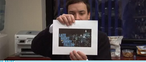
Less than two months from now, on March 2, Jimmy Fallon will make his debut as Conan O’Brien’s successor with Late Night with Jimmy Fallon. Over the last months Fallon has been video blogging all sorts of preemptive shenanigans, and yesterday’s entry was about helping him choose one logo from the three presented by Emily Oberman and Bonnie Siegler of Number Seventeen (designers of the Saturday Night Live opening titles for the last fourteen years). So, if you are ready for someone calling a logo “this guy here” and get excited about logos on mugs then go visit with Fallon.
Thanks to Aaron Jamison for the tip.
In Brief: Clockwise
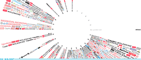
Back in May we saw miss Jane chronicle all the logos of the brands and products she interacted with everyday. Now, Tanner Woodford has taken that idea to the next level as a class assignment at the Visual Communication Design program at Arizona State University. He has taken the 1,035 logos he logged in one day and arranged them in a 24-hour clock.
In Brief: Obama Runner-Ups
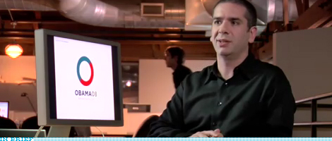
Sol Sender, the man behind the Obama ‘08 logo, recently joined VSA Partners as a strategist and, to celebrate, they posted a really amazing two-part interview on their web site, talking about the logo explorations and identity contenders to the iconic “O.” David Airey at Logo Design Love has unpacked the visual highlights of the interview, which makes for a great set. What I love about all this work is that it shows that the “O” wasn’t just a fluke but that it was the result of a proper identity exploration with a sound strategy and that good things happen when good designers are involved. Even in a market as crap-filled as Presidential campaign identities.
It’s important to note that Sender did the logo and initial identity standards but it was art director John Slabyk and creative director of new media Scott Thomas who extended the identity into novel and exciting executions, like the mutable logos for different sectors of the population.
It’s important to note that Sender did the logo and initial identity standards but it was art director John Slabyk and creative director of new media Scott Thomas who extended the identity into novel and exciting executions, like the mutable logos for different sectors of the population.
In Brief: Kiss This, Mexico City
![]()
Every now and then it’s worthy to remind us of the horrible perils of spec work. Whether designers should do it or not is really not the question, each person can decide what to do, but what’s clear is that the creative process and its manifestation is what suffers the most. A few months ago, Mexico City, through its Department of Tourism announced a contest to design the official logo for the city. Using the I♥NY logo as an example of what it wanted to achieve it then set the following parameters: The logo should depict the Angel de la Independencia monument and it should revolve around the theme of Bésame Mucho, the (rather lovely) song by Consuelo Velázquez. Anybody in the world could participate and vie for the prize of MX$1,000,000 (around US$73,000) to be filtered through a judging panel and the final winner selected by on-line voting. From 8,000 entries five finalists have been selected (one has already been removed for copyright issues) and are available for voting. The results are disheartening (other than the idea of No. 4). You can also see a number of the entries on a Flickr pool; this one is pretty fabulous (semi-NSFW). As a fellow Mexican and designer, it’s really sad to see this, Mexico City (if Lance Wyman proved anything) could have an exciting and vibrant identity and someone leading the process, not just a silly contest that dangles money in front of people. So, dear Mexico City, here is a tip: Hire a professional.
Thanks to Juan Carlos Hernández Cámara for the tip, who has a nice rundown (in Spanish) of each finalist.
Previous Page | Next Page(Total Number of Pages in In Brief: 7)

Many thanks to our ADVx3 Partners


