

Displaying all entries filed under In Brief

In Brief: Graphic Design, Referenced
Before we proceed with our regularly scheduled opinions on identity I wanted to take a moment to inform all of our wonderful readers that our latest book, Graphic Design, Referenced is now officially on the market. This is a 400-page beast with way too much information and way too many great images on the dear subject of graphic design. For all you identity fiends, we have a special 20-page section on logos and identity programs, including obvious mentions like UPS, FedEx and Coca-Cola and perhaps some non-obvious inclusions like the New School identity, the peace symbol and a little logo for a certain U.S. Presidential candidate. If you buy our book and do a big logo project in the near future send it to us and we’ll give you a glowing review here on Brand New. (Not).
In Brief: The Makers of Syfy

Possibly the last post on the evolving saga of Syfy as the channel officially switches identities today: London-based Proud Creative was the design firm responsible for creating the new Syfy identity. The victors of a four-way pitch, Proud Creative partnered with ManvsMachine for the onscreen graphics and with Chester Jenkins of Village to develop a bespoke type family. The results of the full package can be seen here. Will we have any converts that now like the new look?
In Brief: Bye SciFi, Hi Syfy
On July 7, continuing our well chronicled saga, SciFi will officially become the much-dissed Syfy, and to help in usher the change, motion graphics firm Blind created a set of 15-second idents that blow away the old SciFi. As with most identities, the best part comes in the execution, and these idents are starting to give some much needed life to the Syfy logo.
In Brief: Re-instituting the Institute
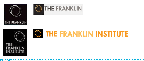
In other Philadelphia related news: In May of 2008 we reported on the redesign of the Franklin Institute Science Museum and how the logo made a big deal to change its name to, simply, The Franklin. Well, it didn’t work. Not going the full way back to their longer name they are going with The Franklin Institute and the logo has been amended as necessary.
Thanks to Chad Kaufman for the tip.
In Brief: 76ers, What’s Old is New Again
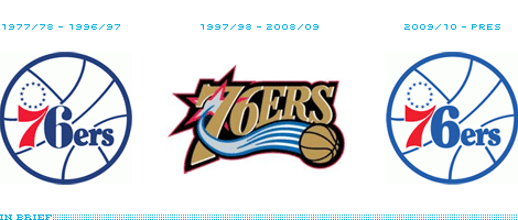
As a basketball fan, there is nothing more I love than the idea of Old School basketball with, say, Julius Erving and his sophisticated dunking in mind. And, sure, I’m a sucker for vintage NBA logos so it was pretty fun to see the Philadelphia 76ers announce that they would be reverting to their glory-days-logo and away from their overdesigned logo. “We are connecting the past with the future,” says the press release, but let’s just call it “we are going retro, because the merchandise will sell like pancakes.”
Continue reading this entry
In Brief: Pizza Hut The Hut
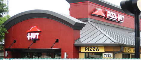
The reason this is not set up as a formal before/after is because, well, it is not. At least not yet — specially considering that some of this new look has been appearing since January of this year. The snazzy new design blog idsgn has a great feature on the introduction of new language and visuals into the Pizza Hut brand. Including an explanation of “The Hut” and its CMO celebrating its appropriateness for the text message generation. I have always liked the dopey script and roof logo but, I don’t mind the new possible design direction. “The Hut,” however is all kinds of wrong.
In Brief: Oreos and Ritz are Right on Target
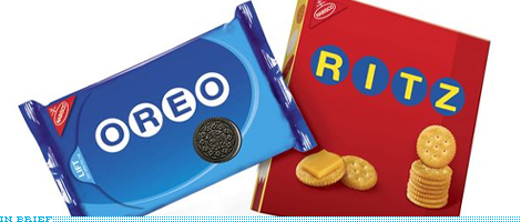
Over the last month we have received numerous e-mails about some mysterious packaging in the aisles of Target: Ritz and Oreos in a deceptively simple packaging. Without many answers available online, The Dieline finally solved the mystery by crediting Baker Associates as the designers of this Summer-only special packaging. Only at Target.
In Brief: Jello-O, What If…?
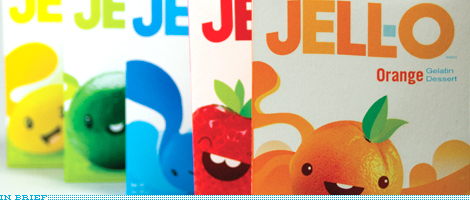
It’s not common that I’ll bring up student work in Brand New, but this effort by semi-recent graduate of Academy of Art University, Richard Perez is worth celebrating. While at SVA, Bryony and I used to have our students redesign the packaging for Sherwin-Williams paints, something mundane and ordinary that you don’t think much about, but when people are reviewing your portfolio it’s a brand they know, can connect with and are able to see the improvements the design makes. This redesign of the Jell-O packaging achieves exactly that: It takes the mundane and ordinary conventions of the Jell-O boxes and presents a vivid interpretation of what it could be. Many more images at Richard’s site.
Thanks to Dawn H. Buscher for the tip.
In Brief: Why do you Sketch Logos?
Most designers will tell you that all logo designs must start as sketches, and this gospel has been passed from generation to generation. But, think about it, why do you sketch logos? How does it help you? What do you gain from it?
The reason we ask this question is to help us develop some bits of content for a very modest Brand New-branded product we will be putting for sale as soon as it’s, well, produced. Read on for further info.
Continue reading this entry
The reason we ask this question is to help us develop some bits of content for a very modest Brand New-branded product we will be putting for sale as soon as it’s, well, produced. Read on for further info.
In Brief: Google Lock-ups
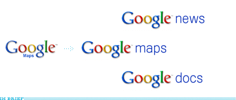
While the title of the post, “New Logo Look,” at the Official Google Blog is more of a tease than an actual new look for their logo, the small gesture of changing the way their myriad services and applications are displayed on screen makes quite a big difference. I’ve always thought that the logo/descriptor lock-ups for Google have been quite a mess and they are all kind of cobbled together differently depending on the space of web real estate where they would sit. So it’s nice to see some consistency being instituted. Who can name the typeface?
Thanks to Iyaz Akhtar for the tip.
Next Page(Total Number of Pages in In Brief: 7)

Many thanks to our ADVx3 Partners


