

NOTE: This is an archived version of the first incarnation of Brand New. All posts have been closed to comments. Please visit underconsideration.com/brandnew for the latest version. If you would like to see this specific post, simply delete _v1 from the URL.
Thanks to all the tipsters; first tip goes to James Mountain.
You can click on each image for a bigger view.
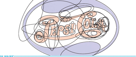
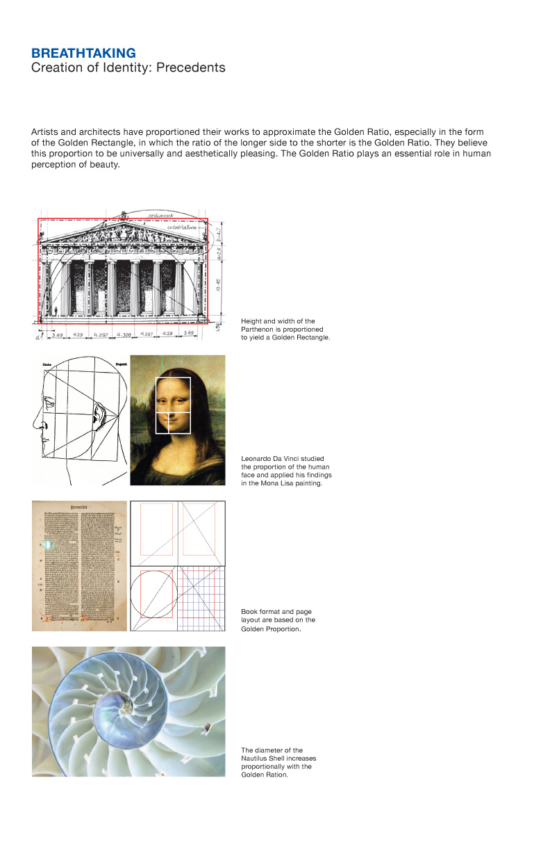
“Breathtaking” design strategy for Pepsi, page 6.
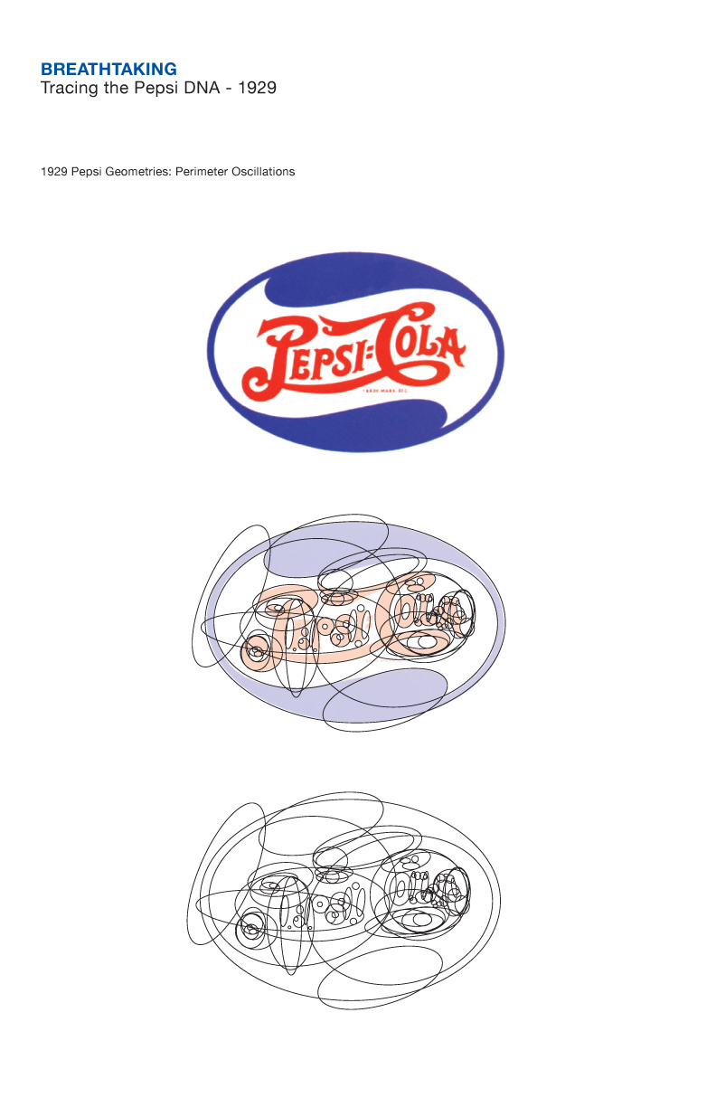
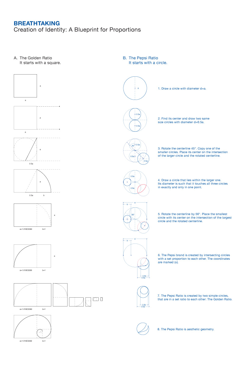
“Breathtaking” design strategy for Pepsi, page 11.
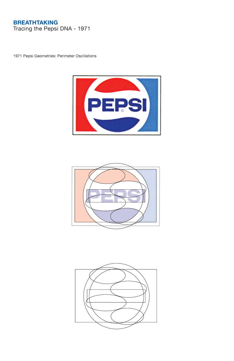
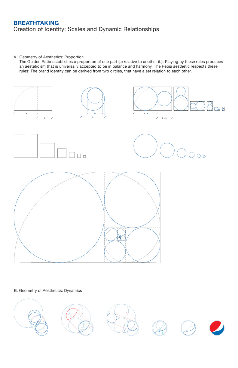
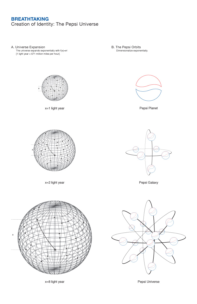
“Breathtaking” design strategy for Pepsi, page 14.
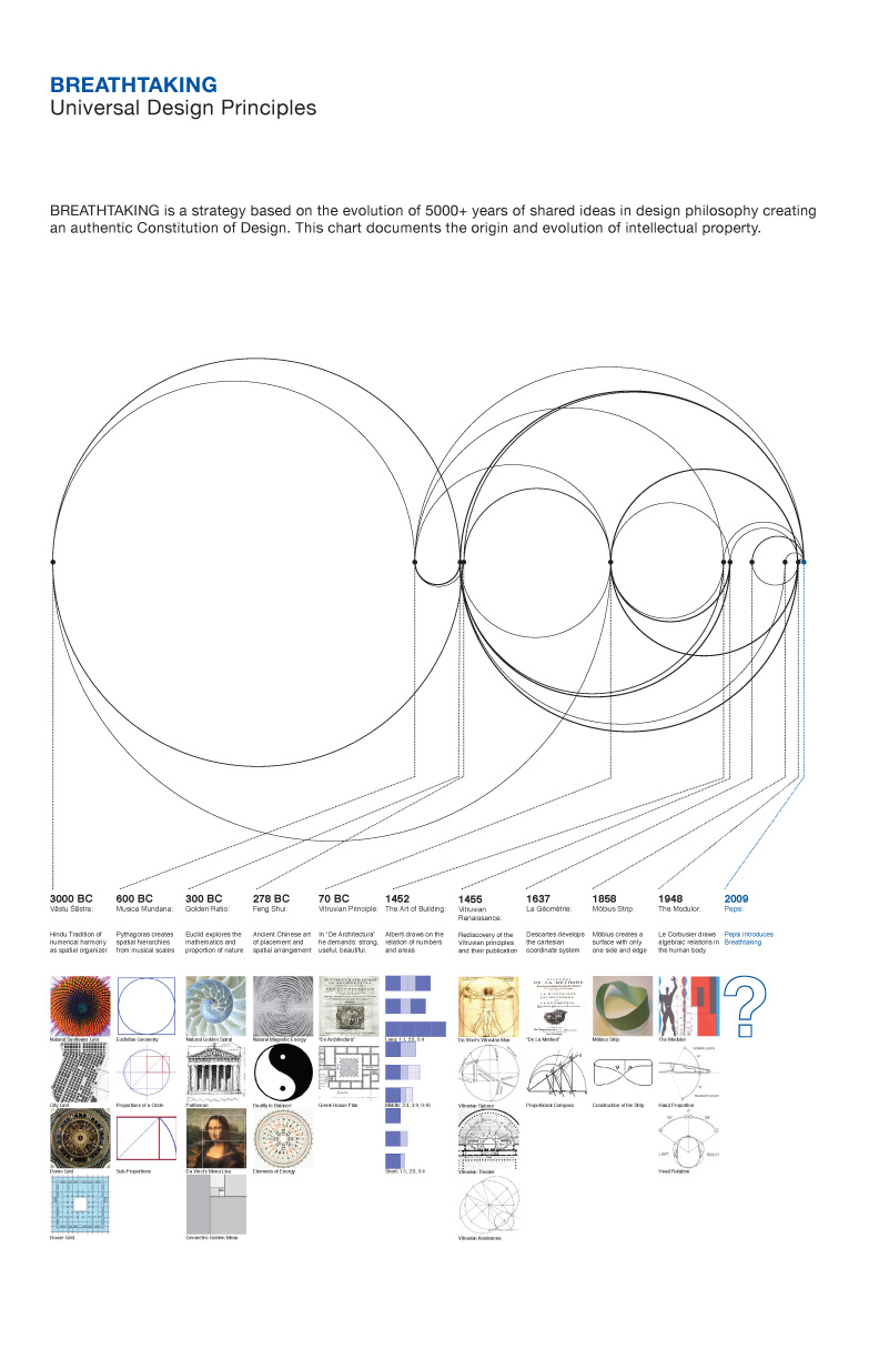
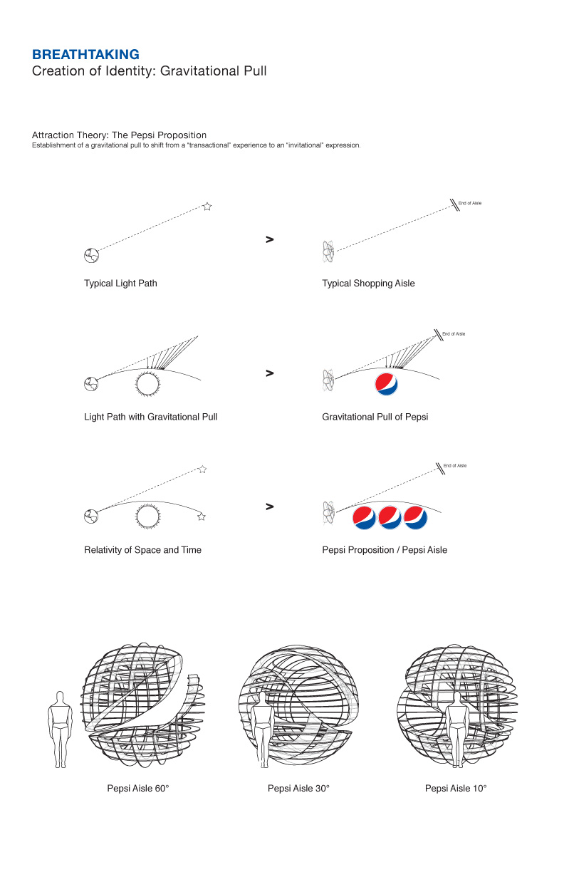
“Breathtaking” design strategy for Pepsi, page 18.
“Breathtaking” design strategy for Pepsi, page 19.
“Breathtaking” design strategy for Pepsi, page 20.
“Breathtaking” design strategy for Pepsi, page 26.
“Breathtaking” design strategy for Pepsi, page 27.


Jump to Most Recent Comment
Remy Overkempe’s comment is:
Wow. That's elaborately pretentious. (And cool at the same time!)
On Feb.10.2009 at 06:41 AM
Andreas Lanjerud’s comment is:
This is insane. And yet totally awesome!
On Feb.10.2009 at 07:07 AM
Daniel’s comment is:
What? I looked at this earlier today and assumed it was a joke! It's real?
On Feb.10.2009 at 07:17 AM
Woke’s comment is:
They should've spent all that time designing a better logo.
The new Pepsi logo and geometry of aesthetics?
On Feb.10.2009 at 07:27 AM
Paul Lewis’s comment is:
This is a joke. Quite literally. It is intended to poke fun at pretentious graphic identity manuals that pile justification against an image to bolster its credibility.
The Arnell Group has just taken it as far as they possibly can—and many people apear to have taken the bait and believe the document is legitimate.
On Feb.10.2009 at 07:28 AM
Armin’s comment is:
> It is intended to poke fun at pretentious graphic identity manuals that pile justification against an image to bolster its credibility.
Yes, and monkeys fly.
On Feb.10.2009 at 07:39 AM
Anonymous’s comment is:
That's funny. I think this was Pepsi's real inspiration:

(from perezfox.com)
Adam’s comment is:
It would be odd if the Arnell Group put this out seeing as they actually did the (badly received) Pepsi redesign. It if is self-satirical in this way then it self-defeating and just adds more nonsense to the Pepsi pile.
It is beautiful nonsense though. Nice work by someone.
On Feb.10.2009 at 07:43 AM
Armin’s comment is:
You can also watch this promo video where the references to all the geometric mumbo jumbo were first put to use. If it's a joke, how come no one's laughing with Arnell, but at Arnell?
On Feb.10.2009 at 07:47 AM
jj’s comment is:
No fan of the logo, nor the justification.
But...
I do understand the need to to talk in terms that marketing managers (in this case at Pepsi) understand, or at least are more familiar with. They were probably putting this together to convince people that need math and science rationale to feel better about a design solution. It is quite possibly the biggest piece of BS I have ever seen, but they may have been presenting to a group of people that required that type of presentation.
I don't know. I'm trying to justify this in some way. (Not excuse it mind you.)
On Feb.10.2009 at 08:17 AM
Jeff’s comment is:
What a waste of time.
But it got them that giant contract ...
On Feb.10.2009 at 08:25 AM
Joseph Szala’s comment is:
If a design student came to me with this...i'd fail him/her. I think justification and information are key in commercial design, but this is so obtuse and ethereal.
On Feb.10.2009 at 08:28 AM
Nick Irwin’s comment is:
so they had an intern design the logo in one day then spent months coming up with an overtly elaborate document describe the ins and outs of a logo that is un-inspirational ?
my head is about to explode?!!?
On Feb.10.2009 at 08:36 AM
Noah’s comment is:
This is so tongue in cheek it's genius. However, the odds of me asking for a Pepsi next time I place an order are still about 1:1,000,000
On Feb.10.2009 at 08:37 AM
Anonymous’s comment is:
Satirical viral marketing? Well played.
On Feb.10.2009 at 08:43 AM
k-ris’s comment is:
Hey guys, you know this is a joke... right?
On Feb.10.2009 at 08:51 AM
Pamela’s comment is:
I wish I was paid big bucks to design BS.
I gotta stop taking work so seriously.
Long live Pepsi! ^_^
Ralph Froman’s comment is:
the mere fact that this MAY be true makes it remarkable. The unfortunate truth seems to be that the people on the brand side require these tedious exercises in order to validate their rebrand and frankly, maybe their jobs. The agency, in fear of losing work, indulges them and creates a set of mostly pointless hoops for themselves to jump through. The one thing large agencies and brands seem to frequently lose sight of is that the consumer will view this rebrand the same way most designers would prefer to actually design them. Which is to say through intuition, instinct and a little bit of a gut-feeling.
That’s not to say there is no place for research in the design process. But any model that requires this much post rationalization and group-feedback is not a model that embraces creativity. As such, Pepsi got what they got.
On Feb.10.2009 at 09:19 AM
Jonathan’s comment is:
The only part that I don't get is how they actually make the logos with those two circles. It doesn't make sense!
Its almost as if they did the redesign first and then said ok, now how can we back this up?
On Feb.10.2009 at 09:19 AM
oak’s comment is:
I can't help but be really impressed with the level of effort. Unfortunately, it appears that the whole process went into creating an elaborate algorithm (for want of a better word) to create the perfect logo and the computer spit the bit.
I'm in the minority in that I actually like the new Pepsi branding, but even I have to conclude that the level of effort (apparently) expended in no way justifies the result.
Either that or "the evolution of +5000 years of shared ideas in design philosophy" is telling us that we're collectively out of ideas...
On Feb.10.2009 at 09:22 AM
helloMuller’s comment is:
If that's a joke, then explain that PR video from last year…?
On Feb.10.2009 at 09:22 AM
What?’s comment is:
If this is a joke, i want to work for the company that has enough money to waste time on this.
On Feb.10.2009 at 09:23 AM
jRod’s comment is:
well, how do we know that this wasn't an actual pitch to pepsi that Arnell put out there? how do we know that they aren't as pretentious as this makes them out to be? this is not so far-fetched really... some of the most self worshipping people i have ever met worked at ad agencies...
On Feb.10.2009 at 09:32 AM
Rob’s comment is:
THIS IS MY KIND OF POST
On Feb.10.2009 at 09:49 AM
Rob’s comment is:
THIS IS MY KIND OF POST
I've been privileged enough to work on a coke project. Not privileged in the sense that its a great client or anything, but in the sense that I had access to a ton of these crazy pdfs for coke and all their sub brands. I love how much the old Sprite standards manual talked about being "street". This Pepsi one I think takes it to a new level.
GREAT STUFF
On Feb.10.2009 at 09:53 AM
Justin’s comment is:
Holy shit. That was overly-complex.
On Feb.10.2009 at 09:54 AM
Adam’s comment is:
Very simple explanation for this: they took one day to "design" the logo and had to justify the rest of the $2,000,000 contract price by giving Pepsi some "content".
On Feb.10.2009 at 10:02 AM
Blake’s comment is:
Wow. At first I thought this was complete BS in the total saturation of nonsense masked as research. Then I kind of found humor in it, assuming it's a joke. But, now my question is... if it's a marketing "joke" to pull some viral hits (which it seems it might just do), why hit such a small audience? I showed this to my non-designer wife, and she literally could give two shits. She still hates the logo ("it's ugly") and dislikes the soda.
Funny to designers, useless to the rest of soda drinkers?
Then again, maybe it's real. Eek.
On Feb.10.2009 at 10:07 AM
nicelogo’s comment is:
The "big banged" theory.
Adam hits the money! It must be true! What else could justify this amount of spin and dazzle?
Awesome either way.
On Feb.10.2009 at 10:09 AM
Chaac’s comment is:
I can totally picture the guy behind this work and the sheep designers looking at him with bambi eyes saying "WOW". This is NOT good publicity. Some publicity is, in fact, bad and this proves it.
On Feb.10.2009 at 10:12 AM
Anonymous’s comment is:
post-rationalization fail!
On Feb.10.2009 at 10:20 AM
Glenn Sakamoto’s comment is:
More polish on a turd.
On Feb.10.2009 at 10:24 AM
Serviceburo’s comment is:
Aside from the fact that this is all stuff that should be taught to first semester design students, I have to agree (assuming it's earnest) that the person/people behind this was truly desperate and uncreative enough to just admit where the idea came from as opposed to simply admitting that the had some sort of non-rational inspiration.
Is it really necessary that we be able to break everything down into visual science? I mean sure, using these rules/theories to tweak a design can have great results, but the only real reason you can justify ridiculous contract quotes is if you have a unique (non-rational) thinking process that enabled you to simply make a leap versus applying a formula.
On Feb.10.2009 at 10:25 AM
Adam’s comment is:
Whether this is a joke or not doesn't change the fact that the mark is bad. A successful identity's visual metaphors should be apparent at a glance, not after a 10 page explanation.
On Feb.10.2009 at 10:45 AM
Randy’s comment is:
This is hilarious. "Pepsi Energy Fields" had me on the floor.
This presentation is why Forbes says that designers are stuck up.
On Feb.10.2009 at 10:54 AM
Kevin Zwirble’s comment is:
A good friend of mine once said "Advertising is bullshit... and we're bullshit artists". Well there has never been a better example of this statement in action as it is in this manual.
And the golden mean?! Really?! If the new pepsi logo was based on the Golden Spiral it would actually look good.
On Feb.10.2009 at 11:18 AM
Chaac’s comment is:
Pablo Neruda once said: Explaining poetry makes it vulgar. I don't know what the poet would have to say about trying to poetically over explaining bad work.
I have always thought that people who over explain its achievements are the ones who are in fact explaining other people talents in a project they marginally participated in.
So I guess, most likely, the original designer of the brand had nothing to do with this presentation. It seems logical to me that someone with absolutely no involvement in the design process created this rubbish and also it is safe to say this person is very important in Arnell or this presentation would have never been approved.
This presentation and overall work, although it answers really complicated questions no one cares to ask (like what is the relationship of my brand with the universe?), it fails to answer the most simple ones: is it necessary? is it nice?
On Feb.10.2009 at 11:21 AM
k-ris’s comment is:
Well, I'll say I can not conceive a designer that would seriously do this. Not even the douchyist of douches would compare a logo to the relativity of space and time or the expanse of our universe and illustrate it .
If this is not a joke I will eat my words - and it should be put on record that no one should hire the Arnell Group unless they enjoy wasting exorbitant sums of money.
If it turns out to be a joke, I seriously appreciate the dedication into making it believable.
On Feb.10.2009 at 11:24 AM
Rob’s comment is:
This is clearly a joke. And a funny one, if you ask me. Come on, Armin--don't feed the troll.
On Feb.10.2009 at 11:24 AM
danny’s comment is:
Uh huh. Still doesn't change the fact that the logo is ugly and its application to the rest of the "brand" is generic and lackluster.
i agree with kevin's point entirely. about the bullshit.
perhaps more time should have been spent on giving the logo a little life and less time digging up ancient aesthetics? which they missed the mark on anyway?
GAH!
On Feb.10.2009 at 11:28 AM
Anonymous’s comment is:
I guess the Arnell Group loves RISD & Yale Grads.
On Feb.10.2009 at 11:35 AM
Gabe’s comment is:
This is like a more elaborate version of the geometry behind the Mint.com logo. A bunch of "design decisions" in attempt to make people like a horrible logo. It doesn't matter how you created the logo, if it's not good.
I think Pepsi does a better job at "brand" than they do "logo", which is far more important these days. Although, having a worthwhile product would probably be essential, too.
On Feb.10.2009 at 11:38 AM
Gabe’s comment is:
Although, the jokes on me!
On Feb.10.2009 at 11:39 AM
Cam’s comment is:
RETARDED.
On Feb.10.2009 at 11:52 AM
Gabrielle Fulginiti’s comment is:
wow, and i thought some of the logos for my clients were ridiculous! this is insanity, they have truly taken this to the next level. a very bad/horrible/suicidal level.
On Feb.10.2009 at 11:56 AM
Harper’s comment is:
This has to be a joke. I think the largest problem I have with this material is that it's not obvious enough that they're taking the piss.
On Feb.10.2009 at 12:02 PM
Silas Amos’s comment is:
The tragic thing is not the ponderous and lame over justification, but rather the sense that the agency believes that the client can only place value on a design if it is dressed in an ill fitting cloak of design history bullshit.
On Feb.10.2009 at 12:13 PM
Anonymous’s comment is:
I wonder why people are so defensive about it being "just a joke". Maybe satire of bad design can't cast in a better light the original bad design.
Or maybe the entire brand (especially the Pepsi soda, the product formerly known as Mountain Dew, and the Tropicana line) simply looks like a cartoon charicature of food-grade wax disguised as a store brand.
On Feb.10.2009 at 12:23 PM
ctsf’s comment is:
What a fustercluck of biblical proportions! Even if this were fake, and I don't believe it is, the rebranding is still awful.
On Feb.10.2009 at 12:26 PM
Sarah’s comment is:
Wow!
The pepsi logo is smiling at me...and frowning, and being playful and blowing raspberries...
Total BS. *Shudder* if its real.
On Feb.10.2009 at 12:31 PM
Kellie Schroeder’s comment is:
Well, it's aptly named. Reading through the gravitational pull theory in this thing took my breath away...in a not so great way. The presentation is really beautiful...it's the correlations that are a little hard to swallow.
Pespi could have about 1.5 million by cutting out all of this crap...but I guess it sells the concept to the C levels. They need something that makes them feel smart and superior...the golden section is perfect. It's intellectual (but not too intellectual), it's historical and mystical.
If design is supposed to influence...I guess this is a good example of the BS working at full speed.
On Feb.10.2009 at 01:29 PM
Mr Posen’s comment is:
I like when a symbol has a hidden architecture, but this is just smoke and mirrors.
'The Pepsi Ratio' vs. 'The Golden Ratio'
Wankers.
Katelynn M’s comment is:
The gravitational pull of pepsi? I have never heard such complete bs in my life.
For the record, I don't think this is a joke. I can just picture some pretentious jerk writing this. Don't any of you remember those people from art school? You know, the blowhards that wrote a ten page paper to justify their painting of a circle? This is apparently what they do when they grow up.
On Feb.10.2009 at 01:45 PM
Darrin Crescenzi’s comment is:
God I wish there were tickets available to watch this pitch happen. I would have paid good money.
Genius.
On Feb.10.2009 at 01:56 PM
rickyaustin’s comment is:
If a piece of dog shit happens to have golden proportions, it's still shit.
On Feb.10.2009 at 02:00 PM
oscar’s comment is:
Well, my mind is blown. What unbelievable douchebaggery.
It's certainly possible that Arnell did this and laughed the whole time, and then gave it to Pepsi. But I don't think this is a joke.
On Feb.10.2009 at 02:02 PM
damon’s comment is:
this can't be real.
Samantha’s comment is:
This is stupid, it's like the Scientology of design. You cannot explain this logo to me in Golden Circle Ratios to make me like it. This is like people coming to your house to sell you Tupperware, and the 6th or 7th time they come and they bring their training packet, and all of a sudden you are convinced. Don't buy in! I'm going to go drink a Coke.
On Feb.10.2009 at 02:36 PM
JC’s comment is:
You guys need to lighten up and see this for what it is. Is it pretentious? Yes. But it is intentionally pretentious. I love it for all its gaudy self-inflatedness.
On Feb.10.2009 at 02:50 PM
JudiWunderlich’s comment is:
This has GOT to be a joke
On Feb.10.2009 at 03:02 PM
M.’s comment is:
Personally, the best part was the breakdown between space-time-relativity vs. a supermarket aisle displaying Pepsi products.
On Feb.10.2009 at 03:03 PM
gitamba’s comment is:
Wow, the amount of crack that must of been smoked at this briefing must of been astronomical. Epic FAIL.
On Feb.10.2009 at 03:12 PM
matt’s comment is:
It's good to know that they put this much thought into the whole thing... and rather distressing to know that they still came to the conclusion that the new logo warranted adoption.
On Feb.10.2009 at 03:27 PM
Gavan’s comment is:
Armin have you gone completely insane? You can see the page about gravitational pull can you not, and you don't think that this is satirical, and would have been presented in humour?
> If it's a joke, how come no one's laughing with Arnell, but at Arnell?
The same reason that everybody is laughing at Paula Scher in the NY Philharmonic thread? The fact that while these firms are actually out there winning big clients and delivering results for them, the best your average Brand New reader can do is sit on their arse b*tching disproportionately about it, pretending they know better?
I find it a little distatesful to have spent this much time and energy on something like this at this stage of the process, but, personally, I think Arnell will still be able to sleep at night.
On Feb.10.2009 at 03:28 PM
Mrs. M’s comment is:
Yes, such ecumenical power Pepsi wields. Why, I wonder why PEPSICO even bothers with its other menial product lines! Alas.
Such sublime imagery could not possibly be affixed to aught but bottles containing an inarguably divine mix of consumable elements. Pepsi's formula is surely the pinnacle of all soft drinks, drawn from 4,000 years of chemistry principles.
Stunning!
Except, even the non-designers I know were confused by this. I keep hearing, "I thought it was the store brand!"
The icon and this PDF (legit or not) remind me of a Bette Davis quote. Ironically, she's discussing her old rival, Joan Crawford, who was married to the head of PEPSICO and served on its board of directors.
"I have always felt her greatest performance is Crawford being Crawford."
Ych.
I personally think the 1906 script would look beautiful, but then they really would be aping Coca-Cola.
On Feb.10.2009 at 03:33 PM
Tim’s comment is:
I can respect a systematic approach to producing a new identity. As a consumer, though, I just don't see any benefit in the new system. I understand that it's a much more consistent cross-brand system, but it's not used effectively. I don't see "mtn dew" or "sierra mist" and think Pepsi. I see the logo and think 1) that's pretty similar to the old icon and 2) that the negative space reminds me of a seamonkey
On Feb.10.2009 at 04:12 PM
Jose Nieto’s comment is:
Gavan, if this is actually a joke, then it's the best deadpan parody since Pale Fire. Until the Arnell Group sends out a press release stating that they've hired the re-animated corpse of Vladimir Nabokov, I say the document is (sadly) for real.
I'm with Armin on this one.
On Feb.10.2009 at 04:15 PM
Paul Lloyd Johnson’s comment is:
I hate all that pretentious crap. Reminds me Daniel Libeskind's architecture, which I hate, not because it isn't interesting, but there is so much bullshit used to 'explain' it.
On Feb.10.2009 at 04:39 PM
fonzie’s comment is:
Gavan, every time I read one of your posts, I can hear the shovel crunch the dirt as you dig that hole a little bit deeper for yourself.
On Feb.10.2009 at 04:41 PM
really?’s comment is:
This is not satire or humorous. It is the real deal; it is Arnell's strategy deck and PepsiCo paid an ungodly sum of money for.
If you think otherwise, welcome to the world of branding and a glimpse into working at a big agency. It is awful and needs to change. It is hurting designers and is making our profession look like it's full of wankers.
On Feb.10.2009 at 04:51 PM
anonymouse’s comment is:
I do love it. But I actually like the logo too. And generally prefer Pepsi -- especially for canned soda -- over Coke. Although with my limited budget I tend to buy Generics. Super Chill is a favorite. Because, how could you not by a soda called Super Chill?
On Feb.10.2009 at 04:56 PM
Chris’s comment is:
Seriously? Read through that then ask yourself: "Why is design always the first thing to get cut in times of economic trouble?" What a total waste of time and money.
Garbage.
On Feb.10.2009 at 04:57 PM
Gavan’s comment is:
Ha Fonzie, I love it. I think I can handle that.
On Feb.10.2009 at 05:17 PM
Brad Gutting’s comment is:
If it's a joke, it's just not that funny.
The biggest reason for it probably not being a joke is that far too much effort went into developing the diagrams used throughout--I don't care how awesome your Adobe Illustrator skills are, that takes awhile. No studio, however insane, can afford to waste that much time on something like this in the name of pulling off an ostensible prank that many people think is real. There's just no purpose or return in it.
Whatever designers think of it, I'm not sure many of our clients will really pay attention or care that much.
Either way...the whole Pepsi identity saga has been among the most surreal things in the industry in some time...
On Feb.10.2009 at 05:49 PM
hinsonian’s comment is:
dudes. it's really real. it really convinced the client. it's really necessary to wax your Wacom to that extent so the client can see, with excruciating clarity, that designers are not doodling all day and are not full of shite. strange that most comments call this BS, where the really real reality is that a designer walking in a room with a mounted comp and a "gut-feeling" would be laughed out of the boardroom and his/her/zer job. Clients really don't know design basics and this deck really totally "blew their mind." Get real.
On Feb.10.2009 at 06:09 PM
BJN’s comment is:
Yin yang, indeed. Pepsico and Arnell Group in a classic 69 pose.
I gotta find a gravitational lens filter for CS4.
On Feb.10.2009 at 06:43 PM
Pamela’s comment is:
I came across this today:
yatra.com.
It's totally the same logo graphic! :O
![]()
I guess they used the same "Universal Design Principal" hehehe
On Feb.10.2009 at 06:50 PM
Palmateer’s comment is:
Found the full PDF. There's a link halfway down this page:
Link
ironknee’s comment is:

the horror
On Feb.10.2009 at 07:56 PM
William’s comment is:
. . . fully strikes me as a flurry of self-indulgent,
spuriously rationalized visual masturbation.
somebody throw Arnell a kleenex.
anonymous’s comment is:
Armin have you gone completely insane? You can see the page about gravitational pull can you not, and you don't think that this is satirical, and would have been presented in humour?
Mocking bad design process and then presenting a bad design ≠ funny.
If this had been an awesome rebrand with a hilariously bad faux-justification for it then it would have been wickedly funny, but that kind of humor only works when the end product is indisputably excellent.
This new logo and can design are shit.
It looks like a poorly thought-through undergraduate product.
And because it's so terrible these kinds of faux-shitty justifications aren't funny, because the reader feels like there has to be SOME justification for such a shitty design and then these kinds of stupid ideas seem possible.
marky’s comment is:
joke or not, we're all talking about it. still.
On Feb.10.2009 at 09:07 PM
Brad Gutting’s comment is:
We're still talking about it because it needs to not happen again. People still talk about New Coke because that was boneheaded as well.
I'll say this much: the new logo is here to stay for as long as Pepsi sells. With New Coke, they were screwing with an established product that people liked a lot. The Pepsi logo is just that--a logo. It's not altering the actual flavor of a product that is bought because of flavor (ads featuring Michael Jackson aside). Unless sales deviate wildly in one direction or another, this identity re-design will be relevant to an excruciatingly small segment of the population and generally be regarded as being of no consequence in the long run. THAT would be unfortunate.
And yes, you have to sell your design and you have to rationalize and contextualize your decisions. But, Arnell Group: please leave quantum physics out of the deck next time, it makes creatives look like intellectual dilettantes.
On Feb.10.2009 at 09:51 PM
Rephlexs’s comment is:
The scientific explanation of bad design
On Feb.10.2009 at 11:22 PM
Anonymous’s comment is:
It is a joke. No one is going to buy this BS. No one. Not even Pepsi.
On Feb.10.2009 at 11:39 PM
Dan’s comment is:
“The sublime and the ridiculous are often so nearly related, that it is difficult to class them separately. One step above the sublime makes the ridiculous, and one step above the ridiculous makes the sublime again.” -Thomas Paine
On Feb.11.2009 at 12:00 AM
Meata’s comment is:
This is not funny people, makes our profession look like bullshit peddlers.
Mark’s comment is:
They have created the Liberace sequence
On Feb.11.2009 at 02:22 AM
Mark’s comment is:
*
victor’s comment is:
I am surprised at some of these comments. This is not a joke. This is a real document that is required when selling a significant departure from one's current identity for a major, iconic brand. All joking aside, I suspect most of these commentators have never worked on a rebranding project of this size. It's an ugly process, full of backwards corporate thinking. I am not a fan of the new identity, but I admire what it stands for: the "Apple-ization" in a world of noise. One trip to your local supermarket, down the soft drinks aisle, and you see the value of this branding: in a world of Nascar 3D chrome logos, Pepsi stands out, with clean, bold packaging.
The end result is what counts. If Arnell has to produce 20 of absurd documents like this one to push through a vision, so be it. Change and risk are usually never smooth, and I congratulate Pepsi for being bold enough to try a different path.
On Feb.11.2009 at 03:49 AM
eyefry’s comment is:
What BS.
On Feb.11.2009 at 05:24 AM
PP’s comment is:
Who wrote that was literally on coke!
On Feb.11.2009 at 07:57 AM
Gabe’s comment is:
This is my favorite PDF.
On Feb.11.2009 at 10:17 AM
brandon’s comment is:
Well they sold the hell out of it. It makes me think that most of this exploration stuff is bullshit Pepsi Universe expanding exponentially... Who gives a shiiitt? This isn't real and if you do all that work and connect these ridiculous ideas and kiss the client's ass it still doesn't mean the logo is gonna connect to the audience or is gonna look good.
On Feb.11.2009 at 10:26 AM
Cory O'Brien’s comment is:
Congrats on them for being able to sell this through for $2 million! I guess you've got to do some strange, out of the box thinking to justify a price like that!
On Feb.11.2009 at 12:49 PM
vectorbug’s comment is:
I guess I am just a terrible designer, or person I suppose. But I like the new logo and identity overhaul. Especially Tropicana.
On Feb.11.2009 at 01:07 PM
steve’s comment is:
This has to be perfectly executed viral. For so many intelligent people to not see this, it's a rousing success.
On Feb.11.2009 at 02:41 PM
Laureen’s comment is:
Wow... so all of this scientific research to back up a design that looks like a first year design student's explorations with the pen tool.
On Feb.11.2009 at 04:07 PM
Raul’s comment is:
Laureen’s comment is:
Wow... so all of this scientific research to back up a design that looks like a first year design student's explorations with the pen tool.
I couldn't have said it better.
It really does look like something I'd expect out of an "Adobe Illustrator 1" course.
While I appreciate the idea behind the rebranding, the curves in the logo are crude and inelegant, and the can designs seem very sloppy and lack a cohesive structure.
I have to wonder if Arnell released these documents to courter critics who had been saying that the design was "half assed" and somehow prove that a lot of thought had gone into what they did.
On Feb.11.2009 at 05:22 PM
Klaman’s comment is:
its not a "joke" its just a fabricated idea. I can't believe people think that pepsi actually "bought" this and thought it was REAL. Its clearly intended to be a little humorous.
The only thing that pepsi "bought" was the logo and for a hefty pricetag. Looks like a win for arnell if you ask me.
And on a side note, i enjoy the new brand, especially tropicana.
On Feb.11.2009 at 05:31 PM
Amanda’s comment is:
bla, bla, bla.
On Feb.11.2009 at 05:33 PM
Emily Charette’s comment is:
this is the best thing I've seen since the Xerox redesign!! bravo!
uh, yeah. just kidding.
On Feb.11.2009 at 06:22 PM
Sab’s comment is:
: 
Seriously, is it true?
On Feb.11.2009 at 08:59 PM
Matheus’s comment is:
can we quit talking about how lame pepsi is.
On Feb.11.2009 at 09:46 PM
taylor’s comment is:
Breathtaking indeed.. Sh*tf&*k....get over yourselves..... I don't know who your kidding, but I haven't bought Pepsi since this crap seeped into the market... and your not reaching anyone in your 'stratosphere', being that your target market is mass market America... who A) Doesn't give a rat's A** about anything presented here, and B) Even the well educated and cultured portion of America doesn't give this respect, because what "ICON"goes and pulls a schizophrenic move like this and expects people to trust them? In the age of '15 minutes of fame', I'm jaded and sick to my stomach. That is all... in the meantime.. Boycott pepsi
On Feb.12.2009 at 01:09 AM
Joe’s comment is:
Brain...melting...from...bastardization of...mathematics!
Not sure if I should call this a fake, managers are stupid...let me illustrate with a real conversation. Names concealed to protect the innocent.
Manager: What do you think about the design?
Engineer 1: I would say, 9.
Manager: Sounds good, I'll put in the Demand of Purchase for the materials immediately!
Engineer 2: Where did you come up with 9?
Engineer 1: 10 sounded like a good number, but I didn't want it to sound too good.
Potato’s comment is:
Although post-rationalization is something condemned in design, everyone does it, and at least this is some brilliant post-rationalization.
The point is, the new logo is fresh, the new branding of Pepsi is refreshing and everyone else is just jealous that 1)they don't have Pepsi as their client 2) they can design something so fresh 3) they can come up with a great story for their design that they can sell for millions of dollars.
Isn't that what branding is about after all?
On Feb.12.2009 at 10:41 AM
Jim Gosz’s comment is:
I'm on the fence with Pepsi's new branding. Part of me says they shouldn't have messed with one of the most recognizable marks in the world. If it's not broken, then don't fix it. Perhaps I'm wrong and Pepsi has the statistics to back that up.
Another part of me commends their effort to re-vitalize their marketing with a slightly revised symbol. It brings about a certain freshness and energy to their line of products. For example, when I saw the changes they made, I immediately went out to see what they did to their other supporting brands. So in that sense, it raised my own awareness.
Hopefully it wasn't change for change's sake. If it was, I think it was a bit misguided.
On Feb.12.2009 at 10:57 AM
lucid’s comment is:
Potato's comments are, to me anyway, what is wrong with corporate ID in America.
The POINT is that the branding is crap, the idea behind it is crap, and it is as fresh as a fart... maybe I am jealous that they are not my client, rest assured that if they were the branding would be real and not some weird bastardization of PEPSI DNA and physics!
On Feb.12.2009 at 12:36 PM
Andrew Klein’s comment is:
Non-designers are going to read this and think we are all nuts!
...i mean, more so than we actually are
On Feb.12.2009 at 01:07 PM
BeakerBen’s comment is:
I'm sorry but I thought the leader image for this post was a "Pregnant Women" and oh yeah the new pepsi logo...talk about design by a comittee...sad!
On Feb.12.2009 at 02:26 PM
Anonymous’s comment is:
What the new rebranding lacks is not concept, but aesthetics. Please, please see the old UPS mark designed by Paul Rand. No BS, no five hundred page story telling. just pure elegant design by an American master.
On Feb.12.2009 at 03:19 PM
Ricardo Cordoba’s comment is:
Advertising Age has an article on the now-infamous PDF here...
On Feb.12.2009 at 04:15 PM
Chris’s comment is:
Really? All that work to make their former logo look as if it were burping?
On Feb.12.2009 at 04:37 PM
Justine’s comment is:
Pop Pretention at it's best
On Feb.12.2009 at 05:51 PM
OC’s comment is:
I don't know what y'all are talking about, but that's genius. Just remember people, we're in an industry where we blow smoke up people's asses.
On Feb.12.2009 at 09:48 PM
andydreamseeker’s comment is:
I don't think this is BS at all.
On Feb.13.2009 at 12:18 AM
Von Glitschka’s comment is:
What a load of self-justifying psycho babble.
On Feb.13.2009 at 05:27 AM
Anonymous’s comment is:
1 vote for what hinsonian and victor said above.
I dont know if im more amused with the document or trying to figure out why someone would leak it. (were they pissed? didn't know any better? trying to be a whistleblower of some kind? Its intriguing.) Pepsi is probably already running up the tab on how much $ this cost their reputation, and I'm sure arnell and omnicom's lawyers are having a witch hunt trying to figure out who leaked, if they haven't already run the poor idiot out of town.
On Feb.13.2009 at 10:04 AM
Todd Simmons’s comment is:
As geeked out as this is... Whatever.
The new logo isn't the problem, itself.
It's the ridiculous emphasis on it
over other design elements and the shear
lack of consideration for there.
The packaging and communications are naive.
The messaging is thin, "hey kids" and stupid.
The typography... Ouch! Yikes.
Joseph Maguire’s comment is:
So you totally left out the rediculous pages... the Rediculous smile pages and emotional response pages.
On Feb.13.2009 at 11:43 AM
Anonymous’s comment is:
Quite simply:
Wonderful PR from Pepsi - great work.
It's got everyone talking about them. Don't know if they really are re-designing their logo but if so - what a way to get people talking about it.
Very clever.
(and, if I'm wrong and this was meant to be serious - words fail me!)
On Feb.13.2009 at 12:01 PM
Marko Lokas’s comment is:
The Pepsi Ratio? Universe expansion? Pepsi orbits? Magnetic dynamics? Strong stuff.
If this is their new "core" way thinking, then it sure is announcing some bold moves on all other fronts. A radical change of indentity should communicate meaningful and tangible changes in how the company operates on the market (and on the inside). If all this is not the case, then it's just BS, and the buyer will soon know about it.
On Feb.13.2009 at 12:21 PM
Anonymous’s comment is:
Joseph Maguire: I haven't looked at the whole document. Is "Rediculous" a Pepsi brand?
On Feb.13.2009 at 01:01 PM
Shadders’s comment is:
Oh dear,
Oh dear oh dear oh dear.
I’m tempted to fire off a half drunken email to Pepsi offering my services. I bet I could have saved them a few bucks by telling Arnell Group to go forth and multiply with themselves for delivering this waste of space.
I certainly would not pay someone to tell me that a light year = 671 million miles an hour! A light year is a unit of DISTANCE! To add more insult, they are off by about 400,000 miles per hour when it comes to the SPEED of light in a vacuum.
The worse thing is, I can imagine a bunch of overpaid under-achievers in upper management at Pepsi lapping this crap up.
On Feb.13.2009 at 02:42 PM
Aggie’s comment is:
This has to be a joke. Gravitational pull?
On Feb.13.2009 at 04:23 PM
Mark’s comment is:
um, What The $%^&?
They have lost me.
erik spiekermann’s comment is:
light year = 671 million miles an hour!
Pseudo-science indeed. This looks like they got some intern to copy/paste everything they could google in an hour about proportions and other stuff that could be used to dazzle ignorant marketing people. What are those “oscillations”? They look like totally arbitrary curves that mean nothing, follow no apparent logic (except perhaps some Adobe Illustrator filter), prove nothing and are anything but scientific. How come nobody in that presentation (I have been in many of those boardrooms myself: yes, they are a world to themselves) recognized that this is all vodoo, mumbo jumbo, or plain bullshit, as you Americans so nicely describe it. This is a result of the same thinking (or lack of) that “designed” derivatives based on non-existing securities and made money out of nothing.
The shit hasn't hit the fan hard enough. As long as our societies can tolerate this sort of behaviour, we're not suffering enough.This is not harmless, these are actual lies being told in the name of “progress”.
On Feb.13.2009 at 05:37 PM
Cesar Castro’s comment is:
Seems as if the designers were discovered geometry!!
On Feb.13.2009 at 08:05 PM
mikemystery’s comment is:
Yeah!
How dare Arnell be creative! How dare they!
And having the cheek to use scientific language for a non rational piece of creativity!
And selling work through in a creative and entertaining way? And making money while doing it?
They should be fucking ashamed!
On Feb.13.2009 at 09:23 PM
Jared’s comment is:
Why stop at logos? They should do a pdf poking fun of BS ad agency "strategy" too.
On Feb.14.2009 at 12:39 AM
Suhel Khan’s comment is:
Cool stuff! I am sure the guys were on weed while doing this or there was some geometry professor looking to create history into identity design
Cheers!
On Feb.14.2009 at 06:29 AM
Day Two Webdesign’s comment is:
Of course the article is a joke, but a very smart one! Pepsi got the attention, right? That's what good branding is all about! ;-)
I like it!
Anonymous’s comment is:
mikemystery: "And having the cheek to use scientific language for a non rational piece of creativity!"
It could have been pulled off well: accurate figures, dreamlike, imaginative. Instead, it looked like a rejected The Onion piece, except without the funny. It could be that most of us here, not being its target audience, have too much real-world knowledge to find this amusing or well-produced.
Day Two Webdesign: "Pepsi got the attention, right?"
Any news is good news, right? I guess they're finally learning from Coke, sorta.
On Feb.14.2009 at 10:29 AM
designscene’s comment is:
They really have loads of time and money on their hands. It looks like they did the design and then tried to back it up with all this stuff.
On Feb.15.2009 at 11:24 AM
Chris Mills’s comment is:
This will now serve as a template for all those presenting to idiots.
On Feb.15.2009 at 11:45 AM
BA Raquis’s comment is:
The Pepsi Ratio (wow!). Still not drinking this... If we (designers or what you want to call yourself) don't see the point, how can a consumer believe this crap.
On Feb.15.2009 at 01:24 PM
Char’s comment is:
Wow, I'd have whatever they smoked.
On Feb.15.2009 at 08:01 PM
Gaylord’s comment is:
great self serving masturbation that the masses do not give a shit as long as it is 1: cheap 2: has lots of sugar. Because the horrible truth behind Pepsi is that it is CIGARETTES FOR THE KIDS.
I guess the game people worked for Philip Morris aka Altria...BRAND NEW IMAGE TO MAKE PEOPLE THINK THEY ARE COOL PUTTING THOSE HUGE CANCER COCKS IN THEIR MOUTH! SO WHY NOT PUT MORE SHIT INTO PEOPLE BY MAKING IT LOOK COOL LIKE PEPSI.
FUCK PEOPLE WHO LIE under the guide of Advertisement.
On Feb.15.2009 at 09:24 PM
Justin Hill’s comment is:
I'm still going to drink Pepsi.
On Feb.15.2009 at 09:36 PM
Jacob’s comment is:
I actually kinda like the new Pepsi logo. Its new, modern, not very literal, and leaves a lot to the imagination. You really don't know what its about. Plus, did the old logo really serve a purpose other than brand recognition (which the new logo still has).
Haha, I just noticed this, it kinda looks like a 3D smiley face, just add two eyes on the red part!
On Feb.16.2009 at 01:37 AM
Goffredo Puccetti’s comment is:
I really would like to know if that is meant to be a joke or not.
I just can't believe it is true.
Erik van Erne, Milieunet Foundation’s comment is:
This is really a big joke for 1.200.000.000 dollar. Probably the most expensive joke ever made in history.
I guess they got a lot of inspiration from Barack Obama.
http://www.barackobama.com/index.php
On Feb.16.2009 at 03:55 AM
Justin Hill’s comment is:
It goes to show that a world without structure or justification is chaos.
On Feb.16.2009 at 06:55 AM
Chris’s comment is:
There's no way that this can be real, right?...
On Feb.16.2009 at 01:22 PM
Chris Dixon’s comment is:
Whether this is real or a joke, all the “viral hits” in the world are never going to change the fact that Pepsi will ALWAYS be number 2. Why don’t they just accept it and move on?
On Feb.16.2009 at 08:07 PM
Justin Hill’s comment is:
Pepsi has always been second in line in all of the states except Michigan and North Carolina, where Pepsi was first introduced. You never know what the future may hold for Pepsi, if Coke falters. No matter what logo Pepsi has, Pepsi will always Pepsi. Pepsi, to me and other Pepsi drinkers will always have a winning taste, no matter what. I like what Pepsi is doing. This is the perfect storm of Pepsi branding. Don't let the flame, that is Pepsi, die out!
On Feb.16.2009 at 10:01 PM
Daniel’s comment is:
Here's a nice article from the Mathematical Association of America that dispels some of the ludicrous myths associated with the Golden Ratio:
The Myth that Will Not Go Away:
http://www.maa.org/devlin/devlin_05_07.html
erik spiekermann’s comment is:
And having the cheek to use scientific language for a non rational piece of creativity!
This is not scientific language. What do “perimeter oscillations” have to dow with anything? What are they? Does anybody here know and could explain it to us? They just made that up. You can throw random curves around any outline – a dog turd, for example – and call those curves by some fancy name. But it would be of no value whatsoever, let alone scientific. You could measure the whole world in units of doughnuts or the circumference of the White House garden fence. That would make great drawings but not offer any enlightenment whatsoever.
If this is really true, than I have even less respect for marketing people and some designers than before. And I’ve been presenting to clients for 35 years now and have resorted to a fair amount of bullshit to make my point. But this tops it all. How can they keep a straight face? What sect do they belong to?
On Feb.17.2009 at 04:24 AM
Mattress QUeen (John warraich)’s comment is:
I doubt they put in so much effort in coming up with a logo... I just think its suppose to be catchy, and something that imprints on the viewer's mind.
Anyways, nice dissection of the logo.
-John
Mattress Queen: Helps you pick the right mattress editor
www.mattressqueen.org
scott’s comment is:
my head hurts. where am i? i can think of a million better things to do with my time than come up with an overly elaborate joke/poke at my own industry. i need to cry now...
On Feb.17.2009 at 09:58 AM
bbizbor’s comment is:
Поставте антиспам
On Feb.17.2009 at 02:17 PM
Lil Joshu’s comment is:
Wow, it may be satire, but it's a good reminder of the hubris of those companies. Kudos.
As for me, I shall continue to, as I generally have, to drink nice, all-natural, refreshing, pure, clean, clear, hydrating, filtered tapwater.
On Feb.17.2009 at 04:21 PM
Amanda’s comment is:
Ridiculous...but good for a laugh.
On Feb.18.2009 at 03:57 AM
Imelda Suriato’s comment is:
I downloaded the PDF to show my designers how every single update on any design project should be presented to me in this format to feed my ego. :-)
Pepsi could've skipped the whole thing and use the money to help build water filtration system in other countries with dire need for clean drinking water. Instead, they get to redo all their cans & labels and dump more money on a campaign to let people know, "Hey, we did spend money on some logo redesign. See?"
On Feb.18.2009 at 11:07 AM
ethan meyer’s comment is:
ok..this is pretentious rot...and if it is a joke, why?
I think the whole logo change thing is a way of distracting us all from the reality of a great depression 2 ...and this logo is depressing.
Why did they bother? Let's hope Coke stays sane and true to the course.
On Feb.18.2009 at 04:06 PM
Fred’s comment is:
Arnell - WTF!!!!! Pepsi now Tropicana - go back to school and grow up! You're a disgrace to the industry for even trying this crap.
On Feb.23.2009 at 01:52 PM
olivia’s comment is:
Where's my molecular breakdown of the pepsi brand?
On Feb.24.2009 at 03:16 PM
Jung S’s comment is:
Sensational!
On Feb.25.2009 at 10:02 AM
John Berg’s comment is:
I have been in the business for forty years. From film to digital and what Arnell did was a glaring example of wasted time and money. Nothing good came out of the new design except comments such as these. It did nothing to gain more sales or notice to the Pepsi brand. When I was 10, I saw copywriters slave, designers and photographers labor and think about what they were trying to sell and say. All those processes have been abandoned and what we usually see is computer crap and not stellar writing, photography and style.
On Mar.03.2009 at 10:44 AM
Graphics Bong’s comment is:
The Golden Rationalization!
On Mar.03.2009 at 03:27 PM
ram’s comment is:
I like the logo and the color wheel differentiation to sub brands. But then there is loads of BL that is simply disappointing.
On Mar.27.2009 at 05:26 PM
yameighty’s comment is:
Wonder what Pythagoras and Euclid would think of this?
On Mar.30.2009 at 07:37 PM
Jason’s comment is:
And here I thought it was just a half-smile swoosh, not the theory of the universe.
BUT, I do love the new designs!
On Apr.02.2009 at 06:00 PM
Kay Hagan’s comment is:
Newsweek interview with Peter Arnell, or is that Gordon Gekko, I can't tell.
On Apr.02.2009 at 11:59 PM
angelica’s comment is:
Let's face it, if there are so many of us actually bothering to comment on it and discuss it's merits or demerits... then it's worked for them. Their new advertising rouse has worked.
And you know what? I'm jealous of them cos they got to work with a client with bucket loads of dough who were willing to shell out on BS. That's life I guess.
On May.13.2009 at 09:21 AM
Dennison Uy’s comment is:
Meh. I bet the time it took them to design the logo is inversely proportional to the amount of time they spent justifying it with that bullshit document. How's that for a golden ratio?
On May.28.2009 at 02:24 PM
unbelievable’s comment is:
This has got to be the biggest piece of crap I have ever seen. The new lol-go makes me think it is a no name brand. Presidents Choice products have better packaging!!! Epic fail, Coke, your tight spot in the drivers seat has no worries anytime soon
On Jun.14.2009 at 03:23 PM
Comments in Brand New, V1.0 have been closed.


