

NOTE: This is an archived version of the first incarnation of Brand New. All posts have been closed to comments. Please visit underconsideration.com/brandnew for the latest version. If you would like to see this specific post, simply delete _v1 from the URL.
![]()
No more than sixteen months ago we reported on the change of the Cheer detergent logo and packaging, and since then we have seen good things (I think) like the introduction of the Cheer Laundress, a lady whose hands you would want your clothes in. It seemed like the brand was moving on. So, it’s very surprising that not even with a year and a half in the market Cheer’s logo and label have changed once again.
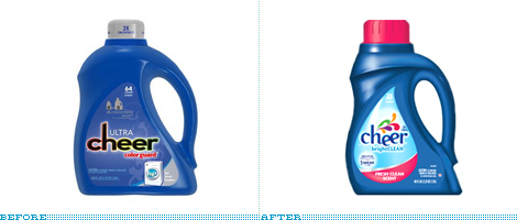
The previous change wasn’t too drastic, so I’m certain most consumers didn’t quite notice, allowing for something more pronounced this time around. If there is one thing that is consistent though is the quirky, yet not quite lovable, typography. The dropped “e” adds some dynamism to the mark, but not sure if provides any other function or what it may mean. The bevels, shadows, highlights or whatever those may be are a little awkward, it vibrates, like when you use red on top of green. And the explosion of colors, who knows what it is, but I’m pretty sure the last thing I want for my detergent is to spew colorful blobs on my clothes. Not much to say about the new label other than it is shaped like a drop, so at least it has that going for it. Overall, it does feel cheerier and lighter.


Jump to Most Recent Comment
Steve Killen’s comment is:
Possible more generic in design but it makes a massive difference on the actual package.
On Mar.11.2009 at 06:31 AM
John McCollum’s comment is:
It's definitely better. I'm not sure about the thing on top. I'm sure it's supposed to look festive, but it kind of feels like something is in the process of dying.
The change most likely to make a real difference on the shelf is the color of the label. The light blue pops and really does make the package look, well, cheery.
On Mar.11.2009 at 06:54 AM
Tomasz Ronda’s comment is:
I like packaging as a whole, label that looks like a droplet. But logo looks a bit squashed, like they ran out of space or something.
On Mar.11.2009 at 06:54 AM
Plamen’s comment is:
Ahm, it could be cause I'm not into washing really, but what is that green shape there?
On Mar.11.2009 at 07:01 AM
lost’s comment is:
the green is there because it makes your colours more colourful lol
On Mar.11.2009 at 07:08 AM
Ben’s comment is:
@ Plamen
I right with you on that. What is meant to be?
I think the logo would be better without the bevel and color squirts. The packaging makes a difference, but I wouldn't attribute it to the logo change.
Robin’s comment is:
@ Plamen & Ben: I think the green looks misshapen because there's supposed to be a white blob in front of it.
On the whole, I like it. The logo definitely has more feminine appeal, and I didn't care for the squished typography of the previous one. The only thing I dislike is the wordmark beneath it — "brightCLEAN"?? The all-capsiness of CLEAN makes it sound like someone's interrupting themselves. "I like my clothes bright — no, CLEAN!"
On Mar.11.2009 at 07:38 AM
David’s comment is:
Overall, I would say this is a dramatic improvement. The packaging itself is very unique. It says, lets have fun doing laundry! The logo on the other hand, has potential and could use a little work to take it all the way. The bevel being my biggest concern.
On Mar.11.2009 at 07:45 AM
JBIII’s comment is:
I like the attempt to brighten up the logo. I think the colorful drops can be executed better. The negative spaces around them are quite awkward. I would have voiced the nice curve of the body of the "h" to start my first droplet.
I also do not understand why only the first e is dropped off the baseline? I start to rethink what I am reading or how I am supposed to pronounce the brand. Is it "ch" - "eer" or is it "cheer". Maybe I am over thinking it......
On Mar.11.2009 at 07:58 AM
DG3’s comment is:
Looks better than the previous version, and that's a good thing these days.
On Mar.11.2009 at 08:03 AM
Swifty’s comment is:
If I were a cynic, I'd say they they used switching to smaller packaging as an excuse to redesign their logo. But that's only if I were a cynic.
By itself, I actually like the logo. I like the colors in the swooshy thing. I even don't mind the bevel in the lettering. I'm not 100% fond of the dropped 'e,' but it's not a dealbreaker.
As for the packaging, I think it looks a bit too generic. You can probably chalk this up to the minimalist kick I've been on lately, but I would have greatly preferred a cleaner, less cluttered label.
On Mar.11.2009 at 08:24 AM
Erik’s comment is:
I like the new packaging overall. It definitely feels more cheerful than the last design. The addition of the teardrop label makes me think of pouring the detergent. I don't particularly care for the new logo, the colors above the type feel awkward and unrefined. the white space between the green and purple is particularly strange to me.
On Mar.11.2009 at 08:36 AM
LogoCrapper’s comment is:
The new package is nice, it feels considerably tighter as a brand. That logo is crap though - not that the old one was much better - but what the hell is that shape? Why is it somewhat consistent except for that green snot on the top of it? (I see the negative white shape in there - but the green pops more)
So to recap
Package: win
logo: fail
Jacob’s comment is:
The color explosion almost looks like a pile of disorganized laundry in a basket. (Well, I guess it's organized, in this case, to look "cheerful".) Not a bad idea--it says Cheer is color-safe.
On Mar.11.2009 at 08:45 AM
Blake’s comment is:
It's certainly... happier. This is a case where nobody had enough time to care about the new brand, so changing it again wouldn't be so dramatic. Like shuffling a deck of cards...
On Mar.11.2009 at 08:57 AM
Matt Gavenda’s comment is:
I think it definitely says "laundry detergent" better than the the last logo. I think the bottle handles the new logo better as well. The previous logo seemed too techy for a laundry detergent with this name. I agree that there IS too much going in this new logo. But overall it does fit the brand better.
On Mar.11.2009 at 09:01 AM
Kristen’s comment is:
Perhaps the logo looks like it's "bouncing" as a reference to your clothes bouncing around in the washer.
On Mar.11.2009 at 09:06 AM
Josh’s comment is:
I LOVE the container. It's very figural, almost like a woman in a dress walking into the wind (headed left). Absolutely a gorgeous form (even though the handle is a bit awkward at the base connection)
On Mar.11.2009 at 09:17 AM
colormist’s comment is:
OMG, the website is freaking adorable. I'm just mousing over stuff to see what will happen next. Sucker for details right here. (Okay, the laundress illustration on the website doesn't match the rest of the design, but I guess that's one detail I can overlook since the rest is so cute.)
I like the overall look and colors, but the edges on the letters are driving me nuts. They're all choppy--even on their website. Hopefully it doesn't look like this on the actual packaging. I'll have to make an effort to check it out next time I'm in the store.
On Mar.11.2009 at 09:23 AM
ZedZedEye’s comment is:
Oh, I get it... the green blob creates a white shape to represent clean "whites". Can't help but see a Sperm.
On Mar.11.2009 at 09:33 AM
Johann Peter Werth’s comment is:
I cannot quite tell what disturbed me about the old-old and the new-old logo since I’m not really familiar with north-american consumer products. (At least not with fabric softener or cleaner.) I can only tell I didn’t like it before. It somehow reminded me too much of something rather cheap.
The new-new logo, it seems, is another step to globalized branding. That is exactly how, now even in Germany, EVERY product has to look like, no matter what it is (dishwashing liquid, tea, soda pops, sausages, a bag of clothspins…). So considering that: The old logo at least had something unique to me. The new-new one could be Kraft Foods aswell as some indoor swimming pool or the Canary Islands or cereals.
How come everything looks so unified?
On Mar.11.2009 at 09:33 AM
kristin’s comment is:
I'm not completely offended by that shape at the top, I just wish it was executed a bit better. That green shape and the white space underneath it seem out of place.
I like the type but it could be improved by bringing the bottom "tails" (forgive me for forgetting my typography terminology) or the c and the second e to connect with the next letters. If you're going to shove letters that close together you may as well go all the way.
Doug Bartow’s comment is:
liga-cheer
(TM)
On Mar.11.2009 at 09:48 AM
Joseph Szala’s comment is:
The execution is so close. I like the newer look. It supports the brand name and vibe. However, the rendering needs some help.
The white droplet dropped out of the green blob is just poor. It looks like it is half baked.
Dropping the first "e" so it flows from the "h" and into the other "e" just isn't worth it. It looks amateur.
The packaging is great and it's an improvement from the other recent redesign. Kudos.
On Mar.11.2009 at 09:49 AM
Glenn Sakamoto’s comment is:
The color explosion adds some whimsy and "cheer" but the dropped "e" seems silly and less credible. The teardrop shape helps to communicate "wash."
An clean improvement.
On Mar.11.2009 at 09:52 AM
Jessi Long’s comment is:
The logo is a bit of a jumbled mess. But the packaging is quite interesting. Quite fierce, actually. Fierce, like a college mascot redesign.
What will really stand out on the shelf though is the drop shape against all that blue. Kudos for giving the label enough negative space around it to stand out on the shelf.
Still, this package redesign won't get me to buy cheer over anything with a lower price point.
On Mar.11.2009 at 09:55 AM
Jonathan’s comment is:
Much improved! That squished black type just weighed down that old packaging, I remember seeing it in stores and just thinking "what were they thinking!"
The new packaging fits right in, definitely competes with Downy or Tide now. The logo has also improved. While the confetti/stripe things aren't rendered too amazingly, they do give a bit of feeling and meaning to the word "cheer" I'm not sure about the type though, it works, but it seems like it could be more polished.
On Mar.11.2009 at 09:55 AM
Brandon’s comment is:
I'm pretty sure I like the new design less than the previous new design. The combination of the soft blues and hot pink make for a more feminine design that I am probably less likely to buy myself.
The label on the front is shaped like a droplet. I don't know what exactly that should represent, except that my clothes should get wet when I wash them. I don't know what the spurting droplets above the name represent, either, but there seem to even be shapes of the droplets in the negative space between other droplets, which is kinda cool.
On Mar.11.2009 at 09:58 AM
Nisio’s comment is:
Overall i think the new logo and the bottle are a too over-engineered and that's what is ultimately hampering the rebrand.
The wordmark is odd rather than quirky, and somehow it still looks unfriendly (it's not rounded enough, the ascender on the 'h' is too high and severe). It's as if a relatively formal font has been tweaked to look friendly, but there's a disconnect. (like dressing a funeral director is a clown costume - obviously an over-the-top example but you get the point).
I'm not too fond of the drops above the wordmark. I like the idea but again they seem a bit overworked, however the flat colours work, shame they saw fit to bevel the wordmark.
Basically a font change, some simplification and flat colours could have made this a really nice rebrand.
On Mar.11.2009 at 09:59 AM
Jeffry Pilcher’s comment is:
Every time I'm in the detergent aisle in the grocery store, I feel like going to a rave. I love all the colors man...
This new design is much more feminine than the old one. I miss the gradient in the old one; it was a unique touch. The new symbol reminds me a little of that logo for some Caribbean nation (whose name escapes me now).
On Mar.11.2009 at 10:10 AM
Frank’s comment is:
Could it be that "naive" design and color explosions become the new swoosh of nowadays ? For me that logo icon tells me nothing really.No idea what it's supposed to be or stand for except for the relation to "colorful" maybe which kinda makes sense for a detergent.But the shapes themselves look awkward and as if intentionally designed to come across as "naive art".Then again, maybe someone was just sloppy but sold it to the client with a good story, who knows.
Glad i'm not the only one who immediately saw "sperm" in the white space blob :)
I kinda like the typography (minus bevel/shadow) and also the dropped e makes sense with a name like "cheer" to emphasize aspects of fun, friendliness etc i think.
On Mar.11.2009 at 10:19 AM
Philip’s comment is:
Definitely more attractive from a consumer standpoint. I think the burst of colors might be suggestive of how bright and vibrant your clothes will be from using the product. I like it minus the light blue drop behind the main word mark.
Also, I love how wordy and substantiated everyone's comments are post-comment debacle blogs. Armin is big brother. Watch out - I heard he will eat you alive.
On Mar.11.2009 at 10:23 AM
Anonymous’s comment is:
A much needed improvement - the squashed type from 16 months ago really bugged me, esp on the store shelf.
This new one is simply better.
On Mar.11.2009 at 10:38 AM
Joseph Maguire’s comment is:
Positively wonderful brand update. What were they thinking with the black identity prior. But overall its a great looking update.
On Mar.11.2009 at 10:48 AM
Ty’s comment is:
The new logo is a mile stone ahead for the brand versus the old logo. The blooming colors on top of the type isn't too bad, although the green part seems out of place. I say change its orientation to resemble the white and orange it sits between and get rid of the "brightCLEAN" type below and it is good to go!
On Mar.11.2009 at 10:55 AM
Ricky Irvine’s comment is:

It's a smile!
On Mar.11.2009 at 11:22 AM
Cristian Loghin’s comment is:
I believe they came close to having something special … but stopped short. In their category, being the product that owns the droplet is something.

craig ’s comment is:
It looks like they went back to the playful ee's used before the 2007 redesign. Cheer must not be selling well to make such a dramatic change. Too much crap squeezed into the new logo.
The old design, though boring, reads better.
On Mar.11.2009 at 11:33 AM
Bradford R. Pilcher’s comment is:
It's certainly brighter and cheerier, which for a product named "Cheer" makes obvious sense. This probably explains why it was selected and approved. That being said, it now blends in with the vast cacophony of bright, cheery brands on your local grocery store aisle.
What bothers me about so many of these types of redesigns is that while it may look nice in a vacuum, brands don't exist in a vacuum. By definition they are competing with other brands in a specific context. No context could be more specific than the overwhelming noise of a shopping aisle. Aside from the quirkiness of this logo, I'm not sure it will help the brand stand out, and for all its limitations, the original design actually did that.
On Mar.11.2009 at 11:50 AM
heather van de mark’s comment is:
Haven't several logo designs included several bursts of rainbow color? ... kraft foods, yoplait, greater montreal, museum of london, cooper union (school)... I guess it's not the shapes of the colors but the similarities between colors... just something I noticed...
On Mar.11.2009 at 11:54 AM
Travis’s comment is:
Seems more appropriate, but that comes at the expense of uniqueness in a category full of fun, colorful, blobby brands.
But the simple, clean look that we designers are drawn to seems to not be working for a few consumer brands. This reminds me of Tropicana's "brand recall." After years of years of being bombarded with bevels, gradients and glows, this is the visual language to which consumers have become accustomed. And like a junkies, when we take away their eye candy the reaction is not a good one.
On Mar.11.2009 at 12:09 PM
Anna Bryant’s comment is:
Is it me, or is the new design a near dead ringer for the Downy fabric softener packaging? Same designer for Proctor Gamble maybe?
I agree, the droplet shaped label is very nice, but I would argue the logo looks about the same as half of the re-branded household items.
On Mar.11.2009 at 12:16 PM
jRod’s comment is:
Seriously, this is an upgrade. the previous version was good but used bold black lettering and probably made the marketing people a little squeamish. this is a much more appealing brand for the female market and looks fantastic on the packaging.
On Mar.11.2009 at 12:19 PM
Kevin’s comment is:
It may be just me, but I agree with Swifty about the package appearing smaller in order to possibly distract the customer from the smaller amount per container. The larger cap on the top is another indication. Pretty clever* actually: the customer pours more out each wash, therefore having to purchase the product more frequently.
Regardless, the overall rebrand is an improvement from the previous, but just how much, I can't say exactly.
*manipulative, dishonest, transparent
On Mar.11.2009 at 01:14 PM
Chad Kaufman’s comment is:
It seems like there has been a lot of news about products reducing the size of their products while keeping the same price. Less product for the same money. I would be interested to see whoever gets their hands on a new bottle if the packaging has been modified to hold less detergent.
Perhaps this quest to fake customers fueled the design behind the new bottle and subsequently a new look.
On Mar.11.2009 at 01:20 PM
Chris’s comment is:
Once I found out about the arrow in the FedEx, I no longer see "FedEx", I see "arrow". Similarly, now that I know about the sperm, all I'm going to see is the sperm. Not to be lewd, but seriously, if you ever get a comment like that about a design, change it immediately.
I don't care if the rest of the logo makes Paul Rand look like a chump, this logo is ruined for life to me. Shame on the designers and P&G for not seeing that.
On Mar.11.2009 at 02:22 PM
Anonymous’s comment is:
i actually really like it!
On Mar.11.2009 at 03:04 PM
Ben Peck’s comment is:
It's definitely an improvement. It's very organic and appealing but I get very confused on the green shape with the white knocked out (the only one that does that). Overall I think its a good move forward.
On Mar.11.2009 at 03:27 PM
Jerry Kuyper’s comment is:
Cheer,
brought to by Kraft Foods
Jerry Kuyper’s comment is:
Cheer,
brought to you by Kraft Foods
Think twice, post once
On Mar.11.2009 at 04:44 PM
Lester’s comment is:
It looks a little like the ‘h’ sneezed or had a colorful liquid fart or something. Aside from that, and the bevels, I really like it. I think the rainbow farticles need a little polishing, though. Fix it so the green one doesn't look so bulgey, the white one less spermy, and the pink one a little less barbed at the tip, and I think it would be a huge improvement.
I get where they're goin' with this, and I think if they would have given in just one more round of minor revisions, it could have been great.
On Mar.11.2009 at 04:45 PM
Stereo Radiation’s comment is:
It appears to me like the black lettering on the "before" packaging was a nod to the past. This redesign is a necessary break with that past.

Stereo Radiation’s comment is:
The "he" in "cheer" is also suggestive of the "high efficiency" symbol now gracing certain packaging:

Jeff’s comment is:
Waittaminute...
Vulcans invented Cheer?
Must have been before the Reformation.
On Mar.11.2009 at 05:24 PM
Pookie’s comment is:
I had really disliked the New 1.0 design, for the past year, but I can't say the New 2.0 works better. I thought that perhaps they were being "retro" with New 2.0, but Stereo R. cleared that up. The New 1.0 was indeed more closely tied to the original logo. Does anyone have shots depicting the era between Vulcan and New 1.0??
On Mar.11.2009 at 06:03 PM
lyndi parrett’s comment is:
i liked the redo version before newest one and the original. the new one is just too much...maybe losing a few of the droplets on top or adding a weighted color like a charcoal or black would give this mark more oompf...the new mark to me is too rainbowish, i feel i would see this at the 99¢ store.
On Mar.11.2009 at 06:13 PM
Mark’s comment is:
Um is it an improvement?
I'm not quite sure...
It could have been done a lot better.
My problem is why didn't they let the previous one last a bit longer before changing to the new one? Why change it so fast?
On Mar.11.2009 at 06:32 PM
Mark’s comment is:
I can see why they changed it, the previous one was too dull and probably blended in on the aisle. This one sticks out more.
I could do without the color squirts (hehehe) though.
On Mar.11.2009 at 06:36 PM
decksnap’s comment is:
Cheer....gets the sperm out.
I guess there's something to be said for that?
Also, is this comment long or insightful enough for the new rules and regulations? :-(
On Mar.11.2009 at 06:54 PM
@dkmashino’s comment is:
it looks like Stop & Shop in New England.
On Mar.11.2009 at 08:40 PM
keone’s comment is:
There's a peacock on their webpage... perhaps the "color blob" is supposed to resemble a peacock's tail feathers? Overall, it's much better than the previous.
On Mar.11.2009 at 09:03 PM
Panasit’s comment is:
White blob overlapping the other "blob" is not an excuse for the apparent of bad curves (and they look really bad). Designers should be responsible for the overall look of their design, including all the shapes that are form in both the positive and negative space.
On Mar.11.2009 at 09:32 PM
Mark’s comment is:
I don't know WHY maybe it's me but...
for some odd reason it looks like the h is vomiting.
I'm not putting that against the designer or anything, it's just something I've noticed.
Was something similar to this intentional, like color emanating from the h?
I could still do without the color squirts (teeheehee)
On Mar.11.2009 at 10:21 PM
Amanda’s comment is:
In today's economy, it seems to be a growing trend and opportunity for reinvention, to stand out in the crowd; And in a world not so cheery, if the refresh on this makes you gravitate to it and purchase Cheer vs. their competitor, it seems the goal may have been achieved.
I'm not in love, but it is a definite improvement by some means. For a brand that began in 1952, I wish it had a bit more graphic stability and historic reference somehow.
On Mar.11.2009 at 11:11 PM
Frank’s comment is:
"i actually really like it!"
@Anonymous:
Could you please elaborate further about what it specifically is that you like about the design ?
Naww, just kiddin'...;)
On Mar.12.2009 at 12:09 AM
Bianca’s comment is:
I didn´t liked the previous one, looked squashed or something.
And even when i don´t like all that color, bevels and the dropped "e" , it definitaly looks better on the package than the previous one.
David Sanchez’s comment is:
The change is a clear indicator that P&G finally gave up on trying to make Cheer androgynous. With research and data of consumption by gender. Cheer crossed over to be more feminine and organic. Nice improvement on the packaging system.
On Mar.12.2009 at 10:10 AM
Anonymous’s comment is:
So much better! And for those of us who actually do laundry every single day of our lives, both the logo and the laundress do add a bit of cheer to the drear.
On Mar.14.2009 at 08:18 AM
orangetiki’s comment is:
if we could just do away with the embossed look on the letters i'd give it an A. B+ from me.
On Mar.16.2009 at 01:10 PM
The Zed Word’s comment is:
Looks to me as if the "burst" started out as a butterfly of sorts on the first pass, and ended up as a color burst.
Also, it seems the first E is below the baseline to emulate the way the type on the original box sloped upwards; the angling is very similar. But if I hadn't seen the Vulcan screencap, I wouldn't have known that!
I don't love it but I can't deny it's quite a bit "cheerier", and definitely brighter, than the recent redesign, which at least fits in with the overall theme.
On Mar.16.2009 at 03:10 PM
Shauna’s comment is:
I like it It looks much more cheerful than the last one. I think the color squirt is supposed to mean that it won't make your colors fade and if that's the case I'm not sure why they used colors like that brownish orange and that pinkish redish color.
And the "bright CLEAN" seems really unnecessary.
Shawna S’s comment is:
@ Ricky Irvine: I agree - it seems like the smile is the design trope of 2009 (Pepsi, most memorably, but there have been others mentioned on Brand New). They're getting boring (like the bubbles or swooshes or spheres before them).
The new logo is definitely more cheerful than the one before it and while I'm not a fan of the logo on its own, you rarely see logos of detergent other than on the packaging (exception being Tide's fantastic Loads of Hope T-shirts) so this one gets a thumbs up. The packaging is a vast improvement.
On Mar.17.2009 at 04:22 PM
izzy’s comment is:
This looks like a last ditch effort to save a brand that lost relevance about a decade ago, and has since been struggling to find a way to justify its reason to exist. My guess is that they are still trying to target a younger (college age), obviously female, and here's the key... "uninvolved" consumer who sees laundry as "like, something kinda cute to do, but so, like, boring and time consuming -- especially since it can't be done right on facebook..."
I cannot see a how a consumer who is looking for efficacy (which I imagine is the key purchase driver in this category) would even consider buying this cute and "organic" (as some have called it here) laundry detergent. I don't know about you, but I want whoever's doing my laundry to look, at least, like they have some confidence to get it done -- and I'm not getting that from this new logo. Instead, this logo projects a somewhat shy, too friendly, delicate and almost apologetic image.
The only thing I find brilliant in this redesign is the way it's creator(s) were able to integrate all of those graphic elements which are "a must" and very au moment today:
- the color spew
- dumb, I mean friendly, typeface
- the smile
- and the overly designed structure that is trying very hard to say something, but nobody is really interested in listening to.
So, Bravo! Job well done! If we're lucky, this will just accelerate the brand's demise, which will open up much needed shelf space for that new version of Tide/Fabreze/Downy/Gain concoction we've all been waiting for!
On Mar.18.2009 at 12:19 AM
Rosella’s comment is:
Positive. Feminine. Bright. Did I mention CLEAN. I think they are hitting their market a little bit better with this redesign. After all, it captures "cheer" better than the logo before, which looks like it could belong on something more like men's deoderant. The packaging has convinced me that the detergent smells better too.
When it comes down to the details it could use a reevaluation, but overall I would say it is an improvement.
On Mar.18.2009 at 08:57 AM
Caroline’s comment is:
That looks great! I love it!
On Mar.19.2009 at 04:24 AM
Todd’s comment is:
its now a detergent for women only?
On Mar.23.2009 at 04:54 PM
DIRT DIZZLE’s comment is:
whats the deal with the white sploosh on top of the green one?
It makes the green one look funny and the white on out of place and goes against the "grain" of how they are all flying out.
On Mar.25.2009 at 03:20 AM
pfffft’s comment is:
It's very reminiscent of the new Kraft logo.
On Apr.03.2009 at 01:20 PM
pfffft’s comment is:
It's very reminiscent of the new Kraft logo.
On Apr.03.2009 at 01:22 PM
film seyret’s comment is:
thanks man
On Apr.14.2009 at 06:02 PM
JeffT’s comment is:
Somehow I find the old Cheer packaging from the 60s so much more clean, modern and eye-catching.
On May.05.2009 at 10:28 PM
TX Design’s comment is:
This reminds me of the logo for the bahamas. Anyone see that?

Anonymous’s comment is:
I just stumbled upon this... I was very involved in the Cheer logo and you guys are WAY overthinking this. Androdgeny, Designed for college students, Sperm!! Ridic. Clearly you have zero understanding of how a multi-billion dollar company makes decisions- we are highly unlikely to pick "college students" with low consumption as a target for a detergent brand. And you're right poster- shame on us for not thinking "SPERM!". And to the person saying it won't "pop" on shelf, - it would probably be a good idea to go look at it in a store before commenting.
On May.22.2009 at 08:39 PM
Comments in Brand New, V1.0 have been closed.


