

NOTE: This is an archived version of the first incarnation of Brand New. All posts have been closed to comments. Please visit underconsideration.com/brandnew for the latest version. If you would like to see this specific post, simply delete _v1 from the URL.
![]()
When I was first tipped about the change of logo at msnbc.com, earlier this month, I floatingly replied, “looks like at least someone’s paying attention to the kerning,” and dismissed it as a simple typography change made internally over the weekend while no one was watching. This, paradoxically, is both disdain for the new msnbc.com logo but praise for the new identity and brand positioning. Let me explain. (As if I wasn’t going to).
As is evidently obvious, the new logo has switched from the unbelievably clunky, non-flattering, monolithic, typographically-wrong — heinous horizontal scaling anyone? — uppercase wordmark to an überfriendly lowercase setting. The peacock’s feathers, of course, have been left unrattled. The move is instantly beneficial in that the mark becomes approachable and rhythmical, instead of cold and monotonous. And this is achieved just by switching from one sans serif — a mangled Helvetica or, worse, possibly Arial — to another — the never-wrong Gotham. Some might consider this a moot, unnoticeable switch but, my guess is that, a screaming change was not in order, and as far as subtle moves go, this is as good as any. The move to lowercase is probably intended to establish msnbc.com’s own identity and shed some of the weight from its genealogical roots, those of the its namesake: MSN and NBC. It succeeds in doing so and forcing you to stop trying to think about what M S N B and C stand for, however, the continued uncapitalization of corporate and brand identity — further enunciated by the proverbial Web 2.0 logos — favors form over substance, and eventually all logos will be blobby, friendly, meaningless avatars of their original meaning. So the logo redesign itself is not exponentially interesting or drastic but it does what it’s intended to do: Signal change.
On April 2, msnbc.com, working with SS+K — “a bunch of… guys with experience in elections and crisis communications” — launched its first themed campaign: A Fuller Spectrum of News. First some press releasing:
“The Fuller Spectrum of News campaign speaks to msnbc.com’s rich consumer experience, an online environment no other news site offers. It’s designed to bring to life compelling, original and even quirky stories, and showcase the diversity of media, sources and platforms consumers discover on the site.”
— Catherine Captain, vice president of marketing, msnbc.com
“Color is a great metaphor and gave us a dynamic way to illustrate the rich variety on the site beyond using the obvious news photos.”
— Marty Cooke, chief creative officer, SS+K
I rarely say this about campaigns, but this is borderline brilliant in two respects. First, it creates a simple parallel: What is as numerous and varied and as the news? Color. Second, it poises msnbc.com to own color. Every color. Not just Target red, or Starbucks green, or Wal-Mart blue. Every single color from lavender to burgundy to black. Not even monopolian Pantone has been able to do this — and their business is color. Because of its extreme media reach, devoted audience and daily relevance, msnbc.com can engrain the color spectrum idea into the consciusness of the public. And when you own the full color spectrum, the possibilities for a vibrant, memorable campaign are almost assured; there is a color in there for everyone! Msnbc.com and SS+K would really have to fumble every execution to make this campaign stink. But so far, the soft launch — from what I’ve read on some blogs, more and major changes will be coming in the next few months — has set an excellent approach:
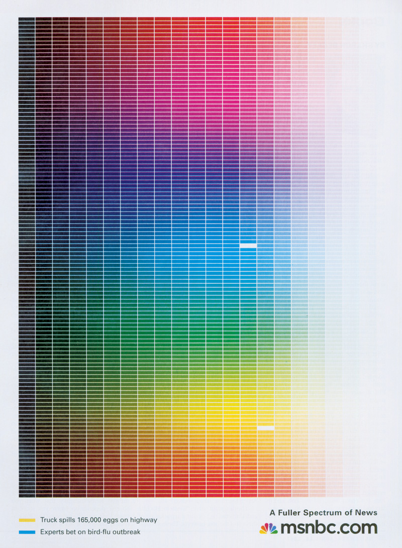
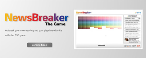
Print ad from Newseek. When it comes to deploying every color in the spectrum you can make it a gradient, make it a rainbow or you can turn up the seriousness dial by strictly compartmentalizing every single color. At the bottom of the ad you can see two of the stories picked out from the spectrum. And the gray background is actually white, not the greatest scan. [Click image for a larger view]


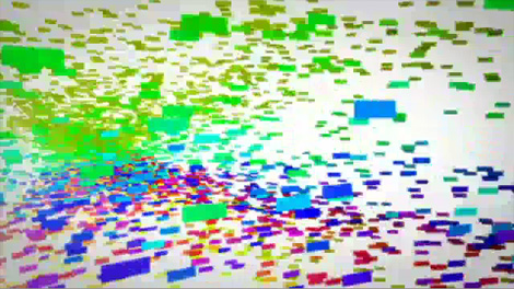
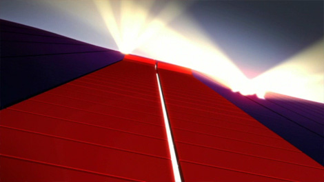
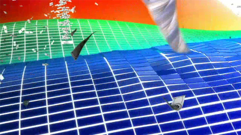
Working with New York-based animation studio CHRLX, SS+K developed a TV spot that is “msnbc.com interpreted in picture and sound,” showcasing the variety of news covered by them. It starts cheesy, but it gets better. And…
![]()
![]()
![]()
![]()
Some of you know how much I love logo animations at the end of TV spots. This one doesn’t disappoint!
And how clever is this?! It’s a loved game and it ties maybe too perfectly to the visual language of the campaign.
While I prefer to get my news from trusted sources like The Daily Show and The Onion if msnbc.com can pull off owning the full color spectrum they might just lure me with all those pretty colors.


Jump to Most Recent Comment
R Berger’s comment is:
"and it ties maybe too perfectly to the visual language of the campaign"
Maybe the chronological order is reversed–
Think maybe somebody was playing Breakout instead of working and got caught…
"What are you doing? you should be working on the MSNBC re-branding!"
"Umm, I am." (quick, make a campaign around Breakout)
accolades
On Apr.12.2007 at 10:30 AM
Patrick Senecal’s comment is:
I like good ideas
On Apr.12.2007 at 10:54 AM
felix’s comment is:
agreed. but not so on board with the kerning tightening... sorry, i couldnt resist...
Insert Image: 
Tom Cox’s comment is:
I like the campaign, and the new mark is "nice", but it seems a little safe to me - almost unnoticeable - maybe that was their objective.
I hope they plan on a site redesign, b/c it lacks the promise of the campaign from a visual perspective.
I also wonder how much this will carry over to the cable network side, which I think has been gaining ratings but still pretty far behind Fox and CNN.
On Apr.12.2007 at 11:21 AM
JonSel’s comment is:
I like good ideas
Couldn't have said it better myself.
On Apr.12.2007 at 11:23 AM
felix’s comment is:
this previous incarnation was far more prevalent than the horizontal version. They're equally bad. Oy. Good riddance.

felix’s comment is:

Today's Imus Mourning After moment brought to you by the clean up network. We blowin' up, yo.
On Apr.12.2007 at 11:32 AM
margot’s comment is:
The way SS+K has used gradients & the spectrum is fresh compared to most usages of color gradients that I've seen. No matter how sick designers get of the omniscient gradient, I believe it's here to stay, so kudos for an interesting use of a cliché.
On Apr.12.2007 at 11:53 AM
DC1974’s comment is:
I agree this campaign has been absolutely amazing. The banner ads all over Wonkette with the news crawl at the top have been fantastic. I can't remember the last time I clicked on a banner ad -- if ever. Each one here has some new aspect going on (like the news items that keep subdividing into more and more with each click until you have the full spectrum). I've clicked through to the msnbc.com website several times in the last few days -- and then the problem starts. Their website doesn't not live up to the quality or the innovation suggested by the ads. It's just another Web 1.0 news site. It comes up empty -- and it looks bad to boot. So in that way the product doesn't live up to the hype. So once I click through -- I don't stay.
On Apr.12.2007 at 12:13 PM
Josh G’s comment is:
Nice update and great campaign. However, for me it just feels a little awkward and perhaps even gimmicky when you see the campaign and then try and associate msnbc with hard news. Seems too light and fun. And when I think color, light, and fun I think of Sony BRAVIA color balls flying everywhere. It's probably just me though.
On Apr.12.2007 at 01:15 PM
jon’s comment is:
Yeah I think this logo is way too friendly looking - wasn't MSNBC trying to make themselves out as the rough, scrappy, hard-hitting news network going up against the boring CNN and the unbalanced Fox News? Isn't this the network whose top show is HARDBALL? Terrible.
On Apr.12.2007 at 01:53 PM
Glen’s comment is:
Similar in concept to another news outlet in the UK, The Guardian:

props to adsoftheworld.com
On Apr.12.2007 at 02:04 PM
Frank’s comment is:
This is an older version of the Sat1 logo, a long established TV station here in Germany:

They had a somewhat similar concept in those days.
On Apr.12.2007 at 06:57 PM
J Levi’s comment is:
What a way to conceptually play off and freshen up the peacock.
I could nitpick, but does it matter?... (Felix's "tighter lock close kern" really does it for me). Good type too. Happy enough/transparent enough/serious enough. Before the type felt like it could be on the sign of an auto body garage in the middle of ohio. (I've seen a lot of type on signs on auto body garage in the middle of ohio)
Plamen’s comment is:
Looking at the logo animation first frame, you can see the logo of the Turkish Show TV, which was (and still is) a sheer knock off of both the peackock logo and that of Sat.1. What an irony...
![]()
Christian Palino’s comment is:
Firstly Armin, great job with the write up on this one. It was nice to learn something new about the campaign positioning and have our brand discussion contextualized within an application/campaign.
Certainly there is a kerning issue—it seems more and more recently like kerning is turning into some kind of dinosaur that we only find artifacts of in the past. Perhaps this is a reflection of the design education system… but thats a topic for another conversation.
The campaign is very strong, and in the US market at least is situated to provided an access point to the news which is relatively new and breathing some fresh air.
The revised logomark for msnbc, while not really expressing the acronym in a technically, gramitcally correct fashion gets away with it just fine. And the use of the lowercase is less imposing, more legible, and just plain friendlier than the all-caps imperialist approach. Gotham is quickly becoming the new corporate DIN…
A gentle logomark update that is indeed an improvement, is smart and was much needed.
On Apr.13.2007 at 04:54 AM
SN’s comment is:
You mentioned how you prefer alternative news sources such as The Onion... But it looks like you did not notice the msnbc-sponsored video content that was their top news earlier this week (though still above the fold now).
On Apr.13.2007 at 09:05 AM
Bobby Henderson’s comment is:
I think the new treatment of the "msnbc" logo is a good improvement. Gotham is inching toward the category of "over-used to death," but it works here. The even, geometric lines of those lowercase letters fit with the even geometric curves in the NBC peacock logo. The harmony is pretty obvious.
The lettering in the previous version looked pretty bad -as if it had been deliberately distorted, and with the distortions being applied unevenly across certain letters. The "S" in the old logo is very oddly given a heavier weight. Why?
My only knock against the new MSNBC logo is that it is a fairly conventional solution. I think a greater level of creativity could have gone into the logo's curvy nature.
On Apr.13.2007 at 04:01 PM
Joe M’s comment is:
Friday Fun Fact:
The "nbc" jingle is actually the notes
"G-E-C" which stands for
General Electric Company.
diane witman’s comment is:
Like the logo, love the print ad and the animated logo.
What is with their line "A Fuller Spectrum of News"? What do they mean by this? Fuller than who or what? Do they mean fuller than before the new logo? Many people mentioned their presence on the web is extremely disappointing. If you're going to roll out a campaign claiming that your news is "a fuller spectrum of news" then all of your presences, online and off, should be in tune with that thought.
Definitely needs to be kerned a little better.
On Apr.13.2007 at 07:28 PM
humanot’s comment is:
i think this is a very nice little polishing up they did ... nothing lost ... nothing hugely gained either, just kind of keeping up with the times .. and doing it in style.
I am disappointed theres no major web relaunch to do the very same thing though .... as of right now CBS has a very nice web template thats actually quite beautiful.
On Apr.14.2007 at 05:23 PM
alba’s comment is:
GE is using a lot of lowercase lately. I think this MSNBC move makes the logo fit into this new standard.
On Apr.16.2007 at 11:33 AM
KC’s comment is:
I wonder if the designers at msnbc were influenced by Adobe's new concept behind their software icons. See the link...
http://stellify.net/visualize-express/adobe-cs3-program-icons-alphabet-soup-on-a-color-wheel-and-what-they-mean/
On Apr.18.2007 at 06:46 PM
Pixel’s comment is:
I'm wondering if this is an ad campaign or a redesign? I mean, beside the new logo I can't see any appliance of this concept to the whole website. So where's the color spectrum?
On Apr.26.2007 at 06:31 AM
Mark’s comment is:
Actually I think this logo SHOULD also be used on the air, it certainly looks more professional than that "corner logo made horizontal" mash-up they got now.
(seriously who chose that WIDE font? I don't think it's even an official font for NBC)
On May.09.2007 at 02:40 AM
jOHN’s comment is:
My only knock against the new MSNBC logo is that it is a fairly conventional solution. I think a greater level of creativity could have gone into the logo's curvy nature. I first seen it at the pre launching partying for this new social networking site called filmstars08.com. It was a featured advertisment and most everyone there felt the same way about the design.
On Oct.21.2008 at 04:02 PM
ian Perkins’s comment is:
funny someone made the connection to the guardian uk work. I used to work at Chermayeff and geismar design (with steff geissbuhler who did the nbc peacock logo) and then i did the guardian stuff. I like bright colours, or colors.
On Oct.31.2008 at 01:31 AM
Ben Moseley’s comment is:
Diane Witman: What is with their line "A Fuller Spectrum of News"? What do they mean by this? Fuller than who or what? Do they mean fuller than before the new logo?
I think it's pretty clear that they mean a "fuller spectrum" than before this ad campaign but also compared to their competition. Not really that ambiguous or difficult to comprehend. Anything more in-depth or pedantic would have killed it.
Btw, I think the new ad campaign is brilliant. The new logo is nice, but the new ads with the color spectrum is what did it for me. It's a really beautiful way to show exactly what their slogan means. So it's not only beautiful but efficient and conveys that they have a wide variety of topics as well as a ton of stories to compliment it. The wordplay coupled with the visual is spot on in my opinion and I'm sure has gained a good size of visitors to the site.
On Oct.31.2008 at 02:44 AM
Ben Moseley’s comment is:
I also disagree that their ad campaign has to be same for both TV and Web. They are two different products. I also think that in trying to boost their readership for the website it will end up in a boost for their network. It's a two-in-one and both of them don't need to be advertised in the same way.
On Oct.31.2008 at 02:48 AM
Comments in Brand New, V1.0 have been closed.


