

NOTE: This is an archived version of the first incarnation of Brand New. All posts have been closed to comments. Please visit underconsideration.com/brandnew for the latest version. If you would like to see this specific post, simply delete _v1 from the URL.
![]()
There are a few reasons why I thought covering this redesign would be helpful, since it falls somewhat outside of our regular coverage: It’s for a brand few of us have probably heard of, for a product we likely don’t need, and it wasn’t done by a fancy design firm. ESS, or Eye Safety Systems for long, is an 11-year-old company that “creates advanced eye protection systems for military, law enforcement, and fire/rescue professionals.” Definitely not your hip aviator sunglasses. This past January they launched their new identity, designed in-house and led by Ian Griffiths, who was brought on board to redesign the whole brand and its related materials.
![]()
One of the reasons I wanted to post this was to show that sometimes a gradient-decked, image-based logo is the most appropriate. In this case, the metal and hardcore texture of the logo really brings to life the bad-assedness that these glasses must be, and communicates that they are tough, durable and can withstand any sort of pressure. A black and white logo sometimes simply can’t do that. And as you can see in the packaging shots below, it can look pretty crisp. There is a 1-color application for the new logo and it works just fine too.
![]()
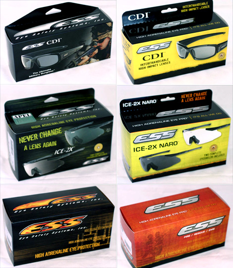
Before and after of three different products.
I would describe this as a really encouraging redesign; it just breathes new life into what was really a poor logo and identity, giving ESS a very appropriate look.

Afghan Police/soldiers (the good guys) with a banner of ESS.


Jump to Most Recent Comment
Nisio’s comment is:
For an EYE safety system, it sure is hard to read.
Other than that it's a pretty boring, macho logo. Maybe they could do a version out of fire... oh, wait, they did.
Sadly, pitch-perfect for it's market.
On May.20.2009 at 08:04 AM
Keli’s comment is:
Never Change A Lens Again! Get your Shamwow! Sorry, I just hate tacky lines like that - at least there isn't an actual exclamation point at the end. Reminds me of an infomercial. They should have gotten rid of that on the packaging and come up with a better message. I don't have any suggestions at the moment but it can be done. As for the logo, I really don't like how the double s's are connected. I understand the metallic look but I think it does translate well into black and white and this could be used cross functionally on different medias.
Better than before.
On May.20.2009 at 08:43 AM
Kevin Zwirble’s comment is:
I think the typography is def. more advanced than what they had been working with. Oddly enough, I think the logo looks better in the metallic texture. I would normally shy away from flashy work, opting for simplicity.
As for the marketing approach, I imagine that it's all done in-house, so there probably isn't any second opinions when it comes to strategy and placement, and they know their customers, so they know what will sell and what won't.
On May.20.2009 at 08:54 AM
Eleventeen’s comment is:
Not bad for an in-house redesign.
On May.20.2009 at 08:54 AM
Chad Kaufman’s comment is:
I find it odd that the texture in the logo cannot be found anywhere else in the branding system. I realize that too much of it would be overkill very quickly, but to not reflect is anywhere else makes it look a bit pieced together.
They do carry the gritty paint splatter throughout which I think works considering a lot of the photos on their site depict people with mud all over their face and dirty, but this effect seems to overshadow the logo's metal texture that you mention.
Sidenote: They need to update their tattoos and shields to reflect the rebrand.


Ryan Adair’s comment is:
You're either with ESS or you're with the terrorists.
On May.20.2009 at 09:28 AM
Glenn Sakamoto’s comment is:
The 80's called and they want their logo back.
On May.20.2009 at 09:47 AM
Alvin’s comment is:
You guys are missing the point. It's not supposed to be trendy, fashionable, hip or "creative". The nuances that you complain about making it hard to read, those are the details that make it unique.
It's a simple, bold, well-designed logo that fits with its market. Which, surprisingly is becoming quite rare these days.
On May.20.2009 at 09:58 AM
Jacob’s comment is:
At first I thought the second "S" was a 5 (five.) That's because the top of the S is flattened, causing a slight bit of visual confusion.
On May.20.2009 at 10:02 AM
jRod’s comment is:
well, despite the uncomplimentary responses this logo is getting, i will say that it is appropriate for the industry and was a major upgrade from the previous version. just because it doesn't have the artistic flair of The Museum of London doesn't mean that its a bad logo. as designers, we must be willing to design what's best for the client, not what happens to be the trend at the time.
Good job Ian...
On May.20.2009 at 10:04 AM
StagingLt’s comment is:
-- "it sure is hard to read."
How? It's three letters.
--"Maybe they could do a version out of fire... oh, wait, they did."
That was one of the "before" packaging photos.
--"It's a simple, bold, well-designed logo that fits with its market."
'Nuff said. Good job on the new logo.
D’s comment is:
@ Nisio
'Maybe they could do a version out of fire... oh, wait, they did.'
That version of the logo on the left with the fire inside of it is the old logo; perhaps before making a lame comment, you should actually review the materials.
I agree with Alvin that the redesign was successful because it fits the audience so well. I also like on the new packaging, especially on the first two examples, that the product is easier to see and stands out more. The readability of the logo is much improved from the last version, and I think it will be well-received by their target market.
On May.20.2009 at 10:20 AM
Gareth Hardy’s comment is:
Nice one!
On May.20.2009 at 10:29 AM
Stuart’s comment is:
Apparently some of you are having trouble figuring out the comparison images above. Let me help. On the left we have the old branding system with the logo on the packages. Nisio, this is where we have the fire in the old versions of the logo, you'll notice that the new packaging simply uses the new logo as is.
Keli, you're next. Welcome to the world of graphic design. You appear to be anew to this weird and fantastic world so let me give you a brief tour. One of your biggest client types is going to be marketeers. We don't all get to work with Nike, a lot of us have to scratch out a living doing work for uncaring, unappreciative, over-demanding clients who have silly requirements like putting market-speak on their packages. You'll note that the message is less prominent on the package. But hey, perhaps even I've been to harsh. Maybe, just maybe this claim is actually true? Do you have any evidence to the contrary? No? Then kindly keep your cynical comments to yourself.
It's not all bad news though. Kevin wrote a nice, well thought out comment that I tend to agree with so I'll not rehash it all over again. A few others towards the bottom definitely understand this as well. Not ever logo is going to be, nor does it need to be, and most definitely should be, trendy. In fact, trendy design can be bad as trends change quickly and all the equity in the brand can vanish in an instant. Please, when analyzing a logo try to put it into perspective of the market segment it's in, the target audience, its intended uses even. Some logos don't necessarily need to be rendered in black and white (not that I'm saying this is one of them) and use of textures and gradients is wholly warranted. OPen your minds and challenge conventions, trends, and everything your crotchety old design teacher told you.
[Ed.'s Note: Comment edited to remove needless sarcasm]
On May.20.2009 at 10:38 AM
Von K’s comment is:
I think the logo is a huge improvement. The old one was very cheap-looking. This one keeps the equity and is much better-built.
The new packaging is an improvement, too, but there's still work to be done, IMO. I'm seeing some inconsistencies (seal placement, secondary type, thin orange band between yellow & black, "High adrenaline eye protection" is a funny line, just saying) that should probably be ironed out to make these perform even better.
Overall, an improvement.
On May.20.2009 at 10:45 AM
Scott’s comment is:
I think it's more fun for people to point out flaws or things they don't like than it is to praise a good redesign. Perhaps they are sharing what they don't like about the new logo and hushing up about what they do like. It's not the best way to "review" a design, but this format really lends itself to that type of commenting.
That being said, I don't have much negative to say about this redesign. It is, without a doubt, an upgrade to the previous logo and it fits with what they are trying to market. It also has the feel of a logo that will not need to be redesigned again in 2 years. I think that's something that most are going for when they design new logos. Well done.
On May.20.2009 at 10:52 AM
Carlo’s comment is:
Photo-op with Afghan police forces holding a cheap banner while the Taliban is sneaking around somewhere behind them???
ARE YOU KIDDING ME?!
JEESH c'mon Oakley!
American corporations just don't get it do they?
Steve K’s comment is:
To speak on Nisio’s behalf, I think he may have been fully aware that the picture was a before image and I thought the comment was rather funny.
On May.20.2009 at 10:57 AM
Keli’s comment is:
Stuart,
Thanks for taking the time to reply to my comment, at least you read it - good for you!
Just so you know, as you have so terribly mis-assumed, I work as a Marketing Graphics Coordinator(weird title I know)or in house graphic design as I like to call it. I do know about all the particular clients. Every day I sit here and deal with the crappy messages marketers before me came up with. I have 5 sub companies I get to collaborate with and handfuls of opinions I get to hear everyday about how they want this moved or that moved, I don't like that color, HEY WHAT ABOUT THIS!I understand this world, don't you worry. Slowly but surely the marketing team (myself included) will change the pretty terrible messaging that exists. Cynical? I don't really think so, although sarcastic is a synonym I prefer that word over the other - so we'll use that! I'd rather be sarcastic than self-righteous any day.
Once again,
Thanks for reading.
On May.20.2009 at 11:01 AM
Nate’s comment is:
It appears that Ian Griffiths has won a small battle in rebranding. While this identity doesn't quite pack the punch of a Nike swoosh A-bomb, it's at least a bullet at the heart of an ugly beast.
Could the new logo do without the metallic effect? Sure. Could the solution push to a higher level of creativity and relevance? Absolutely.
One thing is for certain. It's a heckuva lot better than design #1, so I'll call it a victory.
On May.20.2009 at 11:19 AM
Matt’s comment is:
"Sadly, pitch-perfect for it's market."
Dude, could you be more condescending?
On May.20.2009 at 11:38 AM
V as in Victor’s comment is:
I agree with Stuart. While this isn't the most cutting edge design and definitely uses some elements most of us have been warned about since design school, it works to hit the market. And at the end of the day, that's what we as designers do, help solve our client's problems. Not all logos are designed with the idea of winning awards to bringing about the next big trend. They reach out to the target market, help convey the message and at the end of the day, help build the financial bottom line. And if a logo, along with the collateral, does that we've done our jobs. Advertising and branding is not fine art. In that regard, I think this logo hit the mark.
On May.20.2009 at 11:40 AM
DC’s comment is:
Excellent comment Victor. I totally agree. Solve the problem 1st. If a design does not solve a problem, then it can be deemed as unsuccessful and you can rip it apart all you want.
Well done Ian.
On May.20.2009 at 12:27 PM
Johnny Holeva’s comment is:
V as in Victor gets it. One of the best comments on this site.
On May.20.2009 at 12:55 PM
koyo’s comment is:
Redesign is fine. Nothing brilliant but effective and good looking than the older one.
I have a little question... Where's the Graphic Design on the packaging? Oh Lord!!!
On May.20.2009 at 01:20 PM
John Mindiola III’s comment is:
I look at it like this: the new identity and packaging system is what the original designs were meant to be. They aren't reinventing the wheel, just updating everything, making it more relevant, etc. Nice work.
On May.20.2009 at 01:32 PM
scout’s comment is:
80s or not... like the bullet proof look of the logo.
"Don't stop believin
Hold on to the feelin"
Not a Design Professional’s comment is:
"Sadly, pitch-perfect for it's market."
Sadly, the first comment is both typical of many designers and is also indicative of why I hate the process of hiring designers.
Being a condescending snob is no way to assert your expertise. Well, it is a way, but it's immature, unprofessional and unsupportive.
I know my target market because I've done extensive interviews, observed the market members in their environments and tested the hell out of slogans, packaging, logos and ads to find out which ones sell the products. That's SELL, as in bring in the revenues that keep me in business and pay your fees.
Unless you're one of the very few designers that can back up your opinion about what's cool/pertinent/useful to the target with facts and data based on research and sales data, please keep your opinions to yourself. In return, I promise not to dictate that you add ridiculous gradients, bevels and drop shadows, unless my customers respond strongly to those things in which case I'll expect them all to be present in your work product.
To all the designers out there who realize that your "art" is in service to my business and demonstrate the understanding of my needs, help increase my sales, work to improve customer perception of my brand and are just generally are responsive, helpful and supportive I want you to know how much I appreciate what you do. You are truly rare.
Notice that I didn't begin the post by saying that I hate working with designers, it's the hiring that I can't stand. Working with a great designer is a fantastic experience. Weeding out the condescending, under informed fools who think that every product should be marketed and packaged just like is came from Apple gets pretty tiring.
Again, many thanks to those of you who get it. Your creativity has been an important component of my success.
On May.20.2009 at 02:10 PM
NicKLAUS’s comment is:
This logo definitely hits the mark while still keeping the feel of the original logo. By cleaning it up and streamlining it, this logo is much easier on the eyes, which in a way is keeping with the eye-safety mantra that ESS lives by. The logo looks strong, and it looks like you'd be safe standing behind it. It just feels right.
"ESS eyewear features high-impact polycarbonate lenses, which can stop a shotgun blast from 35 feet."
... that's impressive BUT what about the rest of your face?!
On May.20.2009 at 03:09 PM
Tim ’s comment is:
Verbatim agreed with V for Victor .
Overall, nice redesign. Solved the issue at hand. Move on to the next.
On May.20.2009 at 03:30 PM
Chris’s comment is:
@ Not A Design Professional
Definitely some interesting comments. I'm glad to see a non-designer posting on Brand New as you're probably outnumbered at least 10 to 1 by designers. Perspective around here gets pretty skewed sometimes (although I love the passion for design).
When I'm working a design, I judge the finished product by 2 things. In order of importance:
1. Does it meet the client's objective.
2. Is it beautiful.
Meeting the client's objective should always be first priority, they do pay the bills for crying out loud and they have an objective to meet.
Making something beautiful is secondary but still very important. This doesn't necessarily mean every piece is worthy of a design award, but it needs to be beautiful to who it intended for. You can communicate client's objectives with a giant marketing message set in Arial Bold stretched to fit the package, but who the heck wants to look at it?
Critique on this project:
1. Meet the client's needs: B+. Nice logo, get the message immediately. Packaging could use some help with message hierarchy, but it does the job good enough. Might be a higher grade if I knew if it was consumer-facing or not.
2. Is it beautiful?: C. Not a bad grade, but average. Firefighters/military personnel might think it looks extreme and edgy, but it could be a little more sophisticated. Although, the audience probably aren't big design snobs, they probably are familiar with "extreme" brands such as energy drinks, high-end cars, etc.
Combine scores and you get an overall B-/B. Pretty nice project overall.
On May.20.2009 at 03:42 PM
Nisio’s comment is:
Dear D,
Ah now, I also described it as sadly, pitch perfect for the market, so like it or not, you not only agree with Alvin, but with me also. (though maybe not the 'sadly' part :) As for my lame comment, I honestly couldn't discern the old from the new.
Dear Not A Design Professional
Having an opinion is not intrinsically condescending, in the same way that peppering posts with references to 'my market' 'my product' 'my business' and 'my customers' does not intrinsically garner respect. I'm primarily in branding, not design. I typically go through months of research before creative development starts, so go ahead and wave that research stick all you want. It's not impressive. It's just another set of tools to help reach a decision. A decision which, btw, is more often than not tainted by the client's preconceptions (and the research team's for that matter). The designers 'art' as you put it, is not an 'art'. It's communication, we rely on research and (un)biased data to validate our solutions. That's what they are, solutions designed to evoke a set response, impulse or emotion.
As for being a design snob, not really, but everyone has a limit. If you really want to go down the route of etching in stone or steal or whatever, don't take the lazy option. Go hire a stonemason or a steal-worker to really do it, then photograph it and then at least you have a logo with a some authenticity. A bit of bevelled photoshop, well it looks like a bit of bevelled photoshop.
As for the 'sadly' comment, the market primarily responds to what it's used to, so if the market is fed mediocre logos, mediocre logos will resonate. That is sad, because we all have to live in the world, every inch of our lives is covered in logos, products and adverts, so it would be nice to raise the standard. For all our sakes. Besides, wouldn't a logo that fulfilled the brief and raised the standard be better? They are not mutually exclusive. You can call it differentiation if you like.
Finally, and on a slightly different note, the vibe of your post seemed to communicate a bit of a client power complex. Just a polite reminder, you rely on us just as much as we rely on you. Without us your just selling some white label goods. Branding adds massive amounts of value, that's why the spending shift over the last three decades has pushed factories to the third world and poured billions into branding and advertising.
Quick Q: Were you involved in this rebrand?
On May.20.2009 at 05:39 PM
Violet’s comment is:
Wow. WHATS WRONG WITH YOU PEOPLE! Anyone who is blasting this logo redesign obviously doesn't know crap. Not to be so blunt, but this redesign fits PERFECTLY with their market.
Having a "nice designer-style logo" just wouldn't float. Someone said it's macho... um. Yea? That's the point. It's not supposed to look delicate!
*sigh* you "designers" really disappoint me. Design isn't just about "nice" looking things, it's not about "trendy" things either. It's about getting something to fit the personality of a brand and do it well.
It's bold, it's macho, it definitely is fitting for "SAFETY" wear.
*sigh*
On May.20.2009 at 06:48 PM
damon’s comment is:
I think the packaging got worse for sure, but the logo is a vast improvement.
I see a lot of the work from people on here who have the courage to post their sites, and I'm a bit taken aback at the criticisms, like this one. Very few of you are doing the most cutting edge shit, nor is that the request from most clients (read=almost all) so I don't see how you get off criticising somebody who's made a vast improvement to a mark, and landed bang on target.
just because it doesn't land in the centre of your current circle jerk doesn't make it relevant....get serious.
On May.20.2009 at 11:01 PM
damon’s comment is:
that should say IRRELEVANT in the last line obviously.
On May.20.2009 at 11:14 PM
BDP’s comment is:
Come on all you scathing designers. Lets all look in our own archives and find work that wasn't beautiful/trendy/cool but worked.
Lets remember what our job actually is.
If you want to be an artist F#@k off to paris.
On May.20.2009 at 11:21 PM
Tim Gengler’s comment is:
There's nothing new here, and I'm not a fan of the packaging, but I have to agree with those calling the logo "pitch perfect" for the industry.
I can't imagine anyone at the company not being thrilled with this update, and it translates nicely to one color as well.
It's safe to assume that this is a prime example of the designer giving his client exactly what he wants. "Metal" logos don't get much better.
On May.21.2009 at 03:25 AM
Anthony ’s comment is:
Why is "in-house" treated like a dirty word?
This is a good job well done.
Stuart’s comment is:
Nisio,
I'm a graphic designer who has learned that not all my clients are going to be hip companies with marketing budgets larger then most countries GDP. I have some work in my portfolio I am really proud of and I have some work that I'd never show even my cat. The vibe of my comment depicts my frustration of a wonderful site like this devolving into an idiots convention. Think for a second and recall if any of your design discussion in school would let you get away with a comment like yours. If they did then your teacher sucked. It was lacking in substance and thought. It brought nothing to the table in terms of a real dialog about the merits or lack there of for the logo presented. it was design snobbery through and through. Perhaps if you had offered some constructive criticism and some insight into how you might have solved the problem we wouldn't be having this discussion, we would be discussing design. You know, the reason Brand New and its sister sites exist. Is the logo perfect? Absolutely not. I might not have added the ligatures or kept them all on the bottom as the connection between the S's is awkward in my opinion. As for the metallic look, I don't understand the snobbery towards it. Not everything has to be flat, one-color helvetica. Gradients and metal can work on occasion and in this case they do. Not only that but they don't affect the integrity of the brand as it works in black and white as well as full color, metallic gradients.
On May.21.2009 at 09:39 AM
Nisio’s comment is:
Hi Stuart,
so you disagree with this statement:
...As for the 'sadly' comment, the market primarily responds to what it's used to, so if the market is fed mediocre logos, mediocre logos will resonate. That is sad, because we all have to live in the world, every inch of our lives is covered in logos, products and adverts, so it would be nice to raise the standard. For all our sakes. Besides, wouldn't a logo that fulfilled the brief and raised the standard be better?
Stop looking for a fight and move on.
On May.21.2009 at 10:13 AM
Alvin’s comment is:
Re: Nisio
"As for the 'sadly' comment, the market primarily responds to what it's used to, so if the market is fed mediocre logos, mediocre logos will resonate."
This is true. I totally agree with you, and it's one of the biggest road blocks for a designer. And I'll be the first to admit, I'm a snob. I don't care to water down my opinions or ideas, because that's not what we're here to do. We're here to try and make things better.
Where I disagree with you is that this particular logo is a bad design. Let's first isolate it from the packaging; we won't get into that.
What I find most disconcerting about the lot of new logos is the mind-numbing, generic, balls-less approach designers take (ahem, Chipotle?).
The ESS logo isn't perfect. But those quirks and imperfections are what make it unique. And if you take it simply from a technical execution point of view, it's well-made. If Bill thinks one of the "Ss" looks like a 5, so be it. I'd be willing to wager that it wouldn't stop him from buying it.
So, in the same vein as the "before" Chipotle almost-Papyrus, shriveled raisin-pepper and Bank Gothic weren't web-2.0-designer-friendly, this simple ESS mark feels to me like a breath of fresh air, weird flaws and all.
On May.21.2009 at 10:19 AM
James Re’s comment is:
Commenting on comments is a bit much... really.
On May.21.2009 at 11:15 AM
mongoose’s comment is:
So, we have a solid improvement here. Are we all agreed, despite the 'It's too gradienty and gunmetal' people versus the 'Gradient gunmetal is what you want for this product' bickering?
Because look at the old logo. The letters are an ugly slanting, the lighting effects on the letters are inconsistent, and the white spaces between letters are a jumble. It's not good.
So let's look at the new one. The gradients much softer. Whitespace gone. Dramatically improved letterforms that the slant works with, even the the ligatures might be a bit.. goofy. The final letter does have a bit of the 'S/5' confusion that was mentioned; I think it looks better in the white/black treatment for legibility. The enclosing shape works rather nicely in all forms.
And for selling high-quality eye protection? This logo is appropriate. Metal, strength, durability all come across. But hell. If ESS were selling pre-bagged salads this is still a better logo than before.
I'm giving it a B+, for unquestionable improvement.
--Mongoose
On May.21.2009 at 12:41 PM
Kevin’s comment is:
Very nice redesign that works very well for the product line. The logo literally feels solid and sturdy, which is exactly what this company needed to promote. The 1-color version shows that the logo is strong enough to stand on it's own, so all this gradient bickering has no application here.
On May.21.2009 at 01:31 PM
Orangetiki’s comment is:
As a lot of people have said before me, it works for their branding. I believe that. Granted we can't put the most fanciful logo on a pair of firearms lenses. It would not work. They are not meant to be dainty or expressing of one's soul. It's a pair of glasses that protects your eyes. Mostly from fire and gunpowder. Of course the extra layer of machismo helps.
Honestly I thought "Model of sport motorcycle" when I first looked at it. Again the logo works for the brand. Sometimes we have to do what's best for the brand. As for the packaging, I am glad they let the intern have a crack at a client. He/She shows promise.
On May.21.2009 at 02:05 PM
Jd’s comment is:
I think this redesign works for the market. The packaging needs some work still, but I bet on the product shelfs they do a good job against their competitors. It's important that we as designers never lose track of who (the end user) we are designing for.
To comment on Eleventeens comment "Not bad for an in-house redesign."
Come on dude, thats a ignorant comment. If a designer works in-house are the less talented than one that works for a design firm, I seriously doubt it.
On May.21.2009 at 03:11 PM
EGray’s comment is:
I read a lot of negative comments on this site. Very rarely is anyone commenting happy with the re-design.
Do any of you really think your average, ultra macho guy with a gun is thinking about textures or typography? No.
In my experience, the average client already has an idea for the logo anyways. The objective is to give them their 3-D, metal textured logo while still being able to inject a little of your creativity and talent.
On May.21.2009 at 10:39 PM
tez’s comment is:
I have a suggestion redesign it in a script face that looks like embroidering and then on the packaging cover it in lace... Wake up People take a look at the photo! That's their market outdoorsy gun/batton/firehose totin folk not prissy nannas get with the program!
On May.21.2009 at 11:58 PM
Jordi’s comment is:
Designers have two kind of works: one who gives money, and other who gives prestige. I guess that this is one of the first; it won't win any "logo of the year award".
Anyway, that's an improvement over the old one. But not too risky, in fact it's a waste of time and money to make a redesing just to be one little step further than before.
On May.22.2009 at 11:00 AM
Joel’s comment is:
I like the design.
I don't really care for the comments. Have a great weekend everyone.
On May.22.2009 at 11:21 AM
ProjectCenter’s comment is:
Very appropriate design for the audience that is using the product.
On May.22.2009 at 11:27 PM
Derrick’s comment is:
The logo is great, but the 2D version is much stronger visually than the color version. The packaging is still an uncoordinated, "look-at-me-I-just-learned-Photoshop" mess. It looks like a DIY job... they probably should have hired someone else to do the packaging.
On May.23.2009 at 09:31 AM
Eyephire’s comment is:
Too much resemblance to the EAS logo for this designer.
On May.26.2009 at 12:27 PM
M’s comment is:
Do you guys ever get tired of snobbery?
Saying "It's not bad for in-house" is equivalent to a "fine" art snob saying "It's not bad for illustration.
The rest of the word does not know the difference between Helvetica and Arial or care what the heck kerning is.
On May.29.2009 at 10:09 PM
author’s comment is:
logo is an improvement. Packaging fails.
On Jun.03.2009 at 06:10 PM
Comments in Brand New, V1.0 have been closed.


