

NOTE: This is an archived version of the first incarnation of Brand New. All posts have been closed to comments. Please visit underconsideration.com/brandnew for the latest version. If you would like to see this specific post, simply delete _v1 from the URL.
![]()
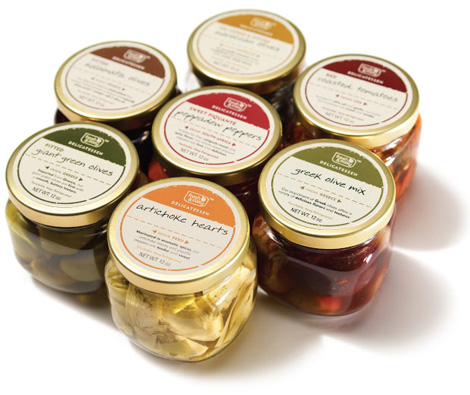
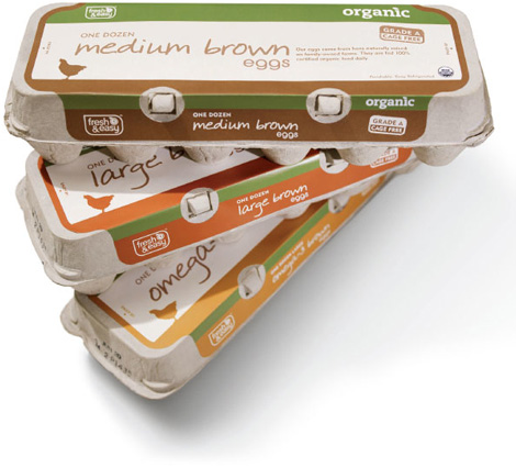
To continue with our supermarket streak (three in a row, booyah!) at Brand New I would like to offer a, well, brand new entrant into the category. Fresh & Easy Neighborhood Market (yes, that’s the official full name) is a new chain of supermarkets opening in the West Coast of the United States, with 30 stores planned to open in the states of Arizona, California and Nevada by the end of 2007. The new venture is headed by UK-based Tesco, one of the world’s largest retailers (“the world’s third-largest retailer, behind Wal-Mart of the United States and Carrefour of France” according to Wikipedia). Launching the store and its associated 1,500-plus SKUs, Tesco worked with three agencies to complete the project, U.S.-based marketing / communications / anythingelse firm Deutsch Inc., U.K.-based and independently-owned branding agency Pemberton & Whitefoord (P&W), and U.K.-based and retail-specialized design and fabrication company Schorleaf. (The invoices from all three combined could probably buy you three or four of those islands near Dubai).
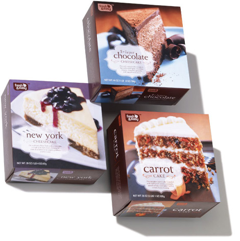
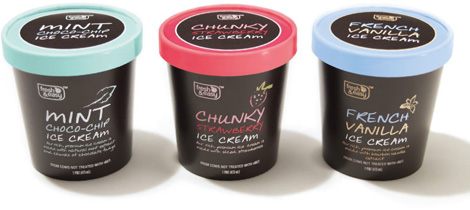
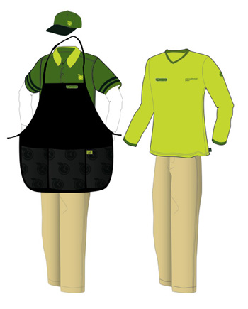
The work towards the launch has been ongoing for more than two and a half years, with Schorleaf being the first one on board and the two other agencies joining in for the remainder eighteen months. Schorleaf was in charge of the physical design of the stores while the two other agencies developed more than 1,500 SKUs that required self-branding — I’m not sure if they sell non-F&E products like, say, Doritos or Tropicana (has anyone been to one of them yet?) — with P&W in charge of 600 SKUs across 70 product families, and Deutsch in charge of packaging for fresh and frozen items, as well as developing the stationery suite, web site, collateral materials, uniforms and a set of brand guidelines done jointly with P&W. So, yes, it was hard. Before I delve into my critique, allow me to share a framework for it:
Tai: Do you think she’s pretty?
Cher: No, she’s a full-on Monet.
Tai: What’s a monet?
Cher: It’s like a painting, see? From far away, it’s OK, but up close, it’s a big old mess.
— Clueless (1995)
My first impression of the work was to be wowed, simply at the fact that so many SKUs were designed from thin air and built into a cohesive brand that would look great aisle after aisle. Colorful, poppy, fresh, dynamic, new… all attributes that came to me at first glance. But I’m not a first glance kind of guy, and upon further scrutiny the whole system is merely competent and sadly lackluster.
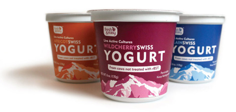
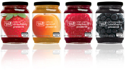
Take the logo. They have employed the rounded-corner-except-one-pointy-one holding shape — that a dozen other companies have used before and used way better by Templin Brink in this packaging for Archer Farms — and plopped a rounded-corner typeface (I’ll give them that) with a very weird apple-bomb-with-timer about to explode that, at best, looks like expensive clip art. There is nothing fresh about this logo — and easy? Well, yes.
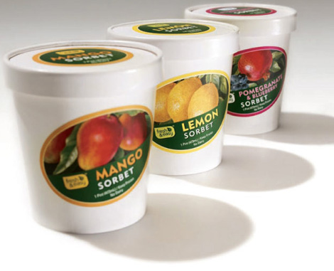
The packaging, again, looks nice, and I would buy those artichoke hearts in an instant, but everything falls short of greatness. Every layout, every color, every supporting element (from illustrations to photography) feels rushed and incomplete — almost as if they all needed one more round of refinement before going into production. Above all, there is one element to this identity that makes me fume and displays the lack of attention to detail that this packaging received: The faux handwriting. One of the biggest clichés to make something feel friendly, personal and neighborhoody. I don’t mind it when it’s well used or, you know, when it’s actual handwriting. Here, there is no uniqueness with this off-the-shelf typeface; anytime you have “ee”, “oo”, “tt” or just repeating letters close to each other, the effect is lost, as the letters are exactly alike and I still haven’t met anyone that can repeat three identical “e“‘s in a row. For the size of the project, I can’t understand why no one would commission a type designer to create an OpenType font that would have contextual alternate glyphs to avoid repetition and add a layer of sophistication and care to the visual system. But enough about that, c’est la vie in the world of large branding agencies.
My mouth waters, not at the packaging, but at the potential of such a blank canvas where new ideas and executions could be brilliantly exploited. Instead we are treated to an unimaginative set of packaging of familiar and well-trodden visual cues striving for uniqueness and personality — and achieving neither.


Jump to Most Recent Comment
JonSel’s comment is:
First, major points for the bit of Clueless dialogue.
Second, and more on point, I think you're being a tad bit harsh. Considering the state of design in the american consumer goods market, this is pretty darned good. Outside of Target and, maybe, Publix, private-label design consists of bad knockoffs and poor attempts at high-class generic design. So, maybe I'm taking the "from far away" look, but as a whole, they get a fair amount of credit from me.
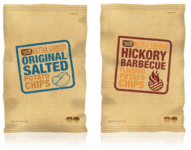
More specifically, though, I find the packaging isn't holding together that well as a system. Those sorbet packs are beautiful and like they were just packed from a sorbet machine on a farm (do they have those?). But they have no relationship to the tortilla chips or the fruit preserves aside from the logo. The potato chips also seem to fall away from the core look with a new typeface. I assume this is because the products were split between two different design firms and they probably didn't talk as much as they should have.
On Dec.04.2007 at 09:51 AM
Armin’s comment is:
> Second, and more on point, I think you're being a tad bit harsh.
Jon, you are right. But I'm being purposefully harsh. This project could have been great, regardless of the "state of design in the american consumer goods market". If we use this as a measuring stick for the work we do, then we are all screwed. My rant is a call to attention to detail and the craft of design; clearly the bigger and more important strategic and holistic goals were set in place, so why not apply the same ambition to the design? Another approach for this post would have been to applaud the effort and give kudos to the hard work, but that doesn't make anyone strive for more.
On Dec.04.2007 at 10:02 AM
Nick’s comment is:
I'll go a bit off topic here and just say that I heard a piece on this initiative on NPR and I think what Tesco is doing is great. Tesco plans on opening a good number of this stores in lower income areas, starting off in the L.A metro area I believe.
On Dec.04.2007 at 10:11 AM
Kristoff’s comment is:
I agree with you both. While I too feel the work could have done with another revision round, I could blame that lack of finish to the two agencies working together and, as JonSel points out, likely suffering from a little communications trouble.
On the other hand, two years should have been enough time to work something nice and given the brand and its offering, they could have anticipated a bit on what needed creating. Then agin, I imagine this sort of thing was likely "Designed By Committee" and as I'm sure we all experienced once was revised into oblivion, resulting in something that now feels rushed and unfinished.
On Dec.04.2007 at 10:25 AM
Ty’s comment is:
I can definitely tell that there are three agencies involved here. Do you think that it would have worked better had there only been one, or even just two managing the project?
On Dec.04.2007 at 11:10 AM
Christopher Pratt’s comment is:
IIRC, they do have Doritos, but not Tropicana juice - and frankly, their freshly squeezed orange juice was far higher in quality than anything from Tropicana.
As a consumer, I don't mind the design at all - it's fine for what it is, and the prices are more than fair.
However, my major complaints with the packaging I've seen are these: many of the boxed goods are designed so that you can't tell what's in the box from most angles (their corn flakes box is, for example, entirely blank on one side, and the other side only has nutritional information and the ingredients list, so if it's in a row of boxes, it's hard to tell what it is unless you can see the top of the box), and everything seems to be labeled in English only, which is a curious choice to have made for a store designed to serve everyone in the southwest USA - why isn't anything in Spanish? Especially here in San Diego, they're leaving potential customers out in the cold (we get a lot of shoppers in from Tijuana, and many of fresh&easy's high end products would, I imagine, be immensely appealing).
On Dec.04.2007 at 11:21 AM
Jon Dascola’s comment is:
To me a lot of the PathMark comments could be valid criticism here. Fantastic potential squandered by generic, contrived graphics. The ornamentation on the luxury desserts. The terrible distress on the potato chips, The pedestrian food photography and the bad handwriting. Very poor work, especially coming from the UK.
I am partial to Waitrose.
On Dec.04.2007 at 11:38 AM
Kyle Hildebrant’s comment is:
They are building the first on in AZ right across the street from my place. I'm looking forward to it coming in. I'm curious what the price point will be.
On Dec.04.2007 at 12:13 PM
Von Glitschka’s comment is:
I would have guessed the branding company was called 'Sybil' based on the multiple personalities I see in this work.
On Dec.04.2007 at 12:22 PM
Armin’s comment is:
> Do you think that it would have worked better had there only been one, or even just two managing the project?
Yes, much better. One large agency that could handle the volume and politics of the project, enforcing creative direction, working with freelance designers or really small design firms would have yielded a better result than two large agencies trying to do things their own way — and it shows.
On Dec.04.2007 at 12:29 PM
John Colucci’s comment is:
It's a great branding - I wish they had locations in northern CA! I'd like to see how their prices line up with Whole Foods and Trader Joe's.
On Dec.04.2007 at 12:30 PM
Ryan’s comment is:
I agree with much of what you said. The whole identity system has the potential to be fantastic, but it just barely misses the mark.
On Dec.04.2007 at 12:52 PM
Blake’s comment is:
Strangely the logo itself doesn't do too much for me, but the package designs are lovely. Six in one, half a dozen (eggs) in the other, I guess.
On Dec.04.2007 at 01:14 PM
Anonymous’s comment is:
I'll go a bit off topic here and just say that I heard a piece on this initiative on NPR and I think what Tesco is doing is great. Tesco plans on opening a good number of this stores in lower income areas, starting off in the L.A metro area I believe.
To go along with this, in their UK stores, they are pushing to label every product in their stores with a carbon label (carbon footprint). Pretty interesting.
On Dec.04.2007 at 01:53 PM
David’s comment is:
Booyah? Seriously?
Anyway, looks like one is going to open up right where I get off the freeway, so I'll have to check it out whenever it opens.
Some of the designs are better than the other, but I could say the same about the private label packaging at Target as well.
On Dec.04.2007 at 04:20 PM
Armin’s comment is:
David, sorry, sarcasm is sometimes hard to translate online.
On Dec.04.2007 at 04:29 PM
jack’s comment is:
perhaps "Booyakasha" would have been better, what with the UK connection to this article and all.

Stacy’s comment is:
gotta say I loved the Clueless reference...
On Dec.04.2007 at 06:05 PM
altoption’s comment is:
Who came up with that awful name? That logo makes me think "panty liner." Not a great association for a food store. Packaging is okay. Doesn't have much of its own unique voice.
On Dec.04.2007 at 06:11 PM
chronicler’s comment is:
I agree wholeheartedly. The entire experience of following Fresh and Easy come to market has been in my words "frustration".
I have been in the grocery industry from all sides in my lifetime and have watched with more than piqued interest this phenomenon. Unusually enough they chose to open their first store in my town. Yes. town. What was once an all white conservative retirement community has evolved into a commuter community. That said I really am not sure they have done their leg work in choosing this location. It is in the hub of the retirement community. Wrapped produce (retirees love to pinch the tomatoes!), over-priced meats and ethnic foods are not going to fly here.
That combined with the rush to open these stores is reflected in exactly the esthetics you mention. Lack of real design, real knowledge of the market and real contact with people. (their website is difficult to manage and has a poor design and is difficult to navigate.) The store's lack of cashiers, meaning you have someone help you while you ring up your own groceries. It's great if you are my age or younger but the 70 and 80 years olds wandering in don't like it.
I am being harsh. I recognize that. However, if Tesco wants to play with the big boys, they need to be batter at presenting themselves and not be so "awe shucks" in their approach. We all know they're big in Europe and the word will get around that they are not "new" to the scene.
Their prices are better on some items and worse on others. The meat does not live it to its price at all.
sorry to go on so much. i did write a review on my first impressions, but coupled with yours, the whole thing gets worse for me as i evaluate it.
On Dec.04.2007 at 07:52 PM
Mr. One-Hundred’s comment is:
Thank God! Another supermarket chain! We’ve been running low on those for some time now, and this one (unlike all of the others) is fresh and easy – see, it says it in their name. Those shelves look choc-full of items I can’t buy anywhere else, too. And they sell eggs!!! And 1500 plus SKUs! What’s not to like about that?
Maybe one day in the future, one of these retail behemoths will get get to first base on one of these projects and say “You know what? We don’t really need another supermarket chain, do we?”
Now, about that mediocre branding and packaging…
On Dec.04.2007 at 10:09 PM
Dale H.’s comment is:
The chain's name is too long so...
...the logo is too complicated so...
...the logo doesn't reproduce well at all on small food labels.
Other than that, I'm pretty impressed. Loved the Tesco experience last time I was in London...if this comes close, could really click.
On Dec.05.2007 at 01:11 AM
robin’s comment is:
as designers shouldnt we see all projects (large, small or even vast) as having the potential to be great! But also as designers we know the restrictions of timings, client comments, budgets etc... frankly taking everything into account i think theyve done a pretty good job. True it uses a lot of cliches and graphic tricks of the trade, but is it a bad thing to use things that you know will work (especially when youre up against the clock and there is no time to investigate and explore...i think they did about 600 packs in 6 months, thats not bad). I agree that the inclusion of the 3 design groups has coursed the packaging to lose its coherency but that is not necessarily a bad thing (could be seen as creating interest) and also it is very Tesco thing to do (in the uk Tesco´s have various own brand ranges, with their own identity depending on the price bracket. All in all, not perfect but pretty damn good nonetheless! Although im not that fussed about the logo, i see as a little weak... but like any new identity time will tell.
On Dec.05.2007 at 04:03 AM
Joe S’s comment is:
I agree that the design is certainly not at all groundbreaking, but who would expect a company trying to compete with the likes of Wal-Mart to do anything unsafe? My real issue isn't with the generic packaging (which is executed with all formal elements up to "code"), but with the identity mark itself. The container space is totally inappropriate for the forms it holds, and it looks like their only goal when placing the type was to avoid collision or overlappign between words and letters. Neither "Fresh" nor "Easy" are placed in any suitable relationship to one another or with the ampersand. The apple-clock thingy won't reproduce properly at smaller sizes, and will certainly look like noise from far away (it does in the pictures posted here). The type-face selection is certainly nice and logical. The color and typeface are the only two things that make any sense about the mark though.
All in all, this just looks like a weak Archer Farms knock-off.
On Dec.05.2007 at 07:27 AM
harry marsh’s comment is:
The packaging doesn't have to look the same, tortillas compete with Doritos, nut butters compete with Skippy etc. The fresh stuff is more deli based so you have whole fridges with no other real competitors. That's why the two look different. I guess when you can see the product and it doesn't really compete with a brand it doesn't need to try so hard.
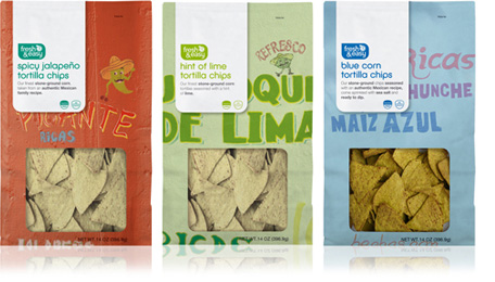
I don't see that as a problem. Compared with 90% of US packaging it's pretty good. The flower packaging, tortilla, chip, salsa and jams packs are really nice.
As for attention to detail, the artworks are probably done by an in-house artwork agency who do all final tweaks like they do in the UK.
As for the logo, it looks like it was designed by committee who asked for various elements to be included. The version on packaging seems to work well and I disagree it doesn't reproduce on packaging very well as it's only in one color on all the packs. I totally agree about the handwriting font though, but if the final artworks are produced by a separate company imagine how difficult it would be to keep commissioning a lettering artist to change the titles!
Lets not forget, this is discount retailer, not Wholefoods.
On Dec.05.2007 at 01:02 PM
Coz’s comment is:
It's ok, kinda boring for the most part. I really like the yogurt containers though.
On Dec.05.2007 at 01:56 PM
Iris’s comment is:
Quick, dirty, and probably confusing to anyone who's not from the UK, but somebody had to do it.

Ross Patrick’s comment is:
Interesting observations...
I have to agree that the design is marginalized somewhat, but if you knew the timeline and the client's history with P&W, then it would make more sense.
Beyond everyone hating the name and the faux script font, the idea was to create a brand that was cohesive, not cookie cutter. If the same font was used on everything, it would look very generic.
The early concepts were very tight and the concept was really amazing. The final art was generated on an extremely tight timeline and there were multiple changes on a daily basis.
That being said -- the design holds together very nicely at the store level... oh, that's right -- you've never been to the store.
Until you have seen it first -hand, shut the fuck up.
I stand behind the design team at Deutsch and the marketing group at Fresh & Easy. For everyone who hasn't experienced the store first-hand, try the $1.99 Merlot(The Big Kahuna) and then eat a slice of the chocolate cheese cake...
(I hope you choke on it!)
The store and the product live up to the promise.
The design doesn't get in the way!
Now get on with your life and move out of your parent's basement.
(insert your weak comeback here)
On Dec.05.2007 at 07:01 PM
damon’s comment is:
don't really feel like the packaging is coming from the same place. I haven't had the time to read the other responses but I feel as though that's probably a common theme.
as for the logo itself, I actually kind of hate it. the carrier is terrible and the font choice and little clock-fruit are trite and pseudo-modern.
I like the packaging (some more than others) in general, but it feels as though it was rushed along as a system, including the instore signage as well...as though it had to be done really fast or was done by different people
On Dec.05.2007 at 07:51 PM
Joe S’s comment is:
Ross, Ross, Ross,
Nobody here is sniping from their parents basement. Some of us are professional designers who've done identity work for Fortune 200 companies (myself).
"The design doesn't get in the way!" Ha! If that's the best compliment you can pay to it that's a pretty weak defense. Design should do more than label. It should grab you and communicate to you. Seeing a photograph of something and seeing it in your hands are certainly diferent experiences, but think of how many people will be looking at photos of the products in newspaper ads, on television, on coupons, etc. It's not irrelevant that the design doesn't look as good in small photographs.
Don't take everything so personally. All work put into the public eye is open to discrimination, like it or not.
On Dec.05.2007 at 08:13 PM
Danny Tanner’s comment is:
Ross, I'd like to take the opportunity to remind you that any press is good press (it was even good for that celebrity on law and order last night who got caught snorting coke while pregnant). Please don't take this opportunity to F it up by being vengful. If your fermiliar with this forum, then you know its not always puppies and flowers.
On a side note, i do like the name's honesty. It says what it is and is what it says. However, it doesnt pass the "Your Mom" Test, i.e. "Fresh and Easy? Yah, like your Mom."
On Dec.05.2007 at 09:39 PM
Jen’s comment is:
I actually was wondering if the design inconsistencies within the packaging were intentional. By changing the style from box to box, does the F&E brand blend in with the other boxes more, thereby making the store's own brand seem less like the cheap/generic/inferior option? Or were there just too many cooks in the kitchen, all with a bad case of brand fatigue? I also wonder if some of the polishing didn't take place because the intent is to pass these designs on to an in-house group to use as templates. (I'm not saying in-house groups can't handle details, I'm saying many rules could make replicating/maintaing the brand even trickier if you didn't build it in the first place.)
They really might look great on a shelf as Ross says, but I'd bet it takes a second to find a F&E product given the look changes so much with each product.
On Dec.05.2007 at 10:38 PM
Jeff’s comment is:
Ross,
Coming here and spewing invective and insults because you don't like the critiques made on your work project is both immature and unprofessional. You could have used the opportunity instead to discuss the branding strategy and the reasons for some of the choices.
Personally, I liked what I saw. However, your attitude leaves much to be desired.
On Dec.06.2007 at 12:30 AM
Harry Marsh’s comment is:
Can someone explain why they think all the design has to look generic? probably the best examples in the world of own Brand Packaging is in the UK in a range of stores called Waitrose. That isn't generic and the packaging is multi award winning. 'P&W' have done a lot of award winning work for the UK TESCO stores and that isn't generic either. I've seen their work in various Rockport books and on their website and there are some really nice ideas.
I love the new Archer Farms design, but it's very retro and does it really work across hundreds of lines?
As for not being able to find a Fresh and Easy products on shelf, anyone who says that obviously hasn't been in a store.
H
On Dec.06.2007 at 07:11 AM
Daniel Bertalotto’s comment is:
I'm chiming in here after there has been quite a bit of critique (and arguing, apparently) but I have some observations and I'll probably stick up for this brand just a tiny bit.
First, I think (and agree) this identity and overall brand strategy is typical and average– which is the article's primary argument. Sure it is specific to the F&E's strategy and it is "clean & simple" to that point. We have another local store chain where I live called Harps that has the same consumer approach – each store section has a slightly different setting and correlating packaging, but not as coordinated or controlled as this.
I've not been to this store, but from what I see I relate it to this one-step-above your average grocer. The design overall probably compliments this and seems to me to be quite consumable for mid-range consumers not looking for a high-touch retail experience.
For the comment, "the design doesn't get in the way," I don't want to put words in anyone's mouth, but I think the intention of this design is not be a grabbing experience. The design should do the job of communicating what its packaging and not overshadow its contents (believe me, I've had food with amazing packaging that was really mediocre in quality) and the identity should stand for the store's promise – Fresh & Easy.
On Dec.06.2007 at 10:46 AM
Jim’s comment is:
What a great place to shop. Quick in and out, easy to find products and no hassle with lines. Prices reasonable, good range of products and the quality of the prepared meals makes most of the other meals sold by competitors look like dinosaurs. Good for F&E! Very basic designs - from floor layout to packaging - but i figure that it takes far more effort to create something that 'simple' and effective.
Welcome to the US of A, Freash & Easy and may you prosper (or at the very least kick the competition hard where they need it!)
On Dec.06.2007 at 02:43 PM
Milan’s comment is:
Publix really does blow all of these supermarkets out of the water.
On Dec.06.2007 at 09:49 PM
Cody’s comment is:
Hmph, how pedantically mundane and trite.
On Dec.09.2007 at 01:23 AM
craig shully’s comment is:
To the designers:
Please don't take this personally.
But, this design system is bland. I don't care what the timeline was -
Generic logo, washed out colors and a complete lack of shelf excitement. Looks like the packages have been sitting out in the sun for too long.
But if the client is happy and the products sell, who cares.
On Dec.10.2007 at 11:32 AM
BWJ’s comment is:
The packaging isn't ground breaking...kind of a Zune to the iPod...slowly catching up to some of the better designed brands out there — like Archer Farms — but still falling really short.
However, the worst part of every package is that horrible logo. A clock? seriously? The logo becomes such a busy mess when it's scaled down small it's just an irritating blemish on all of them.
On Dec.10.2007 at 04:29 PM
K. West’s comment is:
The yoghurts are cute.
On Dec.10.2007 at 08:19 PM
Ross Patrick’s comment is:
Yeah. I think my problem is that I actually agree with most of the comments. We inherited the clock/apple and many of the Tesco formulas from the UK. My comments were directed at the folks who don't understand the realities of working on 3000 SKU's in a period of about 6 months.
Excuses? Compromises? Frustration?
All of the above. But I still defend the work.
The philosophy of the brand were based on creating a hierarchy with the label information and trying to get out of the way -- and let the product show through. Because the products are mainly organic or free of trans-fats, this philosophy and simplicity ends up looking somewhat generic.
The other problem with this many SKU's is that there are no tiers within the product ranges. Therefore every product is considered a premium product -- without using the obvious visual cues and verbage that are used ad naseum in the packaging world.
So -- yeah, I am a bit testy because this baby is still just in diapers(like some of the critics).
On Dec.11.2007 at 02:31 PM
Ryan’s comment is:
There is one of these stores opening up a few miles from my home, in what used to be a Good Guys retail store. It's still in the process of being built, but I can tell you right off the bat that the signage looks bad. Real bad. It's just awkward, is all.
On Dec.12.2007 at 07:09 PM
JOHN DOE’s comment is:
Being an ex-employee I think there are a few things that need putting straight here. The original logo was designed by the architects and not by the UK or us advertising agencies who's job was to adapt what they already had to work on the packaging.
The signage for the different stores is all over the place, but again the design & ad agencies weren't really involved in this and it does break brand guidelines.
Whoever said the colors are washed out clearly hasn't been in a store as many packs are actually too bright.
50% of the store is own brand, something new for the USA. You cannot have a generic Archer Farms identity working on so many packs across store.
Being from a latin American background I'm glad they have catered for our tastes and although I'm not a huge fan of some of the pack designs many are fun, clever, fresh & easy. Some British wit was a welcome addition, and the flower wrap is brilliant.
On Jan.02.2008 at 12:08 PM
my’s comment is:
I think must of us will know by now that "to do things your way" is not completely possible in what some call "the real world". Sometimes that's a shame and sometimes that's rather good!
I don't know what difficulties the companies involved in this project had. But just by knowing that 50% is own brand and 50% isn't I can see why they didn't develop a "waitrose" type of packaging!. Let's face it, most american packaging is far from being a "leader" in the design industry. And yes, you need to push for the best possible work, but keeping in mind your market.
I'm not a huge fan of every single pack, but from the ones posted here I really like the tortillas chips ones, has anyone been to the actual store and seen the coffee, jelly, rice, cereal and tea packs? they're rather good!
On Jan.02.2008 at 01:03 PM
my’s comment is:
I think must of us will know by now that "to do things your way" is not completely possible in what some call "the real world". Sometimes that's a shame and sometimes that's rather good!
I don't know what difficulties the companies involved in this project had. But just by knowing that 50% is own brand and 50% isn't I can see why they didn't develop a "waitrose" type of packaging!. Let's face it, most american packaging is far from being a "leader" in the design industry. And yes, you need to push for the best possible work, but keeping in mind your market.
I'm not a huge fan of every single pack, but from the ones posted here I really like the tortillas chips ones. Has anyone been to the actual store and seen the coffee, jelly, rice, cereal and tea packs? they're rather good!
P.S to make up your mind about a project like this one based on a few pictures posted on a forum without having been to the actual store is quite ambitious!
On Jan.02.2008 at 01:21 PM
Life’s comment is:
Hi, I just shopped at F & E yesterday and found the store to be very gloom and more like an upscale 99 Cent store when it comes to it's food. As soon as i walked into the door, there was a meat display filled with dead beings nicely packaged for all to see?? I dont think I've ever walked into a grocery store to be met by such a sight! They didn't have much at all in organic produce, and the staff appear helpful but also surprised by my simple questions about organics and if they have incentives for those who bring our own reusable grocery totes. I did get a nice bag of pistachios, some rice and a box of Borax but this isn't the type of store that caters to eco-conscious Green People, unfortunately.
On Jan.09.2008 at 02:01 PM
Rian’s comment is:
I get that a brand needs to be cohesive but don't you want to see a little variation in product packaging? Who wants to walk through a grocery store and have everything look exactly the same? How monotonous! For me, the fun in going to the market is looking at all the different brands and packaging. If it stands out... It's likely to fall into my cart. Besides, shouldn't swiss yogurt have a different look than Mexican tortilla chips? I feel that it was a good idea to have three different firms working on the packaging because it gives more diversity, and we could all use more of that in our lives! I think the store looks great and I would love to take a walk down the aisles of any store that looks different from the highly commercialized supermarkets we have today!
On Feb.01.2008 at 01:43 PM
Anonymous’s comment is:
i would to work for you part time can you please call me on 480 888 6390 my name is kevin
Another Opinion’s comment is:
They have a few quaint little signs outside the store that read "parking for families with children only."
Screw em'. I'll never be back. Overpopulation is the root of all evil. Favoritism for screaming children.
My taxes already pay for their damned schooling.
On Feb.27.2008 at 11:23 PM
Demetria Harrison’s comment is:
stipuled zabaglione nonsine muckna scourway mantologist centetes schoolless
http://www.cnn.com/ALLPOLITICS/stories/1999/10/28/ickes.huang/index.html >Huang gets immunity in GOP probe of Democratic fund raising
http://pages.prodigy.net/jlbroker
A UK DESIGNER’s comment is:
What the fuck would you cunts know about this job?
I don't recall being sat next to any of you fuckwits throughout the concept process. You know nothing about the restraints of the job, the enormity of the task and the politics endured before even trying to present creative, witty and engaging solutions.
Who gives a flying fuck what you bunch of sad bastards think anyway?
On Jul.03.2008 at 07:53 AM
Yeghia Tchakmakian’s comment is:
First,
I have to say it was a real pleasure working with Ross Patrick for a short period on this project.
It's a beautiful system. I'm proud to have worked on it.
I love Ross's statements. ;)
a. check out the store.
b. the food is great.
c. have you seen the crap out there in other stores. yuck.
d. 3000 sku's (just a part of the design task) with endless revisions in 6 months, keeping cohesiveness while establishing uniqueness. do you fools even know what that means?
for such an expansive project to come out so elegant with so many hands in the cookie jar. it's a rarity.
I hope Ross get's an award of some kind.
When i get around to updating my portfolio i know Fresh and Easy is going to have a nice place there.
I wonder what the comments would be like if every commenter had a link to their online portfolio available for critique.
Ha!
-Yeg
On Nov.14.2008 at 09:48 AM
Josh Penman’s comment is:
I'm coming at this from a consumer perspective, I'm very partial to the look Sainsbury's 'Basics' products, and Fresh & Easy seems to be sort of like that: I'm looking for something that's really simple, no frills, and cheap - and I get passionate about it. I think, from that perspective, F&E is doing very well. For example, I don't mind the faux handwriting, but I think contextual alternate glyphs might be overkill: I want it as cheap, as uncluttered, and as distinguishable as possible. But I'll give up 'distinguishable' for cheap. Basically, I want to be assured by the product design that the product at hand is the cheapest product possible. I think that's where Sainsburies (sp?) 'Basics' branding did very well: they'd say things like, "less___ but just as much fizz!" for their Coca-Cola replacement. I thought they did a good job of providing an explanation for the cheapness of their food: humans want explanations, and they're leery of things they don't have ready explanations for.
I wonder if some of the design deficiencies in Fresh & Easy's product packaging might not be that bad for consumers looking for a deal - and that if it was that one permutation better if it wouldn't have a subconscious effect on aesthetic-sensitive value-seeking consumers that would damage the brand by making F&E seem to spend too much on design.
But then, maybe there aren't that many aesthetic-sensitive AND value-seeking consumers outside of college students like me, in which case I suppose it would be a failure. When I think of F&E, I want to think "Apple on the cheap", in regards to a tendency towards simplicity and more mono-tone color palettes. Do note that I like the smaller stores better, and think the larger ones have less to differentiate themselves from monstrosities like Albertsons or WalMart.
Comments in Brand New, V1.0 have been closed.


