NOTE: This is an archived version of the first incarnation of Brand New. All posts have been closed to comments. Please visit underconsideration.com/brandnew for the latest version. If you would like to see this specific post, simply delete _v1 from the URL.

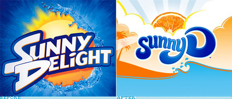
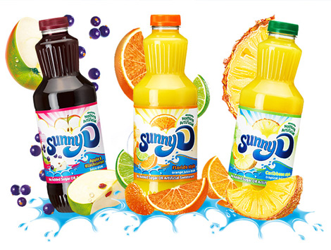
The United Kingdom’s Sunny D is now made with 70% fruit juice, apparently no longer turns kids yellow and has a new look to boot, designed by the brand consultancy Elmwood. This is one of those redesigns that while not doing anything worse, isn’t doing anything better. I remember way back when, the original packaging was just some green and white type on a plastic bottle — which let the shape and the that-can’t-be-natural color do most of the branding work. The new packaging is certainly vibrant, but I’m not so sure about the ominous fruit up in the clouds (which is strangely reminiscent of this Monty Python moment) or that plastic-looking wannabe surf typography. But hey, “It’s got healthy junk!”

Thanks to Skylar Challand for the tip.

Jump to Most Recent Comment
Spacecushion’s comment is:
I feel like a Fanta now.
On May.11.2009 at 07:16 AM
Kyle’s comment is:
It reminds me of Snapple's brand for some reason - maybe it is the "S" - I do like they new playful typography - it still does feel like the same brand.
I really hope they improved the juice - that liquid was a bit rough.
On May.11.2009 at 08:13 AM
Erik at Logo Critiques’s comment is:
oh wow, Sunny D is at the beach and feels a little like That 70'd Show. What fun!
I don't get any 'healthy' impression for the redesign.
On May.11.2009 at 08:21 AM
Plamen’s comment is:
Somehow they all manage to look the same...
On May.11.2009 at 08:36 AM
Alex’s comment is:
I think that the blue and orange in the new logo should be switched around. It'd make it stand out much more. Overall, it's not really bad though.
On May.11.2009 at 08:51 AM
britnee’s comment is:
I also noticed something that wasn't mentioned... they're no longer using the full word, "Delight" on their packaging. I love how the media influenced this name shortening and they (Sunny Delight) didn't resist it...good marketing on their part.
On May.11.2009 at 09:26 AM
ivan’s comment is:
Well, obviously that's a trend: Stolichnaya turned to Stoli in the US. I know, it is unpronounceable in English.
The redesign appeals to me, but my problem here's is that I don't actually see the D...maybe it's just me.
On May.11.2009 at 09:40 AM
jRod’s comment is:
The old one was so much more detailed and interesting to look at. The new version's typography is a lot better, but its a little too simple. Like it needs to go one way or the other, you know? Either go all out and detail it or back it off completely and go with stark. Actually, I would like to see the new logo on the plain bottle with no label... just screen printed on there.
that would be sweeeeeeeeet.
On May.11.2009 at 10:11 AM
Trent Walton’s comment is:
The type is pretty-ok, but all the graphics kind of remind me of a generic istockphoto illustration grab bag.
On May.11.2009 at 10:27 AM
Kosal Sen’s comment is:
The colors and treatment are similar to Sunkist soda. I agree with Trent. Feels like design-by-istockphoto.
On May.11.2009 at 10:37 AM
kirk’s comment is:
does it still taste like artificially flavored orange loogie?
On May.11.2009 at 10:53 AM
John Mindiola III’s comment is:
I love it. I mean, I don't actually enjoy the design, but it's super effective. Come on, it's kids juice! It's not MOMA or anything. The web site is great. The bubbly characters and uber bright colors are perfect. My favorite parts? The surfer scenery at the bottom of the site, and the fruity sun bursing through the clouds at the top of the site. Why is everybody being so harsh? Does it look childish? Yes, or course it does! It's kids juice, not an energy drink.
On May.11.2009 at 11:00 AM
Carlo’s comment is:
They need to make up their mind about the whole "D" letter. Either stick with "Delight" or find a way for the "D" to make sense. Because the letter "D" by itself makes no sense whatsoever in the name of a juice drink.
At best it conjures thoughts of vitamin D for me - which is the wrong vitamin you to conjure when you're trying to sell juice. Maybe the folks at SunnyD have been drinking too much of their own kool-aid - they've been staring at it sooo long they just see it as a cute nickname and are missing an obvious disconnect?
On May.11.2009 at 11:52 AM
Lauren ’s comment is:
Well it sure beats the "wet sun" of the old one. It leans more towards friendly, less towards "extreme sports", and is gradientrific.
You won't catch me drinking Sunny D though! Yecch.
On May.11.2009 at 11:54 AM
Darrin Crescenzi’s comment is:
@Carlo
It makes a lot of sense when every kid who's ever had the drink in the history of the universe refers to it as "Sunny D."
The type is fun, way better than the previous iteration, and I'm sure most kids won't have any issue with the istock illustration style.
I think, for what it is, it's kinda perfect.
However, the thought of purple Sunny D makes me ill.
On May.11.2009 at 12:24 PM
Christian Palino’s comment is:
John brings up a good point regarding the audience, though I'm not sure that young kids are really the target for the brand at POS – that's where mom or dad would likely be selecting the juice for their youngsters. And if it's skewed toward these kind of 14/15 year old "kids", I feel that adolescents these days are pretty brand/design aware and sophisticated – likely more so than most of us when it comes to their age demographic – and thus this rebranding would seem juvenile and out-of-touch in today's market.
On May.11.2009 at 01:06 PM
dg3’s comment is:
Me likey.
On May.11.2009 at 01:07 PM
Amanda’s comment is:
So british! :)
On May.11.2009 at 01:20 PM
JBIII’s comment is:
I do like the different fruit popping out of the clouds and it has potential. The logo treatment is amateur at best, as well as the packaging.
There are some great ideas brewing, but execution is not tight at all.
On May.11.2009 at 01:43 PM
Mark’s comment is:
WTF?
they BOTH look butt-ugly! looks like it was made in the 70's!!!!
I can't find ANYTHING to like about this logo,it's way too rounded it's bubbly and frankly looke amatuerish, yech!.
TRY AGAIN!
On May.11.2009 at 02:29 PM
NicKLAUS’s comment is:
When I drink Sunny D, its a very bold taste, almost as if its still concentrated and is in need of being watered down. With this being said, it needed a bold logo, something not created with a font that looks like its ripped right off of dafont.com. The new logo is bold and fun and child-like just like the drink itself. The orange in the clouds seems like a last minute thought, as if they were taking a photo of the logo with a cloud background and the orange just popped up over the clouds at the last moment to try and ruin the shot.
On May.11.2009 at 02:34 PM
Mark’s comment is:
Although I do realize this is aimed at kids so that IS excusable, but can't they at least keep it in this decade?
My previous reaction was my immediate one that's why I acted like that. It could do without the extra illustration though.
it's OK.
On May.11.2009 at 02:41 PM
jhoysi’s comment is:
I desperately miss the more natural water texture from the older logo. That screamed refreshing, while the new interpretation leaves all that behind for a cutesy beach feel.
On May.11.2009 at 02:46 PM
Tim Schmidt’s comment is:
I looks like it's trying to hard. I hate the D and it looks very dated, like something from 1990.
On May.11.2009 at 02:57 PM
dg3’s comment is:
Mark,
You DO understand the concept of retro rebranding, don't you? It's SUPPOSED to conjure up the past.
On May.11.2009 at 04:09 PM
John Mindiola III’s comment is:
The funniest part of those old 80s/90s commercials wasn't the clothing, it was the teenagers saying "purple stuff." Classic.
On May.11.2009 at 06:43 PM
AxD’s comment is:
The new logo looks like a penis.
On May.11.2009 at 06:50 PM
Artiepants’s comment is:
I think it's really solid, fun and hits their demographic perfectly.
the one thing that bugs me on the type is i feel like the "S" is diminished, and kind of "falling off" the front of the logo ~ i'd have made it a bit bigger with the top of the "S" being above the "u" instead of under it... One of the stronger consumer product rebrands i've seen on here recently
(by the by, i think while the illustration is nice on the old version the type is just tragic...)
On May.11.2009 at 08:19 PM
Taylor Burkum’s comment is:
I am a designer who sees shape. All I see when I look at this logo is sort of a sea-lion/manatee shape. It's amazing how when the before logo is placed into the context of the web by itself, I realize how awful the typography is. I never did. I don't drink SunnyD, it burns my throat, haha! I just think that there is a whole lot of tacky branding going on in the food and drink industry right now. Too bad.
On May.11.2009 at 10:31 PM
Michelle Lynn’s comment is:
I don't think this new logo really makes them sticks out- yes "Sunny D" is often what the people call it in casual conversation..... but the design looks like a generic brand to me
On May.11.2009 at 11:06 PM
Jack G.’s comment is:
Anything to get away from the Mountain Dew-do. Surfy wordmarks, silly cliches or not, always work for me, too. That's why I bought Smile.
On May.12.2009 at 01:25 AM
Fasten’s comment is:
i just had a glass of sunny delight "california sweet" right now. :)
i don't like the before and the after logo. the groove of the letters and composition are to me very ugly. the only thing i like is the bottle shape and texture but i can see that they made it glossy now... bad idea.
On May.12.2009 at 04:31 AM
Scott’s comment is:
Funny, none of these logos is as good as the original.
On May.12.2009 at 08:57 AM
Scott’s comment is:
PS, and wouldn't this discussion merit the inclusion of the international holding company's logo: http://www.sunnyd.com/index.shtml
And, it's US counterpart: http://www.sunnyd.com/home_orig.shtml
Both look superior to me.
On May.12.2009 at 09:01 AM
Paul’s comment is:
Well, this post makes me want some Sunny D. The new branding is not great - I prefer the big 'slash' look to the strange fruit-in-the-clouds look. But the bigger change that was not commented on in the original post is that this is the first time they've shortened 'Delight' to just 'D'... after, what, nearly thirty years and multiple rebrands. This change is one I fully endorse :)
On May.12.2009 at 09:04 AM
Von K’s comment is:
The old logo had a 90s thing going on. That wacky D was especially ugly IMO.
I like the new wordmark much better. I think the D is maybe a little big, compared to Sunny. The glossy-ness fits the category (fruit-esque juice?), and the works with the word "sunny." I know it's cool to hate that look now, but this is where that kind of thing belongs.
The shortening of "delight" to "D" doesn't bother me--that's what people have been calling this stuff for ages.
Scott, I beg to differ in regards to the corporate holding co's logos, especially the international one. The citrus-y illustration is kind of neat on its own, but the type is just downright nasty.
The second link you posted looks like more like a Sunny D's actual site and less like a corporate thing. There are photos of bottles using another logo (for the smoothies)--it's confusing. The logo on that site also looks 90s, though. Lots of gradient sunbursts and a strange slab with serious contrast issues (the upright stroke on the D is like whoa?!).
Both these logos should be scrapped in favor of something descended from the new version, IMO.
On May.12.2009 at 10:29 AM
Tim Lahan’s comment is:
Looks mighty phallic to me. Definitely seeing some weiner.
On May.12.2009 at 11:20 AM
Diana Rusk’s comment is:
I actually really like the new version. I think it looks much more inviting compared with the previous style, which is reminiscent of a washing up powder.
On May.12.2009 at 11:39 AM
Mrs. M’s comment is:
Sorry folks, I like it.
I am the queen of pinpointing phallic imagery in everything (according to my husband), but I don't see it here. I see "groovy" letters that indeed remind me of Sunkist's new design (I like that one too).
Of course, this reminds me of a design I had on my first "big girl" bicycle as a child, so perhaps I'm only soaking in the nostalgia.
This isn't a work of genius, but we're talking about Sunny D. Should it be sophisticated and staid? Hardly. It's fun, fruity, and slightly tacky. Perfect!
On May.12.2009 at 11:56 AM
Horace Nightwatch’s comment is:
Why is orange flavoring associated with gaudy 1970s inspired type and excessive swirls? Sunny Delight should have considered a unique identity. I'm sure that another rebrand will follow once this FAD dies off. See below:


bcrockett’s comment is:
I bet the new Sunny D even tastes like Skype.
On May.13.2009 at 02:11 AM
todd ’s comment is:
hate it! no offense to the designer but i dont like these retro looking logos.
On May.15.2009 at 03:35 PM
colin a’s comment is:
damn i just washed my clothes with sunny d!
no wonder with that logo..
fits its purpose though... crappy logo for crappy product.
On May.16.2009 at 05:54 PM
Jordan Foutz’s comment is:
All of the drink makers identities lately look the same. They don't really look different from one another outside of Pepsi, which is clean, not swirly, orange, or Fanta-y. So far Pepsi (although not great) has executed the best of the recent drink re-branding efforts. Coke must be amused.
On May.17.2009 at 02:33 AM
Panasit’s comment is:
If the D looks a little bit more like a D it will be okay. Now it just looks like a tail that comes out of the word Sunny. Probably because it's bigger than the front S for some weird reason.
I didn't think about this at first but someone mentioned it has the feel of istockphoto vector graphic. Now that it was mentioned, yeah, I agree.
It's not bad though, I mean both the old and new design are good. Just not perfect.
On May.27.2009 at 02:49 AM
M’s comment is:
I like it. I think those bursting out of the background logos have been overused.
On May.29.2009 at 10:21 PM
phar_fetched’s comment is:
Given the amount of junk that is in Sunny D Im not surprised that theyve chsen a more natural look although as so many have said this is a pretty common istock image.
On Jul.07.2009 at 05:51 PM
Comments in Brand New, V1.0 have been closed.


