NOTE: This is an archived version of the first incarnation of Brand New. All posts have been closed to comments. Please visit underconsideration.com/brandnew for the latest version. If you would like to see this specific post, simply delete _v1 from the URL.
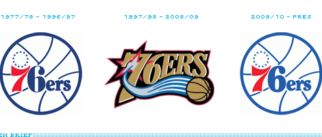
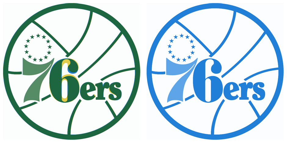
The new logo is nearly identical to the old one, except for a bolder 6, which was surely changed to perform better on all sorts of production techniques. Old logo in blue, new logo overlays in yellow, so anything that’s green remains the same.
Thanks to Eric Lohman for first tip.

Jump to Most Recent Comment
iverson4ever’s comment is:
Overdesigned? I *love* that logo! The "retro" one leaves me cold. Oh well. Enjoy.
On Jun.24.2009 at 07:47 AM
Anders’s comment is:
I have no knowledge of basketball, but this logo makes me think of the EU.
On Jun.24.2009 at 07:54 AM
Last Soundtrack’s comment is:
I have to totally agree with Armin on this one, the vintage logo is way more interesting visually due to it's simplicity. The 97/98 logo just tries too much to look "sporty". Vintage rocks!
On Jun.24.2009 at 08:11 AM
Nick Kask’s comment is:
I am aware it's not the same, but the "white" basketball just reads as a volleyball to me: 
I'm not suggesting it be filled in. Just saying it doesn't really strike me, and I feel it's a lazy 'evolution.' Why not use the wonderful typography but lose the horrible basketball? Maybe some how MELD the two logos together?
Oh well. This will certainly be one in a long line of teams going back to old logos...
On Jun.24.2009 at 08:24 AM
Rodrok’s comment is:
I retro is a nice way of remembering the past, the good old glorious days (in this specific case, at least), is a nice way to show rendition to the past and enjoy the flavor of the nostalgia, but just like in life you have to move on, you have to look ahead and continue with the evolution process.
I'm sure a lot of fans are going be dispointed about this "change", if I were a 76ers fan I'm sure I would be. They are risking loosing fans outside of phily, I'm sure locals specially kids who grew in the "glorious days" in philly won't mind the change (but how big is that percentage?), but people who don't have that local connection might switch to a different team just because the logo doesn't seem cool.
Many times we just choose our professional teams just because of their logo, and this logo doesn't seem like a cool decision.
Best of luck 76ers~
On Jun.24.2009 at 08:35 AM
Jacob’s comment is:
Oh, thank god. Sports logos have really gotten ugly in the past--hmm, how long has it been?--couple of decades. Swooshes, gradients, bevels, weird glows, and angry, angry, angry looking mascots. It's all too much. I hope this portends a trend. (At the same time, I hope the ugly curly "L" of the old NFL logo never makes a return.)
On Jun.24.2009 at 08:43 AM
Dale Campbell’s comment is:
I think it's a pretty smart move - especially since their going to be #1 in the NBA draft - this is great from a merchandising standpoint. Getting the number 1 draft and reverting back to the old school logo will guarantee more profits.
That aside, I do think the retro one is much better.
Keep well,
Dale

Ryan Gonzalez’s comment is:
Hmm.
Retro-chic.
It like that it's simple compared to the "modern" logo, with clean lines, a simple color scheme, and a decrease in superfluous elements.
But somehow I think they could have executed it better. A more modern slab-serif instead of the type used, perhaps?
I can't put my finger it, but there is just something missing to this design. And yes, I do somewhat agree with Rodrok's comment above — though core and local fans may appreciate this, a few fans outside of that demographic might see this as a bad change.
Despite that nagging feeling of mine, the design seems very nice, simple, and attractive.
Sometimes, looking back is the way to move forward.
On Jun.24.2009 at 08:51 AM
JonSel’s comment is:
They should go full-on retro and start smashing backboards again too.
On Jun.24.2009 at 08:53 AM
Jonny’s comment is:
No doubt this was done primarily with merchandising and marketing to urban demo in mind. While I appreciate them going back to the retro styling, I assume it will be temporary, as in 3-5 years and we'll see another new one. The shelf-life for sports logos and looks seems to be about that long.
The Detroit Pistons transitioned successfully and tastefully from mid-90's teal over-design back to good old red-white-and-blue, with nice updates.
On Jun.24.2009 at 08:54 AM
Scott’s comment is:
Finally, that previous incarnation was a travesty to good design. Now if only the following will follow suit:
Milwaukee Bucks
Dallas Mavericks
Seattle Supersonics (oops, err I mean Oklahoma City "Better name than Thunder")
Denver Nuggets
Atlanta Hawks
Golden State Warriors
...and pretty much every other team with a logo (re)designed in the 90s
While we're at it ... Houston Astros, San Diego Padres, Milwaukee Brewers, New England Patriots, damn the list goes on and on.
A lesson for all the "sports logo" graphic designers out there ... the mean, angry, forward-leaning, beveled, grandient, swooshy look is O.V.E.R.
On Jun.24.2009 at 09:09 AM
Joe’s comment is:
"Philadelphia 76ers announce that they would be reverting back to their glory-days-logo" Let's eliminate redundancy.
I don't connect with all the elements: the ball, the stars, and the word. It seems like the identity is stuck with old design/production technology for no apparent reason. Sure, it may appear clean and bright. It doesn't look free or sporty. The white ball is odd.
The 3 color usage is cool: the red, the blue, and the white (implied).
On Jun.24.2009 at 09:10 AM
Scott’s comment is:
As a Sixer fan from Philly, I'll tell you that first of all we do not have the #1 overall pick in the draft. That honor belongs to the LA Clippers. Playoff teams don't even have a chance to be #1 in the draft.
As for the revert back to the old logo, I've said for years that we need to go back to it. I hate when any team redesigns their logo and has a much better one sitting away in their archives. This logo is too classic to not be used. I'd say the most important change is going from the colors of black, gold, and red back to the classic red, white, and blue. After all, the team isn't called the 76ers for nothing.
It's just a solid design and considering that NBA teams wear "throwback" jerseys at about half of their games every year anyway, it will be nice to just hopefully create some continuity with what the team will be wearing in the upcoming season.
On Jun.24.2009 at 09:22 AM
Ricky Salsberry’s comment is:
I could have gone for a little more reworking of the type, especially to make the 7 and 6 feel like they were from the same face, but overall how could this not be an improvement?!
On Jun.24.2009 at 09:33 AM
Kosal Sen’s comment is:
It seems like the identity is stuck with old design/production technology for no apparent reason... It doesn't look free or sporty.
Joe, I don't think this logo is meant to feel free or sporty. From an illustration standpoint, yes, it might seem odd and quirky. But from a branding standpoint, it's purposefully old school because it's meant for those who've already had a connection with the retro logo. I'd agree with you if the retro logo wasn't seen by the public for decades, but it's never truly disappeared from apparel and stuff. Graphically, it does feel colder and less "sporty", but emotionally, it holds more value. So Armin, I think you're spot on: they're going retro because the merchandise will sell.
On Jun.24.2009 at 09:39 AM
Armin’s comment is:
> "Philadelphia 76ers announce that they would be reverting back to their glory-days-logo" Let's eliminate redundancy.
D'oh. Thanks Joe.
On Jun.24.2009 at 09:44 AM
Kevin Zwirble’s comment is:
I think this is a good move for them, for it's style and marketability (is that a word). When they came out with their previous logo they were trying to create a new "winning" era for their franchise; they just drafted Iverson, and were about to leave the past behind. That logo, like many sports logos from the 1990's (that have such an Adobe Illustrator-created look to them),had run it's course.
In recent years many teams have been reverting back to old logos/uniforms for a reason, and I'm glad to see this change for the 76ers.
On Jun.24.2009 at 09:50 AM
Chris’s comment is:
I like the change back to the old logo but hate that they changed the "6". It now looks like the motel 6 logo and doesn't mesh well at all with the 7.


DCos’s comment is:
Does no one else feel like the new "6" is a bit too heavy next to that sweet old "7"?
On Jun.24.2009 at 10:02 AM
Chad Kaufman’s comment is:
Can we bring back some of these old logos also, besides on the occasional Throw-back jersey days:

More here: NBA logos through the years
On Jun.24.2009 at 10:07 AM
Kevin’s comment is:
"people who don't have that local connection might switch to a different team just because the logo doesn't seem cool."
Wow, you must not be a sports fan.
On Jun.24.2009 at 10:12 AM
Sand’s comment is:
The retro logo is great and all but it's just a cheap ploy to sell more merchandise. Sports retro logos go in and out and have lost their value through over-saturation.
There were days where you'd only spot a retro logo during "Turn Back The Clock" days at your local sporting event. Now teams in every league are using retro logos as their "third jersey" (between Home and Away). Not to mention the countless bootlegs and "high fashion" variants.
Again... nice logo "redesign", but the idea doesn't have much value (to me anyway)
On Jun.24.2009 at 10:20 AM
Josh’s comment is:
Where's Charles Barkley when you need him?
On Jun.24.2009 at 10:25 AM
Ethan Allen Smith’s comment is:
@Jason
I agree 100%.
And let's hear it for the Portland Trail Blazers, who have left their "pinwheel" logo virtually untouched since it was first introduced:


tessa’s comment is:
i think changing the 6 is a good choice, i don't think non-design ppl will notice and it will perform MUCH better from a production standpoint, especially when you're talking applique embroidery for jerseys and such...
On Jun.24.2009 at 10:43 AM
Chris’s comment is:
As sports fan, I love that teams are starting to return to their previous logos. The 76ers is definitely a classic and I'm sure this "new" look takes Philly fans back to some great times. It seems like a lot of teams are "connecting the past with the future" as I wrote about some other teams going retro with their looks on our blog.
On Jun.24.2009 at 10:57 AM
Santorini’s comment is:
I hate retro design as much as I hate overdesign. Can't we do anything that is good, simple and new nowadays?
On Jun.24.2009 at 11:01 AM
Anderson Wilson’s comment is:
This seems like a move based on a passing retro fad. Right now retro looks hip, but at some point it's going to look outdated again.
On Jun.24.2009 at 11:08 AM
Sean DL’s comment is:
Well last season was the 60th anniversary of the Sixers, so they brought back this logo in that logo:

So, it was natural for them to go back this season, after great sales and memories in the last game in the old stadium, ">The Spectrum
On Jun.24.2009 at 12:12 PM
Joey V’s comment is:
@Anderson Wilson... I totally agree. It's only cool while retro is in.
I much prefer retro over the overdesigned logos. But, I think it would have been better to take a more modern spin on the retro logo, rather than just reverting to the old one. Maybe a different typeface or the same typeface just enclosed differently. That's just me.
On Jun.24.2009 at 12:15 PM
Tim Gengler’s comment is:
I really like this move.
The Knicks, Lakers, and Celtics have so much value in their logos and uniforms. The Sixers have the history to deserve that same kind of treatment. This is not a matter of hopping on a retro bandwagon, it is an appropriate attempt to pay respect the way those other teams do.
The Pistons reached back a few years ago, and I'd say their doing so was appropriate as well (though they made a few more changes).
If the Kings or Bucks revert to their old logos, though, I won't try defending them. :)
On Jun.24.2009 at 12:24 PM
Johnny Holeva’s comment is:
Huge upgrade back to what works best. The previous Sixers logo/unis hurt my eyes.
On Jun.24.2009 at 12:29 PM
design’s comment is:
The new 6 is dreadful. No longer aligned with the 7 -- which has greater contrast in its weight(s).
Re: Portland Trail Blazers, Agree they've done a nice job with the mark, unfortunately the type is another story.
Portland also announced their football (soccer) team, the Timbers. Which, is another mark moving in an improved direction and away from the 3D bevels, gradients and drop shadows.
On Jun.24.2009 at 12:30 PM
rob_45degrees’s comment is:
i'm all about going retro - but let's take it one step further. how about current teams occasionally throwback to original franchise locations! (ie: LA Clippers > Buffalo Braves)


Brad Thomas’s comment is:
The vintage logo worked great until someone came along and changed it, draining it's value. If it ain't broken, why go messin' with it? The Lakers may have won the Finals, but the 76ers get credit for smartest and best logo move. Congratulations!
On Jun.24.2009 at 12:47 PM
Rodrigo Müller’s comment is:
amazingly simple. love it.
On Jun.24.2009 at 01:08 PM
joel’s comment is:
I agree that this is an improvement - it's a better brand in that it differentiates the franchise from others better, and it emphasizes the "76" more, but let's be honest, the old/new logo is neither pretty or sophisticated. The only thing it has going for it is that it's from a simpler time in sports marketing and is therefore held to a lower standard.
Can anyone think of a better retro sports logo than the one currently on the helmet of the New York football Giants? That's a retro mark you can hang your hat on (or protect your head with). I don't know how long ago they went back to this, but it was clearly a good move. And no, I'm not a fan of the team.
On Jun.24.2009 at 01:14 PM
D’s comment is:
I'm not sure the very limited changes to the new version of the old logo are working. The improved '6' will certainly reproduce more easily, but the way the stars sit above the 7, and the larger empty space above the 'ers' makes the logo feel very unbalanced IMO.
Perhaps a better nod to history would have been to have used the type (tweaked as in the new version), but somehow rework the basketball and star illustrations for a more cohesive icon.
Anderson Wilson and Joey V do bring up a interesting point, too. How long will retro be trendy, and how soon will it become outdated again?
On Jun.24.2009 at 01:16 PM
Denis’s comment is:
The AI-era logo is pretty nice except for the fact it uses so many damn colors. Black, blue, gold, red, white, and a silver/gray gradient. It made a hell of a mess embroidered. Drop it down to red, white, and blue and it is solid.
On Jun.24.2009 at 01:35 PM
PhillyGuy’s comment is:
Now if they can just put DR.J,Moses Malone,Bobby Jones,Mo Cheeks,and Andrew Toney into the fountain of youth and put them onto the 09-10 roster,the Sixers would be set.Go team,Go squad,Go 76ERS!
On Jun.24.2009 at 01:42 PM
Scott’s comment is:
It's not about "retro" being trendy. Sports logo design is about what's good quality design, and what's really poor design-of-the-moment. I argue that the 90s version Sixers logo was what was "trendy" ... it was overdone garbage.
Compare:
Golden State (new version isn't bad, but it's not better than any iteration of the old)
http://www.sportslogos.net/team.php?id=235
Dallas Mavericks
http://www.sportslogos.net/team.php?id=228
Houston Astros
http://www.sportslogos.net/team.php?id=61
San Diego Padres
http://www.sportslogos.net/team.php?id=73
Milwaukee Brewers
http://www.sportslogos.net/team.php?id=1477
Are you serious? There isn't even need to argue how much better the older logo designs are than the more recent iterations. Has nothing to do with trendiness ... has everything to do with thoughtfulness and good design skill.
On Jun.24.2009 at 01:53 PM
Anon’s comment is:
@ Scott
You seriously think the new Astro's logo isn't as good as the old ones? lol
On Jun.24.2009 at 02:03 PM
billy’s comment is:
I love the retro but the execution of where the ball stripes meet the type is AWFUL. it's uneven in it's spacing and creates bad tangents all over the place - very very sloppy.
On Jun.24.2009 at 02:26 PM
Joey V’s comment is:
@ Scott...
I agree that the old logos are better designed. But you don't need to go retro to have a good looking mark. You can do something that is modern, well-designed and different. Do something trend-setting rather than trendy.
On Jun.24.2009 at 02:36 PM
Neil’s comment is:
Looks like all they did was make it easier to embroider. I like :D
On Jun.24.2009 at 03:06 PM
Mark’s comment is:
Good move, the previous on was old, generic and forgettable. That one could've been used for any team and it woul've looked the same. This new one is unique and recognizable. Plus the improvements make it slightly more readable.
Well done.

Kellie Schroeder’s comment is:
Nice job. Brand equity returns.
On Jun.24.2009 at 03:57 PM
Tjeerd van Sas’s comment is:
I don't care for any of the logo's to be honest. While the second one is 90'ies ugly, the new (and old) one is just plain ugly in my opinion.
Who's responsible for the design of these logo's? Might be nice to know as well.
Too bad for them Theodore W. Drake (Chicago Bulls logo) died almost a decade ago.
On Jun.24.2009 at 06:36 PM
Brandon’s comment is:
Armin, I have to say that I don't really like the animated "changes" images you've been using lately. One still image is much easier to compare; an animated one is distracting and forces me to wait until I can compare them again.
On Jun.24.2009 at 07:57 PM
jM’s comment is:
Oh poor brandy.

R’s comment is:
The 90's logo did it for me for some reason, because it worked really well on their uniforms. I like the retro, but it just seems really weak to simply revert, then to actually try to make something new with a look to the past, like the Detroit Pistons and the Washington Capitals.
On Jun.24.2009 at 08:15 PM
craig shully’s comment is:
Big deal
Replace a newer crappy logo with an older crappy logo.
On Jun.24.2009 at 08:22 PM
Eddie’s comment is:
There actually is nothing new about the logo, as they used to use the logo with the thick 6 as well before the 97 change.

Andy’s comment is:
Sports branding has become such a hard genre to design for because the people who make the decisions are looking at it from a financial standpoint, as in, how much money will this make us? The problem is, much of the time these people are looking for something that fits THE trend because that is what is perceived to be making the most money for teams from a merchandising standpoint. Truth is, people are usually going to buy their teams' new stuff no matter what it looks like. The marketing/properties departments for the leagues need to realize that it's not the trend that sells, it's a combination of the product on the court, the experience of the game and the merchandising efforts. Modern interpretations and tasteful updates of these classic logos (you know, stuff you wouldn't be embarrassed to wear on your person) would fit right in and sell great, but the leagues and teams continue to beat the trends like dead horses until they become punchlines. The Sixers could have created something based off this retro logo that used good design sensibilities and looked classic and modern, rather than classic and dated. And trendy.
On Jun.25.2009 at 09:06 AM
Andy’s comment is:
Portland is a good example. The Blazers logo is updated, but basically unchanged, and the uniform retains the familiar 'sash' across the front that they've seemingly had in some form since their inception. Result: They look great.
On Jun.25.2009 at 09:09 AM
GC’s comment is:
As someone who rooted for the Sixers in years past but gradually stopped (moved, lost interest in the NBA in general), I am very happy with this change. I never liked or identified with the previous logo or the black/gold colors.
On Jun.25.2009 at 11:07 AM
room34’s comment is:
This is fantastic. I do prefer the "vintage" 6 to the new one, but I guess it makes sense -- the new one works better at very small sizes.
That said, it is great that they're going back to this old logo, and I hope it's the beginning of a trend. The interchangeably awful sports team logo design style of the '90s and '00s has definitely run its course.
On Jun.25.2009 at 11:30 AM
Darrin Crescenzi’s comment is:
Ha ha, nice to hear all the Trailblazer love.
The Blazers logo is symbolic of the clash between two teams of five… Paul Rand would be proud.
That said, I'm actually not a fan of returning to vintage logos. I think looking to heritage for inspiration is the correct thinking, but an evolution of that language that holds up to contemporary standards of high-end design would be a better solution.
On Jun.25.2009 at 02:55 PM
Rob’s comment is:
The Sixers are finally doing what I have wanted them to do for years. I wouldn't call their decision to switch uniforms/logos as following a trend per se, considering they should never have strayed from the 1980s uniform design in the first place. Each subsequent design got uglier and uglier. I agree with room34, the "Extreme" logos/uniforms that have a habit of adding the color black where it doesn't belong need to be wiped out forever.
On Jun.25.2009 at 03:28 PM
PhillyFanForLife’s comment is:
What any fan and team need is an iconic symbol to stir emotions and that is exactly what the old/new logo does. We need an icon that identifies our loyalty, not a cartoon. Its the best decision the franchise has made in many years.
On Jun.25.2009 at 10:36 PM
AJ’s comment is:
@ Scott
You can't be freaking serious....
The Mavericks old logo was god damn awful and cartoonish. The newer logo at least lets me take the team seriously.
The Padres new logo is decent
The Brewers new logo is really good compared to older ones.... especially the 90's one. Same goes for the Astros
G-State is the only one where you might have a case as I like their old one and new one equally.
Finally for whoever is clamoring for the Bucks and Pats to return to their old logos.... please stop. Those were the most ridiculous logos of all time.
On Jun.26.2009 at 12:09 PM
John Mindiola III’s comment is:
I'm a Milwaukee Bucks fan, and I am disgusted by the organization's current visual direction. The red and green looked okay on Oscar Robertson and Lew Alcindor, but it looks ridiculous this time around. I actually semi-liked the 80s Bucks uniforms with the green kalidescope side panels.
On Jun.26.2009 at 05:36 PM
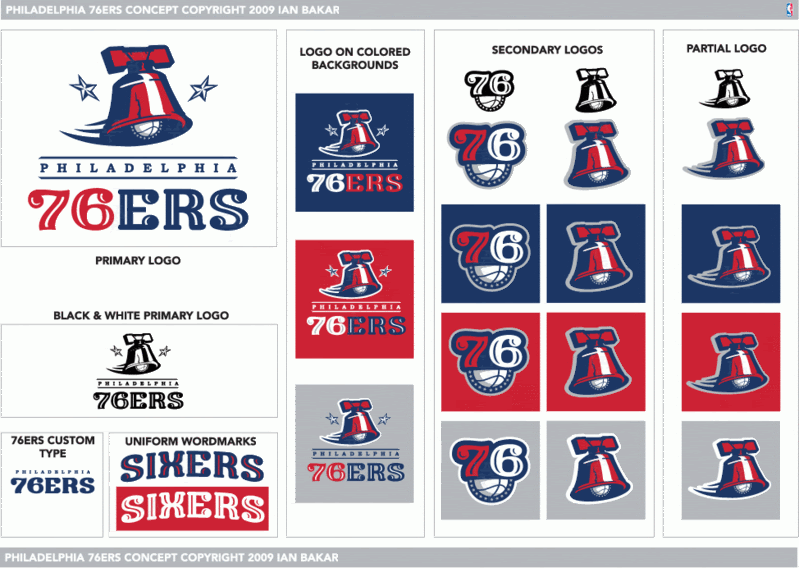
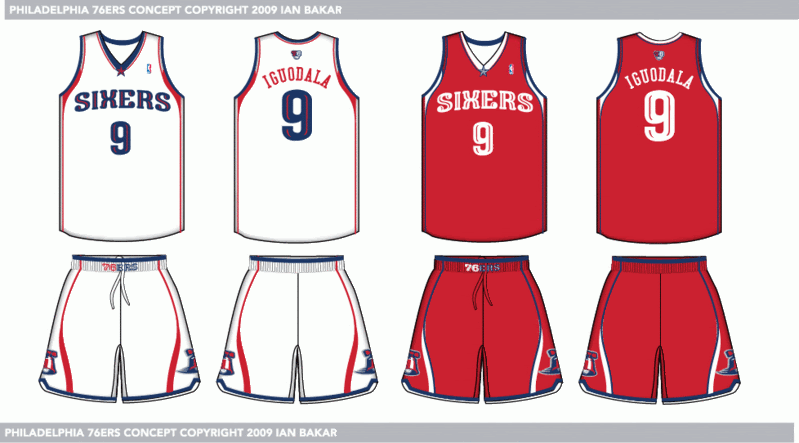
Ian Bakar’s comment is:
Here was my idea for the 76ers. My own custom font for the '76ers' and 'sixers wordmarks. There were some updates, as this was a preliminary version. The latter updated version is posted below the next two.


Different Andy’s comment is:
@ian i like that concept, good update of the classic design
to be honest, i could not be happier about this change. the sixers have to be red white and blue. I dont care at all about basketball, but id like a shirt with this logo on it cause its so great. its one more team that will drop the terrible "black alternate jersey" from their lineup.
now if the brewers would face the music and revert back to the mb mitt logo (the best sports logo ever to be created), all would be right with the world
On Jun.27.2009 at 06:10 PM
Elisa’s comment is:
I really liked some of Ian Bakar's designs, they've got a classic flavor without going over-board. I'm glad the Sixer's went back to their old logo, I'd choose that one hands-down in a competition between the vintage logo and the over-designed logo.
On Jun.29.2009 at 03:13 PM
orangetiki’s comment is:
The retro logo is nice, but I still say you could have cleaned up the ers lettering a lot more. It has that 1960-lettering-cut-from-rubylith look that should be a distant memory.
On Jun.29.2009 at 03:56 PM
Clayton Shumway’s comment is:
The retro design is much more identifiable. Little use of colors and simplicity is king in logo design. Now I need my Phoenix Suns to follow suit...
On Jul.06.2009 at 01:39 PM
Milkrow’s comment is:
Nice work Ian. Was this part of an actual project or just something you put together for this discussion.
On Jul.06.2009 at 10:27 PM
phar_fetched’s comment is:
Very interesting that the simplification of logo design as seen in brands such as Tropicana and Pizza Hut has even made it to the sports scene. I wonder if this will buck a trend with teams in America turning back to more retro and minimilist designs?
On Jul.07.2009 at 05:41 PM
Comments in Brand New, V1.0 have been closed.


