

NOTE: This is an archived version of the first incarnation of Brand New. All posts have been closed to comments. Please visit underconsideration.com/brandnew for the latest version. If you would like to see this specific post, simply delete _v1 from the URL.
Thanks to Andrew Sabatier for the tip.


Jump to Most Recent Comment
Steve K’s comment is:
I’m loving a lot of what Saffron’s doing, they seem to do the simple things very well.
On Mar.23.2009 at 07:08 AM
Van’s comment is:
Am I missing something? This looks fairly boring to me, and out of character for the industry. While that's often a good thing, I can't see it as a good thing this time around.
The not-so-long-ago redesign of Hankook's identity is far better than this.
On Mar.23.2009 at 07:29 AM
Gorka Beaumont’s comment is:
In connection with the tire industry branding, here in Europe, French brand Michelin is very well known by a chubby doll named Bibendum.
On Mar.23.2009 at 07:31 AM
Erik at Logo Critiques’s comment is:
I like it. The emphasis on circular shapes is fitting. I'm a fan of pattern so the circular brand pattern is cool to me. Not crazy about it when it's really big like on one of the envelopes on the Saffron website, but when used smaller I think it is quite effective.
On Mar.23.2009 at 07:59 AM
Fish’s comment is:
tight. I'd like to see a little more control with the scaling of the brand pattern, but other that that I feel this is pretty successful.
On Mar.23.2009 at 08:59 AM
sukisouk’s comment is:
„Out of character for the industry…“ so why’s that supposed to be bad? I like it, it’s nice and pretty. Adding niceness and prettyness to this big container on the pic and thus – the world.
On Mar.23.2009 at 08:59 AM
David H’s comment is:
Armin, I am frequently surprised by the brand redesigns you end up liking.
I often feel that design firms tend to design something unoriginal, but add enough layers of pointless rationale to their design documents that it obscures the simplicity of the design. It feels very much like the modern art movement to me, which seems to exist solely to feed on the viewer's sense of self-doubt: by adding "reasons" for the mess on the canvas, every person pretends to "get" the art, instead of admitting it makes little sense.
The redesign here is similar. Circles for a tire company. Not exactly a revolutionary idea. I got the impression from my own experience, as well as the opinions expressed here, that choosing to go with simple shapes for a logo was a sign of an uncreative mind.
And seriously, circles to represent a sun god? Come on. Really. Why bother with that? Who actually believes that nonsense? Do designers have a fetish for coming up with bizarre reasons for their decisions?
On Mar.23.2009 at 09:10 AM
Armin’s comment is:
> Armin, I am frequently surprised by the brand redesigns you end up liking.
Gotta keep everyone on their toes : )
On Mar.23.2009 at 09:19 AM
Andrew Klein’s comment is:
It says "we sell circular things"
On Mar.23.2009 at 09:27 AM
Matt Hunsberger’s comment is:
@David H: Occam's razor. The simplest solution is the best one.
On Mar.23.2009 at 09:54 AM
Andy’s comment is:
@ David H
I don't think anyone suggested that it was revolutionary. The fact that it's not revolutionary, that it's (duh!) circles for a tire company is why it works well. As simple or 'uncreative' as the solution may be, other tire companies have not done it. They've gone the route of the aggressive, stylized, oblique logotype time and again, which fits the 'character of the industry,' if there is one, I suppose, but can hardly be considered creative compared to this identity.
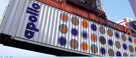
By the way, I love the circular icons representing the various tires. Nice little system for a product that's notoriously difficult to shop for.
On Mar.23.2009 at 09:58 AM
felix sockwell’s comment is:
great stuff. simple. modern. adaptable.
On Mar.23.2009 at 10:03 AM
Andrew Sabatier’s comment is:
Brand identity design doesn't get more new modernist than this, particularly of the no nonsense, cut-to-the chase British variety. British new modernism distinguishes itself with acute business acumen and multi-layered concepts in crisp, simple and pragmatic solutions. On this basis the work is easily sold and only made to fail with huge amounts of energy and insights not generally available to the casual observer or flippant design commentator.
This rebrand has all the best ingredients for a successful corporate brand: archetypal name and story manifested in an iconic, easy to use, robust and flexible identity. Tick, tick, tick, tick, tick and tick.
Saffron is a global consultancy led by a legend of corporate brand identity. Wally Olins has set a precedent for brand identity thinking which has found traction in top level brand consulting the world over. The Apollo rebrand is a superb example of this approach.
A.
marnie’s comment is:
I like this a lot, and not just because I just finished our in-house annual report with a lot of grey and orange circles (hmmm).
But I do find, after looking at it over and over, I kind of lose the 'a' and just see a lot of 'pollo.'
pollo
pollo
pollo
Ryan Adair’s comment is:
Very nice. Keepin' it true to the tire. The usability of this identity looks great. Saffron is doing fantastic work...
On Mar.23.2009 at 10:22 AM
Cam’s comment is:
Well done.
On Mar.23.2009 at 10:28 AM
Jacob’s comment is:
What bothers me most is this piece of rationale:
Apollo is positioning itself as the smart choice, the IKEA or Gap of the tyre industry — neither a luxury nor a cheap brand but rather one that is stylish enough and sensibly priced, and marketed to women as well as to men.
I realize that designers can and often do create profits for their clients by lending perceived value to a brand when, in fact, company's products. But that doesn't make it a good idea. I would rather choose my tires based on performance--that is, when I put them on my car, do I have a quiet and smooth ride, does my car handle well, do I still have traction in the rain, and does the tread wear well--than the feelings that the brand itself evokes. And I would hope that the company that makes my tires understand that I am going to make a decision on whether to spend hundreds of dollars based soley on the performance of its products, not on whether I perceive a strong sense of "style" from the company.
On Mar.23.2009 at 11:03 AM
The Mik’s comment is:
Quite boring, to my opinion, and I add that web is full of similar fonts and logos.
However, it works.
And I tink that it could resist to test of time, too.
Nathan McKinney’s comment is:
While an interesting and clean approach, I just don't see tires in this anywhere. This looks more like direct competition to target than a tire manufacturer.
Flat out, what I see here misses the mark by failing to communicate what the brand actually is.
Graphic design is first and foremost a means for communication. Making things that are trendy just isn't an excuse to ignore the message. This design communicates no message at all. Maybe there is more to this rebrand than I see here, but thus far, I'm not sold.
On Mar.23.2009 at 11:22 AM
Kirk’s comment is:
it looks cool but it doesnt make me think of tyres at all. It makes me think of gift wrap from Target.
On Mar.23.2009 at 11:34 AM
lyndi parrett’s comment is:
my only comment is i'm jealous i didn't do it!
smart and simple!
g’s comment is:
Agreed with some of the comments. I don't see what's so great about it. They could have pushed the design a little further, and I'm not against Saffron, I loved what they did for "Banco de Uno", but in this case, it fails. I also don't see any practical applications, just the logo photoshopped in a couple of pics. I see the stationery, but is that all the identity? Kind of bland in my opinion.
And the use of a circle, while obvious, can't be used as a registered trademark.
EDIT:
Now I know what really bugs me about this one: the color orange. They sell security, don't they? It's very close to red, and it feels uneasy to me, not calming in any way.
Von K’s comment is:
I like this a lot. It's a really pleasing, functional and ownable visual language and I think it'll serve Apollo well for many years.
I'm curious, are the different "tyre" icons used on the packaging/labeling of the product itself? I can see someone riding on a forklift through a warehouse with tyres stacked to the heavens, looking for the thick gray border with the orange dot.
To the arguments that this identity doesn't say tires--so what? How does the Michelin Man say tires? How does Pirelli's weird capital P say tires? It isn't the logo or visual system that literally depicts a product or service, it's the associations that are built between the brand and the public. Pirelli is just a person's name, but over time the logo has become associated with those expensive Italian tires.
If you had to show a picture of a tire to communicate that you were a tire company, well, that'd be pretty boring.
On Mar.23.2009 at 12:05 PM
Hannes’s comment is:
And now, close your eyes and imagine in your head what kind of car these tires go on.
Done?
Was the car you were thinking of round and cute?
How many cars out there are round and cute?
On Mar.23.2009 at 12:07 PM
darrel’s comment is:
The type is quite nice. Not revolutionary, but seems original and appropriate.
I also love the facade graphics in the HQ photo.
On Mar.23.2009 at 12:41 PM
Josh’s comment is:
Hyped up marketing lingo or not, I think Apollo is a simple success. It may reach a bit with the tire patterns, but a brand is a belief system for more than consumers. It is also for the employees.
In comparison to the old identity, think of the difference between working in glass tower with awesome views vs. a suburban, molded brick nightmare with a view of the next molded brick nightmare going up. That is what the new identity is.
Simple is something with which to build on. I can see this identity having elements built around it, functioning in various mediums, but not losing the focus on the brand mark.
And we need more no-nonsense American branding work. How many more new marks can we make look like they've been around since 1950.
On Mar.23.2009 at 12:44 PM
Rodrigo Müller’s comment is:
this is what I call a smart one. the world evolves, your brand must evolve too, and apollo's has evolved the right way. way to go Saffron!
On Mar.23.2009 at 01:01 PM
jRod’s comment is:
yeah, this is a nice branding effort, and it is well put together. but i'll be honest, i says nothing to me as a car enthusiast and performance tire buyer. now, if you dont think that I am apollo's target audience, then so be it. i get that.
the name signifies strength to me, but the circles and rounded lettering do not. they say "we got our pattern off of a toy poodle's designer coat."
Falken and Goodyear are shaking in their rubber boots.
On Mar.23.2009 at 02:36 PM
Mark’s comment is:
it sucks I KID I KID!!!!!
I think it looks brilliant,nice way to stand out from the competition. I like the designs, it quite clever to use the design to indicate what type of tires that are contained inside. The old logo was boring and predictable,this one is quite unique. Sort of reminds me of Target's trailers from a few years ago,but in a GOOD way
On Mar.23.2009 at 03:53 PM
Ross’s comment is:
I love the product matrix, there aren't a lot of ideas like that. It's not quite the 3 stripes, but I like it. It'll be a very unique aspect for them.
Even if the matrix sucked, the word type is still very unique, yet simple, standing apart from competitors. There aren't a lot of tire companies trying a "hip" branding.
Jeremy’s comment is:
Simple, fun and beautifully realized.
Reminds me of Karel Martens work.
Insert Image:
Paul Cooley’s comment is:
Oh! What a breath of fresh air. I haven't felt that good looking at design work in a while. Who would think one could get excited about tires in this context!
Definitely keeping an eye on these folks.
On Mar.23.2009 at 05:56 PM
Kirk’s comment is:
...right but.
its a TIRE company. not a fruity candy or hip dept store.
i think they missed the mark.
On Mar.23.2009 at 06:01 PM
Kirk’s comment is:
yay the Ice Cream Man!

i can hear the music.
On Mar.23.2009 at 06:03 PM
JM’s comment is:
Ice cream truck? sorry don't see it.

Luc Doucedame’s comment is:
This is fantastic! Managing to put something together this sophisticated, differentiated & unique in this market space with a circle (how predictable is that?!)is pretty amazing if you ask me. Then again I'm a sucker for geometric designs. Great work!
On Mar.23.2009 at 07:01 PM
Kellie Schroeder’s comment is:
Nice work.
Not a fan of the logo...but I enjoy the lively application of it...FRESH.
John McCollum’s comment is:
@Jacob (I realize that designers can and often do create profits for their clients by lending perceived value to a brand when, in fact, company's products. But that doesn't make it a good idea. I would rather choose my tires based on performance--that is, when I put them on my car, do I have a quiet and smooth ride, does my car handle well, do I still have traction in the rain, and does the tread wear well--than the feelings that the brand itself evokes.)
I'm sorry, Jacob, but that just sounds really naive. And from a business standpoint, it's just plain wrong. It is, unequivocally and demonstrably, a good idea to position company via the feelings a brand itself evokes.
And assuming Apollo is around for another 50 to 100 years, exactly which features of the tyre should the corporate brand emphasize?
On Mar.24.2009 at 06:26 AM
Jonathan’s comment is:
Tires for chicks, man.
Great identity and branding and all that, just looks like its for candy, NOT TIRES!
Von K’s comment is:
Why is it so hard for people to see tire branding as anything other than what already exists in the segment?
I'm a fan of motorsports. I work on/modify my car and autocross with local groups and still this branding does nothing to threaten my masculinity. I don't get the negative reactions to this.
On Mar.24.2009 at 10:38 AM
Jeremy’s comment is:
Enough said.

Kirk’s comment is:
that set of logos needs some fruit loops!
I'm glad I'm not alone.
although, Continental makes me want to put cream in my coffee.
On Mar.24.2009 at 12:13 PM
Jeremy’s comment is:
Sorry Kirk, I am suggesting differentiation is a good thing.
On Mar.24.2009 at 01:26 PM
Kirk’s comment is:
true, but non of those make me want candy. or ice cream (except for the Continental) Or Target department stores.
everything but automotive. i say its nice, but a fail.
On Mar.24.2009 at 02:38 PM
designscene’s comment is:
Its a great piece of work, especially if you read the logic behind it on the Saffron website. Even without reading at the logic, it looks good and it communicates. Thanks for putting up something from the other half of the world.
On Mar.24.2009 at 03:03 PM
lucid’s comment is:
Feels IKEAesque to me...
Looks like wrapping paper or a great logo for... just about anything else but tires.
May be successful in Europe but will meet challenges in the United States... simply the wrong demographic.
Euro B+
USA C-
Jordi’s comment is:
While this is an improvement over a really old-looking logo, doesn't have anything to do with tires, or anything like that.
Asked my girlfriend, and it said apollo was a bakery.
On Mar.24.2009 at 05:53 PM
t-bone’s comment is:
this is awesome. so clean and logical. and awesome.
On Mar.24.2009 at 06:58 PM
Frank’s comment is:
Marketing lingo aside, this just looks 100% like an Ikea wallpaper.If i was in the market for some new tires and i'd drive by an Apollo sign (assuming i had never heard of the Apollo brand before) i wouldn't stop there because i'd think they'd be some paint shop or selling Ikea furniture or wallpapers.
Like, this might work for customers that already know the brand and it won't keep them from buying; but what about new customers ?
In that regard (brand identity helping to attract new customers) this identity system fails i think.
On Mar.24.2009 at 08:40 PM
Sanjay Basavaraju’s comment is:
Apollo's competition:
Apart from these Indian companies, Good Year and Bridgestone are major players.
Odd one out. Apollo. Cheers.
On Mar.25.2009 at 06:19 AM
Andy’s comment is:
@Frank
That's a terrible criterion and justification for a fail. Look at the other logos in the industry. You're telling me that, even if you hadn't heard of Firestone, you'd know they sold tires by looking at that 'Firestone' script on a sign? Absolutely not. That's preposterous. You're basing your entire statement on the fact that this new Apollo brand is just that, new, and has zero equity at this juncture.
Time and again, designers fail to realize that the logo does not have to tell a story to be successful. It simply needs to identify the company and its products while growing and adapting with them.
In the U.S., Goodyear and Firestone are perfect examples of this. Both brands have little or no literal depiction of or indication of the product these companies sell, but those logos are without doubt among the top 50 most recognizable in our culture.
On Mar.25.2009 at 12:16 PM
Frank’s comment is:
@Andy:
I have to disagree.
First, i do think a logo serves more purposes than just that of a visual identifier.If that wasn't the case, any halfbaken unique visual would work as a logo for any given company or product.But that's not the case.A good logo indeed should communicate something about the company and/or about their products.Doesn't have to/shouldn't be blatant though, but communicate *something*.
The theory that a logo is "just" an identifier might be working if companies had unlimited marketing budgets to push a logo into customers awareness.But as that's not happening, often a logo has to hint potential customers to the nature of the company's business or products.The smaller the company, the more important that factor is, by the way.
As said, the hinting doesn't have to be blatant.But what Firestone, GoodYear etc have in common is that their visual language is based on longstanding, traditional identifiers that their potential customer base is used to and has subconsciously adapted and agreed on.I'm talking visual language of "speed", "racing", "masculin", "flames" etc.
I don't know how big Apollo is in the tires industry but one thing is for sure: That the likes of Firestone are big competition whith brands that are burnt into customers awareness through efforts of time, tradition and probably huge marketing budgets.So, if Apollo should happen to not be an already big player with huge marketing cash, they'd better have an identity that at least in *some* way hints at what they do.
And for me that visual language of "Ikea wallpaper" just doesn't accomplish that.
In short, it's an issue of abstract vs. marketing budget.
On Mar.25.2009 at 01:00 PM
Kirk’s comment is:
why non just leave the old logo along then and built brand Identity from a good product and a known logo.. Unless the old logo tells customers something they already know, Apollo tires totally suck.
A logo isnt going to fix that.
it looks like candy and Ikea. Not something i want to put on my car.
You say that doesnt matter. I say it does. It's not that it doesnt look automotive, its that it looks totally opposite of automotive. that's the problem. if it were something benign they could built a new image off a unique and clever identity but this just screams "hip shower curtain"
On Mar.25.2009 at 01:01 PM
Sandeep Kaul’s comment is:
Simplicity requires courage.
On Mar.26.2009 at 02:19 AM
Andy’s comment is:
It's absolutely true that the smaller a company is, the more its logo needs to communicate rather than identify, but realistically, we're not talking about Ma and Pa's General Store here. We're talking about a large tire corporation that might as well be a household name like Goodyear in India.
Anyway, you're backing yourself up. If you're going to tell me that the Firestone and Goodyear logotypes communicate what those companies do, then there is no basis to criticize the Apollo logotype, because it's bold, aggressive, masculine and looks like a 'racing' logo, just like the others. You're hung up on a circular pattern that is not even the focal point of the brand, but rather is supportive to the logotype both as a decorative element and as a functional one.
Seriously, the opposite of automotive? Every car has tires, circular tires, and I'm sorry you don't agree, but gray circles do a swell job at connoting and communicating that. I suppose it's human nature to try to find flaw, but I personally dislike when good work has such a difficult time drawing supporters. Sometimes, you just have to take it for what it is. The fact is, it's a simple, understandable visual device that is integrated well with the language of the logotype.
On Mar.26.2009 at 09:04 AM
Anonymous’s comment is:
![]()
While it might stand out from their competition, it reminds me too much of the Koodo mobile logo from here in Canada.
On Mar.26.2009 at 08:57 PM
Glenn Sakamoto’s comment is:
It's fun and different. But I am not sure the playfulness and color scheme communicates trust and safety. But definitely miles ahead of the competition!
On Mar.27.2009 at 12:10 AM
Kiran Chetry’s comment is:
Very refreshing, this not only moves the brand forward, but sets a benchmark for the competition.
Good to see Wally and his team, back at the top of their game.
On Mar.31.2009 at 12:09 AM
Qudans’s comment is:
Actually Wally dislikes lipspittles and sycophants, but can understand feelings of sentiment nostalgia towards him given the rough ride he had by Omnicom after the MBO @ Wolff Olins.
• The logo is sideways most of the time (doh!)
• Generally speaking, the name Appollo isn't really distinctive, although may be in Indian markets, it more associated with the Greek deitie. Distinctive in market, yes. Global brand potential, no!
• The pattern doesn't work in monochrome
• Using lower case to accommodate four circular shapes (tyres?) is a visual pun likely only appreciated by other designers, i.e., will be lost on the audience for who it is intended.
This is a good logo, just not a great one. Bridgestone still sets the standard…
Just to note that the brand isn't just the logo —rather the cumulative experience of the company, products, and service in it's entirety from the perspective of the customer.
On Mar.31.2009 at 09:06 AM
Person Person’s comment is:
To Qudans:
— the logo is not sideways most of the time.
— at saffron we feel the name can be distinctive in this market especially. we like it.
— the pattern does work in monochrome and no tints.
— lowercase not appreciated by others? quite a statement.
— we doubt very much the logo will be lost on the audience it’s intended. it seems to have caught the attention of volkswagon which will be launching their latest vehicle with apollo tyres.
— i’m sorry but the bridgestone logo and brand identity is crap.
kirk’s comment is:
perfect. Volkswagen, the Target, Ikea, ice cream candy of car companies.
On Apr.17.2009 at 03:10 PM
Brandista’s comment is:
Came across this one pretty late...visuals from brand consultants often look better than the ground reality. I was in India recently and you got to see the visible visual clutter. And am sorry to say that Apollo wouldn't just manage to stand out.
The consultants simply don't seem to have understood India. Like it or not, brands operate in a context, esp the cluttered, dusty markets of the subcontinent are far from the refined examples shown here. Simplicity is for environments that have some visual harmony, in a place full of all sorts of colourful shapes, the circles just disappear or look like something else.
A euro/us centric mode seems to be applied to create the identity and as several posts refer to, evaluate the brand.
Whats more Apollo isn't using any of the stuff showcased here. So the big question for me is that why haven't they rolled out the brand?
On May.06.2009 at 08:17 AM
joe’s comment is:
poop.
end of story. looks like roadkill. colorful circular roadkill.
On Jul.02.2009 at 11:59 PM
Comments in Brand New, V1.0 have been closed.


