

NOTE: This is an archived version of the first incarnation of Brand New. All posts have been closed to comments. Please visit underconsideration.com/brandnew for the latest version. If you would like to see this specific post, simply delete _v1 from the URL.


Jump to Most Recent Comment
Proverbial Thought’s comment is:
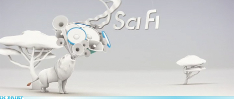
BY an large I think these are good and effective. Of the bunch I thought the Lion was terrible, but the horse was absolutely amazing.
I think the all white canvas brings to life the few colored elements like the fire from the horses thrusters. But, I like the surreal setting that the all white creates with the gray shadows, etc.
I am a little bothered that there seems to be no rhyme or reason to the payoff in there idents. there kind of is, but they make little sense. Also, if you have seen the idents that these are replacing, you might agree that they are not nearly as good ore creative.
But "if" is much more inspiration to work with than "syfy", so this reality is understandable. Still, I think overall they are nice and will do what they were created to do.
On Jul.03.2009 at 09:57 AM
Bassem B.’s comment is:
Interesting as the idents may be, the name "Syfy" remains a terrible choice.
On Jul.03.2009 at 10:25 AM
Joseph Maguire’s comment is:
These do not compare to the work dixon baxi did. and frankly the last one one with the horse turning into a super moter rocket creature is taken straight from the concept of that comcast advertisement with the cat turning into a rocket creature and the taglines are eirily similar on that one.
The others just don't speak to me as a fan of scifi. SyFy needed some great idents to make this change sellable Try again...
On Jul.03.2009 at 10:47 AM
Tre’s comment is:
The name still sucks.
On Jul.03.2009 at 10:48 AM
Joseph Maguire’s comment is:
Their not the same thing at all but their similar one uses a rabbit of course :) http://www.metacafe.com/watch/1490420/powerboost_comcast_cool_commercial/
On Jul.03.2009 at 10:50 AM
Ville’s comment is:
Man that logo is third rate at best..and the animation nowhere near good enough to lift it (doubt anything could)
On Jul.03.2009 at 12:01 PM
Proverbial Thought’s comment is:
Thanks Joseph for that link. I had heard that commercial on the radio but never actualy seen it. Really well done. Sorry for going off topic.
On Jul.03.2009 at 12:03 PM
Aleksander Lenart’s comment is:
Not a fan - animation could have been better. As for the 'Syfy' I wonder if they will keeep the name in Poland as it translates to plural of 'crap' or 'sh*t' :)
On Jul.03.2009 at 12:22 PM
Mark’s comment is:
The idents are pretty amazing saw them on Youtube,but I still hate the spelling of "Syfy". Always have always will.
I will miss that unique Saturn logo, that was recognizable once you saw it, shame they're replacing a well known logo for a bad misspelling of a name. I will also miss their "if" bumpers. I would have preferred "SiFi"
On Jul.03.2009 at 01:25 PM
Andre’s comment is:
As someone who is not a huge science fiction fan but could easily be lured by new (good) programming, I don't grasp how a lion and a horse relate to the fantastic. It feels more like a cool campaign for Animal Planet. That is, of course, unless horses with jet engines are the new unicorns, and I missed the meme?
On Jul.03.2009 at 01:56 PM
Bob’s comment is:
I still defy anyone to look at "SyFy" and not pronounce it "Siffy."
On Jul.03.2009 at 03:14 PM
Steven Hoober’s comment is:
These promos just serve to point out how much worse the new logo is.
On Jul.03.2009 at 03:31 PM
Armin’s comment is:
Tough crowd!
On Jul.03.2009 at 04:23 PM
Mikintosh’s comment is:
I'm with the others, the name is as absolutely stupid as it was when they announced it. I thought when they hadn't made the switch already that they'd ditched the idea, but no luck.
On Jul.03.2009 at 04:46 PM
Raphael’s comment is:
Still can't understand the syfy hating majority, for me its still crisp, memorable (somewhat edgy) and functional. It will perfectly work as a brand, you'll see. By the way, the "saturn logo" is anything else than unique.
On Jul.03.2009 at 05:26 PM
EnergonCube’s comment is:
They've emasculated the brand! At least the old stuff looked cool, futuristic, and science-y. Now it looks like a year 2050 version of My Little Pony.
Stupid.
On Jul.03.2009 at 09:29 PM
Bill Dawson (XK9)’s comment is:
I respect Blind, CD Chris Do & Co.
They had a sad job to do here: sell a bad idea.
For me these animations mainly illustrate that the old logo wasn't great, but the new one is just plain bad.
And the campaign "Imagine Greater*" (*swap with superlative of choice) comes off as oddly critical of the audience. Hey Siffy, imagine if you had come up with a better concept for your identity.
On Jul.04.2009 at 03:23 AM
Rafal S.’s comment is:
I'm with the "tough crowd" here.
These animations are nice, I love this monochromatic approach.
But the name? Still horrible. I believe nothing can save it... This is indeed the limit of my imagination.
Icon’s comment is:
Interesting Logo concept. I like it...
On Jul.04.2009 at 06:27 AM
Shane’s comment is:
i just don't know. I always liked SciFi because it appealed to a subculture. It was weird...not mainstream. I found myself watching it because there was a certain honesty to it's oddness. It celebrated being different and it took being weird really seriously. These new shorts and this new logo feels like someone who doesn't watch SciFi trying to "be" scifi. It lacks the honesty, it lacks the oddity and it lacks personality. I'm sad to see the old brand go and i don't think the new one is capable of filling the void the old one will leave.
On Jul.04.2009 at 09:27 AM
Stuart McCoy’s comment is:
To all the people who claim SyFy is a bad choice, please explain how the network can still keep SciFi and work around their trademark issues? If you can do this then you are free to whine, bitch and moan about SyFy. It's not a bad choice and I'll argue that it's a good branding decision as it adds a uniqueness to the network that really wasn't there to begin with (btw, I always hated the stupid planet logo, the ring was awkward to say the least).
The problem the network faces is not the name, it's creating quality shows instead of the subpar, poorly written, poorly CG'ed drivel they currently produce. They take a good idea from somewhere else, write a cheap script, hire even cheaper actors, and create a show on a production schedule of less than a week (at least it seems this short and if it's not then they are wasting their money).
On Jul.04.2009 at 10:50 AM
William Gibson Rocks’s comment is:
"SiFi" would have worked splendidly. THIS is travesty.
Karma for cancelling Farscape.
jarrod’s comment is:
Just watched the DixonBaxi work someone referred to. It's far, far more compelling, and actually... SciFi, or SyFy or whatever you call it.
I don't understand the new ones, particularly the copy - is it supposed to be for a home improvement show? An energy company? They seem oddly disconnected from science fiction.
On Jul.04.2009 at 11:58 AM
Olivier’s comment is:
wow the idents are not creative and again less well executed. Concerning the name, I guess it was to save a character on Twitter.
SiFi would have worked better though.
adzski’s comment is:
I didn't like the old Sci fi very much, but I like the new Syfyless.
(Boom, tish - thank you, I'm here all week...)
On Jul.04.2009 at 06:40 PM
Stuart McCoy’s comment is:
SiFi looks like it was misspelled. SyFy has the same phonetics but certainly wouldn't be thought of as misspelled. I'd be willing to bet that this was discussed and probably one of the reasons you see SyFy and not SiFi today.
On Jul.04.2009 at 08:42 PM
Justin Hill’s comment is:
I would prefer the name "SieFye" over "Syfy."
On Jul.05.2009 at 01:32 AM
henry’s comment is:
Well, for me the logo now looks much better when given context in these clips. Makes more sense in tandem with the taglines.
Definitely will keep a look out and see how this pan out.
On Jul.05.2009 at 03:42 AM
english101’s comment is:
SiFi looks like a misspelling and SyFy is better?
In the world of "lite" and "nite" and "EZ", I think
the thing to do is go with what WORKS. SyFy,
as I think they're about to find, does not WORK
because people don't LIKE IT and can't RELATE
TO IT. All that stuff I learnt in graphics school
about being able to relate emotionally and such...
none of that's present in SyFy. Let's see how
long it takes before the figure out they need
to rectiFy this mistake.
Stuart McCoy’s comment is:
@english101,
a) SciFi -> SiFi
b) SciFi -> SyFy
Which one of the above looks like the intentional misspelling and which one looks like the art department made a multi-m reasons illion dollar mistake? I realize that both are technically misspelled but one appears to be more "correctly" misspelled, and here's a hint, it's not (a). You can talk about all that stuff learned in design school, but what about all that stuff learned in the real world about not every project being the next Nike rebrand? Do you honestly believe that SiFi wasn't discussed? Whether or not the client had good (we'll likely never know), the brand they settled on was SyFy and as far as it being successful or not, perhaps you should wait until the full rollout has occurred and see if their sub-brands work or not?
On Jul.05.2009 at 08:51 PM
Tez’s comment is:
I don't know about you but for me looks like Syfy is going to be more like Discovery Science and Technology? Has anyone told them that someone is already doing this genre and doing it well?
On Jul.05.2009 at 09:44 PM
Tom’s comment is:
Well, that was just lovely... the motion graphics and 3D work that is.
On Jul.06.2009 at 04:42 AM
MarkeR’s comment is:
whimpy.
On Jul.06.2009 at 10:38 AM
Al’s comment is:
Syfy really isn't as bad as you think it is. A little penicillin clears it all up.
On Jul.06.2009 at 12:25 PM
Aydin’s comment is:
The ads are great, but the Syfy logo so terribly misses the mark for everything that Science Fiction stands for, that it's to no avail. Sad.
On Jul.06.2009 at 02:38 PM
Mark’s comment is:
Well unfortunately like it or not on July 7th, 2009 Sci Fi will officially become Syfy, and we all are going to have to get used to it. I'm excited yet frightened at the same time. Hopefully they don't change their line up too much to unrelated programming.
I'd hate for this channel to lose what's left of it's niche. We don't need another MTV or TV Land on our hands, There's barely anything on TV right now. I don't want this channel to have barely anything watchable on it as well.
I also hope they dump that terrible slogan for something better in the coming years. "Imagine Greater" sounds like something a 5 year old came up with.
On Jul.06.2009 at 02:55 PM
Justin’s comment is:
Unfortunately I think this is where the channel is headed (Mark's fears). Several years down the line I think it'll be vastly different content-wise, and the connection between sci fi and the name SyFy will have dissolved.
On Jul.06.2009 at 04:20 PM
SeeingI’s comment is:
So-so animation, with no clear point, selling a re-branding with no point whatsoever.
Stuart McCoy says: To all the people who claim SyFy is a bad choice, please explain how the network can still keep SciFi and work around their trademark issues? ... it's a good branding decision as it adds a uniqueness to the network that really wasn't there to begin with ... The problem the network faces is not the name, it's creating quality shows instead of the subpar, poorly written, poorly CG'ed drivel they currently produce.
I can't see why you are so self-righteous about it when you pin-point the exact issue - the fault lies not in the brand identity but in the network itself. At least with "Sci Fi" you know what it was supposed to be, even though you'd almost never get it when you tuned in. This is a clear example of a floundering brand mistakenly thinking that a new name and new look will help package the same old crap. If "Warehouse 13" doesn't pan out, then they can spell it any way they like and be damned. And if they think their big problem all this time is that they can't trademark "Sci Fi" then they are in worse shape than I thought.
On Jul.06.2009 at 04:21 PM
nerdski’s comment is:
I really like how they are transitioning. This video is another great example. http://video.scifi.com/player/?id=1131680
On Jul.06.2009 at 05:15 PM
JC’s comment is:
YAWN. The "if" spots were better.......hang on a mo...........
How about "the iF channel"? Too late, you say? damn....
On Jul.06.2009 at 06:24 PM
will’s comment is:
For those of us who don't have dates on Saturday night, I have one thing to say: YOU BETRAYED US, SCIFI!
On Jul.06.2009 at 09:16 PM
Panasit’s comment is:
The motion graphic only reminded us how great the old logo was. And I think the tone of scifi channel ( I refuse to spell it any differently, sorry) is very dark. What's with traveling in space and monster movies. So, the brightness of these little "spots" don't seem to match.
On Jul.07.2009 at 12:01 AM
Anonymous’s comment is:
And the last layer of this change has dropped:
http://www.syfy.com/imaginegreater/
On Jul.07.2009 at 01:26 AM
Soda & Candy’s comment is:
This is dreadful. The logo has no character and the spelling is just irritating / amusing / confusing.
That whole thing about not being able to trademark "SciFi" is bollocks anyway, you don't see the History Channel changing their name.
On Jul.07.2009 at 12:00 PM
Olivier’s comment is:
@Stuart McCoy's
---------SiFi-----------SyFy ---------
Which one of the above reminds you of Sci Fi?
The first one obviously.
English is not my first language and yet SyFy disturb me. Nowadays people are used to shortened, truncated, misspelled names.
Now the issue of Sci Fi was the trademark. Yet they have the opportunity to get the trademark for the cooler, hipper and more actual version, I give you SiFi.
I don't think that anybody would have mind the misspelling here, but everybody mind the SyFy one. Why? Because it doesn't remind them of Sci Fi at all. SiFi does. At least to me, it reminds me of science fiction.SyFy doesn't remind me of anything I can relate to.
Now, isn't what it is all about? Keeping the brand sympathy and making it more actual, refreshing it, without confusing or "betraying" your audience?
Now lets take another example of successful rebranding : Tru Tv.
Oh, they mispelled it, they forgot the "e". Would you think it would have worked better if they had spelled it " Trew Tv" ? No. Tru TV is just perfect. It speaks to people, because it is what they use to do. Moreover, the Sci Fi audience seems to be geeky, another reasons that they would adopt SiFi without a word. Why Adding two "y" when you can just remove a "c" (which is silent anyway) ?
Now SiFi has obviously been discussed around big conference desks with a lot of executives in expensive suit sitting around, and they choose SyFy. Now, my good sense push me on the SiFi side.
I think it would have been a better choice, until someone with valid arguments proves me that I am wrong.
Justin’s comment is:
you don't see the History Channel changing their name.
or the weather channel.
On Jul.08.2009 at 04:45 PM
Comments in Brand New, V1.0 have been closed.


