

NOTE: This is an archived version of the first incarnation of Brand New. All posts have been closed to comments. Please visit underconsideration.com/brandnew for the latest version. If you would like to see this specific post, simply delete _v1 from the URL.
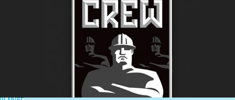
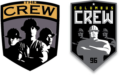
Before and proposed logo.
After The Crew brought the MLS Cup to Columbus in ‘08, I took a long look at how our team and city will be perceived in the months and seasons to come. We have the best team, coaches, fans, and facilities in the league… but we’re running an emblem that’s 12 years old and in need of some rejuvenation.
So, I propose we revamp the Columbus Crew brand to go with our revamped spirit. The logo you see on this page was created by me as a possible solution. Is it the only solution? No but I think it’s a good start.
The purpose of this group is to catch the attention of Crew management to let them know the movement is out there. It’s not a chastising of our current logo… I appreciate the passion and attachment people feel for the old look. This is simply a refresh. You’ll notice that, in concept, this new logo is almost identical: a shield, featuring 3 “crew” members looking sternly onward. What’s been changed is simply our style of expression. The fonts changed. The illustration is simplified. The appearance is revamped. But the heart is the same.
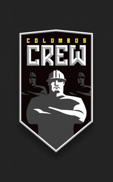
The intent of this redesign is to SIMPLIFY, STREAMLINE, and STYLIZE.
SIMPLIFY: Get rid of the fussy details in the old dudes and present a clean, iconic illustration for the new.
STREAMLINE: Where sloppiness once was is now a crisp collection of elements working together. Precise outlines and mathematical spacing present the Crew as an uncompromising bunch.
STYLIZE: The Crew should be tough and formidable. Hence the hard angles, structured lettering, and geometric layout.
Thanks to Jarrod Beglinger for the tip.


Jump to Most Recent Comment
jRod’s comment is:
sweet. i really like the simplicity of it, and being a soccer franchise, you can do more expressive design and go with little-used fonts in sports brands, such as the one they used here. nice execution guys, and even though you don't want to chastise the current logo, i think i will.
the current Crew logo sucks.
there, i said it for you.
On Dec.08.2008 at 09:13 AM
conkyfilms’s comment is:
Hmm, from Village People to fascists. Not sure if that's much of an improvement.
On Dec.08.2008 at 09:28 AM
suko’s comment is:
The new one looks Communist.
On Dec.08.2008 at 09:30 AM
Jw’s comment is:
I don't know if the proposed logo should be the final... there's a lot more that could be done there.
However, they really need to get rid of that old one. It's awful.
On Dec.08.2008 at 09:32 AM
DK’s comment is:
Holy Mussolini, that looks fascist through and through. Brrr.
Idealized worker muscle men, all looking in the same direction, all clones of each other.
The "96" even comes pretty close to a swastika.
This new design completely creeps me out.
On Dec.08.2008 at 09:38 AM
Tony’s comment is:
It seems like there is at least a hint of ethnic diversity in the old logo. Perhaps he can find a way to incorporate that into his proposed logo, which would also hopefully eliminate some of the fascist overtones people are perceiving?
On Dec.08.2008 at 09:43 AM
Skythe’s comment is:
The old one is less terrible than that proposed new one.
On Dec.08.2008 at 09:46 AM
Chris’s comment is:
My old football coach always said soccer was a "communist sport".
In all seriousness, they look pretty tough. I wouldn't want to face them. Love it.
On Dec.08.2008 at 09:54 AM
Nate’s comment is:
I'm all about the simplicity, and the streamlined version of the crew members is a big step in the right direction, but I'm glad Gabe admitted there's room for improvement. What's up with the communist Russia feel it's got going on?
I think a different typeface and some refinement of the crew members would go a long way.
The proposed logo is certainly different, and almost better.
On Dec.08.2008 at 10:03 AM
Josh’s comment is:
I don't know that fascism or communist Russia are necessarily BAD identifications to make if the goal is to look tough and uncompromising....
On Dec.08.2008 at 10:42 AM
Lank Thompson’s comment is:
Original designer must love cop dramas. Here are his models.


Doug’s comment is:
I'm a big soccer fan and the MLS champions need an identity makeover more than any other squad in the league. I like the new shield shape and the general idea of the updated figures. I agree that the typeface says 'Eastern Bloc.' Put a little more of the yellow in there and give it more of an industrial reference.
A nice start, anyway.
On Dec.08.2008 at 10:48 AM
Jake’s comment is:
As a sports fan, I'd be excited to be involved with that team. It has character and strength, while still having the roots of the franchise intact. As a designer, I'm a little wary of the historical connotations. But other than the bright white highlights, the three guys look somewhat ethnically ambiguous, so maybe with a few adjustments to the type and the illustration it wouldn't be as bad.
Anything to get rid of that old clunker.
On Dec.08.2008 at 11:15 AM
anonymouse’s comment is:
swastika was also the first thing that popped into my mind.
On Dec.08.2008 at 11:22 AM
Jonathan’s comment is:
I like the direction of the new logo, it could use a little more thought. A little less communism as noted above, maybe a little more soccer? Nothing on this logo say soccer to me.
It just seems cold right now, and lose the 96. Its not working.
On Dec.08.2008 at 11:42 AM
Andrea’s comment is:
What do construction helmets have to do with soccer? I don't get either logo because of that.
On Dec.08.2008 at 11:48 AM
Jacob’s comment is:
The Columbus Electro, the Westinghouse Robot.
I agree with others who say it's a good start, but the dude is a little too .... metallic, mean, mechanical, fascist, communist, scary.
On Dec.08.2008 at 11:49 AM
Req’s comment is:
American soccer logos are always horrible. I know there's no history in the new teams and the logos reflect that, but the usual American sports logo/names just doesn't seem to suit soccer in particular. As for this logo in particular. I don't know. It's going some way to polishing a turd I guess.
On Dec.08.2008 at 11:55 AM
Adam’s comment is:
I have to agree that it is a bit "1984" in execution. The old one is pretty miserable though.
On Dec.08.2008 at 12:06 PM
Chris’s comment is:
it looks more like the Union workers weekend soccer league.
On Dec.08.2008 at 12:40 PM
Matt’s comment is:
As Jonathan stated, it doesn't say soccer yet. it certainly says construction workers, is that what is in Columbus, Ohio, construction workers? if so, then you nailed it, great job, but i have a feeling there's more to that town than that.
The good thing in old logo is the 3/4 views of the guys in the bg, maybe that would help the new logo cuz the people look like dups through and through...
and id lose the drop shadow from the shield... put some soccer into it for god's sake
On Dec.08.2008 at 12:41 PM
Duffy’s comment is:
Conceptually and Aesthetically, what it comes down to is that one identity has a decisively direction and purpose while the other is a plethora of mismatched kitch that is apparently suffering 'seemed cool at the time'-ism.
Whether it encompasses so called 'fascist' design elements or not, it has incredible visual appeal and for the most part is getting there aesthetically. Disliking the design because it has a visual tie to communist art is incredibly naïve decision to make. We should let the concept of the design itself be what's spoken for and not let great elements of design be buried in history books. Fascism is social policy, not an aesthetic direction.
On Dec.08.2008 at 12:46 PM
Tara’s comment is:
The character style, custom typography and angular look and feel is very masculine, tough and intimidating – all desirable visual attributes for a sports team I think. The look is reminiscent of the Futurist Movement (i.e. Russian/Italian design from 20s + 30s) but I don't see why this is a negative? The new design seems like more of a stylized nod to an era than a new manifesto.
Since we're comparing the current logo, it's not like copperplate is even slightly ownable or unique, or the posterized photos of the crew members are optimized for reproduction on a variety of mediums (say embroidery?).
I think the designer did a fantastic job making the old new again and making the Crew look like they mean business. BRAVO
On Dec.08.2008 at 12:47 PM
Chris’s comment is:
A redesign is definitely necessary, but as far as the one they provided - its not really working. They have the right idea, but its just doesn't feel like a fully developed piece yet.
On Dec.08.2008 at 01:13 PM
felix sockwell’s comment is:
better but needs more work.
a rabid player myself, i redesigned our local club (free) and will be headed to Vegas in January for soccer in the sun, the largest soccer tournament in north america. if you're there look for maplewood's St James Gate team. we'll be at the bar. pretty nice work gabe. cheers
On Dec.08.2008 at 01:20 PM
Willis’s comment is:
To all those saying "put some soccer into it!" - that's not the only way to look at the design problem. A team in its most organic sense (especially given the traditions and history of soccer teams), is a club, company or organization that enters players into an organized sporting competition. In its most hollow sense, it is a franchise constructed to feel like the above. The identity should, if it at all aspires to be organic, reflect the ambitions and identity of the organization, and not specifically of the sport being played. To me that's like saying Apple should have a computer in its logo. A strong identity will take care of the necessary associations.
Also, consider that specifically in soccer, the logo is worn as a badge on the uniform and so has traditionally developed more as a seal or a crest, with complex and historic connotations (like heraldry). What we think of as a sports logo appropriate for, say, a baseball cap or a football is slightly different. Not that the US has to follow world convention when it comes to soccer... god knows, that's a much larger argument (if you follow the sport at all).
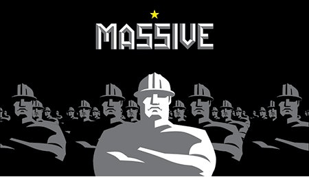
I should add that I like the new concept, especially the way it could evolve a la the "Massive" iteration. I would remove the word "Columbus" from the seal, soften the edges of the wordmarks, and make it wider and squatter (as opposed to taller and leaner).
Maybe just a construction helmet would be a better totem / icon by itself? I've always found the "three tough dudes" thing to be kind of cringe-worthy. Anyway... I love logo design and soccer, so this was a fun exercise. Nice work and good reporting.
On Dec.08.2008 at 01:24 PM
Jacob’s comment is:
Duffy, you wrote, Disliking the design because it has a visual tie to communist art is incredibly naïve decision to make. We should let the concept of the design itself be what's spoken for and not let great elements of design be buried in history books. Fascism is social policy, not an aesthetic direction.
I understand what you're saying, but I think it's even more naïve to think that the end users won't bring their own experiences to the table when reading the designs that are presented to them. If people can't help but think "fascist" or "scary" or "brutal" or whatever when looking at your design, then the message is not being communicated effectively.
Perhaps there are excellent design movements that have unfortunate linkages with past, discredited political movements. If so, perhaps we should bring them back, but they have to be brought back the right way--and using these motifs on the logo of a somewhat obscure soccer team isn't really the way to go.
On Dec.08.2008 at 01:55 PM
Bendy’s comment is:
The old one is obviously dated, but the new one looks like a $75 craigslist logo design.
Pain points:
-free-font typeface
-guys look like tonka characters (and what, couldn't illusrate more than one??)
-shield shape needs to be a bit better thought out.
-don't get the connection between Russian propaganda art and Columbus Ohio
-just looks like a dang Sheppard Fairey OBEY illustration.
I don't think the concept is not strong enough yet to merit engaging change...
On Dec.08.2008 at 02:02 PM
ChrisM70’s comment is:
I remember seeing the Crew logo years ago and liking it because it was so different from the rest of the bland sports logos. However, it's not the mid-90s anymore, and it does feel dated.
I like the concept for the new logo, and I actually kind of like the constructivist style - a lot of companies use it and most people don't see a communist or fascist message.
I think the logo needs some COLOR. Perhaps Gold-colored helmets? Maybe instead of a star, you use a bolt or rivet?
Regardless of the outcome, I'm really impressed by this guy's initiative. To do this on his own, and to push for a better design!
On Dec.08.2008 at 02:09 PM
paulhalupka’s comment is:
fascist/communist/scary? seriously?
the red scare was like 50 years ago; mccarthyism is dead, guys. any associations with communism these days (for those not alive in the 50's) holds at the worst a sense of camp; at best, a resonance of strength and unity. the power of that era's design is undeniabe. and it's hardly the first thing that pops up in a soccer fan's head.
i think the modern nod to constructivist design is a great touch, and is supposed to echo the "crew", a working-class thing anyway. hence the helmets. soccer is the working man's game all over the world. we have to stop and consider whether the other 99% of the population, the non-designers, are trying to get a reference at all.
i like the new one but i miss the old one's asymmetry. beyond that i think it's a step in the right direction. honestly it's just nice to see US soccer get a little TLC.
On Dec.08.2008 at 02:19 PM
Stereo Radiation’s comment is:
Good: I actually like the emphasis on conformity of the "crewmen," which underscores the team concept, as opposed to the old logo which looks like three models in a corporate catalog highlighting diversity. They look more like Broadway dancers as opposed to tough construction workers. A more Art-deco approach could soften the propaganda angle while carrying the same impact - think Wrigley Field marquee.

Bad: I do not like the placement of the "96" over the belly button. But- the 96 on the logo is not a bad idea, perhaps if the 96 were made up more like a belt buckle, or somehow separated from the crewman?
Another thought: the State of Ohio has kind of a shield-y shape, perhaps an asymmetrical version of the shield could suggest Ohio.
On Dec.08.2008 at 03:25 PM
Jacob’s comment is:
fascist/communist/scary? seriously?
Eh, I was just responding more hypothetically to duffy's post than to the actual content in front of me.
The commies weren't the first thing I thought of (as I said, I thought of Electro, the Westinghouse Moto-Man) But the point was made that it's naive to avoid graphic styles out of their associations with particular political movements--a point I don't agree with, generally, if the audience will be distracted from the message by reading other things into what they see.
On Dec.08.2008 at 03:43 PM
Ross’s comment is:
I'm not as bothered by the commie thing as I am by everybody looking the same. I like the unique aspect of the old one, but it does need an update.
On Dec.08.2008 at 04:05 PM
Duffy’s comment is:
Jacob:
I understand what you're saying, but I think it's even more naïve to think that the end users won't bring their own experiences to the table when reading the designs that are presented to them. If people can't help but think "fascist" or "scary" or "brutal" or whatever when looking at your design, then the message is not being communicated effectively.
—I totally agree. Of course this is one of those things that we always have to measure up against in the communication of design. If Abstract Expressionism has taught art and design anything it's been that we are constantly having to answer to the individual and collective gestalts of the audience. While this is the reality of our situation, and it often is the leading cause of death amongst otherwise good design, an eloquent designer is key to launching the zig in the market of zags.
In a sea of heraldic and banal soccer ball infused marks, I have to give them super props for the visual revolt.
On Dec.08.2008 at 04:57 PM
Austin Gray’s comment is:
I don't necessarily like the old logo, but I also don't like the notion that, just because a sports logo is 12 years old, it needs to be "refreshed." MLS would be well suited to try to establish some deep traditions, and that's difficult to attain by constantly refreshing things. The old logo may look dated, but the proposed logo seems even less likely to last another 12 years.
On Dec.08.2008 at 05:40 PM
nisio’s comment is:
Putting a cherry on a turd doesn't make it ice cream, it's just a little nicer to look at.
At it's core the central idea of the mark is bad.
Nisio’s comment is:
That last comment may have sounded a bit harsh, I am a little drunk. I guess what I should have posted was that the old logo looks like a design rather than a brand solution (albeit a bad one) and the second logo looks like a design response rather than a brand response. So the newer mark is built upon the same poor foundations as the original mark.
On Dec.08.2008 at 06:32 PM
CCP’s comment is:
The old one is so nasty it hurts and I do love it when communism sneaks into design, so I'd consider this a big step up.
But really, for any soccer logo to be any good it needs to be 50+ years old.
On Dec.08.2008 at 09:37 PM
MADPHILL’s comment is:
I'm extremely disturbed by the actions of this fan and self-described Designer and think it says a HELLUVA LOT about the future of design. I'm also AMAZED no one else has commented on this yet. Not only was it not commented on, but someone else posted a link to a logo they did for FREE.
Maybe they will have a contest or better yet, just steal the mark all together and have marketing run with it.
It brings a lot of interesting questions to the forefront of what the value of what we do is and how this industry will evolve in the future.
On Dec.08.2008 at 11:29 PM
GregT’s comment is:
The original couldn't look more like a coaster design for a gay bar if it tried. The new one mostly solves that problem. I too noticed the "96" resemblance to a swastika. It does tap into a new fan base if the leather boys stop coming.
On Dec.09.2008 at 02:52 AM
Wünderwoman’s comment is:
I believe Madphil...it is kind of an interesting...um...trend to watch. Will the internet and social networking make people think that a logo is purely a decorative design and not a strategy, a craft and a profession?
or...am I just bitter that I didn't think of the using Facebook as a sales tool first?
On Dec.09.2008 at 03:53 AM
Steve Killen’s comment is:
@Doug:
I agree that the typeface says 'Eastern Bloc.' Put a little more of the yellow in there and give it more of an industrial reference.
Put a bit more yellow in to make it less communist?! It may as well start incorporating red at that point!
On Dec.09.2008 at 04:32 AM
sam’s comment is:
"a somewhat obscure soccer team"??? aren't they the #1 soccer team in the USA this year?
and i agree this could use some more work. like draw some action lines around the dudes and give one of them a goatee or sideburns or something.
On Dec.09.2008 at 08:16 AM
jed jei’s comment is:
"I'm extremely disturbed by the actions of this fan and self-described Designer"
1. you should find better things to be extremely disturbed by
2. not going to get into his credentials, but he is a for real designer
Nick Irwin’s comment is:
all your base belongs to us
On Dec.09.2008 at 08:52 AM
Jonathan’s comment is:
MADPHILL - I think people will continue to get what they pay for ;)
On Dec.09.2008 at 09:44 AM
OMEN’s comment is:
I'm sure we can all agree the current logo is pretty bad, but the proposed solution is hardly an improvement.
On Dec.09.2008 at 10:13 AM
Anonymous’s comment is:
Not reading a lot of the comments above and just going on the post.
I have to say that the old logo is not very good, but the new one is still bad as well.
Looks like a logo for a construction company and not a team that runs around for 90 minutes pouring there hearts out. Plus soccer players are not that robust and barrel chested, they are chiseled, nimble and quick.
On Dec.09.2008 at 11:45 AM
Andrew’s comment is:
jed jei's comment:
1. you should find better things to be extremely disturbed by
2. not going to get into his credentials, but he is a for real designer
---------------------------------------
If you read this thread on the Crew forum. . .
Link: Link
. . . you'll see this guy has a lot of learning to do in terms of how to be a professional, "for real designer." Seems he doesn't like to have his work critiqued. He just ends up bashing long time Crew fans cause they don't like his work.
On Dec.09.2008 at 01:01 PM
haynik12’s comment is:
i agree with Suko. let's keep brainstorming b/c the current logo is totally homosexual.
On Dec.09.2008 at 01:02 PM
Ross’s comment is:
My only issue is the lack of yellow anywhere other than 'COLUMBUS'. I think just a re-organization of the colors would work wonders.
I don't get why so many people are saying it's bad or even worse than the original (really?). This seems right on par with about any professional-sports identity. I think Crew fans would be happy to have a "legitimate" brand to go with their apparently legitimate franchise and team. Sure, there are some tweaks that would probably happen down the line but it's really not that far from completion if you ask me.
I mean, I live in Oklahoma so I can only hope for a similarly talented designer out there to start a movement and replace that horrible OKC Thunder logo.
On Dec.09.2008 at 01:29 PM
df’s comment is:
Wow! into the wood chipper eh!? Take the good comments and leave the bad ones! But which are which! Choose wisely Jedi.
On Dec.09.2008 at 01:43 PM
JC’s comment is:
Say what you want about fascists. They sure knew good design.
On Dec.09.2008 at 03:34 PM
mels_plz’s comment is:

alright everybody relax. all you have to do is:
1. Put Copperplate in the trash and replace it with a typeface with some personality and some meat to it - and one that actually follows the curve of the shield.
2. Get rid of the shield that looks like a back pocket and replace it with one that has some balls to it
3. Tell Jimmy, Jack and Jerry to take a hike and thanks for the memories, replace those guys with actual soccer players with subtle construction helmets on
4. Add '96 to celebrate the rich and storied heritage of the crew
5. Add some highlights for some pop
6. Take it to the bank, because it is worth the same as millions.
ashruss’s comment is:
I think most of us agree that the current logo is outdated and needs some work. Maybe a basic facelift, or something more drastic.
While I think Shultz's refined logo looks good, I think that Mels_plz's logo is looking even more 2008 (or maybe even 2009).
What is clear is that Columbus needs a new logo, so, put it to tender (or even better, get a brief onto a logo/design contest webpage and get hundreds of possible designs).
On Dec.09.2008 at 09:15 PM
john’s comment is:
I can't tell if mels_plz’s comment entry is a serious recommendation or a total joke. (I'm hoping for the latter.)
On Dec.09.2008 at 09:53 PM
John McCollum’s comment is:
Without a doubt, the old logo sucks for a number of reasons. As I understand it, the name of the team was originally meant to refer to Christopher Columbus and evoke the spirit of adventure, exploration and all-around hardiness.
Apparently, the design firm hired by the league didn't really perform any research or receive any design briefs, and they just got to work. When the league launched, my colleagues and I rolled our eyes and one of them said, "I bet they had a week or less to do all of the logos."
I think that the idea of a construction crew is -- and always has been -- just plain stupid. League-wide, the Crew is known by its colors and its name. Everything else can and should be scrapped.
On Dec.10.2008 at 11:13 AM
John McCollum’s comment is:
Imagine if the Columbus Clippers' baseball brand had been designed using the same research methodology as the original crew identity: We'd have scissors and a comb? A barber pole?
On Dec.10.2008 at 11:29 AM
steveo’s comment is:
um... no because a clipper is a ship.
On Dec.10.2008 at 03:12 PM
Anonymous’s comment is:
just to show how poorly executed the logo is. I thought for YEARS that the columbus crew was a crew of BREAKDANCERS. I thought those guys were all wearing KANGOLS. this may be lost on some of you but now that i know that its supposed to be a construction crew i'm very disappointed in the original design.
On Dec.10.2008 at 03:15 PM
John McCollum’s comment is:
Stevo,
EXACTLY. That's my point.
On Dec.10.2008 at 03:20 PM
Matheus’s comment is:
IT'S NOT SOCCER
IT'S FOOTBALL
FOOTBALL, NOT SOCCER
On Dec.11.2008 at 07:35 PM
Paul Lloyd Johnson’s comment is:
I like it, but the guy needs to look a little more happy. He is decidedly unhappy and just needs his mouth straightened up a little.
On Dec.12.2008 at 08:45 AM
Crew FO’s comment is:
BLECH! Don't touch our ******* crest!
We ARE NOT changing. Have a great day.
John McCollum’s comment is:
Matheus:
IT'S NOT EUROPE
IT'S AMERICA
AMERICA, NOT EUROPE
;)
On Dec.16.2008 at 10:06 AM
oasf’s comment is:
Doesn't look like a soccer logo.. Looks like an NFL, NHL or NBA logo. Not good, imo. They should take a look at the European clubs logos. Muuuch better!
On Dec.16.2008 at 11:54 AM
nate’s comment is:
From Midwest to Eastern Bloc.
On Dec.16.2008 at 03:53 PM
szechuan don’s comment is:
So many good points, just want to quickly share agreements/disagreements to add to each pack.
1 - redesign: yes.
2 - proposed redesign: not quite.
3 - it's not communist to stand for or make a graphic that supports labor, especially in a traditional work-graphic style. Plain, bold, and angular elements reflect the components of hard labor - steel, tools, strength, etc. Some of the posters on here seem to disregard the fact that America was built with working class laborers and unions.
4 - the new workers have such an NFL player build, they actually remind me of a specific soccer-hating stereotype. However, maybe that's a good thing, subtly crossing those judgmental lines.
5 - I propose removing either Colombus or Crew, preferably Colombus because Crew is obviously easier to emphasize. There are plenty (too many) teams with the two-named system and in my opinion it's better to have diversity. Some teams go for city/name combos, some go for one uniting title, others just shout out their geographic location. This is (to my knowledge) the case in every major football league in the world and MLS would do well to adapt (and they are starting to). Crew (or The Crew.. I like just plain 'Crew') have an easy transition to the single-name emphasis with their old logo.
6 - 96 is good, as MLS continues to expand it will be a nice badge for league-founders to tout. (as Dallas already has)
7 - for F's sake: don't go for modern, GO FOR TIMELESS. Some clubs have never changed their insignia for their long and storied existences, others have only adopted subtle updates. How many MLS teams have redesigned their brand? Nearly all of them. How many will need to be redesigned in the near future? Nearly all of them. Try to design something with elements that will stand the test of time. Football(soccer) more about tradition than it is about aesthetics.
I think that's it. Great post, great comments, thanks everybody.
On Dec.16.2008 at 04:15 PM
Pete’s comment is:
It blows - clunky typeface, bad color, steel grid design - obviously you never played soccer or understand it - the Crew kicks ass this year and should be rewarded - find the salsa in the game, and highlight the magic - get out of the contractor trailer and do some real design - go stand on the ptich and hear the crowd - you've never sat in the corner with the Crew samba supporters, flags a wavin' -come on and get dsome real design going and let us vote
On Dec.22.2008 at 04:38 PM
kenkins’s comment is:
I'm surprised and disappointed at the SIMPLICITY decision. I was sincerely hoping for something more REFINED or even CLASSY. You can have a simplistic design while being refined, but the Crew haven't been thugs for years.
On Dec.23.2008 at 08:02 PM
Aztexan’s comment is:
I'm a huge MLS fan, though not a Crew fan specifically (except for this year's playoffs, which my own FC Dallas failed to make).
I really like this proposed logo. If nothing else, it shows how outdated the existing logo is; ouch!
I see the "fascist/communist" feel that many people are talking about, but I think that's fine. It's a stoic toughness, the uniformity of the team, that's on display. As some people have commented, "I wouldn't want to face those guys".
The 96 is essential, and sorely missing from the current logo. Referencing the year of origin is very common among soccer clubs (some European teams are named solely by their founding year, e.g., Hannover 96 (though note that's 1896)). Another reason to emphasize the year: the Crew was one of the original teams when MLS was founded. Sure it's only 12 years, but that heritage has to start somewhere.
The hardness, the starkness, the simplicity; this logo is fantastic. I hope the Crew update their logo, and I hope they at least use this as a starting point.
On Dec.24.2008 at 12:21 PM
Patrick ’s comment is:
only one person commented that this is a total OBEY bite? seriously, if you're going to rip off an underground art form, at least pick a lesser known artist. this is very obvious. insult to injury, OBEY design isn't even that good, lol. FAIL. OBEY
OBEY
OBEY OBEY
OBEY OBEY OBEY OBEY
Go Man Utd’s comment is:
I think either way, the Columbus Crew logo will always be horrible, ugly and uninspiring as long as people are depicted on there. I think the style for a new logo should resemble something from British Premier League or the other leagues in France, Spain, Germany and Italy. However, please do keep the yellow/black colors.
On Mar.30.2009 at 09:20 PM
Columbus Crew crest is so damn ugly’s comment is:
Columbus Crew has one of the ugliest, if not, THE UGLIEST team crest of any top division football side on this planet. Seriously, it's a cross between The Village People and an 80's album cover. And the new proposed crest is just as shitty. MLS sides such as Toronto FC, Chicago Fire, DC United, Chivas USA, Real Salt Lake and the new Philadelphia Union has got the crest design thing goin' correct.
On May.17.2009 at 12:53 AM
Comments in Brand New, V1.0 have been closed.


