

NOTE: This is an archived version of the first incarnation of Brand New. All posts have been closed to comments. Please visit underconsideration.com/brandnew for the latest version. If you would like to see this specific post, simply delete _v1 from the URL.
Thanks to Iyaz Akhtar for the tip.


Jump to Most Recent Comment
David’s comment is:
It looks like DIN or some form of it. The "a" has me a little stumped though.
On May.22.2009 at 11:06 AM
Jimmy Marks’s comment is:
Re: the font - I think it's either Trade Gothic or Tee Franklin Minimum?
On May.22.2009 at 11:10 AM
Justin’s comment is:
It's certainly a derivative of DIN. The 'a' is what's throwing me off.
It's almost the lovechild of DIN and Franklin Gothic.
On May.22.2009 at 11:23 AM
Blunden’s comment is:
Yeah, I am pretty sure that google uses trade gothic.
On May.22.2009 at 11:23 AM
Andy Allen’s comment is:
Times New Roman, me thinks...
On May.22.2009 at 11:28 AM
abu’s comment is:
from the google blog post:
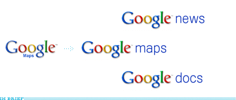
"You may have noticed new logos at the top of some of Google's web pages, including Google Labs, Google Moderator, and Google Code. [...] Now, our product names will appear in clean, simple blue lowercase type alongside the Google logo as shown here:"
then you click on Google Labs and "labs" is grey...
On May.22.2009 at 11:34 AM
Chad Kaufman’s comment is:
Google Crap. Google as a provider of information, online apps, and a world ruler is great, but ever since reading about how they handle design decisions ( StopDesign ) I have a hard time thinking about or discussing their aesthetic–both as style and how it contributes to function.
I wonder what equation they devised to come up with this solution?
"Since the logos appear in many different locations and sizes on our websites, our new designs are standardized to be the same size and color wherever they appear" - this seems like a design and usability decision that should have been implemented long ago
On May.22.2009 at 11:42 AM
Chad Kaufman’s comment is:
"then you click on Google Labs and "labs" is grey..." Amazing. Great observation
On May.22.2009 at 11:44 AM
Kenneth White’s comment is:
The typeface must be Google Gothic.
On May.22.2009 at 11:47 AM
Oscar’s comment is:
That's nothing compared to how they decide on a certain shade of blue - by serving up 41 possible iterations to a subset of users and choosing the one that performs best. What's weird is that blue (as opposed to say, green) was probably an arbitrary choice to begin with.
And no, I'm not joking about the blue thing.
On May.22.2009 at 11:48 AM
Nisio’s comment is:
It's fine. Does what it needs to, sub brand or offerings like these need to be slave to the master brand mark so there's not a lot you can do, especially considering they live primarily online all wee and small. I don't know whether it warrants to be on Brandnew though.
On May.22.2009 at 11:53 AM
Brad McCall’s comment is:
I'm glad to see that Google is making an effort to make it's visual design (interface branding) suck less. This is somewhere that Yahoo has been kicking them around for a long time. It will be nice to see some more product consistency as well.
On May.22.2009 at 12:17 PM
Nick’s comment is:
What's strange is that while each service name is in lower case, the "Reader" in Google Reader has a capital R. I wonder if this was intentional.
On May.22.2009 at 12:18 PM
Adam’s comment is:
@ Chad Kaufman
Thanks for that article post. I didn't even think they had a design department. I never knew Google was so backwards thinking when it came to design...
On May.22.2009 at 01:11 PM
Loren’s comment is:
It's funny to me that Google seems to make so many incoherent design decisions like unintentionally (probably) making the R capital @Nick and the labs grey @abu, because I feel like their clean and easy to use front page is what made it stand out back when there were several search engines competing for the top slot that Google now has. Anybody know how the design for that front page came about? As far as I can remember it hasn't changed layout wise since I've known about it.
On May.22.2009 at 01:26 PM
Random’s comment is:
Why are we talking about this?
On May.22.2009 at 01:30 PM
obse.’s comment is:
It's more a News Gothic than a Trade Gothic. But it sure has been slightly modified. Specially "a" and "s".
Definitely not DIN.
What do I win?
On May.22.2009 at 02:12 PM
Clint Tseng’s comment is:
You're going to complain about the grey text of labs but not the beaker in the logo? Clearly Google Labs is simply a quirky cousin of the normal Google component sites, and so they take more liberties with it.
On May.22.2009 at 03:01 PM
In All Fairness’s comment is:
re: "then you click on Google Labs and "labs" is grey..."
The Google blog post does say that the changes will be rolled out over the next several weeks.
Even the "The Official Google Blog" logo on the page that announces the change is still not compliant with the new identity. Give them a little time and I'm sure the Googlers will get it handled.
On May.22.2009 at 05:49 PM
kensoliva’s comment is:
The typeface is custom and was designed for Google by Hoefler & Frere-Jones: http://typophile.com/node/58262
On May.22.2009 at 06:13 PM
EnergonCube’s comment is:
Vectora.
C'mon people. That should be an easy one.
On May.22.2009 at 06:18 PM
Colin’s comment is:
I'm late to the guessing game but it jumped out at me as Trade Gothic
On May.22.2009 at 07:12 PM
Amanda’s comment is:
I'm just happy that it's not as hideous as it was. Brava for that!
On May.22.2009 at 07:49 PM
John Mindiola III’s comment is:
Yeah, that's not Vectora.
On May.22.2009 at 10:11 PM
EnergonCube’s comment is:
Doh! Close but no cigar.
On May.22.2009 at 10:21 PM
Paul’s comment is:
Having worked a little with Google ... presuming they're staying with what they know ... it's Trade Gothic.
On May.22.2009 at 10:22 PM
Rologo’s comment is:
![]()
Google translate has got its new look for various languages version.
On May.23.2009 at 02:32 AM
arden’s comment is:
@loren - I read some article somewhere a while back (and a friend has interned and will probably be hired by google verified the story). The guys who started google knew absolutely nothing of coding websites, and needless to say had no design background - their background was in math, which is what initially, and continues, to set google apart from many other search engines. The simple front page was all they were able to muster after a few random tutorials. Since it is so effective in its simplicity they kept it.
On May.23.2009 at 05:56 AM
Derrick’s comment is:
Ewwww.... that font is ugly. Not H&FJ's best work.
On May.23.2009 at 09:26 AM
andyRespire’s comment is:
I wish they'd apply this treament to the Gmail logo.
While the envelope 'M' is nice and has become a stand-alone icon, I think when it's paired with the serif 'G' and sans 'ail', it's too many styles packed into a small logo. It reminds me students sqeeze all their good ideas into one design and the result in not harmonious.
They should drop the 'M-velope' - using only the serif 'G' next to this new sans 'ail'. Use an envelope as an icon if needed, but don't M-phasize the 'M'. (My aplogies for the puns...)
On May.23.2009 at 01:12 PM
Jan’s comment is:
Well, "great work done" - but not in all languages. The font has obviously some missing characters and therefore e.g. Google Translator is now "Google peklada" in czech (it should be Google překladač).
On May.23.2009 at 04:18 PM
Jonathan Hoefler’s comment is:
Stumped the band, eh! This must be a first.
The font is a beta of General, a family of typefaces that Kevin Dresser is developing with us. The above samples are a little embryonic; keep an eye on Google, and on http://www.typography.com/blog, for more.
JH
On May.23.2009 at 07:24 PM
Joseph Maguire’s comment is:
The mark is as recognizeable as anything... That being said their branding system design is one of the lamest looking things especially considering they have so many sub brands. Glad to see their starting to think about it.
On May.23.2009 at 11:03 PM
Bassem B.’s comment is:
I just wish Google would change their god-awful logo itself. What an ugly mess of childish colours and bevel-emboss.
On May.24.2009 at 09:24 AM
Neil’s comment is:
Google's logo is a curious one. I mean, everyone recognises it now and surely that's what of the main aims of any logo? And yet, like many others, I too hate it. Do you change something that works because industry says so?
On May.24.2009 at 04:30 PM
rich’s comment is:
looks like gray for labs is for non-products?
On May.25.2009 at 04:01 AM
Loren’s comment is:
@arden - Thanks for the response! I had a feeling it was some kind of coincidence or something. I always find things like that pretty funny because I attribute much of Google's success to it not looking like the Yahoo! front page. One of the world's most powerful companies is based on designers not knowing what the're doing haha.
On May.25.2009 at 02:10 PM
P-Easy K-Shizzeh [PenaltyKillah]’s comment is:
Curses to the Web 2.0, new-age, 21st century font typeface!!! Helvetica forever!
On May.25.2009 at 09:36 PM
hofd’s comment is:
News Gothic.. and that's my final answer Regis
On May.25.2009 at 10:10 PM
ingeorge’s comment is:
Good idea just do not like the type they chose does not look corporate. the type does not match with the logo..it is a shame....but the idea is good and it was about time ... ok we have offers from News Gothic, Helvetica, Beta and DIN.... DIN was also my first guess..
On May.26.2009 at 11:09 AM
Jeffrey T’s comment is:
Ding ding ding on Trade Gothic. That's their corporate typeface.
Typography is the visual expression of language. Trade Gothic is the primary typeface for Google. Simple and straightforward, this sans serif typeface sets the friendly tone we embody as a brand and nicely complements the serif letterforms of our logo. It's available for use in the two variations shown below, Trade Gothic Regular and Bold No. 2. No other fonts should be used on external marketing materials except where specified.
On May.26.2009 at 01:45 PM
Chuck Spidell’s comment is:
I just wish Google would rebrand entirely.
On May.28.2009 at 06:18 AM
Tom’s comment is:
Not the link provided obviously. looks like a custom version of trade. similar enough to call it trade, but there are differences.
On May.28.2009 at 02:38 PM
Michael Barron’s comment is:
The typeface is nice, but why does the baseline of the descriptor name not line up with the basline of 'Google?' Sheesh.
On Jun.02.2009 at 07:33 PM
Alexander Lopez’s comment is:
Giving their products some consistency I think is definitely a plus. And that typeface is definitely News Gothic.
On Jun.03.2009 at 03:06 AM
Justin’s comment is:
I think it's boulas:
http://new.myfonts.com/fonts/t26/boulas/regular/
Blah’s comment is:
My god, stop guessing.
Just Ctrl+F this: On May.23.2009 at 07:24 PM
Comments in Brand New, V1.0 have been closed.


