

NOTE: This is an archived version of the first incarnation of Brand New. All posts have been closed to comments. Please visit underconsideration.com/brandnew for the latest version. If you would like to see this specific post, simply delete _v1 from the URL.
Thanks to Dawn H. Buscher for the tip.


Jump to Most Recent Comment
Scott’s comment is:
Looks like terrific fun. Congrats. Looking forward, my only criticism is how well it would wear over time. It looks dated now, and that's the fun part. Not so sure in five years.
PS - Richard, great stuff on your site. Really terrific. But pay careful attention to your grammar and spelling throughout. It matters. And you've got tons of mistakes that taint an otherwise terrific online presence.
On Jun.16.2009 at 07:59 AM
Ryan Adair’s comment is:
So, how much is he paying you Armin?
On Jun.16.2009 at 08:48 AM
Armin’s comment is:
Ryan, seriously?
On Jun.16.2009 at 08:52 AM
Nisio’s comment is:
Great work, while done.
On Jun.16.2009 at 08:52 AM
Nisio’s comment is:
erm, I mean well done.
need more coffee...
On Jun.16.2009 at 08:53 AM
colormist’s comment is:
I think it's adorable, cute, and awesome. :3
Beautiful work, Richard.
On Jun.16.2009 at 08:57 AM
Matt Hunsberger’s comment is:
Good stuff. I really like the posters, as well.
On Jun.16.2009 at 09:08 AM
Chad Kaufman’s comment is:
Great choice putting this on Armin. And absolutely awesome work Richard, wish my portfolio looked like yours when I graduated, I actually had no formal portfolio, which was a big mistake, because I had a job right out of school.
For all other recent graduates, make sure you always maintain a portfolio, it is very easy to get wrapped up in projects and/or your career and you will get very behind on yourself/portfolio when you need it the most.
On Jun.16.2009 at 09:36 AM
Kevin Zwirble’s comment is:
I agree, great find Armin! Fantastic work Richard. You found a great knack in being able to incorporate a clean, modern feel with your illustration sense.
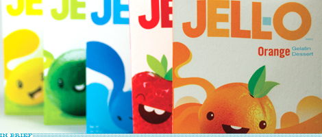
Also, as much as I agree with Scott about the Jello packaging (which is very killer) becoming out-dated, I think it gives you room to explore the brand further and create more illustrations to switch out over time. Kids tend to like things spur-of-the-moment, so it would be a great opportunity to continue the project in the future.
On Jun.16.2009 at 10:13 AM
Impossibly Stupid’s comment is:
Terrible. Apparently what Richard was never taught in art class, and oddly Armin fails to understand, is that you should not market (especially to kids) by turning what they are about to eat into something that was cute and friendly. There is a very good reason a happy cow can sell a gallon of milk and not a pound of hamburger. There is a very good reason cereals usually have mascots. The artwork is nice, but this isn't Draw New.
On Jun.16.2009 at 10:36 AM
Glenn Sakamoto’s comment is:
Bravo. Nicely done.
On Jun.16.2009 at 10:37 AM
Ryan Adair’s comment is:
Haha.
A joke. Richard's work is brilliant. Good find.
On Jun.16.2009 at 10:47 AM
Dale Campbell’s comment is:
Sick.
I'm green.
On Jun.16.2009 at 10:52 AM
Ricky Romero’s comment is:
I love it! Very sweet and fun, just like the confection.
On Jun.16.2009 at 11:03 AM
Ryan Gonzalez’s comment is:
Very well done; the illustrations are beautiful, and it seems to have this light, friendly feeling that I wish more kids food packaging had.
Less swirls and bad typography, more fun and clean lines.
Amanda B’s comment is:
I guess Impossibly Stupid has never eaten Gummy Worms, Candy Frogs or any other animal shaped candy, most of which feature a cute illustration of the edible animal on the packaging.
Love the Jello packaging... Fresh and fun!
On Jun.16.2009 at 11:06 AM
Violet’s comment is:
I think Impossibly Stupid is two things, plain-old-stupid and very jealous and/or insecure about his own designing skills that he'd have to try and find something wrong to make himself feel better.
On Jun.16.2009 at 11:10 AM
Proverbial Thought’s comment is:
I think this is playful and loveable. I think it hits both target groups(kids,moms[parents[) very well. Not a fan of the crooked type, but that's a personal opinion. Everybody knows what JELLO spells, so if the text runs onto the top of the box ther eis no harm no foul to the brand. Great job on this one!
On Jun.16.2009 at 11:14 AM
Armin’s comment is:
> you should not market (especially to kids) by turning what they are about to eat into something that was cute and friendly.
Looks like we could amend this book with one more...
Never Use White Type on a Black Background: And 50 Other Ridiculous Design Rules
On Jun.16.2009 at 11:15 AM
Bill Dawson (XK9)’s comment is:
Color me impressed. Darn kids with their excellent design chops. Jell-o should adopt the packaging and pay for the kid's education.
On Jun.16.2009 at 11:26 AM
Bill Dawson (XK9)’s comment is:
@Impossibly Stupid, if Richard had tried to put happy faces on gelatinous bone marrow, I might see your point. I've never had a problem eviscerating and devouring a happy strawberry.
On Jun.16.2009 at 11:31 AM
mP’s comment is:
Someone give this kid a job!
V as in Victor’s comment is:
This is great! I love the use of the "flat" illustrations on the pictures of the fruit. It definitely pops. The colors are great.
The subtle color differences in the logo are a nice touch as well. Is the logo tweaked a little or is that my imagination?
I like it.
On Jun.16.2009 at 11:44 AM
Tre’s comment is:
I like it, but what's gonna happen to this?
On Jun.16.2009 at 12:09 PM
WORK’s comment is:
The mix of playful shapes and subtle color changes makes this a very sophisticated design. I am sure this speaks to a much broader audience than one would immediately expect. Inspiring.
On Jun.16.2009 at 12:19 PM
Ivan’s comment is:
Really cute and fun! I especially love the posters and window graphics. It could translate into some nice animations for tv spots too. I wish this was real - are you listening Kraft?
On Jun.16.2009 at 12:24 PM
Joey V’s comment is:
Really impressive work!
Student work is the best. No client approval. No budget restrictions. Just do whatever you want. [sigh]
On Jun.16.2009 at 12:25 PM
Anderson Wilson’s comment is:
Richard, I agree with Scott that your spelling and grammar hurt your presentation measurably, but the aesthetics are nice.
On Jun.16.2009 at 12:49 PM
Nate’s comment is:
The idea is great and it is executed very well, but didn't jamba juice use the same idea for the last few years? Richard added on a lot of creativity to it, but the base idea seems the same.
On Jun.16.2009 at 12:53 PM
Al aka El Negro Magnifico’s comment is:
This is a painfully cute redesign. Love it! Makes me think of all the character-based stuff I saw in Japan.
On Jun.16.2009 at 01:28 PM
RK’s comment is:
reminds me of the Kool-aid competitors from the late 60's who had characters like Goofy Grape, Rootin Tootin Raspberry, Jolly Olly Orange, etc.
On Jun.16.2009 at 01:39 PM
Jeff’s comment is:
Nice. Very retro-modern. And timely for me...I just made Jell-O the other day for the first time in ages, and was thinking that the packaging was a little stale (to put it nicely). They would be smart to go back to a more kid-friendly stance like this, instead of the whole "wiggle room in your diet" thing.
On Jun.16.2009 at 02:09 PM
Richard Perez’s comment is:
Wow! Thanks for all the compliments, and critiques, everybody. It's really an honor having the project up on Brand New!
And Scott & Anderson, I'll have to go back and work on my written presentations! Eek!
On Jun.16.2009 at 02:13 PM
Anonymous’s comment is:
Totally reminds me of the new Fanta look and feel.
On Jun.16.2009 at 02:43 PM
Sebastiaan’s comment is:
I sure love it, but somewhere in my brain it says I have seen something like this very simular before... :(
But it is very nice, would love to see it like this on the shelves!
On Jun.16.2009 at 02:45 PM
Impossibly Stupid’s comment is:
@Amanda B: "Gummy Worms, Candy Frogs"
You'd have a point if they tried to make those items the friendly face of the product, and then intended you to kill and consume them! No, they're just generic shapes that appeal to (mostly) boys, not Wally the Worm or Freddie the Frog. Has it really escaped your attention that the number of kids food products that use disassociated mascots vastly outnumber those that don't?
@Violet: "jealous and/or insecure"
I freely admit I have no art skills. That in no way detracts from the point about marketing/branding I'm trying to make. It's not about how well you can draw the item, it's about the underlying message. For the same reason you don't advertise where gelatin comes from on the box, you don't put on the chummy Orange-ians from Orange-ville that are being slaughtered, powered, and turned into a boiling slurry.
@Armin:
I didn't say it should never be done, just that it shouldn't have been done like it was. Believe me, I even thought of counter-examples myself before posting. Things like Charlie the Tuna or the California Raisins immediately came to my mind. But if you actually think about how those got used, they were anthropomorphized in very specific ways that do not encourage direct empathy. Your being dismissive doesn't change the underlying rules of thumb.
On Jun.16.2009 at 02:58 PM
Meagan Burns’s comment is:
Love it! Great work Richard :)
On Jun.16.2009 at 02:59 PM
Estel’s comment is:
Cuute, very solid personal identity through all his work, and that's something not all have, I still haven't define mine completely.
Congrats!
On Jun.16.2009 at 03:08 PM
Nisio’s comment is:
If I was a kid, I guarantee the idea that I would be gobbling up those little critters would make me want jello more, not less.
On Jun.16.2009 at 03:17 PM
Ryan K’s comment is:
Animal Crackers, Chips-ahoy cookies (the 'living' cookies from the commercials, Applejacks cereal (an apple and cinnamon stick), Mini-frosted wheats. These are all marketed directly to kids using living products that they might already have or are about to consume. I don't think kids really take it that serious, they know it's all for fun.
It's truly nice work, well done Richard.
On Jun.16.2009 at 03:22 PM
John Leschinski’s comment is:
I really don't think there is a conflict here with a cute illustration and eating them. The fruits represent a flavour, not the end product. In fact the end product only resembles the characters in colour and sometimes taste. I don't think kids will see an orange cube and think, "Poor Orange guy on the box".
On Jun.16.2009 at 03:57 PM
Brand New or Borrowed?’s comment is:
This color bubble style as well as the roly-poly kewtsy chracters have been 'in' for a 2-3 years now and have already been associated with major campaigns, some of which have been featured here on BrandNew.
Fanta and Jamba Juice are examples that have been noted above. Pepsi had this illustration style going about 4 years ago.
This isn't 'Brand New', this is borrowed.
Branding these days requires a lot of research. to make sure you're not inadvertantly mimicing/copying something that's already been done. This is becoming very common occurance thanks to the internet.
I'm surprised that only a few people noted the obvious similarities to existing campaigns that would make this 'redesign' a rip-off. Check-out Fanta's website to see the exact same motifs and even little birds perched atop swirls or color. Fanta wasn't the first to use this style/motif but I believe they were first to use it in front of a world-wide audience in a major campaign.
On Jun.16.2009 at 04:02 PM
Amanda B’s comment is:


Pigs, Frogs and Worms, the friendly face of candy products shaped just like them, for kids to consume and enjoy. Gummy Bears are another example, and those candy lollipops shaped to look like famous cartoon characters. If a kid doesn't have a problem eating Homer Simpson's face I don't think they will have a problem eating a product promoted by a cartoon fruit.
On Jun.16.2009 at 04:05 PM
Matt’s comment is:
The work looks good, whether student or professional. The only problem I see with it is the box looks kinda blah, no real life to it, unlike the posters and window dressing on Richard's site. If only some of that energy could be brought into the front of the packaging I think it would be more successful.
I'm wondering how this ended up here? I attended the Academy of Art also, and let me assure you these projects are a dime a dozen. The teachers don't allow the students to do crap work, you must spend tons of time and shitloads of money on these projects so they don't look like student work. Are you going to show all the student work in the Spring and Winter shows now? Why not just stick to professional work that inspires everyone?
On Jun.16.2009 at 04:36 PM
Dylan’s comment is:
Very fun! Much more interesting than the current design, in my opinion.
On Jun.16.2009 at 06:19 PM
Armin’s comment is:
> Are you going to show all the student work in the Spring and Winter shows now? Why not just stick to professional work that inspires everyone?
Matt, no, we won't do either. Professional work is the main focus, and I have no inclination to show a bulk of any given season's work from any school in particular.
This Jell-O work crossed my desk, I had a gut reaction that I liked it more than any student work I have seen recently, specially branding student work. And as an In Brief it fits the "Free-for-all-as-long-as-it's-kinda-related" content that I like to share through In Brief. Nothing too big or serious to read into the inclusion.
On Jun.16.2009 at 06:54 PM
Paul’s comment is:
freakin' delicious!
On Jun.16.2009 at 07:08 PM
Altaf’s comment is:
Excellent branding work, I wish my portfolio looked like that.
And I don't agree with "Impossibly Stupid" ... If kids devour M&M's and cartoon shaped ice cream why not Jello?

Impossibly Stupid’s comment is:
@Ryan K: "I don't think kids really take it that serious"
Neither do I, and that's not my objection. Even though nobody is consciously thinking what I've said, there is an underlying aversion to eating cute things. It's not absolute (e.g., chocolate bunnies and peeps) but you have to be extremely delicate when walking in that area. That's why most major brands use mascots instead; it's just easier that way.
@Amanda B: "shaped just like them"
Are those major brands where you live? I've never heard of them around here, and if you listen to me you might start to understand why. The issue is not the shape, but human nature's reluctance to kill and eat creatures we empathize with. Give me a major international brand on par with Jello that does it and you'll have a point. And just one point, mind you, whereas I could pull up countless examples where companies actively avoid anthropomorphizing the food itself.
It's a good effort, but for the wrong product.
On Jun.16.2009 at 08:30 PM
Impossibly Stupid’s comment is:
@Altaf: M&M's
That is one excellent counter example; worthy of a serious study. They've been doing it long enough that I presume it's been successful. Still, it's an example of cherry-picking evidence. The vast majority of products are going to have more successful campaigns if they go a different direction.
More to the point, you need to say why you think it'd work for Jello when it seems to work for so few; the burden is on you to sell the idea past the objections you would definitely get raised during the presentation. If that gets anticipated and addressed beforehand, it would result in a much better overall effort.
On Jun.16.2009 at 08:56 PM
EnergonCube’s comment is:
Ha! This is great. Makes me feel like a kid... just like jello.
On Jun.16.2009 at 10:16 PM
Bugs’s comment is:
At Richard's site, he says the redesign "makes the brand feel playful and pop without veering into overtly saccharine or Saturday morning cartoon territory."
I think he's wrong about that. It definitely ventures deep into that territory, but that's one of the things I really enjoy about it.
On Jun.17.2009 at 12:08 AM
baddrawingblock’s comment is:
interesting points from the debate going on here..
it can also be argued that the cartoon figures can serve as mascots for jello, ie they are not jello themselves but are anthropomorphic fruit
but hell i think we reading too much into this
I just like the packaging, it looks cheerful and fun, just like how i like my jello
Nisio’s comment is:
@ Impossibly Stupid,
there's a time to fight your corner, and a time to collect you toys, go home and have a nice nap.
M&M's is one of the biggest confectionery brands on the planet, (hardly a cherry-pick) so a simple counter to your argument could be that others have avoided visual personification of their products because M&M's owns that territory. It's not the case but is as viable as your position.
Either way your opinion is just that, an opinion. That's fine but shouldn't be confused with fact.
On Jun.17.2009 at 04:30 AM
windwalk’s comment is:
In Germany a Jello is when you spit a big bunch of slime.
On Jun.17.2009 at 06:12 AM
Impossibly Stupid’s comment is:
@baddrawingblock: "they are not jello themselves"
Yet the Jello cannot be made without killing them. Contrast this with most other brand identities, where the mascot encourages you to eat something else, and usually something that is less empathetic. If anything, my complaint stems from the fact that Richard did too good a job making them cute and lovable.
@Nisio: Soooo much wrong . . . :-)
"hardly a cherry-pick"
You don't understand the meaning of the term, then. In the vast universe of major product brands, only that one has been raised as a valid counter-example. That is a rare exception, not proof of your thesis. That is cherry-picking.
"M&M's owns that territory"
You would demonstrate that by offering up examples prior to their entry in that space in 1995. Not just a couple, either, and not just off brands. Yes, it gets tried from time to time, but the usual case is that it doesn't find success because anyone that bothers to do market testing finds such "cute food" does not ultimately go over very well.
"your opinion is just that"
It's not even my opinion, it is just an observation. The fact is that a survey of the actual brand universe shows that the food is seldom portrayed as your friend before you're expected to eat it. The fact is that such artwork, when attached to a full marketing campaign and tested, usually receives a non-specific "I don't like it" evaluation. The only conclusion I've come to is that you shouldn't try to sell people on eating happy, friendly creatures. I'd welcome any other explanations that get at the heart of human nature.
On Jun.17.2009 at 10:05 AM
Nisio’s comment is:
You have a comprehensive survey of the actual brand universe? Cool, show me. Maybe post it up as a link? (Don't you find it odd that the 'rare exception' is one of the most success and internationally popular brands in the world?) Wait, don't answer, I'm sure your survey will put me right. Can't wait to see this survey.
Of the brand universe no less!
On Jun.17.2009 at 10:43 AM
Jon’s comment is:
Richard's work is excellent! The Jell-O campaign is absolutely incredible. I would buy Jell-O just to stare at the beautiful color differentiation on the clean typography. Make's a designer happy.
What was possibly even more entertaining than the post was seeing "Impossibly Stupid's" continuous defensive stance against his flawed arguments. You're the guy us creatives can't stand to work for because you have no clue what creativity is - you just stick to whatever you learned was a "rule" in "Marketing-at-a-liberal-arts-college 101."
You lost man, pack it up and make some *gasp* personified Jell-O.
On Jun.17.2009 at 12:09 PM
Impossibly Stupid’s comment is:
@Nisio: "Cool, show me."
Cool, pay me. As I have already explained, and tire of repeating, the burden is on you to do more than cherry pick. You don't even need to give me $50K for a comprehensive survey. Just walk up any aisle in your local supermarket and tally all the brands that humanize the food itself and all the ones that don't. The raw numbers alone should convince you there is an underlying reason, independent of your strange desire to hate me for having pointed it out. Or, you know, hold on to that one needle in the haystack that M&M's represents, apply no critical insight as to why they might have succeeded with it, and declare victory.
@Jon: "you have no clue what creativity is"
I've already stated I thought it was a good effort, just for the wrong product. It is ironic that you claim I'm the one being defensive and using flawed arguments, because the reality is that the only bias I have is toward an overall brand, which is suppposed to be the greater point of this site, right?
On that measure, where this an actual presentation, the designer should expect the client to pass on it. Defending design errors doesn't make you a better designer. Maybe instead of demanding that world respect your creativity alone, you should clue yourself in to the rest of the business equation that keeps a paycheck in your pocket.
On Jun.17.2009 at 05:10 PM
Nisio’s comment is:
Oh my bad, I get confused when people use the word survey to mean' look at some shelves'. From they way you were talking it sounded like you had, you know, some actual research based insights.
I don't hate you mate. You're too funny.
Brian’s comment is:
Not too crazy about the anthropomorphizing of gelatin (cow hooves—yuck!), but I do love the color and type treatments. Overall, a pleasing package.
On Jun.20.2009 at 04:57 PM
Daho’s comment is:
It's very japanese, but I happen to like that aesthetic. And surprisingly it hasn't been used here much. Jello would be the perfect fit for it. This feels modern and retro at the same time.
On Jun.22.2009 at 04:45 PM
M’s comment is:
That would make me buy jello
On Jul.02.2009 at 12:31 AM
laura’s comment is:
Mr. Peanut would be another good example

Mark’s comment is:
FINALLY someone makes something actually friendly and fun without looking disingenuous!
Well done Richard well done, this packaging makes me smile. :)
On Jul.02.2009 at 03:55 PM
Comments in Brand New, V1.0 have been closed.


