

NOTE: This is an archived version of the first incarnation of Brand New. All posts have been closed to comments. Please visit underconsideration.com/brandnew for the latest version. If you would like to see this specific post, simply delete _v1 from the URL.


Jump to Most Recent Comment
Rob’s comment is:
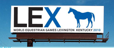
It would have been nice if it was galloping or in motion. Not just standing their off to the side. As well, the font is a little plain, don't you think?
It was a good start but not much more...

Zach Smith’s comment is:
Yea the horse seems a bit disconnected from the "LEX" and maybe a bit to small. It is eye catching, though.
On Mar.23.2009 at 04:46 PM
Jonah’s comment is:
I couldn't tell you why but I love this kind of stuff. It's bold, its a little awkward and it makes it feel a little special against the competition.
Its got instant readability and enough surprise to stick you to it. I'd argue that its got the right amount of minimal alterations and oddities that keep it from being generic.
Another one of the few I've enjoyed from Pentagram.
On Mar.23.2009 at 04:55 PM
Alex S.’s comment is:
I agree that It would be nice to have the horse in motion (particularly because this is in relation to equistrian sporting events), but it does make sense to keep the stance of the "iconic" blue horse painted by Edward Troye, the Kentuckian artist.
The "X" is clever, however the rest of the typography doesn't strike me as particularly exciting nor bad. Just another big and bold all caps sans serif, something I've come to expect from most major re-brands.
PS. I think the "I Horse LEX" is a particularly funny shirt.
On Mar.23.2009 at 04:55 PM
Mark’s comment is:
It's nice...
but I agree it could have look more interesting if the horse was running, it is eye catching though.
On Mar.23.2009 at 05:01 PM
matthew’s comment is:
Are you kidding me? This is lazy student work! This is less then 10 minuets of work for most designers! I know that KISS is a great thing to apply to design, but where is the design here? Seriously. Point it out. If I was designing a logo for this I may have something like this on my screen (again, in the first 10 mins) but it would never be the end point. I couldn't live with myself.
I guess their target market are people who aren't drawn to design?
On Mar.23.2009 at 05:06 PM
Mark Settle’s comment is:
This is utterly forgettable. Matthew is right in every respect. There is a weird space between Lexington and Kentucky, and the horse (size, location, form) seems like something you drop into a comp, promising to replace later. The typography, meanwhile, is utterly lacking. I feel like I've landed in a new airport, or am driving through a construction zone. Perhaps the client got what they want. But even still.
On Mar.23.2009 at 05:16 PM
Kim Siever’s comment is:
What's with the house in LEX?
On Mar.23.2009 at 05:17 PM
Kevin Zwirble’s comment is:
I'm kinda torn on this one. Whether it is truly "lazy" design that can be concocted in minutes or clever, minimalistic work.
But to be honest, that stems from the fact that I've never been a huge fan of Pentagram's work. Not to bash them, they've done some pretty great things. But for every design that's been great, there've been some clunkers.
And unfortunately I can't help but think of Lex Luther.
On Mar.23.2009 at 05:22 PM
Ross’s comment is:
It looks like one of those genetic logos from a movie that an evil bio-engineering firm would use... The font isn't bad, the execution of it is just a little underwhelming. The billboard just feels like they arranged it so all the words would fit. Lex also feels like "Lax" which is what lacrosse players use.
I do like the idea of using the painting as a marketing vehicle, with the giant installations.
Eli’s comment is:
Seems underdone. I like the campaign elements with the giant oil painting - that seems like just the right mix of Kentucky heritage and the surreal to be memorable. But the rest falls flat. The horse as executed on the billboard doesn't evoke the painting so much as it evokes clip art, especially when combined with the giant forgettable type. The Photoshop of the giant horse statue on Pentagram's site is just weird. Why is that giant thing blocking everyone's path on the sidewalk and ruining the view? How would such a structure stand? Would it be permanent? Just seems half baked.
I think if they had a found a way to better integrate the type and the design, and found a way to represent the cool weirdness of the horse in the oil painting in the logo, that would have been more successful.
On Mar.23.2009 at 05:30 PM
Adam’s comment is:
At first glance I didn't like this. The awkward integration of the horse with the letterforms makes it look like two disparate elements. Then I read it was from Pentagram and clicked the link. I tend to see a trend with their identities being less than spectacular, but their application making them work. I think the shirt is funny and would catch my eye. As far as the giant blue horse on the walkway…well it would definitely be tourist fodder. If the goal would be to get people talking, then mission accomplished.
I’m torn when considering their recent identity work. I think a mark should stand alone as something special without explanation, and this just doesn’t do it for me. Application is great, but does that make up for the mark?
On Mar.23.2009 at 05:52 PM
twoeightnine’s comment is:
Looks and sounds like a cheesy "upscale" lounge located at 10 Lexington Ave. trying to be too hip.
On Mar.23.2009 at 06:07 PM
damon’s comment is:
calling out the X as a roman numeral for 10 is kind of nice, but I think you could have done more with it. Lex feels too casual for lexington and certainly for equestrian games. You could have achieved that and more with the entire word lexington.
as mentioned, I'd have liked to see the horse performing some equestrian move or something rather than standing by waiting for the truck to the glue factory.
all in all it's an ok idea with a decidedly blasé execution. Minimal is great, we'd all agree that it can be very powerful, but it has to include some style elements, it can't minimal by way of zero effort.
On Mar.23.2009 at 06:15 PM
Ricky’s comment is:
I disagree about the horse being better if it were in motion. If you've ever been to Kentucky, you'd know that we don't need another running horse, thanks.

I'm realizing a huge problem with identity critiques. Identities shouldn't be critiqued by people outside their locale. That is debatable — (should identities be created by people outside?) — and I know the equestrian games are a worldwide event, but having lived in Kentucky for 15 years now, and having lived near Lexington for a short while, I can tell you that this identity is great in a local sense.
As for the LEX part feeling too casual, the people in Lexington refer to their city as "Lex". It fits. It makes sense when you're here.
Ok, thanks. Bye.
On Mar.23.2009 at 06:40 PM
josh’s comment is:
i liked it to start off with but i think the balance is all wrong, especially that weird space. then again i live in australia and am not into horses, i wouldnt say im their target audience
On Mar.23.2009 at 06:53 PM
twoeightnine’s comment is:
Identities shouldn't be critiqued by people outside their locale.
What's the point of having an identity then? The people in the area already know who and where they are.
On Mar.23.2009 at 06:55 PM
Steve Rose’s comment is:
Seems like simple airport signage: plain and simple. No style, whatsoever.
Too bad they turned Big Lex into a mare. I thought design was all in the details. Maybe that's right.
On Mar.23.2009 at 07:00 PM
Ricky Irvine’s comment is:
@twoeightnine re: Identities shouldn't be critiqued by people outside their locale.
I know it's entirely debatable statement, and not entirely true. That's why I also wrote: That is debatable — (should identities be created by people outside?) — …
I also think what you wrote is debatable and not entirely true (though I sense some sardonicism in there): What's the point of having an identity then? The people in the area already know who and where they are.
We were talking about a city-wide, state-wide, or regional identity. What's happening in Kentucky may not make sense to people living in the heart of Los Angeles, thus they don't have the cultural perspective needed to understand fully. That's an example of what I was getting at.
No running horse. LEX is good. Those were my points. Take it or leave it.
On Mar.23.2009 at 07:27 PM
Matthew Moore’s comment is:
the X looks like some sort of equestrian apparatus that the horse doesn't look all that interested in leaping over. if anyone associated with the logo is lazy, I argue it is the horse!
On Mar.23.2009 at 08:43 PM
Brian Brooks’s comment is:
This is the reason the horse isn't running:

I'm from Louisville (an hour up the road from Lexington) - I think it's a great identity!! - fresh (without being trendy)...a nice tip of the hat to historic Kentucky. There are a lot of things you can do with the whole painting / mascot motif in terms of advertising & marketing - I dig!!
Take a look at this junk we have to put up with in Louisville http://www.possibilitycity.com/
On Mar.23.2009 at 08:58 PM
DanR’s comment is:
Love the simplicity of the blue horse, but I dunno about that "I blue Lex" shirt...
On Mar.23.2009 at 09:20 PM
Stephanie’s comment is:
I like the oil painting very much. The big blue horse brings a quirkiness and fun that feels very inviting. It's refreshing to see classic art technique used in a contemporary campaign.
The stationary seems to incorporate that look and feel, but what is going on with the billboard and t-shirts? I guess we'll have to see how it all unfolds.
On Mar.23.2009 at 10:40 PM
JM’s comment is:
I like the Pop art / surreal sub text to the blue horse.
Kimi’s comment is:
I really like the sculpture idea, why couldn't they have carried that into the billboard?
It made me a bit sad when I laughed out loud very gratuitously at the last sentence in your entry. Am I just a nerd?
On Mar.23.2009 at 10:52 PM
adzski’s comment is:
I quite like the Big Lex image. Simple, evocative, and reminiscent of the winning entry by Mark Wallinger for a recent competition for the Ebbsfleet Landmark Project, seeking a massive sculpture in the south of England (a huge white horse).
But what I really didn't understand was the reason behind the X in LEX being blue. And then I read the explanation - it's like X as in 10, for 2010. Right... but that's far from clear on a simple viewing of the logo. And it just doesn't make sense. What does LE10 mean, anyway? It should have been "LEX MMX", if they wanted to go with the Roman numerals thing.
On Mar.23.2009 at 11:14 PM
TheMaster’s comment is:
@Ricky and/or @Ricky Irvine...
Ok dude, firstly, chill out. Secondly, just admit that there are issues. That's what we're talking about right?
If they actually cared they would have hired you, right? Nobody on this planet knew about the burgeoning design community in "LEX", but i guess the city council could care less. Anyways, just shhhhhhhhh about your dumb regional context.
As for my opinion, I think a mascot is a good idea, but this implementation is just OK. It's predictable and very "Beirut-esque", by that I mean not very well thought out. As in, only half thought out. As in, this is some pre-stage idea I had at the last minute that i'll dump on some Jr. designer to create some really amateur "renderings" that the dumb Kentucky hillbilly client is dumb enough to buy....
Oh god pentagram, give it up...Ricky-ticky-timebomb give it up...
On Mar.23.2009 at 11:21 PM
TheMaster’s comment is:
@Ricky...
Oh yeah and about this "What's happening in Kentucky may not make sense to people living in the heart of Los Angeles" garbage......What is happening? anything?
On Mar.23.2009 at 11:23 PM
Ricky Irvine’s comment is:
@TheMaster
Nothing is happening in Kentucky other than the equestrian games. We don't wear shoes, we don't have teeth, and we only bathe once a year.
You're right. Identity design shouldn't ever consider local culture and perspective. We are a global people. Global economy. Global identity.
Internet or bust.
Thanks.
On Mar.23.2009 at 11:52 PM
Nate’s comment is:
After looking at the campaign in more of its entirety, I think DJ hit the nail on the head.
The singular image of the horse on the billboard didn't strike me as particularly special, but in conjunction with the original painting, I think they complement each other well.
Then again, I'm partial the whole Lex thing.
On Mar.24.2009 at 12:38 AM
David Goldstein’s comment is:
I Love it very very much. A blue horse named LEX who eats blue grass, gets a blue ribbon in my mind, NIce Job.
However, The blue x next to the horse is a bit confusing.
I kind of wonder if they tried the LEX knocked out of the horse? It would really solidify the name of the horse as LEX. It might take away from the mind games its playing with me. I am sure they tried it....
It all works for me on a lot of levels.
On Mar.24.2009 at 01:10 AM
David Goldstein’s comment is:
Armin,
Do you have a color fax?
Rodrigo Müller’s comment is:
it all made sense to me after looking at the original painting in the link. the other materials as well as the shirts please me, and please, no more running or jumping horses for identities.
one thing is for sure though, that billboard is a bit ugly and out of context.
On Mar.24.2009 at 03:40 AM
David Mcg’s comment is:
It amazes me how many people simply don't get this, and just don't understand good design. I love that comment by Mathew who described it as lazy student work. Seriously? Have you seen his holding page: http://mjaystudios.com/ it made me feel physically sick it's so ugly and badly designed. Also, who on earth would want to make the horse galloping for god sake, whats wrong with people.
The whole concept has been meticulously put together, it works.
On Mar.24.2009 at 07:01 AM
Erik at Logo Critiques’s comment is:
After looking at link and seeing more of the ID I'm not blown away or anything, but it's ok overall. I'm not liking the juxtaposition of the original art & the simplified horse icon.
On Mar.24.2009 at 07:46 AM
Joel Herman’s comment is:
So the X is blue on the billboard, but not on the T-shirt? I also don't understand the spacing between city and state.
On Mar.24.2009 at 08:25 AM
Ryan Adair’s comment is:
I think this is great. Beyond the boring type and all, which I agree is quite dull. And beyond the strange space between Lexington and Kentucky, and the unkerned 2010....I still think it's cool and different.
Imagine all the people taking pictures in front of it and posting them on the web...it's like a marketing campaign that never ends!
On Mar.24.2009 at 08:37 AM
kris’s comment is:
The horse shouldn't be running - it's directly referring to a iconic horse in a specific painting, putting the horse in motion would completely destroy that reference as well as the other components of the branding that consists of using the painting (you guys should really read the article before commenting).
Also, everyone has a running horse logo - I think the stationary horse, aside from the connection to Troye is actually somewhat unique.
For the specific market of equestrian competitions it's refreshing - I can see every other logo in my head right now; some small lettering with an angry looking horse head with some implied motion. It's nice to see something move away from that.
One thing that does bother me is the space between Lexington and Kentucky - Looking at it again though, when I first glance at the billboard I see LEX then the horse, and then Kentucky 2010; I don't know if I'm over analyzing here - but that weird space actually make a lot more sense then we are giving it credit for.
I don't even mind the unkerned 2010 really, because it's spaced as 20 10, which is typically how it's used verbally - I wonder if that was noted when it was created, hell - maybe they just didn't kern it.
This branding will certainly catch people's eyes if only because it's bold and simple, though I doubt it'll be all that memorable for the same reasons.
...Oh and I usually refrain from back and fourth with other comments, but "Identities shouldn't be critiqued by people outside their locale. " is the biggest load of horsecrap ever - we don't live in a vacuum.
Malcolm’s comment is:
Nice campaign idea. But the logo feels underwhelming, perhaps because the horse itself seems undersized next to the LEX. I'd have played around with that balance a bit more. But kudos for building it around a local iconic image and giving that image a fresh feel.
On Mar.24.2009 at 10:20 AM
Leland Witter’s comment is:
@Alex S - the "I heart KY" shirts are funnier.
On Mar.24.2009 at 10:20 AM
Shellie’s comment is:
As both a Kentuckian and a graphic designer, I’m very disappointed in this logo. It looks as though it’s a conceptual image… a work in progress. Instead of KISS (keep it simple stupid), I think it portrays “Kentucky Is Simply Stupid”.
On Mar.24.2009 at 10:53 AM
Anonymous’s comment is:
I like it. The blue horse is a nice touch it's kindof like an inside joke for people who know about the big blue horse myth, and it still fits on the sign and looks good to people who don't know about it.
On Mar.24.2009 at 11:03 AM
Lauren ’s comment is:
This identity isn't being shown in a good light on the billboard. Frankly, it's not interesting enough to be the only thing on the billboard - though I think it is a neat nod to KY history.
A horse person myself, I think this identity will work well since it hasn't pigeonholed itself. I disagree with the "regional critiques only" because this is a WORLD event! Many equestrians drive all over the country to compete, so it would be unrealistic to get "local perspective only." Locals will be in the minority at this event, in my estimation.
Regardless of attractiveness, this identity will help get a wide range of sponsors and allow the brand to develop over time and grow into itself. Competitors certainly won't be dissuaded by the identity.
On Mar.24.2009 at 12:42 PM
soully’s comment is:
Wow, I didn't know you could just use clipart with some text and you have an identity, I've been wasting so much time...
On Mar.24.2009 at 12:49 PM
Mark’s comment is:
Okay I understand while the horse is standing, it's relating to the painting I understand now.
On Mar.24.2009 at 02:10 PM
Ricky Irvine’s comment is:
@Lauren
Thanks for being the first person to intelligently respond to what I said about local critiques! Seriously.
I know it's a bogus claim. I knew it when I wrote it. I should have reworded my thought, though, because I seem to be taken too seriously on that point.
Though I'm not sure yet how to defend it, I think there is still some truth (some!) in that some design work has no value of being critiqued outside it's locale. I realize that this is a world-wide identity, so my reasoning with this identity has fallen flat on it's face. (I can take criticism just as much as I can give it. It's easier to do so, though, when the giver is careful about how they present it, rather than being rash and mean.) The reason I brought it up, though, is that there is some local dialect at play in this identity, which makes it work locally.
On Mar.24.2009 at 02:42 PM
lyndi parrett’s comment is:
Type could of been a tad bit more special with all the history this state has with horses...doesn't seem like that typeface fits it...too modern? maybe that's what they are looking for...horse i get and like. i too am drawn toward simple iconography that gets right to the point without an explanation.
On Mar.24.2009 at 04:10 PM
Frank’s comment is:
Another one from Pentagram that i don't get.
Ok, so i'm from Europe and don't have the slightest idea what this blue pony is about.But why should i ?
Afterall this is the *WORLD* Equestrian Games, so are all foreign visitors to the games expected to educate themselves about that blue horse before they actually come to Lexington so they will not miss the signs and billboards ?
Hello ?!
This is a perfect example for mission failed.Once again it seems Pentagram took an opportunity to show off their "artsy" side and ignored the purpose of the mission completely.
Again, how is a visitor from Japan supposed to get what "Lex + blue horse" means ?
On Mar.24.2009 at 08:53 PM
adzski’s comment is:
Frank: is it really that hard? LEX pretty clearly = Lexington. And as for the blue horse, well, they are equestrian games, so I don't think anyone would be surprised it's a horse. And why not blue? Yes it has some meaning if you want to look into it, but other than that it's just a blue horse. I think most "visitors from Japan" could understand that.
On Mar.24.2009 at 11:57 PM
Frank’s comment is:
Well yeah, but is this really something to be called "eccentric identity" then ? I'd rather call it "dull , average street sign" because that's all it is afterall, right ? It's showing the abbr. name of the city and some clipartsy horse. That's it.Hardly something to write home about.
On Mar.25.2009 at 01:37 AM
David’s comment is:
@ adzski
the horse is blue because Kentucky is known as the BLUE GRASS state. If you eat enough of it, you'll turn blue as well.
Lucid’s comment is:
Clip art and a default microsoft typeface... A complete waste of space on this blog and my time.
C-/C
On Mar.25.2009 at 02:47 AM
Lucid’s comment is:
And yes, I saw the painting, and yes it still looks like clip art....
Sorry, just is
adzski’s comment is:
Thanks David - I do get it.
Unlike others on here I managed to read the background documents before commenting. My last comment was just at Frank's suggestion that this wouldn't be understood by "visitors from Japan". My point is, it doesn't need to be 'understood' - on its face it is just a very simple design. But yes, it does have a background that will make more sense to those who know about it.
On Mar.25.2009 at 02:57 AM
Armin’s comment is:
> It's showing the abbr. name of the city and some clipartsy horse. That's it.Hardly something to write home about.
I really wish those links I put up were clicked on.
On Mar.25.2009 at 05:59 AM
Glenn Sakamoto’s comment is:
I love the X Games! Wait, this isn't the X Games?
On Mar.25.2009 at 10:42 AM
Frank’s comment is:
"I really wish those links I put up were clicked on."
@Armin:
I don't think you're getting my point really.Which is, foreign or non-local visitors when say driving by that sign don't have a link they can click on.
You see ?
So in that situation the sign/identity has to work on its own (which is a task any good identiy/logo should accomplish anyway).It has to speak for itself.And as such, it's nothing more than a city name with a clipart horse.
A billboard/street sign that probably works as such but is nothing more than that really to most of its intended audience.
But i guess i'm in the minority anyway in regards of non-appreciation of the latest fashion to ignore the "must stand on its own" rule.As it seems, high-profile agencies lately tend to accompany each and every logo/identity with a big rationale handout which apparently is supposed to disguise the lack of a good, working standalone "speaks for itself" concept.Which often seems to work amongst at least design folk like on here, because i can't count the times i have seen comments like "you have to see it in context".
See Pentagram, Wolff Olins etc recent efforts for examples of what i mean.
For me a concept that needs explanation, a rationale or a bigger context to "work" simply doesn't work.And no marketing lingo no matter how big the agency may be that it's coming from will change that.
On Mar.25.2009 at 12:32 PM
Lindsay’s comment is:
I think people are looking at this as more of a logo than a billboard. Of course this is understandable as Brandnew generally has logo's.
I do like LEX as an idea, being Lex (Lexington) and X being 10. If it was for 'Lexington Equestrian 2010' then it would be even better, but 'Lexington World Equestrian Games 2010' is the event title.
The reference of the Edward Troye painting of Lexington (the horse) is a nice reference, if a bit obscure.
On Mar.26.2009 at 12:47 AM
Julie’s comment is:
I like this identity, but the horse illustration could use a lot more love. My initial thought when I saw this was "wow, that horse looks clunky". It's just slightly off proportionally from a real horse, and it is definitely not the same build as a racehorse (I assume a lot of these games will be races), which would be much more sleek. Refining it slightly to convey a fit horse's athleticism, instead of using what seems to be a straight trace of the horse in the painting, would work wonders for me.
On Mar.26.2009 at 12:47 PM
Julie’s comment is:
Like so:
(racehorse via google image search)


Mongoose’s comment is:
First off: Yes, billboard badly kerned.
Secondly: I'm digging on this, though it's amusing that they're trying to invent a faux local myth. Although. it's not much different than Jackelopes I suppose, or other inventions; It just seems.. both quaint and sleazy simultaneous, if possible.
I'm fine with the horse being standing; there's enough mane-in-the-wind, hooves in furious gallop logos out there that they don't need to go that route. But I think that having the horse in painted form is much more striking than the silhouette (though I Horse Lex on that T-shirt is rather charming.) Painted, it's solid and surreal; silhouetted it's a bit bland.
All in all, I do like it. I think there's probably a bit better positioning than on the billboards, but it's something that can be played with and adapted, hopefully well.
--Mongoose
On Mar.26.2009 at 02:36 PM
ryan K’s comment is:
I don't get it.
The division between the "LE" and "X"/house drives my eyes crazy. It creates a line between the two disconnecting them.
It reminds me of something you'd see in a student portfolio, one of those school projects that every one is school thought was great but no one in the 'real world' cares about and just skips right over.
I think I'm just mostly confused.
On Mar.28.2009 at 12:21 AM
Ryan K’s comment is:
I also read "World Equestrian X Games"
Didn't know there was a need for Extreme Horse Games.
On Mar.28.2009 at 12:23 AM
Peyton’s comment is:
Come on people, surely you realize this is not a real billboard in Lexington, Kentucky. Did you actually read the article on Pentgram's website that started this discussion??
On Mar.31.2009 at 11:23 AM
Anonymous’s comment is:
A correction needed: Not the first ever World Equestrian Games, but the first games to be held in North America.
On Apr.01.2009 at 09:58 PM
Comments in Brand New, V1.0 have been closed.


