

NOTE: This is an archived version of the first incarnation of Brand New. All posts have been closed to comments. Please visit underconsideration.com/brandnew for the latest version. If you would like to see this specific post, simply delete _v1 from the URL.


Jump to Most Recent Comment
Jordan Foutz’s comment is:
I love the focus on white space and the back to basics approach. Reminds me a bit of the new Pepsi product line identity. Mmmm....Pepsi and snacks.
On Jun.16.2009 at 04:47 PM
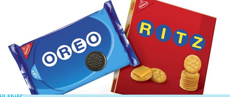
Harper’s comment is:
I love the Oreo Package although the O's don't look like they're quite right in the circles
On Jun.16.2009 at 04:48 PM
Andy’s comment is:
I've been hearing hothing but negativity about them, but I love it. Well, except for the product photos and the weird oval swoosh on the Oreo box. So, I guess I'd love it more if it was just letters in circles on a solid color.
On Jun.16.2009 at 04:49 PM
Spork in the Road’s comment is:
Not being a designer, this may seem like a silly question, but does white space always mean the space is white, or does it simply mean open space?
I ask because Jordan said he loved the focus on white space for this packaging, but I see hardly a lick of white-colored anything on either package. I do however, see plenty of blue and red open space or "breathing room" as I've sometimes heard it called. Just curious.
On Jun.16.2009 at 04:59 PM
Bill Dawson (XK9)’s comment is:
Hmmm... not sure about this. Are Oreos now manufactured as wet-naps? I don't understand that closure.
I am a huge fan of simplicity. A simple composition can be beautiful.
In this case, IMO, less is less.
On Jun.16.2009 at 05:10 PM
Nick’s comment is:
Spork... Yes, white space means open space in designer speak...
On Jun.16.2009 at 05:10 PM
Nick’s comment is:
I agree with Andy, the oreo swoosh seems sorta unnecessary, then again if you take it away, it might be a little too boring, perhaps a swoosh just isn't the right answer to a the problem...
On Jun.16.2009 at 05:14 PM
Spork in the Road’s comment is:
Nick, much obliged.
On Jun.16.2009 at 05:15 PM
Drew Pickard’s comment is:
Weird.
It looks like someone photoshopped everything out like the Garfield-less Garfield comics.
I kinda dig the idea of specialized limited-engagement packaging . . .
Unless of course, it involves stamping movie characters and logos and crap on already-cluttered packaging.
Lisa’s comment is:
Bill: they're not wet-naps, it's the new recloseable packaging that supposedly keeps your Oreos from getting stale if you don't eat them in one sitting. It's been on the Oreo packages I've purchased in the last 6 months or so. Good idea, but not well executed in my opinion, as it's challenging to get to the rows of Oreos on the sides.
Interesting how I get a 'retro' feel from these packages, probably because of the retro packaging craze that's been going around lately in other parts of the supermarket.
On Jun.16.2009 at 05:22 PM
jRod’s comment is:
wow... its so plain. almost soviet in nature.
"do you have cookies?"
"dah, here is the Oreos. you will love them."
On Jun.16.2009 at 05:28 PM
Carlo’s comment is:
I love it, but for an unfortunate reason. Because it reduces the brands to the bulk-generic-monotonous brands that they have become over the years; finally culminating with their bowing to the king of all over-consumption genericness - Target.
They lost what little character they ever had a long time ago and all pretty much became just loud packaging trying to sell as much flour, fructose and fat as possible. But I digress :)
On Jun.16.2009 at 05:40 PM
Steve Rose’s comment is:
The packaging is okay, but I find the idea strange. I assume Nabisco anticipates additional venue from this: do they think people will collect the packages? Will customers actually buy more because of this package, and if so, why limit it to Target?
On Jun.16.2009 at 05:42 PM
Glenn Sakamoto’s comment is:
I am a fan of minimalism and simplicity, but in this case I think it it went too far. Oreos and Ritz are American icons and this new packaging has reduced it to weak signage. Leaves me hungry for more...
On Jun.16.2009 at 06:05 PM
natalie’s comment is:
I think they're boring. There is no charm to them whatsoever. And surprise! They used Helvetica! The most over-used font EVER!
On Jun.16.2009 at 06:35 PM
Paul’s comment is:
Well ... the latest trend certainly seems to be retro simplicity.
On Jun.16.2009 at 07:17 PM
Joey V’s comment is:
I think the Ritz package works a lot better. The Oreo's swooshy thing doesn't seem to fit the style and the O's look a little weird in the circles. But, I'm glad they're simplifying.
So hungry.
On Jun.16.2009 at 08:04 PM
Kevin Zwirble’s comment is:
Yeah, I am a huge proponent of minimalism when it comes to packaging, but this just reeks of Hydrox cookies.
On Jun.16.2009 at 10:02 PM
Jeff’s comment is:
I noticed the Ritz boxes at Target last weekend. While it certainly caught my eye, it looks a little, I don't know...creepy? Not very appetizing. I like minimal, but this is too generic-looking.
On Jun.16.2009 at 10:16 PM
Ty’s comment is:
If this new packaging were permanent, I would hate it. But as a summer-only design for a certain store, I actually kinda like it, and I find it fits in well with Target's branding. It's actually a cool idea--it lets Nabisco try out some simpler packaging without completely throwing away the well-recognized branding.
As for the Oreo closure...it's an attempt at solving the main problem plaguing pre-wrapped cookie packages: once you open them, there's no way to reliably close them again to keep the cookies from going stale. This approach doesn't really work, but it's nice that they recognize the problem.
On Jun.16.2009 at 11:33 PM
Jamie’s comment is:
I agree with Harper. I'll also add that if ever there were an appropriate time to use Gotham, it'd be this here.
On Jun.17.2009 at 03:25 AM
Paul Cooley’s comment is:
As a student, we are constantly warned of the deceiving complexity of white space. We are taught all about correct use and incorrect.
To me these packages are an example of the latter. I don't see a clear compositional strategy and as one gentleman on the dieline put it:
"For me, it's trapped in the middle, rather than being truly simple or truly designed. "
Oh and come one...this Cookies are round, so lets mirror that "design element" and put the type in circles thing is really a bit daft.
On Jun.17.2009 at 06:32 AM
Larry West’s comment is:
I'll be blunt: I hate them.
I don't like using the word "hate" when it comes to something designed, and I've yet to hear it regarding anything I've done, but really, this is one of those times when you have to just say it.
The trend towards over-simplification is a problem as much as it is a benefit to any designer willing to give it the finger and show that, yes, non-simplicity is better 90% of the time. The reason its a problem is because it promotes the idea of everything being "basic" and "generic". It takes away the identity of something in favor of "simple" or "retro" approach.
The packaging isn't bold or daring on its own, but put in contrast to what it has done before and what is around it, it is. If it can't stand on its own, it shouldn't exist.
The reason Tropicana changed their package design back to what it was was largely because of an outcry over the sheer generic look to it. This, to me, along with the Pepsi redesign, is another case of simplicity run amok.
Or, to make this easier: It looks like it was designed by a first-year design student trying to be "cool" or "edgy".
On Jun.17.2009 at 08:22 AM
Evan MacDonald’s comment is:
It's working. I want to run out to target and buy a pack of each.
On Jun.17.2009 at 09:13 AM
TFHackett’s comment is:

ataylor’s comment is:
I tend to agree with those who think that less just isn't quite more here. It's an interesting concept, but ends up feeling less like iconic cookie or cracker packaging and a little bit too much like pretty decent store brand packaging.

It's very close to this old Oreo packaging from the 60s but lacks some of the charm. Perhaps the designers held back a little too much "vintage" and could have taken it a little bit further. Something like this with more blue and less red would look really nice.

This is a nice classic Ritz logo and something along these lines would be a nice solution. Perhaps a lighter stroke weight would feel nice, and maybe putting the "bumpy edges" (for lack of a better word) around the circle to allude to the shape of the crackers might give even more of a charming vintage feel?
Just a couple thoughts. I also hate the top flap of the Oreo packaging. I got some a few months ago and felt like they had a shorter lifespan, if anything.
On Jun.17.2009 at 10:39 AM
Morgan Smail’s comment is:
Great example of how simple identity solutions can communicate more clearly and with just as much impact as, if not more than, unnecessarily decorative ones.
kudos
On Jun.17.2009 at 01:00 PM
Andrew Gerend’s comment is:
I like the concept but it feels unfinished...I question the single Oreo on the packaging as well as the placement of the Ritz crackers.
On Jun.17.2009 at 01:38 PM
Willie’s comment is:
Taking aside all the hyperbolic criticism for a moment -- when it comes to mass-market consumer packaging, there really is only one metric for a design: will it sell more widgets?
According to Target, it does. Apparently they have a hard time keeping these particular items stocked. I can only think that's because the consumer, in the end the only real voice that matters, has decided this design is "cool". Apparently, quite often, too.
On Jun.17.2009 at 01:40 PM
Gary’s comment is:
Um, guys, it's a TARGET promotion. The font and dots? An attempt to Targetize them. It's like when Target bought an entire issue of The New Yorker and all the cartoons included arch Target references. Certainly I'm not the only one to get this. Maybe because while I get the idea, the design fails.
On Jun.17.2009 at 04:06 PM
Tre’s comment is:
If it were a bit more interesting, they'd end up looking too much like this:
![]()
I personally like the simplicity of the whole thing, although Helvetica has been kinda overused. Helvetica Neue Extra Light would have been perfect.
On Jun.17.2009 at 05:51 PM
Mark’s comment is:
niiiiiiiiiiiiiiiiiiiiiice....
now THAT'S how you do packaging, with restraint well done!
On Jun.17.2009 at 08:14 PM
tt dudley’s comment is:
I like the cleanliness, but it is almost too much...they're crossing over into generic. Too devoid of individual character. These are not Ritz crackers, these are Target brand generic Ritz® cracker food product.

And the swoosh is driving me nuts. I think I would have blown the photos way out, huge & falling off the edges.
Gary’s comment is:
Okay, let's all agree that Nabisco/Baker Associates missed the mark. The packages ended up looking "generic" and bland rather than "Target-y". Maybe it's because they thought that simply using the Target font inside dots would do the trick. Would we all have gotten the joke if they had done it with photography instead, say, a single Oreo cookie in the center of a white plate sitting inside a black plate (to establish the concentric ring pattern)? ![]() Would that hit the bullseye?
Would that hit the bullseye?
Tammy’s comment is:
Bill(XK9), Your comments are hilarious!
I'm definitely not a fan of the packaging. I would prefer for it have been even simpler--brown paper bags & stamped lettering, or over-the-top original, like a J.Otto design on it.
On Jun.18.2009 at 05:39 PM
Jeff S’s comment is:
Simplicity is good, but this is not working. I understand that the circles complement the cracker/Oreo shape but maybe it's too much. I do not care for either packaging, however, I believe that the Oreo package is the better of the two.
On Jun.19.2009 at 02:28 PM
izzy’s comment is:
This is just insane, in every level. Perhaps they (Nabisco/Kraft) are so desperate for sales, they'll do whatever it takes? I mean, you need to be in really bad shape to say, "even though our brand visual equity is as important as ever today, as it is our last defense available to continue fighting against Private Label dominance ... let's bastardize it, it'll make Target happy... oh and we don't really have a budget for design -- call Baker, I'm sure they can whip something up real quick! and tell them we'll discuss the cost later (believe me, they'll know what to do if they want to keep our business)."
Fascinating, isn't it??
On Jun.20.2009 at 12:33 AM
Brian’s comment is:
This doesn't look "retro" to me at all. It does, however, look extremely boring and lazy. It does look obvious, simple, and lacking. Take the Ritz piece—what does the word mean? Fancy, right? Does anything about that boring box of primary colors look fancy? No. Ok, now Oreo—first of all, what's with the weird background? What does it mean? Second, MAYBE if the background circles behind the type were dark (like an Oreo), it might ignite a stronger connection. I dunno, it all just seems lazy and lacking in thought.
On Jun.20.2009 at 03:14 PM
Joey’s comment is:
They also did the same thing (and have had it that way for a long time) with Pop Secret.... the packaging, only at target, is minimal and very pleasant. i'll take a picture next time i see it as i'm currently out and can't seem to find a picture of it online.
On Jun.20.2009 at 06:43 PM
steve’s comment is:
the oreo packaging reminds me of a power point background template. yum.
On Jun.22.2009 at 04:24 PM
Sorriso’s comment is:
Designer here:
I wonder if they are riding the "economy cheep wave".
Seems like the economic downfall is effecting package design. Someone told me, right now these major brands are trying to compete with the off brands i.e. less heavy designed packages.
I honestly think they went TOO far with space.
Ok..less means more but...We're talking food here.
People still want quality and good looking packages. For example TROPICANA orange juice box redesign that got denied-the consumer hated it, cause it looked 'TOO cheep"
This is great debatable subject.
Fred’s comment is:
Shocking!!!! At what cost to the brand? Has the Tropicana “experiment” taught us nothing??????
On Jun.23.2009 at 08:16 AM
Van’s comment is:
I am not convinced about this packaging, Oreo always gave you the perfect packaging so you cannot hold the temptation to buy it, (so good inside and out!) but now... something is missing...
I found this picture on Google, seems to be a real package =/

Mark’s comment is:
I think the Oreo package works better since it harkens back to the 60's packaging, while the Ritz one has no connection at all and seems to be made up on the spot. Which I hate.
On Jun.24.2009 at 04:39 PM
Osirros’s comment is:
Thank god Sorisso spoke up...I was waiting for a DESIGNER to chime in.
On Jun.24.2009 at 04:46 PM
Roy Hodges’s comment is:
Again, everyone wants to follow a trend. This design is awful -- I was in Target a while back and I remember seeing it with my sister saying, "Oh my god! What did they do?" Too much white space, too much blah. It looks awful and unappetizing. This whole idea that we need to sell to the people losing their wealth is absurd, we buy things that are of value that make us feel wealthy. If you make an inexpensive product, don't market it with an inexpensive design!
The WHOLE checkout line started commenting on the packaging, we all hated it. We weren't designers, we were customers. This infatuation with minimalism that designers have is just so out of touch because of the insulation university education brings between the public consumer and the university elite.
I'm sorry, but those Ritz are not sitting in my cupboard any longer nor are the Oreos. I LIKE packaging. We outgrew buying products based on value and reasoning after the development of Focus Group Marketing -- be buy what makes us feel good, what appeals to our sense of self, and I have to ask:
What part of yourself does this packaging appeal to? Doesn't appeal to my sense of value, as it looks like a cheap product instead of an inexpensive one. I hate it!
On Jul.06.2009 at 08:05 PM
Anonymous’s comment is:
NO!!!!! looks like a generic store brand now. the simplistic look only works on certain things, and this is not one of them.
On Jul.08.2009 at 01:35 PM
Comments in Brand New, V1.0 have been closed.


