

NOTE: This is an archived version of the first incarnation of Brand New. All posts have been closed to comments. Please visit underconsideration.com/brandnew for the latest version. If you would like to see this specific post, simply delete _v1 from the URL.
Thanks to Dave Zibell for the tip.


Jump to Most Recent Comment
Armin’s comment is:
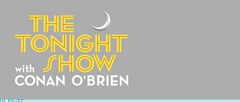
Is that a foot mark in O'Brien's last name? If that's House Industries' Neutraface, a handsome and proper apostrophe is available.


Saylor’s comment is:
How do I order my "Tonight Show with Conan O'Brien" URN??
On May.14.2009 at 08:19 AM
Felix S.’s comment is:
What's up with the lone 3-D crescent moon up there? It doesn't seem to belong there...
The wholeness of the identity just doesn't hold up.
On May.14.2009 at 08:31 AM
Dale Campbell’s comment is:
Man that thing is hideous.
I mean, I love Conan and am happy that the chin is gone. But holy crap - that treatment is bad.
I think it's more less the random bevel on the moon combined with the (I think that is supposed to be) neon lighted text...then you add to that everything being staggered.
Gawd...
It's like, where do I look first???
On May.14.2009 at 08:45 AM
Chris’s comment is:
Inch mark! Dang!
I like the lock-up on the website better w/ the "with Conan O'Brien" tacked on the right side. It's an inconvenient shape for a logo, but it reads better than what's shown here. I think the website clears up the purpose behind the crescent moon as well. Coffee mugs and embroidery aside, this is a logo that will primarily be seen on screen. I think the moon on the night sky gives it enough of the "what is this a logo for" question for television.
On May.14.2009 at 09:21 AM
Ricky Salsberry’s comment is:
In all fairness, it does look better on the Web site. Bummer about that apostrophe...

Chad Kaufman’s comment is:
I actually prefer the mark they used for the apostrophe. I think the proper font apostrophe would sit awkwardly between the O and the B with the tight letter spacing. The foot mark sits nicely with the straight edge of the B and does not interfere with the O that way the tail of the apostrophe might.
On May.14.2009 at 09:59 AM
Proverbial Thought’s comment is:
Nothing says "Tonight" like a Bevel & Embossed toenail... Sheesh.
On May.14.2009 at 10:02 AM
kedge0417’s comment is:
chad kaufman- someone needs to take your graphic design license away.
On May.14.2009 at 10:10 AM
Adam’s comment is:
Foot marks should never be used as apostrophes...it's lazy typography. The type lock up seems random to me. Oh well, at least we don't have to watch Jay Leno be unfunny and talentless every night anymore...at least at that time slot.
On May.14.2009 at 10:10 AM
Matt’s comment is:
"The Tonight Show" type reminds me of the "FPO" section on UC. I see this more of a type lockup rather than an actual Logo. But I do agree when it's shown on the website it does look better than stacked like here. Nonetheless, Conan's gonna rock, can't wait for June 1.
On May.14.2009 at 10:33 AM
jRod’s comment is:
i gotta say, i'm with Chad on this one... looking at Armin's examples, i am drawn more to the foot mark than the apostrophe. and aexactly for the same reason... with the "O" being so perfectly round, it is already awkward working with the character spacing. by throwing in the extremely wide apostrophe, it really makes it look awkward. i can see where the traditionalists among us would look down on this, but if it adds something to the overall look of the wordmark, then go for it. and from a distance, its going to look about the same anyway.
would it help if they tilted the foot mark slightly to the right? :)
On May.14.2009 at 10:39 AM
Armin’s comment is:
> "The Tonight Show" type reminds me of the "FPO" section on UC
Ha! Indeed. Geometric sans with inline.
On May.14.2009 at 10:40 AM
Jeffry Pilcher’s comment is:
@Armin - There are apostrophes, foot/minute marks and single neutral primes. All three look different. The apostrophe is often a hooked dot. The foot mark is tapered and angled. And the single neutral prime (used in Conan's logo) is straight-up-and-down. Single neutral primes are never to be used in typesetting.
Apostrophe: ’
Foot mark: ´
Single neutral prime: '
Most designers confuse single neutral primes with foot marks. For that matter, most typesetting snobs almost never use the correct, angled foot/minute mark.
The TV folks have never really used apostrophes (or quotes). They always use single neutral primes instead (or double neutral primes). I think this has to do with a few things. First, TV people don't really have a clue about typography. Second, the CG software made by companies like Quantel probably only had a handful of typefaces back in the day (1980s) when they were first created, none of which contained any serious typesetting symbols. I've also wondered if the resolution of old TV screens contributed to the use of single neutral primes. These days with HD, you can see the mole on a mosquito. But 25 years ago, I'm not sure the subtleties of an apostrophe would have held up very well on TVs -- certainly at smaller sizes.
I also think that it's interesting that the hosts of shows like Jimmy Kimmel and Conan O'Brien get creative control over their logos. I'd expect the network to be the one calling the shots.
On May.14.2009 at 10:58 AM
Loyal Typo’s comment is:
anyone see the old one?
say what you will, but its a huge improvement.
http://weblogs.newsday.com/entertainment/tv/blog/2009/04/tv_guide_conans_logo.html
Kikilarue’s comment is:
@Jeffry Pilcher - Thanks for an interesting and educational post. Seriously.
On May.14.2009 at 11:11 AM
George’s comment is:
Hey, I think I sent this to you as well!
On May.14.2009 at 11:12 AM
oscar’s comment is:
Just a reminder for people - this is the old Tonight Show logo:
![]()
So I'd call it an improvement. But more importantly, is this the end of cartoon Conan?

Mark’s comment is:
The thin hook will "jump" in TV use. Even in HD age, many videos are then encoded for web and your right back to SD. So design for SD, shine in HD.
Video or motion logos are always killed on here but they are designed for a specific purpose and while they may not look good on paper or still, they often work onscreen.
On May.14.2009 at 11:49 AM
Harper’s comment is:
Well at least this logo has some character. For me it evokes the best aspects of a Grace Kelly movie. And I honestly don't mind the "apostrophe" in Conan's name. In all likelihood it reads better on a standard definition television.
On May.14.2009 at 11:49 AM
Chris M.’s comment is:
I also agree with everyone who thinks the foot mark was a better choice that the apostrophe. The foot mark fits well with the overall feel of the logo and helps with the spacing between the O and B.
When it comes to modern graphic design practices I don't think you need to be a stiffler about which mark you use as an apostrophe. For all I care you could create your own apostrophe as long as it flows with the rest of the logo. The only thing that matters to me is whether or not the designer took the time to kern everything properly. Too many times I see horrible kerning in logos these days.
Overall, the logo is kinda weak, but its a slight improvement from what Jay had going on. That moon just drives me mad.
On May.14.2009 at 12:03 PM
alex’s comment is:
regarding the apostrophe, I'm fine with what they used. If it was purely an aesthetic decision to use the foot mark, I still think they would have been better served using the apostrophe. It has more character.
I suppose if the "S" in "show" was more conventional, I wouldn't care one way or the other. In fact, I don't think I care one way or the other.
On May.14.2009 at 12:06 PM
Alex’s comment is:
The "S" in show and the moon don't seem to fit.
On May.14.2009 at 12:33 PM
Darrin Crescenzi’s comment is:
Chris M. brings up a great point. It's amateurish to use the prime mark, but there's also no reason why they should use the Neutraface apostrophe if it doesn't work within this language.
Just make one that has the correct typographic construction, but still looks nice with the tight letterspacing of the O'BRIEN wordmark. Something that curved nicely around the "O" to fill that negative space could look really great.
If all else fails, DIY! Or even better, if budget allows ask House to design a custom one for this specific use.
On May.14.2009 at 12:38 PM
Carlo’s comment is:
In some ways it seems more NY than Leno's LA-style logo.
On May.14.2009 at 12:43 PM
Jeffry Pilcher’s comment is:
I think Mark's comment helps address why TV people prefer neutral primes over formal apostrophes.
I also think it's dangerous to confuse "the rules of identity design" with "the rules of typesetting" which are way more structured and rigid. There's a big difference between the two schools of design, their objectives, purpose, constraints, etc. I contend that the rules of typesetting can all be broken -- every single one of them -- in the creation of a good identity.
Inasmuch, I prefer the single neutral prime Conan is using over the "technically correct" apostrophe.
You'll also notice the punctuation mark used in Conan's logo has been baseline-shifted down to align the top with ascenders.
On May.14.2009 at 01:07 PM
Glenn Sakamoto’s comment is:
Overall, a great solution.
Regarding the faux apostrophe, an angled footmark would have been handsome instead of either an apostrophe or a neutral prime (thanks Jeffry for the heads up).
Not loving the 3-D crescent moon, however...
On May.14.2009 at 01:25 PM
LB’s comment is:
I know the goal was to maintain some history with this mark, but it feels so serious. And I think the main thing that gets me is that moon. I'd prefer it to be a flat shape.
On May.14.2009 at 01:35 PM
Andy’s comment is:
Quite the contrary for me. I look at this and it looks fun, quirky, glitzy and classic at the same time, perfect for Hollywood. The inline sans has a bit of funk, with the alternate S and the fauxpostrophe, and that little moon sitting up there is really nice, regardless of everyone's apparent fear of anything that contains a bevel, gradient or other institutional graphic design faux-pas. Well, done. I like it better on grey than as a screen graphic. The yellow is difficult to see on the grey, and it softens the whole lockup, adding to its character.
On May.14.2009 at 02:33 PM
Chris N’s comment is:
@Jeffry Pilcher: thanks for the enlightening post; I immediately went to InDesign’s glyphs panel to seek the proper foot marks for future use, and noted with interest an apparent lack of them in the few typefaces I checked, including my old T1 Helvetica Neue, and more disturbingly that Adobe “names” the primes therein as “apostrophe” and “quotation mark”, while the proper marks receive “modifier” status, at best. Shouldn’t Adobe, of all people, know better than that?
What are the keystrokes for foot- and inchmarks? Anyone? Anyone?
Chris’s comment is:
With love and respect to the type purists, the purpose of the apostrophe in O'Brien's name is to represent a verbal hiccup to the (lay) viewer. In that sense, it succeeds whether it is an apostrophe, single neutral prime, or foot mark. If only it had been optically aligned with the top of the B.
Neutraface is appropriate in a contemporary retro way. It has the right feel for the air time, industry, location, and history of the show.
However, the bevel effect in the moon is unnecessary and undermines the feeling of the type.
But overall, a nice solution.
On a side note, here is the text of O'Brien's commencement speech to the Harvard class of 2000. It is very entertaining:
Harvard 2000 Commencement
Mark’s comment is:
I like it.
Sort of retro without looking outdated.
The little moon is very reminiscent of the moon that can be seen in the old Late Night with Conan O'brien logo, nice little reference.

It also reminds me of the little face moons they used to have during the promos of the Late Night with Conan O'brien and The Tonight Show.
Very good logo, clean and simple.
On May.14.2009 at 03:42 PM
Ross’s comment is:
I like the retro-modern feel to the whole thing. I don't feel like it's a complete departure for Conan and his personality. Also, it's infinitely better than Leno and Letterman's "logos". The apostrophe situation is the best solution between the 3 options. I'd almost like to see the 'with' moved to the right a bit so it's not left-aligned with CONAN, thus leaving that weird negative space to the left of the S.
Glad to see Andy's back on board, too!
On May.14.2009 at 03:42 PM
Ross’s comment is:
Compared to other late night logos, I'm digging this one. It's fresh and unique, even if it isn't great. The Letterman logos always have that sports script and Leno's looks like a race car team.
All in all, the brand isn't really the logo in this case, it's the host of the show. I think even more important visually would be the set. The logos are barely used in tv advertising.
Taylor Burkum’s comment is:
I'm having a hard time with this logo. I agree with most of you, the embossed moon and the "s" do not go together. At all. In my personal opinion, the font choice for "the tonight show" is hideous. And there does need to be an apostrophe. Wow. Someone had a great chance for an amazing portfolio builder and they did that.
On May.14.2009 at 04:03 PM
Josh’s comment is:
I dig all of it except for the moon, which doesn't seem to match the style. I'm on board with the apostrophe treatment too.
While I'm also pretty impressed at how much input they let him have into the logo, it's not surprising when I look at Leno's whose mark also fits along with his automotive lifestyle.
On May.14.2009 at 04:16 PM
LadyN’s comment is:
Yikes. Someone forgot to option+shift+]...fired!
:-/
Tez’s comment is:
I was always told. if I can't say anything nice about something, don't say anything at all. That about sums up what I think of this logo.
On May.14.2009 at 06:40 PM
Brian Pelsoh’s comment is:
I think it works quite well because it represents the image of Conan himself. Quirky, classy, funny. I just wish the moon was flat and a true apostrophe was used. To make it fit the space better a diagonal apostrophe like the one in Futura would have worked.
On May.14.2009 at 07:02 PM
dg3’s comment is:
I like it. Pooh pooh the naysayers.
On May.14.2009 at 07:06 PM
t-bone’s comment is:
decent work. but should it be a choice to use incorrect punctuation! (i chose to use an exclamation mark instead of a question mark.)
On May.14.2009 at 11:42 PM
Andy’s comment is:
I don't think a neutral prime is a punctuation mark.
On May.15.2009 at 08:42 AM
Michael’s comment is:
I kinda like it. It tells a nice story of the heritage of late night television. Kinda nostalgic and has a degree of Hollywood kitsch to it, but it's not overdone. The type is nice and it has a sense of fun/swank to it. It's appropriate for the show and sets the right tone.
On May.15.2009 at 12:04 PM
John Mindiola III’s comment is:
I love it. It's classic and irreverant all at once. Besides, when was the last time you saw a yellow logo that you liked?
On May.15.2009 at 02:44 PM
JB’s comment is:
The moon should be replaced with the masturbating bear
On May.15.2009 at 03:00 PM
EMD’s comment is:
I think that basically most talk show logos suck. I think there is some immutable law of science that decides this is so.
On May.15.2009 at 03:51 PM
John’s comment is:
ugh. I hope this isn't a premonition of how the show might change. gross.
On May.15.2009 at 10:20 PM
wilson’s comment is:
it's "ok". doesn't bother me so much as a whole, i agree with whoever said it has a hollywood kitsch to it. but, i'll +1 to the three-dimensional moon graphic. should just be a white solid shape, and bigger. sits awkward in that space. the space between the "with" and "SHOW" bothers me... unless it's working off some sort of grid i can't decipher, it's a weird space.
On May.15.2009 at 10:23 PM
orangetiki’s comment is:
All I see is "Tonight with show". If anything that logo would make me turn off the tv and go to bed
On May.19.2009 at 12:02 PM
ChrisL’s comment is:
I'm willing to forgive the out of place moon because I just KNOW that there was an earlier version of this that replaced one of the letters with a moon.
Overall, big improvement in logo, (and I'm going to go ahead and predict big improvement in host because I never really liked Leno.)
On May.28.2009 at 08:39 PM
Brian’s comment is:
I think it's lovely—almost skin-tight. Two things that bother me from a first impression:
1. The apostrophe is a little bit of a drag (but not a deal-breaker).
2. the spacing between the "with" and the "S" in Show" is awkward.
But, I do like the choice of type, the style, I even dig the moon. I think it's a fantastic mark!
On Jun.20.2009 at 04:37 PM
Comments in Brand New, V1.0 have been closed.


