

NOTE: This is an archived version of the first incarnation of Brand New. All posts have been closed to comments. Please visit underconsideration.com/brandnew for the latest version. If you would like to see this specific post, simply delete _v1 from the URL.
Thanks to James Bowie for the tip.


Jump to Most Recent Comment
Scot’s comment is:
slick.
(too slick?)

Mark’s comment is:
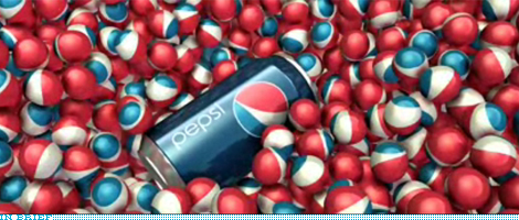
I want one of those Pepsi marbles in the pic if they do exist.
On Oct.28.2008 at 07:21 PM
Ricky Irvine’s comment is:
The video definitely makes the whole package look better than what we've been seeing. But, with all the new hype, are they actually delivering anything new? Anything besides new packaging? This much hype deserves new features or something.
I'm apathetic about it at this point.
On Oct.28.2008 at 07:22 PM
Oliver’s comment is:
lame.
(too lame?)
On Oct.28.2008 at 07:23 PM
Glenn Sakamoto’s comment is:
You can't polish a turd...
On Oct.28.2008 at 07:26 PM
Oliver’s comment is:
Also, I like how they justified the curves of the swooshes in the new Pepsi mark with a jumble of architectural looking circle diagrams. But then again, if I was doing something that arbitrary to a logo, then I'd want to figure out a way to justify it somehow too.
On Oct.28.2008 at 07:26 PM
plicktzah’s comment is:
oh my, the music is really awful.
On Oct.28.2008 at 07:31 PM
dan’s comment is:
yay.. we get to talk about pepsi again! who has something new to say?.... anyone?... is this thing on?...
On Oct.28.2008 at 07:32 PM
Lauren’s comment is:
Hm... the marbles do make it more justifiable, but in no way does it look refreshing. As hokey as the icy crystal Pepsi cups have become, they definitely convey the thirst quenching.
The new Pepsi looks like it's trying to be sophisticated, rather than cola.
On Oct.28.2008 at 07:35 PM
Chaac’s comment is:
Some dreams come true... some nightmares do too.
On Oct.28.2008 at 07:35 PM
Paulo’s comment is:
Wish I was a "digital and social media influencer" to get my hands in those boxes containing cans with all the old logos!
On Oct.28.2008 at 07:48 PM
Paul Johnson’s comment is:
That does sell it to me a little. However, the foreskin bottles have to go!
On Oct.28.2008 at 07:50 PM
Rob’s comment is:
sloppy motion graphics
On Oct.28.2008 at 08:09 PM
Rob’s comment is:
cool balls though
On Oct.28.2008 at 08:10 PM
Jeff Waugh’s comment is:
Yeah, the geometric curve alteration within the logo itself seems cool, but it's a bit to inside-branding-baseball without a lot of communications justification... What does it mean? Consistency of personality is about all I can see, and it makes the new packaging look like an in-house cheapie brand. :-(
Lots of balls in the video... are they saying that only Pepsi has the cojones to make this move? ;-)
On Oct.28.2008 at 08:16 PM
BJN’s comment is:
Nickel, nickel, nickel, nickel,
Trickle, trickle, trickle, trickle,
Nickel, nickel, nickel, nickel,
Trickle, trick...
Place your bets now on how long the simple new packaging graphics last before seasonal and promotional graphics take over to try and jump-start a stale shelf presence.
On Oct.28.2008 at 08:40 PM
adzski’s comment is:
Odd that this "quarter circle" logo from 1996 isn't included in the history of the Pepsi logo across the years.

Maybe it's one they choose to forget - it was pretty short-lived. I predict the new logo will be shortlived too.
On Oct.28.2008 at 09:02 PM
Mark’s comment is:
I....want....that.....Pepsi....Can.
On Oct.28.2008 at 09:04 PM
Mark’s comment is:
that first picture reminds me of:
http://lh3.ggpht.com/_BiUD0ve_zW8/RwAdsNZ-D1I/AAAAAAAACrA/fkKmvEDowHI/DSC01228.JPG
http://bp2.blogger.com/_88Q32uoE514/R06CJlxg22I/AAAAAAAABGI/2hZVZq77GEs/s1600-h/DSCN4822.JPG
now i want that 1996 Pepsi can too
I WANT THEM BOTH!
On Oct.28.2008 at 09:12 PM
Mark’s comment is:
EDIT
that first picture reminds me of:
http://lh3.ggpht.com/_BiUD0ve_zW8/RwAdsNZ-D1I/AAAAAAAACrA/fkKmvEDowHI/DSC01228.JPG
http://bp2.blogger.com/_88Q32uoE514/R06CJlxg22I/AAAAAAAABGI/2hZVZq77GEs/s1600-h/DSCN4822.JPG
now I want that 1996 Pepsi can too
I WANT THEM BOTH!
On Oct.28.2008 at 09:13 PM
SacSquared’s comment is:
The old logos up until 1998 look so much cooler...
On Oct.28.2008 at 09:28 PM
lodenmuse’s comment is:
The can resting in the marbles looks absolutely beautiful. That gorgeous blue and clean minimalism oozes luxury. Their product just went up two steps.
HOWEVER,
It is most saddening that the can bears this vulgarized, bastardized, smirk-ish logo. The old ying-yang/swoosh/ribbon would have elevated this redesign. The "cutie" sorta kills the classy.
=^\
On Oct.28.2008 at 09:49 PM
Jerry Yarnetsky’s comment is:
For me, the new look works very well with the cans, but not on the bottles.
On Oct.28.2008 at 09:54 PM
Matt Riddle’s comment is:
It's definitely a cleaner, kind of futuristic look, but it doesn't grab my attention in the way past designs have. Maybe they are relying on past consumers buying it because they recognize the name.
I love to see intrigue designs on products. I think they add something to the overall feeling people get from using the item. I am disappointed in the new design.
On Oct.28.2008 at 10:00 PM
Mark’s comment is:
Jerry Yarnetsky’s comment is:
For me, the new look works very well with the cans, but not on the bottles.
exactly,I agree,
There's something that works on the cans that bottles fail to do. I wonder if it's possible to have blue transparent bottles? I'd wish they'd change the Pepsi bottle design, it looks so bad.
On Oct.28.2008 at 10:07 PM
GregT’s comment is:
I do like the clean look and that are imposing order on their messy product line.
BUT, with the possible exception of Pepsi Max, there is very little zest or fun to this packaging. It feels anemic. Wimpy.
On Oct.28.2008 at 11:25 PM
Jeff’s comment is:
I mean, they could have done this with the old logo and it would have looked better ... Don't you think?
On Oct.28.2008 at 11:50 PM
ArnoldP’s comment is:
Lame, stupid, unnecessary. All the had to do is to get rid of all the gradients, and 3d stuff in the old design. Killing it was the wrong thing to do.
On Oct.29.2008 at 12:20 AM
Jeremy’s comment is:
It still looks like an Asian airline logo put on packaging that makes me think of deodorant. Doesn't make me want to drink it.
On Oct.29.2008 at 01:05 AM
Matt Riddle’s comment is:
Does anyone else get Vitamin Drink from this?
On Oct.29.2008 at 03:52 AM
mane’s comment is:
Well, must say this looks much better! Fresh, minimalistic. But still... I am not convinced this 'smile' is better than the well-known Pepsi-swoosh.
On Oct.29.2008 at 04:12 AM
Ziga Aljaz’s comment is:
the logo warping does it for me, but the aplications seem a little stiff and a bit too simple.
and they left a little relic of the old logo in the letter E heheh..
On Oct.29.2008 at 06:16 AM
mingshi’s comment is:
Wow, the video is just so... Andy Warhol..!
On Oct.29.2008 at 06:24 AM
Jedd’s comment is:
The new Pepsi logo ball looks really good, quirky and fun. However, the rest of the product packaging is "slick". And that's not a word I'd associate with cola drinks. I don't know. It's just too clean cut for me. Something about the video, especially the later part, reminds me of Apple.
On Oct.29.2008 at 09:01 AM
Andrew Klein’s comment is:
too futuristic-through-the-eyes-of-a-90's-techno-music-video for me.
On Oct.29.2008 at 09:28 AM
Jonathan’s comment is:
I feel like this will work for a year and then it will be boring... like the clear Pepsi from the 90s.
Give it up to Coke, they are definitely #1 now. It seems like Pepsi would be competing more with 3rd party/off-brands now.
On Oct.29.2008 at 09:32 AM
John Mindiola III’s comment is:
Okay, I've been negative on this whole transformation from the get-go, but seeing the deployment across all the Pepsi flavors is better than I thought. Now, that's not saying much, since I thought it was going to be a total train wreck. That being said, if the typography was more aggressive (which I see happening down the line, copyright the last two decades of the brand), and if that whacked out smiley was consistent (or just back to the globe), it would look a little sexier. I mean, the shiny cans and smooth solid colors are nice, but they look anemic like GregT said. I'm hoping this is just a fresh start for the packaging graphics, and I'm actually looking forward to the inevitable visual noise in the decade to come. Unfortunately, until then, I'm through with Pepsi products.
On Oct.29.2008 at 09:41 AM
Ross’s comment is:
That splash photo looks like a big pile of eyeballs.
On Oct.29.2008 at 10:00 AM
rickyaustin’s comment is:
Oh God they're serious...
On Oct.29.2008 at 10:15 AM
rickyaustin’s comment is:
The problem was that their old stuff was just incredibly clluttered and over the top.
They didn't have to redo the whole brand, it just needed cleaned.
It's as if their toilet was clogged, so they replaced the entire bathroom.
On Oct.29.2008 at 10:19 AM
steve’s comment is:
i appreciate the design intent of the cans from the start and this unveiling furthers that interest. i also enjoyed the promotional packages introducing the new cans and the historical cans.
On Oct.29.2008 at 10:29 AM
darrel’s comment is:
There's a brief moment in that video where the smiling ball is animated and actually takes on a bit of an anthropomorphic state and, honestly, is kind of cute/clever.
Had they used that as a campaign element, and then had it morph into the classic logo, I think they would have really had something. Something new, but built upon the 100+ years of equity built with the branding.
But, as it is now, as we've all said already, it's just sloppy and seems to be tossing out 100 years of product history out the window.
They're just 1 degree away from a parody of themselves:
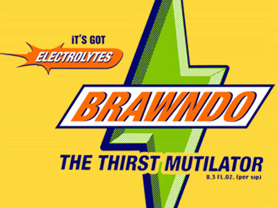
(Actually, I'd argue the Brawndo identity is much stronger than the new Pepsi one)
On Oct.29.2008 at 10:30 AM
Ryan’s comment is:
I would have preferred if they just used the all white cans with a series of really old logos like the ones they shipped out with the new cans. it would have been way more interesting that the new crap.
On Oct.29.2008 at 10:54 AM
David Sanchez’s comment is:
I understand the dynamic brand device, after tinkering a bit - I am loving the typeface. But with the attention span deficiency people go on a daily basis do you think they will notice the slight difference on shield?
On Oct.29.2008 at 11:05 AM
damon’s comment is:
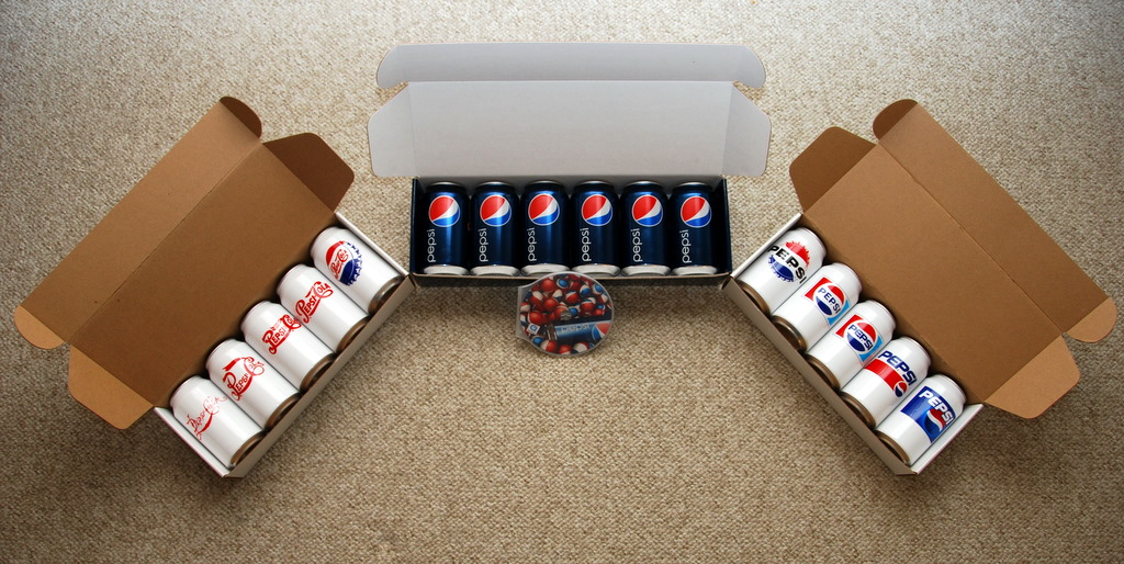
I really like the white cans with the bottle caps on them, among others.
there is a new coke packaging in europe that won a bunch of awards that really simple one colour background and really large logo type wrapped around it, it's really great.
On Oct.29.2008 at 11:23 AM
Matheus’s comment is:
L A M E
On Oct.29.2008 at 12:01 PM
Ty’s comment is:
It's an interesting response to Coke's packaging change a while back. Coke went for ultra simple, and Pepsi one-upped them.
It seems as though Pepsi's MO has for some time been completely responsive to what Coke does. Perhaps this is the last time that happens.
On Oct.29.2008 at 12:24 PM
EnergonCube’s comment is:
Ty... Pepsi has been trying to one-up Coke since the 1950s. This will certainly not be the last time it happens.
Pepsi has developed a me-too culture and it runs deep.
On Oct.29.2008 at 12:57 PM
Mr Posen’s comment is:
Glenn Sakamoto’s comment is:
You can't polish a turd...
or
You can put lipstick on a Pig...
On Oct.29.2008 at 12:59 PM
Josh’s comment is:
I want to jump into a ball pit filled with those "marbles"....
On Oct.29.2008 at 01:51 PM
Joerg’s comment is:
Here is a much better red, white and blue can design.
http://designforobama.org/index.php?p=387&page=8&sort=tr
ERic’s comment is:
Why does every "O" now need to be connected to politics.
On Oct.29.2008 at 02:25 PM
Tom Hackett’s comment is:
Do you get it now, people? Do you get it now?
On Oct.29.2008 at 02:31 PM
XK9’s comment is:
This is bad. It takes what had become a solid brand mark and fractures it. The end result looks like a thesis project created by an undergraduate at a third rate design school. Unprofessional.
On Oct.29.2008 at 02:52 PM
Shane’s comment is:
I'm enjoying the new refreshed look in the branding and logos. I also like how they are introducing it.
On Oct.29.2008 at 03:12 PM
darrel’s comment is:
"Why does every "O" now need to be connected to politics."
Because Obama (or his staff) understood the power of great identity design.
That and we're neck deep in politics in the US at the moment.
On Oct.29.2008 at 03:13 PM
rjp’s comment is:
I was extremely disappointed, uninspired, shocked and astonished by this work when it was first leaked. Nothing has changed, even if the introduction video was fairly cool - all it did was succeed in dressing up an awful design. If only Arnell spent as much time on the Identity and Packaging design as they did the introduction video!
On Oct.29.2008 at 06:08 PM
Chris’s comment is:
Coke goes simple, Pepsi goes simple. Once a me-too brand, always a me-too brand. It's shockingly bad, but somehow totally in character.
On Oct.29.2008 at 06:38 PM
Mr. One-Hundred’s comment is:
Nope, still no good. Any of those white cans except maybe the last two look a million times better than the new one. Why are they in the presentation?
On Oct.29.2008 at 10:39 PM
Mark’s comment is:
on you the youtube video 1:36 missed opportunity.
also 1:30 missed opportunity
also 1:16 missed opportunity
also 1:17 missed opportunity cute smile non-aggressive. Like it tasted Pepsi.
1:31 one half second in {when it's equally open on both sides} very nice smile ANOTHER missed opportunity.
1:37 half second in (when it's balanced}sooooo nice
What's the light brown can for in the video?
1:40 brief preview of the back of the can.
On Oct.30.2008 at 01:30 AM
Ray’s comment is:
OK, I'm all for brand videos but this one looks rushed or like a first round, certainly does not look like a finished product.
I sort of feel that way about the whole line up, it feels very unfinished to me. It also concerns me that they are not looking to capture something that will last a long time. There brand is constantly fluctuating, and I don't know if that is a good thing.
When you look at a brand like Coca-Cola and how recognizable it is and then look at this, there is no comparison. I think it's because the people at Coke have tons of respect for their brand. It seems to me Pepsi still doesn't know who they want to be when they grow up.
On Oct.30.2008 at 10:16 AM
Abe’s comment is:
good.
(not good?)
On Oct.30.2008 at 09:13 PM
Anonymous’s comment is:
"Today’s target demographic is radically different. The drink is mainly marketed to people in the 12-30 year old demographic group, creating a connection to activities like extreme sports and to the video game culture." - wikipedia, mtn dew

teampahl’s comment is:
even the last two white cans, a retro eighties look, could catch all the hipsters still.
On Oct.31.2008 at 02:52 PM
KikII’s comment is:
I don't think it's bad at all.
On Oct.31.2008 at 06:30 PM
Diane’s comment is:
I must admit the new cans all lined up do look pretty nice. I wonder how this new look will be applied to vending machines and POP displays?
In contrast to the white cans, the dark blue cans really make a statement.
I still don't think it's a great move. Boring movie, and boring presentation of the previous cans. Is this done on purpose?
Also, I read over at the Denver Egotist Pepsi pulls a Palin that this is all a hoax by Pepsi, is there any truth in this?
On Oct.31.2008 at 09:20 PM
Justin Hill’s comment is:
Maybe in the year 201X, Burger King will switch back to Pepsi.
"Have a Pepsi with the King."
On Nov.01.2008 at 01:58 AM
Justin Hill’s comment is:
That short video that I saw of Pepsi's new look made it look epic. That comment I made before is made up and only to get a laugh. this is the most radical change to a brand identity that has had a legacy, and, yes, it sort of reminds me of this: 
dale’s comment is:
This is exactly what you get when advertising agencies design brands, instead of branding firms. I've seen this happen so many times in the past 2 or 3 years. Ad agencies are trying to spread their wings because ad dollars are being cut. They have the ears of the brand managers, marketing directors and GM's, telling them that they can holistically design for every consumer touchpoint. Well, the ad agencies have consistently proven they can't compete with the great branding firms out there.
They know nothing about brand architecture, versioning, trends in packaging, industrial design, and what "hunts" for consumers on shelf. They don't think, they product shit, just like this.
Thanks, Peter Arnell from the Arnell Group who's firm redesigned this piece of shit student work, for treading on ground you have no right to be on. You are a failure, so go back to advertising.
IT'S LIKE PUTTING EARRINGS ON A PIG, AND THE EARRINGS ARE UGLY, TOO.
On Nov.01.2008 at 08:58 AM
John’s comment is:
Are they changing the slogan to "Taste We Can Believe In"? :P
On Nov.01.2008 at 11:56 AM
Woah’s comment is:
"dale’s comment is:
This is exactly what you get when advertising agencies design brands, instead of branding firms. I've seen this happen so many times in the past 2 or 3 years. Ad agencies are trying to spread their wings because ad dollars are being cut. They have the ears of the brand managers, marketing directors and GM's, telling them that they can holistically design for every consumer touchpoint. Well, the ad agencies have consistently proven they can't compete with the great branding firms out there.
They know nothing about brand architecture, versioning, trends in packaging, industrial design, and what "hunts" for consumers on shelf. They don't think, they product shit, just like this.
Thanks, Peter Arnell from the Arnell Group who's firm redesigned this piece of shit student work, for treading on ground you have no right to be on. You are a failure, so go back to advertising.
IT'S LIKE PUTTING EARRINGS ON A PIG, AND THE EARRINGS ARE UGLY, TOO."
EPIC TRUTH!!!!
On Nov.02.2008 at 03:33 AM
Jared’s comment is:
It looks like that guy that comes to the party trying to be cool, yet obvious to others, is not.
Pepsi is grasping at straws to try to create a synthetic brand image that has no foundation.
They need to go back to their heritage and look for whats relevant, and not try to "force" an unconvincing hip personality.
kirk’s comment is:
i think their new slogan should be
"we're still not coke"
i dont like the new "dot"
On Nov.03.2008 at 11:55 AM
Andrew O. Ellis’s comment is:
What new of my beloved Wild Cherry / Diet Wild Cherry Pepsi?
On Nov.03.2008 at 04:30 PM
Andrew O. Ellis’s comment is:
Of course that should read "What news..."
On Nov.03.2008 at 04:31 PM
Cees van de Water’s comment is:
I wasn't very enthusiastic about the creative work I saw on the separate bottles and cans. However with a proper amount of facings on shelf, I feel the Pepsi brand block within the beverages section might look quite strong and different.
Next to that I think it is a brave step for a big brand like Pepsi to change their design in such a radical way.
On Nov.04.2008 at 08:31 AM
iRob ’s comment is:
I think the graphic designer have send to print not the right file....
No words....
SpongeBob SquarePants’s comment is:
Fishpaste!!!
On Nov.07.2008 at 04:50 AM
akrokdesign’s comment is:
talk about killing it self. pepsi must be tiered being next to coke and now want to loose some market share.
the brand would had been stronger even with no re-branding.
but the way, anyone know who made this? was it in-house or agency?t.
On Nov.07.2008 at 09:25 PM
Noah’s comment is:
Makes me really like these ones...

ghazaleh’s comment is:
I'm no fan of anything corporate - I mean I'd be on my deathbed if I were to design brands for corporations. But, I have to say, I think it's very clever and incredibly effective for multimedia, motion graphics, 3D elements and can certainly make them big bucks. I think rebranding is fun if you can afford millions to do it, so hey, why not go ahead and have fun with it. It's a bold move pepsi boys, but I'm digging your corporate strategy eventhough I'd never work for you.
On Nov.13.2008 at 01:15 AM
Justin’s comment is:
Previous generation logos of Pepsi have a certain style, the latest logos are definately recognizeable...to the point where this new logo looks like a knock-off. I would put all the money in world on the table, that this logo will be gone by next summer.
On Nov.18.2008 at 05:38 PM
Andrew Sabatier’s comment is:
I think the whole Pepsi identity has been compromised. Adaptability seems to have been crowbarred in. Pepsi is now something else. As much as I like the treatment of the e, in the context of the whole identity it looks like half an idea. It's not strong enough to stand on its own and if they're going to go for a minimalist look they should commit to it. It also indicates that the smiling ball is not strong enough to carry a personality. If it did then a bold piece of minimally styled typography would be enough. A smile? C'mon it's become a major cliche of contemporary branding. And it's not even a discernable smile, it's a witless, comical and cheesy grin.
On Nov.25.2008 at 05:57 AM
mia’s comment is:
something about the white band's bezier is kiling me. literally, killing me. aaaak!
On Nov.27.2008 at 08:26 AM
Brandon’s comment is:
I'm not thrilled with the new look, but I have a greater concern than that.
I saw some bottles and cases of Pepsi at a local grocery store that I frequent a few days ago, mixed in with the remaining supply of the older logo Pepsi products.
The thing that I noticed is this new packaging doesn't seem to mention anything about the Pepsi Stuff points. On the older packaging that is apparently being phased out, it always clearly mentioned the Pepsi Stuff rewards program. Under the caps of the bottles and inside the cardboard of the cases, there are codes that you can redeem for points online and use them to get free items, MP3s, etc.
I tend to buy whatever brand of soda is on sale each week, but whenever it's the Pepsi products, I save the caps and collect the points.
Does anyone know if the Pepsi Stuff points are being phased out? Or are they still included under the caps and in the cases, and they just aren't making it a point to mention this on the packaging?
If no one knows, then I'll find out sooner or later when I have no choice but to buy the new packaging. The Pepsi items were on sale the other day when I was at that store, but out of this concern, I made it a point to buy the 2-liter bottles that were still in the older packaging.
On Dec.08.2008 at 01:34 PM
Shawn’s comment is:
I see they are going for shelf impact (100's of dark blue metallic cans on a shelf is imposing), but the logo and treatment variations aren't meaty enough for general consumers to see the differences - it will be lost on them.
And the "pepsi" text is not strong enough - it definitely has a more sophisticated and, possibly "feminine" feel - much like Tab of years ago.
It will be changed very soon.
On Dec.15.2008 at 05:42 PM
Justin Hill’s comment is:
The new logo looks like a rubber ball you could play jacks with.
On Dec.20.2008 at 10:30 AM
Bluzulu’s comment is:
I like the can, but the bottles suck!
On Dec.24.2008 at 09:32 AM
Justin Hill’s comment is:
Jacks, anyone?
Justin Hill’s comment is:
Pepsi outdid themselves this time by unveiling the design in a New Year's Eve commercial.
On Jan.13.2009 at 01:11 AM
ZUU’s comment is:
Veo unas tetas de todos los tamaños.
On Jan.29.2009 at 05:12 PM
Gentleman Agitator’s comment is:
Pepsi just does not know when to stop messing with their own brand legacy. Sad. Coke is laughing I imagine.
On Feb.09.2009 at 11:31 AM
B J’s comment is:
The new logo SUCKS!!! I liked the last logo with the custom backgrounds.
On May.07.2009 at 08:31 PM
Comments in Brand New, V1.0 have been closed.


